Public Broadcasting Service
Jump to navigation
Jump to search
Logo descriptions by Nicholas Aczel, Kris Starring, Ryan Froula, iLogoMaster, and Pepsi9072
Logo captures by Eric S., Mr.Logo, BenderRoblox, Nightspears, Gilblitz112, Pepsi9072, LogoGuy94 and Megadeth99
Editions by gshowguy, Ryan Froula, BenderRoblox, MariluHennerArtist45, Liz Tetlow, KirbyGuy2001, Mike Bode, TheBigLogoFan, UniversalFlorida1990, gameandwatchrocks101. Unnepad, Mario9000seven and Nick Lancer
Background: The Public Broadcasting Service, known on air as PBS, is a publicly funded non-profit distribution service (founded on November 3, 1969) that serves a variety of television stations in the United States, as well as some areas of Mexico and Canada. PBS replaced its predecessor NET in October 5, 1970 with some of their original affiliates being KPBS in San Diego, WNET in New York, WGBH in Boston, and KCET in Los Angeles. PBS has over 350 affiliates today, mostly owned by educational institutions.
REGULAR IDENTS
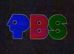
1st Logo
(May 17, 1970-Late Summer 1971)
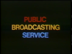
Nicknames: "The Text", "The Text of Boredom", "Multi-Colored/Tri-Colored Text", "Public Boredom Service"
Logo: Just a black background with the words:
stacked on top of each other in red, yellow, and blue.
Editor's Note: This logo is rather infamous as it is the hardest PBS logo to find because of its incredibly short lifespan. In all likelihood, this was developed as a placeholder logo during the NET to PBS transition, hence why the color scheme is the same as the last NET logo. For many years, the only circulating copy was one of very poor quality, and it had barely any information regarding its source. What was known is that it came from "Go Ride the Music", and even then many casual observers failed to connect it with Fanfare for years. However, by the late 2010s, the additional copies mentioned above have come to light, giving the community a few additional captures of this very elusive ID. It has also been found that the original poor quality soruce comes from a [recording].
Logo captures by Eric S., Mr.Logo, BenderRoblox, Nightspears, Gilblitz112, Pepsi9072, LogoGuy94 and Megadeth99
Editions by gshowguy, Ryan Froula, BenderRoblox, MariluHennerArtist45, Liz Tetlow, KirbyGuy2001, Mike Bode, TheBigLogoFan, UniversalFlorida1990, gameandwatchrocks101. Unnepad, Mario9000seven and Nick Lancer
Background: The Public Broadcasting Service, known on air as PBS, is a publicly funded non-profit distribution service (founded on November 3, 1969) that serves a variety of television stations in the United States, as well as some areas of Mexico and Canada. PBS replaced its predecessor NET in October 5, 1970 with some of their original affiliates being KPBS in San Diego, WNET in New York, WGBH in Boston, and KCET in Los Angeles. PBS has over 350 affiliates today, mostly owned by educational institutions.
REGULAR IDENTS
1st Logo
(May 17, 1970-Late Summer 1971)

<iframe frameborder="0" height="165" src="http://wikifoundrytools.com/wiki/closinglogos/widget/genericvideo/b7a7ebb6a8cf508f7d0ee5661ff09459c520fe0a" width="291"></iframe><iframe frameborder="0" height="162" src="http://wikifoundrytools.com/wiki/closinglogos/widget/unknown/0c32ec75804bec13fd85e48cc8e3b46f19e580ce" width="286"></iframe><iframe frameborder="0" height="163" src="http://wikifoundrytools.com/wiki/closinglogos/widget/genericvideo/d1e7529a8189f963a79360c7ae1c350bedd9302c" width="285"></iframe>
Nicknames: "The Text", "The Text of Boredom", "Multi-Colored/Tri-Colored Text", "Public Boredom Service"
Logo: Just a black background with the words:
PUBLIC
BROADCASTING
SERVICE
BROADCASTING
SERVICE
stacked on top of each other in red, yellow, and blue.
Variant: On Firing Line, instead of fading in, the logo cuts in from the CPB logo.
FX/SFX: None.
Music/Sounds/Voice-over: An announcer, MacDonald Carey, says "This is PBS, the Public Broadcasting Service." Later programs used a different announcer.
Music/Sounds/Voice-over Variant: On Calebration, the opening theme plays over this logo, and there is no announcer.
Availability: Extinct. It was used concurrently with the NET logo from 1970 to 1971 mid-season as a placeholder logo (the NET logo appeared at the start of Our Vanishing Wilderness and at the end of the first few broadcasts of Realities during that season) and then quickly replaced with the 2nd logo.
- Though PBS officially went on the air on October 5, 1970, it had actually been formed the year before, in 1969, with the logo allegedly premiering on the Hollywood Television Theatre pilot, "The Andersonville Trial", and appearing on the first season thereof. It also appeared on the Grateful Dead concert program Calebration and the initial broadcasts of the Fanfare episode "Go Ride the Music", featuring Jefferson Airplane and Quicksilver Messenger Service (a bootleg DVD preserves it).
- The logo was likely seen on the fourth season of Mister Roger's Neighborhood and the second season of Sesame Street, but modern prints have featured either the 1971 or 1989 logo. It was also seen on some of the earliest known extant episodes of WNET's Soul!, the first season of The Great American Dream Machine, and the first Masterpiece Theatre serials (from The First Churchills to Pere Goriot).
- It was found on a 1971 episode of Firing Line, which was uploaded to YouTube on January 26, 2017, and is also retained on a few other early episodes thereof. A repeat of the series premiere of Realities, as well as other episodes including "If Eugene Talmadge Were Alive Today...", and the Black Journal episode "Justice?" also have this logo.
- In what appears to be the first known live presentation snafu in the network's history, President's Report on Indochina, which replaced the first planned broadcast of The Nader Report following a delay stemming from objections from the oil companies regarding that show's political content, starts playing the voiceover over a title card reading "An NET News Special"; due to the video file hosted by the American Archive of Public Broadcasting cutting out at that moment, it is currently unknown whether this logo actually appeared on that program.
Editor's Note: This logo is rather infamous as it is the hardest PBS logo to find because of its incredibly short lifespan. In all likelihood, this was developed as a placeholder logo during the NET to PBS transition, hence why the color scheme is the same as the last NET logo. For many years, the only circulating copy was one of very poor quality, and it had barely any information regarding its source. What was known is that it came from "Go Ride the Music", and even then many casual observers failed to connect it with Fanfare for years. However, by the late 2010s, the additional copies mentioned above have come to light, giving the community a few additional captures of this very elusive ID. It has also been found that the original poor quality soruce comes from a [recording].
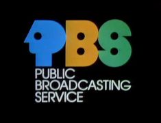
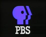
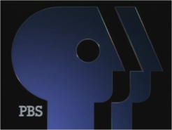
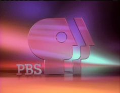
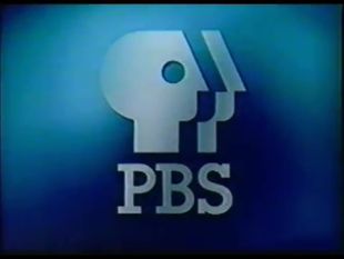
2nd Logo
(Late Summer 1971-September 30, 1984; June 1, 2000)
(Late Summer 1971-September 30, 1984; June 1, 2000)


<iframe frameborder="0" height="164" src="http://wikifoundrytools.com/wiki/closinglogos/widget/genericvideo/ef5484fc3663358e2a2c48330299b970f20316f7" width="218"></iframe><iframe frameborder="0" height="171" src="http://wikifoundrytools.com/wiki/closinglogos/widget/genericvideo/812878702c82b1df79f682d8b85c9b9fe3b85060" width="301"></iframe><iframe frameborder="0" height="166" src="http://wikifoundrytools.com/wiki/closinglogos/widget/genericvideo/47b7c25c485e28ce0b5d6c27c9d35893c0e1aa4d" width="297"></iframe>
<iframe frameborder="0" height="165" src="http://wikifoundrytools.com/wiki/closinglogos/widget/genericvideo/f6aa7062436ff2404ae2b32d9cfd3d4c69c047e8" width="292"></iframe><iframe align="bottom" frameborder="0" height="155" src="http://wikifoundrytools.com/wiki/closinglogos/widget/genericvideo/fea74e07e2931f60da9ec5edc6e38156c3b58ef5" width="271"></iframe><iframe frameborder="0" height="164" src="http://wikifoundrytools.com/wiki/closinglogos/widget/unknown/3ee09280b7f14ce80aae6e4745d36a44c671cc58" width="292"></iframe>
WARNING: THE FIFTH VIDEO IS LOUD, SO LOWER DOWN THE VOLUME BEFORE WATCHING.
Skip to 0:27 on the third video to see the logo
Skip to 0:27 on the third video to see the logo
Nicknames: "P-Head and Friends", "PBS P-Head", "The Tri-Colored Everyman P-Heads", "The Tri-Colored PBS Logo", "The Tri-Heads from/of Hell/Doom"
Logo: On a black background, an abstract blue P zooms out to the top portion of the screen. The "P" turns into a P-shaped head facing left with the text "PUBLIC" appearing underneath (this set and the later lines of text underneath being set in ITC Avant Garde Gothic); both move to the left side of the screen. An abstract orange B pops in to the right of the P-Head and two black dots form the holes within the B (the latter dot coinciding with the text "BROADCASTING" appearing below "PUBLIC"). An abstract green S appears to the right of the B; two black dots cut the inner curves of the S as the text "SERVICE" appears below "BROADCASTING" (coinciding with the second dot). The final text stack reads:
Trivia:
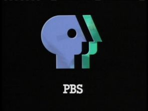
3rd Logo
(September 30, 1984-September 17, 1989; May 9, 1994)
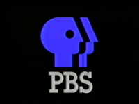
Nicknames: "Split Profile", "The Everyman/Everyperson P", "PBS P-Head II", "The Split".
Logo: On a black background, a blue P-head appears on the upper-mid screen, facing backwards. A piece, unofficially called "The Split", comes out to the right and settles itself about half an inch away. The text "PBS" appears below in a slab serif font, which was designed specifically for PBS (called "ITC Lubalin Graph Bold").
Trivia:
Variants:
FX/SFX: The P-head "splits" as a fragment of the logo stretches away.
Music/Sounds: A majestic piano chord, followed by six string pizzicato tones, then a softer version of the piano chord. Composed by Jonathan Elias.
Availability: Rare. It appeared on old prints of PBS shows produced from 1984-89. Can also be found on early PBS Home Video releases from the '80s; just look for a banner with the P Head on the left and "PBS VIDEO" filling the entire rest of the banner.
Editor's Note: While this logo has not been seen on television for many years, it is still very highly regarded and is a favorite of many.
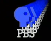
4th Logo
(September 15, 1989-July 31, 1993; November 20, 1995)
Nicknames: "3D Glass", "Transparent Blue P-Head", "Merging Glass P-Head", "PBS P-Head III"
Logo: On a black background, a side-facing transparent dark blue P-head folds to the right, leaving behind a residue trail of "P-Heads". The residue trail fades into the PBS logo from before, which settles itself in the center of the screen, occupying almost all of it. Several multi-colored lines wipe across the bottom of the screen, leaving the text "PBS" in the same font as before to the bottom left.
Variants:
FX/SFX: The P-head folds, leaving behind a trail as it settles in the center of the screen. Multicolor lines wipe in to form the PBS logotype.
Music/Sounds/Voice-over: A long held-out string note combined with synth bells (played on a Roland D-50 using the Fantasia preset) and chimes, followed by an announcer (probably Peter Thomas, who also did the funding credits voiceovers for The MacNeil/Lehrer NewsHour, Nova, and A World of Ideas at the time) saying "This is PBS".
Availability: Rare. As with other vintage PBS logos, the chance of showing up on TV now is almost nothing, but some PBS Home Video releases from the era may have it. Just look for a square in the top-left corner of the front of the box with "PBS VIDEO" below a P-head.
5th Logo
(January 4, 1993-September 4, 1996)
 <iframe frameborder="0" height="176" src="http://wikifoundrytools.com/wiki/closinglogos/widget/genericvideo/c403b9cfd3ed8d046ac477cce1819926e563e4f7" width="313"></iframe>
Nicknames: "Orange CGI P-Head", "Glass P-Head", "Pink P-Heads", "PBS P-Head IV", "Pink PBS Logo"
Music/Sounds/Voice-over: A funky piano and choir boogie tune, followed by an announcer (Chris Murney, the voice of Elisha Hunt Rhodes in Ken Burns' The Civil War) who says "This is PBS." The music was composed by Peter Fish, who has also done music for CBS News.
Editor's Note: This logo is highly regarded by the community due in part to its production process, done without resorting to primarily using computer animation.
6th Logo
 <iframe frameborder="0" height="226" src="http://wikifoundrytools.com/wiki/closinglogos/widget/genericvideo/008e43a86e3b8d02760b57e992582f1770ac8eea" width="401"></iframe>
 <iframe frameborder="0" height="221" src="http://wikifoundrytools.com/wiki/closinglogos/widget/genericvideo/a99fe50aed8a6a026577267b37665e5f780990f8" width="393"></iframe>
Nicknames: "Windows", "The PBS Windows III", "CGI Window", "PBS P-Head VI"
Logo: On a black background, a CGI window appears with a birds-eye view of the earth, a plastic globe spinning on the top right, and a telescope rotating on the bottom left. The pear-colored PBS P-Head (with the split colored light blue) appears in front of the window and grows smaller as the window grows bigger. As the two meet each other, the window disappears. Inside the P-Head are transparent images of two globes, a feather and a telescope. The P-Head takes its place in the top center of the screen and turns to light blue and aquamarine as the text "PBS" fades in below them.
FX/SFX: Neat CGI effects.
Music/Sounds/Voice-over: A new age tune with guitars and flutes, followed by a female announcer (the late Lauren Bacall) who says "This is PBS."
Music/Sounds/Voice-over Variant: On some shows, Lauren Bacall says "You are watching PBS." This was used for program breaks.
Availability: Uncommon. It appears on TV sometimes, but PBS Home Video tapes are an easier way to find it.
Editor's Note: This logo has some very neat effects for the time as well as a calming theme.
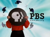
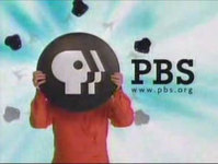
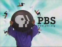
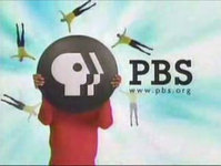
8th Logo
(September 21, 1998-September 1, 2002)
<iframe frameborder="0" height="167" src="http://wikifoundrytools.com/wiki/closinglogos/widget/genericvideo/352e0694c23493e36a8fdd02a7b1096efa57f241" width="294"></iframe>
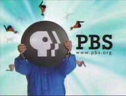
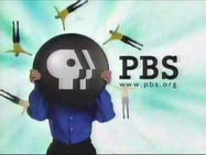
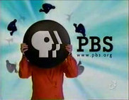
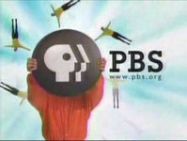
Nicknames: "Acrobats", "Circle P-Heads", "PBS P-Head VII", "Circle PBS P-Head"
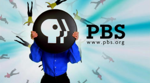
Logo: On a computer-generated green sky background, a person standing to the left covers his or her head with a black circle with the PBS P-Head on it in white. Acrobats jump from all directions off the circle. The text "PBS" appears to the right, with the URL <a class="external" href="http://www.pbs.org/" rel="nofollow" target="_blank">www.pbs.org</a> appearing below it. This is the last logo that used the words "This Is PBS". Also, throughout the ident, different things happen in the background: On all ten variants, there are tiny superimposed silhouettes of people flying in a circle behind the acrobats. On three out of ten of the variants, there are silhouettes of big wands briefly flying down behind the PBS text. And on the rest, there are silhouettes of people tip-toeing in an oval (a circle on the widescreen version) around the person.
Trivia:
Variants: Each time you see this logo, different people are holding the circle with the P-head on it, and the acrobats doing different kinds of tricks around the P-head circle. Here's a list of the men and women you see (that also includes the tricks the acrobats do) :
FX/SFX: The computer effects used to shrink the acrobats and superimpose them around the circle.
Music/Sounds/Voice-over: A brief synth swell and a 3-note flute fanfare, followed by a new age percussion/choir tune, followed by the female announcer from the previous logo (Lauren Bacall) who says "This is PBS." If you listen carefully, you can also hear a trombone and strings in the background as well. There is also a variant that exists with Lauren Bacall saying, "You are watching PBS." This was used for program breaks.
Availability: Rare.
Editor's Note: The many variations of this logo marked the beginning of a trend for PBS idents that continues to this very day. Like the last logo, this one also features very nice effects as well as a great musical theme.
9th Logo
(October 2, 2000-2002)
![PBS (2001) ["Stay Curious"]](/images/thumb/d/d7/F3b2675831cae59961ec36f2a69baeb0.png/268px-F3b2675831cae59961ec36f2a69baeb0.png)
FX/SFX: The "P" Circle easing back and vanishing. The circles forming, spreading, merging, and spreading again. The blurring in of the PBS logo. The circles forming the pbs.org name. Typical early 2000's animation.
Music/Sounds/Voice-over: A three-note ascending tune (D, E, A); most likely played on sitar, Gibson Les Paul or a Rickenbacker 325 (put through a wah-wah pedal) and a voiceover saying "This is PBS."
Editor's Note: Very simple compared to the rest of the logos on here, but some may like its vaguely '60s-ish vibe.
10th Logo
(September 23, 2002-December 3, 2010)
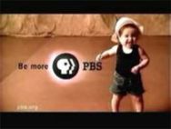
Nicknames: “Be More”, “We Are PBS”, “I Am PBS”, "The Sienna Curtains", "PBS P-Head IX", "Circle PBS P-Head III", "Launch and Megatron Announce PBS"
Logo: We see a letterboxed clip show of live-action footage, filmed on a large set with hardwood floor and a background of shaggy raw sienna-colored curtains. Culturally and generationally diverse people are employed in the variants, each giving different performances on-camera. As the last clip plays, we see the “Circle P-Head” logo animating with the word "PBS" on the right and the slogan “Be more” on the left. The text has been modified a bit after the past 18 years. Throughout the bumper, a bug for the URL "pbs.org" is seen in the lower left corner.
Variants: Here are some of the variations that have been seen of late, with a list of the clips in each variant in chronological order:
FX/SFX: Mostly live action, except for the logo animating at the end.
Music/Sounds/Voice-over: A majestic orchestral tune. The same tune is always used, but is rearranged for some variants and has a different voice-over (see above for examples).
Editor's Note: None.
11th Logo
(September 28, 2009-2020)
<iframe frameborder="0" height="164" src="http://wikifoundrytools.com/wiki/closinglogos/widget/genericvideo/63b46d5d8f2d0707c9327c5796ebf0afe477bf64" width="294"></iframe>
Nicknames: "Be More II", "Be More, PBS", "PBS P-Head X", "Circle PBS P-Head IV"
Logo: We see a video of a person or people having activities. Suddenly, the PBS logo appears with "Be More" on the left and "PBS" on the right. The word "PBS" then changes to the URL "pbs.org". A voice-over says "Be More, PBS." as the logo animates.
Variants:
Availability: Currently in use on most PBS first-run shows. The variants are used randomly, as with the previous logos, on many programs, including Nova, This Old House, Motorweek, and The Woodwright's Shop; however, on certain programs you can always expect to see the following variants:
Editor's Note: While this logo is almost a decade old, its many variants over the years have kept it fresh.
 <iframe frameborder="0" height="202" src="http://wikifoundrytools.com/wiki/closinglogos/widget/unknown/ca54bfdd6b2c83d05b816dd14205bd0c63111c55" width="357"></iframe>
Nickname: "21st Century PBS", "50 Years of PBS"
(November 2, 1998-September 5, 1999)
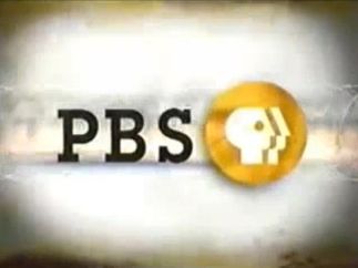 Nicknames: "Gold Circle", "Gold Circle PBS P-Head", "PBS P-Head VII", "Circle PBS P-Head II
FX/SFX: The circle zooming out, the numbers zooming and transforming.
Music/Sounds/Voice-over: A futuristic choir tune with an announcer saying "This is History's Best on PBS". When opening programs, the announcer says, "Presenting History's Best on PBS". Sometimes, it's worded as "You're watching History's Best on PBS".
Availability: Extremely rare. This was used in lieu of the 7th logo on a short-lived programming block called "History's Best". On home video, this appears on the Ken Burns documentary Not for Ourselves Alone. It also appears on a few episodes of American Experience released on home video at the time.
Editor's Note: None.
MERCY STREET:
(January 17, 2016-March 5, 2017)
Logo: Against a brown background featuring BG graphics from Mercy Street, the Mercy Street title appears, followed by the typical PBS logo appearing in its place.
FX/SFX: The Mercy Street title and PBS logo appearing.
Music/Sounds/Voiceovers: A strings tune sourced from incidental music from Mercy Street. An announcer says, "You've been watching Mercy Street on PBS."
Availability: Appears only on Mercy Street. Don't expect to see this on the half-hour behind-the-scenes special Inside Mercy Street. Now no longer current due to the show's cancellation.
Editor's Note: None.
PBS ARTS:
1st Logo
(2011-December 12, 2014)
Logo: Against a purple/magenta background, an orange circle forms itself in watercolor in the center of the screen, followed by a pink circle to its left and a blue circle to its right. "PBS arts", with PBS in magenta, fades in within the orange circle, and the Circle P-Head forms itself to the left. The URL "pbs.org/arts" fades in below.
FX/SFX: The circles forming themselves.
Music/Sounds: A guitar piece.
Availability: Seen on old PBS Arts programs. Its last known sighting was on the Live from Lincoln Center episode "Curtain Up: The School of American Ballet Workshop", first broadcast on December 12, 2014.
Editor's Note: None.
1st Logo
(1992)
Logo: TBA
(2013-October 28, 2019)
Logo: TBA
FX/SFX: TBA
Music/Sounds/Voiceovers: An abridged version of the 2009 CPB logo's music. At the end of the program, a voiceover says, "PBS, your home for independent film."
Availability: Appears at the end of Independent Lens and POV.
Editor's Note: None.
PBS STORIES OF SERVICE:
(2014- )
Logo: TBA
FX/SFX: TBA
Music/Sounds/Voiceovers: A solemn yet uplifting four-note brass piece which sounds almost like the first three notes of "Taps". At the end of the program, a voiceover says, "This is PBS."
Availability: Rare. Can be seen on PBS programs about American servicemen, including the annual National Memorial Day Concert.
Editor's Note: None.
(June 20, 2017- )
Logo: TBA
FX/SFX: TBA
Music/Sounds/Voiceovers: A quick, lively tropical tune.
Availability: Brand new. Debuted on The Story of China. Also appears on Big Pacific and Great Yellowstone Thaw.
Editor's Note: None.
SPOTLIGHT EDUCATION:
(September 12-17, 2016)
Logo: TBA
FX/SFX: TBA
Music/Sounds/Voiceovers: TBA
Availability: Only seen on episodes of POV, Frontline, Nova, Craft in America, and other programs which take a look at the American education system and were broadcast over one week in September 2016.
Editor's Note: None.
THINK WEDNESDAY:
(April 9, 2014-October 30, 2019)
Logo: TBA
FX/SFX: TBA
Music/Sounds/Voiceovers: A new-age rock tune. A female voiceover says, "Think Wednesday, think PBS."
Availability: Seen at the end of The Mystery of Matter, as well as first-run episodes of Earth's Natural Wonders, Nova, and The Brain with David Eagleman, among other programs on the Think Wednesday block, all exclusively during the primetime broadcasts (save for The Mystery of Matter, which used only this logo at the end).
Logo: On a black background, an abstract blue P zooms out to the top portion of the screen. The "P" turns into a P-shaped head facing left with the text "PUBLIC" appearing underneath (this set and the later lines of text underneath being set in ITC Avant Garde Gothic); both move to the left side of the screen. An abstract orange B pops in to the right of the P-Head and two black dots form the holes within the B (the latter dot coinciding with the text "BROADCASTING" appearing below "PUBLIC"). An abstract green S appears to the right of the B; two black dots cut the inner curves of the S as the text "SERVICE" appears below "BROADCASTING" (coinciding with the second dot). The final text stack reads:
PBS
PUBLIC------
------ BROADCASTING
------ SERVICE------------
PUBLIC------
------ BROADCASTING
------ SERVICE------------
Trivia:
- This logo was designed by Herb Lubalin, also responsible for the aforementioned Avant Garde Gothic. Lubalin and his design team have theorized numerous concepts before settling on the final draft:
- "PBS" with stars on it
- "PBS" with a star-shaped vortex next to it
- A falcon with a "PBS"-shaped neck, colored pink
- Numerous color schemes, including the scheme of the Star-Spangled Banner. The idea was rejected due to the political climate at the time. NET had already been killed as a network under pressure from the conservative Nixon administration, and PBS worried that a red left-facing P-head may be interpreted as a pro-Communist symbol had it been approved.
- Some of the aforementioned logo designs make appearances in a late 1980s PBS promo using Lionel Richie's Say You, Say Me as its jingle. You can see a mini-documentary about the logo and its evolution <a href="https://www.youtube.com/watch?v=w6U5RS0Xp3s" target="_self" title="here.">here</a>.
- This logo was parodied in the Family Guy S1 episode "The Son Also Draws", where it is already formed and is still, B&W and crudely drawn, and the P-Head is facing the opposite direction.
- This logo was brought back by PBS as the logo for their "PBS Digital Studios" YouTube channel.
Variants:
FX/SFX: An abstract "P" zooms out and turns into a "head" with an eye cutout, as it pans to make way for a "B" and "S". As the company name rhythmically pops in, similar cutouts appear on the "B" and "S".
Music/Sounds: A telephone-like moog synthesizer scale descending rapidly, followed by 5 synthesized tones as the black dots appear; there is an echo in the final note. Composed by Paul Alan Levi, using a EMS VCS3 Putney synthesizer.
Music/Sounds Variants:
Availability: Uncommon. Due to replacement with newer logos and newer shows, it was extremely rare in recent years. However, DVD releases and streaming have made it easier to find.
- On the April 19, 1977 broadcast of The MacNeil/Lehrer Report, half the logo is chyroned over footage of the studio where the show was taped at the time; said footage cuts away almost immediately after the S pops up.
- On the 1977 "Go Public" promo, the entire logo is seen minus the text below. Also, the "B" is red and the logo is shifted to the middle. Then, the "B" and "S" move away in opposite directions while the "P" moves from the left into the middle.
- On some broadcasts of The MacNeil/Lehrer Report, there is a light blue zooming in effect appearing through the blue slant in the show's title name to reveal the blue "P" in the PBS logo.
- There were two different endings: one with a fadeout, and one without a fadeout.
- On an episode of Alvin Toffler's The Third Wave, the P-Head is green. This is most likely due to videotape deterioration.
- A still version was used for program breaks.
- Another still version with a different font for the text was used on The Ford Carter Debates Pre-Debate Discussion.
FX/SFX: An abstract "P" zooms out and turns into a "head" with an eye cutout, as it pans to make way for a "B" and "S". As the company name rhythmically pops in, similar cutouts appear on the "B" and "S".
Music/Sounds: A telephone-like moog synthesizer scale descending rapidly, followed by 5 synthesized tones as the black dots appear; there is an echo in the final note. Composed by Paul Alan Levi, using a EMS VCS3 Putney synthesizer.
Music/Sounds Variants:
- On We Interrupt This Week, a short-lived game show produced for PBS by WNET in 1978, the regular music was replaced by a male choir singing very loudly, "Happy birthday to you!!". This audio was taken from the episode itself and used as a liner for this variant. The source of the audio from this episode was when the host played a video of the male choir singing the song to a woman (the birthday recipient). If one listens carefully at the beginning of this variant, the normal music can be faintly heard underneath.
- The Southbound episode "Mouth Music" had an acapella version of the logo's music.
- A low tone variant exists.
- The program break variant may have a voiceover, different than the previous logo, which also says, "This is PBS, the Public Broadcasting Service." In other cases, this is silent.
- A prototype logo was found on episodes of Firing Line from September 18 and October 2, 1971, which shows the logo completely formed, with the same announcer from before saying "This is PBS, the Public Broadcasting Service".
Availability: Uncommon. Due to replacement with newer logos and newer shows, it was extremely rare in recent years. However, DVD releases and streaming have made it easier to find.
- One of the logo's first appearances was on Jude the Obscure, broadcast as part of Masterpiece Theatre between October 3 and November 7, 1971; the prototype logo appeared on a few episodes of Firing Line in the late Summer of that year. Also made a sneak appearance on a few 1977-82-era episodes of The Dick Cavett Show on Decades.
- The logo plays on many episodes of The MacNeil/Lehrer Report (later The MacNeil/Lehrer NewsHour) from the era, available for viewing on the American Archive of Public Broadcasting website. Many episodes of Seasons 2-5 of This Old House also retain this logo on the show's official website. Don't expect to see this on MacArthur Library tapes of programs from the era.
- The logo can be found on the DVD sets The Best of the Electric Company and Sesame Street: Old School. In the latter case, this logo replaces the NET and 1970 PBS logos on the respective episodes. The DVD of Zoom: Back to the 70s has this logo and the original WGBH logo. The Great American Dream Machine also has this at the end of each episode on Volumes 1, 2, and 4, and at the end of the final episode on Volume 3.
- The U.S.A. Home Video/International Video Entertainment release of the Hollywood Television Theatre pilot, "The Andersonville Trial", also has this, plastering the previous logo, as do the VHS and DVD of The Scarlet Letter, a DVD for KERA's coverage of the 1981 Van Cliburn International Piano Competition, and the occasional Vestron Video VHS of Nova, such as "The Science of Murder".
- Apart from the occasional appearance in select promos and as archive footage in documentaries and public affairs programs, this made its last known appearance on PBS itself on the 2000 rebroadcast of The Lathe of Heaven, also appearing on the subsequent VHS and DVD release that same year.
- The logo can be found on Twitch.tv and Amazon.com prints of color Mister Rogers' Neighborhood episodes that PBS last aired before 1990 (final airdates <a class="external" href="http://www.neighborhoodarchive.com/forum/index.php?topic=592.0" rel="nofollow" target="_blank" title="here">here</a>), sometimes plastering the NET logo - this includes episodes 1271, 1300, 1309, and 1324 on Amazon; and the 1988 PBS Video release of the episode "Death of a Goldfish", which had this logo until 2017, after which it was itself plastered by the 2013 PBS Kids logo on the 2018 rebroadcast.
- Other sightings of this logo include KETC's 50th anniversary special and WTVS' analog-to-digital sign-off (although in the latter, only the last part of the logo plays--the part where dots appear in the S with "SERVICE" appearing below--before cutting to WTVS' program intro tag from the 1970s, both with generic piano music played over the logos). The anniversary specials for KPTS and KVIE also had this logo, but, the logo just "pops" up one letter at a time in KPTS' 40th anniversary special, while a still logo can be seen in KVIE's 50th anniversary special. It also appears in full on Won't You Be My Neighbor?, a 2018 documentary about Fred Rogers.
- This has appeared occasionally on later PBS programs that reference their older materials, including a PBS NewsHour segment on Sonia Manzano (Maria from Sesame Street) from 2015 and This Old House 40th Anniversary.
Editor's Note: Many individuals who grew up during this logo's time period have strong memories of it -- whether fond or otherwise. The loud synthesizer music freaked out a few people in its day, but now this logo stands for nostalgia more than anything else.
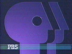
3rd Logo
(September 30, 1984-September 17, 1989; May 9, 1994)


<iframe frameborder="0" height="150" src="http://wikifoundrytools.com/wiki/closinglogos/widget/genericvideo/4c6c9c2e672fd5548ed13e6181aa0c0db24fd5e6" width="199"></iframe><iframe frameborder="0" height="150" src="http://wikifoundrytools.com/wiki/closinglogos/widget/unknown/85102f5ffc3aaa952df44e8d7c91c4c53820bb2e" width="199"></iframe><iframe frameborder="0" height="150" src="http://wikifoundrytools.com/wiki/closinglogos/widget/unknown/0a2de33881a76dbd17d0265553cb33f70744db24" width="199"></iframe>
<iframe height="150" src="http://wikifoundrytools.com/wiki/closinglogos/widget/unknown/d2d44ca857808cd8027f50b98d03d1f43d3a281f" width="199"></iframe><iframe height="150" src="http://wikifoundrytools.com/wiki/closinglogos/widget/unknown/f748c8138ea679c5d6654b8ded66d661253c71c0" width="266"></iframe><embed height="158" src="http://wikifoundrytools.com/wiki/closinglogos/widget/genericvideo/ddae14e27534f760003148145bd0f08d86ea5eb5" type="application/x-shockwave-flash" width="158" wmode="transparent"/>
Nicknames: "Split Profile", "The Everyman/Everyperson P", "PBS P-Head II", "The Split".
Logo: On a black background, a blue P-head appears on the upper-mid screen, facing backwards. A piece, unofficially called "The Split", comes out to the right and settles itself about half an inch away. The text "PBS" appears below in a slab serif font, which was designed specifically for PBS (called "ITC Lubalin Graph Bold").
Trivia:
- Using the "P" in the previous logo as a basis, this logo (and the accompanying slab serif font) was designed and animated by Chermayeff & Geismar, a firm also responsible for many other logos such as the Screen Gems "S" and the 1986 NBC peacock. The logo debuted at the PBS annual meeting on March 30, 1984, and made its first network appearance six months later to the day.
- Despite being created on a 60-field system, this logo runs at 24p.
Variants:
- On the series premiere of Square One TV, after the logo forms, the P-head and letters multiply off into the distance, with voice-overs singing "and on...and on...and on..." (taken from a song from the episode) until it fades.
- There is also a still version, which is sometimes accompanied with a voice-over saying, "This is PBS, the Public Broadcasting Service."
- A version exists with the PBS text in yellow.
- As with the previous logo, this faded out sometimes, including on Eyes on the Prize.
- On season 1 episodes of Shining Time Station, one of the last new programs to use this logo, the fadeout was slower.
- A filmed variant exists. This variant is silent and the "P" logo is a much lighter blue color, resembling a sky blue.
- A variant exists with the piece colored red. On superimposed footage of fireworks, two CGI P-Heads (blue and red) appears from off-screen. As the P-Heads turn, the blue head is placed behind the red one, where most of it dissolves away, forming the piece in front of the blue P-Head. After the logo settles in place, the footage fades to black and the text "PBS" fades in. This was spotted on a KETC sign-off in 1991.
FX/SFX: The P-head "splits" as a fragment of the logo stretches away.
Music/Sounds: A majestic piano chord, followed by six string pizzicato tones, then a softer version of the piano chord. Composed by Jonathan Elias.
Music/Sound Variants:
- Very scarcely (possibly, only a couple of times during this logo's lifespan), a narrator might talk over the logo. This variant was first found on a airing of Sesame Street from November 18th, 1987.
- On the 1985 airing of The Making of Indiana Jones and the Temple of Doom as well as pledge drives held by various PBS member stations, an announcer can be heard saying "When you see this logo, you know that you're watching only the best, member-supported public television."
- The Square One TV variant has the same music, followed by the "And on....and on...." vocals taken from the series premiere episode.
Availability: Rare. It appeared on old prints of PBS shows produced from 1984-89. Can also be found on early PBS Home Video releases from the '80s; just look for a banner with the P Head on the left and "PBS VIDEO" filling the entire rest of the banner.
- The logo allegedly made its first appearance on the Nature episode "Krakatoa: The Day That Shook the World", broadcast on September 30, 1984. This is surprisingly easy to find on Time-Life Video tapes of Nature, most often with the 1987 WNET logo at the start.
- The logo has also appeared on the 1994 rebroadcast and 1995 PBS Video reissue of Pyramid, part of a series of architectural documentaries hosted by David Macaulay, even though earlier installments had this (and the earlier logo, in the case of Castle) plastered with the 1992 logo in the same reissue of the series. It also appeared on the 1997 Turner Home Entertainment release of Spaceflight.
- In an oddity, recent prints of the 1976 miniseries The Adams Chronicles, including the DVD release, end with both this (preserved from a 1987 rebroadcast) and the 2006 WNET logo.
- The logo showed up on the Twitch.tv prints of episodes #1417 and #1456 of Mister Rogers' Neighborhood.
- This logo has plastered the previous logo on rebroadcasts from the era of Christmas Eve on Sesame Street, The Nutcracker, and earlier episodes of Great Performances and This Old House.
- It made a surprise appearance on Milwaukee Public TV's 50th anniversary special.
- The last known appearance of this logo on television was in 2009 on UNC-TV after an episode of Lap Quilting with Georgia Bonesteele. This logo can also be viewed at the end of many episodes of The MacNeil/Lehrer Newshour from the era, available for viewing on the American Archive of Public Broadcasting website.
- The Square One TVvariant is elusive, as available copies of the first episode omit the variant, leading to speculation if this variant is real or not. Furthermore, the only footage of this variant (as seen embedded on this page) is considered a fake or a recreation by many.
Editor's Note: While this logo has not been seen on television for many years, it is still very highly regarded and is a favorite of many.
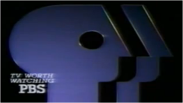
4th Logo
(September 15, 1989-July 31, 1993; November 20, 1995)


<iframe frameborder="0" height="167" src="http://wikifoundrytools.com/wiki/closinglogos/widget/genericvideo/d47e5d7d3c01e1aa3bf7c09cd60697153b2a0b76" width="296"></iframe><iframe frameborder="0" height="167" src="http://wikifoundrytools.com/wiki/closinglogos/widget/unknown/b3d431bb98fb4d55bd3d60de0e6d5717659e053c" width="222"></iframe><iframe frameborder="0" height="167" src="http://wikifoundrytools.com/wiki/closinglogos/widget/unknown/df10842fc00ff14f68fcc897ddc7da5fe674f7cf" width="222"></iframe><iframe frameborder="0" height="167" src="http://wikifoundrytools.com/wiki/closinglogos/widget/unknown/1f32f3586d104e05968b750c9fb423e007eee4ff" width="222"></iframe><iframe frameborder="0" height="172" src="http://wikifoundrytools.com/wiki/closinglogos/widget/unknown/d5c5a50fee8671b1c053fc27f8c3e8966f096155" width="227"></iframe><iframe frameborder="0" height="176" src="http://wikifoundrytools.com/wiki/closinglogos/widget/unknown/08e0139c76ef0783a63d8fe7fd6db5fd4394c432" width="309"></iframe>
Nicknames: "3D Glass", "Transparent Blue P-Head", "Merging Glass P-Head", "PBS P-Head III"
Logo: On a black background, a side-facing transparent dark blue P-head folds to the right, leaving behind a residue trail of "P-Heads". The residue trail fades into the PBS logo from before, which settles itself in the center of the screen, occupying almost all of it. Several multi-colored lines wipe across the bottom of the screen, leaving the text "PBS" in the same font as before to the bottom left.
Trivia:
- Eagle-eyed viewers will notice that the residue trail has a total of seven P-Heads, including the initial P-Head.
- This logo is "videotaped" and runs at 30i rather than PBS' usual 24p (only the 1st and 7th logo share this speed).
Variants:
- In an alternate version of the ident, the "P-head" appears just by fading in with the "PBS" text. No lines streak across the screen; therefore it is a still version of the ident.
- There is a 1990 Just Watch Us Now ident where we zoom out of the P-Head made of glass with light rays coming out of the P-Head's eye. Then the words "TV WORTH WATCHING" zooms out, and goes to the bottom left. The rest of the animation proceeds to this logo starting with lines wiping the word "PBS".
- There is another version of the ident that fades in, lines already intact. This was used for program breaks.
- There is a promo variant where the background is changed to white and there are multi colored shapes rotating around the P-Head. The "PBS" Text is also colored purple.
FX/SFX: The P-head folds, leaving behind a trail as it settles in the center of the screen. Multicolor lines wipe in to form the PBS logotype.
Music/Sounds/Voice-over: A long held-out string note combined with synth bells (played on a Roland D-50 using the Fantasia preset) and chimes, followed by an announcer (probably Peter Thomas, who also did the funding credits voiceovers for The MacNeil/Lehrer NewsHour, Nova, and A World of Ideas at the time) saying "This is PBS".
Music/Sounds/Voice-over Variants:
- On the still version, the same music, as in the ident's original version, is used. Once again, the announcer says "This is PBS". There is also a silent variant as well for this variation.
- A silent version was used on VHS releases of Barney & Friends season 1 episodes. This version also appeared one time on Mister Rogers' Neighborhood "No & Yes #1541".
- The still version with the lines intact uses a different male announcer saying, "This is PBS, the Public Broadcasting Service."
- On Mister Rogers Neighborhood episode 1250, the normal theme plays. However, if you listen closely, the 1971 logo's music plays quietly. This is a result of a bad plaster.
- On the white background promo variant, a synth note is heard instead and the announcer also says "This Fall, on PBS".
Availability: Rare. As with other vintage PBS logos, the chance of showing up on TV now is almost nothing, but some PBS Home Video releases from the era may have it. Just look for a square in the top-left corner of the front of the box with "PBS VIDEO" below a P-head.
- The logo debuted after The Power of the Word: The Simple Acts of Life on September 15, 1989.
- This logo plasters the 1971 logo on Twitch.tv and Amazon.com prints of various 1971-75 Mister Rogers' Neighborhood episodes that last aired on PBS in the 1990s (final airdates <a class="external" href="http://www.neighborhoodarchive.com/forum/index.php?topic=592.0" rel="nofollow" target="_blank">here</a>); this include episodes 1176, 1177, 1179, 1180, 1261, 1281, 1384, and 1389 on Amazon. This also plasters over the 1984 logo on episodes dating from 1984-1989 on the latter program when it aired on Twitch.tv.
- This may plaster earlier PBS logos on Time-Life Video releases of Nature, including "Forest in the Sea" (which preserves its original WNET logo). Other programs where it plastered earlier logos in the early '90s include Dinner at Julia's, French in Action, Reading Rainbow, rebroadcasts of Season 1 episodes of Shining Time Station and later episodes of Season 20 of Sesame Street beginning with episode 2576, and certain of Ken Burns's earlier works, including Brooklyn Bridge, The Shakers: Hands to Work, Hearts to God, The Statue of Liberty, and Huey Long.
- Appearances of this logo on DVD are scarce as they're usually plastered over or trimmed off. It appeared on DVD releases of some episodes of The American Experience from the era, including "Last Stand at Little Bighorn", which retained it on television even as the series entered the Internet age in 1995 with PBS Online.
- For its last year, it was used in tandem with the 5th logo, appearing on Healing and the Mind with Bill Moyers, MotorWeek '93, The American Experience, The New Yankee Workshop, most 24th season episodes of Sesame Street, most 11th season episodes of Nature, all 20th season episodes of Nova, all 2nd season episodes of Lamb Chop's Play-Along, Where in the World is Carmen Sandiego?, and many early-to-mid-'90s reruns of Mister Rogers' Neighborhood. It also appears at the end of of the Turner Home Entertainment VHS releases of Brooklyn Bridge and Thomas Hart Benton. This logo can also be viewed at the end of many episodes of TheMacNeil/Lehrer NewsHour from the era, available for viewing on the American Archive of Public Broadcasting website.
- The silent version can be seen on Time-Life and Lyons Group tapes of season 1 Barney & Friends episodes.
- The last known appearance of this logo on television was in 2012 on KET KY (a sub-channel of Kentucky Educational Television) after an episode of Destinos: An Introduction to Spanish. Some episodes of the latter can still be viewed in a hidden portion of KET's website, with logo included. This logo could also be seen up until late 2006 after Reading Rainbow on many PBS stations.
- Don't expect to see this on the PBS Video release of The Civil War, which uses the off-air version (it appeared on the 1990 broadcast version, but not the Pacific Arts release of the same).
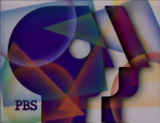
5th Logo
(January 4, 1993-September 4, 1996)
 <iframe frameborder="0" height="176" src="http://wikifoundrytools.com/wiki/closinglogos/widget/genericvideo/c403b9cfd3ed8d046ac477cce1819926e563e4f7" width="313"></iframe>
Nicknames: "Orange CGI P-Head", "Glass P-Head", "Pink P-Heads", "PBS P-Head IV", "Pink PBS Logo"
Logo: In a pink/orange lighted environment, several transparent ellipses revealing people faces appear and disappear one at a time. Then we zoom out through a circle, which turns out to be the eye in the PBS P-Head standing on a floor, made from glass. To the left of the P-Head, the text "PBS" rotates to face the screen.
Trivia:
- Contrary to its first nickname, this was a live-action logo, captured on 35mm film. The people faces were captured on October 19, 1992; the actual logo was filmed two days later. It was created with models; the P-Heads were frosted glass and the "PBS" text was rotated with rostrums. The logo was designed by Telezign. The logo was composited on a computer however.
- Much like [Feature/Special Presentation IDs|HBO] and their famed "In Space" opening, this logo also had its own mini-documentary detailing the making of it. You can watch it <a href="https://www.youtube.com/watch?v=Q7iNg1dRqQI" target="_self">here</a>.
- The footage is sped up to better fill the 30i space allotted to NTSC.
- Eagle-eyed viewers can make out a total of eight faces during the first half of the logo.
Variant: There is a completely still variant with a male or female announcer saying, "This is PBS, the Public Broadcasting Service." This was used for program breaks. The same still variant, without the announcer, would be substituted in place of the "Viewers Like You" credit on Ken Burns' The West.
FX/SFX: Several ellipses appear before the camera zooms out to reveal the P-Head. The PBS logotype flips in.Music/Sounds/Voice-over: A funky piano and choir boogie tune, followed by an announcer (Chris Murney, the voice of Elisha Hunt Rhodes in Ken Burns' The Civil War) who says "This is PBS." The music was composed by Peter Fish, who has also done music for CBS News.
Music/Sounds/Voice-over Variant: There is a rare variant that exists without the voice-over. This was seen on the aforementioned mini-documentary Making the PBS Logo, which was used as a filler program for when there was time left at the end of any program.
Availability: Uncommon.
Availability: Uncommon.
- Your best bet to find it is '90s PBS Home Video tapes, including the Turner releases of The Dinosaurs and the films of Ken Burns. This appeared at the start of most PBS Home Video releases from Turner Home Entertainment in the mid-'90s, as a secondary logo for PBS Home Video. The logo is also preserved on episodes of The MacNeil/Lehrer NewsHour on DVD.
- It first appeared in print in late December 1992 on an issue of Broadcasting Magazine dated January 4, 1993, and the animated version premiered in full on the January 4, 1993 edition of The MacNeil/Lehrer NewsHour. For its first year, it was used in tandem with the previous logo, appearing on some episodes of Nature (starting in its 11th season), Sesame Street (particularly late in the 24th season and on the Spring/Summer 1993 rebroadcast of the season), and Mister Rogers' Neighborhood (mainly episodes that premiered in 1993 as well as some mid-'90s reruns of older programs) as well as all third-season episodes of Shining Time Station, 1993 episodes of Newton's Apple, a March 31, 1993 rebroadcast of Empire of the Air, new editions of Washington Week beginning on January 8, 1993, and the earliest nationally-broadcast episodes of Charlie Rose, among others.
- In the mid-'90s, this logo became the chief means of logo plastering for PBS, appearing on newer prints of Castle (1994 rebroadcast), Cathedral (1994 rebroadcast), Eyes on the Prize, The Civil War (1994 rebroadcast), The Shakers: Hands to Work, Hearts to God, The Statue of Liberty (1994 rebroadcast), Huey Long, The Congress, Empire of the Air, How Difficult Can This Be?, Frontline, and Nature, among other programs.
- This logo can be seen on various episodes of Mister Rogers' Neighborhood from 1974-1980 on Twitch.tv, its first appearance being on Episode #1362. It can also be viewed at the end of many episodes of The MacNeil/Lehrer Newshour from the era, available for viewing on the American Archive of Public Broadcasting website.
- The logo's last new appearance was on the September 4, 1996 edition of The NewsHour with Jim Lehrer (some episodes of Adventures from the Book of Virtues and the films of Ken Burns had this at the start of the video program on the VHS releases). This logo, surprisingly, appeared at the end of an August 05, 2018 airing of An Ice Cream Show, after years of plastering with later logos from 1998 and 2002, on WFWA-TV's 4th sub-channel, know as PBS39 Explore. This is the first confirmed time this logo has aired on television since 2009 on a UNC-TV airing of Faces of Culture.
- It also appears on an ostensible 25th anniversary promo for PBS (key word: obstensible) that was shown during the Fall 1993 pledge drive on many stations.
Editor's Note: This logo is highly regarded by the community due in part to its production process, done without resorting to primarily using computer animation.
6th Logo
(1995-1998)
 <iframe frameborder="0" height="226" src="http://wikifoundrytools.com/wiki/closinglogos/widget/genericvideo/008e43a86e3b8d02760b57e992582f1770ac8eea" width="401"></iframe>
Nicknames: "Auroras", "Metallic Blue", "The Blue Aurora P-Head", "Metallic P-Head", "PBS P-Head V"
Logo: Dark blue lights can be seen swirling and moving around over a blue aurora background. The PBS logo, seen in a similar fashion to the 3rd logo, sits over the lights. The logo is colored light blue with a slight tint of a teal color instead of being purple and white. The P-Head and text are metallic and the logo reflects the aurora and the lights moving around.
Logo: Dark blue lights can be seen swirling and moving around over a blue aurora background. The PBS logo, seen in a similar fashion to the 3rd logo, sits over the lights. The logo is colored light blue with a slight tint of a teal color instead of being purple and white. The P-Head and text are metallic and the logo reflects the aurora and the lights moving around.
Trivia: This would be followed by one of seven themed bumpers PBS had in use back in the day, from a rebrand which PBS would later utilize in the next logo.
FX/SFX: Just the aurora and lights moving around, nothing else.
Music/Sounds/Voice-over: Chris Murney, the same announcer as the previous logo, says "You are watching PBS, viewer-supported public television."
Availability: Extinct. This was used between programs on PBS's satellite feed.
Editor's Note: This logo was a surprise discovery, largely because home recordings from the PBS satellite feed are very rare.
7th Logo
(September 5, 1996-December 5, 1999)
(September 5, 1996-December 5, 1999)
 <iframe frameborder="0" height="221" src="http://wikifoundrytools.com/wiki/closinglogos/widget/genericvideo/a99fe50aed8a6a026577267b37665e5f780990f8" width="393"></iframe>
Nicknames: "Windows", "The PBS Windows III", "CGI Window", "PBS P-Head VI"
Logo: On a black background, a CGI window appears with a birds-eye view of the earth, a plastic globe spinning on the top right, and a telescope rotating on the bottom left. The pear-colored PBS P-Head (with the split colored light blue) appears in front of the window and grows smaller as the window grows bigger. As the two meet each other, the window disappears. Inside the P-Head are transparent images of two globes, a feather and a telescope. The P-Head takes its place in the top center of the screen and turns to light blue and aquamarine as the text "PBS" fades in below them.
Variant: Early editions of The NewsHour with Jim Lehrer that featured this logo had this fading in and out.
Trivia:
Trivia:
- This was based on a 1994 rebranding of PBS produced by PMcD Design; this rebranding would gradually be adopted by many PBS stations over the ensuing years, including WITF, WSJK/WKOP, WNET, WQED, WVIZ, Kentucky Educational Television, Maine Public Broadcasting Network, and Vermont ETV.
- This would be the last PBS logo to be produced in 30i.
FX/SFX: Neat CGI effects.
Music/Sounds/Voice-over: A new age tune with guitars and flutes, followed by a female announcer (the late Lauren Bacall) who says "This is PBS."
Music/Sounds/Voice-over Variant: On some shows, Lauren Bacall says "You are watching PBS." This was used for program breaks.
Availability: Uncommon. It appears on TV sometimes, but PBS Home Video tapes are an easier way to find it.
- The logo's first confirmed appearance was on September 5, 1996, on the daily edition of The NewsHour with Jim Lehrer.
- This appeared at the start and end of Turner Home Entertainment's releases of Adventures from the Book of Virtues, and also plasters the 4th and 5th logos on episodes of American Experience, one of which was packaged with Warner Home Video's 70th anniversary Blu-ray release of Citizen Kane, and Triumph of the Nerds.
- It also appeared on original broadcast prints of pledge drive specials, Keeping Up Appearances: The Memoirs of Hyacinth Bucket and The Carpenters: Close to You, the latter which is now distributed on PBS stations directly by T.J. Lubinsky's Timeless Collection division.
- Even when the next logo started to be used, it continued to be used by some programs for some time, with its last new appearance being on Doo Wop 50. Its last known appearance on television was in 2009 on UNC-TV after an episode of Faces of Culture.
Editor's Note: This logo has some very neat effects for the time as well as a calming theme.
8th Logo
(September 21, 1998-September 1, 2002)


<iframe frameborder="0" height="167" src="http://wikifoundrytools.com/wiki/closinglogos/widget/genericvideo/352e0694c23493e36a8fdd02a7b1096efa57f241" width="294"></iframe>
Nicknames: "Acrobats", "Circle P-Heads", "PBS P-Head VII", "Circle PBS P-Head"
Logo: On a computer-generated green sky background, a person standing to the left covers his or her head with a black circle with the PBS P-Head on it in white. Acrobats jump from all directions off the circle. The text "PBS" appears to the right, with the URL <a class="external" href="http://www.pbs.org/" rel="nofollow" target="_blank">www.pbs.org</a> appearing below it. This is the last logo that used the words "This Is PBS". Also, throughout the ident, different things happen in the background: On all ten variants, there are tiny superimposed silhouettes of people flying in a circle behind the acrobats. On three out of ten of the variants, there are silhouettes of big wands briefly flying down behind the PBS text. And on the rest, there are silhouettes of people tip-toeing in an oval (a circle on the widescreen version) around the person.
Trivia:
- This logo was designed at Publicis & Hal Riney and animated at Lee Hunt Associates.
- This logo was filmed and animated entirely at 30p, an oddity for PBS, which usually had its logos produced in 24p or 30i.
Variants: Each time you see this logo, different people are holding the circle with the P-head on it, and the acrobats doing different kinds of tricks around the P-head circle. Here's a list of the men and women you see (that also includes the tricks the acrobats do) :
- Man in gold shirt; female acrobats with orange do a backflip.
- Man in blue shirt; same acrobats from 1st variant.
- Woman in blue shirt; male acrobats with yellow shirts do a "side spin". (This version was also used for high definition programming.)
- Woman in deep red shirt; male acrobats with Prussian blue shirts curl into a ball and spin around.
- Man in orange-tan shirt; same acrobats from 3rd variant.
- Older woman (Lauren Bacall herself) in red shirt; same acrobats from 4th variant.
- Woman in folly shirt; same acrobats from 4th variant.
- Man in dark blue shirt; same acrobats from 1st variant.
- Woman in red shirt; same acrobats from 3rd variant.
FX/SFX: The computer effects used to shrink the acrobats and superimpose them around the circle.
Music/Sounds/Voice-over: A brief synth swell and a 3-note flute fanfare, followed by a new age percussion/choir tune, followed by the female announcer from the previous logo (Lauren Bacall) who says "This is PBS." If you listen carefully, you can also hear a trombone and strings in the background as well. There is also a variant that exists with Lauren Bacall saying, "You are watching PBS." This was used for program breaks.
Availability: Rare.
- This logo can usually be found on reruns and some PBS Home Video tapes (mainly the ones that use the Warner Home Video logo instead of the PBS Home Video logo) such as An Ice Cream Show. It is also preserved on '98-'02 episodes of Scientific American Frontiers on the Chedd-Angier website. On home video, the "man in gold shirt" variant appeared on An Ice Cream Show (where it plasters the 5th logo), and the "woman in blue shirt" variant appeared on Great Old Amusement Parks and A Hot Dog Program.
- It also plasters older logos on more recent prints of American Experience (various, as early as the 4th logo), French in Action (3rd and 4th logos), Solutions to Violence (5th logo), and Julia Child's cooking programs (5th and previous logos).
- This still appears on Workplace Essential Skills if your station is broadcasting it.
- In addition to program breaks, the "You are watching PBS" variant also appears at the end of Digital TV: A Cringely Crash Course.
- The logo first appeared on the three-part Frontline special "The Farmer's Wife".
- Oddly enough, this appeared on the Sesame Street 30th anniversary special Elmopalooza instead of the P-Pals logo.
Editor's Note: The many variations of this logo marked the beginning of a trend for PBS idents that continues to this very day. Like the last logo, this one also features very nice effects as well as a great musical theme.
9th Logo
(October 2, 2000-2002)

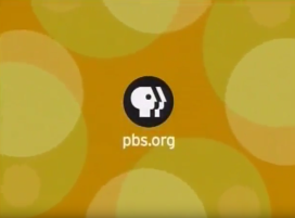
![PBS (2001) ["Stay Curious"]](/page/File:F3b2675831cae59961ec36f2a69baeb0.png)
Nicknames: "Stay Curious", "PBS P-Head VIII", "Circle PBS P-Head II"
Logo: Against an orange background, we see the PBS circle in a light yellow color with the P head being the same orange color as the background. The "P" Circle slowly eases back and fades out as four green circles appear and spread around the screen revealing smaller light yellow circles inside. Four more circles appear and the outer circles merge with the other circles before they begin spreading out. The PBS "P" Circle now in the standard black and white colors appears with a blur effect. Small circles form "pbs.org" below in a white calibri font.
Logo: Against an orange background, we see the PBS circle in a light yellow color with the P head being the same orange color as the background. The "P" Circle slowly eases back and fades out as four green circles appear and spread around the screen revealing smaller light yellow circles inside. Four more circles appear and the outer circles merge with the other circles before they begin spreading out. The PBS "P" Circle now in the standard black and white colors appears with a blur effect. Small circles form "pbs.org" below in a white calibri font.
Variants:
- A version with a blue color scheme was used between programs. Instead of the URL, the text below the PBS circle read "Stay curious. PBS".
- An extended variant begins on a blue background with a darker blue P head. The camera zooms into the pupil and the normal animation begins. The logo also has a green tint to it.
FX/SFX: The "P" Circle easing back and vanishing. The circles forming, spreading, merging, and spreading again. The blurring in of the PBS logo. The circles forming the pbs.org name. Typical early 2000's animation.
Music/Sounds/Voice-over: A three-note ascending tune (D, E, A); most likely played on sitar, Gibson Les Paul or a Rickenbacker 325 (put through a wah-wah pedal) and a voiceover saying "This is PBS."
Music/Sounds/Voice-over Variants: On the blue variant, one of two tunes was used:
- Usually, the tune was played in the key of D (G, A, D) on a celesta, followed by a new age rhythmic tune played on a celesta and acoustic guitar.
- A slightly longer version of the blue variant, usually shown before the 7PM broadcast of The NewsHour with Jim Lehrer, uses the second half of the CPB/Viewers Like You music of the era.
Availability: Extinct.
- This appears to have been used only briefly, and even then as an alternate logo, during PBS's "Stay Curious" campaign. It ended up being retired quickly and the previous logo continued to be used for another year. Being the national station ID shown on the satellite feed, the blue logo remained in use for a while longer.
- One program on which this logo appeared was American High. Unlike other logos, it's not known to have ever plastered an earlier logo.
Editor's Note: Very simple compared to the rest of the logos on here, but some may like its vaguely '60s-ish vibe.
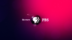
10th Logo
(September 23, 2002-December 3, 2010)


<iframe frameborder="0" height="164" src="http://wikifoundrytools.com/wiki/closinglogos/widget/genericvideo/63b46d5d8f2d0707c9327c5796ebf0afe477bf64" width="294"></iframe>
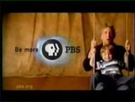
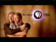
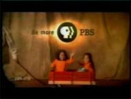
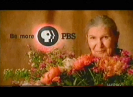
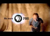
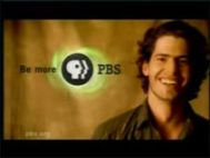
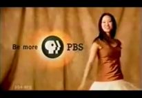
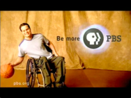
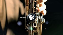
Nicknames: “Be More”, “We Are PBS”, “I Am PBS”, "The Sienna Curtains", "PBS P-Head IX", "Circle PBS P-Head III", "Launch and Megatron Announce PBS"
Logo: We see a letterboxed clip show of live-action footage, filmed on a large set with hardwood floor and a background of shaggy raw sienna-colored curtains. Culturally and generationally diverse people are employed in the variants, each giving different performances on-camera. As the last clip plays, we see the “Circle P-Head” logo animating with the word "PBS" on the right and the slogan “Be more” on the left. The text has been modified a bit after the past 18 years. Throughout the bumper, a bug for the URL "pbs.org" is seen in the lower left corner.
Variants: Here are some of the variations that have been seen of late, with a list of the clips in each variant in chronological order:
- Young People: A teenage girl presses her hands on her boyfriend’s cheeks and gives him a kiss; a mother plays with her baby’s feet; a dad and his little boy are holding guitars; mom and daughter are side by side; a mom runs pulling a red wagon holding her two little girls (Edie Mirman: “We are PBS”).
- Standard: A woman threads her fingers through her hair; another young woman gyrates from right to left; a baby wearing a hat walks. ("We are PBS").
- A man sits with a pile of books; a young man smiling; a close-up of a smiling young woman's head; a close-up of of the previous man smiling. ("We are PBS").
- Performers: A man sits on a stool holding a guitar; a dressy man plays his trumpet; a teenage boy is "bopping" to his headphones; a young dancer spins in her dress; an elderly man takes a bow (David Kaye: “We are PBS”).
- Activities: A man sits with a pile of books, a woman takes a picture of flowers with her camera; a young man in a wheelchair; catches a soccer ball; a man plays with his dog; a young woman hula-hoops.
- Flowers: A close-up of a smiling woman’s head; then we see her holding a large bouquet of flowers, a close-up of the flowers, and finally a close-up of the woman holding the flowers (Helen Mirren: “I am PBS").
- Daddy and Son: A dad and his little boy are holding guitars; a close-up of them playing; and the dad and son on a playground swing (Kyle Eastwood): “We are PBS.”)
- Mother and Daughter: A mother and her teenage daughter are seen spinning and dancing; a close-up shot of the daughter kissing her mom; and the two hug (Edie Mirman: "We are PBS.").
- Generations: A mother holds her baby; an old man smiling; a young man takes off his cowboy hat. (Edie Mirman: “We are PBS.”)
- Cowboy Hat: The young man from the "Generations" variant is dancing with his cowboy hat; a close-up of him wearing it; and finally he briefly tosses it at the camera and giggles (David Kaye: "I'm PBS.").
- Basketball: We see a facial close-up of the man in a wheelchair from "Activities"; he plays with his basketball; then we see him on the left smiling ("I am PBS.")
- Young Woman: This variant features the same dancing woman from "Performers". First, we see her riding on a scooter, then smiling at the camera wearing a picture hat, and finally we see her spinning in her dress as she does in the "Performers" variant, but closer to the right of the screen so we see the logo animating ("I am PBS").
- There is also a version of the logo that has no live-action footage. A burst of light comes in from either side of the screen, and we see an outline of the "P-head" logo (in a style similar to the 1984 logo). Other lighting effects occur, and at the end the circle "P-Head" logo animates, with "PBS" on its right side and "Be more" on its left. There is no voice-over.
- On Carrier, the voice-over says “This show will return in a moment over most of these local stations. We are PBS.”
- On The This Old House Hour, there was another version with a voice-over saying "This PBS show will return in a moment".
- There was another version with a voice-over saying "The following PBS show is closed captioned".
- There was another version with a voice-over saying "PBS will return in a moment".
- There's also a version that appeared on Frontlineand a few editions of The NewsHour with Jim Lehrer from 2003. On the same background as the CPB logo of the time but darker, we see the words "Perspective. Analysis. Understanding." in white slowly zoom in and shine. Then the words "dissolve" away and the Be More PBS logo animates. In the background throughout the ident is a wallpaper-like array of transparent copies of the words seen earlier. (Bob Hilton: "This is PBS.")
- There is another non-animated variant which is adapted from the 2004 PBS Distribution logo, which is normally shortened at the end except after a 29-minute program (usually from PBS Kids). As with the blue variant of the previous logo, this is being used as the national network ID on the satellite feed.
FX/SFX: Mostly live action, except for the logo animating at the end.
Music/Sounds/Voice-over: A majestic orchestral tune. The same tune is always used, but is rearranged for some variants and has a different voice-over (see above for examples).
- On the "Flowers" variant, the music is given a Baroque style arrangement.
- The "Daddy and Son" variant uses a guitar-rock arrangement with horns.
- The "Mother and Daughter" variant uses a soft guitar arrangement.
- The "Cowboy Hat" variant uses a groovy country-style version of the tune, played on bass.
- The "Basketball" variant uses a funky hip-hop style version of the tune.
- The Frontlinevariant uses a piano arrangement, ending in a dramatic string cadence.
- The satellite ID variant uses an extended version of the piano arrangement.
Availability: No longer current, but it's still common, generally being preserved on reruns of older PBS programming, including the specials Lawrence Welk: Milestones and Memories, where it plasters the previous logo; Lawrence Welk: God Bless America, and Welk Stars Through the Years (the former two use the "Flowers" variant, while the latter uses the "Performers" variant). This wasn't used much for plastering, unlike previous logos, though it did appear on rebroadcasts of An Ice Cream Show from 2002 to 2018, when the original logo was surprisingly restored. Though the logo officially ended on September 27, 2009, the transition to the next logo would be staggered among programs, with programs such as Washington Week and Bill Moyers Journal among the earlier programs to make the transition. The satellite ID variant can still be seen on certain programs to this day, though usually promos and interstitials selected by the local PBS station are used instead (you might catch this if your station, by some random chance, e.g. during a transition to or from Daylight Savings Time, or late at night on KET2, or while technical difficulties are sorted out by the local station, broadcasts promos and interstitials from the standard PBS feed at any time for whatever reason).
Editor's Note: None.
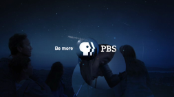
11th Logo
(September 28, 2009-2020)


<iframe frameborder="0" height="164" src="http://wikifoundrytools.com/wiki/closinglogos/widget/genericvideo/63b46d5d8f2d0707c9327c5796ebf0afe477bf64" width="294"></iframe>
Nicknames: "Be More II", "Be More, PBS", "PBS P-Head X", "Circle PBS P-Head IV"
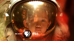
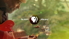
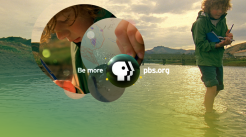
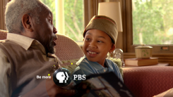
Logo: We see a video of a person or people having activities. Suddenly, the PBS logo appears with "Be More" on the left and "PBS" on the right. The word "PBS" then changes to the URL "pbs.org". A voice-over says "Be More, PBS." as the logo animates.
Variants:
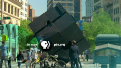
- Art Interacts: A man is walking in a street when he encounters a gigantic exotic Pine Green object that looks like a Rubik's-Cube slanted on its corner, which twirls around quite to the man's amusement.
- Big Dreams: An Ecru-clad woman and her son are in a mall. The kid looks through an astronaut helmet.
- Observing Child: A boy in a forest-green jacket is walking in a shallow lake with his doodling pad.
- Family Viewing: A family is looking through a telescope at the stars in the sky.
- Bluesman: Calvin Keys is playing the tune on his guitar while someone films it on camcorder. On Bluegrass Underground, this fades in and out.
- Photo Album: A man and his grandson are looking at old pictures of their African ancestors in a scrapbook.
- Symphony: A symphony orchestra performs the tune. The camera sees the violin, bass clarinet, marimba, cymbal and tuba.
- Strange Recipe: A storekeeper recommends a pineapple to his supermarket's customer.
- Generic: Sometimes, there is no live action footage; instead the logo is placed on a custom background with bubbles. The background is used in four different colors: blue, green, orange, and magenta. On some shows, an announcer says, "You're watching PBS". On the orange variant,"PBS" does not change to the URL.
- Masterpiece: A variant appears on episodes of Masterpiece. Clips from episodes of the anthology series are shown one by one over the blue background before the PBS logo appears as usual. The voiceover says, "Masterpiece, only on PBS."
- Antiques Roadshow: A variant appears on episodes of Antiques Roadshow. Clips from episodes are shown together over the orange background before the PBS logo appears as usual. The voiceover says, "Antiques Roadshow, only on PBS." Officially retired as of November 4, 2019, having last appeared on the program on October 28, 2019.
- Public Affairs: A variant appears on episodes of Frontline and Washington Week, as well as on the special America After Charleston. Depicted over the blue background are various public affairs personalities (as of 2016, Gwen Ifill, Judy Woodruff, Hari Sreenivasan, and Charlie Rose, in that order; early programs with this logo featured a different montage with a different slate of public affairs personalities), before the PBS logo appears as usual. The voiceover is the same as on the generic variants. This variant was retired following Ifill's death in November 2016, and with Charlie Rose having fallen from grace just over a year later it's safe to say this variant is gone for good.
- Generic (We'll Be Right Back): As with the previous logo, the generic logo (often using the blue or green version) is sometimes shown at the start of program breaks, with a voiceover saying, "This PBS program will return in a moment."
- Opening Variant: Against the blue background, the circle P-head appears in the center.
Trivia: Perhaps due to its appeal to a variety of audiences for the network, this is PBS's second longest-lasting ID, after their Everymen logo.
FX/SFX: Same as the 10th logo.
Music/Sounds/Voice-over: A 5-note tune, created by music company Expansion Team. Like the eighth logo, the same tune is always used, but is rearranged for some variants and has a different voice-over.
Music/Sounds/Voice-over: A 5-note tune, created by music company Expansion Team. Like the eighth logo, the same tune is always used, but is rearranged for some variants and has a different voice-over.
- Art Interacts: The music is played on percussion, electric piano, and celesta.
- Big Dreams: The music is played on electric piano.
- Observing Child: The music is played on a harp and concertina.
- Family Viewing:The music is played on piano and cello.
- Bluesman: The music is played on guitar.
- Photo Album: The music is played on drums, piano, and electric guitar.
- Symphony: The music is performed by an orchestra.
- Strange Recipe: The music is played on woodwinds, with the CPB logo's music playing as a backing track (albeit muffled or in a different arrangement)
- Generic: The music uses either the standard strings and keyboard arrangement or (for the orange and magenta versions) a classical guitar and harp arrangement.
- Masterpiece: The music is played on strings and keyboards.
- Antiques Roadshow: The music is played in a soft guitar and piano arrangement.
- Public Affairs: A hard-rock arrangement of the music.
- Generic (We'll Be Right Back): The music is played either on strings and keyboards (for the green version) or in an electronic arrangement (for the blue version).
- Opening Variant: Just a short string of rising piano notes.
Availability: Currently in use on most PBS first-run shows. The variants are used randomly, as with the previous logos, on many programs, including Nova, This Old House, Motorweek, and The Woodwright's Shop; however, on certain programs you can always expect to see the following variants:
- Art Interacts: Seen at the end of American Masters, some Secrets of Britain specials, some first-season episodes of A Chef's Life, and recent rebroadcasts of A Program About Unusual Buildings and Other Roadside Stuff, and in rotation on Vicious. Some broadcasts of Masterpiece during pledge drive season will end with this instead of the custom variant created for the series, as seen during a nationally-broadcast series six marathon for Downton Abbey, and it also appears in place of said custom variant on the Downton Abbey series finale.
- Big Dreams: Seen at the end of Charlie Rose: The Week, The Brain with David Eagleman, and Jackie Robinson.
- Observing Child: Seen at the end of Earth's Natural Wonders, Wild Alaska Live (including the PBS Kids Channel simulcasts), and recent rebroadcasts of The Adirondacks.
- Family Viewing: Seen at the end of Hometime, some first-season episodes of A Chef's Life, some Secrets of Britain specials, Carol Burnett's Favorite Sketches, and recent rebroadcasts of the original version of Great Old Amusement Parks. It was actually the first variant to be shown, debuting on The National Parks: America's Best Idea.
- Bluesman: Seen at the end of Washington Week (until July 24, 2015), To the Contrary, Jazz, most episodes of Austin City Limits, Bluegrass Underground, and a 2016 rebroadcast of A Ride Along the Lincoln Highway. Also seen at the end of concerts broadcast on PBS, including Simon and Garfunkel: The Concert in Central Park, Alice's Restaurant 50th Anniversary Concert, current broadcast prints of the United Artists film The Last Waltz, and Journey Live in Houston 1981: The Escape Tour, and many a My Music special, including California Dreamin': The Songs of the Mamas and the Papas.
- Photo Album: Seen at the end of PBS NewsHour Weekend, Tavis Smiley, The Roosevelts: An Intimate History, and The Civil War. It also appeared on Great Old Amusement Parks as seen as part of the Rick Sebak's Summer Fun collection and the first episodes of Charlie Rose: The Week.
- Symphony: Seen at the end of PBS Previews, A Capitol Fourth, some current episodes of Austin City Limits, and some Secrets of Britain specials.
- Strange Recipe: Seen at the end of A Chef's Life and The Great British Baking Show.
- Generic (Blue): Seen at the end of PBS NewsHour, Washington Week, Third Rail with Ozy, Amanpour on PBS, Beyond 100 Days, BBC World News, current prints of The Statue of Liberty, and in rotation on Vicious. Also appears on many a My Music special, including Summer, Surf & Beach Music We Love.
- Generic (Orange): Appeared on several programs towards the end of this logo's lifespan, including the first two episodes of Retro Report on PBS.
- Generic (Magenta): Seen at the end of the final episodes of Charlie Rose, and also on Point Taken, Call the Midwife, and in rotation on Vicious.
- Don't expect to see this on rebroadcasts of An Ice Cream Show, which use either the previous logo or (since 2018) the 5th logo.
- The opening variant was only seen on Retro Report on PBS.
- Even after the next logo was introduced, this remained on PBS NewsHour until November 13, 2019, Martha Stewart's Cooking School until November 17, 2019, Washington Week until December 27, 2019, BBC World News until February 28, 2020, and Amanpour and Company until April 17, 2020, and still appears on new episodes of Firing Line, Motorweek, and To the Contrary as of April 2020, and is retained on the 2020 national rebroadcast of The Roosevelts: An Intimate History.
Editor's Note: While this logo is almost a decade old, its many variants over the years have kept it fresh.
12th Logo
(November 4, 2019- )
 <iframe frameborder="0" height="202" src="http://wikifoundrytools.com/wiki/closinglogos/widget/unknown/ca54bfdd6b2c83d05b816dd14205bd0c63111c55" width="357"></iframe>
Nickname: "21st Century PBS", "50 Years of PBS"
Logo:
- Selfies: A man and his girlfriend take a selfie together and walk down a wooded path. Debuted on November 4, 2019, at 8:56 PM ET
- Nature Walk: A woman is in a forest. She grabs onto a leaf on a tree, lets go of it and stares at it in awe. It cuts to another shot of her opening a notebook with a sketch of a leaf. Then it fades to another shot of the woman sitting down while the PBS logo and the letters come out from left side of the logo and shifts to the right. Debuted on November 4, 2019, at 10:56 PM ET; extended version debuted on November 6, 2019, at 8:56 PM ET.
- Backyard Party: TBA. Debuted on November 5, 2019, at 8:56 PM ET; extended version debuted on November 6, 2019, at 9:56 PM ET.
- Kayaking: TBA. Debuted on November 6, 2019, at 8:56 PM ET; extended version debuted on November 7, 2019, at 8:56 PM ET.
- All-American Memories: TBA. Debuted on November 12, 2019, at 8:56 PM ET; extended version debuted on November 6, 2019, at 9:56 PM ET.
- Guitar Lesson: TBA. Debuted on November 9, 2019, at 11:56 PM ET; extended version debuted on November 8, 2019, at 11:56 PM ET.
- Cooking: TBA. Debuted on November 9, 2019, at 4:56 PM ET; extended version debuted on November 10, 2019, at 11:00 PM ET.
- Gaming: TBA. Debuted on November 30, 2019, at 1:56 PM ET.
- Family Dinner: TBA. Debuted on December 13, 2019, at 8:56 PM ET.
- Planetarium: TBA. Debuted on December 22, 2019, at 8:56 PM ET; extended version debuted on January 6, 2020, at 1:56 AM ET.
- Dancing: A hip hop dance troupe performs at a small-town auditorium, to great applause. Debuted on January 1, 2020, at 5:56 AM ET.
- Generic: The P-Head circle zooms out against a PBS blue background and slides to the left, with PBS appearing in white, in the PBS Sans font, to the right. Debuted on November 9, 2019, at 6:26 PM ET.
Opening Variant: Same as the generic variant, except somewhat quicker. On some programs, the logo will animate in reverse, with the opening shot of the program fading in within the P-head's eye.
Trivia: This logo incorporates elements of the 1971, 1992, 2002, and 2009 logos, with emphasis on blues, live-action variants, and a quick zoom-out through the eye of the P-head.
FX/SFX: TBA
Music/Sounds/Voiceover:
- Selfies: An upbeat piano rendition of the 2009 logo's theme. A male voice says, "You're watching PBS."
- Nature Walk: A piano piece followed by a guitar rendition of the 2009 logo's theme. A male voice says, "You're watching PBS."
- Backyard Party: Same as Nature Walk. The extended version has the sound of a dog barking at the start.
- Kayaking: Same as Nature Walk.
- All-American Memories: A held synth chord followed by a synth rendition of the 2009 logo's theme. A male voice says, "You're watching PBS."
- Guitar Lesson: Same as Nature Walk.
- Cooking: Same as Nature Walk.
- Gaming: Same as Selfies.
- Family Dinner: Same as Selfies.
- Planetarium: An orchestrated version of the Selfies/Gaming/Family Dinner variant with violins and brass instruments. A male voice says, "You're watching PBS."
- Dancing: Same as Selfies, but with the sound of applause at the end.
- Generic: Same as Planetarium, but extended at the start with the first six notes of the Selfies/Gaming/Family Dinner variant. When used for intermissions, the voice instead says, "This PBS program will return in a moment." This intermission variant debuted on November 14, 2019.
- Opening Variant: Just the modified 2009 theme (C-D-G-F#-power chord D).
Availability: Brand new. Formally announced on November 4, 2019, it debuted later that night on Antiques Roadshow's Extraordinary Finds and is expected to replace the 2009 PBS logo over the coming year. The opening variant debuted on Independent Lens, and the intermission variant debuted between the This Old House episode "Westerly: The Doors" and the Ask This Old House episode "Switch, Affordable Geothermal" as part of the November 14, 2019 edition of The This Old House Hour. Don't expect this on the 2020 rebroadcast of The Roosevelts: An Intimate History, as it uses the previous logo, though the extended bumpers appear among the post-episode content.
Editor's Note: A new modernization of the PBS logo for the digital age, and the first since the 1971 logo to not use serifs in its identity. However, the corporate brand unification the company has been pushing with this logo and the design itself seems to be garnering less favorable (initial) reactions compared to previous logos. Time will only tell if the community will warm up to this logo.
-------------------------------------------------------------------------------------------------------
SPECIAL IDENTS
SPECIAL IDENTS
HISTORY'S BEST:
(November 2, 1998-September 5, 1999)
 Nicknames: "Gold Circle", "Gold Circle PBS P-Head", "PBS P-Head VII", "Circle PBS P-Head II
 Logo: On a white background, historic images zoom out and black numbers zoom in. A white circle outline zooms out very fast and then changes into the PBS P-Head inside a gold circle on the right and the historical images fade out. Finally, the numbers transform into the word "PBS" on the left.
FX/SFX: The circle zooming out, the numbers zooming and transforming.
Music/Sounds/Voice-over: A futuristic choir tune with an announcer saying "This is History's Best on PBS". When opening programs, the announcer says, "Presenting History's Best on PBS". Sometimes, it's worded as "You're watching History's Best on PBS".
Availability: Extremely rare. This was used in lieu of the 7th logo on a short-lived programming block called "History's Best". On home video, this appears on the Ken Burns documentary Not for Ourselves Alone. It also appears on a few episodes of American Experience released on home video at the time.
Editor's Note: None.
MERCY STREET:
(January 17, 2016-March 5, 2017)
Logo: Against a brown background featuring BG graphics from Mercy Street, the Mercy Street title appears, followed by the typical PBS logo appearing in its place.
FX/SFX: The Mercy Street title and PBS logo appearing.
Music/Sounds/Voiceovers: A strings tune sourced from incidental music from Mercy Street. An announcer says, "You've been watching Mercy Street on PBS."
Availability: Appears only on Mercy Street. Don't expect to see this on the half-hour behind-the-scenes special Inside Mercy Street. Now no longer current due to the show's cancellation.
Editor's Note: None.
PBS ARTS:
1st Logo
(2011-December 12, 2014)
Logo: Against a purple/magenta background, an orange circle forms itself in watercolor in the center of the screen, followed by a pink circle to its left and a blue circle to its right. "PBS arts", with PBS in magenta, fades in within the orange circle, and the Circle P-Head forms itself to the left. The URL "pbs.org/arts" fades in below.
FX/SFX: The circles forming themselves.
Music/Sounds: A guitar piece.
Availability: Seen on old PBS Arts programs. Its last known sighting was on the Live from Lincoln Center episode "Curtain Up: The School of American Ballet Workshop", first broadcast on December 12, 2014.
Editor's Note: None.
2nd Logo
(2013-2014)
Logo: TBA
FX/SFX: TBA
Music/Sounds: TBA
Availability: Seen on Pennsylvania Ballet Celebrates 50 Years.
Editor's Note: None.
(2013-2014)
Logo: TBA
FX/SFX: TBA
Music/Sounds: TBA
Availability: Seen on Pennsylvania Ballet Celebrates 50 Years.
Editor's Note: None.
3rd Logo
(2014-October 2, 2015)
Logo: Against a white background, objects resembling glass curtains part, revealing the Circle P-Head with "PBS | ARTS" to the right. PBS is in the usual font. Below is the URL "pbs.org/arts" and, to the right, the Twitter hashtag "#PBSarts".
FX/SFX: The glass curtains parting.
Music/Sounds: A choir at the start, with an upbeat synthesized tune backing and a 9-note horn stinger at the end.
Availability: Seen during the 2014-2015 PBS Arts season. It last appeared on a rebroadcast of In Performance at the White House honoring songwriters Burt Bacharach and Hal David.
Editor's Note: None.
4th Logo
(October 9, 2015-2016)
Logo: The camera tracks through a colorful environment full of decorations and 2D sculptures of various performers. At the end, the PBS Arts logo is revealed.
Variant: An abbreviated version appears at the end of programs.
FX/SFX: Just the decorations and their minimal movements.
Music/Sounds: A Latino-flavored fanfare with a choir and strings.
Availability: Seen on 2015-2016 PBS Arts programs, including a rebroadcast of Royal Paintbox. This appeared at the start of an hour-long Bluegrass Underground special, though the regular logo appeared at the end.
Editor's Note: None.
5th Logo
(October 21, 2016-October 31, 2019)
Logo: TBA
Variant: Same as the previous logo.
FX/SFX: TBA
Music/Sounds: A hip-hop tune with orchestral hits.
Availability: Seen on 2016-2019 PBS Arts programs. First seen on Hamilton's America, and last seen on a partial rebroadcast of Soundbreaking, having been officially retired by the start of the 2019 fall season.
Editor's Note: None.
PBS ELECTION:
1st Logo
(1992)
Logo: TBA
FX/SFX: TBA
Music/Sounds: TBA
Availability: Extinct. Seen at the start of a 1992 election special.
Editor's Note: TBA
Music/Sounds: TBA
Availability: Extinct. Seen at the start of a 1992 election special.
Editor's Note: TBA
2nd Logo
(1996)
Logo: TBA
FX/SFX: TBA
Music/Sounds: TBA
Availability: Extinct.
Editor's Note: TBA
(1996)
Logo: TBA
FX/SFX: TBA
Music/Sounds: TBA
Availability: Extinct.
Editor's Note: TBA
3rd Logo
(2000)
Logo: TBA
FX/SFX: TBA
Music/Sounds: TBA
Availability: Extinct. Seen on election-themed programming in 2000.
Editor's Note: TBA
(2000)
Logo: TBA
FX/SFX: TBA
Music/Sounds: TBA
Availability: Extinct. Seen on election-themed programming in 2000.
Editor's Note: TBA
4th Logo
(2004)
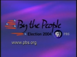
Nickname: "By the People"
Logo: TBA
FX/SFX: TBA
Music/Sounds: Same as on the Frontline variant of the 2002 PBS logo.
Availability: Extinct. Appeared on The NewsHour with Jim Lehrer, among other election-themed programs in 2004.
Editor's Note: None.
(2004)

Nickname: "By the People"
Logo: TBA
FX/SFX: TBA
Music/Sounds: Same as on the Frontline variant of the 2002 PBS logo.
Availability: Extinct. Appeared on The NewsHour with Jim Lehrer, among other election-themed programs in 2004.
Editor's Note: None.
5th Logo
(2008)
Logo: TBA
FX/SFX: TBA
Music/Sounds: TBA
Availability: Extinct.
Editor's Note: None.
(2008)
Logo: TBA
FX/SFX: TBA
Music/Sounds: TBA
Availability: Extinct.
Editor's Note: None.
6th Logo
(2012)
Logo: TBA
FX/SFX: TBA
Music/Sounds: TBA
Availability: Extinct. Appeared on Charlie Rose, among other election-themed programs in 2012.
Editor's Note: None.
(2012)
Logo: TBA
FX/SFX: TBA
Music/Sounds: TBA
Availability: Extinct. Appeared on Charlie Rose, among other election-themed programs in 2012.
Editor's Note: None.
7th Logo
(July 15-November 8, 2016)
Nicknames: "Reliable, Balanced, Real"
Logo: TBA
FX/SFX: TBA
Music/Sounds: A soft fanfare, with a male voiceover saying, "Reliable. Balanced. Real. Election 2016 on PBS."
(July 15-November 8, 2016)
Nicknames: "Reliable, Balanced, Real"
Logo: TBA
FX/SFX: TBA
Music/Sounds: A soft fanfare, with a male voiceover saying, "Reliable. Balanced. Real. Election 2016 on PBS."
Music/Sounds Variants: The logo is sometimes shortened. There are two short variants, each with their own shortened voiceover: either "Election 2016 on PBS." or "Reliable. Balanced. Real. PBS."
Availability: Appeared on election-themed programs in 2016. First appeared on the Washington Week Cleveland Roadshow Edition. Its last appearance was on the marathon-length special PBS NewsHour: Vote 2016.
Editor's Note: None.
Availability: Appeared on election-themed programs in 2016. First appeared on the Washington Week Cleveland Roadshow Edition. Its last appearance was on the marathon-length special PBS NewsHour: Vote 2016.
Editor's Note: None.
8th Logo
(December 19, 2019- )
Nickname: "News You Can Trust", "Your Voice Matters", "Vote 2020"
Logo: TBA
FX/SFX: TBA.
Music/Sounds: The 2001 ITV News theme.
Availability: Brand new. Debuted on PBS NewsHour's 2020 Democratic debate special.
Editor's Note: None.
PBS INDIES:
(2013-October 28, 2019)
Logo: TBA
FX/SFX: TBA
Music/Sounds/Voiceovers: An abridged version of the 2009 CPB logo's music. At the end of the program, a voiceover says, "PBS, your home for independent film."
Availability: Appears at the end of Independent Lens and POV.
Editor's Note: None.
PBS STORIES OF SERVICE:
(2014- )
Logo: TBA
FX/SFX: TBA
Music/Sounds/Voiceovers: A solemn yet uplifting four-note brass piece which sounds almost like the first three notes of "Taps". At the end of the program, a voiceover says, "This is PBS."
Availability: Rare. Can be seen on PBS programs about American servicemen, including the annual National Memorial Day Concert.
Editor's Note: None.
PBS SUMMER OF ADVENTURE:
(June 20, 2017- )
Logo: TBA
FX/SFX: TBA
Music/Sounds/Voiceovers: A quick, lively tropical tune.
Availability: Brand new. Debuted on The Story of China. Also appears on Big Pacific and Great Yellowstone Thaw.
Editor's Note: None.
SPOTLIGHT EDUCATION:
(September 12-17, 2016)
Logo: TBA
FX/SFX: TBA
Music/Sounds/Voiceovers: TBA
Availability: Only seen on episodes of POV, Frontline, Nova, Craft in America, and other programs which take a look at the American education system and were broadcast over one week in September 2016.
Editor's Note: None.
SUMMER OF SPACE
(July 2, 2019- )
Logo: TBA
FX/SFX: TBA
Music/Sounds/Voiceovers: TBA
Availability: Brand new. Seen on space-themed programming broadcast on PBS to celebrate the 50th anniversary of the Apollo 11 Moon landing, beginning with the Secrets of the Dead episode "Galileo's Moon".
Editor's Note: None.
THINK WEDNESDAY:
(April 9, 2014-October 30, 2019)
Logo: TBA
FX/SFX: TBA
Music/Sounds/Voiceovers: A new-age rock tune. A female voiceover says, "Think Wednesday, think PBS."
Availability: Seen at the end of The Mystery of Matter, as well as first-run episodes of Earth's Natural Wonders, Nova, and The Brain with David Eagleman, among other programs on the Think Wednesday block, all exclusively during the primetime broadcasts (save for The Mystery of Matter, which used only this logo at the end).