WGBH
Jump to navigation
Jump to search
Logo descriptions by AsdfTheRevival, StephenCezar15, BenIsRandom, SomerHimpson,Megadeth99 and others
Logo captures courtesy of MSTS1, StephenCezar15, BenIsRandom, SomerHimpson, Megadeth99 and others
Videos courtesy of Tlogos, danf62465, NantoVision2, superpooper180, JohnnyL80, WheelWatcher12345,DudeThatLogo, youngleader610 (Mr.Logo), TrickyMario7654, Edc4, LARDLOGO, Megadeth99 and JustLogos.
Editions by Hoa, MrThorax281, KirbyGuy2001 (Logoblin), BenIsRandom, StephenCezar15, SomerHimpson, GoAnimateFan199Pro, Megadeth99 and Unnepad
Background: WGBH (an abbreviation of Western Great Blue Hill) is a PBS affiliate located in Boston, Massachusetts and owned by the WGBH Educational Foundation. The station launched on May 2, 1955, and introduced an on-screen logo in 1971. It is also one of the biggest in the broadcaster, producing much of the national content for it, and thus is also one of their 2 flagship stations.
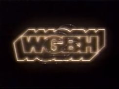
2nd Logo
 <iframe frameborder="0" height="158" src="http://wikifoundrytools.com/wiki/closinglogos/widget/unknown/dd713fa81f23ec3575e70de5973bad54c577c3ca" width="279"></iframe>
Nicknames: "The Neon Sign", "The Flash", "WGBH Outline"
Availability: Very common. Likely the most readily available PBS logo around.
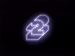
7th Logo
(September 1977-January 1982)
Nickname: "The 2"
Logo: We see a large number "2" (in the style of the WGBH logo) in a different situation. Next to the "2", is the name of the show coming up next.
Variants: There are many variants depending on the show:
FX/SFX: None.
Music/Sounds: An announcer saying "(show's name) is coming up on WGBH-2".
Availability: Can be found on old WGBH programming from that time.
Editor's Note: None.
 <iframe frameborder="0" height="161" src="http://wikifoundrytools.com/wiki/closinglogos/widget/unknown/bd5b1d9d0e42aa5f561e08fdaf8593feba2d5b5b" width="287"></iframe>
Nicknames: "The 2 II", "Shiny 2", "Silver 2"
 <iframe frameborder="0" height="165" src="http://wikifoundrytools.com/wiki/closinglogos/widget/genericvideo/18db088a836645024e8801b3a062a0d87e7f52cf" width="291"></iframe>
 <iframe frameborder="0" height="167" src="http://wikifoundrytools.com/wiki/closinglogos/widget/youtubevideo/c233aa6e100acccd3b02ab78692aa4b63bd1cb12" width="295"></iframe>
12th Logo
(September 30, 1991-October 4, 1996)
Logo: We see a small Earth globe against a starry sky quickly rotate around counterclockwise, and the words "WQED" (in yellow-orange) with "PITTSBURGH" (in white) below slowly rotate around clockwise, followed by "WGBH" (again, in yellow-orange) with "BOSTON" (in white) below.
FX/SFX: The rotating globe and letters.
Music/Sounds:
Availability: Extinct on broadcast television. Only seen on episodes of Where in the World is Carmen Sandiego?. Various episodes of the show have been posted to YouTube, though, so it shouldn't be hard to find it there.
Editor's Note: None.
13th Logo
14th Logo
(January 22, 2001-November 24, 2013?)
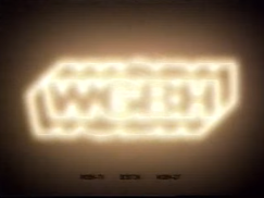
Nicknames: "The Neon Sign II", "WGBH Outline II", "The Flash II", "The Neon Tubes"
Logo: A brief flash shows us uncolored pipes. Suddenly, gold beams fly through them, as the camera pans around, following it. The camera then pans and zooms outward, revealing the now-completed WGBH logo in a neon format as it flashes bright like the 1977 logo. The logo goes dim as a neon number "2" [the channel number] lights up in a bluish-white color for about 3 seconds and goes out.
Variants:
FX/SFX: Very nice CGI for the early 2000s, done by Paul Sanni; a WGBH Creative Services editor, and Elias Mallette; TV director for Creative Services. They also did work for the previous ID.
Editor's Note: None.
Trivia: This logo was created by Paul Sanni (sound and video editing) and Elias Mallette (animation), both of which also did work for the 14th ID. You can read more about the making <a class="external" href="http://filmmakermagazine.com/85052-reimagining-an-id-sound-vision/" rel="nofollow" target="_blank">here</a>.
Logo captures courtesy of MSTS1, StephenCezar15, BenIsRandom, SomerHimpson, Megadeth99 and others
Videos courtesy of Tlogos, danf62465, NantoVision2, superpooper180, JohnnyL80, WheelWatcher12345,DudeThatLogo, youngleader610 (Mr.Logo), TrickyMario7654, Edc4, LARDLOGO, Megadeth99 and JustLogos.
Editions by Hoa, MrThorax281, KirbyGuy2001 (Logoblin), BenIsRandom, StephenCezar15, SomerHimpson, GoAnimateFan199Pro, Megadeth99 and Unnepad
Background: WGBH (an abbreviation of Western Great Blue Hill) is a PBS affiliate located in Boston, Massachusetts and owned by the WGBH Educational Foundation. The station launched on May 2, 1955, and introduced an on-screen logo in 1971. It is also one of the biggest in the broadcaster, producing much of the national content for it, and thus is also one of their 2 flagship stations.
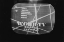
1st Logo
(1955- 19??)

Nickname: "The Sticks"
Logo: The logo consists of the following text on the lower center position of the screen:
WGBH-TV
BOSTON
CHANNEL2
Various lines of various sizes and angles can be seen in the background. Names of cities that received the station can be seen on the left center of the screen.
FX/SFX: None.
Music/Sounds: Unknown, but it may have an announcer.
Availability: Extinct. The only known remains of this logo come from a logopedia page.
Editor's Note: This is the first known identity produced by WGBH. It has quite a unique design for its time too.
2nd Logo
(1956-1971)
Nickname: "The Family"
Logo: The logo consists of an "X" connected to a triangle on the bottom and a vertical line throughout the center. Circles are on both the left and right side of the symbol. Next to the symbol is the number "2" with "WGBH-TV Cambridge/Boston" underneath.
Variant: For television productions, the following is seen with the symbol next to the word "TV":
in association with
WGBH-TV
BOSTON
FX/SFX: For the station ID: unknown. The production variant is an in credit logo which sometimes wipes in from top to bottom.
Music: Unknown for the station ID. The in credit variant uses the ending audio to the program it follows.
Availability: The station ID is extinct and only survives via a photo on Logopedia. The in credit variant is very rare but is preserved on any surviving programming from the time period.
Editor's Note: The symbol is actually an ancient Aztec symbol for "family." The triangle and vertical line represent a woman, the vertical line and top two portions of the "X" represent a man, and the circles represent children. The symbol is still in use as the logo for "WGBH Alumni."
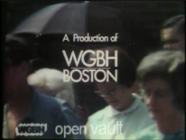
3rd Logo
(1969?-1971?)
 <iframe frameborder="0" height="158" src="http://wikifoundrytools.com/wiki/closinglogos/widget/unknown/dd713fa81f23ec3575e70de5973bad54c577c3ca" width="279"></iframe>
Nicknames: "Early WGBH"
Logo: We see an in-credit disclaimer reading:
A production of
WGBH
BOSTON
FX/SFX: None, unless you count the fades.
Music/Sound: Currently unknown as the narrator reads over the airing of the program but, most likely the ending theme of the program.
Availability: Most likely very rare. This was spotted on The Nader Report 1st episode, currently available for viewing on WGBH's open vault.
Editor's Note: None.
4th Logo
(June 27, 1971-September 1977)
WGBH - CLG WikiWGBH - CLG WikiWGBH - CLG WikiWGBH - CLG WikiWGBH - CLG WikiWGBH - CLG Wiki
 WGBH - CLG WikiWGBH - CLG WikiWGBH - CLG WikiWGBH - CLG Wiki
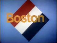
![WGBH - Evening at Pops" variant [1 of 3] (1976)](/images/thumb/f/fb/29c6fa5e8a3256f23ac18da123302c7d.png/191px-29c6fa5e8a3256f23ac18da123302c7d.png)
![WGBH - Evening at Pops" variant [2 of 3] (1976)](/images/thumb/9/97/18341d4e092018d7d717747a74998672.png/191px-18341d4e092018d7d717747a74998672.png)
![WGBH - Evening at Pops" variant [3 of 3] (1976)](/images/thumb/9/92/Ea87800e2d74f5bd5876feec4ea2c07d.png/183px-Ea87800e2d74f5bd5876feec4ea2c07d.png)
![WGBH - Red variant [1 of 3] (1971)](/images/thumb/1/12/90f95b2b106bbea275fb1008fb2adf9f.png/190px-90f95b2b106bbea275fb1008fb2adf9f.png)
![WGBH - Red variant [2 of 3] (1971)](/images/thumb/e/e8/2343b4405f57867c55ee6e5421df4a86.png/192px-2343b4405f57867c55ee6e5421df4a86.png)
![WGBH - Red variant [3 of 3] (1971)](/images/thumb/e/ef/9983b9b2d108c5de43efc2c540b2e642.png/192px-9983b9b2d108c5de43efc2c540b2e642.png)
![WGBH 1974 [Teal Background]](/images/thumb/d/d9/B44779d1e883f795d6501751299b6ccf.png/256px-B44779d1e883f795d6501751299b6ccf.png)
![WGBH 1974 [Teal Background] 2](/images/thumb/7/7e/1dd5142d1ed8988e63c98df6ce7594a6.png/259px-1dd5142d1ed8988e63c98df6ce7594a6.png)
![WGBH 1974 [Teal Background] 3](/images/thumb/c/c5/2cfe28b24ff4a47cd173bf0ddf8882ca.png/237px-2cfe28b24ff4a47cd173bf0ddf8882ca.png)


 WGBH - CLG WikiWGBH - CLG WikiWGBH - CLG WikiWGBH - CLG Wiki

![WGBH - Evening at Pops" variant [1 of 3] (1976)](/page/File:29c6fa5e8a3256f23ac18da123302c7d.png)
![WGBH - Evening at Pops" variant [2 of 3] (1976)](/page/File:18341d4e092018d7d717747a74998672.png)
![WGBH - Evening at Pops" variant [3 of 3] (1976)](/page/File:Ea87800e2d74f5bd5876feec4ea2c07d.png)
![WGBH - Red variant [1 of 3] (1971)](/page/File:90f95b2b106bbea275fb1008fb2adf9f.png)
![WGBH - Red variant [2 of 3] (1971)](/page/File:2343b4405f57867c55ee6e5421df4a86.png)
![WGBH - Red variant [3 of 3] (1971)](/page/File:9983b9b2d108c5de43efc2c540b2e642.png)
![WGBH 1974 [Teal Background]](/page/File:B44779d1e883f795d6501751299b6ccf.png)
![WGBH 1974 [Teal Background] 2](/page/File:1dd5142d1ed8988e63c98df6ce7594a6.png)
![WGBH 1974 [Teal Background] 3](/page/File:2cfe28b24ff4a47cd173bf0ddf8882ca.png)
<iframe frameborder="0" height="146" src="http://wikifoundrytools.com/wiki/closinglogos/widget/unknown/e8cdb32079bf5b98d74b734f8d7e7ba548d863d9" width="188"></iframe><iframe frameborder="0" height="147" src="http://wikifoundrytools.com/wiki/closinglogos/widget/unknown/493fb7b998fd784796c893a3ab33e0a54c6d8b3a" width="191"></iframe><iframe frameborder="0" height="145" src="http://wikifoundrytools.com/wiki/closinglogos/widget/genericvideo/0dde8fe49c02b599ab5a8a41d70104c521649908" width="254"></iframe><iframe frameborder="0" height="148" src="http://wikifoundrytools.com/wiki/closinglogos/widget/unknown/1a8c199c87f86ce8b2bd3a05be18cc58c63d7769" width="196"></iframe><iframe frameborder="0" height="148" src="http://wikifoundrytools.com/wiki/closinglogos/widget/unknown/f23afceec3f305f2837aee0ebde2a7f3a3bf0bf1" width="260"></iframe><iframe align="bottom" frameborder="0" height="148" src="http://wikifoundrytools.com/wiki/closinglogos/widget/genericvideo/f2040de925904ea823e5dcba372d9daa0c04d839" width="261"></iframe><iframe frameborder="0" height="148" src="http://wikifoundrytools.com/wiki/closinglogos/widget/genericvideo/fc7147db7171b3becc4300802f336efa62bc42d3" width="261"></iframe><iframe frameborder="0" height="148" src="http://wikifoundrytools.com/wiki/closinglogos/widget/genericvideo/d9b311af002e2abcced3b9be26909f8419d5aed7" width="259"></iframe><iframe frameborder="0" height="164" src="http://wikifoundrytools.com/wiki/closinglogos/widget/genericvideo/39404cb54ba8a610d2832fe80111d47c577972ff" width="292"></iframe>
Nicknames: "Zooming WGBH", "Zooming Letters"
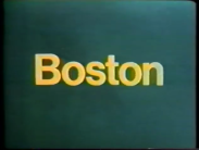
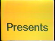
Logo: Against a blue background, the letters "WGBH" in yellow in a generic Helvetica font quickly zoom back, away from the viewer to the vanishing point, and disappearing when the text is very small. Then the word "Boston," also in yellow, also appears out of nowhere and then zooms forward really fast, taking up the whole screen and creating a yellow background. And finally, the word "Presents" zooms forward at a fast pace, in blue.
Variants:
Logo: Superimposed to the end credits of the show is the famous logo still in use, which is the text "WGBH" in a bold font, with the outlines being extended out from the front and back, creating a shadow effect. Below it typically is "Boston", with the colors for both being different at times. Typically there is a copyright for WGBH Educational Foundation.
Logo: Against a blue background, the letters "WGBH" in yellow in a generic Helvetica font quickly zoom back, away from the viewer to the vanishing point, and disappearing when the text is very small. Then the word "Boston," also in yellow, also appears out of nowhere and then zooms forward really fast, taking up the whole screen and creating a yellow background. And finally, the word "Presents" zooms forward at a fast pace, in blue.
Variants:
- On some prints of this logo, due to either film deterioration or film quality, the blue colors are instead dark green.
- The very first season of NOVA has this logo with the words all in green, zooming out, and scanimated as part of the show's intro.
- On many early episodes of NOVA, the background is beige at first, and turnsbrownafter "Boston" zooms in; the words "WGBH" and "Boston" are brown while "Presents" is in beige and it would zoom forward as always, transitioning to the opening cinematic.
- On The French Chef, the logo is chroma-keyed over a slanted flag of France (which has the colors flipped around, making it look more like a Netherlands flag or the 1792 First French Republic flag) against a blue background, animation and all. Also, when the "Boston" text gets close to the screen, it inverts to being a cote out in a yellow square to get the proper effect.
- On the Bicentennial edition of Evening at Pops, there is a black background with yellow confetti. The first two words are white and when "Boston" zooms in and takes the full screen, the background is white, and "Presents" is black.
- A brighter version of the blue version is featured on several episodes of The Advocates. The version has a bright blue/yellow-orange background. Some episodes also feature the logo with a bright teal/cyan background.
- Another variant from The Advocates has the yellow "WGBH" text on a burgundy background. This is the earliest known version of it.
Music/Sounds: Eerie, choppy, UFO-like computer blips ascend and descend several times. A rising Moog violin stinger starts playing over the blips, until the stringer settles on a high note. Composed by Gershon Kingsley.
Music/Sounds Variants:
Availability: Extremely rare in the wild, as programming from this era are usually no longer rerun. You might find this logo on older WGBH programming, assuming it isn't plastered with a later logo. You might find this on old tapes of The French Chef, 1972's Zoom, Evening at Pops, The Victory Garden, Masterpiece Theatre, and/or NOVA episodes from the era. The French Chef variant also showed up when WGBH-2 in Boston, MA had a marathon of old episodes of The French Chef on Christmas Day, 2011. Despite its rarity, the logo can easily be found online on several episodes of The Advocates on the WGBH Open Vault.
Editor's Note: The logo became notorious forits high-contrast colors, fast "V of Doom"-style zoom-ins, and eerie synth music.
Music/Sounds Variants:
- The jingle's speed may vary; it can play slower or faster than usual.
Availability: Extremely rare in the wild, as programming from this era are usually no longer rerun. You might find this logo on older WGBH programming, assuming it isn't plastered with a later logo. You might find this on old tapes of The French Chef, 1972's Zoom, Evening at Pops, The Victory Garden, Masterpiece Theatre, and/or NOVA episodes from the era. The French Chef variant also showed up when WGBH-2 in Boston, MA had a marathon of old episodes of The French Chef on Christmas Day, 2011. Despite its rarity, the logo can easily be found online on several episodes of The Advocates on the WGBH Open Vault.
Editor's Note: The logo became notorious forits high-contrast colors, fast "V of Doom"-style zoom-ins, and eerie synth music.
5th Logo
(March 3, 1974- )


Logo: Superimposed to the end credits of the show is the famous logo still in use, which is the text "WGBH" in a bold font, with the outlines being extended out from the front and back, creating a shadow effect. Below it typically is "Boston", with the colors for both being different at times. Typically there is a copyright for WGBH Educational Foundation.
Trivia: The logo was designed by design firm Chermayeff & Geismar, of which has also designed for NBC, PBS, Showtime, Univision, Viacom, & Screen Gems, among others.
FX/SFX: Typically none.
Music/Sounds: None or the closing theme of the show.
Availability: Common. Its first appearance was at the end credits of the series premiere of NOVA. It would appear at the end of WGBH programming until 1993, when the 5th logo was moved to the end. Curious George, Downton Abbey, and select episodes of Masterpiece are the shows that still have this logo. It also appeared at the end of The Captioned ABC News starting sometime between June 1980 and October 1981, and presumably continuing until that program's discontinuation sometime in 1982.
Editor's Note: None.
6th Logo
(January 5, 1977-2009, August 17, 2019)
Editor's Note: None.
6th Logo
(January 5, 1977-2009, August 17, 2019)


<iframe frameborder="0" height="141" src="http://wikifoundrytools.com/wiki/closinglogos/widget/genericvideo/120276f95fbbe3f1302f41beb5c6dd61445f638f" width="252"></iframe><iframe frameborder="0" height="145" src="http://wikifoundrytools.com/wiki/closinglogos/widget/genericvideo/a6c9c3b7cd781d1b1c4c4f6da94422dcb1d8b537" width="259"></iframe><iframe frameborder="0" height="144" src="http://wikifoundrytools.com/wiki/closinglogos/widget/unknown/7d903b59e9e09f35680e094a442d0bd65c7bb7c0" width="188"></iframe><iframe frameborder="0" height="142" src="http://wikifoundrytools.com/wiki/closinglogos/widget/genericvideo/a31c4a3b4bbabc7c3b0374b616e7c13dc53211a4" width="181"></iframe><iframe frameborder="0" height="144" src="http://wikifoundrytools.com/wiki/closinglogos/widget/genericvideo/6519cdf3ef062c6ed3e6916446340f3eb2daf080" width="186"></iframe>
Logo: Here are the main variants of this logo:
Trivia: Their slogan up to 1982 was "Public Television. It's better than ever."
Variants: There are many variants in terms of the music and the announcer:
FX/SFX: The lines of electricity, and the flash.
Music/Sounds/Voice-over: Same as the 4th logo. There have been 2 versions, a long version and a short version. The entire 7-second jingle is used as the long version, and is in much better sound quality and plays at the correct speed. The short version features only the rising synth chord (but we still hear the UFO noise, but only abridged), and is much more common nowadays. Sometimes, an announcer will say "A production/presentation of WGBH Boston." or "(show's name) is a production/presentation of WGBH Boston."
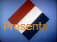
- Version I: On a black background, two orange lines of "electricity" form two, orange, 2D "shadows", one on top and one on bottom. Then the lines form an orange outline of "WGBH" in between the "shadows". The lines stop, and an orange flash starts behind the outline. The flash clears out "WGBH" as "Boston Presents" appears in an orange Helvetica font. The "Boston Presents" logo was a bumper used at the beginning of the show.
- Version II: Similar to the other logo, but usually with the "WGBH" logo already formed as it fades in, and then the flash occurs and the word "BOSTON" appears, spaced-out, below the logo in an orange Art Deco font.
Trivia: Their slogan up to 1982 was "Public Television. It's better than ever."
Variants: There are many variants in terms of the music and the announcer:
- 1977-1987: The full version of the music,with the complete animation and "Boston Presents" ending, and no announcer.
- 1986-1993: Same as above, but shortened to when "WGBH" begins to flash.
- 1993-2009: A different short version with the logo already formed, the "Boston Presents" ending omitted, and the music shortened. An announcer may or may not be heard.
- 2002-2009: A digitally enhanced version of the logo with sped-up animation and no announcer. This version can be seen on episodes of Frontline. Another version has the logo zooming in a bit while the animation is being drawn, which can be seen on episodes of NOVA, and was also used as a station ID. Another version had the PBS logo appearing in its place and shining with an announcer saying "You're watching WGBH Boston.". A superimposed variant of the animation can be seen on episodes of Masterpiece Theater.
- Sometimes, the closing theme of the show will play over this logo. This can be seen on pre-2009 episodes of Arthur and Between the Lions.
- 1993-2009: A version can occasionally be spotted in which the "glowing" animation is played, but no text appears. This can be seen on most pre-2005 episodes of Arthur.
- 1999-2009: Another version exists where the "glowing" animation is delayed for half a second and the "glow" is slightly slowed down. This was only seen on episodes of Arthur.
- On later episodes of Arthur, the byline "WGBH is a trademark of WGBH Educational Foundation" (and sometimes a URL) is shown below written in the Arthur font.
- Another local version used in the 1980s begins with a blue flash, followed by an orange "2" written in the same style as the WGBH logo zooming up. This variant was always played when the station signed on in the morning, and played in reverse when it signed off at night. No music or sounds play here.
- On Evening with Pops, the 1986 logo is superimposed into the intro.
- On Out Of Money, the ending is replaced with "in association with" along with the logo for Money (the magazine) in orange.
- The 1993 version of the logo was superimposed of The American Experience.
- There is a version where the logo forms in warp speed. However, during the flash, the logo turns into the PBS logo. This is seen on some episodes of Mystery.
- A filmed variant exists, which makes it clear that "Boston" simply fades in.
- A variant exists where "Boston Presents" transitions to the text "IN ASSOCIATION WITH MONEY MAGAZINE." "IN ASSOCIATION WITH" is above "MONEY" in the same font as "Presents" as is "MAGAZINE" which is below. "Money" is in its corporate font. The text glows for a couple of seconds until fading out.
FX/SFX: The lines of electricity, and the flash.
Music/Sounds/Voice-over: Same as the 4th logo. There have been 2 versions, a long version and a short version. The entire 7-second jingle is used as the long version, and is in much better sound quality and plays at the correct speed. The short version features only the rising synth chord (but we still hear the UFO noise, but only abridged), and is much more common nowadays. Sometimes, an announcer will say "A production/presentation of WGBH Boston." or "(show's name) is a production/presentation of WGBH Boston."
Music/Sounds Variants:
- The Mystery version has the full music along with a male announcer saying "Mystery is a production of WGBH. Produced in Boston, shared with the world."
- A version has been seen with abridged animation, no voice-over, and slightly lower-pitched music on Design Squad.
- Two versions can be heard whether it's long or short; one is the original pitch, while the other is slightly higher pitched. The 1986 version has the former, while the 1993 version has the latter. The 1977 version has either.
- Sometimes the 1993 or 2002 logos have an announcer saying "(Show's name) is a production/presentation of WGBH Boston." or simply "A production/presentation of WGBH Boston". From 1998 to 2002, on Mystery and Masterpiece Theatre, the announcer has a British accent. On the 1999 revival of Zoom, a kid from the show voices over, with the short music. Starting in 2002, there would be no announcer and it would just have the music. One variant has a creepy voice-over say "Mystery is a presentation of WGBH Boston."
- In the "Money Magazine" variant, the logo has a slight reverb.
- The first version made its debut on the NOVA episode "Hitler's Secret Weapon", and can be seen in its various versions on many PBS shows, such as NOVA, Frontline, American Experience, Masterpiece Theatre, The Victory Garden, and Arthur, among others.
- The filmed variant can be found on 16mm dupes of WGBH programming distributed by Time Life Multimedia for classroom usage.
- The 1993 version with the short music and no announcer has been sighted on early episodes of Fetch with Ruff Ruffman.
- The "Boston Presents" version can be found on video and may also show up on WGBH shows produced from 1982-1993 if your station has older prints.
- The original unabridged version can be seen on videocassettes and DVDs of their 1979 miniseries The Scarlet Letter, all of which also preserve the 1971 PBS logo, and also appears on earlier prints of Cathedral and in full near the start of the 2019 documentary This Old House 40th Anniversary.
- The 1986 version is retained on the Turner Home Entertainment VHS of the Ken Burns film Thomas Hart Benton. Current prints of Arthur plaster it with the 12th logo.
- The "Money Magazine" variant is extinct as it only appeared on On The Money.
- The original 1977 logo and shortened 1986 variant can be seen on episodes of This Old Houseuploaded to their official YouTube channel.
Editor's Note: Like the 1971 logo, this logo was famous for its dark colors, eerie animation, and the creepy synth music; however, it is a favorite of many due to its usage on classic shows.
7th Logo
(September 1977-January 1982)
Nickname: "The 2"
Logo: We see a large number "2" (in the style of the WGBH logo) in a different situation. Next to the "2", is the name of the show coming up next.
Variants: There are many variants depending on the show:
- About the House: The "2" is made of wood.
- The Ascent of Man: The white "2" is tilting on a black background.
- The Way It Was: The "2" is wearing a football uniform with the number "2" on it.
FX/SFX: None.
Music/Sounds: An announcer saying "(show's name) is coming up on WGBH-2".
Availability: Can be found on old WGBH programming from that time.
Editor's Note: None.
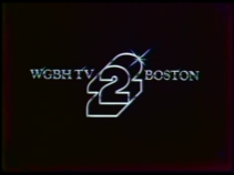
8th Logo
(1979?-1982?)
 <iframe frameborder="0" height="161" src="http://wikifoundrytools.com/wiki/closinglogos/widget/unknown/bd5b1d9d0e42aa5f561e08fdaf8593feba2d5b5b" width="287"></iframe>
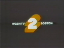
Nicknames: "The 2 II", "Shiny 2", "Silver 2"
Logo: On a black background, we see a silver outline of the "2" from before, with a flash of light on its top. To the left of the 2 is "WGBH TV" and to the right of it is "BOSTON". After a couple seconds, the logo fades to the 3rd logo.
FX/SFX: The logo fading in, then to the 6th logo.
Music/Sounds: A female announcer says "This is Channel 2, WGBH-TV Boston."
Availability: Extinct. Was only used as a station ID.
Editor's Note: None.
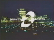
9th Logo
(1983?-198?)

 <iframe frameborder="0" height="165" src="http://wikifoundrytools.com/wiki/closinglogos/widget/genericvideo/18db088a836645024e8801b3a062a0d87e7f52cf" width="291"></iframe>
Note: The logo can be seen at 0:04.
Nicknames: "The 2 III", "2 City" "Cheesy 2"
Logo: Over a shot of the Boston skyline at night, a white colored "2" (with the extrusions filled and the "2" being a cutout) zooms back to the center of the screen. To the left of the "2" is the text "WGBH TV" and to the right of the "2" is the word "BOSTON." The "2" flashes similar to the 3rd logo turning the background black, the "2" white, and the outline orange.
FX/SFX: The logo zooming out. The logo flashing. The logo and background changing.
Music/Sounds: A mellow synth theme with a synthesized whoosh as the logo zooms out. There is a "ping" as the logo flashes and a drumbeat afterwards. Throughout the logo, an announcer (William Pierce) says "This is viewer supported television from Boston. WGBH TV."
Availability: Extinct. Was only used as a station ID. Appeared before programs on WGBH.
Editor's Note: None.
10th Logo
(1987-19??)
 <iframe frameborder="0" height="167" src="http://wikifoundrytools.com/wiki/closinglogos/widget/youtubevideo/c233aa6e100acccd3b02ab78692aa4b63bd1cb12" width="295"></iframe>
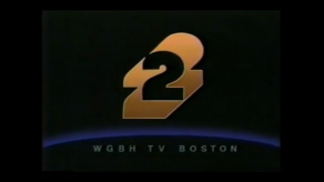
Nicknames: "The 2 IV", "Golden 2", "WGBH in Space"
Logo: We fade into what appears to be space. The background is entirely black with the exception of a dark blue glowing semicircle that represents Earth. The "2" from the previous logo zooms out, but it's in a shade ofgold rather than orange. As it stops zooming back,pinkish red, green, and bluecomets come in from the top left of the screen and go through the cut-out "2" as they streak off to the right. "W G B H T V B O S T O N" appears below in a grey-white generic font. The animation loops a few more times before the logo ends.
FX/SFX: The "2" zooming out. The comets streaking through the logo and to the right of the screen. The text appearing below.
Music/Sounds: An excerpt of "Shadowdance" by "Shadowfax."
Availability: Probably extinct. Appeared on Return of the Art Maker.Also most likely used as a station ID at the time.
Editor's Note: None.
11th Logo
(1989-Early 1990s)
<iframe frameborder="0" height="177" src="http://wikifoundrytools.com/wiki/closinglogos/widget/genericvideo/fc02d2622583a8c78c309462ecb10ed88eb98f76" width="312"></iframe>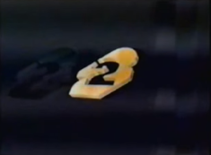

Nicknames: "The 2 V", "CGI 2", "Gold 2"
Logo: On a black background, a gold colored "2" (in the same design as before but in 3D) zooms and tilts back until it disappears.
FX/SFX: CGI animation.
Music/Sounds: None.
Availability: Extinct. Was only used as a sign off ID (and possibly a sign on ID).
Editor's Note: None.
(September 30, 1991-October 4, 1996)
<iframe frameborder="0" height="150" src="http://wikifoundrytools.com/wiki/closinglogos/widget/genericvideo/dc6a2c0b0169fe6ea3eadbc4db3bcf97231b610a" width="266"></iframe><iframe frameborder="0" height="150" src="http://wikifoundrytools.com/wiki/closinglogos/widget/genericvideo/580182c6f33706cadc0fb18bdc5c7e654e684cab" width="266"></iframe>
Nicknames: "WQED/WGBH Earth Globe"
Logo: We see a small Earth globe against a starry sky quickly rotate around counterclockwise, and the words "WQED" (in yellow-orange) with "PITTSBURGH" (in white) below slowly rotate around clockwise, followed by "WGBH" (again, in yellow-orange) with "BOSTON" (in white) below.
FX/SFX: The rotating globe and letters.
Music/Sounds:
- September 30, 1991-December 25, 1992: The first part of the theme of the show as Lynne Thigpen says "Today's caper is presented by WQED Pittsburgh and WGBH Boston".
- September 27, 1993-October 4, 1996: The end theme of the show with Lynne Thigpen saying "This program is presented by WQED Pittsburgh and WGBH Boston".
Availability: Extinct on broadcast television. Only seen on episodes of Where in the World is Carmen Sandiego?. Various episodes of the show have been posted to YouTube, though, so it shouldn't be hard to find it there.
Editor's Note: None.
13th Logo
(Early 2000s)
<iframe frameborder="0" height="206" src="http://wikifoundrytools.com/wiki/closinglogos/widget/genericvideo/347b40b431900d23dc4c15f73f353278d651f05d" width="366"></iframe>
Nicknames:"Greek "WGBH"", "Temple of ""WGBH2""
Logo:On a rendered platform featuring Greek Temple~like columns, monitors of at least six WGBH programs are present, as the camera moves forward until the Boston skyline can be seen in the background.
FX/SFX:The camera and CG animation.
Music/Sounds: An Tribal Kind of song with an announcer saying on top of it "You're watching the best television on television, Boston's PBS station: "WGBH 2."
Availability: Extinct. This station ID lasted about 1-2 years.
Editors Note: Very nice CGI for the time.
14th Logo
(January 22, 2001-November 24, 2013?)


<iframe frameborder="0" height="178" src="http://wikifoundrytools.com/wiki/closinglogos/widget/genericvideo/186bdefc46492833419dd1ac48304cbf3b55f7bf" width="232"></iframe><iframe frameborder="0" height="178" src="http://wikifoundrytools.com/wiki/closinglogos/widget/unknown/c10fa1c805dd8b718b95f5339441b6316ef790d9" width="237"></iframe>
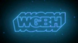
Nicknames: "The Neon Sign II", "WGBH Outline II", "The Flash II", "The Neon Tubes"
Logo: A brief flash shows us uncolored pipes. Suddenly, gold beams fly through them, as the camera pans around, following it. The camera then pans and zooms outward, revealing the now-completed WGBH logo in a neon format as it flashes bright like the 1977 logo. The logo goes dim as a neon number "2" [the channel number] lights up in a bluish-white color for about 3 seconds and goes out.
Variants:
- Also seen with affiliate stations in a black typeface on the bottom of the logo.
- A short version exists beginning where the screen zooms out to show the logo lighting up.
- Another shorter version cuts off the first two seconds of the logo.
FX/SFX: Very nice CGI for the early 2000s, done by Paul Sanni; a WGBH Creative Services editor, and Elias Mallette; TV director for Creative Services. They also did work for the previous ID.
Music/Sounds/Voice-over: A slightly extended version of the infamous WGBH synth theme. When the WGBH logo flashes, Jim Birdsall, who has done work for CNBC and NBC stations KING and KGW in Seattle and Portland, says "WGBH Boston". Finally, a humming sound is heard when the "2" appears.
Availability: Probably extinct. Was only seen as a local station ID. You would've had to go to Boston (or, more generally, the Greater Boston area) to see this logo in person.
Availability: Probably extinct. Was only seen as a local station ID. You would've had to go to Boston (or, more generally, the Greater Boston area) to see this logo in person.
Editor's Note: None.
15th Logo
(2008- )


<iframe frameborder="0" height="153" src="http://wikifoundrytools.com/wiki/closinglogos/widget/unknown/984078a3d23ac6192e6864d84005af1419db2da9" width="296"></iframe><iframe frameborder="0" height="153" src="http://wikifoundrytools.com/wiki/closinglogos/widget/unknown/c9628dfe0a1e8eab42129bf8a7660efc64115686" width="317"></iframe>
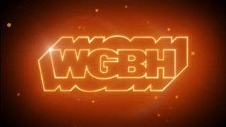
Nicknames: "The Neon Sign III", "WGBH Outline III", "The Flash III"
Logo: It's an updated variant of the 6th logo. The drawing and lighting effects are smoother and more refined, with stars surrounding the logo, like in space, when it flashes. The flash is also brighter than usual, and the WGBH logo zooms in while it's drawn, and dims out when the logo is done.
Variants:
- There is a variant that is tinted blue. This was seen on their local productions, such as Greater Boston.
- An in-credit version of the logo has been spotted on Antiques Roadshow, which simply shows the orange WGBH logo at the bottom of the screen.
- An extended variant exists where the logo stays on screen after the flash disappears and shines before fading out.
FX/SFX: The drawing and lighting effects, as well as the usual flash.
Music/Sounds: The short version of the 4th logo theme.
Music/Sounds/Voice-over Variant: On Greater Boston, a male announcer (with the opening theme playing over his announcement) says, "This is a production of WGBH 2 Boston".
Music/Sounds/Voice-over Variant: On Greater Boston, a male announcer (with the opening theme playing over his announcement) says, "This is a production of WGBH 2 Boston".
Availability: Common. Seen on episodes of WGBH programming, such as NOVA, Frontline, and American Experience, among others. Also seen on post-2008 prints of Arthur, plastering the 1993 logo. The unabridged logo is not as common, it can be seen on Mind of a Chef and occasionally on feature-length specials. The blue variant was seen on earlier episodes of Greater Boston, and is extinct in broadcast, as current episodes now use the standard variant.
Editor's Note: It's a good redux of the 6th logo and it has been slightly tamed.
16th Logo
(November 25, 2013- )
 <iframe align="bottom" height="171" src="http://wikifoundrytools.com/wiki/closinglogos/widget/genericvideo/828643963e730e78f18ba67006a72dd084c625e6" width="301"></iframe>
 <iframe align="bottom" height="171" src="http://wikifoundrytools.com/wiki/closinglogos/widget/genericvideo/828643963e730e78f18ba67006a72dd084c625e6" width="301"></iframe>
Nicknames: "The Neon Sign IV", "WGBH Outline IV", "The Flash IV"
Logo: On a black background, orange neon lights start to trace out the inner part of the WGBH logo, with the top coming first, followed by the bottom part, the 2 holes on the "B", and finally the part that makes part of the "G". The light then draws out the full outline as another line starts to draw the "shadow" part. When the inner outline is complete, the rest of the logo flickers on and flashes in the style of the 3rd logo, revealing "WGBH-TV BOSTON" on the bottom. The logo then glows a la the "2" in the 14th logo, then shortens out in a similar matter.
Trivia: This logo was created by Paul Sanni (sound and video editing) and Elias Mallette (animation), both of which also did work for the 14th ID. You can read more about the making <a class="external" href="http://filmmakermagazine.com/85052-reimagining-an-id-sound-vision/" rel="nofollow" target="_blank">here</a>.
FX/SFX: The tracing of the inner parts, the drawing of the logo, as well as the usual flash. Pretty cool animation.
Music/Sounds/Voice-over: An ominous hum is heard first, followed by a series of snippets of the infamous theme when the neon traces the logo, but the computer blips are now terribly out of tune. The logo then plays the full theme with an announcer saying "You're watching WGBH 2, Boston.", followed with the same humming sound from the 14th ID.
Availability: Current. But like the 14th logo, only as a station ID. The logo can also be seen on WGBH's YouTube channel.
Editor's Note: Nice blend of the 14th and 15th/6th logo! It's a shame this logo only appears as a station ID.