What's the scariest logo you've ever seen?
Jump to navigation
Jump to search
Dominicmgm presents my scariest logos.
Topitoomay's Scariest Logos!
The Curiousity Company: Leave My Eyes Alone! I'm very scared with my eyes by "tick-tock" sound and waves washing ashore sound
Klasky Csupo (2nd Logo): Oh No! My Dream is getting ruined with eyes, I was scared i have sleep see my laptop and TV by a black ink stain on a blue background with a liquid effect appears by splattering all over the screen and also the music and sound effects is getting nightmare
TrickyMario7654's "Formerly" Scary Logos:
Yes that's right, I'm one of the few on here who isn't scared the heck out of by any logos. But growing up, there were plenty of logos I hated seeing, such as these...
(NOTE: There's another variation of this logo that was used between the two above, but I've yet to encounter it on a tape I have)
Welcome! This is where you can post about what logo scares you and why, it could also be logos which no longer scare you as well.
gohan56782
VCI: This one creeped me out when I was younger, probably due to the dark background and the music. I am fine with it now, since I'm used to it..
Oz Film Co: Creepy and unsettling as hell, did not help that on one version, she gave a dark stare at the beginning and that I could see the outlines of her body, which did not help..
MGM: I think Tanner scared me a few times when I watched Tom and Jerry as a kid. It does not now though....
PS2: When the "red screen of death" first occurred, it creeped me out due to the reddish darkness and music.
VID: It's very nightmarish to me, since the animation is loud and unsettling, and I do not like the appearance of that mask
Bryanston Pictures: I don't like this, extremely dark and the creepy sounds make it like a retro horror game
Fabrica: Damn, I hate this one. Really creepy and unsettling to see, and it feels like the eyes are staring into your soul.....
naxo-olé
Horror Factory (France): The skinless man and the jumpscare are so scary...
Slaughterhouse Entertainment: The woman screaming and the drawing of the skeleton are too creepy for me.
BenIsRandom
Caution Video (Japan): I am no longer scared of this anymore, but when I first saw this I thought the man howling was weird, but then the text just jarringly appeared, and the loud clang just made it be like there's this weird dude, and then BAM! That startled me. I'm much used to it now.
- Master Arts Video (Canada): The dragon, music and fireball could really scare anyone, even the bravest!
- United Artists (License to Kill variant): The V of Doom style zoom in, the black background and the sound really does freak me out.
On a side note, I am not scared of the infamous V of Doom and S from Hell.
Brochamp Media
(anex407 on the CLG Wiki)
- Ragdoll Productions (1985) - This logo proves that dolls with creepy button eyes shouldn't be presented against a dark background. They make them look like they're dead.
- WildBrain (1997) - I'll never be able to un-see that ugly face with that very pencil through the ears. His look is just disturbing.
- Stretch Films (1998) - Somebody forgot to floss...
- Oz Film Company (1914) - Acceptable for the 1910's, but not acceptable for little children. Thanks a lot, Vivian Reed.
- More coming soon.
FireLaser244's Scariest logos
THX: The Deep Note was the embodiment of my childhood nightmares
Zombastic Productions: Why does it have eyes? Why would they inject the skull in said eyes? It's all very disturbing to me
TCN Productions: The way it comes closer slowly along with that fanfare that comes off as a wall of noise is something I don't want to think about at night
Ramsay Films(2nd logo): Those screams. They make me feel insecure
VID (6th logo): It's like it's counting down to your death
Valve Corporation: That music still creeps me out, especially with the image
Horror Factory Entertainment (3rd logo): If you thought the first logo was bad, you've never seen this.......
Prathima Films: That Hindu god freaks me out
SnowflakesOmega's Scariest Logos (because I have to take a long time to make a long video of my list, so have a preview while you wait for the big one):
Viacom (1976-1986): It just looks like it's going to get you, along with the grandiose synth theme and sudden abruptness of the ending, so I have to agree with it. At least I'm not scared of the dark and B&W variants.
DIC Entertainment (1987-2001): The darkness, the slow zoom-in to the spiked star, the music (especially the 1990 one), and the way they show the kid sleeping at the beginning is quite disturbing. It looks like the logo is actually stalking the house.
PBS (1989-1993): The theme comes abruptly all of a sudden with the big logo and black background. I find this to be more ominous than the 1971 ID.
Revue Studios (1958-1963), and the other Universal Television logos coming after: Mainly due to the fanfare.
MTE (1989-1991): If Universal had to answer Viacom with a V of Doom-like logo, this would be it.
Titwala Filmwalas (2001): I just want to smash that trumpet everytime it plays.
Hanna-Barbera Cartoons (Swirling Star logos): I'm not a fan of the dark animation and whooshing synth music. The later CGI version is more odd-looking.
More coming soon!
eloc08 (CLG Wiki user aang1337)
Disney Channel Originals (2002): I hate this one because the logo wobbling and the liquid looks too scary for me.
rj4712
off-topic: I am not scared of the Viacom (1976-1986) of Doom.
DIC Entertainment- From 1983(ish)-1987. The scene of someone sleeping is a bit creepy.
Oz Film Company (1914)- The music and Vivian Reed's face staring into your soul.
Logomax Productions' SCARIEST LOGOS!
- Gorgon Video: This is the most scariest thing I have ever seen! I mean, the flames, music, Medusa staring into my soul like hell, and Medusa sticking her tongue out! Though it was likely intentional since because it's a horror company.
- Team Happy Rainbow Panda Bears: Whoever made this logo must been loving animal abuse, which PETA (I still hate them, though) might get mad at them for this! It's too disturbing to see a dead panda on screen.
- Timpson Films (2015 logo): "I think i'm gonna be sick." *barfing* Come on, this "logo" is nothing but a stupid excuse! I mean, it's THRPB 2.0, because it has a dead naked man shown on this logo. (very inappropriate for a logo)
I'll find more scary logos later.
- Logomax Productions
Originalsboy11
Logos That Scare Me
- 1998-2008; 2012- Klasky-Csupo "Splaat" I absolutely hate Splaat and it makes it worse that he stares right at you with this weird look on his face with his big blue eyes makes me want to crawl into a deep hole and never come out. I can tolerate his voice to a degree, but I can't hear it at night though.
- 1998-2007 O Entertainment logo- Seeing a big creepy "O" drop down on a black background with a deep voice does not make a good combo for me.
NightmareEnterprises
NOTE: I am used to these logos mentioned today.
20th Century Fox 94:I was scared by the drumroll. I got used to it by watching the logos on YouTube.
Neversoft (Tony Hawk's Underground):I was scared by the sewer monster eating a person. I got used to it by how much I played Underground.
nihirichan's Scary Logos!
(Please note that I'm not going to link some of my picks because it means I'm truly scared of them. Also, I'm not scared of the V of Doom, S from Hell, Mask of Doom, Fabrica, nor Horror Factory.)
KWSU(1st logo) : While I don't consider this scary by animation, the sounds make this logo unhelpful. I recommend you watching this at daytime.Oz Film Co. : The face of Vivian Reed will forever haunt my daydreams.
Dwarakish Chitra (1st logo) : When I first set foot on this logo, I was perplexed by the way Dwarakish smiles. Later, I suddenly got scared of his smile, which is much scarier than Vivian's. It also made me not to look at Indian logos that don't have a CLG page ever again.
Rainbow Releasing (1st logo)/International Rainbow Pictures: May I ask why Orson's face is in these logos?? It's really unnecessary for his face to be there as the logo is about a rainbow! Not an angry face!
Boje Buck Filmproduktion (Knallhart variant) : While I'm usually a bit jumpy when I see the other variants, the Knallhart one makes it super unsettling with the zoom-out of the rabbit's face.
Gaumont (6th logo; original variant) : See KWSU.
Coliseum Film (both variants) : That elephant is very unnerving.
Shivalik Films : See KWSU.
Topitoomay's Scariest Logos!
The Curiousity Company: Leave My Eyes Alone! I'm very scared with my eyes by "tick-tock" sound and waves washing ashore sound
Klasky Csupo (2nd Logo): Oh No! My Dream is getting ruined with eyes, I was scared i have sleep see my laptop and TV by a black ink stain on a blue background with a liquid effect appears by splattering all over the screen and also the music and sound effects is getting nightmare
TrickyMario7654's "Formerly" Scary Logos:
Yes that's right, I'm one of the few on here who isn't scared the heck out of by any logos. But growing up, there were plenty of logos I hated seeing, such as these...


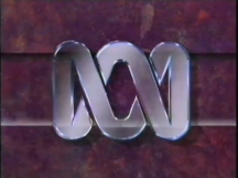
ABC TV (Australia) - When I was younger, I hated EVERY ABC logo used (with the exception of the ABC Kids logo). The design of the Lissajous Figure and the jingle freaked me out, and I had plenty of nightmares over the years. Thankfully, I no longer find it scary and the last nightmare I can recall of this logo was in 2009 (despite no longer finding the logo scary at that point).


(NOTE: There's another variation of this logo that was used between the two above, but I've yet to encounter it on a tape I have)
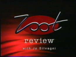
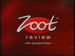
Zoot Review - Believe it or not, these logos were used at the start of a series of "product recommendation" adverts aired in countries such as Australia. Shown at the start of each commercial, we see a red blanket-like background with a black overshadow. In the center of this is a red oval with "review" written under it in white. The word "Zoot" is drawn out in a metallic cursive-like font. After the word has formed, "with *insert reviewer's name here*" appears below "review". For the audio, we have this inhuman guy saying "Zoot Review" while crashing-like noises play in the background. I hated seeing this logo because of the unfriendly logo design and the loud audio. Even worse, it often catches you off-guard as it's the first thing seen in the ad. I had so many nightmares about this logo because of these factors. Even the later redesigned version still looks creepy. While I'm not as scared as this logo as I used to be, it's still startles me whenever I'm transferring commercials from tapes due to the fact I'm watching these blind. Thank goodness these commercials died off in Australia something during 2010.
TheEye12's Scariest Logos
I'm not scared by many logos, but these are the ones on here that used to scare me.
Tell-Tale Productions: I remember seeing this when I was little. It scared me mostly because of the abstract-drawn face at the right, but I don't find it scary today.
Right Entertainment: This was one of the scariest logos I came across. I remember me having my DVD player set to a loud volume, and the sounds were so loud that it scared me to death.
Audi: This is a commercial logo, but even then, I found it so scary, due to the black background, the theme, and the animation. I had nightmares for weeks about this logo and it doesn't help today
that it feels a bit creepy today.
BBC Two (Zapper): I was scared by the zapper breaking, but nothing more.
THX: Oh my gosh... this logo used to scare the heck out of me when I was a kid. The black background, the large, metallic logo, and the one, the only, Deep Note. I had nightmares from whenever
I would see it. Definitely NOT recommended for people with THX-phobia.
Kennithball97's Scariest Logos
1. Klasky Csupo: 2nd Logo A.K.A. "Splaat"
While I'm not scared of this logo nowadays, Splaat was my worst nightmare when I was young. It mostly came from how realistic his eyes and mouth were, however his robotic voice and the "Music" could be factors as well. Despite this, I still have a special place in my heart for this logo, especially seeing that the company treat him like a character, instead of a logo.
2. A.K.A. Cartoon Incorporated: Boo-Haw-Haw Variant of the 2nd Logo A.K.A. "Bloody Guy From Hell"
Say what you want about "Team Happy Rainbow Panda Bears", or "Timpson Films", at least those were shown with unsuitable content, THIS was shown on a KID'S SHOW!I don't think kids would enjoy seeing blood, let alone a dead guy in it.
3. Zombastic Productions Incorporated: Either Variant for their Logo A.K.A. "The Cheapest Scary Logo Ever"
To Begin with, can I just say that prefer it if the nickname "The Low-Budget Nightmare" applied to this logo than Vadimon? Anyway, just about everything is disturbing about this logo. The music, the skull's design, the blood curdling scream, the blood coming out of the logo, the injection of some painful fluid, and other things. I get that this was made to be scary, and they did that very, very well.
That just about it, I'm not scared by a lot of logos.
LogoAshbyroad
VID: Most of you guys aren't scared of this logo. I hate this, that evil mask staring into your soul and that scary and terrible fanfare. The animation is unnecessary and unsettling. I don't wanna see this logo again! 2013 logo was little less worse, though I still find it creepy.
Klasky-Csupo (Robot): When I saw this for the first time, it didn't scared me, at all, though I think the face creepy, and still is. Who approve this? This has scared many kids during their childhood! If I see this logo again, I would close my eyes and mute the TV. That was nasty!
Viacom "V of Doom"
A.K.A. Cartoon, Inc.: WAY OFF THE CHARTS! This is inappopriate for a children's show, it's worse than THRPB and Timpson Films. It's really nothing special, just a dead guy being impaled by a pencil. This is disgusting!
Stretch Films: You thought that KC logo was bad? Wrong! This is even worse! I hate this logo! The mouth is creepy, the laugh freaks me out, not to mention that this is placed in a black background, as well as appearing on a children's show!
PBS (1971-84): Why this logo has ever come to exist? It's a kind of logo that you should not view it in the dark.
WGBH "Flash of Doom": Who thought that was a good idea? The music is eerie and terrible, the animation sucks, not to mention that is also in a black BG! No comments.
Renaissance Pictures
Gracie Films "Treehouse of Horror" Variants: I hate that scream! Wilheim variant is less worse, I think it's funny.
VCI
Oz Film
Fabrica
3G Home Video
Screen Gems "S From Hell"
Paramount Television "Closet Killer" (1969): There's no closet killer on the logo. I don't know why they called this nickname.
ThatRandomOshawott's Scariest Logos
Vadimon Video- This logo would be relaxing andaesthetic if it weren't for the eyes at the beginning. Goodness! Did they have to make them so unsettling?
Fabrica- The first part of the Fabrica logo (where the eyes open) is reminiscent of horror movie jumpscares.
The white text-only NET logo variant- Sometimes, no sound can be scarier than screams. Did they have to drag out the logo for so long? I wouldn't be very comfortable in a dark room with this on the TV.
Ear Booker Productions- Fun fact: Did you know the music in the logo was from a track that was meant to be a jumpscare for those unfortunate fellows who forgot to take out the CD? Also, it appears that the people who made the logo have never heard of epilepsy in their entire life.
DARKIPLIER'S scariest logos:
Klasky Csupo "Splaat": this one scared me as a kid, i will admit. The sudden appearance of Splaat plus the look of him and the fast paced logo overall made for a horrifying moment for me, not to mention it was at the end of a Rugrats movie.
Horror Factory 1st Logo: This one also got me when when i knew it was coming...
A.K.A. Cartoon Inc. What...the...hecc. IT HAS BLOOD ALL OVER THE BACKGROUND AND IT'S A KIDS SHOW! WHAT COULD BE WORSE?
Team Happy Rainbow Panda Bears: ... I don't even want to talk about this one.
Any Neversoft Logo with the spear through the eye: I just don't like eye stuff.
HiT Entertainment (5th Logo) This scared me as a kid for some reason, i think it was the music