Warner Bros Pictures Variations
Jump to navigation
Jump to search
Lumberjack Rabbit (1954, Looney Tunes): The shield shoots up towards us like normal... but overshoots its mark so that it looks like it's crashing into the screen! It then moves back to its normal position though.
Girl on the Run (1958): The logo looks metallic and odd.
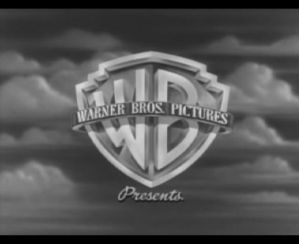
Rebel Without a Cause (195?): The Warner Bros logo is above a city at night.
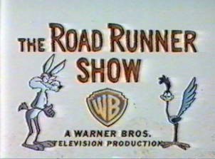
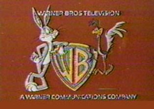
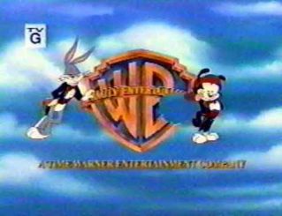
Bugs Bunny/Roadrunner Hour (1970s): Instead of the normal \\' logo used at the time, we get treated to Bugs and the Roadrunner standing beside a bannerless WB shield! "WARNER BROS. TELEVISION" and "A WARNER COMMUNICATIONS COMPANY" are above and below it in the fonts used on the \\' logo.
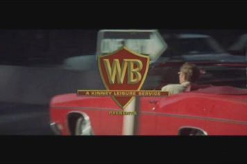
The Omega Man (1972): The WB Shield is superimposed over Charlton Heston driving a car.
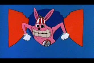
One Crazy Summer (1985): The logo appears as normal. Then, suddenly, it turns into a crudely drawn version of the shield, with wiggling clouds. The Warner Communications byline and clouds dissipate as a REALLY-EVIL looking animated bunny in a beanie cap (like the one seen in the movie) opens the WB shield from inside. He laughs, and then we zoom into his mouth, seeing the "ONE CRAZY SUMMER" title zoom up on us. Scary as hell.
Who’s That Girl? (1987): The Warner Bros. logo with byline appears as animated on a granite background. We zoom up to the logo, the shield opens like a door, and out comes a cartoon Madonna, who closes the shield and poses sexy for the camera. The logo goes up and she moves down to make way for the opening credits.
Batman (1989): The WB shield is almost a light bronze, and the sky is dark blue. The Warner Communications byline is on a different font.
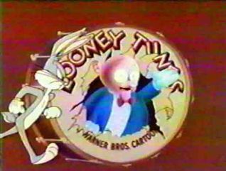
Gremlins 2: The New Batch (1990): Instead of the normal shield logo, a replica of the classic 1936-1963 WB "circles" cartoon logo comes up, with its text and minus shield ("PICTURES, INC." is removed in favor of "A TIME WARNER COMPANY"). The shield then zooms up with Bugs Bunny riding it, and the text fades out. Daffy Duck then comes onscreen, angrily, pushes him off the shield ("50 years of you hogging the spotlight is ENOUGH!"), and tries to ride it... well, it doesn't work as good for him :) They also have another Looney Tunes-style ending, with Porky doing the usual "That's All Folks!" ending before Daffy, like before, complains of Porky hogging (no pun intended) the spotlight, saying something to the effect of "60 Years of you doing the end title is enough". Daffy trys to say the end line, but like before, is stopped when the shield with Chuck Jones' credit comes out, hitting him in the face. He gets back up and weakly says "Fade out."
Invasion of the Bunny Snatchers (1991):
OPEN: A recreation of "The Bullseye" logo with orange circles, black center and "Bugs Riding The Shield." Animation and music is similar to the 1940s Looney Tunes bumper, but the title of the logo reads "WARNER BROS. ANIMATION INC.," and the "LOONEY TUNES" title card reads below "A WARNER BROS. CARTOON MADE IN N.Y.C. AND BURBANK."
CLOSE: We see a recreation of the 1944 Porky In The Drum logo, in which a badly animated "stereotype" version of Porky (whom, aside from also wearing pants, resembles a Terry Gilliam drawing) bursts out of the drum and tries to say his famous line in a pale voice imitation as outer-spacey sound-effects play in the background. A frowning Bugs enters from the left and kicks the fake Porky out, which crashes off screen, then grabs the real Porky and puts him in the drum where he belongs. Porky is surprised for a moment "Oh, oops" then proceeds with his famous line and pose as Bugs exhaustedly exits right.
Batman Returns (1992): Same as the original Batman, only with snow in the sky as well.
Batman Forever (1995): The WB shield transforms into the Batman logo.
From Hare To Eternity (1996): The 1992 Warner Bros. Family Entertainment logo is seen as normal, but we do not hear "Merrily We Roll Along" as often plays over the logo, INSTEAD we hear a re-orchestration of the 1936 Max Steiner WB fanfare. Other variations are done on "The Bullseye" opening/closing credits: the open on this cartoon has a Chuck Jones byline, and the close has "That's All Folks!" written over the bullseye in a SMALLER script than usual.
Twister (1996): The shield appears from the clouds.
Batman and Robin (1997): The WB shield transforms into a frozen Batman logo.
Conspiracy Theory (1997): The initial Warner Bros. logo with the clouds behind is shown - the camera then pulls back to show the logo as a billboard on the side of a bus.
Contact (1997): The Shield is in a dark crystal blue.
Mars Attacks (1997): A little flying saucer flys around the WB shield logo.
Lethal Weapon 4 (1998): The WB shield blows up!
The Matrix (1999): Current logos for both (also includes Village Roadshow), but the colors have been changed to a green tint and a filter has been applied so they look "computerish".
True Crime (1999): The 1984 logo appears, as with all post-1999 Eastwood movies.
Wakko's Wish (1999, WB Family Entertainment): The standard "Bugs walks out from behind the shield, does a Vanna pose, and chews his carrot" logo... until Wakko from Animaniacs walks out, does a Vanna pose... and takes a huge bite of the shield! Bugs is not amused.
Space Cowboys (2000): The Warner Bros. and Village Roadshow logos aren't animated. Also, they are put on a black background and in the same black-and-white color scheme as the first five minutes of the movie.
Swordfish (2001): The opening studio logos for Warner Bros and Village Roadshow Productions flicker as if they were on a problematic computer screen.
Thir13en Ghosts (2001): The opening Warner Brothers logo is in black and white.
Blood Work (2002): The Warner Bros. logo is the 1984 logo with "An AOL Time Warner Company" on the bottom.
Logo Variations - CLG Wiki
Ghost Ship (2002): The opening logos are tinted brown, and the typical Warner Bros. logo is instead an intentionally chintzy 50s style logo.
320px|Logo Variations - CLG Wiki
Scooby-Doo (2002): Proceeds like normal until the music ends, when a chunk of the WB shield disappears with a chomping sounds as if it were bit out, and we hear Scooby-Doo do his famous laugh, and then a zoom out has the WB shield turn into a Scooby-Doo dog collar with the initials "SD" on it. Underneath is a "A Mystery Inc. Company" byline.
Terminator 3: Rise of the Machines (2003): The teaser trailer, which played on prints of Men in Black II, had the shield turning into the liquid metal and melting.
Logo Variations - CLG Wiki
Dreamcatcher (2003): The Warner Bros. and Village Roadshow logos are covered in snow, while the Castle Rock Entertainment lighthouse beams it's light through snow.
Looney Tunes: Back in Action (2003): Just the 1998-present WB logo with the prototype "TIME WARNER" byline but everything but the shield fades out and we see the shield zooming out on the red rings make immediately makes you think "Looney Tunes". The tittle appears on the rings. Over this variation is the classic instrumental composition of "What's Up, Doc".
Logo Variations - CLG Wiki
Matchstick Man (2003): The sky background is replaced with water.
The Last Samurai (2003): Just the 1998-present Warner Bros. logo with the prototype "TIME WARNER" byline but in a blue and black color scheme.
Polar Express (2004): The shield is icy on a black background. Also isn't animated.
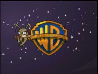
Mucha Lucha: The Return of El Malefico (2005): Bugs walks out eating his carrot as usual then it fades to the Flea eating a doughnut. the background is changed from clouds to a starry sky as well. Then a comet goes across it diagonally and starts the movie.
V for Vendetta (2005): Exactly like Like the Thir13en Ghosts Variation
Flags of Our Fathers (2006): The Warner Bros is a rendition of the 1997 shield used in "Contact" but in Black and
White. Also isn't animated.
Unaccompanied Minors (2006): A (HUGE) pile of snow falls on the shield, causing it to break in half.
Fred Claus (2007): There are Christmas lights surrounding the WB shield. Also, it's snowing in the background.
300 (2007): The WB logo is in stone.
Lumberjack Rabbit (1954, Looney Tunes): The shield shoots up towards us like normal... but overshoots its mark so that it looks like it's crashing into the screen! It then moves back to its normal position though.

Girl on the Run (1958): The logo looks metallic and odd.

Rebel Without a Cause (195?): The Warner Bros logo is above a city at night.


Bugs Bunny/Roadrunner Hour (1970s): Instead of the normal \\' logo used at the time, we get treated to Bugs and the Roadrunner standing beside a bannerless WB shield! "WARNER BROS. TELEVISION" and "A WARNER COMMUNICATIONS COMPANY" are above and below it in the fonts used on the \\' logo.

The Omega Man (1972): The WB Shield is superimposed over Charlton Heston driving a car.


One Crazy Summer (1985): The logo appears as normal. Then, suddenly, it turns into a crudely drawn version of the shield, with wiggling clouds. The Warner Communications byline and clouds dissipate as a REALLY-EVIL looking animated bunny in a beanie cap (like the one seen in the movie) opens the WB shield from inside. He laughs, and then we zoom into his mouth, seeing the "ONE CRAZY SUMMER" title zoom up on us. Scary as hell.
Who’s That Girl? (1987): The Warner Bros. logo with byline appears as animated on a granite background. We zoom up to the logo, the shield opens like a door, and out comes a cartoon Madonna, who closes the shield and poses sexy for the camera. The logo goes up and she moves down to make way for the opening credits.
Batman (1989): The WB shield is almost a light bronze, and the sky is dark blue. The Warner Communications byline is on a different font.
Gremlins 2: The New Batch (1990): Instead of the normal shield logo, a replica of the classic 1936-1963 WB "circles" cartoon logo comes up, with its text and minus shield ("PICTURES, INC." is removed in favor of "A TIME WARNER COMPANY"). The shield then zooms up with Bugs Bunny riding it, and the text fades out. Daffy Duck then comes onscreen, angrily, pushes him off the shield ("50 years of you hogging the spotlight is ENOUGH!"), and tries to ride it... well, it doesn't work as good for him :) They also have another Looney Tunes-style ending, with Porky doing the usual "That's All Folks!" ending before Daffy, like before, complains of Porky hogging (no pun intended) the spotlight, saying something to the effect of "60 Years of you doing the end title is enough". Daffy trys to say the end line, but like before, is stopped when the shield with Chuck Jones' credit comes out, hitting him in the face. He gets back up and weakly says "Fade out."
Invasion of the Bunny Snatchers (1991):
OPEN: A recreation of "The Bullseye" logo with orange circles, black center and "Bugs Riding The Shield." Animation and music is similar to the 1940s Looney Tunes bumper, but the title of the logo reads "WARNER BROS. ANIMATION INC.," and the "LOONEY TUNES" title card reads below "A WARNER BROS. CARTOON MADE IN N.Y.C. AND BURBANK."

CLOSE: We see a recreation of the 1944 Porky In The Drum logo, in which a badly animated "stereotype" version of Porky (whom, aside from also wearing pants, resembles a Terry Gilliam drawing) bursts out of the drum and tries to say his famous line in a pale voice imitation as outer-spacey sound-effects play in the background. A frowning Bugs enters from the left and kicks the fake Porky out, which crashes off screen, then grabs the real Porky and puts him in the drum where he belongs. Porky is surprised for a moment "Oh, oops" then proceeds with his famous line and pose as Bugs exhaustedly exits right.
Batman Returns (1992): Same as the original Batman, only with snow in the sky as well.

Batman Forever (1995): The WB shield transforms into the Batman logo.
From Hare To Eternity (1996): The 1992 Warner Bros. Family Entertainment logo is seen as normal, but we do not hear "Merrily We Roll Along" as often plays over the logo, INSTEAD we hear a re-orchestration of the 1936 Max Steiner WB fanfare. Other variations are done on "The Bullseye" opening/closing credits: the open on this cartoon has a Chuck Jones byline, and the close has "That's All Folks!" written over the bullseye in a SMALLER script than usual.
Twister (1996): The shield appears from the clouds.

Batman and Robin (1997): The WB shield transforms into a frozen Batman logo.
Conspiracy Theory (1997): The initial Warner Bros. logo with the clouds behind is shown - the camera then pulls back to show the logo as a billboard on the side of a bus.
Contact (1997): The Shield is in a dark crystal blue.
Mars Attacks (1997): A little flying saucer flys around the WB shield logo.

Lethal Weapon 4 (1998): The WB shield blows up!

The Matrix (1999): Current logos for both (also includes Village Roadshow), but the colors have been changed to a green tint and a filter has been applied so they look "computerish".
True Crime (1999): The 1984 logo appears, as with all post-1999 Eastwood movies.

Wakko's Wish (1999, WB Family Entertainment): The standard "Bugs walks out from behind the shield, does a Vanna pose, and chews his carrot" logo... until Wakko from Animaniacs walks out, does a Vanna pose... and takes a huge bite of the shield! Bugs is not amused.

Space Cowboys (2000): The Warner Bros. and Village Roadshow logos aren't animated. Also, they are put on a black background and in the same black-and-white color scheme as the first five minutes of the movie.
Swordfish (2001): The opening studio logos for Warner Bros and Village Roadshow Productions flicker as if they were on a problematic computer screen.
Thir13en Ghosts (2001): The opening Warner Brothers logo is in black and white.
Blood Work (2002): The Warner Bros. logo is the 1984 logo with "An AOL Time Warner Company" on the bottom.
Logo Variations - CLG Wiki
Ghost Ship (2002): The opening logos are tinted brown, and the typical Warner Bros. logo is instead an intentionally chintzy 50s style logo.
320px|Logo Variations - CLG Wiki
Scooby-Doo (2002): Proceeds like normal until the music ends, when a chunk of the WB shield disappears with a chomping sounds as if it were bit out, and we hear Scooby-Doo do his famous laugh, and then a zoom out has the WB shield turn into a Scooby-Doo dog collar with the initials "SD" on it. Underneath is a "A Mystery Inc. Company" byline.
Terminator 3: Rise of the Machines (2003): The teaser trailer, which played on prints of Men in Black II, had the shield turning into the liquid metal and melting.
Logo Variations - CLG Wiki
Dreamcatcher (2003): The Warner Bros. and Village Roadshow logos are covered in snow, while the Castle Rock Entertainment lighthouse beams it's light through snow.
Looney Tunes: Back in Action (2003): Just the 1998-present WB logo with the prototype "TIME WARNER" byline but everything but the shield fades out and we see the shield zooming out on the red rings make immediately makes you think "Looney Tunes". The tittle appears on the rings. Over this variation is the classic instrumental composition of "What's Up, Doc".
Logo Variations - CLG Wiki
Matchstick Man (2003): The sky background is replaced with water.
The Last Samurai (2003): Just the 1998-present Warner Bros. logo with the prototype "TIME WARNER" byline but in a blue and black color scheme.
Polar Express (2004): The shield is icy on a black background. Also isn't animated.

Mucha Lucha: The Return of El Malefico (2005): Bugs walks out eating his carrot as usual then it fades to the Flea eating a doughnut. the background is changed from clouds to a starry sky as well. Then a comet goes across it diagonally and starts the movie.
V for Vendetta (2005): Exactly like Like the Thir13en Ghosts Variation

Flags of Our Fathers (2006): The Warner Bros is a rendition of the 1997 shield used in "Contact" but in Black and
White. Also isn't animated.
Unaccompanied Minors (2006): A (HUGE) pile of snow falls on the shield, causing it to break in half.
Fred Claus (2007): There are Christmas lights surrounding the WB shield. Also, it's snowing in the background.
300 (2007): The WB logo is in stone.