Rogue Pictures
Jump to navigation
Jump to search
Logo descriptions by WetPaintLogo1993, indycar, and GETENT
Logo captures by Eric S., EnormousRat and Logo Archive
Editions by Shadeed A. Kelly, kidinbed, and indycar
Background: Rogue Pictures was originally formed by PolyGram Filmed Entertainment in 1997 as its low-profile or low-budget film production division, but it became defunct in 2000 after PolyGram was purchased by Universal Studios. Later in 2004, the company was revived by the Universal Studios-owned Focus Features to produce and distribute films in the specific genres of horror, thriller, African-American, high suspense and action. In 2008, Relativity Media acquired Rogue Pictures from Universal Studios with over 25 films in its library. However, the studio later had films progressively having less and less box-office grosses. After the disastrous critical failure of Movie 43 (despite the film being a moderate box office success), the company was put on hiatus and released one more film in 2016. In 2017, their library was sold to Vine Alternative Investments, and in 2018 the company was revived as an independent studio.
1st Logo
(September 6, 1997-October 20, 2000)
Logo: On a dark red background, we see the word "ROGUE" in crimson red relief letters. Below it, there is the word "PICTURES" in a gradient shade of gold.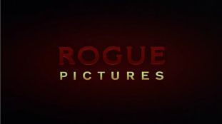
FX/SFX: None.
Music/Sounds: None or the opening theme of the movie.
Availability: Rare. Seen on the 1999 USA Home Video VHS releases of Orgazmo, Trippin' and Cherry Falls.
Editor's Note: None.
2nd Logo
(September 24, 2004-August 4, 2009)
<iframe frameborder="0" height="166" src="http://wikifoundrytools.com/wiki/closinglogos/widget/genericvideo/cfd810d3273d5a7f5616140b280ed8c2d0c5c67d" width="297"></iframe><iframe frameborder="0" height="166" src="http://wikifoundrytools.com/wiki/closinglogos/widget/genericvideo/bafbfff285a4c1f1d24a8d7c344e2e160ff295f0" width="297"></iframe><iframe frameborder="0" height="167" src="http://wikifoundrytools.com/wiki/closinglogos/widget/genericvideo/8e4d4dfb1f56c431350c9b36658adf92ce2a16e0" width="297"></iframe>
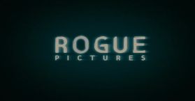
Logo: On a black background, the letters of the company name, ("R", "O", "G", "U", and "E", all of them in blue) fly very fast, close and far, to left and to right, randomly through the screen. After a while, the letters come very fast to form the word "ROGUE", except the "O", which fades in. Under the phrase, the word "PICTURES" (smaller than "ROGUE") fades in also. Also, a blue spotlight fades while the company name forming.
Trivia: This logo was made by DevaStudios.
Variant:
FX/SFX: The static speed of the logo.
Music/Sounds: Static music that goes with the static feel of the logo. The extended version starts with a synth note, along with some whooshes that sync to the animation. When the test card appears, the sound of a vibraphone repeating along with some beeping in the background is heard, as well as a man saying "This is not a test." A quieter version of the standard music is heard when the logo returns, and finally, the same man says "Are you rogue?" at the end. This version can only be heard on A Perfect Getaway.
Availability: Common. Can be found on all their films from 2004 to 2009.
Editor's Note: None.
3rd Logo
(May 21, 2010-January 25, 2013, September 9, 2016)
 <iframe frameborder="0" height="183" src="http://wikifoundrytools.com/wiki/closinglogos/widget/genericvideo/dba2a5ea34ddcd64c633908deceb8eec4a523a04" width="327"></iframe>
Logo captures by Eric S., EnormousRat and Logo Archive
Editions by Shadeed A. Kelly, kidinbed, and indycar
Background: Rogue Pictures was originally formed by PolyGram Filmed Entertainment in 1997 as its low-profile or low-budget film production division, but it became defunct in 2000 after PolyGram was purchased by Universal Studios. Later in 2004, the company was revived by the Universal Studios-owned Focus Features to produce and distribute films in the specific genres of horror, thriller, African-American, high suspense and action. In 2008, Relativity Media acquired Rogue Pictures from Universal Studios with over 25 films in its library. However, the studio later had films progressively having less and less box-office grosses. After the disastrous critical failure of Movie 43 (despite the film being a moderate box office success), the company was put on hiatus and released one more film in 2016. In 2017, their library was sold to Vine Alternative Investments, and in 2018 the company was revived as an independent studio.
1st Logo
(September 6, 1997-October 20, 2000)
Logo: On a dark red background, we see the word "ROGUE" in crimson red relief letters. Below it, there is the word "PICTURES" in a gradient shade of gold.

FX/SFX: None.
Music/Sounds: None or the opening theme of the movie.
Availability: Rare. Seen on the 1999 USA Home Video VHS releases of Orgazmo, Trippin' and Cherry Falls.
Editor's Note: None.
2nd Logo
(September 24, 2004-August 4, 2009)


<iframe frameborder="0" height="166" src="http://wikifoundrytools.com/wiki/closinglogos/widget/genericvideo/cfd810d3273d5a7f5616140b280ed8c2d0c5c67d" width="297"></iframe><iframe frameborder="0" height="166" src="http://wikifoundrytools.com/wiki/closinglogos/widget/genericvideo/bafbfff285a4c1f1d24a8d7c344e2e160ff295f0" width="297"></iframe><iframe frameborder="0" height="167" src="http://wikifoundrytools.com/wiki/closinglogos/widget/genericvideo/8e4d4dfb1f56c431350c9b36658adf92ce2a16e0" width="297"></iframe>
Logo: On a black background, the letters of the company name, ("R", "O", "G", "U", and "E", all of them in blue) fly very fast, close and far, to left and to right, randomly through the screen. After a while, the letters come very fast to form the word "ROGUE", except the "O", which fades in. Under the phrase, the word "PICTURES" (smaller than "ROGUE") fades in also. Also, a blue spotlight fades while the company name forming.
Trivia: This logo was made by DevaStudios.
Variant:
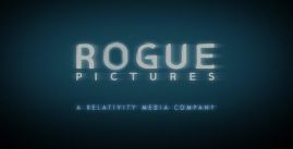
- After Relativity Media's acquisition of Rogue, the logo became slightly updated. At the end of the logo, a byline fades in (in the same shade of blue) that says "A RELATIVITY MEDIA COMPANY". This variant can only be seen on The Unborn and The Last House on the Left.
- A still version can be seen on the video game Balls of Fury for the Nintendo DS.
- The last two films with this logo, Fighting and A Perfect Getaway, have an extended variation of the logo. The word “PICTURES” is removed and replaced with a Relativity Media byline. The logo then burns away to a white background, then a test card with “THIS IS NOT A TEST” in the middle between two circles with random images (a car, a fist, the letters “IM” and “RU”, a film camera, a man in a suit, a woman, a pair of lips, and the letters “R” and “U”) appears. The end of the logo is played again, then the letters move off screen and come back to form "IAMROGUE.COM" in the same style as “ROGUE”. The words “ARE YOU?” fade in below, and in the case of A Perfect Getaway, “TEXT 44666” also appears below. The entire logo slides up to a black background or the opening of the movie.
- On the American release of Hot Fuzz, parts of the animation are looped in order to plaster the 1997 Universal Studios logo.
FX/SFX: The static speed of the logo.
Music/Sounds: Static music that goes with the static feel of the logo. The extended version starts with a synth note, along with some whooshes that sync to the animation. When the test card appears, the sound of a vibraphone repeating along with some beeping in the background is heard, as well as a man saying "This is not a test." A quieter version of the standard music is heard when the logo returns, and finally, the same man says "Are you rogue?" at the end. This version can only be heard on A Perfect Getaway.
Availability: Common. Can be found on all their films from 2004 to 2009.
Editor's Note: None.
3rd Logo
(May 21, 2010-January 25, 2013, September 9, 2016)
 <iframe frameborder="0" height="183" src="http://wikifoundrytools.com/wiki/closinglogos/widget/genericvideo/dba2a5ea34ddcd64c633908deceb8eec4a523a04" width="327"></iframe>
Nicknames: "The Thunder", "The Metal Box", "The Door"
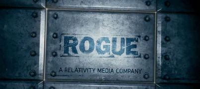
Logo: We start out with thunder (most likely that of a storm). The camera begins to move right and we see that it looks like a heavy metal box with the word "ROGUE" on it. The camera pulls back and then the byline "A RELATIVITY MEDIA COMPANY" fades in below. There are also sparks around the logo. Suddenly, the box opens like a door, revealing a gold outline behind it, then zooms up, filling the screen with a white background. On the white background, the website URL "IAMROGUE.COM" (with "ROGUE" in the same font as on the metal box) fades in, and zooms in. "ARE YOU?" fades in below a few seconds later. Both zoom in quickly.
Variant: On some films, the box opens to a black background, leaving out the last part of the logo.
FX/SFX: The pan through the logo and the box opening.
Music/Sounds: The thunderclap and the door creaking.
Availability: Uncommon. Seen on films from the studio during its last few years of existence under Relativity Media, such as MacGruber, My Soul to Take, Skyline, Season of the Witch, and Take Me Home Tonight, among others. It can also be seen on set video journals for The Dark Fields and Immortals. Also seen on The Disappointments Room released on September 9, 2016.
Editor's Note: None.