Rock 'N Learn
Jump to navigation
Jump to search
2nd Logo
(2001-)
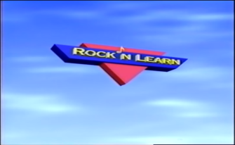
Logo: As we are zooming amongst a space background, we see a very quickly spinning Rock 'N Learn logo. As that happens for the first few seconds, the background switches to a set of blue waves, with turquoise and red-orange ribbons flying around the background. A few seconds later, the logo starts to spin slower and slower until the logo flashes. We see the fully formed logo on a light blue wave-y background, but this time the blue trapezoid is black. Surrounding the logo but expanding away from it is a blue wave.
Variant: There is a newer version as of January 2010. The background is now a darker shade of blue, the logo is a more kid-friendly version (the logo looks more 3D, the music note now holds the N; no apostrophe, and the lettering is aligned randomly as many other kiddish logos do so), and the blue wave has been removed. Also we see the title of the feature below the logo.
FX/SFX: Pretty much everything in the logo.
Music/Sounds: A catchy fanfare with synth notes at the end.
Availability: Common for both variants. Can be seen on their current video lineup. The first feature to use this logo was Telling Time.
Editor's Note: None.
Logo descriptions and capture by GoAnimateFan199Pro
Video captures courtesy of Charles Loftus
Complied by GoAnimateFan199Pro
Background: Rock 'N Learn is an educational video company founded in 1987. Their material is targeted towards children between the age range of 2 to 18.
1st Logo
(1997-2001)
 <iframe frameborder="0" height="207" src="http://wikifoundrytools.com/wiki/closinglogos/widget/unknown/12210d683930226f30a51fe7bc3f5af0ce1f35c8" width="275"></iframe>
Logo: We fade in to a sunrise sky background with clouds. Across the corners of the screen, we see (all in 3D) a red triangle (top center; spinning horizontally), a music note (bottom left; spinning counterclockwise), an stretched trapezoid (top left; spinning counterclockwise), and the logo's title (top right; spinning clockwise) slowly forming the Rock 'N Learn logo. As that happens the sky background becomes blue. Later the triangle and the trapezoid meet and merge with each other, causing a flickering flash. "Rock N Learn" rests on the trapezoid, and the music note rests on top of the "N", acting as an apostrophe. The text shines, then a ball flies from the bottom left of the screen and around the logo. "presents" fades in below the logo, causing the logo to flash. The ball then heads towards the screen and turns white to fill the screen. The screen later fades to the feature's title card.
FX/SFX: The background shifting from sunrise to solar noon, the logo forming.
Music/Sounds: 2 long droning rock/synth notes, muffling themselves during the finished product. Bell notes follow.
Availability: Scarce. Can be seen on their video lineup of the time. The last feature to use this logo was Phonics.
Editor's Note: None.
2nd Logo
(2001-)
<iframe frameborder="0" height="207" src="http://wikifoundrytools.com/wiki/closinglogos/widget/unknown/225310118fd3d80b2b31163d929ca02b35cbd0e4" width="275"></iframe><iframe frameborder="0" height="207" src="http://wikifoundrytools.com/wiki/closinglogos/widget/unknown/c972b810df99b3b98439e8ae45014abcf6217173" width="275"></iframe>
Logo: As we are zooming amongst a space background, we see a very quickly spinning Rock 'N Learn logo. As that happens for the first few seconds, the background switches to a set of blue waves, with turquoise and red-orange ribbons flying around the background. A few seconds later, the logo starts to spin slower and slower until the logo flashes. We see the fully formed logo on a light blue wave-y background, but this time the blue trapezoid is black. Surrounding the logo but expanding away from it is a blue wave.
Variant: There is a newer version as of January 2010. The background is now a darker shade of blue, the logo is a more kid-friendly version (the logo looks more 3D, the music note now holds the N; no apostrophe, and the lettering is aligned randomly as many other kiddish logos do so), and the blue wave has been removed. Also we see the title of the feature below the logo.
FX/SFX: Pretty much everything in the logo.
Music/Sounds: A catchy fanfare with synth notes at the end.
Availability: Common for both variants. Can be seen on their current video lineup. The first feature to use this logo was Telling Time.
Editor's Note: None.