RLJE Films
Jump to navigation
Jump to search
Logo descriptions by Eli Lamoreaux and TeamLogo
Video captures courtesy of Benjamin Peeples, Enormous Rat and Image Entertainment's official YouTube channel
Background: Image Entertainment Inc. was founded in 1981 as a distributor of Laserdiscs and became a dominant distributor of the format. Once DVDs were dominating Laserdiscs and rivaling VHS in the late 1990's, Image re-focused its output distribution to DVDs. They have released a wide variety of entertainment including feature films, TV series, and music programs. In 2012, Image was acquired by RLJ Acquisition, Inc. and was merged with another purchase, Acorn Media. It was a subsidiary of RLJ Entertainment until in 2018, when the company was renamed to RLJE Films.
1st Logo
(1983-1989)
 <iframe frameborder="0" height="195" src="http://wikifoundrytools.com/wiki/closinglogos/widget/unknown/adf1c64bf7b986c7d7138a910f9c560e5fa5139e" width="245"></iframe>
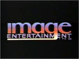
Nicknames: "Discs in the City", "Flying Discs"
Logo: On a sunset background of a city, we see flying discs zooming in on us, with the logo spinning around and zooming in at the same time. The logo rests in place and the BG fades to black, leaving the logo in place. The logo reads "IMAGE (in a blue to yellow font and the g's tail stretched to the left) ENTERTAINMENT INC".
FX/SFX: The discs and the logo flying.
Music/Sounds: A short synthesized melody that loops 7 times.
Availability: Rare. Seen on releases of the time, mainly adult titles, which are very hard to find.
Editor's Note: The logo may get some people with its cheesy effects, and music.
2nd Logo
(1989-1998)
<iframe frameborder="0" height="207" src="http://wikifoundrytools.com/wiki/closinglogos/widget/youtubevideo/f9d654aa8cc6a7ee44f4b34003c99b0066eba04f" width="368"></iframe>
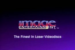
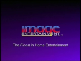
Nicknames: "The Laser", "How a Videodisc Works"
Logo: On a blue background, we see the inside layer of a videodisc. A laser suddenly hits it creating a ray of light. The laser travels around the layer and we zoom out to reveal two layers covering the layer creating a videodisc with the Image logo on it. The logo flies out of the disk and rests in the middle with the laser vanishing and the disc leaving the screen. The words "ENTERTAINMENT INC" fades in. A byline fades in saying "The Finest in Laser Videodiscs".
Variants:
FX/SFX: Impressive FX on the laser, disc and the logo here!
Music/Sounds: A dramatically ascending majestic fanfare accompanied by the laser's scrapping, followed by a more calming synth choir and some bell notes.
Availability: Uncommon. It can be seen on Laserdiscs and DVD releases of the time.
Editor's Note: This logo has gained lots of likes for its synth orchestra and powerful computer animation. Knowing that the sudden sounds and fanfare may put some people off, it's still a cool logo.
3rd Logo
(1998-2009)
<embed allowfullscreen="true" height="195" src="http://wikifoundrytools.com/wiki/closinglogos/widget/youtubevideo/9f78026c0fbf568936bdee93f61075856fd5c0d8" type="application/x-shockwave-flash" width="245" wmode="transparent"/>
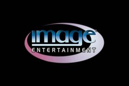
Nickname: "The Ring"
Logo: On a black background, a light blue ring zooms out, while the word "IMAGE" appears turning counterclockwise one letter at a time. The words "ENTERTAINMENT" fades in zooming out. The company's web address, <a class="external" href="http://www.image-entertainment.com/" rel="nofollow" target="_blank">www.image-entertainment.com</a>, fades in. The logo then fades out and the ring zooms out disappearing in the background, leaving the web address remaining.
Variants:
FX/SFX: The ring zooming out, the letters turning, and the logo fading in and out.
Music/Sounds: A soft piece accompanied by a flute and a horn. On most releases, the logo is silent.
Availability: Common. Seen on their DVD releases of the time.
Editor's Note: The logo suffers from basic animation in contrast to the previous logo, looking like it was made in a video editor. The music is beautiful and soothing, however.
4th Logo
(2009-2018)
 <embed allowfullscreen="true" height="195" src="http://wikifoundrytools.com/wiki/closinglogos/widget/youtubevideo/9b4be9a18ceb28585ea12d52b576d2eb6e963ab7" type="application/x-shockwave-flash" width="245" wmode="transparent"/>
Nickname: "Cubes"
Logo: A spectrum of small cubes suddenly zooms in quickly! A ball of cubes is broken up and a trial of small cubes travels around in a neutron like way. The words "IMAGE ENTERTAINMENT" (in a different font than before) appears and turns counterclockwise. The last trial of cubes turns red and they rest on the "I" with a cine of light, leaving one red cube above the "I".
Variant: On some releases, an abridged version is used.
Nickname: TBA
Logo: TBA
Video captures courtesy of Benjamin Peeples, Enormous Rat and Image Entertainment's official YouTube channel
Background: Image Entertainment Inc. was founded in 1981 as a distributor of Laserdiscs and became a dominant distributor of the format. Once DVDs were dominating Laserdiscs and rivaling VHS in the late 1990's, Image re-focused its output distribution to DVDs. They have released a wide variety of entertainment including feature films, TV series, and music programs. In 2012, Image was acquired by RLJ Acquisition, Inc. and was merged with another purchase, Acorn Media. It was a subsidiary of RLJ Entertainment until in 2018, when the company was renamed to RLJE Films.
1st Logo
(1983-1989)
 <iframe frameborder="0" height="195" src="http://wikifoundrytools.com/wiki/closinglogos/widget/unknown/adf1c64bf7b986c7d7138a910f9c560e5fa5139e" width="245"></iframe>
Nicknames: "Discs in the City", "Flying Discs"
Logo: On a sunset background of a city, we see flying discs zooming in on us, with the logo spinning around and zooming in at the same time. The logo rests in place and the BG fades to black, leaving the logo in place. The logo reads "IMAGE (in a blue to yellow font and the g's tail stretched to the left) ENTERTAINMENT INC".
FX/SFX: The discs and the logo flying.
Music/Sounds: A short synthesized melody that loops 7 times.
Availability: Rare. Seen on releases of the time, mainly adult titles, which are very hard to find.
Editor's Note: The logo may get some people with its cheesy effects, and music.
2nd Logo
(1989-1998)


<iframe frameborder="0" height="207" src="http://wikifoundrytools.com/wiki/closinglogos/widget/youtubevideo/f9d654aa8cc6a7ee44f4b34003c99b0066eba04f" width="368"></iframe>
Nicknames: "The Laser", "How a Videodisc Works"
Logo: On a blue background, we see the inside layer of a videodisc. A laser suddenly hits it creating a ray of light. The laser travels around the layer and we zoom out to reveal two layers covering the layer creating a videodisc with the Image logo on it. The logo flies out of the disk and rests in the middle with the laser vanishing and the disc leaving the screen. The words "ENTERTAINMENT INC" fades in. A byline fades in saying "The Finest in Laser Videodiscs".
Variants:
- On some releases, the logo fades to a screen that reads "A feature presentation".
- When Image began expanding to DVD, the byline was changed to read "The Finest in Home Entertainment".
- On some releases, there is no byline.
FX/SFX: Impressive FX on the laser, disc and the logo here!
Music/Sounds: A dramatically ascending majestic fanfare accompanied by the laser's scrapping, followed by a more calming synth choir and some bell notes.
Availability: Uncommon. It can be seen on Laserdiscs and DVD releases of the time.
Editor's Note: This logo has gained lots of likes for its synth orchestra and powerful computer animation. Knowing that the sudden sounds and fanfare may put some people off, it's still a cool logo.
3rd Logo
(1998-2009)


<embed allowfullscreen="true" height="195" src="http://wikifoundrytools.com/wiki/closinglogos/widget/youtubevideo/9f78026c0fbf568936bdee93f61075856fd5c0d8" type="application/x-shockwave-flash" width="245" wmode="transparent"/>
Nickname: "The Ring"
Logo: On a black background, a light blue ring zooms out, while the word "IMAGE" appears turning counterclockwise one letter at a time. The words "ENTERTAINMENT" fades in zooming out. The company's web address, <a class="external" href="http://www.image-entertainment.com/" rel="nofollow" target="_blank">www.image-entertainment.com</a>, fades in. The logo then fades out and the ring zooms out disappearing in the background, leaving the web address remaining.
Variants:
- There is a trailer version coming up in gray color with no ring.
- Another colored version without the ring appears on the trailer for My Name is Bruce.
FX/SFX: The ring zooming out, the letters turning, and the logo fading in and out.
Music/Sounds: A soft piece accompanied by a flute and a horn. On most releases, the logo is silent.
Availability: Common. Seen on their DVD releases of the time.
Editor's Note: The logo suffers from basic animation in contrast to the previous logo, looking like it was made in a video editor. The music is beautiful and soothing, however.
4th Logo
(2009-2018)
 <embed allowfullscreen="true" height="195" src="http://wikifoundrytools.com/wiki/closinglogos/widget/youtubevideo/9b4be9a18ceb28585ea12d52b576d2eb6e963ab7" type="application/x-shockwave-flash" width="245" wmode="transparent"/>
Nickname: "Cubes"
Logo: A spectrum of small cubes suddenly zooms in quickly! A ball of cubes is broken up and a trial of small cubes travels around in a neutron like way. The words "IMAGE ENTERTAINMENT" (in a different font than before) appears and turns counterclockwise. The last trial of cubes turns red and they rest on the "I" with a cine of light, leaving one red cube above the "I".
Variant: On some releases, an abridged version is used.
FX/SFX: CGI animation for the entire logo.
Music/Sounds: The cubes whooshing accompanied by a peaceful melody, which is a remix of the previous logo's music. A small note is played when the cube rests. Sometimes, the logo is silent.
Availability: Common. Also seen on current theatrical releases (since Image has grown into a film producing company along with distributing other companies' titles)
Editor's Note: Much better than the previous logo, but the music is still beautiful and soothing like the other.
5th Logo
(2018-)
Logo: TBA
FX/SFX: All of the CGI animation for the entire logo which may possibly be simple.
Music/Sounds: TBA
Availability: TBA
Editor's Note: Despite startling first-time viewers, it's still a nice logo. But its annoying for those who like the previous logos better.
Music/Sounds: TBA
Availability: TBA
Editor's Note: Despite startling first-time viewers, it's still a nice logo. But its annoying for those who like the previous logos better.