Print Logos - Warner Bros. Pictures
Jump to navigation
Jump to search


7th Print Logo
(1948-1952)
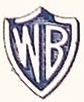
Logo: A white and blue abstract shield with the initials "WB" inside.
.
8th Print Logo
(1953-1967, October 2, 1987-)


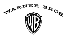
Logo: A redrawn shield outline with the redrawn "WB" inside.
Notes:


Logo: Same as before, but the shield is fatter and it has the banner with it reading "WARNER BROS. PICTURES".
Notes:
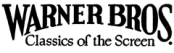
1st Print logo
(1923-1929)

Logo: Just the words "WARNER BROS." with the bottom of the text squeezed into an arch and the words "Classics of the Screen" are seen inside.
.
2nd Print Logo
(1923-1929)

Logo: The shield with the very detailed drawing of a Warner studio and below is an stylized "W-B".
.
3rd Print Logo
(1929-1935)
Logo: Just the stylized flag from the film logo only with "VITAPHONE" in red.
.
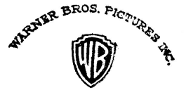
4th Print Logo
(1929-1935)

Logo: The stylized shield containing "WB" inside and the words "WARNER BROS. PICTURES INC." above in an arch.
.
5th Print Logo
(1935-September 1939)

Logo: The stylized shield with "W-B" inside.
.
6th Print Logo
(September 1939-1948)

Logo: The stylized shield with "WB" inside and the banner with "WARNER BROS. PICTURES INC." on top.
.7th Print Logo
(1948-1952)

Logo: A white and blue abstract shield with the initials "WB" inside.
.
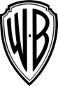
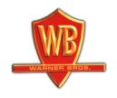
8th Print Logo
(1953-1967, October 2, 1987-)


Logo: A redrawn shield outline with the redrawn "WB" inside.
Notes:
- From 1962 to 1967, it has the words "WARNER BROS. PICTURES INC." in an arch above it.
- The shield can sometimes be inverted.
- The shield at one point was used in from Early-Mid 2000's with a USA flag as the background.
- Starting in 1985, The words "WARNER BROS. PICTURES" or "WARNER BROS." can be seen next to it with the byline and the copyright stamp.
- Sometimes, it would be bylineness.
- It can be used in tandem with the 13th print logo.
- On trailer 1 of Dunkirk, the shield has a dark blue/light blue/white gradient.
9th Print Logo
(1967-1970)

Logo: The Stylized shield with the combined "W" and "7" inside.
.
10th Print Logo
(1969-1972)

Logo: Just the Red Kinney Shield from the movie logo except there is "WARNER BROS." inside the rectangle instead of the byline of the time.
.
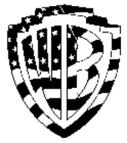
11th Print Logo
(1972, 1984-2001)

Logo: An black outline of the shield with the initials "WB" inside in style of the movie logo.
.
12th Print Logo
(1972-1984)

Logo: An black rounded box with the \\' inside.
Note: The box can be coloured blue, like the Warner Home Video at the time.
Note: The box can be coloured blue, like the Warner Home Video at the time.
Trivia: This is still used as a logo today for other Warner properties (mainly the now-unrelated Warner Music Group), and the stylized typeface was used for WB's home video division from 1977 to 1997.
.
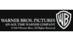
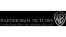
13th Print logo
(1993-)
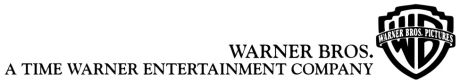

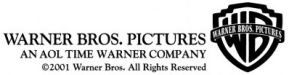

(1993-)


Logo: Same as before, but the shield is fatter and it has the banner with it reading "WARNER BROS. PICTURES".
Notes:
- From 2001 to 2003, the AOL Time Warner byline is used.
- From 2003 onwards, the copyright stamp is used. The TimeWarner byline can sometimes be used.
- In 1998, for the company's 75th Anniversary, The shield is placed on a box with the border inside and "75 YEARS" on top and "ENTERTAINING THE WORLD" below.
- It can be used in tandem with the 8th print logo.