Paramount Home Entertainment Warning Screen
Jump to navigation
Jump to search
As of 2013, no warning screens or bumpers will be edited on here anymore. Head on over to <a class="external" href="http://companybumpers.wikifoundry.com/" rel="nofollow" target="_blank">the new, separate wiki</a> please.
Warning descriptions by SonicRacer and wisp2007
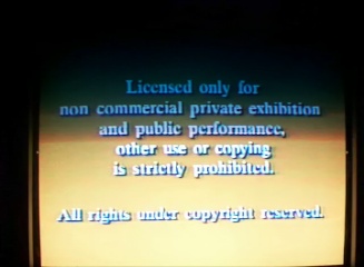
1st Warning
(1976-1979)
 Nicknames: "Warning of Tepidity", "The World's Most Boring Warning"
Warning: We see on a dark blue background the warning text in white. The 1976 Paramount Home Video logo precedes this.
FX/SFX: The fade-in transformation from the logo to the Warning.
Music: None.
Availability: Seen on Betamax releases and a few VHS releases with the 1976 Paramount Home Video logo.
Scare Factor: None, not scary, just boring.
2nd Warning
(1979-1989) 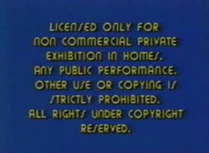
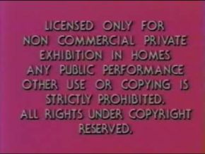
Nicknames: "Acid Trip", "Taste the Rainbow", "Flowing Colors"
Warning: On a background of changing colors (green, yellow, red, pink, purple, blue, and green again) [ala the 1989-2004 MGM/UA Home Video logo] appears the warning text in white in large lettering in a Kabel font.
Early Variant: There is an early variation where the text is smaller and in a different font (Bauhaus 93), and in yellow instead of white. This was used until 1984.
FX/SFX: The changing colors.
Music: None.
Availability: Seen on all releases from this era. The Bauhaus variant can be seen on tapes including later prints of the original release of Grease. The variant is also spotted on Star Trek Paramount tapes from the 1980s (with "Paramount HOME VIDEO" on the side and the Gulf+Western print mountain on the other.)
Scare Factor: Low.
3rd Warning
(1989)
Warning: On a brown gradient background, appears the warning text in white, and in a different font (Times New Roman).
FX/SFX: Same as the previous screen.
Music: None.
Availability: Extremely rare. Spotted on a 1989 VHS release of Star Trek: The Animated Series - Volume Five.
Scare Factor: Low.
4th Warning
(1987-2005)
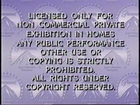
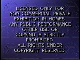
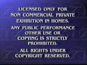
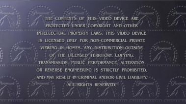 Nicknames: "The Print Paramountains", "Warning of Boredom", "Feature Presentation just Died"
Warning: Transforming from the zooming-in of "FEATURE PRESENTATION" from the then-current Paramount Home Video logo of the era, we see a wallpaper with the Paramount logo all over it. We see the standard Warning in a different font than the previous ones, similar to one used on Jeopardy!.
Variant: In 1995, the font became somewhat more modern looking.
Color Backgrounds:
Bylines:
Variants:
FX/SFX: The transformation from the "FEATURE PRESENTATION" zoom-in to the Warning.
Music: None.
Availability: Seen on all videos from this period. The gray-colored BG varient can be found on most Paramount DVDs.
Scare Factor: None, unless you want to count the transformation from the "Feature Presentation" to the Warning.
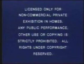
5th Warning
(2002-)
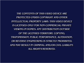
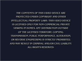
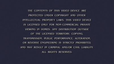
Nicknames: "The Not-So-Scary-as-Heck Warning", "Where's the Paramountains"
Warning: On a navy blue background, we see the Warning text, in English on the first screen, and Spanish on the second screen. On most tapes, the Spanish screen isn't there.
Variant: Sometimes, the background is eggplant-colored.
FX/SFX: None, unless you want to count the transformation from English to Spanish on some DVDs.
Music: None.
Availability: Current on all Paramount releases from 2002-present and DreamWorks releases from 2006-2011.
Scare Factor: None.
For international warnings, see CIC Video Warning Screen.
Warning descriptions by SonicRacer and wisp2007
1st Warning
(1976-1979)

Warning: We see on a dark blue background the warning text in white. The 1976 Paramount Home Video logo precedes this.
FX/SFX: The fade-in transformation from the logo to the Warning.
Music: None.
Availability: Seen on Betamax releases and a few VHS releases with the 1976 Paramount Home Video logo.
Scare Factor: None, not scary, just boring.
2nd Warning
(1979-1989)


<embed allowfullscreen="true" height="225" src="http://widget.wetpaintserv.us/wiki/closinglogos/widget/youtubevideo/6a5c49009d602b440293a2e4560b080456771d6b" type="application/x-shockwave-flash" width="273" wmode="transparent"/><embed align="bottom" allowfullscreen="true" height="225" src="http://widget.wetpaintserv.us/wiki/closinglogos/widget/youtubevideo/692c565d125919d50768816b4aa065c790e53048" type="application/x-shockwave-flash" width="273" wmode="transparent"/>
Nicknames: "Acid Trip", "Taste the Rainbow", "Flowing Colors"
Warning: On a background of changing colors (green, yellow, red, pink, purple, blue, and green again) [ala the 1989-2004 MGM/UA Home Video logo] appears the warning text in white in large lettering in a Kabel font.
Early Variant: There is an early variation where the text is smaller and in a different font (Bauhaus 93), and in yellow instead of white. This was used until 1984.
FX/SFX: The changing colors.
Music: None.
Availability: Seen on all releases from this era. The Bauhaus variant can be seen on tapes including later prints of the original release of Grease. The variant is also spotted on Star Trek Paramount tapes from the 1980s (with "Paramount HOME VIDEO" on the side and the Gulf+Western print mountain on the other.)
Scare Factor: Low.
3rd Warning
(1989)

Warning: On a brown gradient background, appears the warning text in white, and in a different font (Times New Roman).
FX/SFX: Same as the previous screen.
Music: None.
Availability: Extremely rare. Spotted on a 1989 VHS release of Star Trek: The Animated Series - Volume Five.
Scare Factor: Low.
4th Warning
(1987-2005)


Warning: Transforming from the zooming-in of "FEATURE PRESENTATION" from the then-current Paramount Home Video logo of the era, we see a wallpaper with the Paramount logo all over it. We see the standard Warning in a different font than the previous ones, similar to one used on Jeopardy!.
Variant: In 1995, the font became somewhat more modern looking.
Color Backgrounds:
- 1987-1989: Mauve/white gradient.
- 1989-2005: Dark blue gradient.
Bylines:
- 1987-1989: A Gulf+Western Company
- 1989-1995: A Paramount Communications Company
- 1995-2005: A Viacom Company (in the Viacom Wigga-Wigga font)
Variants:
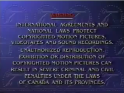
- One variant had the background in light/dark gray gradient and had more text as well. Seen on most Paramount DVD releases from 1999-2002, such as Wayne's World, Black Sheep and South Park: Bigger, Longer & Uncut.
- There is an extremely rare variant on demo tapes (for example, Dollman Vs. Demonic Toys) that asked the viewer to call a certain telephone number and to help prevent video piracy. The text also scrolls up.
- The Canada version has the word WARNING in red.
- A variant from 2002 had the text (written in the pre-1995 font) on a plain blue background. This is seen with the special Paramount "Feature Presentation" logo from that year.
- On the 1998 VHS of Titanic, because it didn't contain the "Feature Presentation" logo, this screen instead faded in from black.
FX/SFX: The transformation from the "FEATURE PRESENTATION" zoom-in to the Warning.
Music: None.
Availability: Seen on all videos from this period. The gray-colored BG varient can be found on most Paramount DVDs.
Scare Factor: None, unless you want to count the transformation from the "Feature Presentation" to the Warning.
5th Warning
(2002-)


Nicknames: "The Not-So-Scary-as-Heck Warning", "Where's the Paramountains"
Warning: On a navy blue background, we see the Warning text, in English on the first screen, and Spanish on the second screen. On most tapes, the Spanish screen isn't there.
Variant: Sometimes, the background is eggplant-colored.
FX/SFX: None, unless you want to count the transformation from English to Spanish on some DVDs.
Music: None.
Availability: Current on all Paramount releases from 2002-present and DreamWorks releases from 2006-2011.
Scare Factor: None.
For international warnings, see CIC Video Warning Screen.