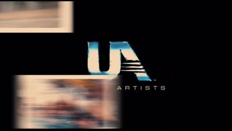
Logo Variations - United Artists
Jump to navigation
Jump to search
Logo descriptions by Sean Beard, Matt Williams, Nicholas Aczel, indycar and others.
Image captures by indycar
Images, up-to-date and design by Eric S.
_______________________________________________________________________________________
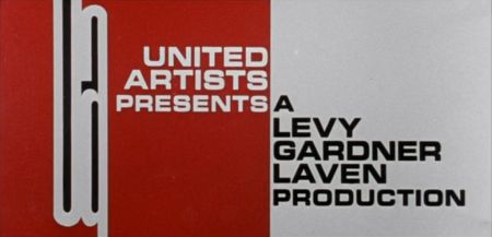
Clambake (1967): A peculiar, stretched-out, lowercase "ua" appears on a red background with "UNITED ARTISTS PRESENTS" next to it. A white screen is seen next to the logo that says "A LEVY GARDNER LAVEN PRODUCTION".
_____________________________________________________________________________________
Midnight Cowboy (1969): The 1968 logo fades to a white screen from an abandoned drive-in.
On some more recent prints, it's the 1987 logo that dissolves to the screen.
_______________________________________________________________________________________
Sleeper (1973): The 1968 logo is black & white and has a jazzy tune playing over it. Usually replaced with a later logo on current prints; however, it has turned up in widescreen on a TCM Australia airing.
_______________________________________________________________________________________
Sleep with Me (1994): The 1982 logo is used.
______________________________________________________________________________________
Undertow (2004): The 1982 logo is used. This was reportedly a creative choice by director David Gordon Green.
_______________________________________________________________________________________
Lions for Lambs (2007): We see the current U\ logo, then the U\ turns red.
 _______________________________________________________________________________________
Hot Tub Time Machine (2010): The logo moves into the opening title.
Images, up-to-date and design by Eric S.
These are the logo variations seen throughout the years by United Artists Pictures.
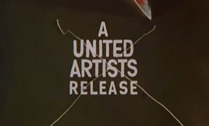
Duel at Diablo (1966): We see the text "A UNITED ARTISTS RELEASE" on a black background. A sword rips and makes an x through the logo. Then, the sword slices down, which make the rips of the logo fly back, revealing the opening scene of the film.

_________________________________________________________________________________________________
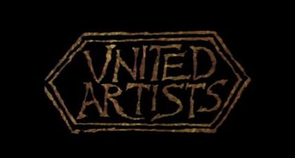
A Funny Thing Happened on the Way to the Forum (1966): The logo is written in a messy Roman font and is spelled "VNITED ARTISTS".

_______________________________________________________________________________________
Clambake (1967): A peculiar, stretched-out, lowercase "ua" appears on a red background with "UNITED ARTISTS PRESENTS" next to it. A white screen is seen next to the logo that says "A LEVY GARDNER LAVEN PRODUCTION".

_______________________________________________________________________________________
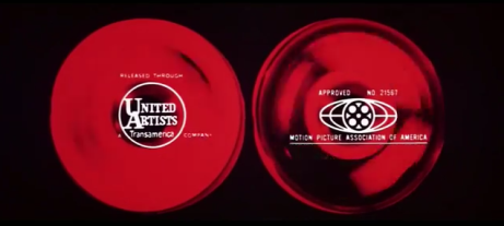
Billion Dollar Brain (1967): The 1967 logo appears superimposed on a record player at the end of the film. The Motion Picture Association of America logo appears on the right.
Billion Dollar Brain (1967): The 1967 logo appears superimposed on a record player at the end of the film. The Motion Picture Association of America logo appears on the right.

_____________________________________________________________________________________
Midnight Cowboy (1969): The 1968 logo fades to a white screen from an abandoned drive-in.

On some more recent prints, it's the 1987 logo that dissolves to the screen.

_______________________________________________________________________________________
Sleeper (1973): The 1968 logo is black & white and has a jazzy tune playing over it. Usually replaced with a later logo on current prints; however, it has turned up in widescreen on a TCM Australia airing.

_______________________________________________________________________________________
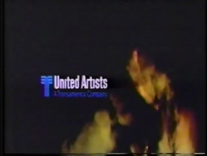
A Bridge Too Far (1977): A special animated variant of the Hexagon logo was created for the film. The name zooms out on a black background, the three hexagon outlines fade in from the center outward, then the background fades in along with the byline "A Transamerica Company" and the Transamerica "T-Flower". Some prints do not contain the Transamerica references.

__________________________________________________________________________
Manhattan (1979):The 1975 logo is in black & white. On most likely the film itself, it's now usually replaced with a later logo on current prints.
__________________________________________________________________________
Apocalypse Now (1979): The 1975 logo is superimposed over the real-life demolition of the Kurtz compound set at the end credits. This only appears on early 35mm copies of the film (which some early TV prints were derived from); all other versions have the end credits rolling on black.
_______________________________________________________________________________________

_______________________________________________________________________________________
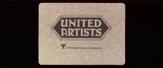
Heaven's Gate (1980): The Hexagon logo is used once again,with a small black and white Transamerica "T-Flower" and the words "A Transamerica Company" fading in underneath. Possibly due to the film's disastrous results at the box office, some prints (such as the MGM DVD releases) do not contain the Transamerica references. The Transamerica byline, however, has been restored on the Criterion Collection DVD & Blu-ray.
_______________________________________________________________________________________Sleep with Me (1994): The 1982 logo is used.
______________________________________________________________________________________
Undertow (2004): The 1982 logo is used. This was reportedly a creative choice by director David Gordon Green.
_______________________________________________________________________________________
Lions for Lambs (2007): We see the current U\ logo, then the U\ turns red.

Hot Tub Time Machine (2010): The logo moves into the opening title.
