Logo Variations - Trailers - United Artists
Jump to navigation
Jump to search
Logo descriptions by Sean Beard, Matt Williams, Nicholas Aczel, and others.
Images, up-to-date and design by Eric S.
Images, up-to-date and design by Eric S.
These are the logo variations seen on trailers throughout the years by United Artists.
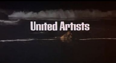
The Long Goodbye (1973): The company name is superimposed over a scene from the movie. Seen at the end of the trailer.
_______________________________________________________________________________________
Manhattan (1979): The 1975 logo is in black & white.
_______________________________________________________________________________________
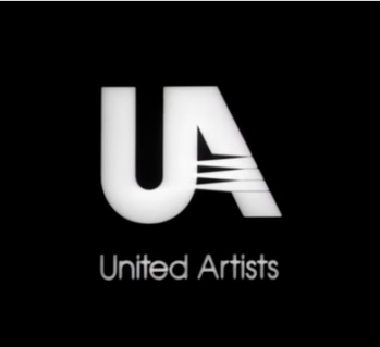
The Living Daylights (1987, 1988 Home Video Trailer): The 1987 logo is in white, and zooms in. Plus, the company name is shifted down a little.
______________________________________________________________________________________
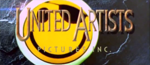
Hackers (1995): The 1994 logo gets eaten by a smiley face wearing an eyepatch.
_______________________________________________________________________________________
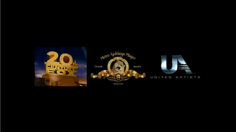
Valkyrie (2008): The logo shifts closer, along with the 20th Century Fox and MGM logos.

_______________________________________________________________________________________
Manhattan (1979): The 1975 logo is in black & white.
_______________________________________________________________________________________
The Living Daylights (1987, 1988 Home Video Trailer): The 1987 logo is in white, and zooms in. Plus, the company name is shifted down a little.

______________________________________________________________________________________
Hackers (1995): The 1994 logo gets eaten by a smiley face wearing an eyepatch.

_______________________________________________________________________________________
Valkyrie (2008): The logo shifts closer, along with the 20th Century Fox and MGM logos.
