GTO (UK)
Jump to navigation
Jump to search
Logo description by katola520
Background: This was a film production and distribution company from the UK.
(1974-1981, 2007)
 <iframe frameborder="0" height="186" src="http://wikifoundrytools.com/wiki/closinglogos/widget/unknown/c1bc7e5a4a8cd00a471c925ff0a5dfd39da1e392" width="329"></iframe>
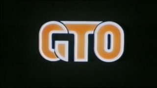
Logo: We see what looks the side or lower outlined parts of three orange block letters streaking downwards on screen. The orange parts continue to streak outwards as white lines resembling those letters slide downwards on screen. As both parts zoom out, we see the full "GTO" in quasi-futuristic lettering with the orange streaks starting to become solid and the white lines now fixed. The logo zooms even farther back until we see only the white outline of the letters.
The logo then moves forward towards us and the orange streaks now fill out the letters. The logo finally stops in the middle of the screen and stays there for a couple of seconds before the screen fades to black.
FX/SFX: The orange lines. Typical 70s animation.
Music/Sounds: A horn fanfare with some wah-wah chords. It has a minor riff that sounds somewhat like the Columbia Pictures Television logo of the 1980's.
Availability: Uncommon. Found in films that were either produced or distributed by that company such as The Last Moments.
Editor's Note: TBA.
Background: This was a film production and distribution company from the UK.
(1974-1981, 2007)
 <iframe frameborder="0" height="186" src="http://wikifoundrytools.com/wiki/closinglogos/widget/unknown/c1bc7e5a4a8cd00a471c925ff0a5dfd39da1e392" width="329"></iframe>
Logo: We see what looks the side or lower outlined parts of three orange block letters streaking downwards on screen. The orange parts continue to streak outwards as white lines resembling those letters slide downwards on screen. As both parts zoom out, we see the full "GTO" in quasi-futuristic lettering with the orange streaks starting to become solid and the white lines now fixed. The logo zooms even farther back until we see only the white outline of the letters.
The logo then moves forward towards us and the orange streaks now fill out the letters. The logo finally stops in the middle of the screen and stays there for a couple of seconds before the screen fades to black.
FX/SFX: The orange lines. Typical 70s animation.
Music/Sounds: A horn fanfare with some wah-wah chords. It has a minor riff that sounds somewhat like the Columbia Pictures Television logo of the 1980's.
Availability: Uncommon. Found in films that were either produced or distributed by that company such as The Last Moments.
Editor's Note: TBA.