Difference between revisions of "Print Logos - MTV"
Jump to navigation
Jump to search

(Created page with "<div class="WPC-editableContent"><div><b>1st Logo (prototype)</b></div><div>(May 5, 1980 - 1981)</div><div></div><div align="center"><img align="bottom" alt="MTV (1st Print Lo...") |
|||
| Line 1: | Line 1: | ||
| − | <div class="WPC-editableContent"><div><b>1st Logo (prototype)</b></div><div>(May 5, 1980 - 1981)</div><div></div><div align="center"> | + | <div class="WPC-editableContent"><div><b>1st Logo (prototype)</b></div><div>(May 5, 1980 - 1981)</div><div></div><div align="center">[[File:E24c1518b8329140434bad0bde0d6c13.png|370px|MTV (1st Print Logo)]]</div><div></div><div><b><u>Logo</u></b>: We see the <b>black</b> letters "<b><i>MTV</i></b><font color="#333333">" with lines connecting each letter together. The line connecting the letters "</font><i><b>M</b></i><font color="#333333">" and "</font><b><i>T</i></b><font color="#333333">" ends with a </font><font color="#cccccc"><b>white</b> </font><font color="#333333">glove-clad hand holding a eighth note symbol. Words underneath read "</font><b>THE MUSIC CHANNEL</b><font color="#333333">" in Eras font, also in black.</font></div><div></div><div></div><div><b>2nd Logo</b></div><div>(August 1st, 1981 - February 7th, 2010)</div><div></div><div></div><div align="center">[[File:613c8cc92b02c8144d76420abe7fe511.png|257px|MTV (2nd Print Logo)]]</div><div align="center"></div><div></div><div align="left"><b><u>Logo</u>:</b><b> </b><font face="Arial, Verdana, Helvetica, sans-serif">We see a large, black, 3-D, block-like "</font><font face="Impact">M</font><font face="Arial, Verdana, Helvetica, sans-serif">" (think of Gill Sans), along with the word "<b>TV</b>" in white overlapping the right of the "</font><font face="Impact">M</font><font face="Arial, Verdana, Helvetica, sans-serif">" done in a graffiti-esque style. Below is a caption in Helvetica reading "</font><font face="Impact">MUSIC TELEVISION</font><font face="Arial, Verdana, Helvetica, sans-serif">", which is also <b>black</b>.</font></div><div align="left"><font face="Arial, Verdana, Helvetica, sans-serif"><br/></font></div><div align="left"><font face="Arial, Verdana, Helvetica, sans-serif"><b><u>Trivia</u>: </b>This logo was designed by Pat Gorman, Frank Olinsky, and Patti Rogoff at Manhattan Design, and was sent to the Fred/Alan design agency who works for Warner-Amex Satellite, the owner of MTV at the time.</font></div><div align="left"><font face="Arial, Verdana, Helvetica, sans-serif"><br/></font></div><div align="left"><b><u>Variations</u>: </b><font color="#333333"><font face="Arial, Verdana, Helvetica, sans-serif">The "</font><font face="Impact">M</font><font face="Arial, Verdana, Helvetica, sans-serif">", the sides of the "</font><font face="Impact">M</font><font face="Arial, Verdana, Helvetica, sans-serif">" and the "<b>TV</b>" text come in differentcolors and variations.</font></font></div><div align="left"></div><div align="left"><b>3rd Logo</b></div><div>(February 8th, 2010 - present)</div><div></div><div></div><div align="center">[[File:49956421ad64018a9c94b41184cd40d2.png|200px|MTV (3rd Print Logo)]]</div><div align="center"></div><div align="center"></div><div align="left"><b><u>Logo</u>: </b>Same as the last logo, except the "<font face="Impact">MUSIC TELEVISION</font><font face="Arial, Verdana, Helvetica, sans-serif">" byline is removed, and the logo itself is cropped and slightly modified.</font></div><br/></div> |
Latest revision as of 23:42, 5 November 2020
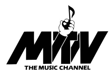
1st Logo (prototype)
(May 5, 1980 - 1981)

Logo: We see the black letters "MTV" with lines connecting each letter together. The line connecting the letters "M" and "T" ends with a white glove-clad hand holding a eighth note symbol. Words underneath read "THE MUSIC CHANNEL" in Eras font, also in black.
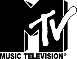
2nd Logo
(August 1st, 1981 - February 7th, 2010)

Logo: We see a large, black, 3-D, block-like "M" (think of Gill Sans), along with the word "TV" in white overlapping the right of the "M" done in a graffiti-esque style. Below is a caption in Helvetica reading "MUSIC TELEVISION", which is also black.
Trivia: This logo was designed by Pat Gorman, Frank Olinsky, and Patti Rogoff at Manhattan Design, and was sent to the Fred/Alan design agency who works for Warner-Amex Satellite, the owner of MTV at the time.
Variations: The "M", the sides of the "M" and the "TV" text come in differentcolors and variations.
3rd Logo
(February 8th, 2010 - present)

Logo: Same as the last logo, except the "MUSIC TELEVISION" byline is removed, and the logo itself is cropped and slightly modified.