KLRN
Jump to navigation
Jump to search
Logo descriptions by gshowguy and Jonathan Hendricks
Logo captures and videos courtesy ofSloshedMail, sptweb and skyoneer2007
Background: KLRN is a PBS affiliate located in San Antonio, Texas.
1st Logo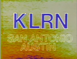 <iframe frameborder="0" height="200" src="http://wikifoundrytools.com/wiki/closinglogos/widget/unknown/4df8abae5f80ba2e665ce8f65b0c1d43ca8c563d" width="267"></iframe>
2nd Logo
(1978-1987?)
Nickname: "The Spinning Star"
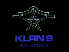
Logo: On a black background, we see a dark sapphire five-pointed star spinning, flat down, then rising up as a "water drop" drops onto the star and red and blue sparkles fly from it (which grows an Alamo-like arch above it) and cause "KLRN 9" to appear in ablue Aero Extended font. Below appears with "SAN ANTONIO" below it, also in blue but in Helvetica. The star turns white.
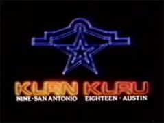
Variant: Until 1984, when KLRU separated, the star animation continued as normal, but the star stays blue, unlike the main logo. "KLRN" (in a yellow-orange outline) and "KLRU" (in a red-orange outline), in Aero Extended are drawn in and "NINE - SAN ANTONIO" and "EIGHTEEN - AUSTIN" (both in white), in Times New Roman appear below.
FX/SFX: The star, sparkles, and forming text. It all turns out to be typical contemporary scanimate effects, but nothing really cheesy at all with the star.
Music/Sounds: A catchy Moog synth disco tune in the normal logo, and a flute and piano rendition in the variant. The latter might actually be the main tune, considering its usage in the 1987 ID and the Southwest Texas Public Broadcasting Council logo. The variant also uses ACL producer Terry Lickona saying "This is public television, KLRN San Antonio and KLRU Austin.".
 Nickname: "The Shine", "White Marble"
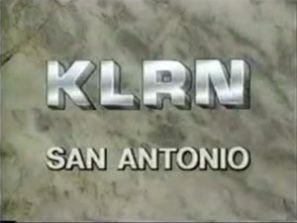
Logo: On a white marble background, we see "KLRN", in 3D form, but in a similar font from the previous logo, over a chyroned "SAN ANTONIO". "KLRN" then shines.
FX/SFX: Just the shine.
Music/Sounds: None.
Availability: Possibly used as a station ID.
Editor's Note: None.
5th Logo
FX/SFX: Better animation and effort than the previous logo.
Music/Sounds: The flute and piano tune from the 2nd logo and an announcer saying "You're watching KLRN TV, Channel 9."
Availability: Likely extinct. It was probably only used as a local ID.
Editor's Note: None.
 <iframe frameborder="0" height="183" src="http://wikifoundrytools.com/wiki/closinglogos/widget/unknown/7eb3b990dbfb8520e4fe106f914bb54fbdde8a7f" width="325"></iframe>
Logo captures and videos courtesy ofSloshedMail, sptweb and skyoneer2007
Background: KLRN is a PBS affiliate located in San Antonio, Texas.
1st Logo
(1976-1978)
 <iframe frameborder="0" height="200" src="http://wikifoundrytools.com/wiki/closinglogos/widget/unknown/4df8abae5f80ba2e665ce8f65b0c1d43ca8c563d" width="267"></iframe>
Logo: We see a yellow sandy background zoom out, revealing "KLRN" in a gray outline on the top. Then, "KLRN", in blue, zooms out to fill in the outline. After that, the outline in "KLRN" turns white, and the stacked words "SAN ANTONIO" and "AUSTIN" appear outlined in white.
FX/SFX: The zooming and the outlined words appearing all of a sudden.
Music/Sounds: Two slightly different warbly synths, followed by a synth chord.
Availability: Seen on 1976-1978 episodes of Austin City Limits.
Editor's Note: The logo is very bright and the music can be headache-inducing.
2nd Logo
(1978-1987?)


<embed height="167" src="http://wikifoundrytools.com/wiki/closinglogos/page/KLRN/widget/youtubevideo/-63445828" type="application/x-shockwave-flash" width="200" wmode="transparent"/>
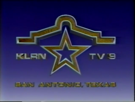
Nickname: "The Spinning Star"
Logo: On a black background, we see a dark sapphire five-pointed star spinning, flat down, then rising up as a "water drop" drops onto the star and red and blue sparkles fly from it (which grows an Alamo-like arch above it) and cause "KLRN 9" to appear in ablue Aero Extended font. Below appears with "SAN ANTONIO" below it, also in blue but in Helvetica. The star turns white.
Trivia: There is sometimes a countdown in which the logo is known as "Animated KLRN Only Logo Jazz".
Variant: Until 1984, when KLRU separated, the star animation continued as normal, but the star stays blue, unlike the main logo. "KLRN" (in a yellow-orange outline) and "KLRU" (in a red-orange outline), in Aero Extended are drawn in and "NINE - SAN ANTONIO" and "EIGHTEEN - AUSTIN" (both in white), in Times New Roman appear below.
FX/SFX: The star, sparkles, and forming text. It all turns out to be typical contemporary scanimate effects, but nothing really cheesy at all with the star.
Music/Sounds: A catchy Moog synth disco tune in the normal logo, and a flute and piano rendition in the variant. The latter might actually be the main tune, considering its usage in the 1987 ID and the Southwest Texas Public Broadcasting Council logo. The variant also uses ACL producer Terry Lickona saying "This is public television, KLRN San Antonio and KLRU Austin.".
Music/Sounds Trivia: The music with the synth is described as "Jazz" in the logo countdown.
Music/Sound Variant: On a 1983 episode of SA Perspective, a continuous series of Morse code "E" beeps play along a repeating uprising 4-note synth-horn arpeggio (sixteenth note C-sharp/D-flat, F-Sharp/G flat, G-Sharp/A flat and C-sharp/D-flat (this one is 12 semitones higher than the first one)). This could be the opening theme. If not, the disco tune presumably debuted in 1983.
Availability: Extremely rare. This was used as a station ID back in the early 1980s. After 1984, it replaced the Southwest Texas Public Broadcasting Council logo for their programming, but not for KLRU. One show that is confirmed to have this is ArtBeat.
Editor's Note: Its a favorite of many due to the cool music and animation.
Logo: On a black background, we see the numbers "9" and "18" in Aero Extended font in white with a rainbow-colored square between the two numbers. Underneath is "KLRN SAN ANTONIO/KLRU AUSTIN" in white.
FX/SFX: None.
Music/Sounds: A funky disco jingle, actually the beginning of "Keep You Eye On the Sparrow" by Earl Klugh. A female announcer says, "You're watching KLRN San Antonio and KLRU Austin."
Availability: Extinct. It was only used as a local ID.
Editor's Note: None.
4th Logo
(1980's-1994)
Editor's Note: Its a favorite of many due to the cool music and animation.
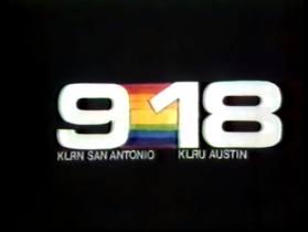
3rd Logo
(1979?-1984)
(1979?-1984)

<iframe frameborder="0" height="204" src="http://wikifoundrytools.com/wiki/closinglogos/widget/genericvideo/e8ff50c4b3e4c4eb26dab3bdab544402d9de4081" width="361"></iframe>
Logo: On a black background, we see the numbers "9" and "18" in Aero Extended font in white with a rainbow-colored square between the two numbers. Underneath is "KLRN SAN ANTONIO/KLRU AUSTIN" in white.
FX/SFX: None.
Music/Sounds: A funky disco jingle, actually the beginning of "Keep You Eye On the Sparrow" by Earl Klugh. A female announcer says, "You're watching KLRN San Antonio and KLRU Austin."
Availability: Extinct. It was only used as a local ID.
Editor's Note: None.
4th Logo
(1980's-1994)
 Nickname: "The Shine", "White Marble"
 Logo: On a white marble background, we see "KLRN", in 3D form, but in a similar font from the previous logo, over a chyroned "SAN ANTONIO". "KLRN" then shines.
FX/SFX: Just the shine.
Music/Sounds: None.
Availability: Possibly used as a station ID.
Editor's Note: None.
5th Logo
(1987-1994)

<iframe frameborder="0" height="183" src="http://wikifoundrytools.com/wiki/closinglogos/widget/genericvideo/37c7f75d8549b118648a933ca847f69818b6df4c" width="324"></iframe><iframe frameborder="0" height="185" src="http://wikifoundrytools.com/wiki/closinglogos/widget/genericvideo/e846132a435d93fb587f952bf5f5903e514113ce" width="329"></iframe>
Logo: On a blue/white gradient background, a outline of the Alamo in teal flies in with it facing flat and quickly rotating up. It zooms out as 8 stars fly behind it and the top of the dome zooms in with a wood texture and white outline as the star in the same texture and the text "KLRN TV 9" in white and still in Aero Extended, fly in. The Alamo outline fades out and "SAN ANTONIO, TEXAS" in brown and Aero Extended flies in below.
FX/SFX: Better animation and effort than the previous logo.
Music/Sounds: The flute and piano tune from the 2nd logo and an announcer saying "You're watching KLRN TV, Channel 9."
Availability: Likely extinct. It was probably only used as a local ID.
Editor's Note: None.
6th Logo
(1994-200?)


<iframe frameborder="0" height="167" src="http://wikifoundrytools.com/wiki/closinglogos/widget/unknown/9442839e5d08b970e2da7f76b839d9d8df978c39" width="222"></iframe><iframe frameborder="0" height="167" src="http://wikifoundrytools.com/wiki/closinglogos/widget/unknown/2b87b1522d79374585cc07642315a26779870161" width="222"></iframe><iframe frameborder="0" height="167" src="http://wikifoundrytools.com/wiki/closinglogos/widget/unknown/9d63400806570f8d1ced5a9b00e0b8029de25e5b" width="222"></iframe>
<iframe frameborder="0" height="164" src="http://wikifoundrytools.com/wiki/closinglogos/widget/genericvideo/f02c91b48cceb4a21af3f608b82855612457362d" width="292"></iframe><iframe frameborder="0" height="167" src="http://wikifoundrytools.com/wiki/closinglogos/widget/genericvideo/d693acdea24a8dabfb1485eef1d4ab289fb2017c" width="295"></iframe>
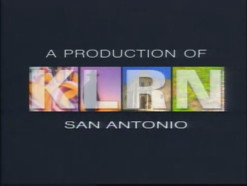
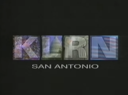
Logo: We first see a zooming out slow motion video of a Jalisco dancer dancing. Half a second later, a still square image of the beginning footage starts fading in on the center left with a "K" on the square. Next, we see an image of a silhouette of a cowboy at sunset, just as another square fades in next to the one with the "K", but with the silhouette image and an "L", . Later, we see a right-tilted angle of shot of the Alamo. It does the same with the previous image, but with the Alamo photo and the "R". Then, we see a few lily pads with Lotus Blossoms at a lake, and it does the same animation square animation with its respective incumbent capture, and the "N". Finally, the words "A PRODUCTION OF" and "SAN ANTONIO" fade in above and below the logo.
Variant: A local variant exists without "A PRODUCTION OF", with different scenes (e.g. balloons, capital, etc), and the K is zoomed in as it slides at the beginning.
FX/SFX: Live action and the fading.
Music/Sounds: First we hear a trumpet fanfare vaguely similar to that of "Jarabe Tapatio". Next, a sound of a nighttime vibe. Then, some knocking sounds, and finally, water. All this is played over a tribal beat which plays to the end. Sometimes, it uses the closing theme of the show.
Music/Sounds Variant: The local variant used a jungle-like score with the same announcer from the previous logo says "This is KLRN-TV, channel 9 in San Antonio."
Availability: Rare, but extinct outside of home media, unless TV stations rerun KLRN productions of the time. It is seen on ArtBeat and San Antonio Remembered.
Editor's Note: None.
7th Logo
(200?-2007)

<iframe frameborder="0" height="183" src="http://wikifoundrytools.com/wiki/closinglogos/widget/genericvideo/c8012efddd8922ec7cc137fa0a4120b07f8834b0" width="324"></iframe><iframe frameborder="0" height="183" src="http://wikifoundrytools.com/wiki/closinglogos/widget/genericvideo/c818eb4d4b7bfdf98a395a46eb1fc16b04b7178e" width="325"></iframe>
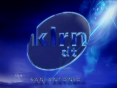
Logo: On a blue sky background with flaring from the sun, we see a glass oval slowly zooming containing the letters "klrn dt" with a charge of lightning going through it. Below is "SAN ANTONIO" chyroned. The logo shines.
FX/SFX: The zooming, charge and shine, all in well-done CGI similar to the 1997 PolyGram Films logo.
Music/Sounds: A longer variant of the 2002 PBS jingle and thunder. Another version has a guitar chorus tune.
Availability: A video shows a sighting on early episodes of Travelscope.
Editor's Note: None.
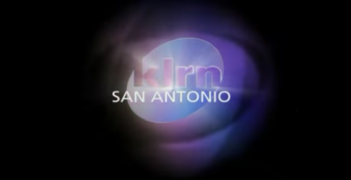
8th Logo
(2007-)
 <iframe frameborder="0" height="183" src="http://wikifoundrytools.com/wiki/closinglogos/widget/unknown/7eb3b990dbfb8520e4fe106f914bb54fbdde8a7f" width="325"></iframe>
Logo: On a black background, we see KLRN's current logo in violet rotate into place behind a drop shadow in the same color. A comet flies by revealing "SAN ANTONIO". A light passes through the logo.
FX/SFX: The rotating, the comet, and the light.
Music/Sounds: A synth note held out throughout followed by a gunshot.
Availability: Unknown, but seen on Heroes.
Editor's Note: None.