KCPT
Jump to navigation
Jump to search
Not to be confused with Los Angeles-based KCET.
Background: KCPT (abbreviated "Kansas City Public Television") is a PBS affiliate located in Kansas City, Missouri. It went on the air on March 29, 1961 as KCSD, and became KCPT in 1972.
1st (known) Logo
(1980)
 <embed allowfullscreen="true" height="227" src="http://wikifoundrytools.com/wiki/closinglogos/widget/youtubevideo/c36cb2dbef6fcadda68671ac98658446712234b6" type="application/x-shockwave-flash" width="301" wmode="transparent"/>Nicknames: "Stacked KCPTs", "Too Many KCPTs"
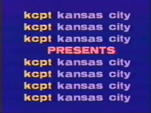
Logo: On a dark blue background, we see eight rows of text appearing one-by-one (from top to bottom):
The text is in a lowercase Annonce font with "kcpt" in yellow and "kansas city" in light blue. The fourth row of text suddenly disappears to make room for the word "PRESENTS" (in all caps), which slowly slides in from the right until it faces the center.
FX/SFX: The rows of text appearing one-by-one and "PRESENTS" sliding in.
Music/Sounds: Unknown, but is likely to be silent and/or has the program's opening credits music.
Availability: Was spotted at the beginning of a local program from 1980 called Songwriters Showcase. Check old recordings for this logo.
Editor's Note: None.
2nd Logo
(1983)
 <iframe frameborder="0" height="230" src="http://wikifoundrytools.com/wiki/closinglogos/widget/unknown/ddd75f34ff3543df76a42f351f3bf8968aa19170" width="306"></iframe>
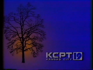
Nicknames: "Autumn Tree"
Logo: On a blue background, we see a silhouette of a large sycamore tree (without leaves) on the left side of the screen. About a second later, an orange glow illuminates the tree from behind. Following this, the KCPT logo with "19" beside it and "KANSAS CITY" underneath appears on the lower right of the screen.
FX/SFX: The "glowing" light behind the tree.
Music/Sounds: The voice of former KCPT president Robert Fuzy says, "KCPT Kansas City -- Channel 19".
Availability: Extinct. Was only used as the local ID.
Editor's Note: None.
3rd Logo
(1983-1984)
 <embed allowfullscreen="true" height="225" src="http://wikifoundrytools.com/wiki/closinglogos/widget/youtubevideo/f54d3cd8198236e15e48c0bb056cc1b998e5e64f" type="application/x-shockwave-flash" width="269" wmode="transparent"/>
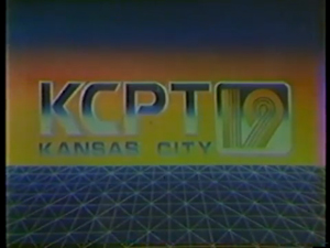
Nicknames: "Weird 19", "Metallic KCPT"
Logo: On a teal/orange/yellow gradient background, we see the KCPT logo in a fancy-cut font with "KANSAS CITY" below that. To the right of the logo is an odd-looking lined "19" in a rounded-edge box. The entire logo is colored with a metallic teal/white gradient. Below the logo is a dark teal-blue field with light blue intersecting lines (straight and diagonal) that form a dodecahedron-like grid.
FX/SFX: None.
Music/Sounds: The voice of former KCPT president Robert Fuzy says, "This is Kansas City Public Television -- KCPT Kansas City, Missouri -- Channel 19". There is no music.
Availability: Extinct. Used as the local station identification, but might show up on old recordings of KCPT produced shows.
Editor's Note: None.
4th Logo A
(1984-1985)
 <embed allowfullscreen="true" height="225" src="http://wikifoundrytools.com/wiki/closinglogos/widget/youtubevideo/13349c26ca0f4cc7485c6e8f17b2d07d6c38071e" type="application/x-shockwave-flash" width="278" wmode="transparent"/>
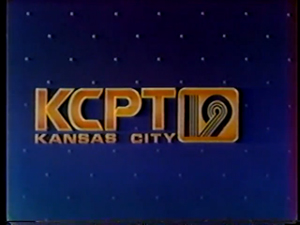
Nicknames: "Gold KCPT"
Logo: On a dark blue background of patterned white dots, we see the same KCPT logo from before now in a chrome gold color.
FX/SFX: Same as 3rd logo.
Music/Sounds: A relaxing six-note tune (comprised of synthesizers) that ends with a piano chord. The voice of Robert Fuzy says, "This is Kansas City Public Television -- KCPT Kansas City, Missouri -- Channel 19".
Availability: Extinct. Used as a station ID.
Editor's Note: None.
Logo: On a blue background with a white grid on it, we see the shiny text:
Editor's Note: None.
5th Logo
(1985-1989)
<embed allowfullscreen="true" height="222" src="http://wikifoundrytools.com/wiki/closinglogos/widget/youtubevideo/d575d58893691c58da3c894f5f31a3bbd1e14a91" type="application/x-shockwave-flash" width="270" wmode="transparent"/> <embed allowfullscreen="true" height="222" src="http://wikifoundrytools.com/wiki/closinglogos/widget/youtubevideo/c3d3b3fc00d92aeaa330e3ff99dee5b7d66d20b6" type="application/x-shockwave-flash" width="257" wmode="transparent"/>
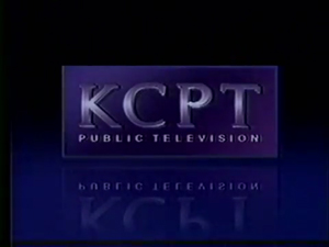
Nicknames: "Glass Rectangle", "Chrome KCPT"
Logo: On a shady blue background, a CGI rectangle (in a glossy purple color) flies in from the top of the screen that bares this logo:
The letters are in a chrome lavender Book Antiqua font with the plain text "PUBLIC TELEVISION" below it. As the rectangle flies in, it rotates counter-clockwise until it faces the viewer head-on. The KCPT letters shimmer as they appear, and a reflection of the logo is visible while all this is happening.
Editor's Note: None.
6th Logo A
(1989-1998)
<embed allowfullscreen="true" height="225" src="http://wikifoundrytools.com/wiki/closinglogos/widget/youtubevideo/0d83b2657bb29571130ceabab08f74b2c248668c" type="application/x-shockwave-flash" width="270" wmode="transparent"/> <embed allowfullscreen="true" height="225" src="http://wikifoundrytools.com/wiki/closinglogos/widget/youtubevideo/55f461f71b656a2c823aa92b437d434ed068a525" type="application/x-shockwave-flash" width="270" wmode="transparent"/> <embed allowfullscreen="true" height="225" src="http://wikifoundrytools.com/wiki/closinglogos/widget/youtubevideo/3da3dd5fda85c76012fc97e0efe78d76a80ba21c" type="application/x-shockwave-flash" width="278" wmode="transparent"/>
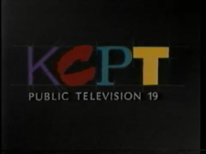
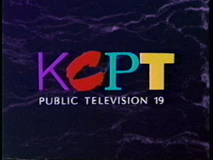
Nicknames: "Random Fonts"
Logo: On a black background we see a blueprint-like sketch formation of the KCPT logo with each letter in a different font. We start at a close angle, then pan across as each letter gets "painted" or "marked" a different color. The K is in a thin sans-serif font colored lavender, the C is in a brushstroke font colored red, the P is in a serif font colored light teal-blue, and the T is in a thick Helvetian font colored yellow. Once the logo pans out to a comfortable distance, the text "PUBLIC TELEVISION 19" fades in below.
Variant: Beginning in 1992, this logo was animated over a purple marble background.
FX/SFX: The painting/stroking/colorizing effects on the KCPT letters.
Music/Sounds: There are also a few variations:
Availability: Uncommon. Should be seen on programs from the era.
Editor's Note: None.
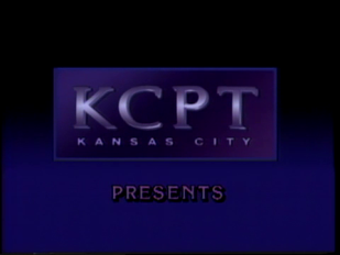
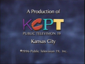
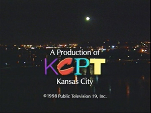
6th Logo B
(1992-2000s)
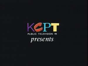
Opening Logo: Just the KCPT logo (the "C" is embossed) with "PUBLIC TELEVISION 19" underneath. Below that is the word "presents" in an italic Times New Roman font.
Closing Logo: An in-credit logo with the text "A Production of" above the KCPT logo and "Kansas City" below that. Toward the bottom is a copyright tag.
FX/SFX: None. The opening version is a still logo and the closing version is in-credit.
Music/Sounds: None for the opening version, but the closing version has the end credits music played over it.
Availability: Seen at the beginning and end of KCPT produced programs from that period, such as Kansas City Week in Review and Ruckus. Also seen on the hard-to-find local produced documentaries Remember Me and Whizzo, Ol' Gus, and Me; both of which were released on VHS.
Editor's Note: None.
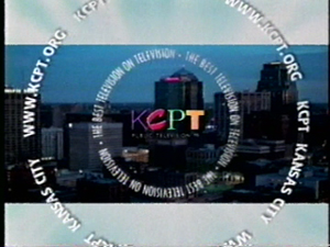
7th Logo
(1998-2000)
 <embed allowfullscreen="true" height="225" src="http://wikifoundrytools.com/wiki/closinglogos/widget/youtubevideo/2ec1caa766a248f3adeb197d007d23ddc73dda7c" type="application/x-shockwave-flash" width="271" wmode="transparent"/>
Nicknames: "Letterbox City"
Logo: Against a letterboxed view Kansas City's skyline (the letterbox bars have the light blue and white light trails from the PBS ident used at the time), we see the same KCPT logo from before with "PUBLIC TELEVISION 19" underneath. Surrounding the logo are two circular rows of text, the inner row containing the slogan "THE BEST TELEVISION ON TELEVISION" and the outer row containing the station's name "KCPT KANSAS CITY" and the website domain "WWW.KCPT.ORG". Both rows of text rotate as the KCPT logo slowly approaches the frame.
Variant: A shortened version of the logo features a view of Bartle Hall's rooftop structure. The announcer says, "KCPT Kansas City".
FX/SFX: The circular rows of rotating text surrounding the KCPT logo.
Music/Sounds: A funky contemporary jazz tune with percussions and bass guitars. The second male announcer from the 5th logo says, "You're Watching KCPT -- The Best Television on Television".
Availability: Extinct. It was only used as the local ID.
Editor's Note: None.
8th Logo
(2000-2002)
Nicknames: "Split Screen", "KCPT Circles"
Logo: On the left side of the screen, we see a light red column with animated circles (and outlined circles) moving in and out on the inside. The KCPT logo is in all black with a circle PBS "P-Head" logo to the right of it. Below that is the text "CHANNEL 19 Kansas City, MO" and toward the bottom is the website domain name "kcpt.org". The column is suspended a bit to fit the width of the KCPT and PBS logos, and there's a dark red border on the outside of the column (with a view of the nighttime skyline inside of that). The remaining right side of the screen is a view of the city's skyline (viewed from the Missouri River) at sunset.
FX/SFX: The animation of the circles inside the column and the movement of the skyline images.
Music/Sounds: Usually a light jazz tune or an acoustic guitar/violin melody; although the music would randomize at times. An announcer (male or female) says, "You're watching KCPT -- Kansas City Public Television".
Availability: Extinct. Another station ID that was only used locally.
Editor's Note: None.
9th Logo A
(2002-2006)
Nicknames: "Light Streaks"
Logo: On a blue/purple/red ethereal background of vertical light streaks (similar to that of the 2002 Corporation for Public Broadcasting logo), we see the KCPT logo with the PBS "P-Head" and the text "KANSAS CITY" in all white. On the bottom of the screen is a small white and navy blue bar with thin lines forming parallel outlines above the white half. Inside the bar are the various town and region names of the city's metropolitan area with the text "KCPT" next to each name. The bottom text in the white half is navy blue and the colors invert as it scrolls slowly from left to right.
FX/SFX: The moving light streaks and the scrolling bottom text.
Music/Sounds: A female announcer that says "You're watching KCPT -- Kansas City Public Television".
Availability: Extinct. It was only used as the local ID.
Editor's Note: None.
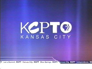
9th Logo B
(2002-2011)
Nicknames: "Zooming Outlines"
Logo: On a black background, we see the KCPT logo with "KANSAS CITY" below that. A second later, neon outlines of the KCPT letters zoom out one-by-one from the base of each letter and blur out of focus.
FX/SFX: The outlines of each letter zooming out of focus.
Music/Sounds: None.
Availability: Seen at the beginning of KCPT produced programs from that period.
Editor's Note: None.
10th Logo
(2006-2012)
Nicknames: "KCPT Circles II"
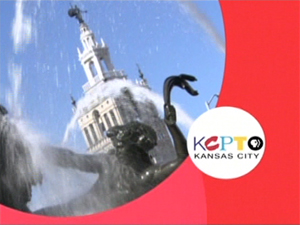
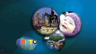
Logo: A large circle (with footage of a statue, monument, or building representing a part of the city) takes up a good portion of the screen, and is bordered by a background of animated circles (usually in bright red, but sometimes in different colors such as green, purple, or yellow). Near the lower right-hand corner is the PBS "P-Head" logo in a black circle, which expands and transforms (fades) to a white circle baring the KCPT logo (with the PBS "P-Head" beside it). The text "KANSAS CITY" wipes across underneath the logo.
FX/SFX: The moving of the circles behind the footage of the city and the PBS logo expanding and changing into the KCPT logo.
Music/Sounds: Usually a soft violin and/or acoustic guitar melody, but the music is somewhat randomized.
Variant: There are several variants of this logo. The generic ID (pictured here) has no announcer, but other IDs that represent the different towns or regions of the metropolitan area has a female announcer that says, "You're watching (REGION NAME)'s public television -- KCPT Kansas City".
Availability: Extinct. It was only used as the local ID.
Editor's Note: None.
11th Logo A
(2011-2016)
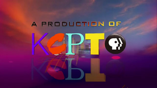

Nicknames: "CGI KC"
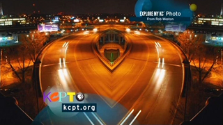
Logo: On a background of a magenta/orange color mesh and blue/pink clouds blended together, we see a CGI rendering of various buildings in Kansas City. This includes the Bartle Hall rooftop structure, the Power & Light building, plus the Sprint Center among others. A bunch of yellow lines forming a grid appear below the buildings (to represent Kansas City's intersecting downtown streets). We then zoom out to reveal each letter of the KCPT logo rotating one-by-one in unison (along with the PBS "P-Head" on the right in a chrome black circle). Right above that, each letter of the text "A PRODUCTION OF" quickly appear one-by-one in a black Bank Gothic font with a gold shine.
FX/SFX: The zooming out of the CGI city and the rotating of the KCPT letters (and the PBS logo).
Music/Sounds: A three-note acoustic guitar sounder.
Availability: Was seen at the beginning of The Local Show, available on KCPT's YouTube channel.
Editor's Note: None.
11th Logo B
(2012-2016)
Nicknames: "KCPT Circles III"
Logo: TBA
FX/SFX: TBA
Music/Sounds: TBA
Availability: Extinct. It was only used as the local ID.
Editor's Note: None.
12th Logo
(2016-)
 Nicknames: "Modern KCPT"
Logo: TBA
FX/SFX: TBA
Music/Sounds: TBA
Availability: Currently in use. It can be seen at the beginning of The Local Show, available on KCPT's YouTube channel.
Editor's Note: None.
Background: KCPT (abbreviated "Kansas City Public Television") is a PBS affiliate located in Kansas City, Missouri. It went on the air on March 29, 1961 as KCSD, and became KCPT in 1972.
1st (known) Logo
(1980)
 <embed allowfullscreen="true" height="227" src="http://wikifoundrytools.com/wiki/closinglogos/widget/youtubevideo/c36cb2dbef6fcadda68671ac98658446712234b6" type="application/x-shockwave-flash" width="301" wmode="transparent"/>
Logo: On a dark blue background, we see eight rows of text appearing one-by-one (from top to bottom):
kcpt kansas city
kcpt kansas city
kcpt kansas city
kcpt kansas city
kcpt kansas city
kcpt kansas city
kcpt kansas city
kcpt kansas city
kcpt kansas city
kcpt kansas city
kcpt kansas city
kcpt kansas city
kcpt kansas city
kcpt kansas city
kcpt kansas city
The text is in a lowercase Annonce font with "kcpt" in yellow and "kansas city" in light blue. The fourth row of text suddenly disappears to make room for the word "PRESENTS" (in all caps), which slowly slides in from the right until it faces the center.
FX/SFX: The rows of text appearing one-by-one and "PRESENTS" sliding in.
Music/Sounds: Unknown, but is likely to be silent and/or has the program's opening credits music.
Availability: Was spotted at the beginning of a local program from 1980 called Songwriters Showcase. Check old recordings for this logo.
Editor's Note: None.
2nd Logo
(1983)
 <iframe frameborder="0" height="230" src="http://wikifoundrytools.com/wiki/closinglogos/widget/unknown/ddd75f34ff3543df76a42f351f3bf8968aa19170" width="306"></iframe>
 Nicknames: "Autumn Tree"
Logo: On a blue background, we see a silhouette of a large sycamore tree (without leaves) on the left side of the screen. About a second later, an orange glow illuminates the tree from behind. Following this, the KCPT logo with "19" beside it and "KANSAS CITY" underneath appears on the lower right of the screen.
FX/SFX: The "glowing" light behind the tree.
Music/Sounds: The voice of former KCPT president Robert Fuzy says, "KCPT Kansas City -- Channel 19".
Availability: Extinct. Was only used as the local ID.
Editor's Note: None.
3rd Logo
(1983-1984)
 <embed allowfullscreen="true" height="225" src="http://wikifoundrytools.com/wiki/closinglogos/widget/youtubevideo/f54d3cd8198236e15e48c0bb056cc1b998e5e64f" type="application/x-shockwave-flash" width="269" wmode="transparent"/>
Nicknames: "Weird 19", "Metallic KCPT"
Logo: On a teal/orange/yellow gradient background, we see the KCPT logo in a fancy-cut font with "KANSAS CITY" below that. To the right of the logo is an odd-looking lined "19" in a rounded-edge box. The entire logo is colored with a metallic teal/white gradient. Below the logo is a dark teal-blue field with light blue intersecting lines (straight and diagonal) that form a dodecahedron-like grid.
FX/SFX: None.
Music/Sounds: The voice of former KCPT president Robert Fuzy says, "This is Kansas City Public Television -- KCPT Kansas City, Missouri -- Channel 19". There is no music.
Availability: Extinct. Used as the local station identification, but might show up on old recordings of KCPT produced shows.
Editor's Note: None.
4th Logo A
(1984-1985)
 <embed allowfullscreen="true" height="225" src="http://wikifoundrytools.com/wiki/closinglogos/widget/youtubevideo/13349c26ca0f4cc7485c6e8f17b2d07d6c38071e" type="application/x-shockwave-flash" width="278" wmode="transparent"/>
Nicknames: "Gold KCPT"
Logo: On a dark blue background of patterned white dots, we see the same KCPT logo from before now in a chrome gold color.
FX/SFX: Same as 3rd logo.
Music/Sounds: A relaxing six-note tune (comprised of synthesizers) that ends with a piano chord. The voice of Robert Fuzy says, "This is Kansas City Public Television -- KCPT Kansas City, Missouri -- Channel 19".
Availability: Extinct. Used as a station ID.
Editor's Note: None.
4th Logo B
(January 1, 1984-1985)
<iframe align="bottom" height="183" src="http://wikifoundrytools.com/wiki/closinglogos/widget/genericvideo/0e3a95e561d2108a9248130fbcad5b7838d2f329" width="324"></iframe>
Logo: On a blue background with a white grid on it, we see the shiny text:
KCPT/19
Kansas City
...in the center. The outlined word "PRESENTS" fades in shortly after.
FX/SFX: The shining of the word, "PRESENTS" fading in. Simple animation.
Music/Sounds: None.
Availability: Ultra rare. Seen on a few episodes of Kansas City Illustrated available on the American Archive of Public Broadcasting.
FX/SFX: The shining of the word, "PRESENTS" fading in. Simple animation.
Music/Sounds: None.
Availability: Ultra rare. Seen on a few episodes of Kansas City Illustrated available on the American Archive of Public Broadcasting.
Editor's Note: None.
5th Logo
(1985-1989)


<embed allowfullscreen="true" height="222" src="http://wikifoundrytools.com/wiki/closinglogos/widget/youtubevideo/d575d58893691c58da3c894f5f31a3bbd1e14a91" type="application/x-shockwave-flash" width="270" wmode="transparent"/> <embed allowfullscreen="true" height="222" src="http://wikifoundrytools.com/wiki/closinglogos/widget/youtubevideo/c3d3b3fc00d92aeaa330e3ff99dee5b7d66d20b6" type="application/x-shockwave-flash" width="257" wmode="transparent"/>
Nicknames: "Glass Rectangle", "Chrome KCPT"
Logo: On a shady blue background, a CGI rectangle (in a glossy purple color) flies in from the top of the screen that bares this logo:
K C P T
The letters are in a chrome lavender Book Antiqua font with the plain text "PUBLIC TELEVISION" below it. As the rectangle flies in, it rotates counter-clockwise until it faces the viewer head-on. The KCPT letters shimmer as they appear, and a reflection of the logo is visible while all this is happening.
Variant: A variant with the words "KANSAS CITY" replacing "PUBLIC TELEVISION", and the word "PRESENTS" seen below exists.
FX/SFX: The flying/rotating of the rectangle and the shimmering of the KCPT letters. It's all nice early computer animation.
Music/Sounds: There are a few variants:
Availability: Uncommon. Old tapes of the series Kansas City Illustrated plus PBS specials (produced by KCPT), pledge drives, and auctions from that period should have this logo. The variant with the 1984 A music was used as a local station ID. The "KANSAS CITY" variant is seen on the 1988 Missouri Governor Candidates Debate, which can be found <a class="external" href="http://americanarchive.org/catalog/cpb-aacip_384-40xpp1rx" rel="nofollow" target="_blank">here</a>.
FX/SFX: The flying/rotating of the rectangle and the shimmering of the KCPT letters. It's all nice early computer animation.
Music/Sounds: There are a few variants:
- The main ID features the same music from the 1984 logo. Once again, the voice of Robert Fuzy says, "This is Kansas City Public Television -- KCPT Kansas City, Missouri -- Channel 19".
- A still version of this logo (with no music) was used. A different announcer says, "You're watching KCPT: Kansas City Public Television".
- As an opener for KCPT produced shows, the music was a light synth tune followed by a soft "woosh" sound effect.
- The "TV Worth Watching" jingle, with mention of "KCPT" in place of "Public TV".
- Sometimes the announcer said "KCPT--Kansas City--Channel 19".
- Another local variant has a news like synth with the announcer saying "You're watching member supported public television in Kansas City--KCPT, channel 19--serving eastern Kansas and western Missouri.
- For the "KANSAS CITY" variant, an 8 note synth bell is used.
Availability: Uncommon. Old tapes of the series Kansas City Illustrated plus PBS specials (produced by KCPT), pledge drives, and auctions from that period should have this logo. The variant with the 1984 A music was used as a local station ID. The "KANSAS CITY" variant is seen on the 1988 Missouri Governor Candidates Debate, which can be found <a class="external" href="http://americanarchive.org/catalog/cpb-aacip_384-40xpp1rx" rel="nofollow" target="_blank">here</a>.
Editor's Note: None.
6th Logo A
(1989-1998)


<embed allowfullscreen="true" height="225" src="http://wikifoundrytools.com/wiki/closinglogos/widget/youtubevideo/0d83b2657bb29571130ceabab08f74b2c248668c" type="application/x-shockwave-flash" width="270" wmode="transparent"/> <embed allowfullscreen="true" height="225" src="http://wikifoundrytools.com/wiki/closinglogos/widget/youtubevideo/55f461f71b656a2c823aa92b437d434ed068a525" type="application/x-shockwave-flash" width="270" wmode="transparent"/> <embed allowfullscreen="true" height="225" src="http://wikifoundrytools.com/wiki/closinglogos/widget/youtubevideo/3da3dd5fda85c76012fc97e0efe78d76a80ba21c" type="application/x-shockwave-flash" width="278" wmode="transparent"/>
Nicknames: "Random Fonts"
Logo: On a black background we see a blueprint-like sketch formation of the KCPT logo with each letter in a different font. We start at a close angle, then pan across as each letter gets "painted" or "marked" a different color. The K is in a thin sans-serif font colored lavender, the C is in a brushstroke font colored red, the P is in a serif font colored light teal-blue, and the T is in a thick Helvetian font colored yellow. Once the logo pans out to a comfortable distance, the text "PUBLIC TELEVISION 19" fades in below.
Variant: Beginning in 1992, this logo was animated over a purple marble background.
FX/SFX: The painting/stroking/colorizing effects on the KCPT letters.
Music/Sounds: There are also a few variations:
- The first variant of the main ID (from 1989) had a light piano/synth chord and a new male announcer (from the 5th logo) that says, "You're watching KCPT -- Kansas City's home for the best in viewer-supported public television".
- The second variant of the main ID (from 1992) had a majestic orchestral theme, which sounds similar to the 1990 Universal Pictures theme. A different announcer says, "The best of adventure, drama, mystery, and nature. It's all yours on television worth watching -- KCPT Channel 19: Kansas City's viewer-supported public television".
- The same synth tune from the 1985 logo (with the "woosh" sound effect) was also used with this logo as an opener for KCPT produced shows until around 1992.
Availability: Uncommon. Should be seen on programs from the era.
Editor's Note: None.
6th Logo B
(1992-2000s)


Opening Logo: Just the KCPT logo (the "C" is embossed) with "PUBLIC TELEVISION 19" underneath. Below that is the word "presents" in an italic Times New Roman font.
Closing Logo: An in-credit logo with the text "A Production of" above the KCPT logo and "Kansas City" below that. Toward the bottom is a copyright tag.
FX/SFX: None. The opening version is a still logo and the closing version is in-credit.
Music/Sounds: None for the opening version, but the closing version has the end credits music played over it.
Availability: Seen at the beginning and end of KCPT produced programs from that period, such as Kansas City Week in Review and Ruckus. Also seen on the hard-to-find local produced documentaries Remember Me and Whizzo, Ol' Gus, and Me; both of which were released on VHS.
Editor's Note: None.
7th Logo
(1998-2000)
 <embed allowfullscreen="true" height="225" src="http://wikifoundrytools.com/wiki/closinglogos/widget/youtubevideo/2ec1caa766a248f3adeb197d007d23ddc73dda7c" type="application/x-shockwave-flash" width="271" wmode="transparent"/>
Nicknames: "Letterbox City"
Logo: Against a letterboxed view Kansas City's skyline (the letterbox bars have the light blue and white light trails from the PBS ident used at the time), we see the same KCPT logo from before with "PUBLIC TELEVISION 19" underneath. Surrounding the logo are two circular rows of text, the inner row containing the slogan "THE BEST TELEVISION ON TELEVISION" and the outer row containing the station's name "KCPT KANSAS CITY" and the website domain "WWW.KCPT.ORG". Both rows of text rotate as the KCPT logo slowly approaches the frame.
Variant: A shortened version of the logo features a view of Bartle Hall's rooftop structure. The announcer says, "KCPT Kansas City".
FX/SFX: The circular rows of rotating text surrounding the KCPT logo.
Music/Sounds: A funky contemporary jazz tune with percussions and bass guitars. The second male announcer from the 5th logo says, "You're Watching KCPT -- The Best Television on Television".
Availability: Extinct. It was only used as the local ID.
Editor's Note: None.
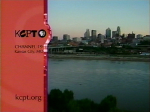
8th Logo
(2000-2002)

Logo: On the left side of the screen, we see a light red column with animated circles (and outlined circles) moving in and out on the inside. The KCPT logo is in all black with a circle PBS "P-Head" logo to the right of it. Below that is the text "CHANNEL 19 Kansas City, MO" and toward the bottom is the website domain name "kcpt.org". The column is suspended a bit to fit the width of the KCPT and PBS logos, and there's a dark red border on the outside of the column (with a view of the nighttime skyline inside of that). The remaining right side of the screen is a view of the city's skyline (viewed from the Missouri River) at sunset.
FX/SFX: The animation of the circles inside the column and the movement of the skyline images.
Music/Sounds: Usually a light jazz tune or an acoustic guitar/violin melody; although the music would randomize at times. An announcer (male or female) says, "You're watching KCPT -- Kansas City Public Television".
Availability: Extinct. Another station ID that was only used locally.
Editor's Note: None.
9th Logo A
(2002-2006)
Nicknames: "Light Streaks"

Logo: On a blue/purple/red ethereal background of vertical light streaks (similar to that of the 2002 Corporation for Public Broadcasting logo), we see the KCPT logo with the PBS "P-Head" and the text "KANSAS CITY" in all white. On the bottom of the screen is a small white and navy blue bar with thin lines forming parallel outlines above the white half. Inside the bar are the various town and region names of the city's metropolitan area with the text "KCPT" next to each name. The bottom text in the white half is navy blue and the colors invert as it scrolls slowly from left to right.
FX/SFX: The moving light streaks and the scrolling bottom text.
Music/Sounds: A female announcer that says "You're watching KCPT -- Kansas City Public Television".
Availability: Extinct. It was only used as the local ID.
Editor's Note: None.
9th Logo B
(2002-2011)

Logo: On a black background, we see the KCPT logo with "KANSAS CITY" below that. A second later, neon outlines of the KCPT letters zoom out one-by-one from the base of each letter and blur out of focus.
FX/SFX: The outlines of each letter zooming out of focus.
Music/Sounds: None.
Availability: Seen at the beginning of KCPT produced programs from that period.
Editor's Note: None.
10th Logo
(2006-2012)
Nicknames: "KCPT Circles II"

Logo: A large circle (with footage of a statue, monument, or building representing a part of the city) takes up a good portion of the screen, and is bordered by a background of animated circles (usually in bright red, but sometimes in different colors such as green, purple, or yellow). Near the lower right-hand corner is the PBS "P-Head" logo in a black circle, which expands and transforms (fades) to a white circle baring the KCPT logo (with the PBS "P-Head" beside it). The text "KANSAS CITY" wipes across underneath the logo.
FX/SFX: The moving of the circles behind the footage of the city and the PBS logo expanding and changing into the KCPT logo.
Music/Sounds: Usually a soft violin and/or acoustic guitar melody, but the music is somewhat randomized.
Variant: There are several variants of this logo. The generic ID (pictured here) has no announcer, but other IDs that represent the different towns or regions of the metropolitan area has a female announcer that says, "You're watching (REGION NAME)'s public television -- KCPT Kansas City".
Availability: Extinct. It was only used as the local ID.
Editor's Note: None.
11th Logo A
(2011-2016)


Nicknames: "CGI KC"
Logo: On a background of a magenta/orange color mesh and blue/pink clouds blended together, we see a CGI rendering of various buildings in Kansas City. This includes the Bartle Hall rooftop structure, the Power & Light building, plus the Sprint Center among others. A bunch of yellow lines forming a grid appear below the buildings (to represent Kansas City's intersecting downtown streets). We then zoom out to reveal each letter of the KCPT logo rotating one-by-one in unison (along with the PBS "P-Head" on the right in a chrome black circle). Right above that, each letter of the text "A PRODUCTION OF" quickly appear one-by-one in a black Bank Gothic font with a gold shine.
FX/SFX: The zooming out of the CGI city and the rotating of the KCPT letters (and the PBS logo).
Music/Sounds: A three-note acoustic guitar sounder.
Availability: Was seen at the beginning of The Local Show, available on KCPT's YouTube channel.
Editor's Note: None.
11th Logo B
(2012-2016)


Nicknames: "KCPT Circles III"
Logo: TBA
FX/SFX: TBA
Music/Sounds: TBA
Availability: Extinct. It was only used as the local ID.
Editor's Note: None.
12th Logo
(2016-)

Logo: TBA
FX/SFX: TBA
Music/Sounds: TBA
Availability: Currently in use. It can be seen at the beginning of The Local Show, available on KCPT's YouTube channel.
Editor's Note: None.