What is the ugliest logo of all-time?
Jump to navigation
Jump to search
Welcome! Post your own section about what you think is the ugliest logo of all-time here.
So far, these are the ugliest logos I've seen.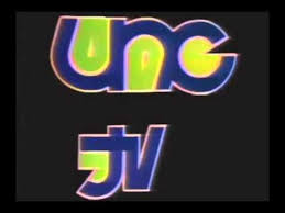
 All the colors used in the logo don't mix well.
Ugh. Did a 2 year old draw this?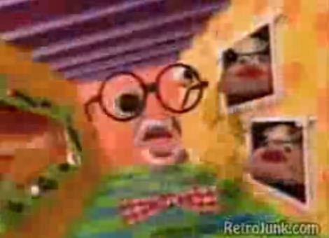
What is going on here? Why is the so much flashing? What is up with those hand puppets? And WHAT IS UP WITH THAT FACE?
kidinbed.r:
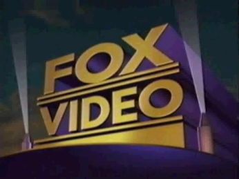
Fox Video (1993). Purple and gold don't mix on a putrid green background.
BenderRoblox:
Comedy Central 9th logo: Wow, is this the worst color choice possible? I think so. Neon green and purple don't mix.
Adventure_Time:
Disney Channel Originals: That banner is very ugly to me.
WalMart Films: My guess is that WalMart never made a film.
Graaaaagh (Rexeljet)
Ugly idents and logos, eh?
All current BBC2 idents apart from Mirror look ugly. Why did they go and redesign the 2 if 1) They were only going to change it a little bit and 2) It looks hideous?
That 1980's RKO Television ident (The one with the big 9) The horrid rainbow trail doesn't look good. In fact, rarely anything rainbow-coloured looks good, especially in that sort of shade. And the big 9 looks atrocious!
Channel Television (1992) I think this goes without saying.
Yeow95
The Warner Bros. shield used for the 2004 Looney Tunes shorts (most of them canceled).
MariluHennerArtist45
Simitar Other S From Heck logo. Outside of that, i like the animation and music.
NET Map ident 1952-1955
BBC Video =v= logo 1985-1988
Simitar
THEY ARE AN INSULT!!!!!!
CooleyBoy10/FromtheWordsofBR/BenGriswald/BenBopper/what have you:
 Nelvana (2001) Borrrrniiinggggggggggg
MrGooby
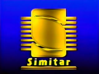
Simitar Entertainment (1990)
Is that supposed to be an S? Well, it is, but it's hard to really tell, because it's too boxed up, and most of the tapes this company put out have the worst tracking ever.
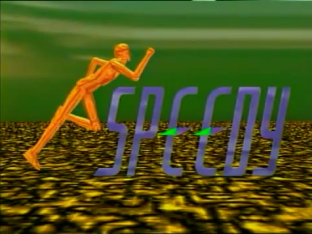
Speedy Video (1996)
This logo is a mess, considering Toy Story came out the year before. C-3PO has a beard and hair, and those E's also double as compasses.
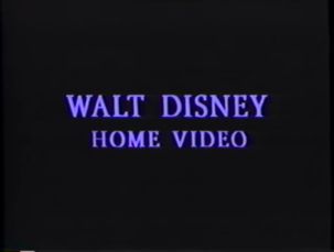
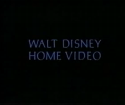
Walt Disney Home Video (1995)
How is this a logo, especially a Disney one. For Disney, this is unacceptable, I've seen a tuna sandwich make a better logo (heck, that would even be better)
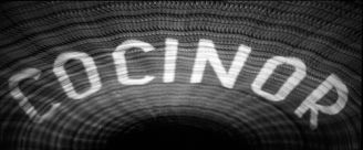
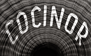
Cocinor (1958)
I wonder how many Frenchies remember going to the movies in the 1950s and being greeted to a trip through a digestive track.
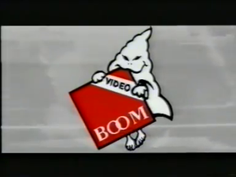
Boom Video (1980s)
The ghost is creeping me out with his frog-like eyes. Also, it looks like it's reading "Video BOOM" instead of "BOOM Video", also, is the ghost nibbling on the triangle?
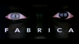
Fabrica (2001)
If someone really had pupils like that, I'd be sad to see it, also, apparently it looks like someone was looking at their computer screen while doing this.
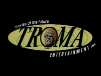
Troma Entertainment (1999)
Now, it's not Toxie's face, but his MS Paint eyes that make this so ugly.
BaltyRaven's Ugliest Logos:
The_Username_15
So far, these are the ugliest logos I've seen.


The 1971 UNC-TV logo. The fun thing is, this probably wasn't deliberately supposed to look horrible.
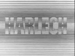
And Harlech Television 1968. Who doesn't love a television logo that you can't even see?
There are some others too.
JackLovesCLGLogos:
 All the colors used in the logo don't mix well.
Why is it so loud? And as a bonus, I can barely even read it!

Ugh. Did a 2 year old draw this?
Nickelodeon Pinchface Bumper:

What is going on here? Why is the so much flashing? What is up with those hand puppets? And WHAT IS UP WITH THAT FACE?
kidinbed.r:
Fox Video (1993). Purple and gold don't mix on a putrid green background.
BenderRoblox:
Comedy Central 9th logo: Wow, is this the worst color choice possible? I think so. Neon green and purple don't mix.
Adventure_Time:
Disney Channel Originals: That banner is very ugly to me.

WalMart Films: My guess is that WalMart never made a film.
Graaaaagh (Rexeljet)
Ugly idents and logos, eh?
All current BBC2 idents apart from Mirror look ugly. Why did they go and redesign the 2 if 1) They were only going to change it a little bit and 2) It looks hideous?
That 1980's RKO Television ident (The one with the big 9) The horrid rainbow trail doesn't look good. In fact, rarely anything rainbow-coloured looks good, especially in that sort of shade. And the big 9 looks atrocious!
Channel Television (1992) I think this goes without saying.
Yeow95
The Warner Bros. shield used for the 2004 Looney Tunes shorts (most of them canceled).
MariluHennerArtist45
Simitar Other S From Heck logo. Outside of that, i like the animation and music.
NET Map ident 1952-1955
BBC Video =v= logo 1985-1988
AnimeTVLogos
BC Video. It can't get any uglier than this. The flashing coming from the Denver the Dinosaur background is just nauseating. Plus, the design of the logo is ugly as well. Overall a lazily made logo that makes Kultur and Erry Vision look like masterpieces.
NightmareEnterprises
VID (1990)

Dat face. Dat face is ugly as hell
When I first saw the logo, "an" looks like a m next the text reading MERRY Vision films.
Simitar

THEY ARE AN INSULT!!!!!!
CooleyBoy10/FromtheWordsofBR/BenGriswald/BenBopper/what have you:

TrickyMario7654:
<tbody></tbody>
| Logo Capture | Company Name (& Debut Year) | What I Think... |
 | DiC (1984) | Green on a blue and purple vortex-like background looks like an eyesore, the music Isn't any better. |
 | Vestron Video (1982) | While this logo may be a classic, the logo looks incredibly ugly! Not to mention, those annoying sound effects in the logo! |
 | DFE Films (1969) | The red-lava like background, the color-changing letters, and the flashing are really bad to the human eye! |
| Harlech (1968) | My word! What were they thinking!? This logo is really headache inducing! It's very hard to look at! How could of this been allowed!? |
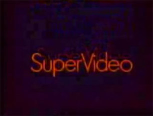
  | SuperVideo (1983) | I thought Harlech was bad enough, but when I saw this, I almost died at the sight of this ugly logo. But hey, it's way better than that darn skyrail they're trying to build in Melbourne's south-east to eliminate nine level crossings... |
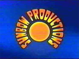
 | Sunbow Productions (1981) | Here's another ugly piece of doodie for you. The color scheme looks awful! |
BenIsRandom:

-------------------------------------------
This logo is the most laziest logo of all time. First of all, the logo just fades in and out. That's just plain boring. The 1993 music doesn't help either. Plus, the logo looks like something cheap, like from Windows Movie Maker. And, to top it all off, the logo isn't even in the corporate Disney font. It's just the words "WALT DISNEY HOME VIDEO". The people at Disney must've been really lazy to make this logo, because this is both lazy and ugly, because you'd expect more from Disney.
GETENT
Paramount (1975, early variant): Blech! This logo looks terrible! The size of the circle is too small, and the stars are too far away! Thank GOODNESS that they fixed this not long after.
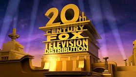
20th Century Fox Television Distribution (2013): No joke, when I first saw this logo, I thought it was fake! THAT is unacceptable for a logo for a huge company! The platform in which 20th stands on is completely out of proportion, the zooming out looks terrible, the logo is WAAAY too tall (just simply use Distributed By. Problem solved.) and to top it all off, this looks like it was done on Blender by some 10-year old for their YouTube channel! To quote the AVGN, "What were they thinking?!?!"
London Weekend Television (2000): Not the ugliest logo, but a pretty ugly logo though. The end result looks terrible with all the ugly colors and logo. Oh yeah, the beeping soundtrack sounds awful as well.
---
socoollogos
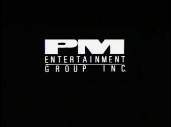
The very first PM Entertainment logo. (Used in 1989, on L.A. Heat; L.A. Vice; Midnight Warrior; Deadly Breed; Shotgun; the trailer for Coldfire(1990).)

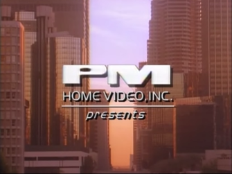
Also this PM Home Video variant used in Repo Jake(1990).

Also this variant used in the trailer for Shotgun.

Not to mention this UGLY variant in Angels of the City(1989).

OMG, THIS IS UGLY. IF THIS ISN'T UGLY, I DON'T KNOW WHAT IS.
PolarJack77

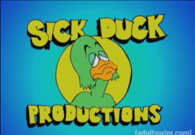
Sick Duck Productions: So gross and uncomfortable to eat


Shadow Projects Film (1997)
Choppy Animation
Wellmart3's Ugliest Logos
Sunbow - Both the first 2 logos, eugh! The 1st logo is just cheap, while the 2nd logo is more!! Gloomy, just GLOOMY!

SuperVideo - Not to mention, the most seizure-inducing logo ever. Couldn't they have just something more good rather thanPSYCHEDELIC???
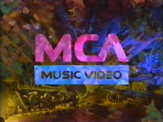
MCA Music Video - WHEN WILL THIS PSYCHEDELIC MADNESS STOP???

Fox Video - Not very psychedelic this time, but with the UGLY colors? No, just no.

Cocinor -Might be well as the scariest one on this list. Music, creepy-looking tunnel, AND MAYBE THAT ISN'T EVEN A TUNNEL!

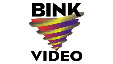
Bink Video - The design is strange, especially having gaudy colors!

And last but not least...
ERRY VISION!!! ThatTERRIBLE design! Lets not forget, the more strange music!!! Lets also not forget, THAT I WAS WRONG ABOUT COCINOR AS BEING THE SCARIEST ON THE LIST!!!!!!
SnowflakesOmega
Paramount Television (2015): I know they were playing an homage to the Blue Mountain logo with their 2012 film one, but the idea doesn't work well.
Photo Video (Greece): That mess of pixels
20th Century Fox (1950's): That slanted zero
20th Century Fox Television Distribution: Seems like a cheap Blender project.
MrGooby

Simitar Entertainment (1990)
Is that supposed to be an S? Well, it is, but it's hard to really tell, because it's too boxed up, and most of the tapes this company put out have the worst tracking ever.

Speedy Video (1996)
This logo is a mess, considering Toy Story came out the year before. C-3PO has a beard and hair, and those E's also double as compasses.

Walt Disney Home Video (1995)
How is this a logo, especially a Disney one. For Disney, this is unacceptable, I've seen a tuna sandwich make a better logo (heck, that would even be better)

Cocinor (1958)
I wonder how many Frenchies remember going to the movies in the 1950s and being greeted to a trip through a digestive track.

Boom Video (1980s)
The ghost is creeping me out with his frog-like eyes. Also, it looks like it's reading "Video BOOM" instead of "BOOM Video", also, is the ghost nibbling on the triangle?

Fabrica (2001)
If someone really had pupils like that, I'd be sad to see it, also, apparently it looks like someone was looking at their computer screen while doing this.

Troma Entertainment (1999)
Now, it's not Toxie's face, but his MS Paint eyes that make this so ugly.
BaltyRaven's Ugliest Logos:

rj4712
Nickelodeon (splat era)- Absolutely hideous.
Speedy Video (1996)- What a mess.
Erry Vision Films (1987)- Looks more like Merry Vision Films.
Sick Duck Productions- Sick indeed.
Harlech (1968)- It'll give your eyes a strain to look at.
WebWanderer (yep, I'm throwing my name in, too)

Split the Difference Productions: Whose idea was it to have a logo in screaming red? And I'm pretty sure a slice by a chainsaw doesn't look like that.
Saliva Films: A logo based on a bodily fluid. Yaaaay. At least there's no actual saliva dripping off it.
Viva Films: I actually find the color to be rather ugly.
Harlech: WHO WAS COMMISSIONED TO DESIGN THIS?!
Image result for Froben Enterprises, incFroben Enterprises, Inc: Okay, so while this one hasn't been given a page, it's still perfectly qualified to be here. Somebody out there thought it was a great idea to end his show with a clip of some guy rowing through a throat. (or is it a digestive tract?) To add insult to injury, the effect isn't even done very well.