What's the cheapest logo you've ever seen?
Jump to navigation
Jump to search
SuperMetroLJK193
KaratePianoLogoNerd
Billywws:
Jupiterboy
- New World Pictures 1977
- Zombastic Productions well its a little cheap but its funny when he yells no so anyone
- Empire of Cinemas from Israel its so cheap that you can see the guys head its unintentional comedy.
- FADYO (2nd Logo) - There is way too many ripoffs like the two Beatles tunes that play in the logo, the opening of "All You Need is Love" and "Free Bird", then they rip off the famous universal 1990 logo, universal is going to be mad at them one day if they are still a living company. finally, the first logo had more imagination and thought, why didn't the first logo be kept instead of the worst logo in the entire universe.
GETENT
- Artisan (early variant): Probably took as long as writing this to make it.
- Boyd's Video: "MOVE 'ER BACK JOHNNY!!"
- American Eagle Video: *goes on Google Images, searches up eagle, pastes in MSPaint, types down text unknowingly misspelling it, then animates it in Movie Maker* "Here boss, my new logo!!" *Sends it off to the factory*
- Helltimate Studio: I believe the TV was the most expensive part of this logo.
- ANY OBSCURE ARGENTIAN OR GREEK HOME VIDEO LOGO: Oh gosh, there's too many to mention.
- BC Video and Erry Vision (tie)
- Boyd's Video
- Excellent Resources
- Erry Vision/BC Video
- Interlight Video
- Messrs Isaardas Naommal
- Schick Sunn
- 1001 Video
- Knockout Video
- Suma Video
- Beograd Film
BenIsRandom
- Erry Vision (I think it's funny not because of the music, but because they might've accidentally spelled "eerie" wrong.)
- American Egale Video (They misspelled "eagle" and it looks like something out of PowerPoint.)
Gilblitz112: The winner for the most cheapest logo goes to this contender:
<iframe frameborder="0" height="289" src="http://wikifoundrytools.com/wiki/closinglogos/widget/unknown/2529e1a253c09e14e3180b452c9e318359055ee4" width="512"></iframe>
SnowflakesOmega's Most Cheapest Logos
Empire of Cinema (Israel): I don't know if it's creative or not after I watched this, but this truly is cheap.
Class Video (Argentina): I haven't seen Suma Video, but in my opinion, this is way more longer! And that formation of the logo is just poor and S-S-L-L-O-O-W-W!
1001/Knockout Video: Looks like something an 8 year old can make currently in Paint. The later version makes it feel more awkward.
Imagen Video SRL (Argentina): I think people from South America has a thing with this kind of logos.
Artisan Entertainment: It's just a plain print logo zooming in, but the logo's design at least had 20% effort. How cheap can you get?
Shokus Video: This debuted in the 80's with cheap animation and a VHS logo design, and the worst part is that they still use this today! Seeing they distribute old TV shows, well, this may be the reason of the logo's undestructable state.
Producciones Video Home (Argentina): OK, *goes in Photoshop, makes a colored background, adds some text, moves the text with the Free Transform tool for a few snapshots, changes the color of the text, keeps on moving the text, saves pictues, finishes "animation", adds all the pictures on a video editing program, adds the 1970 Gaumont fanfare, exports video, sends logo to the company's e-mail and the company approves it* ...I definitely agree that Argentine home video logos are the cheapest.
Wellmart3's Cheap Logos List
More TBA... or is that all?
TrickyMario7654
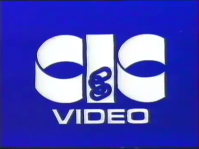

*CIC Video (1981): Really? Is that all they could come with? It's just the CIC Video logo fading in and out on a blue background. There next logo was much better that! The versions used in Sweden (CIC-Esselte Video) & Australia (Rigby-CIC/CIC-Taft Video) were slightly better, they had music in them (The latter had a catchy theme and a Voiceover, I've noticed that Rigby-CIC tapes had a slightly different voice-over than CIC-Taft tapes). The normal version however looks cheap as chips. The chainless version looks incomplete and rather odd.
*Anchor Bay Entertainment (2016): This logo sucks just as much as Donald Trump! That's all I have to say...
*Anchor Bay Entertainment (2016): This logo sucks just as much as Donald Trump! That's all I have to say...
The_Username_15
Film and DramaYouthOrganisation (2003):This logo...how...could they have this much of a shoestring budget? They stole footage from the Universal Studios 1990's logo, and then they decided to use very basic computer effects to have their logo appear. It's so bad that you'll have to see it yourself. I can't even explain how stupid it looks.
Boyd's Video: Now that is just ugly. Don't even get me started. This is what happens when you let KIDS take control of the camera, with the parents telling them not to zoom in yet. And the pink background too. Wow.
Billywws:
- Photo Video (Greece): This logo is literally a trip.
AnimeTVLogos
- (go to the "What is the ugliest logo you have ever seen?" page to see what I have to say about this logo).
- (go to the "What's your least favorite logo?" page to see what I have to say about it).
Logomax Productions' CHEAPEST LOGOS!!!!!!!
- Golumbia Video (Canada): IS THAT THE BEST THEY EVER COME UP WITH?!!! The animation looks like it was done on Microsoft Powerpoint! The music is usually STOCK MUSIC!!!!!! And the quality is so terrible that it could give the FADYO logo (Mentioned Next) a run for their money! WHAT WERE THEY THINKING?!!!
- FADYO (2nd Logo): UGH! Cheap Animation + Stock Music + Stolen Animation from the 1990 Universal Pictures logo + Stolen music from the Beatles + horrible quality = EXTREMELY CHEAPLY DONE LOGO!!!!!!!!!!!!
- Les Studios Marko (Canada): *Goes on Google Images, searches up "Canadian Flag", puts it on MS Paint, adds the text, goes on Sony Vegas, adds a simple zoom in and out effect, goes on MIDI, creates the music for this logo, adds it to the logo.* "Here boss, my new logo!" *Sends it to Les Studios Marko.*
- American Egale Video: CHEAP AS HELL!!!!!!!!!!!! Bland and unusual piece of trash!
- Warner Bros. Publications: Warner Bros., you're such a big company, but THIS?!! Why is Warner Bros' music logo had cheap animation for this logo?! Who send this cheap piece of junk to WB?!!!! Awful animation that looks like it was done by a 5-year-old. And cheap, yet catchy music that sounds like it was done by MIDI!!! Like, what the hell Warner Bros?!!!!!!!
I'll explain more cheesy logos later.
rj4712
American Egale Video- a last-minute job, with no spellchecker.
FADYO- the result of: stealing music, little to no experience in Powerpoint and Photoshop. They must be really out of money.
Photo Video (Greece)- will hurt your eyes.
KM Video- inexcusable for the 1980s.
Anything from Greece.
vhSloGos
- Carrey Video - Unfortunately, this entire company is a rip-off of a UK pre-cert label "Carrey Home Video", and the animation in the Carrey Video logo is also all stolen from the pre-cert company but trimmed the start of the logo and the plaster over the text with their own company name. I would considered Carrey Video now being the cheesiest logo ever!
- Almost every Argentina video distributor - Many such as Superfilms, Class Video, Sega, and others are some of the cheesiest, but are also very retro 8-bit style to many of them for some strange reason other than this could be because of very low resolution. There are a few Argentina logos I kinda like and I certainly would like to find a full audible version of the Class Video logo. But all we know is that Aregntina has the most low resolution cheesy logos.
- Monte Video - This logo deserves a Z-! There is zero effort into it, and can easily be remade in any software as possible.
- 1001/Knockout Video Film Distributors Brimingham - Both have any effort put into it since you can also easily remake it with Adobe Flash/Animate. The cover arts on the videocassettes also are very horrible. I really can't believe some a company that distributed very gore films into pre-cert videocassettes made a very poor logo than many other pre-cert labels. But this was more of a common sight for pre-cert labels instead actually. So I think I rant enough about some of these logos.
- Din Video (1st Logo) - Absolutely insane, this looks all like it was drawn with a Crayola crayon on a paper and cutout the logo with sscissors and then put it on a black table or bed and then take a picture of it and then you have a cheesy logo that looks a good YouTube intro to cause people cringe-itous or at least cancer. But at least the second logo (Proudly discovered by MEEE, of course) is better with a nicer logo concept. But the first one is definely top of the cheesiest in Sweden video distribution history.
- Green Star (2nd Logo) - SodatedSo 90s So cheesy So terrible So epiltic So eyesore So polish So primitive So cancer So cringe WOW!