Warner Bros. Publications
Jump to navigation
Jump to search
Logo description by kidinbed
Logo and video captures by ThatLogoDude, JP Creative Group, and LogicSmash
Editions by mr3urious and GETENT
(1998-)
Nicknames: "WB Shield Transition", "Shield of Splendor", "Silver Shield", "Another Cheesy Shield", "MIDI Shield"
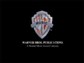
Logo: On a black background at an oblique angle, we see a silver WB shield without the lettering and a gold treble clef spinning around it. Also, there is some spinning silver text that reads "WARNER BROS. PUBLICATIONS". A white light knocks the treble clef off, and translucent shields fly through the WB shield. Then, the very familiar WB letters fly through the shield. Afterward, a silver WB shield with the lettering on an amber background and a gray banner with the letters "MUSIC" in black hits the shield and settles down. The logo turns toward the viewer and shines. The words "WARNER BROS. PUBLICATIONS" zoom in. The WB crest shines again. The byline "A Warner Music Group Company" fades in, and the WB crest shines some more.
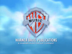
Variant: Since 2000(?), the logo now takes place in the sky (like the Warner Home Video logo). Also, from 2001-2003, the byline is replaced with “WARNER MUSIC GROUP, AN AOL-TIME WARNER COMPANY”.
FX/SFX: The shield spinning.
Music/Sounds: A generic MIDI theme consisting of a synth pad, a slap bass, drumbeats, and two "ting" sounds each time the logo shines.
Availability: Rare. Seen on instructional WB music videos, such as the Song Express series.
Editor's Note: This logo looks like a cheap high-school project, with its primitive CGI and stock-sounding music. The version with the AOL byline is even worse, because the normal sky background variant runs faster, they had to slow it down so the music could fit in, resulting in an extremely choppy logo.
Logo and video captures by ThatLogoDude, JP Creative Group, and LogicSmash
Editions by mr3urious and GETENT
(1998-)


<iframe frameborder="0" height="183" src="http://wikifoundrytools.com/wiki/closinglogos/widget/genericvideo/e8643c08c83e6c692699e13185477e9a53ceddc3" width="324"></iframe><iframe frameborder="0" height="186" src="http://wikifoundrytools.com/wiki/closinglogos/widget/genericvideo/334b8635b053f57945011aaa7be3aee0d8c4b1d3" width="329"></iframe><iframe frameborder="0" height="183" src="http://wikifoundrytools.com/wiki/closinglogos/widget/genericvideo/38c6d2df623cf13862b5410c96d467633e1db5b2" width="324"></iframe>
Nicknames: "WB Shield Transition", "Shield of Splendor", "Silver Shield", "Another Cheesy Shield", "MIDI Shield"
Logo: On a black background at an oblique angle, we see a silver WB shield without the lettering and a gold treble clef spinning around it. Also, there is some spinning silver text that reads "WARNER BROS. PUBLICATIONS". A white light knocks the treble clef off, and translucent shields fly through the WB shield. Then, the very familiar WB letters fly through the shield. Afterward, a silver WB shield with the lettering on an amber background and a gray banner with the letters "MUSIC" in black hits the shield and settles down. The logo turns toward the viewer and shines. The words "WARNER BROS. PUBLICATIONS" zoom in. The WB crest shines again. The byline "A Warner Music Group Company" fades in, and the WB crest shines some more.
Variant: Since 2000(?), the logo now takes place in the sky (like the Warner Home Video logo). Also, from 2001-2003, the byline is replaced with “WARNER MUSIC GROUP, AN AOL-TIME WARNER COMPANY”.
FX/SFX: The shield spinning.
Music/Sounds: A generic MIDI theme consisting of a synth pad, a slap bass, drumbeats, and two "ting" sounds each time the logo shines.
Availability: Rare. Seen on instructional WB music videos, such as the Song Express series.
Editor's Note: This logo looks like a cheap high-school project, with its primitive CGI and stock-sounding music. The version with the AOL byline is even worse, because the normal sky background variant runs faster, they had to slow it down so the music could fit in, resulting in an extremely choppy logo.