Warner Bros. Feature Animation
Jump to navigation
Jump to search
Logo description by Supermarty-o and WileE2005
Logo captures by Logoboy95 and Supermarty-o
Editions by StephenCezar15
Background: In 1994, Warner Bros. Pictures started a Feature Animation division after the success of Disney's The Lion King. Space Jam was the first feature produced from the studio, and was a box office success, but was met with mixed to negative reviews. The second feature, Quest for Camelot, was a critical and commercial failure, a first of the many features from this studio. The third, The Iron Giant, received positive reviews but was a box office bomb due to a rushed marketing campaign from Warner, but has a second life on DVD and TV showings and is now considered a classic. After a slew of critical and commercial failures (such as Osmosis Jones, Looney Tunes: Back In Action, among others), Warner Bros. decided to close the studio, with much of the staff being integrated into the Television Animation division, several of their later animated films were animated by other companies (such as The Polar Express and both Happy Feet films). However, in 2013, the studio was re-established as Warner Animation Group, their first movie being The Lego Movie.
(August 6, 1999)
Nicknames: "WB Shield", "Zooming WB Shield"
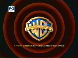
Logo: On a black background, the WB shield fades on-screen, which it zooms in onto the screen. In the backdrop, we reveal the red Looney Tunes rings (as in the WB cartoon logo) as a gold banner fades in over the shield with "FEATURE ANIMATION" displayed in yellow in it. "A TIME WARNER ENTERTAINMENT COMPANY" fades in, then the rings disappear when the WB shield turns dark and then we fade out to black.
Trivia: The Iron Giant was originally going to use the Warner Bros. Family Entertainment logo, but Brad Bird (director of The Iron Giant) <a href="https://www.joblo.com/movie-news/exclusive-interview-brad-bird-talks-iron-giant-tomorrowland-flop-more-202" target="_self">was against the idea</a>, instead electing to make a custom variant (leading to this), as a result, The Iron Giant was the only movie to use this logo.
Variants:
Music/Sounds: Only the intro of The Iron Giant's opening theme; a Sputnik-like beeping sound was heard throughout the whole logo.
Music/Sounds Variant: The prototype version had the opening theme of the trailer.
Availability: Rare. Seen only on The Iron Giant.
Editor's Note: The way the shield zooms through the red Looney Tunes rings is similar to how Looney Tunes and Merrie Melodies shorts used to open with back in the 1950s.
Logo captures by Logoboy95 and Supermarty-o
Editions by StephenCezar15
Background: In 1994, Warner Bros. Pictures started a Feature Animation division after the success of Disney's The Lion King. Space Jam was the first feature produced from the studio, and was a box office success, but was met with mixed to negative reviews. The second feature, Quest for Camelot, was a critical and commercial failure, a first of the many features from this studio. The third, The Iron Giant, received positive reviews but was a box office bomb due to a rushed marketing campaign from Warner, but has a second life on DVD and TV showings and is now considered a classic. After a slew of critical and commercial failures (such as Osmosis Jones, Looney Tunes: Back In Action, among others), Warner Bros. decided to close the studio, with much of the staff being integrated into the Television Animation division, several of their later animated films were animated by other companies (such as The Polar Express and both Happy Feet films). However, in 2013, the studio was re-established as Warner Animation Group, their first movie being The Lego Movie.
(August 6, 1999)


Nicknames: "WB Shield", "Zooming WB Shield"
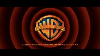
Logo: On a black background, the WB shield fades on-screen, which it zooms in onto the screen. In the backdrop, we reveal the red Looney Tunes rings (as in the WB cartoon logo) as a gold banner fades in over the shield with "FEATURE ANIMATION" displayed in yellow in it. "A TIME WARNER ENTERTAINMENT COMPANY" fades in, then the rings disappear when the WB shield turns dark and then we fade out to black.
Trivia: The Iron Giant was originally going to use the Warner Bros. Family Entertainment logo, but Brad Bird (director of The Iron Giant) <a href="https://www.joblo.com/movie-news/exclusive-interview-brad-bird-talks-iron-giant-tomorrowland-flop-more-202" target="_self">was against the idea</a>, instead electing to make a custom variant (leading to this), as a result, The Iron Giant was the only movie to use this logo.
Variants:
- On pan & scan versions of The Iron Giant, there is an open-matte version of this logo.
- On a trailer for The Iron Giant, a prototype version was used, which had the shield zooming in faster than the final version.
Music/Sounds: Only the intro of The Iron Giant's opening theme; a Sputnik-like beeping sound was heard throughout the whole logo.
Music/Sounds Variant: The prototype version had the opening theme of the trailer.
Availability: Rare. Seen only on The Iron Giant.
Editor's Note: The way the shield zooms through the red Looney Tunes rings is similar to how Looney Tunes and Merrie Melodies shorts used to open with back in the 1950s.