Telepictures Productions
Jump to navigation
Jump to search
Logo descriptions by Matt A., James Fabiano, Adam P., and Ben Masters
Logo captures by Shadeed A. Kelly, Bob Fish, Eric S., Mr. Logo Lord, V of Doom, megamanj2004, and others
Editions by Shadeed A. Kelly, Eric S., and V of Doom
Video captures courtesy of Eric S., Phasicblu, JohnnyL80, Stephen Cezar, and TVLogoFan2
Background: Telepictures was formed initially as "Telepictures Corporation" in 1978 by Michael Garin. The company syndicated the Rankin-Bass library's holdings from post-1974 to 1988, as well numerous television programs. In 1983, the company formed Telepictures Productions as the production arm of the corporation. Telepictures merged with Lorimar Productions, creating Lorimar-Telepictures Corporation (or just simply "Lorimar-Telepictures") on April 21, 1986. Under Telepictures' ownership, Rankin-Bass produced original animated series. In 1988, Lorimar-Telepictures split the television production divisions into their own separate names but keeping the Lorimar-Telepictures name as the distribution arm. In 1989, Warner Communications (later TimeWarner, now WarnerMedia) purchased the company. Lorimar remained a separate production entity, which would be folded into Warner Bros. by 1993. Telepictures Productions later became a producer of syndicated programming that Warner Bros. Television would distribute starting in 1990 after a two year hiatus. It is also involved in online areas, including operating the TMZ celebrity blog, amongst others.
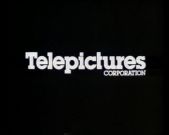
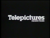
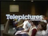
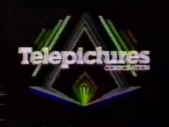
1st Logo
(1980-1986)
<iframe frameborder="0" height="167" src="http://wikifoundrytools.com/wiki/closinglogos/widget/unknown/d52db29f6e59b989f10ee9cedcf22e48c8c0d536" width="296"></iframe>
Nicknames: "Drum Roll", "Flying Parallelograms", "Rollercoaster", "Shadows", "Telecoaster"
Logo: Here are the main versions of this logo:
Variants:
FX/SFX: The shapes piling and forming the logo depending on the variant.
Music/Sounds: A drum roll sound during the formation of the logo, ending with a "ding" from a triangle when the logo turns white. Sometimes has silence or the end-theme.
Music/Sounds Variants:
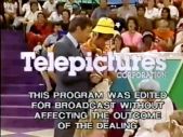
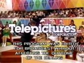
Availability: Quite rare.
Editor's Note: While the black background, drum roll, and flashing "CORPORATION" may not go well with everyone, it's still a favorite of many, featuring some very excellent slit-Scanimate animation. Its also somewhat unique for having at least 2 different versions of animation, but having the same end result.
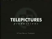
2nd Logo
(1990-Mid 1993)
<iframe frameborder="0" height="148" src="http://wikifoundrytools.com/wiki/closinglogos/widget/unknown/e2e0fc485affaf9ba651cdf231b88de98cc1945c" width="262"></iframe>
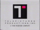
Nicknames: "The T", "The Flipping T", "The Spinning T", "T in the Box", "Telepictures T"
Logo: On a white background, a square with a "T" in it (except the left tip of the "T" is separated from the rest of the letter in a little box) quickly changes colors in a blur, from yellow to orange to neon green, before it quickly flips around. When it stops, the "T" square turns black, and small black text appears underneath that says "TELEPICTURES PRODUCTIONS, INC." in spaced-out lettering. Then the separated part of the "T" (which is now on the right side) turns red.
Bylines: On 1992-1993 episodes of The Jenny Jones Show andThe Jane Whitney Show, either the byline "A TIME WARNER COMPANY" on early episodes or "A TIME WARNER ENTERTAINMENT COMPANY" on later episodes (in the same font used in the Warner Bros. Pictures and Warner Bros. Television logos) fade in after the separated part of the "T" on the right side turns red.
FX/SFX: The "T" square changing colors, and flipping around.
Music/Sounds: The closing theme of the show, silence on season 2 of The Jenny Jones Show, and/or an announcer spiel.
Availability: Extinct. It was seen on the final season of Fun House, the first two seasons of The Jenny Jones Show, the short-lived 1990-91 game show Trump Card, and the early episodes of the short-lived talk show The Jane Whitney Show, among other shows.
Editor's Note: Although it isn't terribly animated, the final product is such a downgrade compared to the 1st logo.
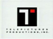
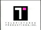
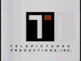
3rd Logo
4th Logo
(Late 1993-2009)
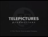
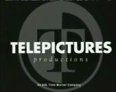
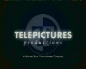
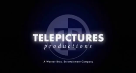
Nicknames: "The Circle T II", "The T III", "Telepictures T III", "T of Doom", "Circle T of Doom"
Logo: On a black background, the same circular logo from the previous logo, but in white, is coming towards the screen. In a flash, the logo appears much closer and with the word "TELEPICTURES" (in the same font as the previous logo) in the center. Another flash (which results in a white bar as if someone turned off a television) brings the logo to a median distance, and under "TELEPICTURES" is "p r o d u c t i o n s" (spaced and in italics as seen in the example). Under all that is the Warner byline fading-in.
Bylines:
Variants:
FX/SFX: The flashes and the logo "jumping".
Music/Sounds:
Availability: Very rare.
Editor's Note: This is another popular logo from Telepictures, featuring some pretty cool effects and interesting sounds.
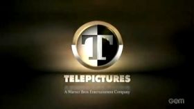
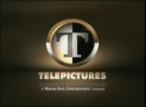
5th Logo
(2009- )
<iframe height="158" src="http://wikifoundrytools.com/wiki/closinglogos/widget/unknown/f7ed4d3b5452bde58778f52ce97e588d65b83930" width="278"></iframe>
Nicknames: "The Golden Circle T", "The Circle T III", "CGI Circle T", "The T IV", "2010s T", "The Decade T", "The Decade Circle T", "Telepictures T IV"
Logo: On a brown background, a gold bar zooms out of view as lights move in different directions. The gold bar is rotated, revealing that it is the pieces of the Telepictures logo, with the "T" cut in half (the logo resembles the 1993 version, with amendments made to its design). The parts of the "T" then join to form the whole "T" as the black and white circle fades-in, and the text "TELEPICTURES" rotates and zoom-out (like before it is set in Futura, but here it's a thicker weight). The logo then zooms-out slowly to its usual distance, with the Warner Bros. Entertainment byline fading-in.
Variants:
FX/SFX: The combination of the Telepictures logo, the rotation, and zooming letters.
Music/Sounds: A laser-like sound followed by:
Availability: Common. It's seen on post-2009 Telepictures shows currently in syndication such as The Ellen DeGeneres Show, Extra, TMZ, Judge Mathis, and The Real. Also appears on videos uploaded for the Tumblr blog DC All Access, which are produced by Telepictures and on the 2016 revival of Mad TV.
Editor's Note: An excellent CGI update to the 1993 logo.
Logo captures by Shadeed A. Kelly, Bob Fish, Eric S., Mr. Logo Lord, V of Doom, megamanj2004, and others
Editions by Shadeed A. Kelly, Eric S., and V of Doom
Video captures courtesy of Eric S., Phasicblu, JohnnyL80, Stephen Cezar, and TVLogoFan2
Background: Telepictures was formed initially as "Telepictures Corporation" in 1978 by Michael Garin. The company syndicated the Rankin-Bass library's holdings from post-1974 to 1988, as well numerous television programs. In 1983, the company formed Telepictures Productions as the production arm of the corporation. Telepictures merged with Lorimar Productions, creating Lorimar-Telepictures Corporation (or just simply "Lorimar-Telepictures") on April 21, 1986. Under Telepictures' ownership, Rankin-Bass produced original animated series. In 1988, Lorimar-Telepictures split the television production divisions into their own separate names but keeping the Lorimar-Telepictures name as the distribution arm. In 1989, Warner Communications (later TimeWarner, now WarnerMedia) purchased the company. Lorimar remained a separate production entity, which would be folded into Warner Bros. by 1993. Telepictures Productions later became a producer of syndicated programming that Warner Bros. Television would distribute starting in 1990 after a two year hiatus. It is also involved in online areas, including operating the TMZ celebrity blog, amongst others.
1st Logo
(1980-1986)


<iframe frameborder="0" height="167" src="http://wikifoundrytools.com/wiki/closinglogos/widget/unknown/d52db29f6e59b989f10ee9cedcf22e48c8c0d536" width="296"></iframe>
Nicknames: "Drum Roll", "Flying Parallelograms", "Rollercoaster", "Shadows", "Telecoaster"
Logo: Here are the main versions of this logo:
- 1980-1983: On a black background, we see the word "Telepictures" in white (in ITC Lubalin Graph Std Bold) emerging from the bottom of the screen followed by many "shadows" (blue in the color version), and moving up and "curving" down as if it was a roller coaster. When it stops in the middle, the "CORPORATION" (in ITC Lubalin Graph Std Demi) appears as always.
- 1983-1986: Against a black background, numerous rectangles of different blue shades fly from the top and bottom of the screen and towards the middle, where they form a blue, horizontally segmented "Telepictures" logo. The word "CORPORATION" appears at the right below the logo, and all the words then turn white.
- On network television, the name appeared as "Telepictures PRODUCTIONS".
Variants:
- The "rollercoaster" was later updated with smoother animation, "Telepictures" emerging more rapidly, a more vivid blue color, and, instead of the shadows constantly trailing, a limited number appearing and then piling into the logo.
- Sped-up variants of this logo exist.
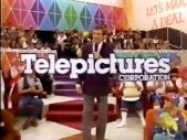
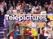
- The All New Let's Make a Deal, 1981-1986 episodes of The People's Court, the 1985-1986 US version of Catch Phrase, and the 1st season (1983-84) of Love Connection superimpose this logo over the credits, animation and all.
- A B&W variant exists.
FX/SFX: The shapes piling and forming the logo depending on the variant.
Music/Sounds: A drum roll sound during the formation of the logo, ending with a "ding" from a triangle when the logo turns white. Sometimes has silence or the end-theme.
Music/Sounds Variants:
- On the first season of ThunderCats, the Rankin-Bass logo music segues into a custom five-note horn fanfare (composed by Bernard Hoffer), which keeps the "ding" at the end. The "ding" sound is longer on earlier episodes of said show.
- On the animated special The Coneheads (based on the SNL sketch), the 2nd half of the Rankin-Bass music plays, mixed with the drum roll, perfectly in sync with the "ding" noise from the Telepictures logo.
- On produced TV movies, this logo is silent; ones they distributed, the logo has its normal music.
- On The All New Let's Make a Deal, Brian Cummings (Dean Goss for season 2) says "The All New Let's Make a Deal is a Stefan Hatos-Monty Hall Production, in association with Telepictures!" For the first episode, the drum roll and ding were absent; it was used for all other episodes.
- On Catch Phrase, John Harlan announces "Catch Phrase is a Pasetta Production, in association with Telepictures!" The drum roll and ding are not heard.
- A low-tone variant exists.
Availability: Quite rare.
- It was previously seen on The All New Let's Make a Deal (in-credit version) on Buzzr and GSN.
- It's also seen on ThunderCats DVD releases from the first season.
- It was also last seen on Love Connection on GSN.
- Most tapes of Telepictures' movies removed the logo, and most of Telepictures' distributed shows have since been acquired by other companies.
- This also appeared on early seasons of The People's Court when it was last reran and appeared on AOL's In2TV site.
- This was also seen on the short-lived 1985 U.S. version of Catch Phrase with Art James.
- The 1980 "rollercoaster" version can be found at the end of a sales promo from 1981 for the syndication release of Here's Lucy. This promo is available on disc 4 of Shout Factory's DVD "best of" release.
- It also appeared on a VHS of Flush, which was put out on VHS in Canada by Marquis Video and that a pay TV print was probably used.
- This version also appears at the start of each episode of My Favorite Martian on Amazon Prime's video streaming service.
Editor's Note: While the black background, drum roll, and flashing "CORPORATION" may not go well with everyone, it's still a favorite of many, featuring some very excellent slit-Scanimate animation. Its also somewhat unique for having at least 2 different versions of animation, but having the same end result.
2nd Logo
(1990-Mid 1993)


<iframe frameborder="0" height="148" src="http://wikifoundrytools.com/wiki/closinglogos/widget/unknown/e2e0fc485affaf9ba651cdf231b88de98cc1945c" width="262"></iframe>
Nicknames: "The T", "The Flipping T", "The Spinning T", "T in the Box", "Telepictures T"
Logo: On a white background, a square with a "T" in it (except the left tip of the "T" is separated from the rest of the letter in a little box) quickly changes colors in a blur, from yellow to orange to neon green, before it quickly flips around. When it stops, the "T" square turns black, and small black text appears underneath that says "TELEPICTURES PRODUCTIONS, INC." in spaced-out lettering. Then the separated part of the "T" (which is now on the right side) turns red.
Bylines: On 1992-1993 episodes of The Jenny Jones Show andThe Jane Whitney Show, either the byline "A TIME WARNER COMPANY" on early episodes or "A TIME WARNER ENTERTAINMENT COMPANY" on later episodes (in the same font used in the Warner Bros. Pictures and Warner Bros. Television logos) fade in after the separated part of the "T" on the right side turns red.
FX/SFX: The "T" square changing colors, and flipping around.
Music/Sounds: The closing theme of the show, silence on season 2 of The Jenny Jones Show, and/or an announcer spiel.
Availability: Extinct. It was seen on the final season of Fun House, the first two seasons of The Jenny Jones Show, the short-lived 1990-91 game show Trump Card, and the early episodes of the short-lived talk show The Jane Whitney Show, among other shows.
Editor's Note: Although it isn't terribly animated, the final product is such a downgrade compared to the 1st logo.
3rd Logo
(Mid-Late 1993)
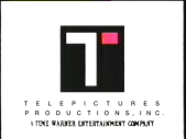
Nicknames: "The Circle T", "The T II", "Telepictures T II"
Logo: On a white background, we see a circular logo in gray. Its border is gray on the top half and white on the bottom, and the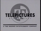 inside's left half is grey and the right white. Inside is a "T", the left of which is white and right gray. The black text "TELEPICTURES" (in a Futura font) and "p r o d u c t i o n s" (spaced out and in italics) zooming out. A line and the black text "A TIME WARNER ENTERTAINMENT COMPANY" fades in below.
Logo: On a white background, we see a circular logo in gray. Its border is gray on the top half and white on the bottom, and the

FX/SFX: The simple zoom-out of the text.
Music/Sounds: None or the end theme of the show.
Availability: Rare. It can been seen on mid-late 1993 episodes of The Jenny Jones Show and The Jane Whitney Show.
Editor's Note: This appears to be a transitional placeholder between the 2nd and 4th logos.
Music/Sounds: None or the end theme of the show.
Availability: Rare. It can been seen on mid-late 1993 episodes of The Jenny Jones Show and The Jane Whitney Show.
Editor's Note: This appears to be a transitional placeholder between the 2nd and 4th logos.
(Late 1993-2009)


<iframe frameborder="0" height="163" src="http://wikifoundrytools.com/wiki/closinglogos/widget/unknown/28e237c6a7bda26fa563423eb34e3c9e99cf652c" width="290"></iframe><iframe frameborder="0" height="163" src="http://wikifoundrytools.com/wiki/closinglogos/widget/unknown/ae062df01beb25bbb680c8e76748ce19644b906d" width="288"></iframe>
Nicknames: "The Circle T II", "The T III", "Telepictures T III", "T of Doom", "Circle T of Doom"
Logo: On a black background, the same circular logo from the previous logo, but in white, is coming towards the screen. In a flash, the logo appears much closer and with the word "TELEPICTURES" (in the same font as the previous logo) in the center. Another flash (which results in a white bar as if someone turned off a television) brings the logo to a median distance, and under "TELEPICTURES" is "p r o d u c t i o n s" (spaced and in italics as seen in the example). Under all that is the Warner byline fading-in.
Bylines:
- 1993-2005: "A Time Warner Entertainment Company"
- 2001-2003: "An AOL Time Warner Company"
- 2004-2009: "A Time Warner Company"
- September 8, 2008-2009: "A Warner Bros. Entertainment Company"
Variants:
- 1993-1994: An early version exists where the logo is grey on a white background. The text then zooms out and plasters itself on the logo. The byline, this time in all capitals, then fades in below a black rectangle.
- 2001-2003: A later version exists where the animation is the same, but the end product looks different. In this variation, the "Circle T" is zoomed-in much more (almost taking up the whole screen) and the "T" is now in a Times New Roman font, and the "Telepictures Productions" text seems smaller in proportion than the original. This is done to create a new byline (in about the same position as the old logo) inside the "Circle T" stating the AOL Time Warner byline.
- 2008-2009: Another version, which was "enhanced" for HD, features the logo glowing blue with a fresh byline to boot. The word "Productions" now zooms in and spreads into position.
FX/SFX: The flashes and the logo "jumping".
Music/Sounds:
- 1993-2004: A thunderclap sound is heard, along with a "shout", with "tingles" and "wind" heard in the background. Sometimes, it'll just have the end of the show's theme or, on early episodes of The Ellen DeGeneres Show, post-2003 episodes of Street Smarts, and post-1993 episodes of The Jane Whitney Show, the sound effect with the show's theme, ABC airings of Are You Hot? used the network's generic theme.
- 2004-2009: Sounds similar to before, but the "crash" sounds more percussive and the wind has been replaced with a synth drone.
Availability: Very rare.
- The AOL version is pretty much extinct, and the Time Warner/WBE variants are just as scarce. Most productions from this period either aren't rerun on TV nowadays or are talk shows, which typically aren't broadcast past their original airings. Your best bet is to search old video recordings of programs from this time for this logo.
- The AOL variant was seen on 2001-2003 episodes of The Jenny Jones Show, Judge Mathis, The US version ofThe Sharon Osborne Show,Street Smarts, and Elimidate, among others.
- The Time Warner variants can be found on all shows produced by the company from 1993-2009, such as The Jenny Jones Show starting in 1993 until 2001, The Tyra Banks Show, 1999-2001 and 2003-2009 episodes of Judge Mathis, all episodes of The Rosie O'Donnell Show, and pre-2009 episodes of TMZ on TV.
- The WBE version was seen only on episodes of The Ellen DeGeneres Show from September 8, 2008 up to the time their next logo was introduced in 2009.
Editor's Note: This is another popular logo from Telepictures, featuring some pretty cool effects and interesting sounds.
5th Logo
(2009- )


<iframe height="158" src="http://wikifoundrytools.com/wiki/closinglogos/widget/unknown/f7ed4d3b5452bde58778f52ce97e588d65b83930" width="278"></iframe>
Nicknames: "The Golden Circle T", "The Circle T III", "CGI Circle T", "The T IV", "2010s T", "The Decade T", "The Decade Circle T", "Telepictures T IV"
Logo: On a brown background, a gold bar zooms out of view as lights move in different directions. The gold bar is rotated, revealing that it is the pieces of the Telepictures logo, with the "T" cut in half (the logo resembles the 1993 version, with amendments made to its design). The parts of the "T" then join to form the whole "T" as the black and white circle fades-in, and the text "TELEPICTURES" rotates and zoom-out (like before it is set in Futura, but here it's a thicker weight). The logo then zooms-out slowly to its usual distance, with the Warner Bros. Entertainment byline fading-in.
Variants:
- This logo was updated with the Warner Bros. byline in a serif font.
- Some shows such as TMZ and Extra, have the logo fade out at the end and the following Warner Bros. Television logo would fade in. Other shows, such as The Ellen DeGeneres Show, will have the logo cut straight to the WBTV logo.
- On 2020s episodes of TMZ, the logo is part of the split screen credits alongside the Harvey Levin Productions, ParaMedia, and the WBTV logos.
FX/SFX: The combination of the Telepictures logo, the rotation, and zooming letters.
Music/Sounds: A laser-like sound followed by:
- 2009-2010: Two mysterious-sounding synth notes.
- 2010- : 3 synth piano chords. This version is still used on The Ellen DeGeneres Show.
- 2014- : A rearranged version of the 2009 music. First appeared on season 2 of The Real.
Availability: Common. It's seen on post-2009 Telepictures shows currently in syndication such as The Ellen DeGeneres Show, Extra, TMZ, Judge Mathis, and The Real. Also appears on videos uploaded for the Tumblr blog DC All Access, which are produced by Telepictures and on the 2016 revival of Mad TV.
Editor's Note: An excellent CGI update to the 1993 logo.