Rede Globo (Brazil)
Jump to navigation
Jump to search
 <iframe frameborder="0" height="220" src="http://wikifoundrytools.com/wiki/closinglogos/widget/genericvideo/3ac0f2c9b82199c169206fddb9e96ba49f96e69c" width="389"></iframe>
 <iframe frameborder="0" height="230" src="http://wikifoundrytools.com/wiki/closinglogos/widget/genericvideo/fc22c85d4d8a9f95c4c166e23e054c9d7730431d" width="407"></iframe>
Background: Rede Globo is a Brazilian free-to-air television network, launched by media proprietor Roberto Marinho on 26 April 1965. It is owned by media conglomerate Grupo Globo, being by far the largest of its holdings. Globo is the largest commercial TV network in South America and the second-largest commercial TV network in annual revenue worldwide just behind the American ABC Television Network and the largest producer of telenovelas. Globo is headquartered in the Jardim Botânico neighborhood of Rio de Janeiro, where its news division is based. The network's main production studios are located at a complex dubbed Estúdios Globo, located in Jacarepaguá. It is composed of 122 owned and affiliate television stations throughout Brazil plus its own international networks, Globo TV International and TV Globo Portugal. In 2007, Globo moved its analog operations to high-definition television production for digital broadcasting. Rede Globo is one of the largest media companies in the world, and produces around 2,400 hours of entertainment and 3,000 hours of journalism per year in Brazil. Through its network, the broadcaster covers 98.6% of Brazil's territory. Recognized for its production quality, the company has already been presented with 14 international Emmys. The international operations of Globo include seven pay-per-view television channels and a production and distribution division that distributes Brazilian sports and entertainment content to more than 190 countries around the world. In Brazil, Globo TV presently reaches 99.5% of potential viewers, practically the entire Brazilian population, with 122 broadcasting stations that deliver programming to more than 183 million Brazilians. The network has been responsible for the 20 most-watched TV programs broadcast on Brazilian television, including Avenida Brasil, a 2012 record-breaking telenovela that reached 50 million viewers and was sold to 130 countries.
NORMAL IDENTS
1st logo
(1965)
(1965)
Logo: On what looks like a piece of cardboard, where at the left is the 1965 Rede Globo logo, we see a rounded square with the text "Canal 4". The camera zooms in on the text.
FX/SFX: The zooming.
Music/Sounds: None.
Availability: Extinct. Can only be found on old prints.
Editor's Note: It's obvious that this logo was just a camera zooming in on a piece of cardboard.
2nd logo
(1965-1966)
<iframe align="right" frameborder="0" height="198" src="http://wikifoundrytools.com/wiki/closinglogos/widget/genericvideo/9eada901cc421e909bd1a228a70dbe3fe40bde9c" width="351"></iframe>
3rd Logo
(1965-1966)
<iframe align="right" frameborder="0" height="198" src="http://wikifoundrytools.com/wiki/closinglogos/widget/genericvideo/9eada901cc421e909bd1a228a70dbe3fe40bde9c" width="351"></iframe>
NOTE: The video does not show the exact logo that Globo used at the time, but rather an affiliate. The logo is otherwise the same, minus "Canal 4" being replaced with "Canal 2".
Nicknames: Globo Pinwheel, "Petrifying Pinwheel"
.
Logo:We see the 1965 Rede Globo logo in the right corner of the screen. There are black rays shooting out from the logo. "TV GLOBO CANAL 4" is seen to the left.
FX/SFX: None.
Music/Sounds: A tense string theme (reminscient of the theme from The Twilight Zone) with an announcer who says "Canal 2, cada vez mais perto de você." (Channel 2, getting closer to you.)The announcer has a booming sound to his voice, almost like it's being shouted through a megaphone. Of course, the version Rede Globo used would say Canal 4 instead.
Availability: Extinct. Only remakes can be found on Youtube.
Editor's Note: The imposing logo design, strange music, and almost evil-sounding voice over (along with the questionable slogan used here)proved to unsettling to many at the time.
(1966-1969)
Availability: Extinct. The 1978 version was only used as a bumper.
Logo: This logo consisted of cylindrical lines (of rainbow color), and silver balls moving about them. The final product has the Rede Globo logo and the Rede Globo font coming in with a multicolored chyron trail.
Variant(s): Another logo to have a few variants.
Music/Sounds: It depends.
Availability: Again, extinct.
FX/SFX: The ball(s) moving, walls diverging, and text appearing at the end. More early CGI done by Pacific Data Images.
Availability: See the 5th logo.
Editor's Note: The effects are still dated here, but it's an interesting showcase of what CGI at the time was like. The music has been known to be a favorite of many as well.
<iframe frameborder="0" height="164" src="http://wikifoundrytools.com/wiki/closinglogos/widget/genericvideo/fde405616545324d8ed2ea814c02361268c3e894" width="218"></iframe><iframe frameborder="0" height="166" src="http://wikifoundrytools.com/wiki/closinglogos/widget/genericvideo/55897f8d4200fd3797f9f32656d45826e629b211" width="220"></iframe><iframe frameborder="0" height="166" src="http://wikifoundrytools.com/wiki/closinglogos/widget/genericvideo/f012adb429b92d9354b336d87af2c5eee049f719" width="220"></iframe><iframe frameborder="0" height="160" src="http://wikifoundrytools.com/wiki/closinglogos/widget/genericvideo/9997453bae5ef480e3af0573753a4207102dee80" width="285"></iframe>
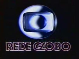
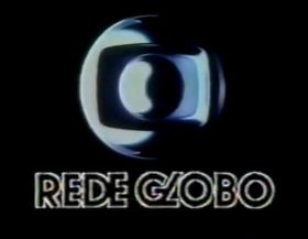
(1992-1995)
Logo: Same as above, but with a new logo that involves the use of ray-tracing methods.
 Logo: On a black background, we see colorful CGI streaks passing by in front of the camera. after a few seconds, other streaks come from the left and all the streaks are unified. Then, a silver ball zooms out from the left of the screen to the unified streaks, and then zooming out more, revealing the new logo in a white gradient background.
<iframe align="right" frameborder="0" height="224" src="http://wikifoundrytools.com/wiki/closinglogos/widget/genericvideo/3819881865650b8f093b6c518f0bbd8c0c776fe3" width="298"></iframe>
Nicknames: "Frightening Four"
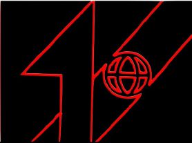
Logo: We see an arrow move to the left on the screen. This arrow eventually forms into a giant 4, which has a space inside where the lines in the 4 "connect". The Globo logo (a simple wireframe globe with longitude and latitude lines) is seen inside of the square, in which the camera suddenly zooms into.
FX/SFX: The arrow transforming, and the zoom-in.
Music/Sounds: A drum fanfare, followed by a Brazilian announcer saying "No ar, mais um campeão de audiência Brasil no seu Canal 4." ("On air, another Brazil audience champion is on your Channel 4."), followed by an ascending UFO sound.
Availability: Long extinct.
Editor's Note:The music, announcer, fast zoom-in, and UFO sounds can be disturbing to many, especially in the 1960s. It's just as sinister as the last logo.
4th logo
(1969-1975)
Logo: On a black background,white rays are seen shooting out from a pair of lips. The lips then open up and a speech bubble grows from them, in which the word "NOTICIA" appears. The speech bubble and the rays then cut out as the top lip forms a "M" in which more letters appear to form "AMOR". The word then goes to a vertical formation, in which it becomes "EMOCAO" as a caricature of a women slides in and sheds a tear. The women then opens her eyes and smiles, in which the text suddenly becomes "ALEGRIA" and the tear turns into a star. Everything then disappears as the star zooms in and then forms a circle with 6 segments, the vertical ones being curved while a horizontal line cuts them, which also was the Rede Globo logo at the time. 2 stars then appear on the and the words "O QUE E BOM" appears in an arch, while "ESTA NA GLOBO" appears in a smile shape, in which these appear and stretch one by one when the chorus sing them out. The logo then fades out and the words and stars zoom in as the opening of the program starts.
(1969-1975)
<iframe align="right" frameborder="0" height="221" src="http://wikifoundrytools.com/wiki/closinglogos/widget/genericvideo/2c9680eba7d3993020ca21dae5b290f68e38c04a" width="295"></iframe>
Nicknames: "The Globe", "Ghostly Vocals"
Logo: On a black background,white rays are seen shooting out from a pair of lips. The lips then open up and a speech bubble grows from them, in which the word "NOTICIA" appears. The speech bubble and the rays then cut out as the top lip forms a "M" in which more letters appear to form "AMOR". The word then goes to a vertical formation, in which it becomes "EMOCAO" as a caricature of a women slides in and sheds a tear. The women then opens her eyes and smiles, in which the text suddenly becomes "ALEGRIA" and the tear turns into a star. Everything then disappears as the star zooms in and then forms a circle with 6 segments, the vertical ones being curved while a horizontal line cuts them, which also was the Rede Globo logo at the time. 2 stars then appear on the and the words "O QUE E BOM" appears in an arch, while "ESTA NA GLOBO" appears in a smile shape, in which these appear and stretch one by one when the chorus sing them out. The logo then fades out and the words and stars zoom in as the opening of the program starts.
Variants: A shortened version exists, starting with the logo revealed.
FX/SFX: The various sequences appearing, the star zooming in and forming the logo, the words popping up and stretching.
Music/Sounds: A small violin ditty, followed by an bombastic theme with a very distorted-sounding chorus singing "Rede Globoooooo! O que e bom esta na Globo!" ("Rede Globoooooo! What's good is at Globo!"), with a final sound of trumpet before segueing into the opening theme.
Availability: Extinct. Seen on programs from the time, but there's no way that those would be available.
Editor's Note: Like the previous logos, this logo is known to have scared many Brazilians at the time, with the choppy, imposing animation and ghostly chorus.
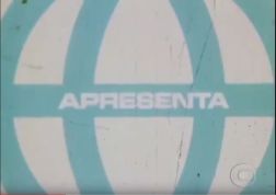
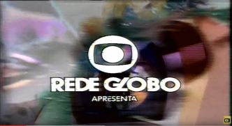
5th logo
(1973-2000s)
(1973-2000s)


Logo: At the very end of whatever ID is playing, we see the Rede Globo logo., with "APRESENTA" under it. The logo is fit to whatever time period it is in.
Variant: Sometimes, "Apresenta" doesn't appear: it's just the logo.
FX/SFX: The logomark on whatever is happening behind it.
Music/Sounds: The opening theme to the show.
Availability: Actually common. Shows up on programs of the era; for example, older episodes ofGlobo Repórter and Fantástico. These still manage to rerun from time to time on Rede Globo.
Editor's Note: None.
6th Logo
(1976-1981)
(1976-1981)

<iframe frameborder="0" height="171" src="http://wikifoundrytools.com/wiki/closinglogos/widget/genericvideo/59f5892b0036b3af1b15c7120dd7c41fced07b15" width="225"></iframe><iframe frameborder="0" height="170" src="http://wikifoundrytools.com/wiki/closinglogos/widget/unknown/a13a1009412001b15e4a0412ca1aa7ca8eb918dd" width="294"></iframe><iframe frameborder="0" height="169" src="http://wikifoundrytools.com/wiki/closinglogos/widget/genericvideo/d0c46c33612f8b858adab66d8cfa10fcee2d534e" width="288"></iframe>
Nicknames: "S.W.A.T." (1976-1977), "Bubbles" (1977-1980), "Ocean" (1978)
Logo: You will find out with this logo and the succeeding idents that Rede Globo liked to use many variants for the same logo.
- The 1976 variant was made of many blue circles arranging in different formations, with "REDE GLOBO" in a more stylized Avant Garde Gothic font appearing as well. This would conclude with the finished product, consisting of both the text and the blue globe. The logo was created by Hans Donner, an Austrian who wanted to renew the brand of Rede Globo. It represents the earth being a television, with a TV tube cutout in the center with another circle inside of that.
- The 1977 variant has bubble-like silver balls (which would become iconic throughout the next decade). They would float around. A bubble in the center would be segmented off with a rainbow light. This bubble would zoom in and form the Globe (as it was known), with the Rede Globo text appearing from above with a rainbow trail.
- The 1978 variant has a similar concept. There would be just one bubble, however, and it looks as if it's in the ocean (hence the nickname).
FX/SFX: Depending on the variant. Usually done with Scanimate. The animation was actually done by Robert Abel & Associates.
Music/Sounds: It depends:
- 1976-1977: A dramatic fanfare with an announcer.
- 1977-1980: Weird synth music, ending with a warbling synth note.
- 1978: A techno synth-pop tune (which sounds strange), ending with the weird synth music from the 1977-1980 logo.
- Sometimes there is an announcer.
Editor's Note: While the animation in this logo is very dated today, this is a favorite of many Brazilians.
7th Logo
(1979-1981)


Logo: We see a blurry version of the Globe featured in previous and following logos. There are about five of them, copied side to side, on a black background. These Globes turn to face us, and then they sort of merge together and fade out. There is one globe remaining and it shines a bit. There is a white "masking" over it, which eventually comes towards the screen as words saying "REDE GLOBO". More Globes appear and the words slide to the top and bottom of the screen.
FX/SFX: All described above. Excellent live action and Scanimation by Dolphin Productions.
Music/Sounds: It varied, but mostly consisted of nice upbeat jazz-funk themes.
Availability: Unknown, but from what we know this was a station ident.
Editor's Note: None.
8th logo
(1980-1983)
(1980-1983)


<iframe frameborder="0" height="185" src="http://wikifoundrytools.com/wiki/closinglogos/widget/genericvideo/7dd75e4abfda86a14b7fbb71be50ca42d1f054a1" width="246"></iframe><iframe frameborder="0" height="184" src="http://wikifoundrytools.com/wiki/closinglogos/widget/genericvideo/7bb6400eac52cf2c14de2d1d64c93b31fd689e6c" width="246"></iframe>
Logo: This logo consisted of cylindrical lines (of rainbow color), and silver balls moving about them. The final product has the Rede Globo logo and the Rede Globo font coming in with a multicolored chyron trail.
Variant(s): Another logo to have a few variants.
- In 1982, the cylindrical lines would sometimes be arranged almost like a slide, and would wrap around the screen.
- 1982-1983: The lines were replaced with silver balls with a rainbow tint. The Globe would slide across these balls, ending as usual.
Music/Sounds: It depends.
Availability: Again, extinct.
Editor's Note: Again, the animation here hasn't aged all that well. It's another favorite, though.
9th Logo
(1983-1986)
(1983-1986)

<iframe frameborder="0" height="163" src="http://wikifoundrytools.com/wiki/closinglogos/widget/genericvideo/77ddf73f1d181bd499b249813d9c8d870df029c3" width="214"></iframe><iframe frameborder="0" height="163" src="http://wikifoundrytools.com/wiki/closinglogos/widget/genericvideo/1d3c4f400dcc21feab31edb859fda605cbddf7ca" width="287"></iframe><iframe frameborder="0" height="163" src="http://wikifoundrytools.com/wiki/closinglogos/widget/genericvideo/f337f38f77785bf5435580e8f8d41c678514c310" width="215"></iframe><iframe frameborder="0" height="163" src="http://wikifoundrytools.com/wiki/closinglogos/widget/genericvideo/8ce31c45cbd514707e43b0ef1c3ec1faccbf83fe" width="217"></iframe><iframe frameborder="0" height="163" src="http://wikifoundrytools.com/wiki/closinglogos/widget/genericvideo/dd8f3ee3ee20ac6ea4a07648db2b305bda9362b0" width="217"></iframe>
Logo: There were multiple variants, but this is the main one. On a black background, we see a bunch of colors. Suddenly, we see a ball hit the colors, revealing them to be color walls. The camera pans to the end of the colors. Once the ball is done hitting them, it reveals to be the Rede Globo logo. Then we see the 3D text "REDE GLOBO" in an Avant Garde Gothic font spin to the bottom.
Variants: As you know, Rede Globo didn't stick to just one particular ident;
Variants: As you know, Rede Globo didn't stick to just one particular ident;
- The main variant had a more bluish tint to it sometimes.
- A second logo at the time consisted of a different setup of the colored walls. They were different shapes and seemed more diverse. There would be multiple silver balls moving about the area of the camera pan. The music on this variant is also different.
- There was a third variant showing a clip showing the wireframe animation that is constituent of the variant above. The music was yet again different, and would be used in the variant below.
- There would be another arrangement of colored walls sweeping to and fro the viewer in a fourth variant. This would also contain lots of silver balls. The music in the variant above would be used.
FX/SFX: The ball(s) moving, walls diverging, and text appearing at the end. More early CGI done by Pacific Data Images.
Music/Sounds: A dramatic synth tune with an ascending drone. The drone increases in pitch as the ball "opens up" each colored wall, then descends as it does the same in the latter portion of the logo; we then hear a voice singing "Rede Globo!", then the last note of the music. The variants had slightly different music or a brass fanfare accompanied with a pop beat similar to that of the other variants.
Music/Sounds Variant(s):
Music/Sounds Variant(s):
- For the second variant, it was an exuberant brass tune much different than the main variant.
- For the third variant, a synthpop tune was used during the showcase of animation. This would segue into a high-tempo synthesized ditty that would end with the singers as usual.
Availability: See the 5th logo.
Editor's Note: The effects are still dated here, but it's an interesting showcase of what CGI at the time was like. The music has been known to be a favorite of many as well.
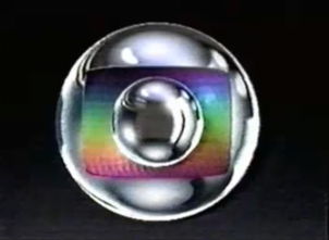
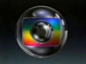
10th Logo
(1986-1992)
(1986-1992)


<iframe frameborder="0" height="164" src="http://wikifoundrytools.com/wiki/closinglogos/widget/genericvideo/fde405616545324d8ed2ea814c02361268c3e894" width="218"></iframe><iframe frameborder="0" height="166" src="http://wikifoundrytools.com/wiki/closinglogos/widget/genericvideo/55897f8d4200fd3797f9f32656d45826e629b211" width="220"></iframe><iframe frameborder="0" height="166" src="http://wikifoundrytools.com/wiki/closinglogos/widget/genericvideo/f012adb429b92d9354b336d87af2c5eee049f719" width="220"></iframe><iframe frameborder="0" height="160" src="http://wikifoundrytools.com/wiki/closinglogos/widget/genericvideo/9997453bae5ef480e3af0573753a4207102dee80" width="285"></iframe>
Logo: Multiple variants, eventually forming the logo.
Variants:
- In 1986, the Globo logo was depicted hiding itself inside of the rainbow gradient. This would zoom out, and the logo would appear.
- In 1987, an ident showcased many pyramids laid upside-down forming a color gradient. A ball would burst through the pyramids and they would move about and form the logo.
- Another 1987 ident showed a ball moving across a green-blue wave.
- Yet another ident from 1987 simply had the rainbow gradient moving above the ball in the center, and then going back inside the larger ball, revealing the logo.
- In 1988, there was an ident that involved blue tower-like figures. The camera would switch to vertical view, and the towers would converge to form the logo.
- 1989 saw an ident, entitled "Predios" ("Buildings") in which a ball would move along a silver cityscape. The background would then fold in on itself, revealing the logo.
- In 1989, an ident seeing a spiky blue-red gradient ball zooming out on a space background with bubble-like figures, finally "hitting" something, and revealing the logo was used.
- In 1991, a similar ident to the one used in 1986 was used.
FX/SFX: Some action that reveals the logo. Usually impressive animation for the time done by Hans Donner, the creator of the original logo.
Music/Sounds: Any sort of fast-paced synthpop tune that has some sort of announcer or slogan attached to it.
Availability: Ranging from rare to extinct.
Editor's Note: This is yet another iconic logo, and a favorite of many.
Editor's Note: This is yet another iconic logo, and a favorite of many.
.
.
.
11th Logo(1992-1995)


FX/SFX: TBA
Music/Sounds: TBA
Availability: TBA
Editor's Note: None.
Editor's Note: None.
12th Logo
(1995-2000)


Logo: TBA
FX/SFX: TBA
Music/Sounds: TBA
Availability: TBA
Editor's Note: None.
Editor's Note: None.
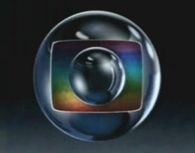
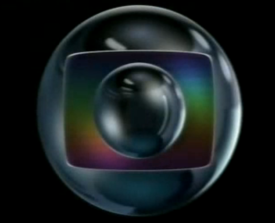
13th Logo
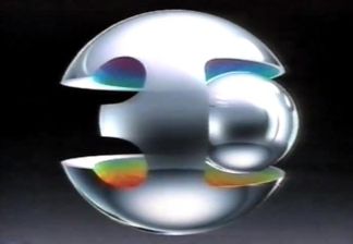
(2000-2005)


<iframe frameborder="0" height="188" src="http://wikifoundrytools.com/wiki/closinglogos/widget/genericvideo/58118c73fb4da58cf99c4596ce5f12f290b99454" width="250"></iframe>
Logo: Each variant consists of the same animation: against a video of a place or landmark from Brazil, the glass Rede Globo logo slowly zooms out until it's fully revealed. Then we fade to the normal logo on a black/blue background.
Variants:
- Numerous variants of the logo exists, consisting of more than 25 of them.
- The TV Globo International ident is similar but modified: the background is a satellite shot of the Earth, and when we fade to the logo, it zooms back to the top to make place for the letters "TV GLOBO" and "INTERNATIONAL".
FX/SFX: The glass logo zooming back on the video of the Brazilian landmark.
Music/Sounds: It depends on the variant, but all of them finish with the trademark Rede Globo jingle.
Availability: Extinct. These were never used on any programs. Check your old(er) tapes!
Editor's Note: None.
Editor's Note: None.
14th Logo
(2005-2007)
Logo: The premise is similar to the previous logo but different. Against a video of a Brazilian landmark, glass streaks appear from somewhere, expand and then move out. The glass Globo logo then appears and zooms back, just like what the previous one would do, but when we fade, we see a more brighter version of the logo on a cyan/white gradient.
Variants: Compared to the previous logo, there were around 3 variants of this one.
FX/SFX: The glass streaks and logo.
Music/Sounds: Same as the previous logo.
Availability: Extinct.
Editor's Note: None.
Editor's Note: None.
.
.
.
15th Logo
(2007-2008)
TBA!
16th Logo
(March 30, 2008-2009)
(March 30, 2008-2009)
 Logo: On a black background, we see colorful CGI streaks passing by in front of the camera. after a few seconds, other streaks come from the left and all the streaks are unified. Then, a silver ball zooms out from the left of the screen to the unified streaks, and then zooming out more, revealing the new logo in a white gradient background.
Trivia: The logo was changed at this time due to the growing use of widescreen TVs in the country (as well as worldwide).
FX/SFX: The CGI streaks and the zooming effects.
Music/Sounds: A futuristic tune with woodwinds at the end. No plim-plim to be heard in this ID.
Availability: Extinct, as the company doesn't use this logo anymore.
Editor's Note: None.
Editor's Note: None.
17th Logo
(2009-2010)
(2009-2010)
<iframe align="right" frameborder="0" height="210" src="http://wikifoundrytools.com/wiki/closinglogos/widget/genericvideo/be0540a2b6fa6bbaa5cbb6d8b977d7f780fa0da8" width="280"></iframe>Logo: TBA
FX/SFX: TBA
Music/Sounds: TBA
Availability: Extinct.
Editor's Note: None.
Editor's Note: None.
18th Logo
(April 26, 2010-2012)
 <iframe frameborder="0" height="210" src="http://wikifoundrytools.com/wiki/closinglogos/widget/genericvideo/447df93d5ff1aff402aeb147432921c3e3b94cb6" width="280"></iframe>
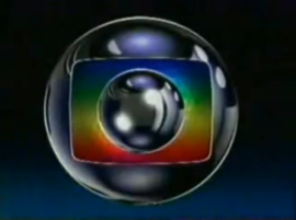
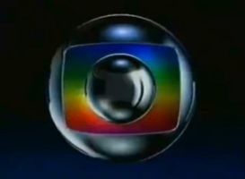
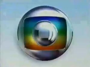
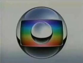
Logo: On a rainbow background, a silver ball zooms out and as it does so, the background waves. Then, the ball zooms in and after that, we zoom out to reveal that the ball and the background are on a tube-like shape inside another silver ball. Finally, the silver balls flash two times.
FX/SFX: The ball zooming, the background waving.
Music/Sounds: Same as the 10th and the 11th logo, accompanied by Rede Globo's famous "plim-plim" sound (which was introduced in 1970 as a pair of simple beeps accompanying the network logo of the time, used in break bumpers between commercial breaks and the main program; the "plim-plim" morphed into its current form, two telephone ringtone-like computerized "bleeps", in 1977).
Availability: Extinct.
Editor's Note: None.
(April 26, 2010-2012)
<iframe frameborder="0" height="210" src="http://wikifoundrytools.com/wiki/closinglogos/widget/genericvideo/447df93d5ff1aff402aeb147432921c3e3b94cb6" width="280"></iframe>FX/SFX: The ball zooming, the background waving.
Music/Sounds: Same as the 10th and the 11th logo, accompanied by Rede Globo's famous "plim-plim" sound (which was introduced in 1970 as a pair of simple beeps accompanying the network logo of the time, used in break bumpers between commercial breaks and the main program; the "plim-plim" morphed into its current form, two telephone ringtone-like computerized "bleeps", in 1977).
Availability: Extinct.
Editor's Note: None.
19th Logo
(2012-2013)
TBA!
20th Logo
(2013-2014)
TBA!
21st Logo
(2014- )
TBA!
------------------------------------------------------------------------------------------------------------
ANNIVERSARY IDENTS
1st Logo (10th Anniversary)
(1975)

NOTE: The next image shows the print logo.
Logo: During the show credits or ending, we see a stylized "10", with the Globe representing the 0. There is a line running through the globe. All of this looks enclosed by a square.
FX/SFX: None.
Music/Sounds: The closing theme.
Availability: Extinct. It is only know to appear in the show credits. Aside of that, it is unknown if it had a complete logo.
Editor's Note: None.
2nd Logo (15th Anniversary)
(1980)
<iframe align="right" frameborder="0" height="186" src="http://wikifoundrytools.com/wiki/closinglogos/widget/genericvideo/6c88cd9cb005635f72b345543d6b1e27ef611993" width="329"></iframe>
Logo:
- We see two doors with the number 15 on them. The Globe is in the middle of these doors. They open, revealing a multitude of musical instruments floating around in some sort of void. Two streaks of pale blue light pass through the doors as they open. There is a red-orange diagonal grid "floor". More light streaks pass by, and the black background acts as more doors.The doors open, and we see a light blue 15 on a dark salmon background. An orange streak of light falls on the curve in the 5, revealing the Rede Globo logo.
- We seeredandgreenneon lights forming a "floor". The camera pans forth and above them gradually.Yellow-orangelight streaks move away from the viewer. There is a big flash of the same color. A Scanimated 15 (with a trail behind it) zooms in, as does the camera, and the trail eventually stops continuing once the camera approaches it. There is awhite-ishflash as a result of this. The 15 is now solid, with the Rede Globo logo inside of it.
FX/SFX: Depends of the variant, but is either modeling or early CGI, combined with Scanimation.
Music/Sounds: A simple disco beat that gets slightly dramatic at the end.
Availability: Extinct on TV.
Editor's Note: None.
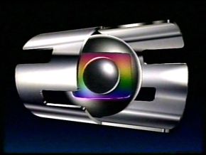
3rd Logo (20th Anniversary)
(1985)


<iframe frameborder="0" height="183" src="http://wikifoundrytools.com/wiki/closinglogos/widget/genericvideo/c6dde32e75fa154d0717a46cde86608c08a6a6fd" width="323"></iframe>
Logo: We see a silver background, which gets segmented by an unfamiliar object. The object leaves behind a rainbow-gradient outline. The camera zooms out, and we see what appears to be a "0" from first view. This is part of a structure. The structure rotates to one side and shows the Rede Globo logo, and keeps rotating. Objects keep flying out of the structure, which is a stylized, bold "2O". The object eventually stops spinning and stays on the side with the Rede Globo logo on it.
Variant:
- We see segments of the bold "2O" seen in the previous ident. They are in various parts of the screen. The pieces then converge into a rainbow "2O" structure (with ablue-indigo-red-yellow-aquamarine-bluegradient) with the Globo logo placed at the end (being a part of the structure).
- An early version just consisted in the same structure, but completely silver, spinning continuously.
- Some later versions had the logo completely still, while some people appear interacting.
FX/SFX: The animation, which is early CGI. It's hard to both look at and comprehend, but it's still good for the time. Likely done by Pacific Data Images.
Music/Sounds: An oversaturated catchy synth-pop tune that starts dramatically.
Music/Sounds Variant: A generic theme with an announcer was mostly used, but one ident had a more upbeat tune to it (along with a male chorus in the beginning).
Availability: Extinct.
Editor's Note: None.
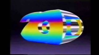
4th Logo (25th Anniversary)
(1989-1991)
 <iframe frameborder="0" height="220" src="http://wikifoundrytools.com/wiki/closinglogos/widget/genericvideo/3ac0f2c9b82199c169206fddb9e96ba49f96e69c" width="389"></iframe>
The early variant can be seen <a href="https://www.youtube.com/watch?v=5fVzpx2DDxQ&t=210s" target="_self">here</a>, and the later variant can be seen <a href="https://www.youtube.com/watch?v=5fVzpx2DDxQ&t=253s" target="_self">here</a>.
Logo: On a space background, we see the inside of something that looks almost like a paper towel tube. The tube is purple/pink/red gradient. We then see a ball moving in from the Earth. The tube begins cutting out to form a stylized "25". The Globo logo is revealed as the ball turns inside of the tube, and the structure keeps spinning.
FX/SFX: Good animation here, especially for 1990.
Music/Sounds: An upwards flourish followed by a dramatic theme. Ends with chorus and finishing notes. May include announcer.
Music/Sounds Variants:
- Earlier when the logo was used (late 1989), the theme sounded more synthesized.
- Later in its lifetime, it became stronger on the treble and had a bit more delay. The theme at the end sounded a tad more dramatic, and the chorus at the end sounded different.
Availability: Extinct.
Editor's Note: None.
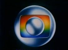
5th Logo (30th Anniversary)
(1995)
 <iframe frameborder="0" height="230" src="http://wikifoundrytools.com/wiki/closinglogos/widget/genericvideo/fc22c85d4d8a9f95c4c166e23e054c9d7730431d" width="407"></iframe>
Logo: TBA
FX/SFX: TBA
Music/Sounds: TBA
Availability: Extinct.
Editor's Note: None.
6th Logo (40th Anniversary)
(2005)
TBA!
7th Logo (45th Anniversary)
(2010)
TBA!
8th Logo (50th Anniversary)
(2015)
TBA!
Here below is a complete history of the company's idents, bumpers, and special IDs.
<iframe frameborder="0" height="208" src="http://wikifoundrytools.com/wiki/closinglogos/widget/genericvideo/8e784c2b069db755a09e9526e8cf2b0f1535595c" width="368"></iframe>