Red Tape Productions (UK)
Jump to navigation
Jump to search
1st Logo
(1980's)
Nicknames: "Another Naughty/Seducing/Sexy Logo", "Heart to Lips", "English Park Avenue", "Park Avenue Was A Huge Success", "British Park Avenue Counterpart"
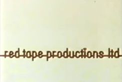
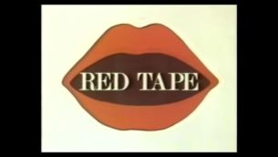
Logo: Begins with some clips featuring nude women. After a while of this, a red isosceles triangle pointing to the left with "red tape productions ltd." in a fancy multi-lined font with a heart as the tittle of the "i" over it, covers the screen. Then we zoom out to reveal that the red background is part of a red heart shape on a white background, then it completely unzips and cross-fades to "red tape productions ltd." in red, which zooms to the top and the same heart zooms out from the bottom to the center and morphs into a pair of lips, which opens up to reveal "RED TAPE" in the Bodoni font inside. The company name then shines and we zoom into the lips afterwards.
(1980's)


<iframe frameborder="0" height="165" src="http://wikifoundrytools.com/wiki/closinglogos/widget/genericvideo/4a8e27dca7726ed200d93b1d97cd8c274c08399d" width="292"></iframe>
Note: The video provided has the nudity cut out.
Nicknames: "Another Naughty/Seducing/Sexy Logo", "Heart to Lips", "English Park Avenue", "Park Avenue Was A Huge Success", "British Park Avenue Counterpart"
Logo: Begins with some clips featuring nude women. After a while of this, a red isosceles triangle pointing to the left with "red tape productions ltd." in a fancy multi-lined font with a heart as the tittle of the "i" over it, covers the screen. Then we zoom out to reveal that the red background is part of a red heart shape on a white background, then it completely unzips and cross-fades to "red tape productions ltd." in red, which zooms to the top and the same heart zooms out from the bottom to the center and morphs into a pair of lips, which opens up to reveal "RED TAPE" in the Bodoni font inside. The company name then shines and we zoom into the lips afterwards.
FX/SFX: The clips, and the rest of the animation with the logos. At least it looks better than Park Avenue (excluding your thoughts on the subject matter of the first half), for a good reason.
Music/Sounds: A descending synth decrescendo seguing into the disco tune.
Availability: Seen on adult films at the time.
Editor's Note: None.