Radio-Quebec (Canada)
Jump to navigation
Jump to search
 <iframe frameborder="0" height="230" src="http://wikifoundrytools.com/wiki/closinglogos/widget/genericvideo/3db4406dfc02d5ea357c0c0207066725cd21ae08" width="407"></iframe>
Background: Currently known as Télé-Québec, this company is a Canadian French language public educational television network available in the province of Quebec.
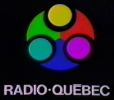
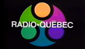
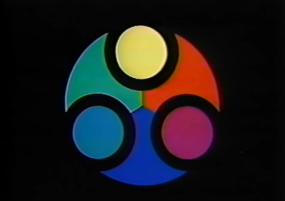
1st Logo
(1969-1980s)


<iframe frameborder="0" height="186" src="http://wikifoundrytools.com/wiki/closinglogos/widget/genericvideo/78beeb2f5ed44d7e666fad276dcf2964131046eb" width="329"></iframe>
Nicknames: "Multicolor Ball" "Spooky Circle"
Logo: On a black background three shapes - one green, one red, and one blue - appear on the top of the screen one by one. Then three circles appear between the shapes, those being in yellow, cyan and purple. What's about to be the finished result looks like a cylinder-like design, a-la the GPB logo of the 1970s. While the circles appear, the word "RADIO-QUÉBEC" (with a line above the first E of "QUÉBEC") zooms in below the logo in a choppy fashion.
Variants:
Variants:
- One of the variants had the shape of the logo zooming in until it covers the most of the screen. The logo is also on a different hue than the original ident. The name of the company then would fade in front of the logo.
- Another variant had the Radio-Québec symbol fading in appearing still, then fading out with no text.
FX/SFX: The parts of the logo appearing, the name zooming in.
Music/Sounds: An 9-note synth theme that ends with a dissonant binaural tone.
Availability: Probably extinct; it was a network ID bumper, so programming of the time likely won't have this.
Editor's Note: The logo forms in too slowly and the last note of the jingle sounds like if there was an error on the system. The text zooming is really cheaply done as well, and notably shaking. Looks like the whole thing was made with Scanimation. The placement of the circles on the original variant are also off-position, most notably the purple circle.
2nd Logo
(1975-1981)
<iframe frameborder="0" height="183" src="http://wikifoundrytools.com/wiki/closinglogos/widget/genericvideo/1ea99e772ae20dfc86c8c72c0a781e542b5bd6e5" width="324"></iframe><iframe frameborder="0" height="186" src="http://wikifoundrytools.com/wiki/closinglogos/widget/genericvideo/f668d2f106b7d648c91e1a5cd233387c6eebb66b" width="329"></iframe>
Logo: Both bumpers contain analog video effects; the first bumper has a moving green blob and "Intermede" with a video feedback effect. The second contains rapid orange gear-like patterns; the "Intermede" text is static in this variant and does not have video feedback.
FX/SFX/Cheesy Factor: The Scanimation and video feedback effects; typical '70s animation standards, but done in a more unique way.
Trivia: One of the songs used in this logo ("One Note Samba", mentioned below) is part of the first-ever LP to include synthesized music, with the song being released in 1967.
Music/Sounds: A almost purely synthesized light jazz tune, almost sounding like "elevator music". The first track is actually called "One Note Samba", made by Perrey & Kingsley. The second track is called "Lover's Concerto" (1975) made by the same music group as mentioned before.
Availability: Extinct, this was possibly used when the channel went off-air, though more often as an interstitial clip to fill time between programs.
Editor's Note: This may be a favorite of some due to the trippy animation and music score.
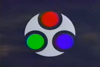
3rd Logo
(1988-1997)
 <iframe frameborder="0" height="230" src="http://wikifoundrytools.com/wiki/closinglogos/widget/genericvideo/3db4406dfc02d5ea357c0c0207066725cd21ae08" width="407"></iframe>
Nickname: "CGI Shapes"
Logo: On a dark sky, we see a 3D transparent cylinder with red, green, and blue segments. The cylinder now rotates to the background, revealing the logo.
FX/SFX: Standard late '80s CGI.
Music/Sounds: A jazz theme, with a voiceover announcer saying "Ici Radio-Québec" at the end of the ID.
Availability: Can be seen on commercial breaks from the time, found on VHS.
Editor's Note: None. Much tamer than the previous two logos.