Oregon Public Broadcasting
Jump to navigation
Jump to search
Logo description by mr3urious, AnimeDude892
Background: Oregon Public Broadcasting is a PBS affiliate which serves much of Oregon. Despite the name, OPB does not serve Southern Oregon, which is instead served by Southern Oregon Public Television (SOPTV).
1st Logo
(1977-1986, 1989) <iframe frameborder="0" height="186" src="http://wikifoundrytools.com/wiki/closinglogos/widget/unknown/50c8a58752acf5d8c0e77c7487d788137ad9d1be" width="247"></iframe>
Music/Sounds: A synth choir tune with a 4-note "twinkling" sound. The variants used an extended version of the theme, with the choir holded out for a while before a horn theme appears. The twinkling still happens.
Availability: Rare. Appears on Front Street Weekly, and possibly a Rick Steves travel show on PBS around that time. It also may have showed up on The Oregon Story.
Editor's Note: The logo's design was advanced for the 80s, and held up well into the end of its lifespan, though not today sadly.
5th Logo
(1999-2002)
Background: Oregon Public Broadcasting is a PBS affiliate which serves much of Oregon. Despite the name, OPB does not serve Southern Oregon, which is instead served by Southern Oregon Public Television (SOPTV).
1st Logo
(1977-1986, 1989)
 <iframe frameborder="0" height="186" src="http://wikifoundrytools.com/wiki/closinglogos/widget/unknown/50c8a58752acf5d8c0e77c7487d788137ad9d1be" width="247"></iframe>
Nickname: "Evergreen Star"
Logo: On a yellow background, a arrow-like tree rises up from the middle of the screen, followed by 2 more beside it, then 2 more beside them. The left side lifts up and suspends itself in a strange form, which followed by the right side and they form a star out of negative space. "oepbs" in a rounded orange-ish font zooms out, one letter at a time, forming a dip in the text. A white light appears in the center of the trees.
FX/SFX: Early Scanimation effects.
Music/Sounds: A slowed down version of the first few seconds of Toccata by Mannheim Steamroller, along with announcer saying "From the Oregon network.".
Availability: Extinct. This can be seen at closedowns at the time, as well as an opening ident for local programs, but those programs are long gone. This did, however show up after the 4th logo on the final episode of Front Street Weekly, which can be view <a class="external" href="http://americanarchive.org/catalog/cpb-aacip_153-16c2fszm" rel="nofollow" target="_blank">here</a>.
Editor's Note: By the end of its usage, this logo began to appear as highly outdated.
2nd Logo
(1980?-198?)
Logo: On a blue background, the tree-star from before, but in white, appear and spin at a rapid rate. The star then zooms out, which stutter in the process, and the "oepbs" text materializes below the star and it shifts up, eventually stopping. A rounded box outline then draws around the logo from the bottom to top.
Variant: There's short version starting with logo stopping spinning.
FX/SFX: The star spinning and the box drawing.
Music/Sounds: An announcer says "From the Oregon Network."
Availability: See 1st logo. It was preserved in some programs.
Editor's Note: None.
3rd Logo
(1984?-19??)
TBA
4th Logo
(1986-2002)
 Logo: Against a gray/black gradient background, a black/grey gradient square can be seen with the text "OREGON PUBLIC BROADCASTING" below in orange. A "O" then rotates around in the square as the text shines.


<iframe frameborder="0" height="201" src="http://wikifoundrytools.com/wiki/closinglogos/widget/unknown/f3a75573460744c3e56cc0f417933fb762d1f766" width="266"></iframe>
Variants:
- A longer version of the regular logo exists as an station ID. On a black/grey gradient background, the "O" slowly rotates around, all while it zooms out. The background then changes around it, leaving a square enclosure, as "OREGON PUBLIC BROADCASTING" wipes in below while shining.
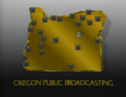
- A variant exists of the station ID, but its at the tail end of the logo and the text doesn't appear. Instead, a golden model of Oregon slides down and the square zooms out, splitting off to the their spots of broadcast. The text then wipes in below and the squares shine.
Music/Sounds: A synth choir tune with a 4-note "twinkling" sound. The variants used an extended version of the theme, with the choir holded out for a while before a horn theme appears. The twinkling still happens.
Availability: Rare. Appears on Front Street Weekly, and possibly a Rick Steves travel show on PBS around that time. It also may have showed up on The Oregon Story.
Editor's Note: The logo's design was advanced for the 80s, and held up well into the end of its lifespan, though not today sadly.
5th Logo
(1999-2002)
Nickname: "OPB on the Air"
Logo: Over a moving indigo-tinted background of transparent satin, we see the "O Square" from the previous logo, but below is "OPB" in the same font as the previous logo. In the background, we see a film strip moving upward, along with some gears moving in all directions, that later fade out and are replaced by waveforms. Signals emit from the square.
FX/SFX: The signals emitting and the background.
Music/Sounds: None.
Availability: Seen on Oregon's Memorable Century.
Editor's Note: None.
6h Logo
(2002-2007)
Nickname: "OPB Crescent"
Logo: We see a white crescent turning into place against a black background, along with the letters "OPB", also in white, zooming out slightly. "OREGON PUBLIC BROADCASTING" appears below.
FX/SFX: The crescent turning and letters zooming out.
Music/Sounds: A 5-note cello tune.
Availability: Seen on Rick Steves' Europe. Early See More's Playhouse episodes should have this logo, too.
Editor's Note: None.
7th Logo
(2007-20??)
Nickname: "OPB"
Logo: On a light blue wall/floor background, a white "O" in a blue square, a white "P" in a green square, and a white "B" in a brown square form the OPB logo one-by-one, in sync with the audio. We later zoom out very fast to see a blue "Oregon Public Broadcasting" below the logo.
Later variant: Later on, we see the logo simply zoom in.
FX/SFX:
Music/Sounds: A cutesy-sounding xylophone tune or a new-age electronic tune.
Availability: Very uncommon. It can be seen on Rick Steves' Europe, Mustard Pancakes, and See More's Playhouse, to name a few.
Editor's Note: None.
Logo: Over a moving indigo-tinted background of transparent satin, we see the "O Square" from the previous logo, but below is "OPB" in the same font as the previous logo. In the background, we see a film strip moving upward, along with some gears moving in all directions, that later fade out and are replaced by waveforms. Signals emit from the square.
FX/SFX: The signals emitting and the background.
Music/Sounds: None.
Availability: Seen on Oregon's Memorable Century.
Editor's Note: None.
6h Logo
(2002-2007)
Nickname: "OPB Crescent"
Logo: We see a white crescent turning into place against a black background, along with the letters "OPB", also in white, zooming out slightly. "OREGON PUBLIC BROADCASTING" appears below.
FX/SFX: The crescent turning and letters zooming out.
Music/Sounds: A 5-note cello tune.
Availability: Seen on Rick Steves' Europe. Early See More's Playhouse episodes should have this logo, too.
Editor's Note: None.
7th Logo
(2007-20??)

Nickname: "OPB"
Later variant: Later on, we see the logo simply zoom in.
FX/SFX:
- Original variant: The squares forming the OPB logo, the zooming.
- Later variant (with Cheesy Factor): The zooming of the logo, and not much else.
Music/Sounds: A cutesy-sounding xylophone tune or a new-age electronic tune.
Availability: Very uncommon. It can be seen on Rick Steves' Europe, Mustard Pancakes, and See More's Playhouse, to name a few.
Editor's Note: None.
8th Logo
(20??-)
TBA
