Mirage Enterprises
Jump to navigation
Jump to search
Logo description by EnormousRat and Eric S.
1st Logo
(1992?-1995)
Logo: On a black background we see filmstrip superimposed with a big lowercase M coloured grey. Under it, the words "MIRAGE ENTERPRISES" appear.
FX/SFX: None.
Music/Sounds: None.
Availability: TBA
Editor's Note: None.
2nd Logo
(1995- )
<embed allowfullscreen="true" height="227" src="http://wikifoundrytools.com/wiki/closinglogos/widget/youtubevideo/537028be066f196721b6cc990868ced43d351163" type="application/x-shockwave-flash" width="276" wmode="transparent"/>
1st Logo
(1992?-1995)
Logo: On a black background we see filmstrip superimposed with a big lowercase M coloured grey. Under it, the words "MIRAGE ENTERPRISES" appear.
FX/SFX: None.
Music/Sounds: None.
Availability: TBA
Editor's Note: None.
2nd Logo
(1995- )


<embed allowfullscreen="true" height="227" src="http://wikifoundrytools.com/wiki/closinglogos/widget/youtubevideo/537028be066f196721b6cc990868ced43d351163" type="application/x-shockwave-flash" width="276" wmode="transparent"/>
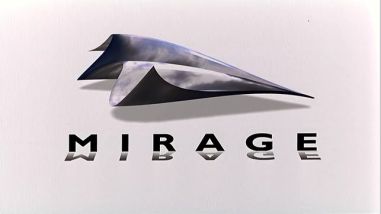
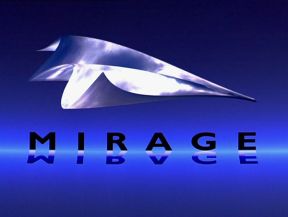
Nickname: "Folding Mirage"
Logo: We see a live action shot of clouds moving. After a few seconds it begins to fold, like a piece of paper, into a paper plane, against either a white of gradient blue background. The word "MIRAGE" then slides in from below. Reflections of the letters can be seen as the word slides into place.
Variant: On The Reader, the logo is black and white.
FX/SFX: Moving clouds, landscape folding into paper, the word rising up, the shine.
Music/Sounds: None or a soft organ theme.
Availability: Uncommon. Seen on Sliding Doors, The Reader, The Quiet American, and Blow Dry, among others. Might also be on Catch a Fire and Michael Clayton.
Editor's Note: None.