London Weekend Television (UK)
Jump to navigation
Jump to search
Logo descriptions by Matt Williams and Kris Starring
Logo captures by Mr. Logo Lord, TrickyMario7654, and <a href="https://web.archive.org/web/20141107070526/http://www.ultimate-lwt.co.uk/index.html" target="_self">The Ultimate LWT Website</a>
Video captures courtesy of mrskiling, maramotus, BSH12, and Tim Mischka
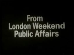
1st Logo
(August 2, 1968-1969)
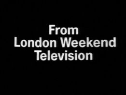
Nicknames: "Zooming Words", "Pinball Noise", "LWT Pinball", "Zooming London Weekend Television"
Logo: On a black screen, the words "From London Weekend Television" zoom in from the center.
Variants:
FX/SFX: The zooming in.
Music/Sounds: It starts off with a short, but odd, 6-note electric organ ditty, sustaining the last note. This is followed by a bouncy, 6-note Moog synthesizer sounder (with a 12-note synth harp in the background) ending with a "pinball noise" (Moog arpeggio). The public affairs variant used the electric organ tune, albeit pitched a half-step up, along with a Moog synth arpegiatting up and down repeatedly, followed by four additional notes from the organ as well as two bass notes playing in sync with the organ.
Availability: Extremely rare. The still version can be seen on videotaped LWT-produced shows from the period such as On the Buses, Frost on Saturday, Please Sir!, and The Big Match. The animated version was used as a local ID and was also possibly used on filmed shows of that time, and made an appearance at the end of LWT’s last day of broadcast on October 27, 2002. The public affairs version is also extremely rare and is seen on documentaries of that time.
Editor's Note: The zooming in looks like someone is moving it onto the screen. The music tries to sound cutting-edge and futuristic but ends up sounding confused, disoriented, and a tad creepy. The music also sounds like it's overcompensating for the very basic animation. The audio quality of the music (as far as we know) is also pretty poor.
2nd Logo
(1969-1970)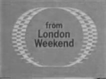
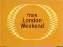
Logo: On a mustard background, three rows of stripes form, the middle being cream-colored, and the ones to the sides of it a dark brownish color. They then rotate to the left, revealing that it is a circle with an outline of stripes (which is supposed to resemble a British pound coin), and "from London Weekend" in the center.
Variants:
FX/SFX: The rotating.
Music/Sounds: A four-note "highbrow" tune with four timpani drum beats at the end (in the B&W logo, the music is at a slightly lower pitch with three drum beats).
Availability: Rare. As this wasn't widely seen in America, probably seen on On the Buses episodes from the era. It can be seen on shows such as Curry & Chips and Frost On Sunday.
Nicknames: "The River", "LW"
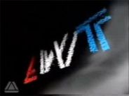
Logo: On a black background, a row of red-orange, white, and blue stripes moves onto the screen. They swerve at strategic points, resembling a connected "LW", with the "W" connected to the "L" by the bottom of the letter. Above it, the words "London Weekend" appear.
Variants:
FX/SFX: The appearance of the stripes.
Music/Sounds: A xylophone scale that climaxes in a full orchestra, which was composed by Harry Rabinowitz. The still version is silent, or has the end theme playing over it.
Availability: Rare. The 1977 series Love for Lydia has the logo retained on VHS, and the Just William variant is preserved on the show's UK DVD releases from Network. The version with no text was seen on one episode. Also seen on On the Buses episodes from the era.
Editor's Note: The rough animation combined with the jingle may rattle nerves. Its a fan to many, especially those who watched their programs back then.
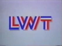
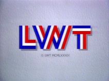
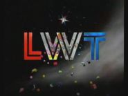
4th Logo
(September 1, 1978-1986; October 27, 2002)
Logo: The same as the 3rd logo, but near the end of the animation, the "LW" disconnects and morphs into the letters "LWT" (The L moves down, the W's tips rotate upwards, and another bar drops down from the end to form the T), each made up of the same stripe pattern. Below it, "London Weekend Television" appears.
Variants:
FX/SFX: The appearance of the stripes and the morphing effect.
Music/Sounds: The same as above, only slightly redone, so that the end is a bit more majestic. Re-mixed by Graham Hix.
Availability: Again, usually only seen in Britain. Can be seen in America on a VHS of Agatha Christie's Partners in Crime and other shows. It was also used on LWT's last day of broadcasting on October 27, 2002, along with other idents. Overall, this is rare to find even on older tapes due to the time period used.
Editor's Note: The animation is still rough, but the jingle is much mellower. Its a favorite of many as well.
5th Logo
(1982-1985)
FX/SFX: The neon effects forming the logo; very nicely done for 1982.
Music/Sounds: A jazzy fanfare with saxophones, drums, and a synth bass line, with the last note being played really high.
Availability: Extinct. It was used as a Britain-only ident in 1982.
Editor's Note: None.
6th Logo
(September 1983-1986)
 <iframe frameborder="0" height="204" src="http://wikifoundrytools.com/wiki/closinglogos/widget/unknown/2e885b6eadd7d9edc32c27e3908c4734239131dc" width="271"></iframe>
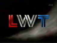
Logo: On a black background, we see red, white, and blue 3D stripes coming from the top and bottom of the screen. We rotate around to find that the stripes are the diagonal lines going through the "W" in "LWT", elongated and stretching farfrom the logo. The lines all condense and go in to place as the "LWT" rotates to face us, and a sphere with a design somewhat similar to the 80's New World logo on it rotates into view. The sphere and "LWT" stop and the words "YOUR WEEKEND ITV" (ITV being in the form of the '80s ITV print logo) rotate around coming from the left, "orbiting" the sphere, and stop at the bottom left corner of the screen.
FX/SFX: Great early 3D CGI. This logo was made during the "boom" of CGI logos in the UK.
Music/Sounds: Starts out with a futuristic computer-like synth sound, which culminates into an '80s techno jingle.
Availability: Extinct, and only seen in Britain. LWT used it as an alternative to the "River" ident for introducing shows out-of-vision (such as ITN news breaks) and as a break bumper in the early '80s.
Editor's Note: The cheesy "futuristic" synth music, while pretty cool, does not go with this logo. Also, the logo here appears to be more compressed, as the letters connect to the "W".
7th Logo
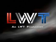
(August 29, 1986-August 30, 1992; October 27, 2002)
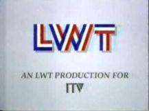
Nicknames: "Blinds", "Genesis", "Solari", "LWT IV", "CGI LWT II"
Logo: There were two main variants of this logo:
FX/SFX: The rotating in of the stripes. Great CGI that holds up even today. LWT was by now famous for good logos.
Music/Sounds: A triumphant synthesized theme, sometimes accompanied by a continuity announcement.
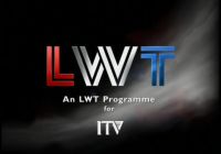
Availability: Seen mainly in Britain. ITV abolished front-caps like this in 1988, so idents would become even scarcer from this point on. The closing variant was seen in America on Lovejoy, when A&E aired it during the 1990s. Still saved on TV-movies and series produced by LWT, such as The One That Got Away from 1996. A still variant exists on DVD and VHS releases of Poirot. Series 1-4 of Gladiators retain the "An LWT Production for ITV" endcap, with series 5-8 featuring the 12th logo's endcap.
Editor's Note: The fanfare may get to a few, but this is an excellent logo, even today.
8th Logo
(1986-1989)
Logo: On a blue space background, we see three "invisible kids" with white T-shirts, each with a different-colored cap (with matching sneakers) coloredperiwinkle/yellow, red/grayish, and lime green/yellow from left to right. They dance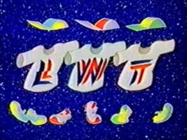 around as a boom box and three colored balls fly across the screen. This ends with the kids spinning around one by one, revealing a letter in the LWT logo, but redesigned in a lightning bolt font. The three kids strike a pose afterward.
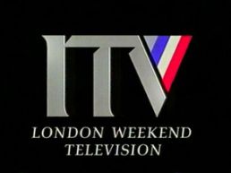
Logo: See ITV.
11th Logo
(September 4, 1992-August 26, 1996; October 27, 2002)
Nicknames: "Flying Blocks", "LWT VII", "CGI LWT III"
Logo: On a black background, red, white, and blue circular shapes appear. They quickly move to the left as they break apart into many red, white and blue blocks, along with similarly colored "streaks". The blocks move towards each other and lock together, forming a CGI LWTlogo. Behind it, several streaks in red, white, and blue appear. Sometimes, the ITV logo would appear, from similar streaks, below (that version was only used before networked programs).
Variants:
FX/SFX: The square effects. Very good CGI for its time, and still holds up well today.
FX/SFX: The squares forming the new LWT logo, all in downright breathtaking CGI.
Music/Sounds: An orchestral hit, followed by a string section climaxing in a four-note fanfare. A continuity announcement may follow. The music would sound less uplifting during tragic events (such as during the death of Princess Diana).
Availability: The animated version, used on TV until 1999, is extinct. The production logo is saved on TV-movies and shows like Jane Eyre, Wuthering Heights and Greta Garbo: A Lone Star, and was in use until the summer of 2002, when Granada introduced the purple end boards for all its owned regions. It also plastered older logos.
Editor's Note: Though the bold and loud fanfare may catch some younger viewers off guard, it's a very nice logo with some excellent animation and music.
13th Logo
(July - August 1998)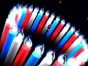
Note: This was used to commemorate LWT's 30th anniversary.
Nicknames: "The Candles", "LWT IX", "CGI LWT V", "30 Years of LWT"
Logo: On a black background, we pan upward from the side of red, white, and blue CGI candles with glowing white flames (kinda looking like lightbulbs), and bubbles with the LWT logo in them flying out. Then, one of the bubbles rises up to match the size of the candles, and a big "30" appears in the bubble, along with what looks like confetti. "Thirty Years of LWT" shimmers in below the circle, while many transparent LWT logos constantly revolve around it. The numbers '888' appear in the top right corner, as to denote subtitles available via teletext.
FX/SFX: The panning, the glowing, the bubbles appearing, the shimmering, and revolving.
Music/Sounds: A celebratory-sounding version of the 9th logo's theme. A continuity announcement followed at the end.
Availability: Again, extinct. It was only used for the week that LWT celebrated its 30th anniversary.
Editor's Note: The bubbles are a great touch, and it's beautifully designed.
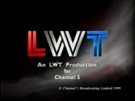
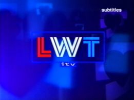
14th Logo
(November 12, 1999-March 19, 2000) 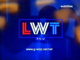
![[Untitled]](/images/thumb/c/cc/16e2d40465bfe69c1679396828cede75.png/263px-16e2d40465bfe69c1679396828cede75.png)
Nicknames: "The Video Wall","LWT X" "CGI LWT VI"
Music/Sounds: A rather electronic theme with beeping sounds, which became slightly rearranged in late 2000 with less apparent beeping sounds and additional drumbeats. This would often be followed by a continuity announcement.
Availability: This ident was sadly to be LWT's last, as the new branding for ITV1 as of October 27, 2002 called for a generic, flagship London region that gave the city no regional identity. The new region is known off-screen as "ITV London" and operates both weekdays and weekends.
Editor's Note: The colors and music here are quite ugly. Nonetheless, this logo was a fitting end to an ITV company with a long history of famous logos.
15th Logo
(2002-2004)
![[Untitled]](/images/thumb/b/b7/50byqexLorCXUU_dq7kJiA11486.jpeg/294px-50byqexLorCXUU_dq7kJiA11486.jpeg)
Nickname: "LWT XI"
Logo: This is the general logo, showing the LWT square over a purple silk background.
Trivia: The logo is a simple redesign of the Granada logo of the era. Starting from 2002, Granada was taking over all LWT productions, ending the process in 2004, and new series were credited to Granada London instead of LWT, then later to ITV Productions.
FX/SFX: None.
Music/Sounds: None.
Availability: Should be saved at the end of original programming from LWT. It was seen on some episodes of Poirot from the time.
Editor's Note: None.
Logo captures by Mr. Logo Lord, TrickyMario7654, and <a href="https://web.archive.org/web/20141107070526/http://www.ultimate-lwt.co.uk/index.html" target="_self">The Ultimate LWT Website</a>
Video captures courtesy of mrskiling, maramotus, BSH12, and Tim Mischka
1st Logo
(August 2, 1968-1969)


Nicknames: "Zooming Words", "Pinball Noise", "LWT Pinball", "Zooming London Weekend Television"
Logo: On a black screen, the words "From London Weekend Television" zoom in from the center.
Variants:
- On most shows, the logo was still and silent.
- One extremely rare variant had the words "Television" wipe out so that "Public Affairs" would wipe in in its place. Also, the words do not zoom in at the beginning.
FX/SFX: The zooming in.
Music/Sounds: It starts off with a short, but odd, 6-note electric organ ditty, sustaining the last note. This is followed by a bouncy, 6-note Moog synthesizer sounder (with a 12-note synth harp in the background) ending with a "pinball noise" (Moog arpeggio). The public affairs variant used the electric organ tune, albeit pitched a half-step up, along with a Moog synth arpegiatting up and down repeatedly, followed by four additional notes from the organ as well as two bass notes playing in sync with the organ.
Availability: Extremely rare. The still version can be seen on videotaped LWT-produced shows from the period such as On the Buses, Frost on Saturday, Please Sir!, and The Big Match. The animated version was used as a local ID and was also possibly used on filmed shows of that time, and made an appearance at the end of LWT’s last day of broadcast on October 27, 2002. The public affairs version is also extremely rare and is seen on documentaries of that time.
Editor's Note: The zooming in looks like someone is moving it onto the screen. The music tries to sound cutting-edge and futuristic but ends up sounding confused, disoriented, and a tad creepy. The music also sounds like it's overcompensating for the very basic animation. The audio quality of the music (as far as we know) is also pretty poor.
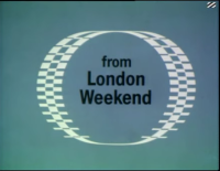
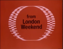
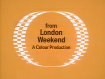
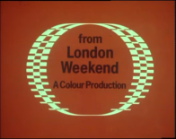
2nd Logo
(1969-1970)


Nicknames: "LWT Ring", "The Coin", "Spinning Ring", "Spinning London Weekend"
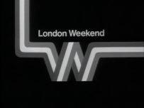
Logo: On a mustard background, three rows of stripes form, the middle being cream-colored, and the ones to the sides of it a dark brownish color. They then rotate to the left, revealing that it is a circle with an outline of stripes (which is supposed to resemble a British pound coin), and "from London Weekend" in the center.
Variants:
- This logo originated in black and white, with the brownish stripes dark gray and the background a light gray.
- Sometimes, "A Colour Production" would be shown below.
- This logo could be seen with a green, red, and blue background on Curry & Chips, LWT's first color programme.
FX/SFX: The rotating.
Music/Sounds: A four-note "highbrow" tune with four timpani drum beats at the end (in the B&W logo, the music is at a slightly lower pitch with three drum beats).
Availability: Rare. As this wasn't widely seen in America, probably seen on On the Buses episodes from the era. It can be seen on shows such as Curry & Chips and Frost On Sunday.
Editor's Note: This has surprisingly clean animation for the coin, and it still holds up really well. The text is pretty choppy, but its still pretty good.
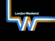
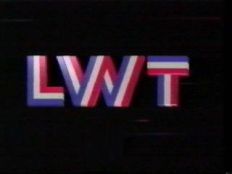
3rd Logo
(September 1970-August 1978)
(September 1970-August 1978)


Nicknames: "The River", "LW"
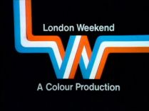
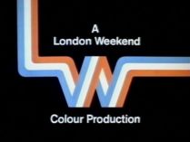
Logo: On a black background, a row of red-orange, white, and blue stripes moves onto the screen. They swerve at strategic points, resembling a connected "LW", with the "W" connected to the "L" by the bottom of the letter. Above it, the words "London Weekend" appear.
Variants:
- At the end of programs, the logo would be still, and "A Colour Production" would be seen below, or it would be written as "A London Weekend Colour Production". Sometimes, it would be shown on a white background.
- There is an extremely rare version without the accompanying text.
- The first episode of the 1978 LWT production, End of Part One, parodies this logo. The tri-coloured stripes fall vertically down until they disappear and crash down to the ground. The words "London Weekend" appear on the bottom right of the screen and shake as the crash sound plays.
- On the 1976 TV adaptation of Just William, William bursts through the logo after it's finished, leading into the show's title sequence.
FX/SFX: The appearance of the stripes.
Music/Sounds: A xylophone scale that climaxes in a full orchestra, which was composed by Harry Rabinowitz. The still version is silent, or has the end theme playing over it.
Availability: Rare. The 1977 series Love for Lydia has the logo retained on VHS, and the Just William variant is preserved on the show's UK DVD releases from Network. The version with no text was seen on one episode. Also seen on On the Buses episodes from the era.
Editor's Note: The rough animation combined with the jingle may rattle nerves. Its a fan to many, especially those who watched their programs back then.
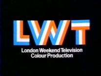
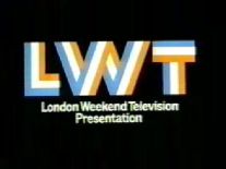
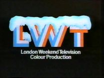
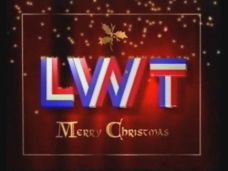
4th Logo
(September 1, 1978-1986; October 27, 2002)


<iframe frameborder="0" height="149" src="http://wikifoundrytools.com/wiki/closinglogos/widget/unknown/e237f33421c38d2122c8fe42efc87c760193189a" width="246"></iframe>
Nicknames: "The River II", "LWT Returns", "LWT"
Logo: The same as the 3rd logo, but near the end of the animation, the "LW" disconnects and morphs into the letters "LWT" (The L moves down, the W's tips rotate upwards, and another bar drops down from the end to form the T), each made up of the same stripe pattern. Below it, "London Weekend Television" appears.
Variants:
- One end variant used around Christmas time had the logo covered in snow.
- Sometimes, "Colour Production" or "Presentation" would be below.
- There is also a version with a white background with the red-orange part a lot more orange.
- A still variant exists.
FX/SFX: The appearance of the stripes and the morphing effect.
Music/Sounds: The same as above, only slightly redone, so that the end is a bit more majestic. Re-mixed by Graham Hix.
Availability: Again, usually only seen in Britain. Can be seen in America on a VHS of Agatha Christie's Partners in Crime and other shows. It was also used on LWT's last day of broadcasting on October 27, 2002, along with other idents. Overall, this is rare to find even on older tapes due to the time period used.
Editor's Note: The animation is still rough, but the jingle is much mellower. Its a favorite of many as well.
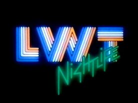
5th Logo
(1982-1985)

Nicknames: "LWT Nightlife", "LWT II"
Logo: We see some white, then green, and finally orange neon lines forming the LWT logo. Then, the three color segments "flash" separately. "NigHTLiFE" is drawn at the bottom right in a futuristic green font, with the dots on the I's flashing in afterward. This is repeated again.
FX/SFX: The neon effects forming the logo; very nicely done for 1982.
Music/Sounds: A jazzy fanfare with saxophones, drums, and a synth bass line, with the last note being played really high.
Availability: Extinct. It was used as a Britain-only ident in 1982.
Editor's Note: None.
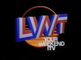
6th Logo
(September 1983-1986)
 <iframe frameborder="0" height="204" src="http://wikifoundrytools.com/wiki/closinglogos/widget/unknown/2e885b6eadd7d9edc32c27e3908c4734239131dc" width="271"></iframe>
Nicknames: "Your Weekend ITV", "CGI LWT", "LWT III"
Logo: On a black background, we see red, white, and blue 3D stripes coming from the top and bottom of the screen. We rotate around to find that the stripes are the diagonal lines going through the "W" in "LWT", elongated and stretching farfrom the logo. The lines all condense and go in to place as the "LWT" rotates to face us, and a sphere with a design somewhat similar to the 80's New World logo on it rotates into view. The sphere and "LWT" stop and the words "YOUR WEEKEND ITV" (ITV being in the form of the '80s ITV print logo) rotate around coming from the left, "orbiting" the sphere, and stop at the bottom left corner of the screen.
FX/SFX: Great early 3D CGI. This logo was made during the "boom" of CGI logos in the UK.
Music/Sounds: Starts out with a futuristic computer-like synth sound, which culminates into an '80s techno jingle.
Availability: Extinct, and only seen in Britain. LWT used it as an alternative to the "River" ident for introducing shows out-of-vision (such as ITN news breaks) and as a break bumper in the early '80s.
Editor's Note: The cheesy "futuristic" synth music, while pretty cool, does not go with this logo. Also, the logo here appears to be more compressed, as the letters connect to the "W".
7th Logo
(August 29, 1986-August 30, 1992; October 27, 2002)


<a class="external" href="http://wikifoundrytools.com/wiki/closinglogos/page/London+Weekend+Television/widget/youtubevideo/-884821828" rel="nofollow" target="_blank" title=", shockwave-flash@http://wikifoundrytools.com/wiki/closinglogos/page/London+Weekend+Television/widget/youtubevideo/-884821828">
</a><a class="external" href="http://wikifoundrytools.com/wiki/closinglogos/page/London+Weekend+Television/widget/youtubevideo/-884821828" rel="nofollow" target="_blank" title=", shockwave-flash@http://wikifoundrytools.com/wiki/closinglogos/page/London+Weekend+Television/widget/youtubevideo/-884821828">
</a><a class="external" href="http://wikifoundrytools.com/wiki/closinglogos/page/London+Weekend+Television/widget/youtubevideo/-884821828" rel="nofollow" target="_blank" title=", shockwave-flash@http://wikifoundrytools.com/wiki/closinglogos/page/London+Weekend+Television/widget/youtubevideo/-884821828">
</a><iframe frameborder="0" height="167" src="http://wikifoundrytools.com/wiki/closinglogos/widget/unknown/484cde036194ddd5eb2bec506c8d6ee6017573ef" width="222"></iframe>
Nicknames: "Blinds", "Genesis", "Solari", "LWT IV", "CGI LWT II"
Logo: There were two main variants of this logo:
- On a light gray textured background, the stripes on the letters "LWT" slowly rotate into view, forming the letters in the process. The letters are formed one by one. The orange stripes are now clearly red. A shadow forms when the logo is completely formed. This was seen on the beginning of networked programs for the entire ITV region. Officially called "Genesis".
- On the same light gray textured background, the entire logo rotates like a pair of venetian blinds to pictures of the letters separately on the gray background, then to a picture of all the letters together. This was only seen on the beginning of regional programs. Officially named "Solari".
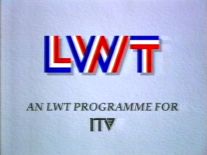
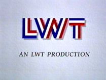
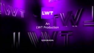
Variants:
- At the end of locally-produced programs (like the other ITV franchises), there would be a still, silent version of this logo with a smaller "LWT" logo and "AN LWT PRODUCTION (or "PROGRAMME") FOR" and the ITV logo below it. Sometimes, there would just be "AN LWT PRODUCTION (or PROGRAMME)", or just a copyright date below.
- An extremely rare shorter variant of the "Genesis" ident exists, in which the stripes all appear and rotate at once.
FX/SFX: The rotating in of the stripes. Great CGI that holds up even today. LWT was by now famous for good logos.
Music/Sounds: A triumphant synthesized theme, sometimes accompanied by a continuity announcement.
Availability: Seen mainly in Britain. ITV abolished front-caps like this in 1988, so idents would become even scarcer from this point on. The closing variant was seen in America on Lovejoy, when A&E aired it during the 1990s. Still saved on TV-movies and series produced by LWT, such as The One That Got Away from 1996. A still variant exists on DVD and VHS releases of Poirot. Series 1-4 of Gladiators retain the "An LWT Production for ITV" endcap, with series 5-8 featuring the 12th logo's endcap.
Editor's Note: The fanfare may get to a few, but this is an excellent logo, even today.
8th Logo
(1986-1989)
Nicknames: "LWT Kids", "LWT V"
Logo: On a blue space background, we see three "invisible kids" with white T-shirts, each with a different-colored cap (with matching sneakers) coloredperiwinkle/yellow, red/grayish, and lime green/yellow from left to right. They dance
 around as a boom box and three colored balls fly across the screen. This ends with the kids spinning around one by one, revealing a letter in the LWT logo, but redesigned in a lightning bolt font. The three kids strike a pose afterward.
FX/SFX: The dancing kids. Great 2D animation.
Music/Sounds: A rock/hip-hop rendition of the fanfare from the 7th logo, sometimes followed by a continuity announcement.
Availability: Extinct. This was used during children's programming.
Editor's Note: None. It's a nice logo with great animation and music.
9th Logo
(1989)
Nickname: "LWT VI"
10th Logo
(September 1, 1989-August 30, 1992)
Music/Sounds: A rock/hip-hop rendition of the fanfare from the 7th logo, sometimes followed by a continuity announcement.
Availability: Extinct. This was used during children's programming.
Editor's Note: None. It's a nice logo with great animation and music.
9th Logo
(1989)
Nickname: "LWT VI"
Logo: Over a background consisting of an animated sundial, we see three thin white arcs and a thin white straight line moving over them in a manner resembling that of the second hand of a clock. We also see a set of horizontal 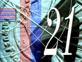 red, white and blue stripes at the top left of the screen, and two thick vertical stripes to the right of them, one red and the other blue. After a few seconds, a large white "21" slides in from the right, then twice disappears and reappears again. Finally, in the same manner as for the "blinds" variant of the 7th logo, the entire picture flips like a set of venetian blinds to reveal the LWT logo on a gray textured background.
FX/SFX: The sundial background, the "21", and the picture flipping.
Music/Sounds: A synthesized tune with plenty of drumbeats and clock ticking.
 red, white and blue stripes at the top left of the screen, and two thick vertical stripes to the right of them, one red and the other blue. After a few seconds, a large white "21" slides in from the right, then twice disappears and reappears again. Finally, in the same manner as for the "blinds" variant of the 7th logo, the entire picture flips like a set of venetian blinds to reveal the LWT logo on a gray textured background.
FX/SFX: The sundial background, the "21", and the picture flipping.
Music/Sounds: A synthesized tune with plenty of drumbeats and clock ticking.
Availability: Extinct. This was merely a special ident for LWT's 21st anniversary.
Editor's Note: None.
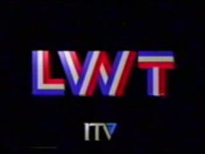
10th Logo
(September 1, 1989-August 30, 1992)

Nickname: "ITV Generic",
Logo: See ITV.
11th Logo
(September 4, 1992-August 26, 1996; October 27, 2002)


Logo: On a black background, red, white, and blue circular shapes appear. They quickly move to the left as they break apart into many red, white and blue blocks, along with similarly colored "streaks". The blocks move towards each other and lock together, forming a CGI LWTlogo. Behind it, several streaks in red, white, and blue appear. Sometimes, the ITV logo would appear, from similar streaks, below (that version was only used before networked programs).
Variants:
- An additional ident was in 1994-1995. The logo form up after swirling lines and squares contract and expand in the center, like a camera shutter. The ident was also used as a next bumper.
- There are special holiday variants of this logo in 1994 and 1995.
FX/SFX: The square effects. Very good CGI for its time, and still holds up well today.
Music/Sounds: A joint recomposition of both the David Dundas theme from the generic ident and the music from the 1986 idents, often with a continuity announcement at the end.
Availability: Extinct.
Editor's Note: Although some may be put off by the more serious sounding music (possibly because it attempts to sound happy), it's otherwise a clean logo and an effective warm-up for the next logo LWT used.
12th Logo
(August 30, 1996-2002)
Availability: Extinct.
Editor's Note: Although some may be put off by the more serious sounding music (possibly because it attempts to sound happy), it's otherwise a clean logo and an effective warm-up for the next logo LWT used.
12th Logo
(August 30, 1996-2002)


Nicknames: "LWT VIII", "CGI LWT IV"
Logo: On a black background, two "stars" of squares appear, in the LWT colors. The squares then zoom away from the star-like shape and then group together to form a new LWT logo, now redesigned, with the stripes now cut out of the letters and the now redesigned "LWT" being a solid red, white, and blue, respectively. The logo is on a background with smoke.
Variants:
- During Christmas time, one variant was used in which a star and falling CGI ornaments in the shape of a tree were superimposed over the logo. Another variant used fireworks flying around.
- A short variant exists, which cuts halfway to the squares forming the logo.
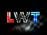
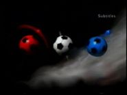
- During football/soccer games, the letters transform into footballs/soccer balls (still in their respective colors) and swirl around.
- Waving checkered flag graphics and sounds of cars speeding by would be used during broadcasts of Grand Prix races.
- A New Year's variant was also used, which is yet to be described.
- There was another variant in which the squares zoomed out and came together at an angle, swaying back and forth. A more soothing rendition of the fanfare is used here.
- An end variant had "An LWT Production" below, sometimes with an extra credit to ITV, or to Channel 5 and/or a Channel 5 copyright date below. This was also sometimes shared with the split-screen credits on the right.
- On the final series of Gladiators, the endcap reads "An LWT Production in association with ON Digital for ITV", with ON Digital and ITV displayed with their respective logos.
FX/SFX: The squares forming the new LWT logo, all in downright breathtaking CGI.
Music/Sounds: An orchestral hit, followed by a string section climaxing in a four-note fanfare. A continuity announcement may follow. The music would sound less uplifting during tragic events (such as during the death of Princess Diana).
Availability: The animated version, used on TV until 1999, is extinct. The production logo is saved on TV-movies and shows like Jane Eyre, Wuthering Heights and Greta Garbo: A Lone Star, and was in use until the summer of 2002, when Granada introduced the purple end boards for all its owned regions. It also plastered older logos.
Editor's Note: Though the bold and loud fanfare may catch some younger viewers off guard, it's a very nice logo with some excellent animation and music.
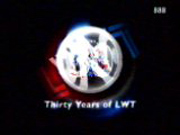
13th Logo
(July - August 1998)


Left: The candles used.
Right: The finished ID.
Right: The finished ID.
Note: This was used to commemorate LWT's 30th anniversary.
Nicknames: "The Candles", "LWT IX", "CGI LWT V", "30 Years of LWT"
Logo: On a black background, we pan upward from the side of red, white, and blue CGI candles with glowing white flames (kinda looking like lightbulbs), and bubbles with the LWT logo in them flying out. Then, one of the bubbles rises up to match the size of the candles, and a big "30" appears in the bubble, along with what looks like confetti. "Thirty Years of LWT" shimmers in below the circle, while many transparent LWT logos constantly revolve around it. The numbers '888' appear in the top right corner, as to denote subtitles available via teletext.
FX/SFX: The panning, the glowing, the bubbles appearing, the shimmering, and revolving.
Music/Sounds: A celebratory-sounding version of the 9th logo's theme. A continuity announcement followed at the end.
Availability: Again, extinct. It was only used for the week that LWT celebrated its 30th anniversary.
Editor's Note: The bubbles are a great touch, and it's beautifully designed.
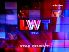
14th Logo
(November 12, 1999-March 19, 2000)


Variants: May sometimes be with a URL byline "www.g-wizz.net/lwt".
14th Logo
(March 24, 2000-October 27, 2002)
(March 24, 2000-October 27, 2002)

![[Untitled]](/page/File:16e2d40465bfe69c1679396828cede75.png)

Nicknames: "The Video Wall","LWT X" "CGI LWT VI"
Logo: A crowd of people, shown in silhouette, are watching a mostly red video wall. The camera zooms towards the wall and then "flashes" to the LWT/ITV logo like in the 9th logo, scrunched up and rotated. The logo rotates to its normal position and we zoom out to see it pictured on the video wall, with red "static" behind it. The web address, "www.g-wizz.net/lwt", appears below.
Variant: Starting in late 2000, the video wall is mostly blue and less "staticky" in this version, and the URL "<a class="external" href="http://www.lwt.co.uk/" rel="nofollow" target="_blank">www.lwt.co.uk</a>" is shown below. This was created following viewer complaints that the 2000 variant was an eyesore and cheesy. On August 11th, 2001, it was updated to incorporate the ITV1 branding, along with updated music. The last revision was in November 2001, adding the "itv.com" URL.
Variant: Starting in late 2000, the video wall is mostly blue and less "staticky" in this version, and the URL "<a class="external" href="http://www.lwt.co.uk/" rel="nofollow" target="_blank">www.lwt.co.uk</a>" is shown below. This was created following viewer complaints that the 2000 variant was an eyesore and cheesy. On August 11th, 2001, it was updated to incorporate the ITV1 branding, along with updated music. The last revision was in November 2001, adding the "itv.com" URL.
FX/SFX: The camera panning, and the wall.
Music/Sounds: A rather electronic theme with beeping sounds, which became slightly rearranged in late 2000 with less apparent beeping sounds and additional drumbeats. This would often be followed by a continuity announcement.
Availability: This ident was sadly to be LWT's last, as the new branding for ITV1 as of October 27, 2002 called for a generic, flagship London region that gave the city no regional identity. The new region is known off-screen as "ITV London" and operates both weekdays and weekends.
Editor's Note: The colors and music here are quite ugly. Nonetheless, this logo was a fitting end to an ITV company with a long history of famous logos.
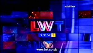
15th Logo
(2002-2004)

![[Untitled]](/page/File:50byqexLorCXUU_dq7kJiA11486.jpeg)
Nickname: "LWT XI"
Logo: This is the general logo, showing the LWT square over a purple silk background.
Trivia: The logo is a simple redesign of the Granada logo of the era. Starting from 2002, Granada was taking over all LWT productions, ending the process in 2004, and new series were credited to Granada London instead of LWT, then later to ITV Productions.
FX/SFX: None.
Music/Sounds: None.
Availability: Should be saved at the end of original programming from LWT. It was seen on some episodes of Poirot from the time.
Editor's Note: None.