Kultur
Jump to navigation
Jump to search
Logo descriptions by Brillemeister
Background: Kultur is a home media company that distributes and produces history, theater, and other genres. It is based in Forked River, Lacey Township, New Jersey.
(Early-Mid 1980's?)
 <iframe frameborder="0" height="227" src="http://wikifoundrytools.com/wiki/closinglogos/widget/unknown/46d83ffcc0f92565183e816847ab571e87dc33aa" width="402"></iframe>
Nicknames: "Unkultured", "First Time On The Computer", "Taffy Staff", "New Apple II User"
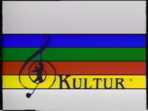
Logo: An off-center image of a stave/staff with a federal blue treble clef that has a conductor-like figure in it fades in, on a white background, with the word "Kultur" in a light ITC Benguiat font on the bottom space in the same color as the clef. Then, with a lateral zooming effect synchronized with the music, the spaces each become filled with color from top to bottom, first blue, then green, red and yellow. When this is done, the finished image "swings" to the left like a door, then to the right in a sort of "echo." Then, it comes down toward us in an angle reminiscent of the Star Wars opening text; this repeats twice, trimmed to sync with the music. After this the image is "stretched" and pulled from the center toward us to the right, then is also seen moving back to the left, like a conveyor belt; then the whole thing collapses briefly and re-inflates, while being turned back to face us as at the beginning. Finally it leans back slowly, then is stretched and pulled down toward us and fades out.
FX/SFX: The color fill, flipping, stretching, and squeezing.
Music/Sounds: An oversaturated recording of Beethoven's Symphony No. 5 "Fate".
Availability: Uncommon; found on 80's tapes related to art.
Editor's Note:A solid contender for the cheesiest logo ever produced. Evidently made by somebody who was either new to computers or severely farsighted; during the stretching, pixelated artifacts can be clearly seen on the image, which is the only object in this half-minute sequence, and the color saturation is inconsistent between "shots" (not attributable to the videotape). To top things off, the animation looks like it was done on an Apple II computer, not to mention the blue stripe is longer than the rest of the stripes, making it look like it's floating in the animations.
Background: Kultur is a home media company that distributes and produces history, theater, and other genres. It is based in Forked River, Lacey Township, New Jersey.
(Early-Mid 1980's?)
 <iframe frameborder="0" height="227" src="http://wikifoundrytools.com/wiki/closinglogos/widget/unknown/46d83ffcc0f92565183e816847ab571e87dc33aa" width="402"></iframe>
Nicknames: "Unkultured", "First Time On The Computer", "Taffy Staff", "New Apple II User"
Logo: An off-center image of a stave/staff with a federal blue treble clef that has a conductor-like figure in it fades in, on a white background, with the word "Kultur" in a light ITC Benguiat font on the bottom space in the same color as the clef. Then, with a lateral zooming effect synchronized with the music, the spaces each become filled with color from top to bottom, first blue, then green, red and yellow. When this is done, the finished image "swings" to the left like a door, then to the right in a sort of "echo." Then, it comes down toward us in an angle reminiscent of the Star Wars opening text; this repeats twice, trimmed to sync with the music. After this the image is "stretched" and pulled from the center toward us to the right, then is also seen moving back to the left, like a conveyor belt; then the whole thing collapses briefly and re-inflates, while being turned back to face us as at the beginning. Finally it leans back slowly, then is stretched and pulled down toward us and fades out.
FX/SFX: The color fill, flipping, stretching, and squeezing.
Music/Sounds: An oversaturated recording of Beethoven's Symphony No. 5 "Fate".
Availability: Uncommon; found on 80's tapes related to art.
Editor's Note:A solid contender for the cheesiest logo ever produced. Evidently made by somebody who was either new to computers or severely farsighted; during the stretching, pixelated artifacts can be clearly seen on the image, which is the only object in this half-minute sequence, and the color saturation is inconsistent between "shots" (not attributable to the videotape). To top things off, the animation looks like it was done on an Apple II computer, not to mention the blue stripe is longer than the rest of the stripes, making it look like it's floating in the animations.
_________________________________________________________________________
Kultur DVD
(2000's)
 <iframe frameborder="0" height="186" src="http://wikifoundrytools.com/wiki/closinglogos/widget/unknown/e99566c6543af9a67b6579c3b2028bce08f618bf" width="275"></iframe>
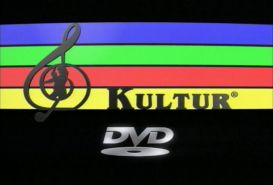
Music/Sounds: A deep synth drone with a zooming sound followed by a short extract from Beethoven's Symphony from the previous logo.
Availability: Seen on classical music and art DVDs.
Editor's Note: None.
 <iframe frameborder="0" height="186" src="http://wikifoundrytools.com/wiki/closinglogos/widget/unknown/e99566c6543af9a67b6579c3b2028bce08f618bf" width="275"></iframe>
Logo: On a black background, we see the topside of a disc. The disc pans down and we see three discs below. The sides of the discs are blue, green, red and yellow. They keep moving as the staff from the previous logo flies down along with the letters of the company name. The discs merge together and the finished product resembles the first logo. A lens flare appears beneath the logo, giving way to the DVD logo.
FX/SFX: The logo forming, which is an major improvement over the previous logo and the concept is creative.
FX/SFX: The logo forming, which is an major improvement over the previous logo and the concept is creative.
Availability: Seen on classical music and art DVDs.
Editor's Note: None.