Gaumont Columbia Films RCA Video (France)
Jump to navigation
Jump to search
(1982-1989)
 <iframe frameborder="0" height="223" src="http://wikifoundrytools.com/wiki/closinglogos/widget/genericvideo/38b0dd0c5370720d8269011ca83ce80080cbc27f" width="277"></iframe>
(1989-1993)
 <iframe frameborder="0" height="227" src="http://wikifoundrytools.com/wiki/closinglogos/widget/unknown/4a9e6609fe918a52cc4e775a2fcaaeb54118af99" width="402"></iframe>
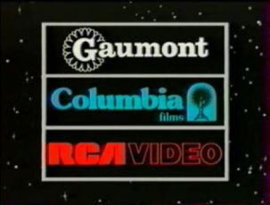
Logo: On a space background, several balls zoom out with trail effects to the back of the screen. A 3D version of the Gaumont logo then drops down with a trail behind it and zooms out to its position, just as the balls stop. A blue wire frame trail then zooms in and reveals itself to be the Columbia Pictures print logo (but with "films" instead), swinging a bit before stopping in the middle. The RCA logo then comes in and moves into position, with the "A" flipping in the process. "VIDEO" zooms in beside it and 2 halves of a 3-tiered rectangle outline then come in, enclosing the logo. The spaces are then wiped with black to block out the stars. The final result is exactly the same as the previous logo; the differences being the Columbia logo and the tighter spacing.
FX/SFX:The animations of the letters.
Music/Sounds:Same as the previous logo.
Availability: Same as the above.
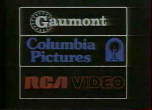
Gaumont Columbia Pictures RCA Video
(1982-1989)
 <iframe frameborder="0" height="223" src="http://wikifoundrytools.com/wiki/closinglogos/widget/genericvideo/38b0dd0c5370720d8269011ca83ce80080cbc27f" width="277"></iframe>
Logo:On a black background, a white rectangle spins upwards, containing the 1981-1995 Gaumont logo in white and slightly off center. It eventually rests at the top of the screen as the Columbia Pictures print logo at the time (but arranged horizontally) in blue spins up from the bottom left corner and rests below the Gaumont section. The 2 halves of the box then swing in around the logo and encase it. Below them, the text "RCA VIDEO" (with the former being the RCA logo and the latter being just a red outline) zooms in from below the screen and a incomplete rectangle then slides up, enclosing it and finishing the logo
FX/SFX: The animation of the logos.
Music/Sounds:A fanfare that sounds identical to the 20th Century Fox fanfare and the Superman theme, but not as good.
Availability:On French releases of Gaumont and Columbia Pictures (and TriStar Pictures) and even some Orion Pictures movies from the time. It's unsure but doubtful if it appears on Canadian French releases distributed by ISV, like Alone in the Dark (to name one).
Editor's Note: Really simple animation.
-------------------------------------------------------------------------------------------------------------------------
Gaumont Columbia Films RCA Video
(1989-1993)
 <iframe frameborder="0" height="227" src="http://wikifoundrytools.com/wiki/closinglogos/widget/unknown/4a9e6609fe918a52cc4e775a2fcaaeb54118af99" width="402"></iframe>
FX/SFX:The animations of the letters.
Music/Sounds:Same as the previous logo.
Availability: Same as the above.
Editor's Note: Better than before, but it's very primitive.