Difference between revisions of "YTV Originals (Canada)"
Jump to navigation
Jump to search
| Line 1: | Line 1: | ||
| − | <div class="WPC-editableContent | + | <div class="WPC-editableContent"><font size="3"><font><i><font color="#ffa500">Logo descriptions and captures by</font></i> <i>AsdfTheRevival, Eric S, wisp2007, and RedheadXilamGuy</i></font><br/><i><font color="#ffa500">Editions by </font><font color="#333333">Emini4, LJVborgSuperSet, Thisisanswer, and GETENT</font></i><br/><br/><font><u>Background</u>: Launched on September 1, 1988, YTV was the successor to two prior special programming services operated by various Ontario cable companies beginning in the late 1970s. They did not use a logo until <i>Deke Wilson's Mini-Mysteries</i> premiered in 1989. The two largest shareholders in YTV were two cable companies: Rogers Cable and a company known as CUC Broadcasting, which would later be acquired by Shaw Communications. By 1995, through various acquisitions and trades, Shaw had secured full control of YTV; it was spun off as part of Corus Entertainment in 1999.</font><font> <br/><br/><br/>1st Logo <br/>(1989-1991)</font><br/></font><div align="center"> </div> <div align="center"> </div> <div align="center"> <font size="3"><br/></font></div><div align="center">[[File:ZWefQtf-45gvaxttUBRoZA5846.jpeg|288px|YTV 1989]]<iframe frameborder="0" height="166" src="http://wikifoundrytools.com/wiki/closinglogos/widget/genericvideo/a493728ab25dcb25c9f10f64fdbb75fbca6413a4" width="295"></iframe></div><div align="center"></div><div align="center"><font size="3"><br/></font></div><font size="3"><font><u>Nicknames</u>: "Static Window", "The YTV Window"<br/><br/><u>Logo</u>: On a black background, we see a slanted window painted in with <font color="#0000ff">blue</font> borders. Inside the window is a very fuzzy <font color="#808080">gray</font>/black TV screen with the red words "<b><font color="#ff0000">YTV</font></b>" in it, although the YTV letters have got a black shadow.<br/><u>Trivia</u>:</font></font><div><font size="3"><font>-This was also used at the end of YTV commercials from 1989-1991.</font></font></div><div><font size="3"><font>-There is a rare in credit version as well.<br/><br/></font><font><u>FX/SFX</u>: The fuzzy TV screen.<br/><br/><u>Music/Sounds</u>: None.</font> </font><ul></ul><font size="3"><u>Availability</u>: Extremely rare, although this logo was never seen in the United States during the time of the debut. Seen on DVD sets of <i>The Adventures of the Black Stallion</i> (the Canadian print), as well as other YTV shows such as <i>Maniac Mansion</i> and <i>Dog House</i>. When Family Channel (now FreeForm) began running <i>The Adventures of the Black Stallion </i>in the 1990s, the YTV logo never appeared, as the Alliance & Atlantique logos were sped up. Instead, Family Channel's logo appeared, even though Family Channel's logo played over the closing of <i>The Adventures of the Black Stallion</i>; this variant also appeared when Canada's Showcase channel reran the show in the mid-2000s. It was considered extinct when <i>The Adventures of the Black Stallion </i>stopped being rerun on television until the most recent DVD releases came out and retained the logo. <br/><br/><u>Editor's Note</u>: None.<br/><br/><br/><br/>2nd Logo<br/>(1991-1993)<br/> </font><div align="center"> <font size="3">[[File:Xm28PajXxwBLK8fQGldmwg116033.png|258px|YTV (1992)]]</font><iframe frameborder="0" height="185" src="http://wikifoundrytools.com/wiki/closinglogos/widget/genericvideo/29830897ce5c6e20379e8571ef2cf2a4f5bef5d1" width="329"></iframe><font size="3"><br/><br/></font></div><font size="3"><font><u>Nicknames</u>: "The Neon Rainbow Rectangles", "The Rainbow Trail", "The Pretty Colored</font><font> Squares"<br/><br/><u>Logo</u>: On a black background, we see a bunch of neon rainbow rectang</font><font>les flying in different directions in trails. The YTV logo is seen in black, but when the trails pass by, the YTV letters disappear, they blend in with the background. There are 5 rainbow trails: the first one is </font><font color="#ffff00">yellow <font color="#333333">with <font color="#ffa500">orange<font color="#333333">, the second is <font color="#ffa500">orange <font color="#000000"><font color="#333333">with</font> <font color="#00e7f7">light blue<font color="#333333">, the third is <font color="#c60be3">purple <font color="#333333">with <font color="#ffff00">yellow<font color="#333333">, the fourth is <font color="#00ff00">green <font color="#333333">with <font color="#e191ed">light purple</font></font></font></font></font></font></font></font></font></font></font></font></font></font></font></font><font><font>, and the last trail is in </font><font color="#0000ff">blue <font color="#333333">with <font color="#ffff00">yellow<font color="#333333">, forming the YTV letters in <font color="#ff0000">red<font color="#000000">.</font></font></font></font></font></font><font> For the most part, only the logo's final part was used as a closing logo.<br/><br/><u>Variant</u>: On <i>Are You Afraid of the Dark?</i>, "PRODUCED IN ASSOCIATION WITH" is shown above the YTV logo. It is also cut short, only showing the </font><font color="#0000ff">blue</font><font> and </font><font color="#ffff00">yellow</font><font> </font><font>rectangles forming the logo.<br/><br/><u>FX/SFX</u>: The rainbow trail effects moving in different directions.<br/><br/><u>Music/Sounds</u>: From 1991-92, it used a synthesized three-note piano tune with bells played over it, although it was also used for YTV's <i>Coming Up Next</i> bumpers from 1991-93. From 1992-93, a female choir singing with dreamy music when used as an on-air ID on YTV. During at the end of TV shows, it is usually silent, or contains the end theme of the show, such as on <i>Are You Afraid Of The Dark?</i>.<br/><br/><u>Availability</u>: Extremely rare; it can be seen on early episodes of <i>Are You Afraid of the Dark?</i> in the Amazon DVD-on-demand release. T</font></font><font face="Arial"><font color="#000000"><font color="#333333">hey used to show this in Canada as one of YTV's bumpers. It was also spotted on the Canadian DVD releases of <i>The Adventures of the Black Stallion</i> episodes from 1991-93. It was probably replaced by the 1995 logo (with Corus byline) on many shows. The musical versions are considered extinct, as they were seen on Canadian prints of <i>Shining Time Station</i> and<i> Lamb Chop's Play-Along</i>. Strangely enough, this logo was appears on some Kids and Teens TV airings of "Lamb Chop's Play-Along!", including the episode "The Ring" and "Have I Got A Girl For You". The shortened version can also be found on early VHS releases o The Big Comfy Couch.</font><br/><br/><font color="#333333"><u>Editor's Note</u>: A beautiful logo with some well-done early CGI effects.<br/></font></font></font><br/><br/><font><br/>3rd Logo<br/>(1993-1995)</font><br/> <div align="center"> <font size="3">[[File:PwIz-n58U0KhKQUxpUifrA35418.jpeg|275px|YTV Canada - CLG Wiki]][[File:ZVb6FiASfnBGbh5ksdvQ9w7796.jpeg|275px|YTV (1992-1994)]]<br/></font></div><div align="center"><iframe frameborder="0" height="199" src="http://wikifoundrytools.com/wiki/closinglogos/widget/genericvideo/0ad4b37764f3a7cc27c19f3762a44e386b6b9df2" width="357"></iframe><font size="3"><iframe frameborder="0" height="197" src="http://wikifoundrytools.com/wiki/closinglogos/widget/unknown/75fc1e39f4a62e9b6b51388d15dc21e14d54ab3c" width="261"></iframe></font></div> <div align="center"> </div><font size="3"><br/><u>Nicknames</u>: "*click* WAOOOOOW! No Problem", "Screaming YTV" (for the 1994-1995 variant), "YTV TV", "CGI TV", "TV of Doom" (also for the 1994-1995 variant)<br/><br/><font><u>Logo</u>: On a black background, we see a</font><font color="#ee00ff"> purple</font><font>CGI television set with </font><font color="#00ff00">green </font><font>buttons on the right side of it. Inside the TV screen is an </font><font color="#ffa500">orange</font><font> background with the white letters "<b>YTV</b>", with "T" and "V" on the left, and arranged on top of each other. The YTV text then rumbles out of the screen to cover up most of the TV set.</font><font><br/><u><br/>Variant</u>: On <i>Are You Afraid of the Dark? and The Big Comfy Couch, </i>the text "Produced in association with" is seen above in white.</font><br/><font><br/><u>FX/SFX</u>: The text rumbling.<br/><br/><u>Music/Sounds</u>: From 1993-94, it was a boing sound. From 1994-95, it was a click and a scream from a group of female singers (taken from Best Service's <i>Hallelujah</i>and <i>Voice Spectral Vol. 1</i> sample libraries) followed by a girl saying "No problem." In addition, the logo is also silent or it plays over the closing theme of a show.</font></font><div><font size="3"><br/></font></div><div><font size="3"><u>Music/Sounds Variant</u><u>:</u> On early episodes of <i>The Big Comfy Couch, </i>a different boing is used with children laughing.<br/><br/><u>Availability</u>: Rare; it appears on <i>Are You Afraid of the Dark?</i><i> </i>on the CreateSpace DVD release and occasional airings on TeenNick's NickSplat. In Canada, it can be found on a YTV print of the Christmas special <i>Christopher the Christmas Tree</i>. Usually replaced in Canada by the fourth logo with the Corus byline. Toonami's airings of <i>ReBoot</i> from the era also had this logo.</font></div><div><u><font size="3"><br/></font></u></div><div><font size="3"><u>Editor's Note</u>: The animation of the ''YTV'' text is choppy, and the unexpected scream can get to some.</font><div> <div> <div align="center"> </div> <div align="center"> </div><font size="3"><br/><br/><br/></font><div align="center"> </div> <div> <font size="3">4th Logo</font></div> <div> <font size="3">(1995-October 21, 2007?)</font></div></div></div></div></div><div><div align="center">[[File:E4697754d3270dff0773da5ecb426a75.png|297px|YTV (1995)]][[File:F962e40ed4a0e7bc359b34286906cd82.png|288px|YTV (1997) - a]][[File:8Nv4IoZiinkqD Inr9QsXQ272287.png|296px|YTV Originals (Canada) - CLG Wiki]][[File:712aa4dd1780b22377d0f477fc5cf60c.png|281px|YTV (Produced in association with variant 2) (2007)]][[File:OY2uf-1oulOTe0aFMQj2qA11634.jpeg|293px|YTV (1999, with Shaw byline)]][[File:GDp fZFES6c xS6XnUH1jA17321.jpeg|289px|YTV 1999]][[File:UIdzpGIReljIJgN39W7tCQ15500.jpeg|274px|YTV (Corus)]][[File:E811f6b1d73b37507b847ae70fe03d05.png|264px|YTV (1999)]][[File:Ac57f83dc20c87b539e96f64f4a8b59e.png|284px|YTV (1997) - b]][[File:54e76594ca46f7bf0d76ab64fe6ff36d.png|271px|YTV (2001)]]</div><div align="center"></div><div align="center"></div><div align="center"></div></div><div><div><div align="center"></div><div align="center"></div><div align="center"><iframe frameborder="0" height="147" src="http://wikifoundrytools.com/wiki/closinglogos/widget/genericvideo/86c92eab90e8b2c2f05e5b27c88132e81c6da9e9" width="261"></iframe><iframe frameborder="0" height="150" src="http://wikifoundrytools.com/wiki/closinglogos/widget/unknown/217b6b5d06867834d2765f0b0f7dc5415c30144b" width="199"></iframe><iframe frameborder="0" height="147" src="http://wikifoundrytools.com/wiki/closinglogos/widget/genericvideo/4a68cb66b9a03302b1b2174fb2b0a8d8ae9e88f8" width="263"></iframe></div><div align="center"></div><div align="center"><iframe frameborder="0" height="146" src="http://wikifoundrytools.com/wiki/closinglogos/widget/genericvideo/ecb8a5f0f61f8231bec895e113578aa6c6dc9765" width="259"></iframe><iframe frameborder="0" height="149" src="http://wikifoundrytools.com/wiki/closinglogos/widget/genericvideo/1dfbbb8e039462aabce1298d8a3a30040384ffa9" width="265"></iframe><iframe frameborder="0" height="149" src="http://wikifoundrytools.com/wiki/closinglogos/widget/genericvideo/75c4e76f6b8c6d27b036166d6225210ad9a6313e" width="265"></iframe></div><div align="center"><div align="center"> <div align="center"></div> <div align="center"> </div></div> <div align="center"> </div></div> <div align="center"> </div><font size="3"> <br/><u>Nicknames</u>: "YTV TV II", "Screaming YTV II" (for the <i>ReBoot</i> variant), "CGI TV II", "TV of Doom II" (also for the <i>ReBoot</i> variant)<br/><br/><u>Logo</u>: On a black background, we see the same television set as before, except the design of the set looks slightly different. The text "<b>YTV</b>", arranged the same way as before but looking a little different font-wise, rapidly zooms out from the right and smashes into the TV set, making the TV set "lean back". The TV then comes into place, now with the YTV text in the screen of the set. The text "Produced in association with" sometimes appears above the set.<br/><br/><u>Trivia</u>: This was actually the 1995-2000 YTV logo. A new logo between 2000-06 was used as the channel's official logo. However, this logo remained to be used as a closing logo through 2007.<br/><br/><u>Bylines</u>: <br/></font><ul> <li> <font size="3">1995-1999: "<font face="Impact">A SHAW COMMUNICATIONS COMPANY</font>"</font></li><li> <font size="3"><font face="Arial, Verdana, Helvetica, sans-serif">1997-1999: "</font><font face="Times">A</font> <font face="Arial" size="2"><b><i>SHAW</i></b></font><font color="#3692d9">)</font> <font face="Times">Company</font><font face="Arial, Verdana, Helvetica, sans-serif">" with "</font><font size="2"><b><i>SHAW</i></b></font><font color="#3692d9">)</font><font face="Arial, Verdana, Helvetica, sans-serif">" being the 1997-2012 Shaw logo and the rest being in Garamond font. It either cuts or fades in.</font></font></li><li> <font size="3"><font color="#333333">1999-2002: The Corus logo with "</font><font color="#ffa500">A CORUS ENTERTAINMENT COMPANY</font><font color="#333333">" next to it in two lines. This byline slides up from the bottom.</font></font></li><li> <font size="3">2000-2007: "<i>A</i><font color="#00ff00">C</font><font color="#ffff00">O</font><font color="#ff00ff">r</font><font color="#ff0000">U</font><font color="#0000ff">s</font><i>Entertainment Company</i>", with "<font color="#00ff00">C</font><font color="#ffff00">O</font><font color="#ff00ff">r</font><font color="#ff0000">U</font><font color="#0000ff">s</font>" in its corporate font. This byline blurs in.</font></li><li><font size="3"><font color="#333333">2006?-2007: "<b>A</b> </font><font color="#00ff00">C</font><font color="#ffff00">O</font><font color="#ff00ff">r</font><font color="#ff0000">U</font><font color="#0000ff">s</font><font color="#333333"> </font><font color="#333333"><b>ENTERTAINMENT COMPANY</b></font><font color="#333333">", with "<font color="#00ff00">C</font><font color="#ffff00">O</font><font color="#ff00ff">r</font><font color="#ff0000">U</font><font color="#0000ff">s</font>" in its corporate font. The byline blurs in a different way.</font></font></li><li><font size="3">The logo is bylineless on some shows mostly from the Shaw era. When this variant was used in the Corus era, the Corus Entertainment logo follows this logo.</font></li></ul> <div><font size="3"><u>Variants</u><u>:</u></font></div> <div> <ul> <li><font><font face="Arial, Verdana, Helvetica, sans-serif"> "</font><b><font face="Garamond"><font>P</font><font>RODUCED IN ASSOCIATION WITH</font></font></b><font face="Arial, Verdana, Helvetica, sans-serif">" appears above. Seen on season 1 of </font><i>Beast Wars</i><font face="Arial, Verdana, Helvetica, sans-serif">,</font><i> </i><font face="Arial, Verdana, Helvetica, sans-serif">the later episodes of </font><i>Are You Afraid of the Dark?</i><font face="Arial, Verdana, Helvetica, sans-serif">, </font><i>Urban Vermin</i><font face="Arial, Verdana, Helvetica, sans-serif">, </font><i>The Anti-Gravity Room</i><font face="Arial, Verdana, Helvetica, sans-serif">,</font><i>Viva Piñata</i><font face="Arial, Verdana, Helvetica, sans-serif">,</font><i> </i><font face="Arial, Verdana, Helvetica, sans-serif">and</font><i> </i><i>Edgar and Ellen.</i><br/></font></li><li><font size="3"> A variant exists where the logo is up against an orange background with various shapes in the background along with the Shaw byline.<br/> </font></li><li><font size="3"> Same as as the last one, but on a black background. Seen on <i>Shadow Raiders</i>, season 3 of <i>Beast Wars</i>,<i> </i>and early episodes of <i>Beast Machines: Transformers</i> (plastered by the Sony Pictures Television logo on the DVD release).</font></li><li><font size="3">Another variant exists that has the "Produced in association with" variant, but afterward it cuts to the still logo with the 1995 Shaw byline on a black background. This was seen on the series <i>Mission Genesis</i> (known as <i>Deepwater Black </i>in the UK and Canada).<br/></font></li><li><font size="3">There are three versions: one has the TV slightly tilting back when the words zoom out (1995-2002); another version has the TV jump in the air when hit (1998-2007) and the final version has the TV zoom back further and rushes back quickly (2006?-2007).</font></li><li><font size="3">There is a weird version used on<i> Being Ian</i> where the aspect ratio is distorted. The logo starts out stretched, then when the TV jumps in the air, the aspect ratio zooms back and straightens itself (it's really hard to describe).</font></li><li><font size="3">On <i>Treasure!</i>, it appears in-credit.</font></li><li><font size="3">On <i>Chip N’ Orbit</i> a copyright below reads either © YTV Productions Inc. MM or</font>©MMI YTV Productions Inc.</li></ul></div><div><font size="3"><u><u><br/></u></u></font></div><div><font size="3"><u><u>FX/SFX</u></u>: Just the words zooming out.<br/><u><br/>Music/Sounds</u>: The end theme of the show, or no music at all. On <i>ReBoot</i> and <i>The Big Comfy Couch</i>, it uses the previous logo's music for plastering over the previous logo.<br/><br/><u>Music/Sound Variants</u>:<br/> </font></div><ul> <li> <font size="3">On seasons 1 and 2 of<i> ReBoot</i>, the audio from the previous logo plays. Season 3 used a short hip-hop tune, which was also used on some episodes of <i>Mission Genesis </i>(known as <i>Deepwater Black </i>in the UK and Canada). As such, it plastered over the previous logo. </font></li><li><font size="3">On <i>Prank Patrol</i>, a cartoonish whack sound is made when the text hits the screen, then a thump when the TV hits the ground.</font></li><li> <font size="3">On <i>RadioActive</i>, you can hear a quiet whistle (plays over the theme song).</font></li></ul><div><font size="3"><u><br/></u></font></div><div><font size="3"><u>Availability</u>: Common in both the U.S. and Canada. In the U.S., it can be seen on shows such as <i>Jane and the Dragon </i>on Qubo, and earlier episodes of <i>T</i><i>he Big Comfy Couch, </i>while in Canada, it can be seen on all pre-2007 YTV original programming. The <i>ReBoot </i>variant is scarce, however, and was last seen when aired on Toonami in the US and Teletoon Retro in Canada, and on DVD. Also, it can be seen on the first seasons of both <i>Grossology</i><i> </i>and<i> </i><i>Mona the Vampire</i><i>. </i>It also plastered older YTV logos as well.<br/><br/><u>Editor's Note</u>: This logo is well-remembered by those in Canada who grew up watching YTV.</font></div><div><font size="3"><br/><br/><br/>5th Logo<br/>(May 12, 2007-2010, April 1, 2011-August 17, 2013)<br/> </font></div><div align="center"><font size="3">[[File:MrrWbmU7Caxijz1bHwFAVg19669.jpeg|270px|YTV (2007- )]][[File:8MSnv1mBkkOpvU4Wu7Y2fQ497196.png|277px|YTV (2006)]][[File:B38b012baaf4efeffdcc2c8a0389108b.png|349px|YTV (2006, ytv.com variant)]][[File:87aa63c593afd5e3e42e17cb0addc34b.jpeg|352px|YTV (2007)]]</font>[[File:7e05e9fa103ea5e285b54e958b91804a.png|394px|YTV (2008)]]<font size="3"><br/></font><iframe frameborder="0" height="147" src="http://wikifoundrytools.com/wiki/closinglogos/widget/genericvideo/0e1d66b41ef16db3a1b1009e8283394e41e323ac" width="259"></iframe><font size="3"><iframe frameborder="0" height="147" src="http://wikifoundrytools.com/wiki/closinglogos/widget/genericvideo/3173af1042b6549e803376941cef6774d1c74838" width="263"></iframe><iframe frameborder="0" height="143" src="http://wikifoundrytools.com/wiki/closinglogos/widget/genericvideo/b5f8d43d289909364ec97f53d1cbfe08fadc49d3" width="250"></iframe></font></div><div><font size="3"><u><br/>Nicknames</u>: "Jungle of Lines", "Yellow Lines", "Swirling Tornado", "YTV Circle"<br/><br/><u>Logo</u>: On a blue and cyan gradient background with revolving white and yellow lines, we see a lots of white and blue lines coming together to form a cyan and white circle with "<b>YTV</b>" on it, arranged similarly to the previous logos. A byline appears below.</font></div><div><font size="3"><br/><u>Bylines</u>:</font></div><div><ul><li><font size="3"><font color="#333333">2007?: "</font><font color="#333333"><i>A </i>CORUS<i> ENTERTAINMENT COMPANY</i>" with "CORUS" in its corporate font and in color.</font></font></li><li><font color="#333333" size="3">2007?-2008?: The byline from the previous logo (background and all) is superimposed below the logo.</font></li><li><font color="#333333" size="3">2008-2013: "<i>A </i>CORUS<i> Entertainment Company</i>" with "CORUS" in its corporate font and in white.</font></li></ul></div><div><font size="3"><u>Variants</u>:<br/> </font></div><ul> <li> <font size="3">Sometimes, "<b>PRODUCED IN ASSOCIATION WITH</b>" is shown above the logo. </font></li><li><font size="3">An early version exists where the byline from the previous logo (background and all) is superimposed below the logo. This can be found on 2007-2008 episodes of <i>Viva Piñata </i>and Nicktoons Network's split-screen credits airings of<i>Edgar and Ellen</i>.</font></li><li><font size="3">In 2008, the YTV logo has a glowing effect<font>. Also, the</font> YTV's logo animation was slightly altered to be longer and is centered.</font></li><li><font size="3">On some shows, "www.ytv.com" is below the byline.</font></li><li><font size="3">There was an extended version without a byline used as a station ID.</font></li><li><font size="3">There's also a variant of the extended version with the Corus byline appears on some shows such as <i>Rollbots</i>.</font></li></ul><div><font size="3"><u><br/></u></font></div><div><font size="3"><u>FX/SFX</u>: The lines forming the logo. <br/><br/><u>Music/Sounds</u>: None, or the ending theme of the show. On <i>Edgar and Ellen</i><i> </i>and<i> </i><i>Zeke's Pad</i>, we hear the fast drum tune, covered by laser sounds, another laser sound with note (when logo formed). The "woo-woo-woo" like sound is heard at the end.<br/><br/><u>Availability</u>: Was last seen on <i>Storm Hawks </i>and<i> League of Super Evil</i> on Cartoon Network, <i>Kid vs. Kat </i>on Disney XD and <i>Edgar & Ellen</i> on Nicktoons Network (now Nicktoons) in the United States. However, this is more common in Canada because most cartoons and shows that air on Canada usually carry this logo at the end of most of YTV's post-2007 programming.The early byline variants can be found on 2007-2008 episodes of <i>Viva Piñata </i>and presumably <i>Edgar and Ellen</i>. When the next logo was introduced, this logo was kept on <i>Scaredy Squirrel</i> for its first two seasons, then switched to the next logo.</font></div><div><font size="3"><br/><u>Editor's Note</u>: The fast action and sudden appearance as well as the logo suddenly slamming into the screen may startle you the first time you see it, but it's a tamer than the last 2 logos.<br/><br/><br/><br/>6th Logo<br/>(2009?-2014)<br/></font></div><div align="center"><font size="3">[[File:UqyeHpZZJeb32hsd8j3GEQ179236.png|336px|YTV (2009) (Produced In Association With Byline)]][[File:016782e04fccea3f58780c900fb91262.jpeg|331px|YTV (2010)]]<font>[[File:235d15a3be93c8ab966dd4c6e1e9593e.jpeg|276px|YTV (2012)]]</font>[[File:EdHh09jPTtMfv Zj-3s0Hw29744.jpeg|331px|YTV Original (2010)]][[File:E4d07d848c8bdeb2c91697d7a6228731.jpeg|331px|YTV (2014)]]</font></div><div align="center"><iframe frameborder="0" height="182" src="http://wikifoundrytools.com/wiki/closinglogos/widget/genericvideo/85ae04246411341c24598561dc42eb6b8bd4160d" width="323"></iframe><font size="3"><iframe frameborder="0" height="174" src="http://wikifoundrytools.com/wiki/closinglogos/widget/unknown/e30863da145047aad3968ff846a79d70d7e91791" width="287"></iframe><iframe frameborder="0" height="175" src="http://wikifoundrytools.com/wiki/closinglogos/widget/unknown/2ce7b858d0df7b814aad088301aeeedb5f22f967" width="287"></iframe></font></div><div align="center"><font size="3"><br/></font></div><div><font size="3"><u>Nicknames</u>: "Swirling Tornado II", "YTV Circle II"<br/><br/><u>Logo</u>: In a blue environment, there are random yellow shapes around the screen moving around. In the space that is being surrounded by the shapes, there are many flying shapes in blue and white. The shapes then collide and form the YTV logo, this time fully blue and white as the text spreads out on it and the screen shakes as it forms with the spikes rotating. The logo rotates as a Corus byline appears below and "Produced In Association with" sometimes appears above.</font></div><div><font size="3"><br/></font></div><div><div><font><u>Bylines</u>:</font></div><div><ul><li><font size="3">2009-2012: The full Corus Entertainment logo (in white) and next to it is the text "A Corus Entertainment Inc. Company".</font></li><li><font size="3">2012-2013: (Bylineless)</font></li><li><font size="3">2013-2014: "A Corus ENTERTAINMENT COMPANY" with "Corus" being the 1999-2016 logo and "ENTERTAINMENT COMPANY" spaced out.</font></li></ul></div><font size="3"><br/><u>Variants</u>:</font></div><div><ul><li><font size="3"> <u>2012-2013</u>: The shapes come in as the YTV logo comes in and makes a U-turn like an boomerang and a rectangle comes in and places itself below. It's design is the same as the later version, but the logo has no white bumpers, lacks the Corus byline, the shapes and lighting are different, now at a different angle, and has "ORIGINAL" in a generic font and the rectangle it was on was darker.</font></li><li><font size="3"><u>2013-2014</u>: On a differently lighted blue environment, we see a blue hemisphere with white lines. It zooms out and spins as the yellow shapes, this time different, move into place. The hemisphere then spots spinning and reveals the logo with "ORIGINAL" on a light blue rectangle going under it. There are white borders surrounding it moving positions. Under it is the newer Corus byline.</font></li><li><font size="3">There was a longer version which had a white piece with 8 different colors in it that has the yellow shapes and blue/white pieces surrounding it. Here, the environment has a blue floor and white wall. The camera zooms out as the white piece breaks apart and the yellow shapes place themselves around the team. The rest continues as normal. A version without a byline was used as a station ID.</font></li><li><font size="3">On some shows, "YTV.COM" fades in next to the byline.</font></li><li><font size="3">There was a still version with the logo on a black background.</font></li></ul><font size="3"><u><br/></u></font></div><div><font size="3"><u>FX/SFX</u>: The logo forming. The hemisphere spinning in the later version.<br/><br/><u>Music/Sounds</u>: Same as before.<br/><br/><u>Availability</u>: Appeared on <i>Babar and the Adventures of Badou</i> on Disney Junior. Also can be seen on all YTV programming from this era rerun on YTV.<br/><br/><u>Editor's Note</u>: None.<br/><br/><br/><br/>7th Logo</font></div><div><font size="3">(2014- )</font></div><div align="center"><font size="3">[[File:B6df3baf7a1300eaeacd8b1b8faded15.jpeg|439px|YTV Originals (Canada) - CLG Wiki]][[File:Bdc3f3e569fafbe748bde9d158c4eda4.jpeg|438px|YTV Original (2016)]]</font></div><div align="center"></div></div><div align="center"><font size="3"><iframe frameborder="0" height="244" src="http://wikifoundrytools.com/wiki/closinglogos/widget/unknown/5c3ae9589c8e1ce95bcaeaf2263d08848005b38a" width="405"></iframe><iframe frameborder="0" height="244" src="http://wikifoundrytools.com/wiki/closinglogos/widget/genericvideo/324d72b261dd26652253add27678a5f7555ca053" width="439"></iframe></font></div><div><div align="left"><u><font size="3"><br/></font></u></div><div align="left"><font size="3"><u>Nickname</u>: "YTV Circle III"</font></div><div align="left"><font size="3"><br/></font></div><div align="left"><font size="3"><u>Logo</u>: We start with an extreme closeup of the same logo as before, but now it is aquamarine. It zooms back while spinning around until it positions itself in the middle of the screen, and we see an aqua green banner with the word "ORIGINAL" in white appear below it and zooming at us a bit, all on an entirely white background. The Corus byline fades in below. The logo hovers in mid air as if it was floating.<br/></font></div><div align="left"><font size="3"><br/></font></div><div align="left"><div><font><u>Bylines</u>:</font></div><div><ul><li><font><font color="#333333">Originally, the byline was read as "</font><font color="#333333">A Corus ENTERTAINMENT COMPANY". (same as the previous one, but it's gray this time)</font></font></li><li><font size="3">Starting in 2016, the byline was updated to contain an updated Corus logo and byline, but unlike most Corus properties, YTV went ahead and used "Produced in association with <b>Corus.</b>" (in black color) instead.</font></li><li><font size="3">On most shows since the Corus byline was updated, the byline "A <b>Corus.</b> COMPANY" (with "<b>Corus</b>." being its current logo) is used. This byline is in black this time.</font></li></ul></div></div><div align="left"><font size="3"><br/></font></div><div align="left"></div><div align="left"><font size="3"><u>FX/SFX</u>: The logo zooming back and spinning, the "ORIGINAL" banner zooming at us a bit. Also, the logo hovering.<br/></font></div><div align="left"><font size="3"><br/></font></div><div align="left"></div><div align="left"><font size="3"><u>Music/Sounds</u>: The ending theme of the show or whooshing sounds.</font></div><div align="left"><font size="3"><br/></font></div><div align="center"></div><div align="left"><font size="3"><u>Availability</u>: Seen on all of YTV's newest programming, such as<i> </i><i>Make It Pop</i><i> </i>and <i>The Stanley Dynamic</i>. The one with the newer Corus byline can be seen on newer episodes of the latter.</font></div><div align="left"><font size="3"><br/></font></div><div align="left"></div><div align="left"><font size="3"><u>Editor's Note</u>: This is a little more tame than the previous 2 logos, not to mention its new, more friendly color. Also, the spinning and zooming of the logo is smoother, plus it's all in one piece. It zooms away from you this time, so it's not so scary.</font></div><div align="left"></div><div align="left"></div><div align="center"><font size="3"><br/></font></div><div align="center"><font size="3"><br/></font></div></div></div><br/></div> |
Latest revision as of 11:50, 4 November 2020
Logo descriptions and captures by AsdfTheRevival, Eric S, wisp2007, and RedheadXilamGuy
Editions by Emini4, LJVborgSuperSet, Thisisanswer, and GETENT
Background: Launched on September 1, 1988, YTV was the successor to two prior special programming services operated by various Ontario cable companies beginning in the late 1970s. They did not use a logo until Deke Wilson's Mini-Mysteries premiered in 1989. The two largest shareholders in YTV were two cable companies: Rogers Cable and a company known as CUC Broadcasting, which would later be acquired by Shaw Communications. By 1995, through various acquisitions and trades, Shaw had secured full control of YTV; it was spun off as part of Corus Entertainment in 1999.
1st Logo
(1989-1991)
 <iframe frameborder="0" height="166" src="http://wikifoundrytools.com/wiki/closinglogos/widget/genericvideo/a493728ab25dcb25c9f10f64fdbb75fbca6413a4" width="295"></iframe>
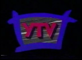
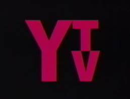
Nicknames: "Static Window", "The YTV Window"
Logo: On a black background, we see a slanted window painted in with blue borders. Inside the window is a very fuzzy gray/black TV screen with the red words "YTV" in it, although the YTV letters have got a black shadow.
Trivia: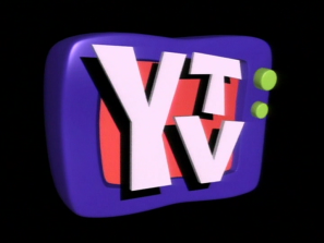
Nicknames: "YTV TV II", "Screaming YTV II" (for the ReBoot variant), "CGI TV II", "TV of Doom II" (also for the ReBoot variant)
Logo: On a black background, we see the same television set as before, except the design of the set looks slightly different. The text "YTV", arranged the same way as before but looking a little different font-wise, rapidly zooms out from the right and smashes into the TV set, making the TV set "lean back". The TV then comes into place, now with the YTV text in the screen of the set. The text "Produced in association with" sometimes appears above the set.
Trivia: This was actually the 1995-2000 YTV logo. A new logo between 2000-06 was used as the channel's official logo. However, this logo remained to be used as a closing logo through 2007.
Bylines:
5th Logo
(May 12, 2007-2010, April 1, 2011-August 17, 2013)
<iframe frameborder="0" height="147" src="http://wikifoundrytools.com/wiki/closinglogos/widget/genericvideo/0e1d66b41ef16db3a1b1009e8283394e41e323ac" width="259"></iframe><iframe frameborder="0" height="147" src="http://wikifoundrytools.com/wiki/closinglogos/widget/genericvideo/3173af1042b6549e803376941cef6774d1c74838" width="263"></iframe><iframe frameborder="0" height="143" src="http://wikifoundrytools.com/wiki/closinglogos/widget/genericvideo/b5f8d43d289909364ec97f53d1cbfe08fadc49d3" width="250"></iframe>
Nicknames: "Jungle of Lines", "Yellow Lines", "Swirling Tornado", "YTV Circle"
Logo: On a blue and cyan gradient background with revolving white and yellow lines, we see a lots of white and blue lines coming together to form a cyan and white circle with "YTV" on it, arranged similarly to the previous logos. A byline appears below.
Bylines:
Editor's Note: The fast action and sudden appearance as well as the logo suddenly slamming into the screen may startle you the first time you see it, but it's a tamer than the last 2 logos.
6th Logo
(2009?-2014)
Variants:
Editions by Emini4, LJVborgSuperSet, Thisisanswer, and GETENT
Background: Launched on September 1, 1988, YTV was the successor to two prior special programming services operated by various Ontario cable companies beginning in the late 1970s. They did not use a logo until Deke Wilson's Mini-Mysteries premiered in 1989. The two largest shareholders in YTV were two cable companies: Rogers Cable and a company known as CUC Broadcasting, which would later be acquired by Shaw Communications. By 1995, through various acquisitions and trades, Shaw had secured full control of YTV; it was spun off as part of Corus Entertainment in 1999.
1st Logo
(1989-1991)
 <iframe frameborder="0" height="166" src="http://wikifoundrytools.com/wiki/closinglogos/widget/genericvideo/a493728ab25dcb25c9f10f64fdbb75fbca6413a4" width="295"></iframe>
Logo: On a black background, we see a slanted window painted in with blue borders. Inside the window is a very fuzzy gray/black TV screen with the red words "YTV" in it, although the YTV letters have got a black shadow.
Trivia:
-This was also used at the end of YTV commercials from 1989-1991.
-There is a rare in credit version as well.
FX/SFX: The fuzzy TV screen.
Music/Sounds: None.
Editor's Note: None.
2nd Logo
(1991-1993)
 <iframe frameborder="0" height="185" src="http://wikifoundrytools.com/wiki/closinglogos/widget/genericvideo/29830897ce5c6e20379e8571ef2cf2a4f5bef5d1" width="329"></iframe>
Nicknames: "The Neon Rainbow Rectangles", "The Rainbow Trail", "The Pretty Colored Squares"
Logo: On a black background, we see a bunch of neon rainbow rectangles flying in different directions in trails. The YTV logo is seen in black, but when the trails pass by, the YTV letters disappear, they blend in with the background. There are 5 rainbow trails: the first one is yellow with orange, the second is orange with light blue, the third is purple with yellow, the fourth is green with light purple, and the last trail is in blue with yellow, forming the YTV letters in red. For the most part, only the logo's final part was used as a closing logo.
Variant: On Are You Afraid of the Dark?, "PRODUCED IN ASSOCIATION WITH" is shown above the YTV logo. It is also cut short, only showing the blue and yellow rectangles forming the logo.
FX/SFX: The rainbow trail effects moving in different directions.
Music/Sounds: From 1991-92, it used a synthesized three-note piano tune with bells played over it, although it was also used for YTV's Coming Up Next bumpers from 1991-93. From 1992-93, a female choir singing with dreamy music when used as an on-air ID on YTV. During at the end of TV shows, it is usually silent, or contains the end theme of the show, such as on Are You Afraid Of The Dark?.
Availability: Extremely rare; it can be seen on early episodes of Are You Afraid of the Dark? in the Amazon DVD-on-demand release. They used to show this in Canada as one of YTV's bumpers. It was also spotted on the Canadian DVD releases of The Adventures of the Black Stallion episodes from 1991-93. It was probably replaced by the 1995 logo (with Corus byline) on many shows. The musical versions are considered extinct, as they were seen on Canadian prints of Shining Time Station and Lamb Chop's Play-Along. Strangely enough, this logo was appears on some Kids and Teens TV airings of "Lamb Chop's Play-Along!", including the episode "The Ring" and "Have I Got A Girl For You". The shortened version can also be found on early VHS releases o The Big Comfy Couch.
Editor's Note: A beautiful logo with some well-done early CGI effects.
3rd Logo
(1993-1995)
Nicknames: "*click* WAOOOOOW! No Problem", "Screaming YTV" (for the 1994-1995 variant), "YTV TV", "CGI TV", "TV of Doom" (also for the 1994-1995 variant)
Logo: On a black background, we see a purpleCGI television set with green buttons on the right side of it. Inside the TV screen is an orange background with the white letters "YTV", with "T" and "V" on the left, and arranged on top of each other. The YTV text then rumbles out of the screen to cover up most of the TV set.
Variant: On Are You Afraid of the Dark? and The Big Comfy Couch, the text "Produced in association with" is seen above in white.
FX/SFX: The text rumbling.
Music/Sounds: From 1993-94, it was a boing sound. From 1994-95, it was a click and a scream from a group of female singers (taken from Best Service's Hallelujahand Voice Spectral Vol. 1 sample libraries) followed by a girl saying "No problem." In addition, the logo is also silent or it plays over the closing theme of a show.
FX/SFX: The fuzzy TV screen.
Music/Sounds: None.
Editor's Note: None.
2nd Logo
(1991-1993)
 <iframe frameborder="0" height="185" src="http://wikifoundrytools.com/wiki/closinglogos/widget/genericvideo/29830897ce5c6e20379e8571ef2cf2a4f5bef5d1" width="329"></iframe>
Logo: On a black background, we see a bunch of neon rainbow rectangles flying in different directions in trails. The YTV logo is seen in black, but when the trails pass by, the YTV letters disappear, they blend in with the background. There are 5 rainbow trails: the first one is yellow with orange, the second is orange with light blue, the third is purple with yellow, the fourth is green with light purple, and the last trail is in blue with yellow, forming the YTV letters in red. For the most part, only the logo's final part was used as a closing logo.
Variant: On Are You Afraid of the Dark?, "PRODUCED IN ASSOCIATION WITH" is shown above the YTV logo. It is also cut short, only showing the blue and yellow rectangles forming the logo.
FX/SFX: The rainbow trail effects moving in different directions.
Music/Sounds: From 1991-92, it used a synthesized three-note piano tune with bells played over it, although it was also used for YTV's Coming Up Next bumpers from 1991-93. From 1992-93, a female choir singing with dreamy music when used as an on-air ID on YTV. During at the end of TV shows, it is usually silent, or contains the end theme of the show, such as on Are You Afraid Of The Dark?.
Availability: Extremely rare; it can be seen on early episodes of Are You Afraid of the Dark? in the Amazon DVD-on-demand release. They used to show this in Canada as one of YTV's bumpers. It was also spotted on the Canadian DVD releases of The Adventures of the Black Stallion episodes from 1991-93. It was probably replaced by the 1995 logo (with Corus byline) on many shows. The musical versions are considered extinct, as they were seen on Canadian prints of Shining Time Station and Lamb Chop's Play-Along. Strangely enough, this logo was appears on some Kids and Teens TV airings of "Lamb Chop's Play-Along!", including the episode "The Ring" and "Have I Got A Girl For You". The shortened version can also be found on early VHS releases o The Big Comfy Couch.
Editor's Note: A beautiful logo with some well-done early CGI effects.
3rd Logo
(1993-1995)


<iframe frameborder="0" height="199" src="http://wikifoundrytools.com/wiki/closinglogos/widget/genericvideo/0ad4b37764f3a7cc27c19f3762a44e386b6b9df2" width="357"></iframe><iframe frameborder="0" height="197" src="http://wikifoundrytools.com/wiki/closinglogos/widget/unknown/75fc1e39f4a62e9b6b51388d15dc21e14d54ab3c" width="261"></iframe>
Nicknames: "*click* WAOOOOOW! No Problem", "Screaming YTV" (for the 1994-1995 variant), "YTV TV", "CGI TV", "TV of Doom" (also for the 1994-1995 variant)
Logo: On a black background, we see a purpleCGI television set with green buttons on the right side of it. Inside the TV screen is an orange background with the white letters "YTV", with "T" and "V" on the left, and arranged on top of each other. The YTV text then rumbles out of the screen to cover up most of the TV set.
Variant: On Are You Afraid of the Dark? and The Big Comfy Couch, the text "Produced in association with" is seen above in white.
FX/SFX: The text rumbling.
Music/Sounds: From 1993-94, it was a boing sound. From 1994-95, it was a click and a scream from a group of female singers (taken from Best Service's Hallelujahand Voice Spectral Vol. 1 sample libraries) followed by a girl saying "No problem." In addition, the logo is also silent or it plays over the closing theme of a show.
Music/Sounds Variant: On early episodes of The Big Comfy Couch, a different boing is used with children laughing.
Availability: Rare; it appears on Are You Afraid of the Dark? on the CreateSpace DVD release and occasional airings on TeenNick's NickSplat. In Canada, it can be found on a YTV print of the Christmas special Christopher the Christmas Tree. Usually replaced in Canada by the fourth logo with the Corus byline. Toonami's airings of ReBoot from the era also had this logo.
Availability: Rare; it appears on Are You Afraid of the Dark? on the CreateSpace DVD release and occasional airings on TeenNick's NickSplat. In Canada, it can be found on a YTV print of the Christmas special Christopher the Christmas Tree. Usually replaced in Canada by the fourth logo with the Corus byline. Toonami's airings of ReBoot from the era also had this logo.
Editor's Note: The animation of the YTV text is choppy, and the unexpected scream can get to some.
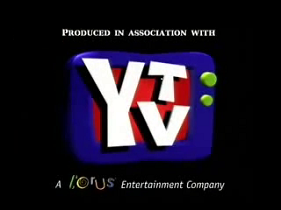
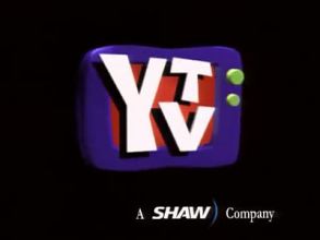
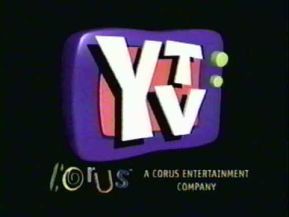
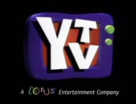
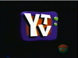
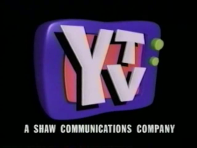
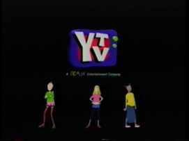
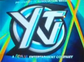
4th Logo
(1995-October 21, 2007?)


<iframe frameborder="0" height="147" src="http://wikifoundrytools.com/wiki/closinglogos/widget/genericvideo/86c92eab90e8b2c2f05e5b27c88132e81c6da9e9" width="261"></iframe><iframe frameborder="0" height="150" src="http://wikifoundrytools.com/wiki/closinglogos/widget/unknown/217b6b5d06867834d2765f0b0f7dc5415c30144b" width="199"></iframe><iframe frameborder="0" height="147" src="http://wikifoundrytools.com/wiki/closinglogos/widget/genericvideo/4a68cb66b9a03302b1b2174fb2b0a8d8ae9e88f8" width="263"></iframe>
<iframe frameborder="0" height="146" src="http://wikifoundrytools.com/wiki/closinglogos/widget/genericvideo/ecb8a5f0f61f8231bec895e113578aa6c6dc9765" width="259"></iframe><iframe frameborder="0" height="149" src="http://wikifoundrytools.com/wiki/closinglogos/widget/genericvideo/1dfbbb8e039462aabce1298d8a3a30040384ffa9" width="265"></iframe><iframe frameborder="0" height="149" src="http://wikifoundrytools.com/wiki/closinglogos/widget/genericvideo/75c4e76f6b8c6d27b036166d6225210ad9a6313e" width="265"></iframe>
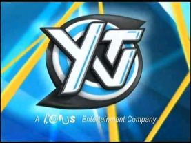
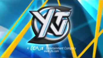
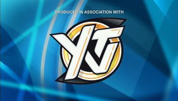
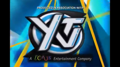
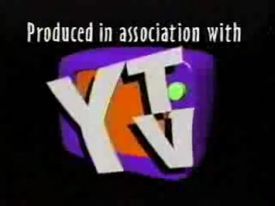
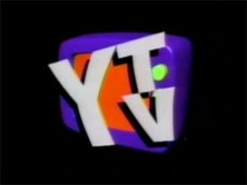
Nicknames: "YTV TV II", "Screaming YTV II" (for the ReBoot variant), "CGI TV II", "TV of Doom II" (also for the ReBoot variant)
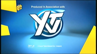
Logo: On a black background, we see the same television set as before, except the design of the set looks slightly different. The text "YTV", arranged the same way as before but looking a little different font-wise, rapidly zooms out from the right and smashes into the TV set, making the TV set "lean back". The TV then comes into place, now with the YTV text in the screen of the set. The text "Produced in association with" sometimes appears above the set.
Trivia: This was actually the 1995-2000 YTV logo. A new logo between 2000-06 was used as the channel's official logo. However, this logo remained to be used as a closing logo through 2007.
Bylines:
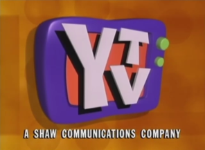
- 1995-1999: "A SHAW COMMUNICATIONS COMPANY"
- 1997-1999: "A SHAW) Company" with "SHAW)" being the 1997-2012 Shaw logo and the rest being in Garamond font. It either cuts or fades in.
- 1999-2002: The Corus logo with "A CORUS ENTERTAINMENT COMPANY" next to it in two lines. This byline slides up from the bottom.
- 2000-2007: "ACOrUsEntertainment Company", with "COrUs" in its corporate font. This byline blurs in.
- 2006?-2007: "A COrUs ENTERTAINMENT COMPANY", with "COrUs" in its corporate font. The byline blurs in a different way.
- The logo is bylineless on some shows mostly from the Shaw era. When this variant was used in the Corus era, the Corus Entertainment logo follows this logo.
Variants:
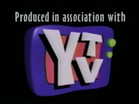
- "PRODUCED IN ASSOCIATION WITH" appears above. Seen on season 1 of Beast Wars, the later episodes of Are You Afraid of the Dark?, Urban Vermin, The Anti-Gravity Room,Viva Piñata, and Edgar and Ellen.
- A variant exists where the logo is up against an orange background with various shapes in the background along with the Shaw byline.
- Same as as the last one, but on a black background. Seen on Shadow Raiders, season 3 of Beast Wars, and early episodes of Beast Machines: Transformers (plastered by the Sony Pictures Television logo on the DVD release).
- Another variant exists that has the "Produced in association with" variant, but afterward it cuts to the still logo with the 1995 Shaw byline on a black background. This was seen on the series Mission Genesis (known as Deepwater Black in the UK and Canada).
- There are three versions: one has the TV slightly tilting back when the words zoom out (1995-2002); another version has the TV jump in the air when hit (1998-2007) and the final version has the TV zoom back further and rushes back quickly (2006?-2007).
- There is a weird version used on Being Ian where the aspect ratio is distorted. The logo starts out stretched, then when the TV jumps in the air, the aspect ratio zooms back and straightens itself (it's really hard to describe).
- On Treasure!, it appears in-credit.
- On Chip N’ Orbit a copyright below reads either © YTV Productions Inc. MM or©MMI YTV Productions Inc.
FX/SFX: Just the words zooming out.
Music/Sounds: The end theme of the show, or no music at all. On ReBoot and The Big Comfy Couch, it uses the previous logo's music for plastering over the previous logo.
Music/Sound Variants:
Music/Sounds: The end theme of the show, or no music at all. On ReBoot and The Big Comfy Couch, it uses the previous logo's music for plastering over the previous logo.
Music/Sound Variants:
- On seasons 1 and 2 of ReBoot, the audio from the previous logo plays. Season 3 used a short hip-hop tune, which was also used on some episodes of Mission Genesis (known as Deepwater Black in the UK and Canada). As such, it plastered over the previous logo.
- On Prank Patrol, a cartoonish whack sound is made when the text hits the screen, then a thump when the TV hits the ground.
- On RadioActive, you can hear a quiet whistle (plays over the theme song).
Availability: Common in both the U.S. and Canada. In the U.S., it can be seen on shows such as Jane and the Dragon on Qubo, and earlier episodes of The Big Comfy Couch, while in Canada, it can be seen on all pre-2007 YTV original programming. The ReBoot variant is scarce, however, and was last seen when aired on Toonami in the US and Teletoon Retro in Canada, and on DVD. Also, it can be seen on the first seasons of both Grossology and Mona the Vampire. It also plastered older YTV logos as well.
Editor's Note: This logo is well-remembered by those in Canada who grew up watching YTV.
Editor's Note: This logo is well-remembered by those in Canada who grew up watching YTV.
5th Logo
(May 12, 2007-2010, April 1, 2011-August 17, 2013)


<iframe frameborder="0" height="147" src="http://wikifoundrytools.com/wiki/closinglogos/widget/genericvideo/0e1d66b41ef16db3a1b1009e8283394e41e323ac" width="259"></iframe><iframe frameborder="0" height="147" src="http://wikifoundrytools.com/wiki/closinglogos/widget/genericvideo/3173af1042b6549e803376941cef6774d1c74838" width="263"></iframe><iframe frameborder="0" height="143" src="http://wikifoundrytools.com/wiki/closinglogos/widget/genericvideo/b5f8d43d289909364ec97f53d1cbfe08fadc49d3" width="250"></iframe>
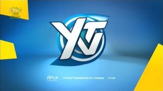
Nicknames: "Jungle of Lines", "Yellow Lines", "Swirling Tornado", "YTV Circle"
Logo: On a blue and cyan gradient background with revolving white and yellow lines, we see a lots of white and blue lines coming together to form a cyan and white circle with "YTV" on it, arranged similarly to the previous logos. A byline appears below.
Bylines:
- 2007?: "A CORUS ENTERTAINMENT COMPANY" with "CORUS" in its corporate font and in color.
- 2007?-2008?: The byline from the previous logo (background and all) is superimposed below the logo.
- 2008-2013: "A CORUS Entertainment Company" with "CORUS" in its corporate font and in white.
Variants:
- Sometimes, "PRODUCED IN ASSOCIATION WITH" is shown above the logo.
- An early version exists where the byline from the previous logo (background and all) is superimposed below the logo. This can be found on 2007-2008 episodes of Viva Piñata and Nicktoons Network's split-screen credits airings ofEdgar and Ellen.
- In 2008, the YTV logo has a glowing effect. Also, the YTV's logo animation was slightly altered to be longer and is centered.
- On some shows, "www.ytv.com" is below the byline.
- There was an extended version without a byline used as a station ID.
- There's also a variant of the extended version with the Corus byline appears on some shows such as Rollbots.
FX/SFX: The lines forming the logo.
Music/Sounds: None, or the ending theme of the show. On Edgar and Ellen and Zeke's Pad, we hear the fast drum tune, covered by laser sounds, another laser sound with note (when logo formed). The "woo-woo-woo" like sound is heard at the end.
Availability: Was last seen on Storm Hawks and League of Super Evil on Cartoon Network, Kid vs. Kat on Disney XD and Edgar & Ellen on Nicktoons Network (now Nicktoons) in the United States. However, this is more common in Canada because most cartoons and shows that air on Canada usually carry this logo at the end of most of YTV's post-2007 programming.The early byline variants can be found on 2007-2008 episodes of Viva Piñata and presumably Edgar and Ellen. When the next logo was introduced, this logo was kept on Scaredy Squirrel for its first two seasons, then switched to the next logo.
Editor's Note: The fast action and sudden appearance as well as the logo suddenly slamming into the screen may startle you the first time you see it, but it's a tamer than the last 2 logos.
6th Logo
(2009?-2014)


<iframe frameborder="0" height="182" src="http://wikifoundrytools.com/wiki/closinglogos/widget/genericvideo/85ae04246411341c24598561dc42eb6b8bd4160d" width="323"></iframe><iframe frameborder="0" height="174" src="http://wikifoundrytools.com/wiki/closinglogos/widget/unknown/e30863da145047aad3968ff846a79d70d7e91791" width="287"></iframe><iframe frameborder="0" height="175" src="http://wikifoundrytools.com/wiki/closinglogos/widget/unknown/2ce7b858d0df7b814aad088301aeeedb5f22f967" width="287"></iframe>
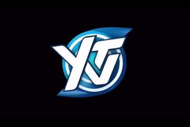
Nicknames: "Swirling Tornado II", "YTV Circle II"
Logo: In a blue environment, there are random yellow shapes around the screen moving around. In the space that is being surrounded by the shapes, there are many flying shapes in blue and white. The shapes then collide and form the YTV logo, this time fully blue and white as the text spreads out on it and the screen shakes as it forms with the spikes rotating. The logo rotates as a Corus byline appears below and "Produced In Association with" sometimes appears above.
Logo: In a blue environment, there are random yellow shapes around the screen moving around. In the space that is being surrounded by the shapes, there are many flying shapes in blue and white. The shapes then collide and form the YTV logo, this time fully blue and white as the text spreads out on it and the screen shakes as it forms with the spikes rotating. The logo rotates as a Corus byline appears below and "Produced In Association with" sometimes appears above.
Bylines:
- 2009-2012: The full Corus Entertainment logo (in white) and next to it is the text "A Corus Entertainment Inc. Company".
- 2012-2013: (Bylineless)
- 2013-2014: "A Corus ENTERTAINMENT COMPANY" with "Corus" being the 1999-2016 logo and "ENTERTAINMENT COMPANY" spaced out.
Variants:
- 2012-2013: The shapes come in as the YTV logo comes in and makes a U-turn like an boomerang and a rectangle comes in and places itself below. It's design is the same as the later version, but the logo has no white bumpers, lacks the Corus byline, the shapes and lighting are different, now at a different angle, and has "ORIGINAL" in a generic font and the rectangle it was on was darker.
- 2013-2014: On a differently lighted blue environment, we see a blue hemisphere with white lines. It zooms out and spins as the yellow shapes, this time different, move into place. The hemisphere then spots spinning and reveals the logo with "ORIGINAL" on a light blue rectangle going under it. There are white borders surrounding it moving positions. Under it is the newer Corus byline.
- There was a longer version which had a white piece with 8 different colors in it that has the yellow shapes and blue/white pieces surrounding it. Here, the environment has a blue floor and white wall. The camera zooms out as the white piece breaks apart and the yellow shapes place themselves around the team. The rest continues as normal. A version without a byline was used as a station ID.
- On some shows, "YTV.COM" fades in next to the byline.
- There was a still version with the logo on a black background.
FX/SFX: The logo forming. The hemisphere spinning in the later version.
Music/Sounds: Same as before.
Availability: Appeared on Babar and the Adventures of Badou on Disney Junior. Also can be seen on all YTV programming from this era rerun on YTV.
Editor's Note: None.
7th Logo
Music/Sounds: Same as before.
Availability: Appeared on Babar and the Adventures of Badou on Disney Junior. Also can be seen on all YTV programming from this era rerun on YTV.
Editor's Note: None.
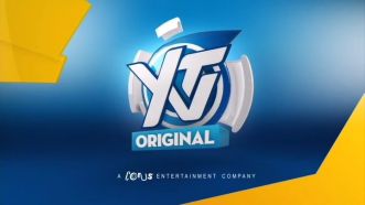
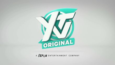
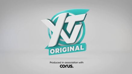
7th Logo
(2014- )


<iframe frameborder="0" height="244" src="http://wikifoundrytools.com/wiki/closinglogos/widget/unknown/5c3ae9589c8e1ce95bcaeaf2263d08848005b38a" width="405"></iframe><iframe frameborder="0" height="244" src="http://wikifoundrytools.com/wiki/closinglogos/widget/genericvideo/324d72b261dd26652253add27678a5f7555ca053" width="439"></iframe>
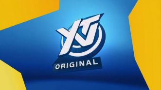
Nickname: "YTV Circle III"
Logo: We start with an extreme closeup of the same logo as before, but now it is aquamarine. It zooms back while spinning around until it positions itself in the middle of the screen, and we see an aqua green banner with the word "ORIGINAL" in white appear below it and zooming at us a bit, all on an entirely white background. The Corus byline fades in below. The logo hovers in mid air as if it was floating.
Bylines:
- Originally, the byline was read as "A Corus ENTERTAINMENT COMPANY". (same as the previous one, but it's gray this time)
- Starting in 2016, the byline was updated to contain an updated Corus logo and byline, but unlike most Corus properties, YTV went ahead and used "Produced in association with Corus." (in black color) instead.
- On most shows since the Corus byline was updated, the byline "A Corus. COMPANY" (with "Corus." being its current logo) is used. This byline is in black this time.
FX/SFX: The logo zooming back and spinning, the "ORIGINAL" banner zooming at us a bit. Also, the logo hovering.
Music/Sounds: The ending theme of the show or whooshing sounds.
Availability: Seen on all of YTV's newest programming, such as Make It Pop and The Stanley Dynamic. The one with the newer Corus byline can be seen on newer episodes of the latter.
Editor's Note: This is a little more tame than the previous 2 logos, not to mention its new, more friendly color. Also, the spinning and zooming of the logo is smoother, plus it's all in one piece. It zooms away from you this time, so it's not so scary.