What logo scares and/or annoys you?
Jump to navigation
Jump to search
ATTENTION: As of September 1, 2011, this page will be no more. You have until then to transfer your lists to your profile page, if you want.
CooleyBoy10:
*Icon Entertainment - the thunder would always startle me.
More coming soon!
: LogoWriter (remake of the list):
CooleyBoy10:
*Icon Entertainment - the thunder would always startle me.
More coming soon!
: LogoWriter (remake of the list):
I have seen a lot of more, so I change a list a bit. So here is the most scariest logos ever!:
*VID (1990-2001) SSF mask: No matter what I said, no one should ever look at the mask, it will scare the crap out of ya, you know why. Because I was formerly not scared of the logo, but when I look up a Wikipedia article of VID, there was the logo, it has been wider, which I hate. And then suddenly, the face scared the c**p out of me! When I saw this, I don't know why the creator of the company was dead in 1995, and the killers are unknown. Maybe they hate the logo too as well as me, which the Killers came from Russia I think.
*Klasky Csupo SSF logo (1998-2008), After ten years of scariness of this logo, it went away. But still on the past, OK, so what the heck am I watching, is this suppose to be a trick where Gabor Csupo or Klasky want to scare the kids. First of all, let me tell you this, after I watch a show which appears that was made by Klasky Csupo, this weird logo showed up, I first thought that the cool but sometimes cheesy 1992 logo will come up, but instead came up with a new logo. First of all, I see a splat, I thought that was cool. But I thought it was the worst hook of a logo ever seen. And then suddenly, this happens. Two eyes appear on the screen by a hand. It looks like googley eyes came from a art project, then a weird mouth with paper on it. What the heck am I watching? Then suddenly, this gets more annoying than ever. Random and disjointed. Looks like almost like the viewer will scream and say a string of swear words. After that, it ends, finally. God, if you want to check it out. You can, but this is perfectly the worst logo evar! (Use that from ROBLOX).
Used to scare me:
*The Powerpuff Girls- When I was small, I first saw this show on cartoon network I first saw powerpuff girls, I saw a crying little baby a smart idiot and a fierce dummie, I thought they will kill me and they did. , skip it! But the second time, it was scarier. i might be the crybaby.
Annoys me:
* 1986 Simitar Entertainment logo - The worst logo, and it's also the metal worst movie ever, first of all, banging sounds coming out the screen, with weird tv static sound-like bars right there, forming a rectangle (vertical), and then suddenly a cheesy cut of the bottom of the logo forming "Simitar Entertainment", that's how to top off a cheesy logo.
* Viacom "V of Doom", I don't care for this logo, I'm not like the others that are scared with the logo it's very short not making much detail and excitement of the logo, Oh well. And also, the music and sounds seems boring, and the V of Doom zoom in is boring. BORING LOGO!!! OK, now I am done. NEXT!
BenderRobot
Scares me:
*Stretch Films (All logos): That EXTREMELY freaky mouth scares the living daylights out of me, and just seeing a still picture of it freaks me out
*Viacom (1976): Alright, it is not that scary. But on a TV in a dark room, it is a lot scarier.
*VID mask: No wonder they call it the Russian SSF.
*PFFR: That is the most disgusting logo ever.
*Fat Dog Productions: Is that dog supposed to resemble THAT?
*One Ho Productions: That drawing is disturbing.
*Mohawk Productions: For some reason, I find it creepy.
*The Curiosity Company: Okay, this is the reason when I watch my Futurama DVDs at night, I immediately go to the menu when the credits start. It is just so freaky and creepy.
*First Guild Home Video: This logo is just so freaky and creepy due to the weird shape and synth music.
*Klasky Csupo Rooster: I find this logo to be messed up.
*Erry Vison
Used to scare me:
*Klasky Csupo (1998): This used to be the scariest thing on Earth to me when I was a child, but now I find it to be funny.
*Rabbit Ears Storybook Classics: Scared me when I was a child.
*Alien Productions Variant: Since I was not expecting it.
*MGM DVD: When I wasn't expecting it with the sound so loud, it was scary.
*Hanna-Barbera (1968): I just found the fanfare to be creepy.
*DIC Kid in Bed: The first time I saw it, it freaked me out.
*Columbia Tristar Home Video (2001): The sudden appearance of DVD/HOME VIDEO startled me.
*Gramercy Pictures (1993): I was expecting to see a Universal Pictures logo, but instead the variant of this logo with the fanfare appeared and startled me.
Annoys me:
*Warner Bros. (1984): Most of the time I like the logo, but when I am looking for the \\' logo, it gets frustrating.
*Universal Pictures (1999): This logo is used EVERYWHERE! And I can't even skip it on DVD.
*MGM/UA Home Video (1989): It takes forever for it to go away.
*NBC-Universal Television: I just find it to be extremely ugly.
*MoPo (1995): I love golfing, but this logo is just getting boring and I do not like the animation style.
*Hanna-Barbera (1994): All the sound effects going extremely fast is very annoying. The action variant is even more annoying with the bongos in the background.
*Renaissance Pictures (1994): I just find it offensive seeing the Mona Lisa being ripped in half.
*Cookie Jar Entertainment (2004): It is truly one of the most annoying things ever.
*20th Century Fox Television (1960): The way "Television" zooms in makes it seem like a bad adobe flash project.
*JamesBond"Marilu Henner fan"Guy28:Scares me now=Nada.Scared me when i was a little boy=The 1965 TCF TV logo & the 1971-1973 Mark the 7th Limited gold logo(original 1971-1972 jingle;it sounded like a weird remix of a track from the 1963 Hitchcock thriller"The Birds").Annoys Me=Any WGBH ident(that jingle is OVERUSED and gets ANNOYING!),BC Video Presentation(the music is awful),Simitar 1986(Nothing special;the 1990 logo ROCKS!),Warner Bros. 1972(OK,what is SO special about a stupid black TV Tube w/ an ugly white"\\'"on it zooming,then out w/ a different color scheme?!) and PBS Kids"SURPRISE!!!!"Ident(Big deal,the PTV Park ident is WAY better than this ol' hoot!).
logomaneuver
Used to scare me:
Curiousity Company: Bloopl blop bloopl blop. CREEEEEEEEEEEEEEEEEEEEEEEEEEEEEEEEEEEEEEEEEEEEEEEEEEEPOUT! Even if you see
it at night! It can be seen from Olive The Other Reindeer. I'll never forget the drip sounds.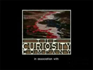
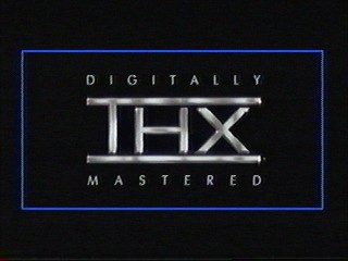
THX Broadway Trailer: This sounds like someone's moaning when it's starting to come on but guess what? It doesn't sound anything like a moan. I mean the note doing the "RRRRRRRRRRRRREEEEEEEEEEEEEEEEEEEEEEEEEEEEEEEEEEEEEEEEEEE"? Come on! Do you have a brain problem? The THX trailer,this is (definitely) a part of phobia..I bet. Anyway, this is a authentic example of a horrorous logo. When I saw this, it made my ears get abstract. What else is horrible than this!? This is the best thing to thing to call an annoying ammo, I geuss. It's in the start of movies, too. But the only one that is funny is the tex kind. Okay. For now, the rant for this is going to end like a lozenge.
.
ClosingLogoLover
Scares me:
*Stretch Films (All logos): That EXTREMELY freaky mouth scares the living daylights out of me, and just seeing a still picture of it freaks me out
*Viacom (1976): Alright, it is not that scary. But on a TV in a dark room, it is a lot scarier.
*VID mask: No wonder they call it the Russian SSF.
*PFFR: That is the most disgusting logo ever.
*Fat Dog Productions: Is that dog supposed to resemble THAT?
*One Ho Productions: That drawing is disturbing.
*Mohawk Productions: For some reason, I find it creepy.
*The Curiosity Company: Okay, this is the reason when I watch my Futurama DVDs at night, I immediately go to the menu when the credits start. It is just so freaky and creepy.
*First Guild Home Video: This logo is just so freaky and creepy due to the weird shape and synth music.
*Klasky Csupo Rooster: I find this logo to be messed up.
*Erry Vison
Used to scare me:
*Klasky Csupo (1998): This used to be the scariest thing on Earth to me when I was a child, but now I find it to be funny.
*Rabbit Ears Storybook Classics: Scared me when I was a child.
*Alien Productions Variant: Since I was not expecting it.
*MGM DVD: When I wasn't expecting it with the sound so loud, it was scary.
*Hanna-Barbera (1968): I just found the fanfare to be creepy.
*DIC Kid in Bed: The first time I saw it, it freaked me out.
*Columbia Tristar Home Video (2001): The sudden appearance of DVD/HOME VIDEO startled me.
*Gramercy Pictures (1993): I was expecting to see a Universal Pictures logo, but instead the variant of this logo with the fanfare appeared and startled me.
Annoys me:
*Warner Bros. (1984): Most of the time I like the logo, but when I am looking for the \\' logo, it gets frustrating.
*Universal Pictures (1999): This logo is used EVERYWHERE! And I can't even skip it on DVD.
*MGM/UA Home Video (1989): It takes forever for it to go away.
*NBC-Universal Television: I just find it to be extremely ugly.
*MoPo (1995): I love golfing, but this logo is just getting boring and I do not like the animation style.
*Hanna-Barbera (1994): All the sound effects going extremely fast is very annoying. The action variant is even more annoying with the bongos in the background.
*Renaissance Pictures (1994): I just find it offensive seeing the Mona Lisa being ripped in half.
*Cookie Jar Entertainment (2004): It is truly one of the most annoying things ever.
*20th Century Fox Television (1960): The way "Television" zooms in makes it seem like a bad adobe flash project.
*JamesBond"Marilu Henner fan"Guy28:Scares me now=Nada.Scared me when i was a little boy=The 1965 TCF TV logo & the 1971-1973 Mark the 7th Limited gold logo(original 1971-1972 jingle;it sounded like a weird remix of a track from the 1963 Hitchcock thriller"The Birds").Annoys Me=Any WGBH ident(that jingle is OVERUSED and gets ANNOYING!),BC Video Presentation(the music is awful),Simitar 1986(Nothing special;the 1990 logo ROCKS!),Warner Bros. 1972(OK,what is SO special about a stupid black TV Tube w/ an ugly white"\\'"on it zooming,then out w/ a different color scheme?!) and PBS Kids"SURPRISE!!!!"Ident(Big deal,the PTV Park ident is WAY better than this ol' hoot!).
logomaneuver
Used to scare me:
Curiousity Company: Bloopl blop bloopl blop. CREEEEEEEEEEEEEEEEEEEEEEEEEEEEEEEEEEEEEEEEEEEEEEEEEEEPOUT! Even if you see
it at night! It can be seen from Olive The Other Reindeer. I'll never forget the drip sounds.

THX Broadway Trailer: This sounds like someone's moaning when it's starting to come on but guess what? It doesn't sound anything like a moan. I mean the note doing the "RRRRRRRRRRRRREEEEEEEEEEEEEEEEEEEEEEEEEEEEEEEEEEEEEEEEEEE"? Come on! Do you have a brain problem? The THX trailer,this is (definitely) a part of phobia..I bet. Anyway, this is a authentic example of a horrorous logo. When I saw this, it made my ears get abstract. What else is horrible than this!? This is the best thing to thing to call an annoying ammo, I geuss. It's in the start of movies, too. But the only one that is funny is the tex kind. Okay. For now, the rant for this is going to end like a lozenge.
.

ClosingLogoLover
Scares (annoys) me:
*Worldvision Enterprises, Inc. (1988): The flash of white, the zooming Radar Globe and the sudden accompanying "WHOOSH" sound followed by a synthesized 3-note jingle make this a bad logo, especially at night. The longer home video variation is especially creepy.
*Viacom Enterprises (1976): The phrase "A Viacom Presentation" that zooms to the bottom half of the screen, followed by the zooming "V" logo that never stops until the sequence is done, and a Universal TV-inspired 5-note synthesized tune are all what makes this logo be bugged to heck.
The (DFS) Program Exchange (the 1979 and 1987 logos): The music used for the first logo, and until 1993 for the second one, is scary as the synthesizer jingle resembles a fire alarm. Even with the more relaxing second jingle, the logo visuals can still be creepy. A short-lived "DFS Dorland" version of the logo used on the second season of the Dennis the Menace cartoon (1986-87) is just as scary and resembles the second version of the 1979 theme used as the first jingle for the second logo.
Used to scare me:
*Paramount Television (1969): The Dominic Frontiere 8-note jingle combined with the zooming action from the complete rectangle to the Paramountain view of the logo. The more I saw it the more that I'd gotten used to it.
*Paramount Television (1970): New 8-note tune by Lalo Schifrin initially scared me due to its fast pace, especially when combined with the zoom-in from the complete rectangle to the Paramountain.
*Paramount Television (1979): The sixth variation of the Lalo Schifrin music as used for the Blue Mountain logo of the 1979-80 TV season (plus a few years after that for syndication) sounds like a remix of the second (1972-75) Schifrin jingle used in the Split Rectangle logo. This followed the Desilu logo on all pre-January 1968 episodes of Star Trek (The Original Series) when remastered in 1984.
Yoshidude987
Scares me:
*K-C SSF: WHAT IS THIS?! This face has scared me! Especially my friends. Well, that logo is so upsetting. Although, they stopped in 2003 to have the 'Rooster' logo. Now they continued the SSF (shudders)! Later the logo stopped today. The site has the SSF in the Home Page. Maybe this logo is going to be replaced by a mellower one in 2010 or 2011.
* VID mask: I hate when this happens. First of all, the ball going up and down on some springy thing is CRAZY. Second of all, the mask is so angry and EXTREMELY UGLY!
* 'Snee OOSHH !' music: I can't believe by that . So , the totem bird logo of Hey Arnold scares the crud out oddly! Hey Arnold! is a good sight of the Nick channel.
* YTV screaming TV: WHAAAAAAAAAAAAAPOW! is very unsettling. Using this logo on early episodes of the Big Comfy Couch can be catching me off guard.
Annoys me:
*Bell-Phillip Light-House Bells: I was annoyed by really this logo plenty of times. So CBS can handle it though on TV before Afternoon News on CBS.
* OZ Film Company Lady of Doom: The lady in the center of the screen is plain boring because it lacks a title above or below her.
* Starry Night Productions: The GOOOM! Chord is dull a lot; it makes me faint.
LogoWriter
Scares me
* The First Guild Home Video logo- I know there is nothing to be scared about any animation but the only thing that I am scared is the music. I know what the music is about, it is a horror one. This was a song, and with kind of sweet music but however, this is "Tubular Bells" from The Exorcist. But however, I am just only a little bit scared of it. Even though that the first one has a great animation one.
* 1998 Klasky Csupo, Inc. logo: OK, do I have to say this. Should they kept the 2003 Klasky Csupo logo anyways? Look, how bad is this logo? Arlene Klasky and Gabor Csupo made a really bad animation for there logos but except for the 2003 logo. But this logo has bad animation, and possibly so scary. See, let me tell you first, the first reason is at the beginning, the blob of ink can be scary for first-time viewers, but I have no idea what happen to the face? Can't you see this face is for some reason is not tame enough. Look, it looks like almost like a robot is gonna scare you. And plus, the rest of this is a annoying logo. Can't you see that there is a funny lip sound. You mean, that is a very annoying including the quack sound. And finally in 2008, they stopped the logo. I think that Klasky Csupo is making a new logo possibly in 2010.
* Renaissance Pictures "Bad Weather in Lourve" logo: This logo made me think that Renaissance Pictures hate the Mona Lisa painting. It also like they want to show them how could they get this painting gone. You mean, how could they do it. Should they kept the Earth logo? Because, this is way too scary, because, are they thinking this is a tame one? No, they add lightning for people who like lightning but nobody likes lightning. Gotta to avoid any show, mostly Xena.
* Simitar Entertainment "SimiNightmare" logo: I know that I like to call logos nicknames, but however, this is the 1986 logo and luckily it is a very rare one. My only thing to like is that white creepy lines look like they are using a sound DJ radio recording or whatever whatsoever. You mean, this is a bad animation? The only thing that scares me is the music, and the animation. Not scared of the white creepy line but for some reason, scared about the "S" which stand for "Simitar". So, I guess that the next logo is tamer and I like the 1990 through 2000 one.
Used to Scared me -
* Family Home Entertainment "The Paintbrush" logo- When I first saw this on a VHS release of Rudolph the Red Nosed Rain Deer, it is a TV special on VHS. There was the FBI Warning screen, possibly the new one and then later however, the jarring cut to the Paintbrush logo, this really scared me, because there is a music that I thought it was creepy when I was a first time viewer. But, when there was this giant or gigantic paintbrush. This is the main reason why I was scared of this logo and I will never ever watch it, but after I watch a while and watch a high quality capture. I now think this is a pretty cute logo.
* CBS DVD- At the beginning, it was a little bit scary because my volume was loud and the music coming out of nowhere, but I watch this for a while or a few days and now I got use to this logo. I think we have a DVD of a Season 1 packaging box of CSI: Crime Scene Investigation distributed by Paramount DVD.
* MTM Enterprises "Mimisie the Cat"- I know I was only scared for one time, When I first watch on some kind of YouTube video which shows 4 logos including the possibly only logo of MTM Enterprises. The cat unexpectedly surprise out of nowhere. But now, I thought that cat was pretty cute but we are on honor of MImisie the Cat.
Ineedajob11111 Scary
Mohawk Productions; that baby and the music is terrifying, and I go into the other room as George Lopez ends on Nick at Nite. I love WGBH
Logophile
Scared of these logos out of me then, but now am okay with
MGM Coffee the Lion
Want to hear a fun story about my first experience with Coffee the Lion? It was fall 2003. I was 13. That's when I've been recording logos on tapes. Well, one day, for no reason, on a Saturday Night, I stayed up real late. I love to record logos from TCM. Anyway, it was one of those one reel wonders. After Robert Osbourne gave his intro, I saw this lion I haven't seen before. It was Coffee. At his first roar, I thought, okay, this won't be bad. Then his second roar, it scared the living hell out of me, and on his third roar was just as scary. I was shaking, traumatized. It was so scary, i recorded over the logo. I was nervous to view MGM films on TCM for a while. About five years later, I met him again on YouTube, and I was okay with it. But I will never forget this experience.
Logos that left me scared and confused
Tanner roaring four times
I was watching TCM and Tanner appeared. After his second roar, the logo still kept going! I screwed with the mute button. I was scared and confused.
Annoys me
MCA Home Video (1984)
Sony Pictures Television
United Artists (1994)
Paramount Pictures (1987-2002, especially the Viacom logo, uh!)
Paramount Television (1987-2002, again, the Viacom logo!)
Columbia Tristar Home Video (1992)
Tristar Pictures (1993)
MGM Home Entertainment
Warner Bros. TV 2003
Universal 1997
Walt Disney Home Video (the one with the plain text)
Artisan Entertainment
Walt Disney Pictures (the one with the plain text)
20th Television
Scares Me
MGM DVD (first logo)
InuYashafan01
Scares Me:
None.
North Carolina Public Television
This logo is just plain stupid because of the stupid music (It's C-C-F by the way!)
Used to scare me but okay with:
Connecticut Public Television (1993-2004)

This logo used to scare the crap out of me when I first saw this on television. The music is made of really creepy synths, and the "Explosion" is really scary. The animation looks confusing for the time, but does it scare me? Pretty much, but the music is what makes this logo so scary. Not to mention the "Explosion" is the scariest part.
T.H.X. (Fall 1983)
WNET (1993-1999)
This logo used to scare thecrap out of me when I was little (especially after the closing credits of "Shining Time Station" and "Thomas & Friends" from (1993-1999) episodes).
PBS Kids (1993-1999)
This logo once scared me during the mid-1990s. I saw this logo after the end credits of "Barney and Friends."
kidinbed:
Scary:
-Klasky-Csupo SSF. At first, when I was really young, I didn't mind it too much, but then, I saw this logo several years later and let's just say I couldn't sleep for weeks on end. As with WillWill45, if I even see a still image of that face, it scares the crap out of me. It's strange that a logo I grew up on and didn't scare me then can scare me now.
-Inter Pathe Video. Most German logos are very cool-looking and don't scare me (even Constantin Film, the one with the 'shaking', has only a medium scare factor in my opinion). But when I found this logo, I didn't even think the rooster looked like a rooster. To me it looked like some evil alien who would take over the world. Then I heard that sudden crow, then funky 70's music. But the "VIDEO" zooming in and the blurry background made this logo extremely scary (not to mention extremely cheesy). This logo was so scary and so cheesy to me, I couldn't help but say on the page for this logo that it makes every other German logo look like PolyGram's excellent "Icarus". No other German logo is cheesier or scarier than this.
Annoying:
Anything with moog synth or weird music. Walt Disney Classics, for one, and the other Elektra logo too.
Used to scare me:
The Columbia TriStar "TAKE HOLLYWOOD HOOOOME!!!" chorus logo. That sudden loudness scared the crap outta me when I was 3.
Oh, I gotta add the Touchstone Snake (1986-2002). That logo gave me very vivid nightmares of blue snakes, thunder, etc. And the bell tune stuck in my head and constantly replayed, causing more bad dreams.
Simitar doesn't really scare me anymore, mainly because I watched a higher-quality capture of the logo.
Hoa:
Scary:
All Simitar logos.
CTHV Take Hollywood Home logos
All MGM Lions
New Line 1982
Disney Classics 1984
MGM/UA Home Video 1982, 1983 and 1993.
MGM Home Entertainment 1998
Atari Jaguar 1993
Annoying:
TriStar 1984, Klasky-Csupo 1998, Live Home Video 1990, Manadalay Entertainment, Warner Bros. Cartoons 1964-1970 logos
AsdfTheRevival:
Scary
NONE!
Annoying
The 2002-present DiC logo, the 2004-present NBC Universal logo, and the 2003-present WB Television logo and the Klasky-Csupo SSF
Used to Scare me
The Bedford Falls Company logo as seen on shows like "My So Called Life" with the haunted house and creepy voices used to scare the crap out of me, but now that I've seen it tens of thousands of times, it's not creepy anymore. However, I warn you, this will scare the crap out of you the first time you see it on Youtube- especially if your volume was high (which mine was when I first saw it) MachineryNoise and Mikintosh3001 currently have it. Mikintosh's version is in high sound and video quality making it less scary, however.
Klasky Csupo "SSF", for the same reasons stated by WillWill45
WillWill45
Scary:
And even seeing a still image of the face makes my heart beat at Mach 1. (That should be a good sign how scary it is.) I even sent a direct e-mail to Gabor CSUPO (of K-C, his email address is csupo@klaskycsupo.com, BTW if you want to complain about this logo to him. I also tried Klasky too, but it was no dice.) saying that they should remove the logo and replace them with a less scarier logo (like the rooster logo they once used, or a "Graffiti" remake). But Csupo diddn't respond. (As a side note, I shoulda tried a couple of years ago, when K-C was still active.) Another thing: LogoWriter and Yoshidude said once that K-C is planning on a new logo to come out 2010 or 2011 (considering that they are still active, they released a couple of plots on Nick), let's hope it's less scarier than the SSF.
Used to scare me:
Scares me:
HBO Independent Productions :UUUUUUUUUUUUUUUUUUUUUUUUUUUUUUUUU UGLYYYYYYYYYYY!
Is that logo supposed to be an oven, which is getting ready to kill me? Oh and don't forget the bzzzzzzzzzzz bzzzzzzzzzzzz sound effect when the hand turns on the light. I refuse to watch Martin, and Everybody Loves Raymond, because of this logo.
Annoys me:
Columbia Tri-Star Television (1996-2002)
bigrene2
Scares Me:
meesterfonnyboy
Scares me: None.
Scared me: MGM-TV Wallpaper (esp. the "long pause" variant); NBC News (Huntley-Brinkley era); Revue/Universal City (the music); NBC Radio News 1976 (the audio, of course); sfm Media with narrator.
Gets on my last nerve: any of the Hanna-Barbara "Action" logos (what a mess!); NBC/Universal; Starry Night with the laugh.
ryanasaurus0077:
Used to be scary:
The 1993 PBS Kids P Pals logo. It knocked my socks off the first time I saw it, but in recent years, I've conditioned myself to like this logo, and now this is my kid brother's favorite logo! Not that he likes logos as much as I do, but still!
Annoying:
I like the 1983 MGM/UA Home Video and Big W logos, but the former always appears when I expect MGM/UA 1982, and the latter plasters earlier WB logos even on the earliest releases of THX-1138 and The Candidate! The only logos I really hate are the Bars of Boredom (2002), which makes even the Boxes of Boredom (all its incarnations, even the TV version from 1996!) look interesting, and the Sesame Workshop House of Boredom (2000), which combine on Dragon Tales, though even that deadly combo fails to make me hate the show at all! After all, Dragon Tales IS PBS, and I like PBS.
Gladiator42
There aren't any that annoy me, but there are five that are EXTREMELY scary and they are:
The 90's Thames Video logo - Too scary!
VID - OMG it's that mask with that scary music! After Pole Chudes, people in Russia would get freaked out by the Gruesome Twosome!
2nd Barney Home Video logo - The animation is WAY too scary!
Media Blasters - don't EVER mention the zoom in! It's scary, horrible and can almost kill you if you look at that part (the VHS tapes and DVDs didn't scare me however)!
Rainbow Releasing Productions - I've only seen the logo once but Orson's very VID-esque gaze nearly turned me into a statue. And the eerie silence as well. At least it was only seen once.
WonderCat 2000
Scares me: Three words: THX, MGM and VID. OK, I never saw VID in video: but I had a EVIL confrontation with that..... mask.... THX? This scares the ^ amp;* out of me! Heck, I think it scares me as much as sega3dmm is!
those idiots say it FEELS loud. it IS loud! MGM. OK: I have the roar with RPG Maker 2003 (LOL!) but I am scared half to death when I see him with audio. Bob, however is tame.
Used to scare me: Lyrick Studios 2nd logo: I felt that MUSIC was gonna KILL me! It's OK with me now.
Scares and annoys: Media blasters: This is probably the scariest and most annoying anime logo!
Creative Capers: That MUSIC..... OOH!
Annoys: none, really.
grantyOvideos
scares me: OMIGOD! Since I was 2, I've been afraid of the THX Tex 2:Moo Can logo! Deep Note is bad enough without a terrible moo can sound effect! I am also freaked out by Klasky-Csupo SSF. I always thought the WGBH 70's logo zooming in and out was funny. I cried before at the end of Powerpuff Girls Hanna-Barbera Swirling Star!
This logo used to scare the crap out of me when I watched Disney movies such as "101 Dalmatians".
WNET (1993-1999)
This logo used to scare thecrap out of me when I was little (especially after the closing credits of "Shining Time Station" and "Thomas & Friends" from (1993-1999) episodes).
PBS Kids (1993-1999)

This logo once scared me during the mid-1990s. I saw this logo after the end credits of "Barney and Friends."
kidinbed:
Scary:
-Klasky-Csupo SSF. At first, when I was really young, I didn't mind it too much, but then, I saw this logo several years later and let's just say I couldn't sleep for weeks on end. As with WillWill45, if I even see a still image of that face, it scares the crap out of me. It's strange that a logo I grew up on and didn't scare me then can scare me now.
-Inter Pathe Video. Most German logos are very cool-looking and don't scare me (even Constantin Film, the one with the 'shaking', has only a medium scare factor in my opinion). But when I found this logo, I didn't even think the rooster looked like a rooster. To me it looked like some evil alien who would take over the world. Then I heard that sudden crow, then funky 70's music. But the "VIDEO" zooming in and the blurry background made this logo extremely scary (not to mention extremely cheesy). This logo was so scary and so cheesy to me, I couldn't help but say on the page for this logo that it makes every other German logo look like PolyGram's excellent "Icarus". No other German logo is cheesier or scarier than this.
Annoying:
Anything with moog synth or weird music. Walt Disney Classics, for one, and the other Elektra logo too.
Used to scare me:
The Columbia TriStar "TAKE HOLLYWOOD HOOOOME!!!" chorus logo. That sudden loudness scared the crap outta me when I was 3.
Oh, I gotta add the Touchstone Snake (1986-2002). That logo gave me very vivid nightmares of blue snakes, thunder, etc. And the bell tune stuck in my head and constantly replayed, causing more bad dreams.
Simitar doesn't really scare me anymore, mainly because I watched a higher-quality capture of the logo.
Hoa:
Scary:
All Simitar logos.
CTHV Take Hollywood Home logos
All MGM Lions
New Line 1982
Disney Classics 1984
MGM/UA Home Video 1982, 1983 and 1993.
MGM Home Entertainment 1998
Atari Jaguar 1993
Annoying:
TriStar 1984, Klasky-Csupo 1998, Live Home Video 1990, Manadalay Entertainment, Warner Bros. Cartoons 1964-1970 logos
AsdfTheRevival:
Scary
NONE!
Annoying
The 2002-present DiC logo, the 2004-present NBC Universal logo, and the 2003-present WB Television logo and the Klasky-Csupo SSF
Used to Scare me
The Bedford Falls Company logo as seen on shows like "My So Called Life" with the haunted house and creepy voices used to scare the crap out of me, but now that I've seen it tens of thousands of times, it's not creepy anymore. However, I warn you, this will scare the crap out of you the first time you see it on Youtube- especially if your volume was high (which mine was when I first saw it) MachineryNoise and Mikintosh3001 currently have it. Mikintosh's version is in high sound and video quality making it less scary, however.
Klasky Csupo "SSF", for the same reasons stated by WillWill45
WillWill45
Scary:
- Klasky-Cuspo SSF: OK, to see why this is scary, I'll explain in my words. Basically after watching a episode of Rugrats/AGU/a couple episodes of Spongebob Squarepants (specifialy the "Wet Painters" episode, it was a flub on Nick's part, now fixed)/any other KC show that was produced after 1998, the credits cut to a purple static screen for no reason, then, a blob splatters on, and a hand puts VERY FREAKY LOOKING mouth and two FREAKY eyes on the blob forming a VERY FREAKY face, and, he just stares at you for a few seconds (0_o), and then says the company name, in a odd robotic voice. (And also, for some reason, I thought that the face said "Boston Sucko", whatever the heck that means...), and some blocks come up, and then they form the KC logo, and suddenly, the background (and face) are replaced by two black blocks that slide from the top and bottom of the screen, and the Y turns purple. Oh, and the music, in my words, it's like this: a splattering sound when the blob comes on screen, a synth descending scale during the faces stare time (with the same notes as the bass scale in the previous logo), and then, during the background transition, a odd horn-brass instrument-bonging noise. Oh, and for the icing on the rotten cake, what often follows this logo is the 2000-2006 Nick split screen credits logo with some kids laughing in a very annoying way as the soundtrack. That logo is VERY scary, and I'm not kidding. I eventually had to stop watching Nickelodeon and its sub networks because of that logo!!!! And I also had to view the KC page with Lynx (a UNIX text web browser), but not any more, because I help edit it now. (along with Tom T.) Also, one time, Tom T wondered what it would be like if the VID logo (a very scary logo too, especially if you live in Russia. [It has also been called a SSF, BTW.]) used the SSF instead of the somewhat scary mask. And, I replied, to quote myself:
And even seeing a still image of the face makes my heart beat at Mach 1. (That should be a good sign how scary it is.) I even sent a direct e-mail to Gabor CSUPO (of K-C, his email address is csupo@klaskycsupo.com, BTW if you want to complain about this logo to him. I also tried Klasky too, but it was no dice.) saying that they should remove the logo and replace them with a less scarier logo (like the rooster logo they once used, or a "Graffiti" remake). But Csupo diddn't respond. (As a side note, I shoulda tried a couple of years ago, when K-C was still active.) Another thing: LogoWriter and Yoshidude said once that K-C is planning on a new logo to come out 2010 or 2011 (considering that they are still active, they released a couple of plots on Nick), let's hope it's less scarier than the SSF.
- Hellas Kosmos Video E> OF DOOM: I never own any tapes from that Greek video company (or any Greek tapes, for that matter), but when I saw it on Youtube, that WOOSH freaked me out at the beginning.
- The First two logos of Constrain Film: When I saw both logos on Youtube/DailyMotion, both logos REALLY freaked me out, thanks to that bombastic fanfare, and the "shaking".
- Inter-Pathe Video (1980's, German): Oh man, this logo is a scare (and cheese) fest!!!!!! First, the odd rooster-like creature at the beggening, then, the Constrain Films-like shaking, along with: THE UNEXPECTED ROOSTER CROW. Buuuut, the 70s style theme is a nice touch, but after that, the shaking-n-rooster-crow happens again. And also, this logo makes ALL OTHER GERMAN LOGOS (even the first two Constrain Film logos) look like the Polygram "Icarus"!!!! (and we all know that Polygram logo looks liked a cutscene from a Square Ernix game, I mean, that Polygram logo was so BEAUTIFUL!!!!)
- Mad Dog Productions: Echg, this logo speaks for itself, and this is one of the reasons why I am a cat lover.
Used to scare me:
- THX: When I am without earplugs (yes, I have sentivite hearing) and see this logo, it realy pounds on my ears. Well, now that I wear earplugs, I am fine with that logo now.
- Simatar: When I first saw that on MachineryNoise's profile, I was scared of that logo, because of that loud music/crappy|creepy animation/banging/low quality. When I saw it on CPVG90's account, it was tamer because of that logo's music missing, and it was in higher qualty. Also, as I found out on http://www.critcononline.com/video_companies_cover_art.htm, just about all of Simatar's tapes are in EP, meaning they are hard to view on a VCR due to tracking problems. 5 words of advice: DONT BUY SIMITAR TAPES, EVER!
- K-C Grafiti: Yea, I know, it's not as scary as the SSF, but when AAH!!! Real Monsters was airing on Nicktoons Network, (my brother liked that show for some reason), and IT WAS MADE BY K-C. I expected the SSF to show up, but no, a K-C logo with dancing background noise and random sound effects (and animation), appeared suddenly after the credits. It shocked me, but I can handle it now, and now I view it as a strange, but not-as-scary-as-the-SSF logo.
- Moonlight Entertamtent (or something like that): WTH?!?! The music on this logo is the most annoying ever, but thank goodness for earplugs, because it would of ALSO pounded on my ears. (BTW, can someone make a page for this company?)
- Sabrin Brown Planet: I'm not going to lie to you, there is some really annoying music in that logo.
- Nick Split Screen Credits 2000-2006: This one is VERY annoying because of the excessive habit of plastering Nicktoons logos when the splitscreen credits are used. Also, when this followed the SSF, it comes shrink-wrapped with some kids laughing in a VERY annonying way.
- Erry Vision Films: Seriously!!!! Who thought a totaly still logo with some creepy music playing was a good idea?!?! As Jon McEnore would say, "You can't be serious!!!"
- Manuel Esteba P.C. (Spain): Oh man, this logo wants to make me Hurricane Kick the creator of this logo. Just everything about it is annoying. That, and also it was in front of the horrible El E.T.E. y el OTO, which shoulda gotten riffed on Mystery Science Theatre 3000.
Scares me:
HBO Independent Productions :UUUUUUUUUUUUUUUUUUUUUUUUUUUUUUUUU
 UGLYYYYYYYYYYY!
Is that logo supposed to be an oven, which is getting ready to kill me? Oh and don't forget the bzzzzzzzzzzz bzzzzzzzzzzzz sound effect when the hand turns on the light. I refuse to watch Martin, and Everybody Loves Raymond, because of this logo.
Annoys me:
Columbia Tri-Star Television (1996-2002)
bigrene2
Scares Me:
WNET (1993)
The creepy music and darkness seems to be very scary!
Annoys Me:
Thorn-EMI/HBO Video,
It's Because of that music!
sega3dmm:
Scares me:
-like acesnding noise and you feel the theater shaking. Then the THX logo appears, and the sound holds on a pitch, taunting you and making you deaf. This hold is very long until the THX logo fades out. Also, the logo shines like how people put their finger and slide it across their necks.
Used to scare me:
 What used to scare me was the Walt Disney Classics logos from 1988-1994. I didn't care if the audio is clean or distorted. The animation scared me - so did the animation of the 1986 WDHV logo! Distorted music made it worse. I even had to REFUSE watching my Disney classics on VHS!
I was also scared of the 1993 PBS Kids ident called "The P-Pals". It wasn't scared of the Hip-Hop music and the "This is PEE BEE EZ! Hooh! Arf!" which I thought was awesome. I was afraid of the seizure-textured P-Pals and that dog. Does that dog even look like a dog or a pile of living s**t!? Iremember I used to shield my eyes with a pillow or something when it comes on. When the P-Pals were banned and were replaced by 2 kids named Dash and Dot, I was happy, but I remember the day I first saw it on TV. When I expected the P-Pals to come on-screen, I covered my eyes (with a pillow) but I heard different music and I took I little peek. I shouted in my mind that the P-Pals were dead - and I remember this and I was 4 years old!
Annoys Me:
Media Blasters/Anime Works
It's because of that synth! It's on my Invader Zim DVD!
I'm also annoyed by the plaster-happy Incredible World of DiC logo because it plasters every single pre-2001 DiC show and I have a HIGH feeling that it's on those SatAM, AoSth and Captin N box sets for every SINGLE episode.
The thrid logo, or should I say logos, that annoys me is the Nickelodeon logos that plasters every Nicktoon logo if the split-screen credits were used. What puts the icing on the poisend cake is the kids laughing on those logos. I prefer those drum sounds in the 2000-2006 logo in it's very early days
Unknown:
This is a real annoyance:
It's not scary, per se, but it sure is monotonous. And annoying. And plaster-happy.
Juniorfan88 (JRmotorsportsfan88)
Scares Me Currently:
MTE (1987-1990)
This logo scared the crap out of me when I first saw this on Youtube. I don't remember seeing this much on television in the 1990's. The way the music is remixed like the regular 1975-1990 Universal static globe with different instruments sounds pretty godawful and scary. The animation looks pretty cool and well done for the time, but does it scare me? Fairly, but the music is what makes this logo scary. Not the rollercoaster-like CGI, but the instrumental remix of the 1975-1990 Universal theme.
Constantin Films (early 1960's)
Man, another bloody nightmare!! Here's another scarefest: the Constantin Films logo used in the 1960's. The music in this one can't be more bombastic then what it already is. It starts out with a mellow drumroll; just as soon as that ends, we abruptly hear a bombastic fanfare with very high pitch notes which may scare even the most emoist of kids ( just kiddin'). The logo is pretty much static in this one; however, at the end, it all of a sudden brings forth seizure-like animation which looks very cheap even for it's time. The animation is horrible and very scary.
Renaissance Pictures
One of longest lasting logos currently shown on television, yet giving people more and more scares. Now the animation is cheesy but not scary with the exception of the lightning; however, the monks droning "AMEN!" and the crackle of lightning is pretty scary and very unexpected after watching another episode of the fine action show Xena.
Logos that used to scare me:
LBS Communications (1984)
After watching Inspector Gadget and Heathcliff & the Cadillac Cats back in 1994 and 1995, I would see Dic and this indigo thing. Am I scared of it anymore? No, but the music is what I was scared of because it played that overly dramatic synthesizer tone with animation that looked pretty awesome. Approximately 12 years later, I really admire how much i miss the logo which very nice looking early CGI and is amongst one of my favorites. Like I posted before, the music is very dramatic for synthesizer, and it could scare some little kids like me.
Saul Group/SFM Combo
I know I forgot to put Nelvana in there for you Care Bear fans, but here's what I thought was a deadly combo when I was a little Saul Group and SFM. I'm not putting SFM as the picture, but Saul Group I will. Let's start out with the Saul Group. The animation is really not that bad, it's cheesy and fairly cheap with the two "S"s forming and flashing. The music/ SFX, on the other hand used to pretty much scare me because it went from a quiet, mellow, low synthesizer jingle to were you heard a bell which sounds fairly loud which always kept me off guard when I watched Care Bears. Today, the Saul Group for my opinion is pretty much average with no scare factor and a pretty nice mellow synthesizer tone which makes this logo sorta relaxing. The SFM logo I'm stilll fairly creeped out about it today. The main reason why like 13 years and sometimes today is because of the announcer and the morse code which meant scare factor pretty much close to off the charts. Like I said, I still think the SFM logo is still fairly creepy today.
MGM (Everyone of the lions)
I used to not like the MGM Lions because they were loud and obnoxious. Today, I see them as pretty awesome particularly Leo and Jackie which those two are pretty awesome.
Logos that annoy me
P.I.T.S. Films (1978)
Two things I hate about this logo: the music and color scheme. The synthesizer jingle for this one makes me want to go into an utter insanity and commit suicide because it's that bad. The color scheme is messed-up as well because they chose an excellent color combo (sarcastically) green against blue and thought, "Wow, let's make something that looks like it's from an Apple 1 or 2" The 3-D letters and animation look fairly cool, but the music and color scheme are so godawful they make my ears and eyes bleed.
Sony Pictures Television (2002)
The animation is slightly better the Columbia Tristar Pictures Television "Boxes of Boredom", but the question is "Is it better than the Boxes of Boredom?" Answer: No! Main reason: it's very monotonous; even though, they have an extended version of the logo on Jeopardy!. The music for this logo is not bad, but after hearing from 2003 when the logo started getting monotonous until this year and beyond, it became apparent within the logo community that the music became very stale, trite, and very elderly (old) like the mockery from the current Orville Redenbacher commercials. Overall, the logo pretty much sucks.
Incredible World of Dic (2001)
May look cute in the process, but after watching it plaster old Dic shows with the old Dic logos such as the Littles, the logo became very annoying, boredom was settling in the recesses of my brain, and oh yes, one other thing for this logo which is the icing on this cake, it's very monotonous/tedious/repetitive of how many times it has played.
CBS Paramount Television (May 2006-July 2007)
I can stand the "Eye in the Sky" and the first variation of this logo, but the second variation is absolute crap because we have average animation for this logo which indeed looks cheap. Afterwards, we have instrumental music which does not even sound half as good as the "Eye in the Sky." Another thing which sucks about this logo is how monotonous it was for the 14 months it lived. This logo was on Judge Judy without the music, Judge Joe Brown with the music and Entertainment Tonight with the music. This logo was also used alot on the CW when it took over the WB September 2006. Overall, they over drawn this logo too many times, and those are the three reasons why this logo is a piece of crap. In August 2007, we see a much better looking logo for what was Paramount/ CBS Paramount Television as I like to call it "The Backstage" with much better music which sounds more dramatic and more uplifting, the logo looks like spent decent time with that because the animation/ logo's appearance looks alot better/cleaner.
Viacom V of Doom (1976):
Just a horrid logo that use to scare me when I was little, but now pretty much hate the logo because of the godawful synthesizer/tymphany combo which sounds like garbage which I dunno what the conductor was thinking, and the music can give you a migraine the size of texas knowing how craptascular/loud the jingle is. It has a bad color scheme (not as bad as P.I.T.S. Films) which is purple against dark purple against white which looks bad. The only decent thing about this logo is the animation which is not bad for it's time, but still reeks early CGI.
JART4629: That 1989 PBS logo. No, don't laugh at me, I actually had nightmares about that logo. I was like three and after the Sesame Street music came, I would sit in fear of that logo. And as for sega3dmm, I used to hate the Black Diamond, too, as well as the KingWorld "spotlights" THAT was unfriendly.
Annoying ones: That yellow FHE logo is disgusting, Moonlight Productions, Sony Bars of Boredom.
BreilLogos:
THE LOGO THAT ONES VEEEEEEERY FREAKY AND SCARY:
Screen Gems "Loud S from hell" (Alternate) 1961-1967 (but i don't know the year!!!)
V of doom 1981-1990
Walt Disney Home Video 1993 and Walt Disney Home Video blue
____________________________________________________________________
Those are the ones that are scare me.
Annoying logos:
THX
Columbia TV 1982
DiC Video 1987
MCA-Universal Home Video 1994 short version
MCA-Universal Home Video 1994 still
MCA-Universal Home Video 1990
amndweek:
Scares Me:
Disney MGM Studios Logo
Annoys Me:
Thorn EMI-HBO Video Logo What logo scares and/or annoys you? - CLG Wiki
dealydugan1995
Logos That Scare Me:
Universal Television w/ 1979-1981 music:
This logo scares the hell out of me ever since I first heard it. The music was slowed down and had the kettledrum at the final note, and scares me to death. I have nightmares of this logo every time I see it! There are other people who are scared of this too...
Hanna Barbara "Swirling Star":
I am absolutely terrified of this! At the end of "The Powerpuff Girls", the logo starts playing and scares me to death.
1978 WGBH Boston:
This scares me and gives me nightmares.
Logos That Used to Scare Me:
Wolf Films:
When I was little (about 4 or 5), I was terrified of the Wolf Films logo every time I saw it at the end of "Law & Order" on A&E (it showed on A&E from 1994?-2002).
Logos That Annoy Me:
None
heart1994
Logos That Used to Scare Me:

Man! That logo scared the hell out of me when I was 8. It was the Hanna Barbera Action logo from 1994. I've seen this on Scooby Doo, Where Are You?. That's a nightmare!!!
mr3urious
TheAdmiester:
Annoys me alot:
Magnetic Video Corp. (????-????)
The mirror effect is just overdone and it seems to go on forever. The logo is about 30 seconds of scrolling text over a big M. And don't even mention the music.
boomersmamaw
JHprod:
Scary:
VID TV Company (1990-1999)
The mask scared me out, but it stared at me!
Annoying:
Hanna-Barbera "All-Stars, Action" (1994-2002)
What the heck is that music?
Spidey016:
Scary:
Oz film company This logo scared the $#%@ out of me when I first saw this! That logo has a freaky lady! She looked like the exorcist from the scary maze game!
MTM (St. Elsewhere finale): The logo was plain scary, horrible, and sad. This is the worst way to end a TV show. It's the only logo that relates to DEATH!
Annoying: Walt Disney HV 1986: The music is just annoying.
CheesyBob42:
Used to be Scary:
The 1986 Walt Disney Home Video "presents" variant surprised me when the "presents" appeared. I had it on Brave Little Toaster!
Another logo that knocked me out of my socks was the David E. Kelly logo that I saw when I was flipping through channels. I almost threw a fit when the text knocked down the old lady. Afterward, I saw a split second of the 20th Century Fox Television logo thinking it would save me from that logo.
Thorn-EMI/HBO Video,
It's Because of that music!
sega3dmm:
Scares me:
-like acesnding noise and you feel the theater shaking. Then the THX logo appears, and the sound holds on a pitch, taunting you and making you deaf. This hold is very long until the THX logo fades out. Also, the logo shines like how people put their finger and slide it across their necks.
Used to scare me:
 What used to scare me was the Walt Disney Classics logos from 1988-1994. I didn't care if the audio is clean or distorted. The animation scared me - so did the animation of the 1986 WDHV logo! Distorted music made it worse. I even had to REFUSE watching my Disney classics on VHS!
I was also scared of the 1993 PBS Kids ident called "The P-Pals". It wasn't scared of the Hip-Hop music and the "This is PEE BEE EZ! Hooh! Arf!" which I thought was awesome. I was afraid of the seizure-textured P-Pals and that dog. Does that dog even look like a dog or a pile of living s**t!? Iremember I used to shield my eyes with a pillow or something when it comes on. When the P-Pals were banned and were replaced by 2 kids named Dash and Dot, I was happy, but I remember the day I first saw it on TV. When I expected the P-Pals to come on-screen, I covered my eyes (with a pillow) but I heard different music and I took I little peek. I shouted in my mind that the P-Pals were dead - and I remember this and I was 4 years old!
Annoys Me:
Media Blasters/Anime Works
It's because of that synth! It's on my Invader Zim DVD!
I'm also annoyed by the plaster-happy Incredible World of DiC logo because it plasters every single pre-2001 DiC show and I have a HIGH feeling that it's on those SatAM, AoSth and Captin N box sets for every SINGLE episode.
The thrid logo, or should I say logos, that annoys me is the Nickelodeon logos that plasters every Nicktoon logo if the split-screen credits were used. What puts the icing on the poisend cake is the kids laughing on those logos. I prefer those drum sounds in the 2000-2006 logo in it's very early days
Unknown:
This is a real annoyance:

It's not scary, per se, but it sure is monotonous. And annoying. And plaster-happy.
Juniorfan88 (JRmotorsportsfan88)
Scares Me Currently:
MTE (1987-1990)
This logo scared the crap out of me when I first saw this on Youtube. I don't remember seeing this much on television in the 1990's. The way the music is remixed like the regular 1975-1990 Universal static globe with different instruments sounds pretty godawful and scary. The animation looks pretty cool and well done for the time, but does it scare me? Fairly, but the music is what makes this logo scary. Not the rollercoaster-like CGI, but the instrumental remix of the 1975-1990 Universal theme.
Constantin Films (early 1960's)
Man, another bloody nightmare!! Here's another scarefest: the Constantin Films logo used in the 1960's. The music in this one can't be more bombastic then what it already is. It starts out with a mellow drumroll; just as soon as that ends, we abruptly hear a bombastic fanfare with very high pitch notes which may scare even the most emoist of kids ( just kiddin'). The logo is pretty much static in this one; however, at the end, it all of a sudden brings forth seizure-like animation which looks very cheap even for it's time. The animation is horrible and very scary.
Renaissance Pictures
One of longest lasting logos currently shown on television, yet giving people more and more scares. Now the animation is cheesy but not scary with the exception of the lightning; however, the monks droning "AMEN!" and the crackle of lightning is pretty scary and very unexpected after watching another episode of the fine action show Xena.
Logos that used to scare me:
LBS Communications (1984)
After watching Inspector Gadget and Heathcliff & the Cadillac Cats back in 1994 and 1995, I would see Dic and this indigo thing. Am I scared of it anymore? No, but the music is what I was scared of because it played that overly dramatic synthesizer tone with animation that looked pretty awesome. Approximately 12 years later, I really admire how much i miss the logo which very nice looking early CGI and is amongst one of my favorites. Like I posted before, the music is very dramatic for synthesizer, and it could scare some little kids like me.
Saul Group/SFM Combo

I know I forgot to put Nelvana in there for you Care Bear fans, but here's what I thought was a deadly combo when I was a little Saul Group and SFM. I'm not putting SFM as the picture, but Saul Group I will. Let's start out with the Saul Group. The animation is really not that bad, it's cheesy and fairly cheap with the two "S"s forming and flashing. The music/ SFX, on the other hand used to pretty much scare me because it went from a quiet, mellow, low synthesizer jingle to were you heard a bell which sounds fairly loud which always kept me off guard when I watched Care Bears. Today, the Saul Group for my opinion is pretty much average with no scare factor and a pretty nice mellow synthesizer tone which makes this logo sorta relaxing. The SFM logo I'm stilll fairly creeped out about it today. The main reason why like 13 years and sometimes today is because of the announcer and the morse code which meant scare factor pretty much close to off the charts. Like I said, I still think the SFM logo is still fairly creepy today.
MGM (Everyone of the lions)
I used to not like the MGM Lions because they were loud and obnoxious. Today, I see them as pretty awesome particularly Leo and Jackie which those two are pretty awesome.
Logos that annoy me
P.I.T.S. Films (1978)
Two things I hate about this logo: the music and color scheme. The synthesizer jingle for this one makes me want to go into an utter insanity and commit suicide because it's that bad. The color scheme is messed-up as well because they chose an excellent color combo (sarcastically) green against blue and thought, "Wow, let's make something that looks like it's from an Apple 1 or 2" The 3-D letters and animation look fairly cool, but the music and color scheme are so godawful they make my ears and eyes bleed.
Sony Pictures Television (2002)
The animation is slightly better the Columbia Tristar Pictures Television "Boxes of Boredom", but the question is "Is it better than the Boxes of Boredom?" Answer: No! Main reason: it's very monotonous; even though, they have an extended version of the logo on Jeopardy!. The music for this logo is not bad, but after hearing from 2003 when the logo started getting monotonous until this year and beyond, it became apparent within the logo community that the music became very stale, trite, and very elderly (old) like the mockery from the current Orville Redenbacher commercials. Overall, the logo pretty much sucks.
Incredible World of Dic (2001)
May look cute in the process, but after watching it plaster old Dic shows with the old Dic logos such as the Littles, the logo became very annoying, boredom was settling in the recesses of my brain, and oh yes, one other thing for this logo which is the icing on this cake, it's very monotonous/tedious/repetitive of how many times it has played.
CBS Paramount Television (May 2006-July 2007)
I can stand the "Eye in the Sky" and the first variation of this logo, but the second variation is absolute crap because we have average animation for this logo which indeed looks cheap. Afterwards, we have instrumental music which does not even sound half as good as the "Eye in the Sky." Another thing which sucks about this logo is how monotonous it was for the 14 months it lived. This logo was on Judge Judy without the music, Judge Joe Brown with the music and Entertainment Tonight with the music. This logo was also used alot on the CW when it took over the WB September 2006. Overall, they over drawn this logo too many times, and those are the three reasons why this logo is a piece of crap. In August 2007, we see a much better looking logo for what was Paramount/ CBS Paramount Television as I like to call it "The Backstage" with much better music which sounds more dramatic and more uplifting, the logo looks like spent decent time with that because the animation/ logo's appearance looks alot better/cleaner.
Viacom V of Doom (1976):
Just a horrid logo that use to scare me when I was little, but now pretty much hate the logo because of the godawful synthesizer/tymphany combo which sounds like garbage which I dunno what the conductor was thinking, and the music can give you a migraine the size of texas knowing how craptascular/loud the jingle is. It has a bad color scheme (not as bad as P.I.T.S. Films) which is purple against dark purple against white which looks bad. The only decent thing about this logo is the animation which is not bad for it's time, but still reeks early CGI.
JART4629: That 1989 PBS logo. No, don't laugh at me, I actually had nightmares about that logo. I was like three and after the Sesame Street music came, I would sit in fear of that logo. And as for sega3dmm, I used to hate the Black Diamond, too, as well as the KingWorld "spotlights" THAT was unfriendly.
Annoying ones: That yellow FHE logo is disgusting, Moonlight Productions, Sony Bars of Boredom.
BreilLogos:
THE LOGO THAT ONES VEEEEEEERY FREAKY AND SCARY:
Screen Gems "Loud S from hell" (Alternate) 1961-1967 (but i don't know the year!!!)
V of doom 1981-1990
Walt Disney Home Video 1993 and Walt Disney Home Video blue
____________________________________________________________________
Those are the ones that are scare me.
Annoying logos:
THX
Columbia TV 1982
DiC Video 1987
MCA-Universal Home Video 1994 short version
MCA-Universal Home Video 1994 still
MCA-Universal Home Video 1990
amndweek:
Scares Me:
Disney MGM Studios Logo
Annoys Me:
Thorn EMI-HBO Video Logo
dealydugan1995
Logos That Scare Me:
Universal Television w/ 1979-1981 music:
This logo scares the hell out of me ever since I first heard it. The music was slowed down and had the kettledrum at the final note, and scares me to death. I have nightmares of this logo every time I see it! There are other people who are scared of this too...
Hanna Barbara "Swirling Star":
I am absolutely terrified of this! At the end of "The Powerpuff Girls", the logo starts playing and scares me to death.
1978 WGBH Boston:
This scares me and gives me nightmares.
Logos That Used to Scare Me:
Wolf Films:
When I was little (about 4 or 5), I was terrified of the Wolf Films logo every time I saw it at the end of "Law & Order" on A&E (it showed on A&E from 1994?-2002).
Logos That Annoy Me:
None
heart1994
Logos That Used to Scare Me:

Man! That logo scared the hell out of me when I was 8. It was the Hanna Barbera Action logo from 1994. I've seen this on Scooby Doo, Where Are You?. That's a nightmare!!!
mr3urious
TheAdmiester:
Annoys me alot:
Magnetic Video Corp. (????-????)
The mirror effect is just overdone and it seems to go on forever. The logo is about 30 seconds of scrolling text over a big M. And don't even mention the music.
boomersmamaw
JHprod:
Scary:
VID TV Company (1990-1999)
The mask scared me out, but it stared at me!
Annoying:
Hanna-Barbera "All-Stars, Action" (1994-2002)
What the heck is that music?
Spidey016:
Scary:
Oz film company This logo scared the $#%@ out of me when I first saw this! That logo has a freaky lady! She looked like the exorcist from the scary maze game!
MTM (St. Elsewhere finale): The logo was plain scary, horrible, and sad. This is the worst way to end a TV show. It's the only logo that relates to DEATH!
Annoying: Walt Disney HV 1986: The music is just annoying.
CheesyBob42:
Used to be Scary:
The 1986 Walt Disney Home Video "presents" variant surprised me when the "presents" appeared. I had it on Brave Little Toaster!
Another logo that knocked me out of my socks was the David E. Kelly logo that I saw when I was flipping through channels. I almost threw a fit when the text knocked down the old lady. Afterward, I saw a split second of the 20th Century Fox Television logo thinking it would save me from that logo.
meesterfonnyboy
Scares me: None.
Scared me: MGM-TV Wallpaper (esp. the "long pause" variant); NBC News (Huntley-Brinkley era); Revue/Universal City (the music); NBC Radio News 1976 (the audio, of course); sfm Media with narrator.
Gets on my last nerve: any of the Hanna-Barbara "Action" logos (what a mess!); NBC/Universal; Starry Night with the laugh.
ryanasaurus0077:
Used to be scary:
The 1993 PBS Kids P Pals logo. It knocked my socks off the first time I saw it, but in recent years, I've conditioned myself to like this logo, and now this is my kid brother's favorite logo! Not that he likes logos as much as I do, but still!
Annoying:
I like the 1983 MGM/UA Home Video and Big W logos, but the former always appears when I expect MGM/UA 1982, and the latter plasters earlier WB logos even on the earliest releases of THX-1138 and The Candidate! The only logos I really hate are the Bars of Boredom (2002), which makes even the Boxes of Boredom (all its incarnations, even the TV version from 1996!) look interesting, and the Sesame Workshop House of Boredom (2000), which combine on Dragon Tales, though even that deadly combo fails to make me hate the show at all! After all, Dragon Tales IS PBS, and I like PBS.
Gladiator42
There aren't any that annoy me, but there are five that are EXTREMELY scary and they are:
The 90's Thames Video logo - Too scary!
VID - OMG it's that mask with that scary music! After Pole Chudes, people in Russia would get freaked out by the Gruesome Twosome!
2nd Barney Home Video logo - The animation is WAY too scary!
Media Blasters - don't EVER mention the zoom in! It's scary, horrible and can almost kill you if you look at that part (the VHS tapes and DVDs didn't scare me however)!
Rainbow Releasing Productions - I've only seen the logo once but Orson's very VID-esque gaze nearly turned me into a statue. And the eerie silence as well. At least it was only seen once.
WonderCat 2000
Scares me: Three words: THX, MGM and VID. OK, I never saw VID in video: but I had a EVIL confrontation with that..... mask.... THX? This scares the ^
those idiots say it FEELS loud. it IS loud! MGM. OK: I have the roar with RPG Maker 2003 (LOL!) but I am scared half to death when I see him with audio. Bob, however is tame.
Used to scare me: Lyrick Studios 2nd logo: I felt that MUSIC was gonna KILL me! It's OK with me now.
Scares and annoys: Media blasters: This is probably the scariest and most annoying anime logo!
Creative Capers: That MUSIC..... OOH!
Annoys: none, really.
grantyOvideos
scares me: OMIGOD! Since I was 2, I've been afraid of the THX Tex 2:Moo Can logo! Deep Note is bad enough without a terrible moo can sound effect! I am also freaked out by Klasky-Csupo SSF. I always thought the WGBH 70's logo zooming in and out was funny. I cried before at the end of Powerpuff Girls Hanna-Barbera Swirling Star!
TomTornados3
Scares me:
Mohawk Productions: Pretty scary. The dark background, the scary fetus, and it's giggle combined is terrifying.
Snee-Oosh: Still, the creepy choir, and the weird looking totem pole bird makes it a scary logo.
EA Games 2002-2004: This logo gives me the adrenaline feeling just thinking about it, what with the dark background and animation; not to mention the
creepy voices. Though not too scary, it just gives me the chills.
Klasky Csupo SSF: I have to admit, the SSF IS a pretty scary logo. The face is startling, but thank god, they're making an improved logo.
DiC Kid in Bed: Yes, that logo is more than creepy. I mean, what's with a creepy bedroom background and an ominous dreamy tune playing throughout
being a good idea? It AIN'T! Even though DiC made such scary logo like that, I kinda wish DiC was still alive.
VID TV: The mask is somewhat creepy, but not too scary.
PFFR: The logo I mentioned a long time ago was scary. Still is quite a bit.
Scared Me:
Klasky Csupo Graffiti: The bad, random sounds gave me nightmares, and so does the face-paced and cheap animation. Not scary anymore.
Connecticut Public Television: The music was ominous, and I thought it was a creepy choir.
South Carolina Television: Mainly because of the darkness.
Cheri Sundae Productions: I thought it was going to scare the hell outta me! Yet it turned out it wasn't as scary as I thought it would.
FJK2344:
Currently Scary:
PFFR: SUPER SCARY!!, It Hurts My Head.
klasky-Csupo SSF: That Logo Somehowe Gives Me Chills...
View Askew: Somehowe Creepy.
Ten-Thirteen: It Looks Very Scary To me.
Dark Castle Entertainment: AHH!!!!!!!! SO SCAREY!!, Scariest Logo EVERR!!!, When I Watched Gothika, When That Scream That Came from The Statue Head, It Made Me Pee 'Cuz I Had The Volume Up at About level 40.
Annoying:
Sinister Cinema: Very Cheesy, The Music Sounds Stupid.
Mariofan88
Lorimar Telepictures Crashing Comets:THE MUSIC AND COMETS ARE TOO SCARY, IT GAVE ME A NIGHTMARE! AHHHHHHHHHHHHHHHHHHHHHHH!!!!!!
vzeu019j:
Logos that USED to scare me:
*THX- I mean, come on! It's bad enough that I was afraid of loud noises in the first place, but this topped it off. Every time I saw that blue rectangle, and that crescendo-synthesizer sound that played while the logo was forming, I used to simply plug my ears! I always saw this on Disney releases, too. I could not understand why everybody(who wasn't intrested in logos, and such) wasn't afraid of this. Fortunately, though, I got over it in 2007.
* Connecticut Public Television(1993-2004)- When I was younger, and I used to watch Barney & Friends, I would always hear the last 12 notes of the closing theme, and after that--the logo appeared. I couldn't believe my eyes when I saw the unique "C"s, and the way they merged, and the way the dot exploded, too. Not to mention the music! Almost everytime I had a nightmare, the dream would always finish with the logo, before I woke up, panting and in shock. Even though this ended in 2004, I started to face my fears with this logo in 2003. Since then, I can take this
logo anyday!
* Warner Bros. Television(1994-2003)- Not really the logos, but that fanfare that they used with the logo. It didn't scare me TOO much, as with the two I mentioned above, but if I heard it caught off guard, I would be a little afraid. But it doesn't hurt me at all now.
*Revue/Universal Television(1958-1991)- Now this was something that used to get to me a lot as well, and was something else that I used to find in my nightmares as well. The Revue theme used to make me shudder a little from watching shows from both Revue TV, and Univseral TV, who both carried that jingle. There were the later variants, and I was shooken by that as well, knowing that it was the same fanfare from Revue, but different arangements. Then, there came the 1975 theme for Universal Television. I wasn't really afraid by that too much, but the way the fanfare came on, from one note, to another HIGHER note! The MCA byline got to me a little as well. Sometime recently(as of 2006 or 2007), I got over it.
*KCTS Seattle(1991-1999)- I wasn't TOO much afraid of this logo either, even by it's sudden appearence and the sudden wind synthesizer sound. Of course, I always used to see this after watching an episode of Bill Nye The Science Guy on PBS. However, it sometimes caught me off guard, especially when I wasn't paying attention! But I like it though.(In fact, this is something that I would WANT to see, especially after seeing CPTV's logo!)
*Dic Entertainment/Enterprises/Audiovisuel(1984-1987, and 1990-1997 logos(not counting the 1987 or 1998 variants of the "Kid in Bed" logo)- When I would watch Inspector Gadget, or Madeline, I used to see Dic's logo, of course. After seeing the "Vortex" logo, in videotape quality, it didn't scare me, it was the music, basically. The way that synthesizing note comes up on you!, or the way that the alternative jingle sounds, which used to get me. On the other hand, I wasn't too crazy about the 1990 KIB logo. It used to make me have a funny feeling about it. Just the way it appears right in your face, and then the music, too! But again, though, I would rather see either of these logos, then see any other scary logos I mentioned above.
* Bing Crosby Producctions(1964-1971)- When I used to watch Ben Casey somewhere when I was younger(as a 3 year old), I always heard the first three notes of that loud-menacing theme that they called the "Crashing Cars" logo!
It used to scare me so much that I used to cry when I saw this logo, and the music!
* Telepictures Productions(1993-2004)- This used to scare the LIVING HELL out of me!! This one I compare to THX, because I would want to run away, or hide when I heard that BOOM! sound heard in the logo. What was even worse was the closing theme to The Jenny Jones Show that always used to preceed before it. That gave me nighmares as well, up until around 2003, and I was no longer afraid of it.
I'll tell you guys, even though not all of these logos would get to me, the REAL scary ones, such as THX, Connecticut Public Television, and Telepictures, would make me so desperate, that, I've got to admit(and think I'm CRAZY all you want!), that I would rather hear something that's scary to a lot of people, such as the "Closet Killer" from Paramount TV 1969(which I'm NOT, and never was afraid of, by the way, and not to rub it in to anyone who still is)!
Here's a question for all the companies I mentioned: WHAT WERE THEY ALL THINKING?????!!!!!!
TheBigTubeAnim
Scares me now:
*VID Mask
When I saw this logo on YouTube, it startled me with the scary music, and, obviously, THAT FACE! What were they thinking?! Same goes for the Christmas variant! I feel sorry for the people (children in general) in Russia that had to see this.
*Disney 1994 Feature Presentation Logo
The zooming out and flashing caught me off guard the first time watching, and as a result, scared me! It still scares me a bit!
*Klasky-Csupo SSF
That face is just creepy! The music doesn't help, either!
Used to scare me:
*Walt Disney Classics
The music just scared me to death! I remember being scared of this as a little kid! I saw the logo again on YouTube, and was scared again, until I saw a video containing a dance remix of the logo, and then this logo wasn't scary anymore.
Chowchillah
What used to scare me:
PBS Kids (the 1993 one)
Not because of the alien-like "P-Pals" or the cheesy animation, it was the music which sounded as though PBS was mad at me for no reason. *shudders*
THX
Oh God, that crescendo!!! RUN!!!!
Yorkshire Television
DER-DER-DER-DER-DER!!!!! Might as well run all the way to Ilkla Moor Baht 'At!
What scares me now:
OECA
Because of those weird Scanimate graphics and that spooky music.
That weird VID mask-thing
That mask and that bombastic music can both put me in the fear of God.
Most hated logos:
Columbia TriStar "Boxes of Boredom"
Looks like it was made by someone who had never heard of Columbia or TriStar. *facepalm*
Simitar "Gold Bars and Gold Ugly S" (just being silly now)
Looks like it was made by a bunch of 1st-year computer scientists who are probably going to send me hate mail over this.
Key Video
Looks and sounds ridiculously dated. *facepalm*
universalxdisney172
Scary
DiC Choir Variant
Simply the WORST Kid in Bed variant ever! Some ridiculous choir singing "DiC" and the TM bug just looks ugly!
CGI Swirling Star (Bylineless variant)
I reffered this as "Evil Swirling Star" because it killed Johnny Bravo all because of an editing mistake! I used to love watching Johnny Bravo when I was 5 to 8 until earlier in 2009 I read the trivia about the CGI Swirling Star. It was horrifying!

THELOGOfactory1.12
PBS 1984- No, no. Anyway, heavenly music + black background + all dark = equally scary!
Lionsgate's 1981 FBI Warning- Okay, the cut is jarring, it's all dark (once again), and that blinking WARNING! At least the version on those IKWTCBS tapes
Blancic Video- No, dont ask me, this logo's neon colors can scare some, especially on those CIC video tapes.
MILLENNIA07:
LOGOS THAT USED TO SCARE ME

THX- I didn't get over my fear of this logo until very, very recently. For the longest time, the deep note just completely scared me to death. Then, a few days ago, I said "IT!" and I watched every THX logo in chronological order. And, lo and behold, my fear was gone. MAGIC.
LOGOS THAT STILL SCARE ME
 WARNER BROS. CARTOONS- Oh my god, where do I start with this little hellraiser. First of all, the logo itself is just UGLY. Do these people know how to draw? LOOK AT THIS THING! And the sound! JESUS! HOW DO YOU COME UP WITH A SOUND LIKE...... THAT?!?! Then, the animation. Wow. Talk about SUDDEN. Plus, you never know how close the shield is going to get to your FACE. Sometimes, it seems like it's miles away. On the other hand, LUMBERJACK FREAKING RABBIT. And the logo itself isn't really that original at all. The animation is pretty much stolen from.......
  THIS LITTLE ATROCITY. WARNER BROS. PICTURES 1937-
Oh my. The choppiness. The... LONGness. This is the ugliest logo you will ever find. EVER. THE END.
 WARNER BROS. TELEVISION-
I'm sensing a pattern here.....
 WARNER BROS. PICTURES (COLORIZED)-
Yeah..... Yeah, definitely a pattern.......
 OBVIOUS-
Okay, YOU KNOW WHAT?!?!?!
WARNER BROS. IN GENERAL-

THERE. THAT'S WHAT SCARES ME. CAN WE MOVE ON NOW?!?!?
LOGOS THAT KIND OF CREEP ME OUT:

Finally. Something that isn't WB.
So, yeah, screen gems.... what else is there to say? Creepiest music of all time. Leave it at that.
Okay! What's next on my list?
 WARNER HOME VIDEO-
AAAAAAAAAAAAAAAAAAAAAAAAAAARGHF,ER;L,G;RL,FMT;GL,';D/S,F';ELGL;FGFLGKFGLF,F;D.;S.D[
E;RL,GTRKLHJMIORDPSKX,IUNBHJMYFKDHJTGBNGJHFGNGH.
.......... I'm done.
Logodoctor99:
Well...I haven't been online in a while here at Closinglogos.com,so i made a return!
---------------------------------------------------------------------------------------------------------------------
Logos that scare me:
THX "Broadway"
DO I NEED ANY REASONS WHY?!?
Klasky csupo robot
Ok...im not really that scared of this logo,but the face still kinda scares me,only because of its "after-shock" that makes you think its gonna sneak up on you.
Wbgh " 'zoom in and out' and 'light streaks/flash of doom' "
That creepy sinth......thats the worst.
Logos that used to scare me:
Neversoft
the eye always scared me to death.
THX (tex moo can)
that version used to scare me,but i find it funny now.
Logos that i like (bonus round ftw!)
Vid (the first one)
Accually, i find the face and the dramatic music awsome.
Paramount home video
"PARAMOUNT BRING YOU...OUR FEATURE PRESENTATION!"
i just found the music catchy
No logos annoy me,other than the new "Nickelodeon" end bumper
Iamanangrybeaver:
The YTV Eyes Logo From 2004 IS Very Weird The First Time I Sawn It It Was Really Creepy.
1994 Buena Vista Feature Presentation Logo Is Super-Scary It Is High To Nightmare.


TheLogoPredator-
SCARES ME-
New World Pictures 80'S Logo- Just the dark nature to it freaks me out

VID Mask- Well, You know what I mean
Constantin Film 60's Logo- THE SHAKING!, DEAR GOD THE SHAKING!!!
Entertainment In Video 1987 Logo- The CGI effects, The sudden thunder and the synth music. Why did they use this so long?!!
ANNOYS ME-
Sony Pictures Television- Once, great. All of the freakin' time, AAANNOOOYYYYYYYIIIIINGGGG!!!!!!!!!!!!!!!!!
Columbia TriStar Home Entertainment- I don't really know why. Maybe the effects and music?
USED TO SCARE ME-
Warner Home Video 1986 Logo- The sudden fanfare, the in-your-face CGI effects. Everyone must've been scared at this at least once!
Columbia TriStar Home Video logo- Yet again, the sudden fanfare and the in-your-face animation.
Walt Disney Home Video 1986 Logo- For some reason when I was 3, I thought this was kinda intense!
4 Front Video/Polygram Video Logo- The electric guitar riff (which I think is awesome now) and animation did freak me out.
Touchstone Pictures 1986 Logo- Yes, a nightmare I will remember forever AND EVER!.
Palace Video- The unsettling 80's neon effects and music made me cringe in fear.
BBC Video logo- This makes the Guild logo music sound like heaven!
Mutant Enemy Productions- The reason why I hate Joss Whedon to this very day!
<a href="/wiki/File:MutantEnemy.jpg" target="_self">
 </a>
</a> Userjt:
Used to scare me but not now:
One Ho Productions "Creepi Goldberg": Hey, its just a caricature.
UBU Productions: Only with the music. Now i'm okay with it.
Klasky Csupo SSF: This face is UUUUUUGGGGGGLLLLLLLYYYYYY!!!!!! For a while, i was okay with it but now it's surprising and annoying.
Sony Pictures Television "Bars of Boredom": The slowness gave me nightmares when i was watching "Dragon Tales". I just covered my face when it appeared. Now, it's one of my favorite logos.
Discovery Networks: The music scared me, but it's now annoying.
BID Logo: Obviously, the face. Now, i'n okay with it.
Annoys me:
Klasky Csupo SSF: See above.
Discovery Networks: See above.
Scares me still:
Pilot Boy Productions: This man is ugly and gave me nightmares. The music is the only thing not scary.
Mad Cow Productions: Right in the point where the cow rolls his eyes. This was so ugly! I'm now not as scared as before, but i refuse to hear the music.
PFFFR: Everithing there is ugly!
Megamanj2004 (aka Megamanj2004X and Megamanj2007)
SCARY/CREEPY (To this day):
- Toots Productions (the Snow Globe of Doom): As a kid watching Life Goes On, I never paid any attention to this logo much. But seeing it now, this logo gives me the heebie-jeebies whenever that closing theme from LGO plays and this logo comes up out of nowhere.
- VID Mask: This logo puts the Viacom "V of Doom," Screen Gems "SFH," Lorimar "Line of Doom" all to shame, thanks to the music and horrific-looking animation design.
- Klasky-Csupo: Those god-awfully freaky-looking lips and mouth can give little kids nightmares and creeps, too! - Mohawk Productions: Without a shadow of a doubt! That dark background, that music, and the creepy-looking fetus in that god-awful dark womb, combined with that evil giggle can most certainly cause more than enough creeps and scares. To make matters even worse, this logo is has one of those creepy IAW notices, esepcially in its later years when the IAW became animated!
- Renaissance Pictures: Bar none one of the most cruel closing logos I have ever seen in my entire life! The way the Mona Lisa gets ripped and the effects that come after this logo finishes make it a true nightmare here, people!
- Bellasarius Productions: The eerie-looking way that sand blew around gave you an early indication as to what nightmare is about to come your way.
UPDATES (as of 6/10/2010):
- United Artists "Turning UA" logo: The way that the UA logo very slowly turned around combined w/ the climatic loud music on a black background is more creepy than scary, though.
NOT-AS-SCARY (these days):
- Lorimar-Telepictures (Comets and Fireworks): This used to get me as a little kid because of the music, but this logo isn't as scary anymore. Heck, when I see this logo nowadays I think the animation is very cool.
- Warner Bros. Home Video (1985): The synthesized version of the WB movie jingle combined with the animation used to get me. These days it's somewhat cheesy but not totally bad by any means.
- Warren and Rinsler Productions: The way this guy's animation moves can somewhat creep some, plus the 1st music used on The Parent 'Hood can get to some. It's even worse when you hear the high-tone WBTV that followed on most pre-1998 eps. of that show. The 2nd jingle helped eased my tensions with this logo.
UPDATES (as of 3/4/2010):
- Dic (Kid in Bed): This logo never once scared me at all. I actually enjoyed the background and music on this logo.
- Ruby-Spears (1981-very early '90s Gold R-B): This logo was the reason why I used to cringe when watching the closing credits of Alvin and the Chipmunks. Nowadays this logo is still somewhat scary but as it was when I was younger.
- Universal Television/Revue/MCA-TV: The only time this logo is scary is all depends on what logo this follows after, otherwise it's scary but not that scary.
- HARPO Productions: Ok, I must admit that that freaky-looking animated caricatchure of Oprah plus the first 3-4 seconds of the music on this logo used to me all the time. Nowadays, it's kinda surprising to say the least.
ANNOYING AS PISS:
- The 20th Television (1992-2008: Tower of Tepidity): I hated when this version of the TCF-TV logo plastered over the original TCF-TV on older shows. It rubs even more salt wounds when the original TCF-TV jingle is played on this logo.
- Columbia Tristar Television (Boxes of Boredom): This logo is lame! NO IT'S BYOND LAME! IT'S AS LAME AS THEY COME! This logo even plasters other non-Columbia TV logos and Embassy TV logos, too!
- Sony Pictures Television (Bars of Boredom): A lot of people thought that when Sony debuted this logo that most of the old Columbia Pictures Television logos would come back. It did for a year and that Sony wasn't becoming as monotous...AS IT IS NOW! Even the enhanced and longer version don't help! It's twice as annoying when it's plastering older Embassy-TV and or Columbia Picutres Television logos!
- Warner Bros. TV (2003-current): The music isn't totally bad as I enjoy the music here. It's when this logo gets to plastering older WB logos that makes it bad.
- Dic (Wonderful World of Annoyance): UGH! I really, REALLY can't stand this logo at all! The moment that yellow globe pops up on my screen, my eyes and ears are bleeding and crying their eyes out and not in a scary way, either. They bleed and cry because this logo is EXTREMELY ANNOYING! HECK, IT'S WORSE THAN ANNOYING! IT'S BEYOND ANNOYING! IT'S THE EPITOMY OF ANNYOING! The so-called innocent music on this logo makes my ears bleed to death!
- Universal TV (all of the logos after 1997): None of these Universal-TV logos stack up well and the music on all of these are just uninspiring.
- Hanna-Barbera (1994 Comedy All-Stars): Enough said! Music is OK but can get annoying when listen to it over and over.
UPDATES (as of 3/4/2010):
- Paramount Television (1987-2006 CGI Mountain of Monotomy): Hearing that music over and over can grind your ears! It's twice as annoying seeing the Viacom byline version of this logo plastering the older Paramount TV (and even Viacom logos for that matter)!
- CBS Television Distribution/CBS-Paramount: Both of these logos are fine by themselves and aren't terribly bad...EXCEPT WHEN THEY'RE PLASTERING THE OLD PARAMOUNT TV LOGOS ON DVD's!
MrThorax281:
Scary:
Worldvision Home Video (I had this on full blast once, and there went my living daylights)
Simitar Entertainment (do NOT get me started on that, a HQ version exists, not as scary, but the messy version makes room for a virtual visit to hell)
WGBH 1978 (would've put it on annoying as hell pile, but after a nightmare I had with the logo, then here we are)
Not Scary Anymore:
Klasky Csupo SSF (felt uncomfortable, but dang, the logo is bland)
Hanna Barbera Zooming HB (same as KC SSF)
Annoying As Hell:
CBS TV Distribution (seen quintillion times now, grrrr!)
Sony Pictures TV (same as CBS TV Distribution)
Paramount TV (tried to find v of doom, and this came on)
Viacom Wigga Wigga (same as Paramount TV)
CBS/FoxKid999
I'm not really scared of any logo, but I did get a bit startled with some.
Startled me:
Viacom V of Doom: Watching the video that I had found on this wiki, I realized the sound was off, so I turned it on and the music startled me a bit.
1986 Walt Disney Home Video logo: I hadn't watched it in a while, so when I watched it again, the music startled me.
A WDHV "Flash of Doom" bumper: I forget what one it was, but this time it was the animation that startled me a bit.
Only mildly creeped me out:
Vid mask: It was the face.
Theeds32
Belisarius Productions (1983)
It Was A Stone With The Wind And The Screen Flashes And It Says Productions.
It Was From NCIS And From Jag (No Longer Airing) On CBS
Jerry Bruckhimer Television (1996)
It Was A Road And Hits The Seed And Lightning Flases, At The Seed It Becomes A Seed.
It Was Seen From The CSI Trilogy, Cold Case And Without A Trace.
Used To Scare Me:
Kingworld Productions (1998)
The Golden Sky
It Was Seen From Jeopardy! And Wheel Of Fortune From 1998-2007 And From CSI And CSI New York On Spike TV And CSI Miami On A&E TV.
CTV Productions (2000)
It Had The Ribbons And The Font Looked Weird And Bell Globemedia On The Bottom.
offcampusstudent1993
Scares me:
- Columbia Pictures 1993 logo (High Pitched Jingle on NTSC movies like "Cloudy with a Chance of Meatballs", "Zanthura", "Pink Panther (2006)", "Talageda Nights")
- Jim Henson Feature Presentation logo (with only the 1992 WDHV music) as seen on "The Muppet Movie" (DEMO Tape)
- Miramax 1987-1999 logo (Quadruple Pitched logo)
- 1992 WDHV logo (High Pitched as seen on Italian WDHV VHS's)
Used to scare me:
- Feature Program logo from WDHV Tapes (Such as Doug (Customized for his tapes but uses the WDHV jingle instead of his own theme), Sing a Song with Pooh Bear, Sing a Song with Tigger, Honor to us All, Happy Haunting, etc)
- 1992 WDHV logo
- Columbia Tristar Home Video logo (From "Madeline", "The Muppet Movie", "The Swan Princess 3", and "Muppets from Space")
- 20th Century Fox Television logo (From mid-1990's reruns of "The Simpsons")
- 1975 Paramount Television (Seen on 1990's reruns of "Happy Days")
- Paramount Home Video Feature Presentation Bumpers
 What Really Scares me:
- Goodtimes Home Video: Usually the background of it is a blue-periwinkle gradient, The wrong Background is used.
- Walt Disney Pictures (from The Wild.): The Hand Scared me all right.
- Hanna-Barbara (All Stars Logos.): The kick scared my head off.
- MCA Discovision 1977: The sound makes me annoying.
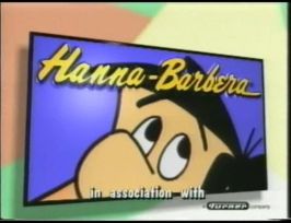

Used to Scare me:
- Columbia Pictures (From Cloudy with a Chance of Meatballs.): I said it got PWNED 4 that. 0_o.
- THX w/ TEX: It first scared me during Toy Story.
- DiscoVision: Kinda Groovy to me.
- Cartoon Network Studios (all 2001 version variants): WTF! Those scared me.
DarkJester25: I have a few, some of which spook me even now.
Warner Bros. Home Video, 1986. Oh good God, not this one. That awful synth fanfare, coupled with the cheesy CGI... and then the way it just ends on a random, spooky sting... I really, really do not like that logo AT ALL.
The VID Soviet Scary Face. rrrrrrrrrrRRRRRREEEEEEEEEEEEEE! Fwwwwwsssssshhhh... DAH-dah-DAH-dah-DAAAAAHHHH! Why anyone would ever make such a sadistically scary logo is beyond me.
Ghost House Pictures. The slamming door gets me every time, and then the skull appears so suddenly through the keyhole...
Renaissance Pictures, the Scary Mona Lisa version. Ominous Latin Chanting, indeed! This one got to me quite badly as a kid. I don't know why, maybe the thunder and lightning? Then again, I never really got spooked by thunder as a kid...
The Children's Television Workshop Sparklers. Brrrrrlll! Brrrrrlll! Brrrrllll! SHING! *echoing warpy noise*. No idea why it spooked me, probably just the noise.
WGBH Boston. Oh Lord, this one gave me NIGHTMARES for the longest time. dodododododododododododododorrrrr-rrrrrr-RRRR-RRRREEEEE-EEEEEEEE! That loud droning synth paired with the bright flash ALWAYS got me. It still gets me. Doubly so when paired with the Children's Television Workshop Sparklers from above.
The V of Doom. I love it now, but when I get in the wrong frame of mind, it's just terrifying.
The F.H.E. Crayon Writing Logo, the Cheesy Eighties one with the Jaundice Yellow colored notepad... The synth fanfare's the worst part of that one, and it spooked me as a kid. I dunno why now that I think about it...
The Program Exchange Arrows. No idea why...
TheFreakyFreak:
1. THX "Dell Broadway Variant"
Why? Well, the "Deep Note" is STRETCHED out so you hear it for, like, 30 seconds! And, you see it every time you boot up your Dell PC! So, see for yourself in the video below.
<embed align="bottom" allowfullscreen="true" height="407" src="http://widget.wetpaintserv.us/wiki/closinglogos/widget/youtubevideo/9b9277be9a44f5985c3f8de90037985fd93fff60" type="application/x-shockwave-flash" width="653" wmode="transparent"/>
Graaaaagh (Rexeljet):
Scares Me:
- Ian Allan Video: It's the music that gets to me, The coat of arms zooming into the screen in a choppy, pixellated way is also quite unnerving for me. But for some reason I like watching it.
- Bumper Films: It's not on the wiki, but I always found this quite scary when I watched the end of a classic episode of Fireman Sam or something else. The Whoosh sound and the small symbol (I think it's two kids on a dodgem car) I always found terrifying. I Once had a nightmare recently about the logo; For some reason I was watching the end of a bumper films animation, when the logo popped up and the dodgem car was tipped over! the two kids were shown on the floor next to the severed dodgem car. That's stuck in my mind for a while.
- Carlton Screen Advertising: It's not scary when I watch it on Youtube, but in the Cinema on a hige screen it can be quite scary.
- Vision Video: I think I watched this at the end of a Letterland tape late at night when I was little. I had no problem with the big black metal pillars rising from the desert-like scribble, it was the lightning and the ominus twinkling that followed it that scared the hell out of me.
- Ragdoll Productions: The early, pre-teletubbies version was what scared me. The weird look of the doll, with its lack of pupils, holding a torch made me liken it to a zombie. The light shining from the torch was also horrible to look at for me, and the horrid music that follwed it in Episodes of Brum made it even worse.
- S4C: After watching a Superted Tape, the early 'WALES4CYMRU' Endcap appeared. It wasn't in the centre of the screen, but at the bottom instead. The fact that it had a black background made it worse. Form some reason I've had some sort of mild fear of silent static captions that appear unexpected and fade in and out.
- Stretch Films: Not scared of it anymore but I did think it was a bit startling the first few times I saw it.
- ВИD: I can now watch the original versions without gettinng scared, althogh fanmade parodies ('Sphere', 'ВИD of doom', etc.) can scare me.
- The 'S From Hell': I don't see what's so scary about it. People talk about it like its the closest you can get to a heart attack without actually getting one. It's not. I've seen scarier things in my toilet. What I don't understand is that people give logos like this a scare factor of Nightmare, when much scarier idents like the Ragdoll Productions logo have a scare factor of none. I think that if the Screen Gems logo wasn't so talked about, the scare factor would be medium at most.
- Klasky Csupo 'SSF': For the same reasons. I grew up with this logo from the age of about 4 or 5, and I didn't think it was scary at all. Sure the eyes are a bit creepy, but I can't find anything that makes it petrifying.
- HiT Entertainment (2000): It annoys me because it seems to go on forever. the party poppers and fireworks are annoying, I'm glad I now have the Complete Series 7 and 8 of Thomas the Tank Engine & Friends from the classic collection boxset so I don't need the old DVD's with the old HiT Logo on them.
- FHE (199x): Due to the amount of arguments there were some time ago about when It was. when it was proved that it was being used in 1991, some people were still insistant that it was introduced in 1993, and that the Video that used it in 1991 was 'an error'.
Currently Scares Me:
- Constantin Film (First three logos): It was ONLY the fanfare, because it scared me badly. I really will never forget those logos in the present.
- VID: At first, when i saw out this logo, it din't scare me at all, but now i'm scared of it.
- Yorkshire Television: The 5-note fanfare still scares me, and i don't know why.
- Revue/Universal Television (1958-1982): The fanfare gives me the shakes.
- Columbia Pictures (1993-): When i was 9 years old this scared me but now i find it a bit annoying.
- MGM: It was only the lion who scared me.
- 20th Century Fox: I was not scared of this logo at all, but when i saw it on cinemas, the fanfare startles me.
- PBS 1989: It startled me at first, but now i get used to it.
- Columbia Pictures (1993-) See above.
- Discovery Networks: I've seen this one for 500 times and it still annoys me!
- Sony Pictures Television International: Same as Discovery Networks.
mimitchi33:
Scary:
200px|NET/PBS - CLG WikiPBS "And on" logo: The vocals and the duplicating P-Head scares me! I like the normal version of the logo better.
 1978-1986 Walt Disney Home Video AKA Neon Mickey: It looks too scary for a 70's logo, and I won't bother to watch it, and I never have watched it!
Family Home Entertainment 1983 (black variant): The way it looks and the description here on CLG Wiki makes me think that it is scary! As with the PBS "And on" logo, I like the original version better!
Used to scare me:
 1-800 BAR NONE sock puppet commercials- Not a closing logo, but for some reason I always ran out of the room when those ads came on. Now I'm not scared of the puppet anymore.
Sort of creepy:
Nickelodeon Pinchface- I find this logo cool, but when you're in a dark place, it can get a bit creepy when you try to watch it or think about it.
PBS PTV Park Piano Ident-
 The P-Pal that looks like it has a bird-shaped tail looks a bit creepy, but all of the PTV Park IDs are my favorites.
Annoying:
Viacom "Wigga Wigga": Everytime I try to find the V of Doom on Twilight Zone, this always seems to come on!
2009 PBS ident series: I like these logos, but when I try to find PBS idents from 2002 or earlier, this seems to come on almost all the time! When I tried to find any of those idents during Christmas break 2010, I only found the 2002 ident about 6 times, and found the 1998 logo 2 times (one of those times, when I woke up, it was the first thing I saw).
socoollogos:
Scares me:
Frankly, logos never scare me, but there ARE some that can get to me.
For example:
VID mask. It doesn't really scare me, but seeing all of those spoofs of it they made scare me a little.

And look at that, what would scare me if I found it:
New, huh? First, I have the Warner Home Video Cheesy Shield prototype logo (which I've nearly found a billion times), AND the multicolored V of Doom (which might be fake, but who knows).
I also have the planetless version of the Turner globe one, but I think it's finally fake, and the 2nd Astral Video logo: animated version, but it wouldn't be so much of a deal, because I have it on a VHS of Look Who's Talking Now.

And used to scare me:
The blue BG Columbia TriStar Home Video logo, I was 4, 5 or 6 when looking for logos on VHSes ( I was a member of the CLG back then and I wasn't at the same time! ;-) ), I saw it on a VHS (I don't remember the movie) and the screen was black for a minute, and then, the clouds appeared with the music, it made me jump... It doesn't scare me anymore.

And finally annoys me:
There aren't so much logos that annoy me, except for a few, including the NET carpet logo.
