What is the cheesiest logo you've ever seen?
Jump to navigation
Jump to search
Please write your opinions here about the cheesiest logos you've ever seen.
Paperking99:
QUICK!!! GET OUT, GET OUT OF HERE!!! THE TOENAILFOOGLE'S CHEESY LOGOS HAVE ESCAPED!!!!
Logomax Productions' CHEESIEST LOGOS!!!!!
Topitoomay's Chessy Logos:
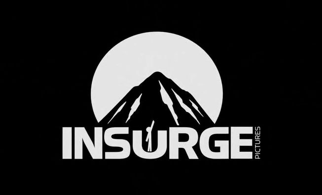
Insurge Pictures: It's that Stickman on the letter "U"? This animation look like it was done with Pivot Animator.
(I would know that effect anywhere: I use Pivot Animator Because I actually love this Animation Software.)
So what does SomerHimpson think?
dexterslablover
CD20Superness:
1.FADYO: The logo is very cheesy and weird
2.Home Video (Korea):The logo is cheesy and made me laugh.
Paperking99:
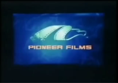
Pioneer Films (Philippines): SERIOUSLY?! Why did they steal the MPCA logo?! I'm guessing they were too lazy to animate their own logo, so they decided to steel an american logo, hoping no Filipinos would recognize it as a logo theft. Nonetheless, this is one of the worst logos ever. At least they didn't steel the MPCA music.
Enterprise Producciones (Argentina): They stole the Prism Entertainment logo, AND the music, making this logo worse than the Pioneer Films logo. I don't think the company got sued, but they should have!
Photo Video (Greece): I've seen many cheesy logos. For a long time, I found the American Egale (spelled Egale on purpose) Video logo to be the cheesiest logo ever, but then I saw THIS abomination of a logo. What were they thinking?!
The logo has unbelievably cheap computer animation (even cheaper than other Greek logos from the time), and the logo is TOO long! Do I need to say anything more?!
I will describe some more logos that I find to be cheesy later.
Nate S.:
Media Home Entertainment (1978): Very cheesy, because it looks like a low-budget hand-drawn cartoon, possibly Hanna-Barbera or Filmation. Not to mention this obvious typo: MEDA. But it's okay.
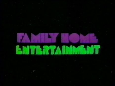
Family Home Entertainment (1981): This is cheap. I mean, it sometimes scared the pants off of me as a child while watching a really old Gumby tape of mine. What's up with this cheesy-sounding "music" that would always give kids seizures? It's nothing but creepy beeping noises and a horrendous synth cord. The animation is very cheesy, the space background is unnerving and cheap, and of course, this giant spinning "sun" that looks nothing like a sun at all. It looks more like a weird pink ultra-spiky ball that rotates weirdly for five minutes. Sometimes I got along with the logo, but it's still as scary as the 1985 yellow writing pad logo, which I now got along with despite making my ears bleed a little.
Video City International (Greece)
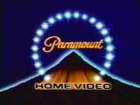
Paramount Home Video (1979): Both cheesy AND scary, mainly the cheapie animation and ear-ringing synth music.
MGM/CBS Home Video and CBS Video (1979): Yeah, the 2D animation is very simplistic and the rather uninspiring music is basically sudden and cheap.
Adventure_Time:
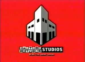 Cartoon Network Studios (2001): The building looks like it's side to side.
DarkJester25:
Scherzo Distribution: Nice animation, but its trippiness and Pink Floyd-esque synth rock tune make this a cheesy one for me. Eyes in an orange sky, a mouth opening to reveal a scorpion randomly sitting on a glowing teal plane in the middle of space, gridlines stretching towards the horizon... and it just cuts out at the end. It looks like a parody of an eighties animated music video! Still a nice logo despite its cheese factor, though.
Graaaaagh (Rexeljet):
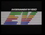
Entertainment in video's Early 80's ident seems pretty cheesy to me. The waving colours don't actually look too bad. However, the actual symbol looks very dated. If I were to pick one word that would perfectly describe what this ident isn't, it would be 'Timeless'. It's still a half decent ident though.
RV Television (1988-1997)- Probably the cheesiest ident of all time. The ident looks like it was an animated GIF that was blown up to accommodate the resolution of a TV screen.
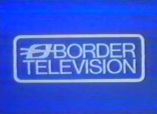
Border's idents were always a bit cheesy, because they were just the logo and the words "Border Television", with no animation or music.
Yeow95
Warner Home Video, FHE, SuperVideo, and Pony Canyon are some of the cheesiest logos I've ever seen.
MariluHennerArtist45
Video Communications, Inc. "3 Boxes" logo 1981-1986
WGBH "Zoom" ident 1972-1978
All the MTM custom logos
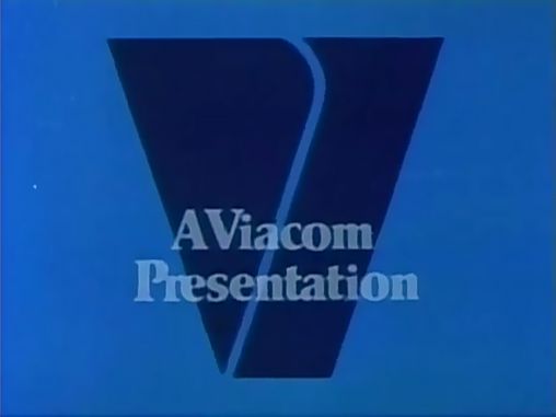
Viacom V of Happiness
Screen Gems 1958-1960
Bob Myers Productions
Hellas Kosmos Home Video
Cyclo Video's 2nd logo
youjustfailedfilms
This slice of old Wensleydale:
and this piece of fine American cheddar:
plus this block of Stilton
and this bag of grated Mozzarella:
Honorable mentions go to this package of Stinking Bishop:
closely followed by this block of Parmesan:
In all honesty, there are too many to name.
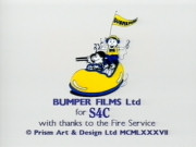 Bumper Films (The Joshua Jones variant): what the heck was the point of using the sped-up whoosh sound from Fireman Sam?
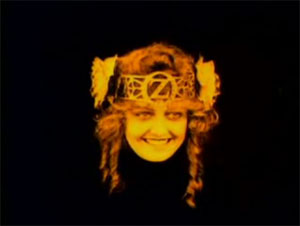 OZ Film Company: ok why does she have to be so creepy? (maybe that was intended...but who knows)
CooleyBoy10:


Media Home Entertainment (1978): Very cheesy, because it looks like a low-budget hand-drawn cartoon, possibly Hanna-Barbera or Filmation. Not to mention this obvious typo: MEDA. But it's okay.
Family Home Entertainment (1981): This is cheap. I mean, it sometimes scared the pants off of me as a child while watching a really old Gumby tape of mine. What's up with this cheesy-sounding "music" that would always give kids seizures? It's nothing but creepy beeping noises and a horrendous synth cord. The animation is very cheesy, the space background is unnerving and cheap, and of course, this giant spinning "sun" that looks nothing like a sun at all. It looks more like a weird pink ultra-spiky ball that rotates weirdly for five minutes. Sometimes I got along with the logo, but it's still as scary as the 1985 yellow writing pad logo, which I now got along with despite making my ears bleed a little.
Video City International (Greece)
Paramount Home Video (1979): Both cheesy AND scary, mainly the cheapie animation and ear-ringing synth music.
MGM/CBS Home Video and CBS Video (1979): Yeah, the 2D animation is very simplistic and the rather uninspiring music is basically sudden and cheap.
Adventure_Time:
 Cartoon Network Studios (2001): The building looks like it's side to side.
DarkJester25:
Scherzo Distribution: Nice animation, but its trippiness and Pink Floyd-esque synth rock tune make this a cheesy one for me. Eyes in an orange sky, a mouth opening to reveal a scorpion randomly sitting on a glowing teal plane in the middle of space, gridlines stretching towards the horizon... and it just cuts out at the end. It looks like a parody of an eighties animated music video! Still a nice logo despite its cheese factor, though.
Graaaaagh (Rexeljet):

Entertainment in video's Early 80's ident seems pretty cheesy to me. The waving colours don't actually look too bad. However, the actual symbol looks very dated. If I were to pick one word that would perfectly describe what this ident isn't, it would be 'Timeless'. It's still a half decent ident though.
RV Television (1988-1997)- Probably the cheesiest ident of all time. The ident looks like it was an animated GIF that was blown up to accommodate the resolution of a TV screen.

Border's idents were always a bit cheesy, because they were just the logo and the words "Border Television", with no animation or music.
Yeow95
Warner Home Video, FHE, SuperVideo, and Pony Canyon are some of the cheesiest logos I've ever seen.
MariluHennerArtist45
Video Communications, Inc. "3 Boxes" logo 1981-1986
WGBH "Zoom" ident 1972-1978
All the MTM custom logos
Viacom V of Happiness
Screen Gems 1958-1960
Bob Myers Productions
Hellas Kosmos Home Video
Cyclo Video's 2nd logo
youjustfailedfilms
This slice of old Wensleydale:

and this piece of fine American cheddar:

plus this block of Stilton

and this bag of grated Mozzarella:

Honorable mentions go to this package of Stinking Bishop:

closely followed by this block of Parmesan:

In all honesty, there are too many to name.
Gohan56782
Hanna-Barbera Home Video (1987-1991):The words flipping is bad, the swirling star does not animate that good and the Script words look horrible. The music is alright though.
Paramount Home Video (1979-1982): I don't really like the way it animates. It looks too dark and the stars over the mountain look more like balls of light.
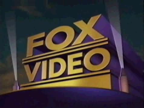
Fox Video (1993-1996): This logo is absolutely cheesy. The colours are not right, the logo animates horribly and the letters look horrible. Along with all of the cheesiness, it looks like it was done in 5 minutes.
TBA
iheartparamount:
 Bumper Films (The Joshua Jones variant): what the heck was the point of using the sped-up whoosh sound from Fireman Sam?
 OZ Film Company: ok why does she have to be so creepy? (maybe that was intended...but who knows)
AnimeTVLogos
BC Video Presentation (go to the "What is the ugliest logo you have ever seen?" page to see what I have to say about this logo).
FADYO (go to the "What's your least favorite logo?" page to see what I have to say about it).
NightmareEnterprises:
We got two chessy logos in my opinion
First, The Chessy field of ugly derps

Last, a pile of chesse nippies
Gilblitz112
Kari's Logo Here: They say that a picture is worth a thousand words... this one is worth just three.
Park Avenue: Oh, DON'T get me started.
Alpha Video:The music sounds like something straight from the '80s (which it is).
TrickyMario7654
- 2001 MGM Logo - This logo is really generic and annoying due to it plastering older logos.
- 1967 United Artists Logo - The logo looks real cheap and looks like it was made in 15 minutes.
- 1956 MCA TV Logo - The Grammar is terrible and the blind-like turning effects are cheap.
- American Egale Video Logo - The logo looks like they just took a picture of an eagle from Google Images and added the text in MS Paint and the fanfare is a ripoff of the ABC Radio News Fanfare!
- Roadshow Home Video Mid 80's Logo - The laser-like effects look like terrible cel-animation from the 70's, though I sorta like it.
- CEL Home Video Mid 80's Logo - The CGI looks really cheap, and the grid on the bottom half of the logo looks like something you see in an 80's action cartoon.
--------------------------
socoollogosATA Video - The animation is bad, looks like the Windows "Mystify Your Mind" screensaver, the music is loud and the text types itself in too slowly.
Mega Video - The animation is bad, looks like the Win-- ... it's the same thing as the ATA Video logo, except the colors and the music are different, and the text types itself in even slower!
Temple Video - The anima-- ...... Once again. The colors and music are different again, and the text types itself in even SLOWER!!! Was there some kind of "logo creator" available on the market, and those three companies bought it?
1001 Video - Just plain text and a color-changing background. Enough said.
Knockout Video (1) - Just plain text and a black background. It's even worse.
Knockout Video (2) - Almost the same thing as the 1001 Video logo. Must've been another "logo creator".
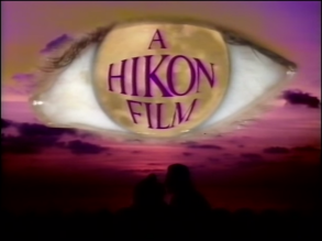
Hikon Film Video Distribution - The transition effect at the beginning is horrible. Not to mention that huge eye.
Oh yeah, and the voiceover, either being "A Hikon Film...", said so quietly that you must turn up the volume to the max. Then, you get the 2nd version: you expect it to be the 1st version, so you turn up the volume and... A HIKON FILM!!!You'd hardly survive.
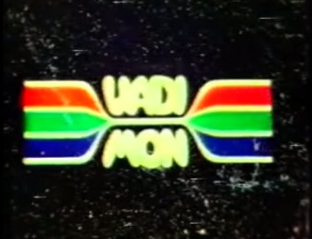
Vadimon Video - Everything about this logo is bad, the pair of eyes, the planets, not to mention that VADI---MON card, which is obviously chroma-keyed as it is actually held by someone!
Zombastic Productions- Do I really need to say it? The special effects (and the rest...) are HORRIFYINGLY AWFUL!!! I wonder if the producer of this logo injected Pepto-Bismol (or something worse) into himself before making this?!
Park Avenue- This erotic tape company sure showed us a lot of their... work. But they could've at least put some effort into it.
Boyd's- A card. A bad zoom-out. A pink screen. Change of cards that can slightly be seen. This has to be the worst logo ever made.
--------------------------------------------------------------------
I could keep going, but I'd make 50% of this page.
~socoollogos~
--------------------------------------------------------------------
CooleyBoy10:
----------------------------------------------------------------------
FanCentralNetwork:
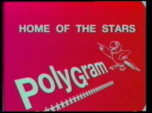
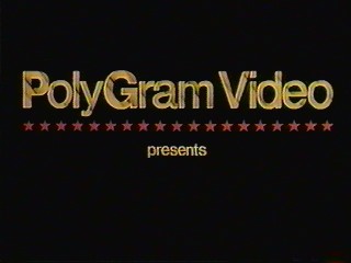
I think this PolyGram logo is unintentionally funny because of the random parrot. Though this isn't exactly random when you remember the phrase "Polly want a cracker?" and then look at the name PolyGram. It's still out of the ordinary. Also, what is the parrot pointing to? the word "The"?
I think this PolyGram logo is unintentionally funny because of the random parrot. Though this isn't exactly random when you remember the phrase "Polly want a cracker?" and then look at the name PolyGram. It's still out of the ordinary. Also, what is the parrot pointing to? the word "The"?

----------------------------------------------------------------------
GoAnimateDude888aka RobbieTheGoAnimator:
Top 5 Cheesy logos:
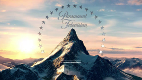
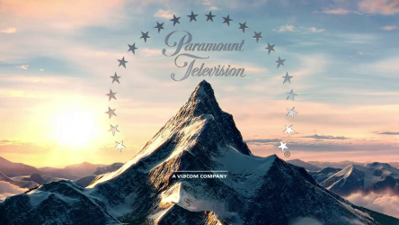
#5: The Paramount Television logo from 2015.
It looks like it was done in 20 minutes. Also, why did they use the last notes of the 70's Paramount fanfare? Couldn't they alternate the current fanfare? My god, whoever made this logo must be so lazy. Although it's a little decent to me.

#4: The Screen Gems "S From Hell" logo.
To me, it doesn't look scary at all. Not even close. To me, it looks like an intro to a 6th grader's PowerPoint project

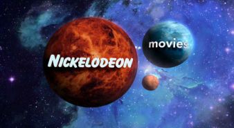
#3: The Nickelodeon Movies "Planets" logo.
It's basically a ripoff of the Universal logo. Also, what planet is the "movies" supposed to be? Earth? I know for a fact the "NICKELODEON" is supposed to resemble Mars and the ball in between I think is supposed to be Jupiter. Also, Mars and the Earth are far away from each other, when you come to think about it. And how could the Earth or Mars move away from their current position? That makes no sense. And that Jupiter ball would've been bigger than the size of the two balls combined!

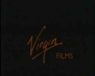
#2: The Virgin Films Early 80's logo.
The music sounds like someone flushing their magic instruments down a giant toilet and having the people next door hear it automatically play some tunes while it's down the drain. Also, the logo looks too cheap and it's transition to "Presents" is just too stupid.

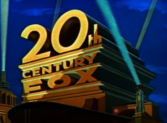
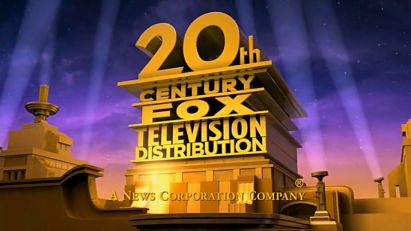
And last but not least; #1: The 20th Century Fox Television Distribution logo
My god, this is the worst logo I have ever seen! It looks so cheap and lazy, it looks like a remake of a logo by some kid on Blender. The one with the News Corp. byline is even worse, the byline is so choppy. The logo is the worst logo not just even made, but even thought of.

----------------------------------------------------------------------
Sagan's Top 5 Cheesiest Logos of All-Time:
Where is it???? Where's the creativity?????? Just popped up suddenly without notice, and then " WHOOOOOOOOOOOOOOOOOOOOOSH!!!!!! BAAAAAAAAANG!!!!"
It just can be made with Sony Vegas for less than 5 minutes, and THAT'S IT!!!! Also, why they used this longer than it's FAR-better 1992 counterpart?
OMG!! This looks VERY bland, like something came out from Blender, not to mention Caillou's annoying laugh (i respect your opinion, if you like it),and a failure to the most-favorable 1993 logo.

Disappointing. JUST Disappointing, that's it.
WTF???!!! SERIOUSLY???!!!!! Did THEY, the makers of the logo have a TRUE faith to make a logo, or just want a money and made a trashy logo like this?? First off, the background seems ripped straight from the 2003 Studiocanal logo, and then they added some annoying zooms to "form" a logo. Well, at least NOTHING compared to the next logo....

1. AAAAAAAAAAAAAAAAAAAND THE WORST OF ALL TIME......
First, i want to say this clearly as possible... "ercgnutknye096358tynuc0pn5xm86uvnyhmu57ubjmu65pomu4y9v8cpgmu548tvyncoiermyvceogyn5e94y
vnogueom5uvo4my58vn96589nyv695mvuy895p6mvu8n5eyurovtny34ytnc459ynv945ynvt9458tyn45"
OK, back to the topic. This logo sucks as it animates roughly. And what makes this in the top spot? THE GOD-AWFUL THEME SEEMS LIKE IT WAS COMPOSED BY BURGDORF!!!! (Untergang reference) Everytime, the music stucks in my brain as how it makes me dizzy and (sometimes) puke....
Even worse, kids on YT do many AWFUL remakes on this logo, and this made me even sicker than before.

Dishonorable mentions:


BenIsRandom says...

Twentieth Century Fox Television Distribution. I strongly believed this was fake at first. But apparently, I was wrong and some lazy animator decided to use a Blender-like logo.
List of other cheesy logos:
2. Hikon Film Video Distribution (Although that loud voiceover does sound like Rainer Wolfcastle... that's a Simpsonscharacter in case you didn't know)
5.Viacom (1976-1986; The wicked V of Doom; Although I kinda made up some lyrics for the theme that fit perfectly with the logo: "I'm gonna get you...")
The RysherTPEMan says.....
Polygram Video, Home of the Stars: *goes on Google Images, searches up white outline of parrot, inserts in Microsoft Powerpoint on a red background, then adds "PolyGram" under a line of asterisks, and adds "Home of the Stars" above it, then adds three beeps and a stock disco tune in AVS Video Editor* Here boss, the new logo! *emails it to PolyGram*

Viacom V of Doom: "ZOOM 'ER IN BOB!"
Wellmart3's Cheesy Logo List
AIMS Media: Oh, yes! This logo, with the UGLY design, and that horrifying synth! And it lasting until the 2000's, this is one sure dated logo!!
Genesis Home Video:OK, this logo? Lets explain - A logo with terrifying and awful music, simple effects, and that HORRID background at the end!
Louisiana Public Broadcasting: Shall we present an old logo from the early 90's, which looks too, and I mean TOO newfor its time?
Kirin Entertainment: You know, that logo with a jingle that tries to be good, but actually awful and eerie. The same thing can be said for the animation.
Top Entertainment: Another logo to be made in Microsoft Powerpoint. The animation is just too cheesy and simple.
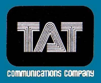
T.A.T Communications Company: One cheesy hard-to-find logo, with a monstrous jingle, and one that has been COPIED.
Hammer Video Home: IT'S THE MOST LONGEST LOGO OF ALL TIME!!!!!!! It's even longer than Photo Video, which was even longer than Hendring!!!!
SNOWFLAKESOMEGA'S CHEESY LOGO LIST REDUX! (as of now):
SNOWFLAKESOMEGA'S CHEESY LOGO LIST REDUX! (as of now):
- Kwang Young Products: They stole the Image Entertainment laserdisc logo AND music, but also the Orion logo. That's right. Worse than the Enterprise Producciones logo with an extreme lack of "animation" felt onto it.
- Film And Drama Youth Organization (FADYO): You know why.
- Fax Video Design: OMG, that animation gives me a headache!
- Class Video: BOOOOOOOOOORING!!! No one else wants to see this ultra-cheap depressed animation! Just take me to your coming attractions, movie, whatever!
- NCR Production: Extremely short and poorly designed even for a 2000s logo. Next...
- Colombus: This screams BLATANT! The choice of ripping off Columbia and Coca-Cola for your own French logo to pretend you're really attracted to American pride makes me laugh!
- SEGA (Argentine home video company): If this is a bootleg company, then I'm OK.
- FLT Films International (3rd logo): So that means you were living since 1998 and still using vintage cartoon effects?
- TVE Bahia (1985): With no doubt, the best/worst 2D animation ever put on an 80s logo.
- Zelex Nig. Ltd. (1st logo): Nigerians weren't happy with using CGI back in the day...causing abominations like this as a result.
- Best Films: It's proven that stealing from 20th Century Fox doesn't make you be called "Best Films" so if you're reading this, at least be original.
Billywws' Cheesy Logo List:
- Manoli Films (normal variant): Really? They just had to steal the Playstation startup's theme? And even if we disregard the music, the logo looks terrible. Green and poor-quality elephant symbols and ugly-looking text, and we've got a very cheap and cheesy logo.
- Ear Booker Productions: I don't know what they were thinking with this one. Throwing in jarring music with Weird Al Yankovic screaming his lungs out and seizure inducing flashing is off the charts in terms of cheesiness.
- Photo Video (Greece): A low-budget synthesized theme with psychadelic patterns that look like something from a Commodore 64 program, and the logo's really long length. This is very, VERY cheesy. Not quite the cheesiest in my opinion, but it stands as the cheapest-made logo ever made.
- Kanaal 2/2BE (startup variant): I can't even comprehend what in the heck this logo is. Just throw a bunch of random patterns with incredibly strange chant-like humming music, which turns into a creepy choir? What were they thinking?! This is in my opinion the cheesiest logo of all time.
- Inter-Pathé Video (1980's-1990's): I don't even get this crap, just a rooster crying then just shows text then it does it at the end then that's it, it looks like some 1920's retro drawn logo, why are Germany making too many bad logos in the 80s?
- Paramount Television (2015-) Uhhh........ what the hell was Paramount thinking about? Too bored to use a new fanfare for it, just using an retro sound, really lazy.
- A Hikon Film (1980's): Even though I like this logo a bit, I still kind of find this logo unusual, they seemed to use a eye and then showing 2 people kissing then the text coming in, it's more cheesy for using an eye and using a moon on the eye? Huh...
- CBS Special Presentation (1973-1991) ... that Special coming in and it looked like it was repeating it and going on again but I still seem to like the logo.
- Boje Buck (1990s-): Well I've been seeing this WAY too much and just making a logo with a rabbit eating a snake for lunch is making it kinda boring, although it's an interesting logo.
- Interglobal Video (1987-19??): Um... just a logo with an earth with filmstrips and zooming and spinning in way too quick and the text coming up makes it really cheesy, why can't they think of a betterdesign to make?
- Pony Canyon (1989-2001): What the living hell is this crap? CGI wasn't being happy being used for logos with Japan back then...
- Paramount (1950-1953): Ok, that mountain drawing is just terrible and the stars don't end at each mountain edge, if Adolf Zukor drew that, I wouldn't be that mean because he would have almost been in his 80's.
- Boyd's Video (1980's): The zooming in is WAY too slow, boring to watch since it's silent, the 80's had bad luck with computers.
- Oz Film Company (1914-1915): Just using a face for the logo is just boring, also BND may have inspired this logo or they wanted to use a face so they wanted to look cool
- ATA Video, Temple Video & Mega Video (1980's): Hey look? A poor made BBC Micro logo with cheesy effects, wow how cool! (Being sarcastic)
- BC Video (1987): Another poor made logo which is drawn by a little kid, wow... who even LET these people let the little kids help with them?
- FADYO (2003-????): The logo is just a copy from the Universal Pictures logo from the 1990's. In addition of the cheap GIF images and the Beatles songs... Off the charts!!!
Nightspears:
- BC Video: (1987) A logo which it had to cover up an intro to a TV show (Denver the Last Dinosaur) to create the effects for itself! The strangest part is that it didn't even air yet until a year later, one of the strangest mysteries i've seen!
- FADYO: (All versions) Their first logos looks simple and could be made in a half hour tops! Easily looks like an intro to a 6th graders class video. Easiest way to get a nightmare logo in my opinion. But the worst has to be their second logo, WHAT WERE THEY THINKING!? Copy and pasting a Universal logo with copyrighted Beatles music. Then try to be creative with their own logo, which already looks abysmal. Disgusting, just filthy and rancid...
- Home Game: (1990's) Seems that South Korea can't seem to make up a creative logo. The Home Game logo is a pure example of this... Copying a Showtime ID along with putting THEIR name into the middle along with a choppy moving Pac Man (which is by Namco) just makes it dumbfounded that they didn't get sued by the buttocks by the two companies!
- Kim Lợi Production: (2000's) This Vietnam company stole two original and beautiful logos and turned them into disgusting vomit, along with a theme that only plays for around 10 seconds which then repeats jarringly makes this look completely awful. And they're still USING THIS TODAY!!!It already looks old and outdated, hope they change it soon...
- And the absolute winner of the most cheesiest and most AWFUL logo i've seen is....
- CLASS VIDEO: (1980's-1990's) I have no words, just click on it. The cheesy factor will tell you EVERYTHING that's wrong with this, as well as the video. One of the worst logos i've ever seen, even badder then most logos who are widely considered the worst anyways....

Vadi-Mon: I suppose the logo's makers just went to the nearestCatholic seminary and videotaped a bunch of random **** at the AV studios in the seminary, and then cobbled it together and stuck it at the beginning of all their tapes!

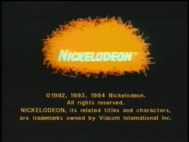
Nickelodeon:The orange scribble looks like it was drawn by a drunk man in a bar.
Dominicmgm presents my cheesiest logos.
- Rainbow Releasing Productions:The logo is from 1995, but look at it! It looks like a logo from the 1970s and the text does not match up with the rainbow Orson Welles is holding. The 2001 logo fixes this by making the text match up with the rainbow, but we still have that 70s look. And the 2014 logo only has 4 colours on the rainbow.
- FADYO (Bangladesh) (2nd logo):OH GOD. They stole the Universal logo from the 90s AND Beatles music. Was this made by 6 year old kids?
- Photo Video (Greece):It looks like it came out of an NES, it's too long, and the music is horrendous.
- Mushroom Pictures (Australia): WHAT??? Sydney getting destroyed and seizure triggering things on the screen is something you would NOT put in a logo.
- Boyd's Video (UK): WAS THIS FILMED BY AN 8 YEAR OLD? It's obviously a camera zooming out and then a card transition and another zoom out. And if you look closely during the transition, you can see the cards being switched!
- Ascot Elite Entertainment Group (Germany): The CGI at the beginning is okay by 1996 standards, but when the logo is formed, it looks like a logo from the 70s.
- American Egale Video (no, that isn't a typo): Bob, we need a logo, make one in 5 minutes please. [goes on Google Images, finds eagle picture, adds into Paint and starts adding text.]
- Empire of Cinema (Israel):Same as Boyd's Video (UK), but without the card transition, though I do find the handwritten warning unique.
- PAP Video (Greece): Why did they have to steal The Final Countdown?
- Video City International (Greece): See PAP Video (Greece), but they replace the music with Star Wars music! The beginning looks like a crazy sparkler.
- Sega (Argentina): Just type it in and see.
- Deep Water: The creator has really bad mental health. Why a shark attack, with blood and shrieking?
- Sick Duck Productions: This would be OK for the 1980s, but this was 2012. I have seen better logos than that from the 80s, such as the Marvel Productions "CGI Spidey" logo. Also, the subject matter is on par with the Deep Water logo.
- Fat Dog Productions: It is pretty scary, and the logo itself looks like it's from the 1930s. However, it's the perfect way to scare your kids from watching porn!
Brochamp Media
(anex407 on the CLG Wiki)
- Family Home Entertainment(1981) - It's very clear the pink "sun" isn't actually one, and the block-like text makes the logo even more unappealing to the human eye. Why is the sun pink, anyway?
- Photo Video(1988) - The whole product looks like it was produced on a obsolete Amiga/Commodore/IBM/Apple computer, the music composition is choppy, and the logo's so long that it makes me feel, makes me feel, feel- Zzzzz...
- Paramount Home Video (1980) - No, no, no, no... Don't get me started.
- American "Egale" Video (2000's?) - They just had to copyright a image of an eagle, er, I mean, "egale" stolen from Google Images. Someone at this excuse of a home entertainment unit must've seen the logo for a split-second and called it effort, not remembering what the image looked like.
- More coming soon.
FireLaser244
- Golumbia Video - This is actually from 2010, but you won't believe that if you saw it
- FADYO - Do I even need to say anything?
- American Egale Video - HOW IS THIS EVEN A LOGO?
- Boyd's Video - Beyond horrible, how does someone mess up ZOOMING OUT! It's also too long, and the whole card switching thing THAT YOU CAN SEE!
- Class Video - Boring and long, even Boyd's Video was more entertaining than THIS. Combine that with lackluster animation, and you've got the worst logo ever made. Should be called: "Class Failure"
NOTE: Logos mentionedon my cheapest logos list will not be included.
- Home Game: Looks like both Showtime and Namco are gonna sue 'em because of this!
- Payless Entertainment: I have to say this right now,IS THIS EVEN A FREAKING LOGO?!!!!!!!!!!!!!!
- 20th Century Fox Television Distribution: Why is such an major awesome company had to make this logo THAT BAD?! It looks like it was made by a 5-year-old and created this logo on Blender!
- A Hikon Film: What was I even watching!
- Best Films: More like WORST FILMS!!!!!!!! Whoever made this must been very lazy! They ripped-off a masterpiece known as the 20th Century Fox logo! Is this even real?!
- SEGA (No, not the video game company. This is only about the Argentine home video label): I hope the real SEGA is gonna sue you for this because of being a confusing Argentine imposter of the popular video game company that made a gem, Sonic the Hedgehog!
- Laser Video: The blatantuse of the THX deep note will MAKE ME CALL THX AND SUE YOUR PANTS OFF OF YOU FOR STEALING THEIR ICONIC DEEP NOTE!!!!!! What the hell is wrong with you, Russia?!
Storytime823's cheesy logos.

First of all, what is wrong with that face? Is that a way to emote? Second of all, the hand animation at the beginning is quite choppy! Looks like something made in Powerpoint.
They misspelled eagle (egale) wrong, and the finished result looks like it was finished in 30 seconds in Movie Maker.
Verylogo433's Top 7 of the cheesiest logos.
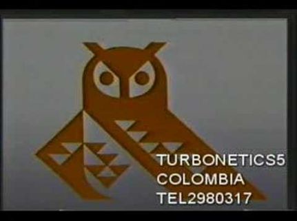
7. Colcultura (From Colombia) (1983)

The animation is awful,the music is awful,EVERYTHING IS AWFUL!
and it bothers me that...
THAT THE OWL IS LOOKING AT ME OF THAT WAY!!!!!
6. Hammer Video Home (From Argentina) (1986)
[No image]
I can not believe that the creators of this logo are from my country...
The concept of the logo is quite boring.
But the music relaxes me.
5. Pioneer Films (From Philippines) (1993)

2 words...
EPIC FAIL!
The use of the MPCA's logo make me laugh like a crazy
Well,WHO THOUGHT THAT THIS LOGO WAS A GOOD IDEA?!
The good thing is that they did not steal the audio otherwise this logo would be in the 1st place.
4. Entrepise Producciones S.A (From Argentina) (1980's)
[No image]
GODNESS! THIS LOGO IS WORST THAN THE PIONEER FILMS LOGO!!!
But that good that they edited a bit the sounds and the logo or I move to another country

Choppy animation and annoying music.

hahah.. Hahahahah.... HAHAHAHAHHAHAHAH!HAHAHAH!!!!!!
Horrible effects and choppy music!
Ok,the logo is from 1981,in that year the logos had early computer animation,Bad CGI,and not so good quality in image and music.
And the winner is...
1. Vadimon Video (From Spain) (1977)

Those eyes!
The logo is ultra cheesy!
The music is so low budget and horrible,the images looks old and the effects are simple and cheap.
Bonus!
5: Les Studio Marko (2003?) (From Canada)
[No image]
F***** THIS S**T!!!!!
Ok,sorry but this logo is so cheesy...
The reasons:
THE IMAGE HAS A LOW QUALITY WHEN ZOOMS TO THE LEAF OF THE FLAG OF CANADA!!!!
The second reason is because is very simple the animation (What? THAT'S NOT ANIMATION!!!!)
The music is great and cool,but sounds very amateur.
"Things only worse..."
4: Photo Video (1988) (From Greece)
This is not a logo,THIS IS A GLITCH FROM A GREEK VIDEOGAME!!!!
What the f*** with the effects and VERY BUT VERY LOW QUALITY OF THE IMAGE AND MUSIC!!!!!
3: SuperVideo (80's) (From Germany)
This is the weirdest and trippy logo ever,but mercifully is not a f***ng glitch like the previous logo...
I like the music but the sudden coloured background is very cheesy.
2: Mushroom Pictures (2000's) (From Australia)
[No image]
Epic music,but the very crazy action and the nonsensical begin is very cheesy!
And the winner of the winners is...
1: Inter Pathé Video (KOOOKOOOROCK KOOOOO! Oops,i mean 80's) (From Germany)
First I will say what I think after seeing this logo...
SUCK MY C*** F****NG ROOSTER AND THE F****NG CREATORS OF THIS S**TTY LOGO!!!
Ok,I think I insulted this logo a lot...
Here the reasons:
The "SUPPOSED" rooster is very cheesy but I saw the rooster in detail and it looks like the shadow of a rooster.
But the logo looks like a 1920's presentation!

Insurge Pictures: It's that Stickman on the letter "U"? This animation look like it was done with Pivot Animator.
(I would know that effect anywhere: I use Pivot Animator Because I actually love this Animation Software.)
So what does SomerHimpson think?
Well, there are a couple that I should explain.
- Family Home Entertainment '82: The beginning of the logo (as well as the music) actually went perfect: weird, non-understandable music for a weird, non-understandable text formation. The rest of the music is actually decent.
- Hikon: Three words: A HIKON FILM!!!
- Vadi-Mon '77: Hard to believe this was shown on some porn films as well. If some pervert saw those eyes watching them, I guarantee they'd just walk away with the feeling that the TV is watching them.
dexterslablover
Hanna-Barbera (1994-1997): Both good and cheesy at the same time, due to plastering.
Paramount Television (2015-): The logo looks like it was made on Adobe After Effects or Sony Vegas
Cookie Jar Entertainment (2004-2012): I only dislike it at the end of DiC shows (like Inspector Gadget and Mario)
Fox Video (1993-1996): The background and logo looks creepy
Buena Vista International Television (2006-2007): The logo looks like it was filmed at underwater.
edunk5
<a href="https://www.youtube.com/watch?v=IPlZ77mP3Ho" target="_self" title="Fox Kids (1997-1999)">Fox Kids (1997-1999)</a>: Even though the picture, cinematography and most of the visuals are fine, the CGI effects of the earth and space have aged horribly. What's worse is the logo itself as it's really messed up with the text's and light's colors going out and touching each other along with the square and most of it isn't even properly filled in. Thank god, this logo was only short lived as it was replaced with a version of the logo that is completely filled in and staying in.
<a href="https://www.youtube.com/watch?v=6ampf_reY4E" target="_self" title="Southern Star Entertainment (1985-1989)">Southern Star Entertainment (1985-1989)</a>: While the third logo is my all-time favourite, the first would have to be one of the worst logos I ever saw in my life even though I didn't grew up in the 80s. Everything is wrong about it; the choice of visuals, the effects, the sounds but what's worse is the Alternate Thunderclap variant as it's much louder and even frightening if you're expecting the usual sound. It has dated real badly and it even looks bad for it's time.