Warner Bros. International Television
Jump to navigation
Jump to search
Logo descriptions by mr3urious and PluMGMK
Logo captures by mr3urious, V of Doom and PluMGMK
Editions by mr3urious and Shadeed A. Kelly
Video captures courtesy of joliver325 and PluMGMK
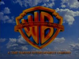
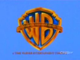
1st Logo
(1996-2001)
Nickname: "The 2D Shield of Staleness"
Logo: On a cloudy sky BG or on a sky blue BG, we see the WB shield with "INTERNATIONAL TELEVISION PRODUCTION" written on its banner. The Time Warner Entertainment byline is shown below.
In-credit Variant: There is in-credit text variant for shows or TV movies that would say, "WARNER BROS. INTERNATIONAL TELEVISION DISTRIBUTION".
FX/SFX: The moving and forming clouds, or none. Also,
Music/Sounds: The end theme of the show or the 1994 WBTV theme.
Availability: Rare.
Editor's Note: A rather odd-looking version of the WB shield. The shield is more darker than usual and it appears more two-dimensional. Also, the banner color does not blend well with the rest of the shield, and it's also positioned a bit too high on the shield.
2nd Logo
(2013- )
Logo: On a black background, a WB shield, with "INTERNATIONAL TELEVISION PRODUCTION" written across it, fades in. The text "Distributed by Warner Bros. International TV Production" is written underneath in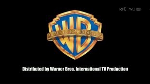 Impact font. It fades out a few seconds later.
Variant: On The Bachelor New Zealand and The Bachelor Australia, we see the shield on a sky blue background with a slight lens flare effect, and the banner shines. The byline is also absent and as a result, the logo takes up more space on the screen.
FX/SFX: Just the text and logo fading in and out.
Music/Sounds: None, but the Bachelor variant uses the 2003 Warner Bros. Television theme.
Availability: Brand new. It appeared on <a href="/page/RT%C3%89" target="_self">RTÉ</a>'s My Best Shot in Ireland. That show is produced by Vision Independent Productions, which recently signed a deal with Warner Bros., so this logo will probably become more common over time.
Editor's Note: Overall, this logo is just lazier than the last one: the use of the impact font, the poorly-written byline, and overall design. If there's any consolation, it's that the shield design was fixed for this logo, but in the end, the whole result looks like it was made in a matter of minutes.
Logo captures by mr3urious, V of Doom and PluMGMK
Editions by mr3urious and Shadeed A. Kelly
Video captures courtesy of joliver325 and PluMGMK
1st Logo
(1996-2001)


Nickname: "The 2D Shield of Staleness"
Logo: On a cloudy sky BG or on a sky blue BG, we see the WB shield with "INTERNATIONAL TELEVISION PRODUCTION" written on its banner. The Time Warner Entertainment byline is shown below.
In-credit Variant: There is in-credit text variant for shows or TV movies that would say, "WARNER BROS. INTERNATIONAL TELEVISION DISTRIBUTION".
FX/SFX: The moving and forming clouds, or none. Also,
Music/Sounds: The end theme of the show or the 1994 WBTV theme.
Availability: Rare.
- It appears on Zorro: The Animated Series, as well as on some episodes of Code Name: Eternity on Sci-Fi Channel (now "SyFy").
- It also appeared on the 1998 made-for-TV movie Terror in the Mall and old British airings of Police Academy: The Series.
Editor's Note: A rather odd-looking version of the WB shield. The shield is more darker than usual and it appears more two-dimensional. Also, the banner color does not blend well with the rest of the shield, and it's also positioned a bit too high on the shield.
2nd Logo
(2013- )
Logo: On a black background, a WB shield, with "INTERNATIONAL TELEVISION PRODUCTION" written across it, fades in. The text "Distributed by Warner Bros. International TV Production" is written underneath in
 Impact font. It fades out a few seconds later.
Variant: On The Bachelor New Zealand and The Bachelor Australia, we see the shield on a sky blue background with a slight lens flare effect, and the banner shines. The byline is also absent and as a result, the logo takes up more space on the screen.
FX/SFX: Just the text and logo fading in and out.
Music/Sounds: None, but the Bachelor variant uses the 2003 Warner Bros. Television theme.
Availability: Brand new. It appeared on <a href="/page/RT%C3%89" target="_self">RTÉ</a>'s My Best Shot in Ireland. That show is produced by Vision Independent Productions, which recently signed a deal with Warner Bros., so this logo will probably become more common over time.
Editor's Note: Overall, this logo is just lazier than the last one: the use of the impact font, the poorly-written byline, and overall design. If there's any consolation, it's that the shield design was fixed for this logo, but in the end, the whole result looks like it was made in a matter of minutes.