WGBY
Jump to navigation
Jump to search
Background: WGBY is a division of WGBH; a PBS affiliate located in Springfield, Massachusetts. Its launch was on September 26, 1971.
1st Logo
(1985-1998)
 <iframe frameborder="0" height="184" src="http://wikifoundrytools.com/wiki/closinglogos/widget/unknown/9efc71677eb89d9520eb92d205e71cabab38610d" width="325"></iframe>
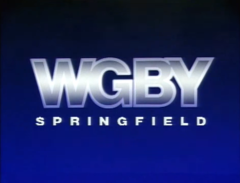
Logo: On a black/blue gradient background, an outline of "WGBY", in Helvetica and colored translucent grey, fades in. A white bar slides down inside it, coloring much of the text."S P R I N G F I E L D" fades in below in white.
FX/SFX: The bar moving.
Music/Sounds: None.
Availability: Can be seen on locally-produced shows from WGBY from the era.
Editor's Note: The lack of music and dark environment may spook some, but it's nowhere near as what WGBH had at the time.
 <iframe frameborder="0" height="203" src="http://wikifoundrytools.com/wiki/closinglogos/widget/unknown/7bf7b290aa521d98437d087de23051063782952c" width="268"></iframe><iframe frameborder="0" height="202" src="http://wikifoundrytools.com/wiki/closinglogos/widget/genericvideo/ace9dc590c5697a2bbc86b8ea768d69b0daa8546" width="265"></iframe><iframe frameborder="0" height="202" src="http://wikifoundrytools.com/wiki/closinglogos/widget/genericvideo/d8b9780faae89109a1facf27f28bff75c84ee518" width="361"></iframe>
1st Logo
(1985-1998)
 <iframe frameborder="0" height="184" src="http://wikifoundrytools.com/wiki/closinglogos/widget/unknown/9efc71677eb89d9520eb92d205e71cabab38610d" width="325"></iframe>
FX/SFX: The bar moving.
Music/Sounds: None.
Availability: Can be seen on locally-produced shows from WGBY from the era.
Editor's Note: The lack of music and dark environment may spook some, but it's nowhere near as what WGBH had at the time.
2nd Logo
(1999-2006)
 <iframe frameborder="0" height="203" src="http://wikifoundrytools.com/wiki/closinglogos/widget/unknown/7bf7b290aa521d98437d087de23051063782952c" width="268"></iframe><iframe frameborder="0" height="202" src="http://wikifoundrytools.com/wiki/closinglogos/widget/genericvideo/ace9dc590c5697a2bbc86b8ea768d69b0daa8546" width="265"></iframe><iframe frameborder="0" height="202" src="http://wikifoundrytools.com/wiki/closinglogos/widget/genericvideo/d8b9780faae89109a1facf27f28bff75c84ee518" width="361"></iframe>
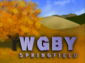
Nicknames: "Spring To Fall Transition", "Spring Field", "Fallfield"
Logo: We see "WGBY" above "SPRINGFIELD" towards the bottom right corner taking place on a hill with a tree on the left. The leaves turn from green to yellow/orange (like a transition from spring to fall), and leaves blow to the right.
Variants:
- A longer variant was used in early years. The tree remains green longer than in the shorter variant.
- A prototype variant exists, featuring the logo placing itself out onto a black background.
FX/SFX: The leaves.
Music/Sounds: A piano jingle. The longer version uses a theme made with an electric and acoustic guitar. The last 4 notes resemble that of the PBS theme.
Availability: Seen on WGBY programming in the early 2000's.
Editor's Note: None. It is relaxing.
3rd Logo
(2006-)

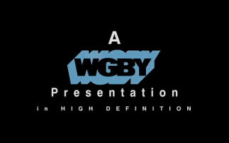
Nickname: "WGBH's Brother"
Logo: Against a black background, the WGBY logo in steel blue is seen. Since 2010, a logo resembling the standard "WGBH shadows" logo is used. Above the logo is "A" and below it is "Presentation". The logo shines.
Variants:
- On high definition programs, the text "in HIGH DEFINITION" fades in and spreads out while easing in.
- A version of his logo exist with Helvetica text in place of the WGBH styled logo, in both regular and HD variants.
FX/SFX: The text easing, appearing, and spreading.
Music/Sounds: A gentle acoustic guitar riff with shimmering sounds in the background.
Availability: Current. Can be seen on WGBY programs, such as Autism: Coming of Age.
Editor's Note: None. It's a very calm logo, especially compared to its much more (in)famous cousin.