Universal Studios
Jump to navigation
Jump to search
The printable version is no longer supported and may have rendering errors. Please update your browser bookmarks and please use the default browser print function instead.
Logo descriptionsby Jason Jones, Matt Williams, Eric S., jupiterboy and Logophile
Logo captures by Eric S., Bob Fish, Mr.Logo, codyfinke, Shadeed A. Kelly, Logozextreame102, Logophile, Muzzarino, V of Doom, TrickyMario7654 Donny Pearson, jupiterboy and StephenCezar15
Editions by Eric S., Shadeed A. Kelly, V of Doom, Donny Pearson, Nathan B., Mr.Logo, shnick1985, AlekaJ1003,CD20Superness, jupiterboy and others
Video captures courtesy of Jordan Rios, LogicSmash, DaVinci030 2nd, Ken Horan, TR3X PR0DÚCTÍ0NS, Peakpasha, LogoLibraryinc, ThisIsLotso, BasicMasterReloaded, EnormousRat, Universal Pictures and The Universal Rewind
Background: Universal Pictures was originally formed on April 30, 1912 by Carl Laemmle, a German-Jewish immigrant who settled in Oshkosh, Wisconsin, where he managed a clothing store. It is the oldest studio in Hollywood. The word "Universal" means "Omnipresent". In 1915, he opened Universal Studios. In 1946, Universal merged with International Pictures, headed by Leo Spitz and William Goetz. This team ran Universal-International, while Nate Blumberg and J. Cheever Cowdin remained at the helm of Universal Pictures, the parent company. In late 1951, Universal-International was acquired by Decca Records. In 1962, Music Corporation of America (MCA) purchased Decca Records and with it, Universal-International Pictures, leaving Milton Rackmil and Edward Muhl in charge, while Dr. Jules Stein (Board Chairman) and Lew Wasserman (President) guiding MCA. As a result of a consent decree with the justice department, MCA divested itself of its talent agency business. In 1990, MCA/Universal was acquired by Panasonic Corporation and later sold to Seagram and Sons in 1995. On December 9, 1996, MCA was reincorporated and renamed as "Universal Studios". In December 2000, French company Vivendi acquired Universal Studios from Seagram and Sons and formed Vivendi Universal Entertainment. On May 11, 2004, it was part-owned by Vivendi SA (20%) and General Electric (80%) and became a subsidiary of NBC Universal, Inc. On January 26, 2011, Vivendi S.A. sold the remaining 20% of NBC Universal to GE until January 28, when Comcast Corporation acquired a 51% controlling interest of the renamed NBCUniversal, LLC, and the remaining stock (49%) from GE on March 19, 2013. In 2016, Comcast acquired DreamWorks Animation, and by doing so, Universal gained distribution rights from 20th Century Fox which was effective in 2019.
1st Logo
(1913?-1918?)
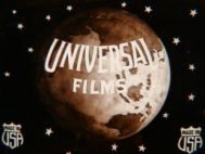
FX/SFX: Just the globe rotating at a fast pace.
Availability: So far, this is known to appear on The Hedge Between, The Girl Ranchers, The Ohio Floodor The Heart of Humanity.
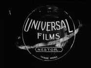
2nd Logo
(July 22, 1914-1919)
Logo: We see a circle with "UNIVERSAL" written above and "FILMS" written below. Inside the circle is some small text that says "TRADE MARK". A Saturn-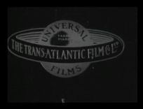 like ring surrounds the circle, which reads "THE TRANS-ATLANTIC FILM CO. LTD." (Universal's British distributor at the time).
FX/SFX: None.
Music/Sounds: The closing theme of the movie. Otherwise, it uses a violin theme.
Availability: Ultra rare. The reason why this logo and the last logo are hard to come across is because most of their silent films of this time were destroyed, while some went into public domain and have recreated titles replacing the Universal references. A few silent films however, have turned up with their original credits and this logo intact, so look hard for this one. It last appeared on a silent film aired on TCM's Silent Sunday Nights. However, it can be found on the film By the Sun's Rays.
 Nicknames: "Saturn Globe III", "Print Saturn Globe"
Logo: We see a checkered background with a Saturn-like globe with the words "UNIVERSAL FILMS" on it. "UNIVERSAL" is shown above the globe in a stencil-like font. "FILM MANUFACTURING COMPANY", "PACIFIC COAST STUDIOS", and "Universal City, Cal." are shown below, in different fonts (and the first line in an upward arc).
FX/SFX: None.
Music/Sounds: None.
Availability: Ultra rare. It appears on silent films on TCM's Silent Sunday Nights.
4th Logo
(January 16, 1922-September 9, 1927)
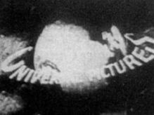
Nicknames: "Saturn Globe IV", "Cheesy Globe II", "Airplane Passing Globe", "Biplane", "Earth Globe II"
Logo: Against some dark clouds, we see a biplane flying around a rotating globe counterclockwise, leaving a trail of smoke behind it, which form the words"UNIVERSAL PICTURES".
Variant: A more zoomed out version in a sepia tone color was used sometimes.
FX/SFX: The plane rotating around the globe, the forming of the name.
Music/Sounds: None.
Availability: Ultra rare. It currently appears on some 1920's Universal films on TCM's Silent Sunday Nights. It has been seen on The Cat and The Canary.
Editor's Note: Given the fact that the first picture of the Earth from space was not taken until 1967, the globe in the logo is inaccurate. Madagascar is three times larger then in real life, and Japan and the Philippines are missing. As well the globe spins to the left instead of to the right.
(1913?-1918?)


<iframe frameborder="0" height="150" src="http://wikifoundrytools.com/wiki/closinglogos/widget/genericvideo/3949325fa8ce021981d28dc26eba4d03a3831678" width="265"></iframe><iframe frameborder="0" height="150" src="http://wikifoundrytools.com/wiki/closinglogos/widget/genericvideo/1ea79b00a0bba2313b2eda1a63efbe54fb039ef7" width="265"></iframe>
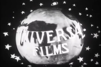
Nicknames: Saturn Globe, "Cheesy Globe", "Earth Globe"
Logo: A sepia rotating model globe with "UNIVERSAL FILMS" on a space background with "Made in USA" logo on two bottom corners.
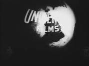
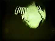
Variants:
- There is a green version of the logo.
- There is a black and white version of this logo.
- There is a variant where "UNIVERSAL FILMS" is not superimposed over the globe but rather a model. The text is also placed in a lower position than normal. The globe and space background also looks different. The "Made in USA" logo is also gone. The globe animation is also improved as well.
- There is a variant where the logo looks drawn in a black background. The "Made in USA" logo and the stars are gone. A plate with the text "NESTOR" or "SPECIAL" has been added along with the trademark text under the plate. Sometimes, the text "NATIONAL BOARD OF CENSORS" is added under the globe.
FX/SFX: Just the globe rotating at a fast pace.
Music/Sounds: Silence.
Availability: So far, this is known to appear on The Hedge Between, The Girl Ranchers, The Ohio Floodor The Heart of Humanity.
Editor's Note: A good effort for the 1910s, though with choppy animation. The company would use the globe on all of their future logos.
(July 22, 1914-1919)
Nicknames: "Trans-Atlantic Globe", "Saturn Globe II", "Trans-Atlantic Saturn Globe"
Logo: We see a circle with "UNIVERSAL" written above and "FILMS" written below. Inside the circle is some small text that says "TRADE MARK". A Saturn-

FX/SFX: None.
Music/Sounds: The closing theme of the movie. Otherwise, it uses a violin theme.
Availability: Ultra rare. The reason why this logo and the last logo are hard to come across is because most of their silent films of this time were destroyed, while some went into public domain and have recreated titles replacing the Universal references. A few silent films however, have turned up with their original credits and this logo intact, so look hard for this one. It last appeared on a silent film aired on TCM's Silent Sunday Nights. However, it can be found on the film By the Sun's Rays.
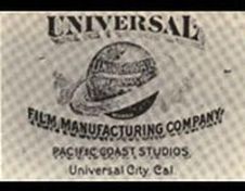
3rd Logo
(August 23, 1920-January 11, 1922)
(August 23, 1920-January 11, 1922)

Logo: We see a checkered background with a Saturn-like globe with the words "UNIVERSAL FILMS" on it. "UNIVERSAL" is shown above the globe in a stencil-like font. "FILM MANUFACTURING COMPANY", "PACIFIC COAST STUDIOS", and "Universal City, Cal." are shown below, in different fonts (and the first line in an upward arc).
FX/SFX: None.
Music/Sounds: None.
Availability: Ultra rare. It appears on silent films on TCM's Silent Sunday Nights.
4th Logo
(January 16, 1922-September 9, 1927)


<iframe frameborder="0" height="167" src="http://wikifoundrytools.com/wiki/closinglogos/widget/genericvideo/41c1d0a9957b278c747f7d39b24a972127f205b4" width="295"></iframe>
Logo: Against some dark clouds, we see a biplane flying around a rotating globe counterclockwise, leaving a trail of smoke behind it, which form the words"UNIVERSAL PICTURES".
Variant: A more zoomed out version in a sepia tone color was used sometimes.
FX/SFX: The plane rotating around the globe, the forming of the name.
Music/Sounds: None.
Availability: Ultra rare. It currently appears on some 1920's Universal films on TCM's Silent Sunday Nights. It has been seen on The Cat and The Canary.
Editor's Note: Given the fact that the first picture of the Earth from space was not taken until 1967, the globe in the logo is inaccurate. Madagascar is three times larger then in real life, and Japan and the Philippines are missing. As well the globe spins to the left instead of to the right.
5th Logo
(January 18, 1925-1927?)
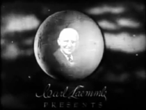
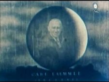
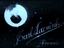
Nicknames: "Carl Laemmle Globe", "Cheesy Globe III", "Eerie Organ Face", Creepy Carl Laemmle
Logo: On a dark cloudy background, we see a globe slowly rotating as a smiling Carl Laemmle can be seen within the middle. Below are the words "Carl Laemmle" in a script font and "P R E S E N T S" below it.
(January 18, 1925-1927?)


<iframe frameborder="0" height="167" src="http://wikifoundrytools.com/wiki/closinglogos/widget/genericvideo/a92875e15a321a3ed78b8725398ca2d73607512c" width="295"></iframe>
Nicknames: "Carl Laemmle Globe", "Cheesy Globe III", "Eerie Organ Face", Creepy Carl Laemmle
Logo: On a dark cloudy background, we see a globe slowly rotating as a smiling Carl Laemmle can be seen within the middle. Below are the words "Carl Laemmle" in a script font and "P R E S E N T S" below it.
Variants:
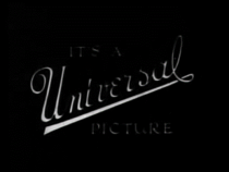
Closing Variant (Smouldering Fires): On a black background it says "It's a Universal Picture", with "Universal" in a cursive font.
FX/SFX: The globe rotating.
Music/Sounds: An organ theme for the normal logo whilst for the variant it has a descending orchestra which could be an opening to the movie. On both prints of the film it would be normally silent like the original film.
Availability: Like most early Universal logos, extremely rare. Can be seen on the silent film Smouldering Fires, and the variant can be seen on another silent film Head Winds.
Editor's Note: This is an unusual Universal logo, as it is the only one where the globe is not the focal point.
6th Logo
(1927-September 17, 1936) 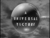
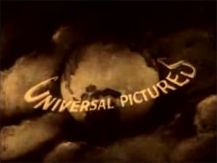
Nicknames: "Airplane Passing Globe II", "Biplane II", "Cheesy Globe IV" "Golden Age Globe", "Earth Globe III"
Logo: On a cloud-like background, an earth globe rotates. No clouds are visible on the globe. As the globe rotates, a biplane flies around it, with "A UNIVERSAL PICTURE" being wiped in diagonally as the biplane passes the globe.
Music/Sounds: Just the sound of the biplane's engine.
Availability: Rare. Can be seen on films of this era. This logo can sometimes be seen after the current Universal logos on certain movies. The earlier DVD releases of Frankenstein and Dracula have plastered this with the B&W variation of the 1997 logo, while the later VHS releases of the films plaster this with the B&W variation of the 1963 logo. Early Betamax and VHS releases of the films do not use a logo at all, though it can be seen on the alternate opening for the former on its 2005 Special Edition DVD and the 2012 DVD & Blu-ray of the two aforementioned titles. This is also seen on Bride of Frankenstein, including its 1984 MCA Home Video VHS release. It appears on TCM's print and the Criterion and Universal DVD releases of My Man Godfrey, although several public domain prints of the film have the logo removed entirely.
Editor's Note: This is an impressive logo for its era.
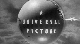
7th Logo
(May 11, 1936-August 16, 1946)
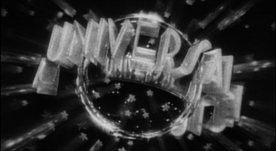
Nicknames: "The Art-Deco Globe", "Rotating Letters", "Cheesy Globe V", Cheesy Universal "Golden Age Globe II"
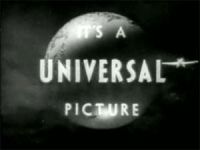
Logo: A stylized glass globe is seen, tilted at an angle. Around the globe, the words "A UNIVERSAL PICTURE" rotate, in a stylized 1930's font. Stylized five-point stars (a la the stars on the Paramount logo) surround the globe.
Variant:
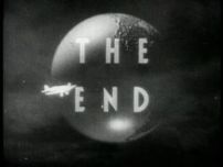
Closing Variant: Superimposed on a special background or in the last seconds of a movie, we see the words "The End" with lettering that varies on the movie along with the text "A Universal Picture" or "A Universal Release".
FX/SFX: The stars, globe, and rotating letters, done in live action, which looks pretty impressive for its time.
Music/Sounds: A proud, bombastic orchestral fanfare, composed by Jimmy McHugh. Dead Men Don't Wear Plaid uses a remix of the tune. From about 1945 onwards, the opening theme of the movie was used instead of the fanfare.
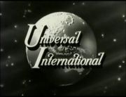
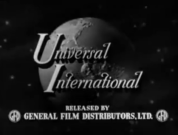
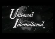
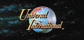
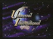
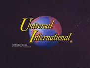
Nicknames: "Rotating ('40s) Globe", "Cheesy Globe VI", "50s Globe", "Earth Globe IV"
Logo: On a space background, a model globe (harkening back to the 2nd logo; still no clouds though), rotates. Superimposed onto the globe are the words "Universal International" (in white for B&W films or yellow-orange for color films) in a italic Roman font with "U" and "I" bigger than the rest of the letters, symbolizing Universal's merger with International Pictures.
Variants: There are widescreen and color versions of the logo.
Byline: Later on, the credit "EDWARD MUHL, IN CHARGE OF PRODUCTION" would appear in the lower-left corner.
Closing Variant: Same as above, but the text is "A Universal-International Picture".
FX/SFX: The rotating globe. Compared to the previous logos, the model animation used in here is actually pretty nice.
Music/Sounds: None or the opening theme of the movie. However, on some films such as The Egg and I and The Naked City, the bell theme from the International Pictures logo is used.
Availability: Again, seen on Universal International releases of the period. Sometimes, the 13th logo would precede it on later releases of movies from the period (like the DVD release of To Kill a Mockingbird).
Editor's Note: The longevity of this logo, with 18 years in use, made this a very iconic one.
9th Logo
(June 26, 1963-May 18, 1990)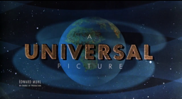
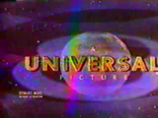
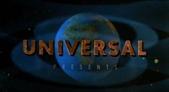
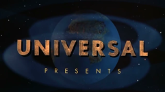
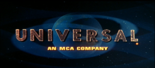

Nicknames: "Zooming Globe", "Gaseous Globe", "Famous Globe", "MCA Globe", "Zooming MCA Globe", "Classic Globe", "Earth Globe V"
Logo: We zoom through space, and a pair of Van Allen radiation belts start to form. The rotating earth globe appears in the distance, and as we get closer to it, the word "UNIVERSAL", in a bold, planetary font (named Futura Bold), fades in close-up to us and zooms out to a comfortable distance. When the word and the globe are in position, the byline "AN MCA COMPANY", fades in below it, in a bold yellow font (named Eurostile Bold). Two Van Allen belts surround the globe.
Trivia: The logo was animated and designed by Universal Title and Optical (commonly known as "Universal Title"), who was also responsible for the animation for the Universal Television logos, and handled all of the titles and optical effects for all Universal films and television series until 1990. The globe was hand painted on a rubber ball by Eyvind Earle, who also did the space background and the Van Allen belts as well.
Variants: Several renditions of this logo have been discovered. This is going to get complicated, so let's explain this simply. There are many main variations of this logo:
Music/Sounds Variants:
Editor's Note: A favorite of many, thanks to its advanced (for the time) animation and longevity. In fact, it lasted 27 years, making it one of the longest running film logos.
10th Logo
(May 25, 1990-June 18, 1997)
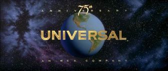
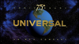
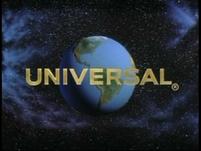
Nicknames: "75th Anniversary", "Rotating Letters II", "MCA Globe II", "90s Globe", "90s MCA Globe", "75 Years of Universal", "75th Anniversary Globe", "Earth Globe VI"
Logo: A large "flash" appears as we view the far right side of the Universal globe, still cloudless and against the new detailed starfield background. We move down the globe as the flash dims away and see, in golden letters, the word "UNIVERSAL", in a brand new font (named Copperplate Gothic Bold), appears from behind the globe and circling it. We zoom out and the globe moves to center, as the word "UNIVERSAL" straightens itself out and takes its place across the globe. The byline "AN MCA COMPANY", in gold and in spaced-out letters to fit the width of "UNIVERSAL", appears below the logo.
Trivia: This logo was produced by The Chandler Group and Studio Productions (now known as Flip Your Lid Animation), who also created the 1994-2010 20th Century Fox logo and the 1986-2003 Paramount Pictures logo. The animation of the globe and the letters were shot with motion control at The Chandler Group. The background was a painting that was done by Eric Von Schmidt.
Early Variant: In 1990, Universal was celebrating its 75th Anniversary, and the initial version of this logo was different from the one used afterwards. It began with clips of the 7th, 8th, and 10th logos, and then segued into the then-current logo, as if it were a grand unveiling, or a passing of the torch. The end logo also had "75th ANNIVERSARY" on top of the logo, with "75" in the middle of "ANNIVERSARY", which is in spaced-out letters like the MCA byline, and written out in script with "th" flashing in next to "75". Movies that have this logo include Back to the Future Part III (first film to use this logo), Ghost Dad, Jetsons: The Movie, Problem Child, Mo' Better Blues, Darkman, Henry & June, Child's Play 2, White Palace, Havana, Kindergarten Cop, Lionheart, King Ralph, Closet Land, The Hard Way, Career Opportunities, and A Kiss Before Dying (the final film to use this variant of the logo). This was only used from May 25, 1990 to April 26, 1991. From May 24, 1991 to June 18, 1997, starting with the film Backdraft, the regular variant was used (although the trailers for it had the 75th Anniversary variant).
Music/Sounds: A majestic orchestral fanfare composed by the late James Horner. A French horn fanfare was played during the clips of the old logos during the 75th Anniversary logo which segues into the normal theme; a sped-up version of this was later used as the 1991 UTV theme.
Music/Sound Variants:
Availability: Common. It's easy to see, as this was on all Universal releases of the era such as Cape Fear, Army of Darkness, Carlito's Way, Jurassic Park, Schindler's List, Casino, Happy Gilmore, Billy Madison and Waterworld, among others.
Editor's Note: This is an excellent logo all around. It still holds up very well to this day, thanks to its usage of practical effects, and it has one of the most gorgeous logo themes ever (especially on the 75th Anniversary variant). The only real odd thing about it is that Universal's 75th anniversary was actually in 1987, though it's likely referring to when Universal City Studios opened in 1915.
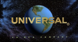
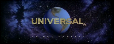
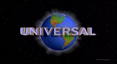
11th Logo
(May 23, 1997-July 3, 2012) 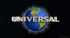

<iframe frameborder="0" height="167" src="http://wikifoundrytools.com/wiki/closinglogos/widget/unknown/55e725c9d607807e22bd502468d830ae1e7c7c80" width="297"></iframe>
Nicknames: "CGI Globe II", "The Glittering Globe", "The Shimmering Globe", "The Transparent Globe", "2000s Globe", "Rotating Letters III", "Earth Globe VII"
Logo: On a black background, an arc slowly appears and brightens. A series of lights begin appearing below the arc and we see that this is another globe, looking over Europe. We move down as the lights appear all over Europe, and then Africa (which the Earth's continents now have the green, yellow, and red color design this time). As we begin to zoom out, the letters in the word "UNIVERSAL", in a similar font as the last logo but handsomely redone (this time, the text is still gold, but has the inner white part of the text rising out of the gold part), rotate to the front of the globe as the lights around the continents dim out. By this time, the globe is shining from the back. A small copyright appears at the bottom-right.
Trivia: The logo was introduced to coincide with the rebranding of "MCA, Inc." into "Universal Studios, Inc." on December 9, 1996. It was designed by Identica Partnership in London.
Variants: A treasure trove. Here are a few variants:
FX/SFX: The lighting of the globe and the rotation of the letters.
Music/Sounds: Begins with a powerful, majestic horn fanfare, followed by two orchestra hits. Then, another horn fanfare, followed by two more hits. Then, a very majestic fanfare as the logo is completed, with the horn theme coming back near the end. Composed by the late Jerry Goldsmith, who was also the composer for the Carolco logo theme.
Music/Sounds Variants:
Availability: Very common. Appears on all Universal films from the era.
Nicknames: "CGI Globe III", "100th Anniversary Globe", "Rotating Letters IV", "Majestic Globe", "100 Years of Universal", "Comcast Globe", "Centennial Globe", "Earth Globe VII"
FX/SFX: The panning of the planet, the company name rising, the continents glowing. All brilliant CGI effects, and is reminiscent of the 1990 and 1997 logos.
Music/Sounds: A powerful re-orchestration of the last logo's fanfare, accompanied by "a choir, new string parts, and drum cadence utilizing world percussion instruments", according to the <a class="external" href="http://www.hollywoodreporter.com/news/universal-pictures-100th-anniversary-logo-the-lorax-296227" rel="nofollow" target="_blank">Hollywood Reporter</a>. Composed by Brian Tyler.
Music/Sounds Variants:
Editor's Note: A worthy update of the 1990 and 1997 logos, with beautiful CGI.
- On a black background, we see a globe on the top left with Carl Laemmle smiling in the middle whilst the globe is rotating at a normal pace. On the bottom right hand corner we see "Carl Laemmle" in a script font like the normal logo and says "Presents" below it.
- Another variant has the rotating globe but with the "CARL LAMMMLE" text in a capitalized font.
Closing Variant (Smouldering Fires): On a black background it says "It's a Universal Picture", with "Universal" in a cursive font.
FX/SFX: The globe rotating.
Music/Sounds: An organ theme for the normal logo whilst for the variant it has a descending orchestra which could be an opening to the movie. On both prints of the film it would be normally silent like the original film.
Availability: Like most early Universal logos, extremely rare. Can be seen on the silent film Smouldering Fires, and the variant can be seen on another silent film Head Winds.
Editor's Note: This is an unusual Universal logo, as it is the only one where the globe is not the focal point.
6th Logo
(1927-September 17, 1936)


<iframe frameborder="0" height="150" src="http://wikifoundrytools.com/wiki/closinglogos/widget/genericvideo/48802f8e4bda1e2fb6a71a22705ce15f62e50c49" width="265"></iframe><iframe frameborder="0" height="150" src="http://wikifoundrytools.com/wiki/closinglogos/widget/genericvideo/6809d70430f6f9960998a53342504bba409d994b" width="265"></iframe><iframe frameborder="0" height="150" src="http://wikifoundrytools.com/wiki/closinglogos/widget/genericvideo/a1678609576e07f2953d64202c3c42d48be2c2c9" width="265"></iframe>
Nicknames: "Airplane Passing Globe II", "Biplane II", "Cheesy Globe IV" "Golden Age Globe", "Earth Globe III"
Logo: On a cloud-like background, an earth globe rotates. No clouds are visible on the globe. As the globe rotates, a biplane flies around it, with "A UNIVERSAL PICTURE" being wiped in diagonally as the biplane passes the globe.
Trivia: The biplane is a Lockheed 8C Sirius.
Variants:
Closing Variants:
FX/SFX: The biplane, wiping on of letters, and the globe. The biplane and globe are both models.
Variants:
- The position of the globe varies per movie.
- The logo was cropped to 1.85 for Universal's 75th Anniversary logo in 1990. However, full screen prints of the logo retains the full aspect ratio.
Closing Variants:
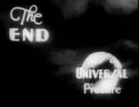
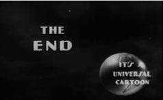
- The words "THE END" are seen superimposed over the globe and the sky is darker. Then, seconds later, "IT'S A UNIVERSAL PICTURE" fades in.
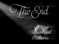
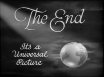
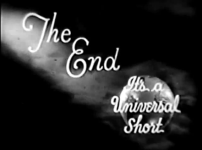
- Another closing variant exists where the globe is at the bottom right corner rotating. On the top it says "The End" in a cursive font. "It's a Universal Picture" (also in cursive) is superimposed over the globe. A ray of light also shines down on the globe. On some films, the text is on the bottom left corner. Starting around 1933, the text is in a Broadway font.
- On short films, instead of the text saying "It's a Universal Picture", the text is replaced with "It's a Universal Short".
- On cartoons, it says "It's a Universal Cartoon" in a script font.
FX/SFX: The biplane, wiping on of letters, and the globe. The biplane and globe are both models.
Music/Sounds: Just the sound of the biplane's engine.
Availability: Rare. Can be seen on films of this era. This logo can sometimes be seen after the current Universal logos on certain movies. The earlier DVD releases of Frankenstein and Dracula have plastered this with the B&W variation of the 1997 logo, while the later VHS releases of the films plaster this with the B&W variation of the 1963 logo. Early Betamax and VHS releases of the films do not use a logo at all, though it can be seen on the alternate opening for the former on its 2005 Special Edition DVD and the 2012 DVD & Blu-ray of the two aforementioned titles. This is also seen on Bride of Frankenstein, including its 1984 MCA Home Video VHS release. It appears on TCM's print and the Criterion and Universal DVD releases of My Man Godfrey, although several public domain prints of the film have the logo removed entirely.
Editor's Note: This is an impressive logo for its era.
7th Logo
(May 11, 1936-August 16, 1946)


<iframe frameborder="0" height="167" src="http://wikifoundrytools.com/wiki/closinglogos/widget/genericvideo/683b08bad3eba9012c261d4c6ca3da400385c318" width="295"></iframe><iframe frameborder="0" height="167" src="http://wikifoundrytools.com/wiki/closinglogos/widget/genericvideo/0f756c111e897f985e17d3571af591419b80c031" width="295"></iframe>
Nicknames: "The Art-Deco Globe", "Rotating Letters", "Cheesy Globe V", Cheesy Universal "Golden Age Globe II"
Logo: A stylized glass globe is seen, tilted at an angle. Around the globe, the words "A UNIVERSAL PICTURE" rotate, in a stylized 1930's font. Stylized five-point stars (a la the stars on the Paramount logo) surround the globe.
Variant:
- On some color releases, like colorized Woody Woodpecker cartoons at the time,the logo is tinted blue.
- On the colorized versions of the Universal <a href="https://www.youtube.com/playlist?list=PL1t1H8SIcCpfv2WkStdn9rpM4ALgXvSRg" target="_self">Sherlock Holmes movies</a>, the letters are gold colored.
- Like the previous logo, this logo was also cropped to 1.85 for Universal's 75th anniversary logo in 1990. The full screen version retains the full aspect ratio.
Closing Variant: Superimposed on a special background or in the last seconds of a movie, we see the words "The End" with lettering that varies on the movie along with the text "A Universal Picture" or "A Universal Release".
FX/SFX: The stars, globe, and rotating letters, done in live action, which looks pretty impressive for its time.
Music/Sounds: A proud, bombastic orchestral fanfare, composed by Jimmy McHugh. Dead Men Don't Wear Plaid uses a remix of the tune. From about 1945 onwards, the opening theme of the movie was used instead of the fanfare.
Availability: Uncommon. Can be seen on Universal releases of the era. This doesn't show up that often on TV since the movies it appears on don't appear as often as newer movies (so you might have to look on home media), but Svengoolie on Me-TV happens to be one of the best sources of this logo (and other older logos from other movie companies). The last regular appearance of this logo was on the Woody Woodpecker cartoon "Woody the Giant Killer".
Editor's Note: A stylish logo for the time.
8th Logo
(August 28, 1946-May 8, 1964)
Editor's Note: A stylish logo for the time.
8th Logo
(August 28, 1946-May 8, 1964)


<iframe frameborder="0" height="150" src="http://wikifoundrytools.com/wiki/closinglogos/widget/unknown/ccecd13a1d4ef318232923731a1e499465c00c33" width="266"></iframe><iframe frameborder="0" height="150" src="http://wikifoundrytools.com/wiki/closinglogos/widget/genericvideo/4b80dda8060f79db0eccda957592fe0ca369f80f" width="197"></iframe><iframe frameborder="0" height="150" src="http://wikifoundrytools.com/wiki/closinglogos/widget/genericvideo/8041786e01279b8c242fbd6049b8b0ad923cb621" width="265"></iframe><iframe frameborder="0" height="150" src="http://wikifoundrytools.com/wiki/closinglogos/widget/genericvideo/4e6f237e646e1c06a584232f03367d4f004e565f" width="265"></iframe><iframe frameborder="0" height="150" src="http://wikifoundrytools.com/wiki/closinglogos/widget/genericvideo/b52563ebee31274fc15e02184a84ee985fe15802" width="265"></iframe><iframe frameborder="0" height="150" src="http://wikifoundrytools.com/wiki/closinglogos/widget/genericvideo/43c2d9df10137bb5baee4d810ecf6d886d0d4312" width="265"></iframe><iframe frameborder="0" height="150" src="http://wikifoundrytools.com/wiki/closinglogos/widget/genericvideo/aa363b9d6a5fd8c91cd4c12d72bbba1eec29fa36" width="265"></iframe>
Nicknames: "Rotating ('40s) Globe", "Cheesy Globe VI", "50s Globe", "Earth Globe IV"
Logo: On a space background, a model globe (harkening back to the 2nd logo; still no clouds though), rotates. Superimposed onto the globe are the words "Universal International" (in white for B&W films or yellow-orange for color films) in a italic Roman font with "U" and "I" bigger than the rest of the letters, symbolizing Universal's merger with International Pictures.
Variants: There are widescreen and color versions of the logo.
Byline: Later on, the credit "EDWARD MUHL, IN CHARGE OF PRODUCTION" would appear in the lower-left corner.
Closing Variant: Same as above, but the text is "A Universal-International Picture".
FX/SFX: The rotating globe. Compared to the previous logos, the model animation used in here is actually pretty nice.
Music/Sounds: None or the opening theme of the movie. However, on some films such as The Egg and I and The Naked City, the bell theme from the International Pictures logo is used.
Availability: Again, seen on Universal International releases of the period. Sometimes, the 13th logo would precede it on later releases of movies from the period (like the DVD release of To Kill a Mockingbird).
Editor's Note: The longevity of this logo, with 18 years in use, made this a very iconic one.
9th Logo
(June 26, 1963-May 18, 1990)


<iframe frameborder="0" height="150" src="http://wikifoundrytools.com/wiki/closinglogos/widget/genericvideo/688dbb4042032987c8c8a2824f604a34fdc0c460" width="265"></iframe><iframe frameborder="0" height="150" src="http://wikifoundrytools.com/wiki/closinglogos/widget/genericvideo/66ba6a29b988db25459283b91b22325883c69562" width="265"></iframe><iframe frameborder="0" height="150" src="http://wikifoundrytools.com/wiki/closinglogos/widget/genericvideo/6f687664a76933763d370bcd86e2e0f3705d695f" width="265"></iframe>
<iframe frameborder="0" height="150" src="http://wikifoundrytools.com/wiki/closinglogos/widget/genericvideo/f2e11ebfc634637128d6c15013e0bfd9e76b6eef" width="265"></iframe><iframe frameborder="0" height="150" src="http://wikifoundrytools.com/wiki/closinglogos/widget/genericvideo/f6abb93ff0f981179cdc6ae541948926a6485e38" width="265"></iframe>
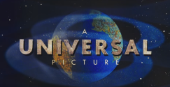
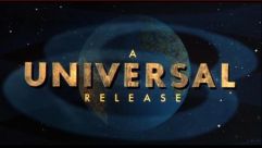
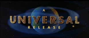
Nicknames: "Zooming Globe", "Gaseous Globe", "Famous Globe", "MCA Globe", "Zooming MCA Globe", "Classic Globe", "Earth Globe V"
Logo: We zoom through space, and a pair of Van Allen radiation belts start to form. The rotating earth globe appears in the distance, and as we get closer to it, the word "UNIVERSAL", in a bold, planetary font (named Futura Bold), fades in close-up to us and zooms out to a comfortable distance. When the word and the globe are in position, the byline "AN MCA COMPANY", fades in below it, in a bold yellow font (named Eurostile Bold). Two Van Allen belts surround the globe.
Trivia: The logo was animated and designed by Universal Title and Optical (commonly known as "Universal Title"), who was also responsible for the animation for the Universal Television logos, and handled all of the titles and optical effects for all Universal films and television series until 1990. The globe was hand painted on a rubber ball by Eyvind Earle, who also did the space background and the Van Allen belts as well.
Variants: Several renditions of this logo have been discovered. This is going to get complicated, so let's explain this simply. There are many main variations of this logo:
- 1963-1973: "A UNIVERSAL PICTURE/RELEASE", with the "UNIVERSAL" text sandwiched between "A" and "PICTURE" or "RELEASE". This can also be seen on newer movies that use this logo for a retro effect.
- "PRESENTS" is underneath the "UNIVERSAL" text. Sometimes, "UNIVERSAL PRESENTS" starts blurred, but becomes clearer as the globe zooms in fast. This variant is seen on movies like Secret Ceremony, The Killers (1964) and Two-Lane Backdrop.
- 1971-1990: The byline "AN MCA COMPANY", in a yellow Eurostile Bold font, appearing below the "UNIVERSAL" text.
- "Scope": Shown in a wide ratio of 2.20:1 or 2.35:1 widescreen, the globe appears to zoom in rather slowly, and the "UNIVERSAL" text is blurred when it fades in, becoming clearer as it zooms out. The logo is much wider than usual, to accommodate the extra space. This is seen on films shot in this format such as High Plains Drifter, The Sugarland Express,Jaws, The Car,Halloween II and III, The Thing, Scarface, The Dark Crystal, The Last Starfighter andThey Live. It also had a bylineless variant of its own, Tell Them Willie Boy Is Here (1969) and The Day of the Jackal (1973). A sepia-tone variant can be found on The Deer Hunter.
- "Flat": Presented in 1.37:1 academy or 1:85:1 "matted" widescreen, the logo appears to move somewhat faster than the widescreen version. The "UNIVERSAL" text is not blurred, and simply fades in. Seen on films such as Coogan's Bluff, Duel,Charley Varrick,The Sentinel,An American Werewolf in London, Videodrome, Cat People (1982), Monty Python's The Meaning of Life, The Breakfast Club, Back to the Future I and II, Brazil, and Somewhere in Time. In an earlier variant, used in tandem with the normal version, "A UNIVERSAL PICTURE" starts blurred, but becomes clearer, along with the Edward Muhl byline. The globe zooms in faster in this variant, used on movies like Shenandoah, Send Me No Flowers, Charade and Father Goose. A B&W version of this variant can also be seen on Kitten with a Whip, which was featured on an episode of Mystery Science Theater 3000 (with the logo intact). It was also the default pan-and-scan version of the logo and plastered the above variant on older VHS copies of most, if not all, Universal films shot in scope (a notable exception being the original VHS of The Dark Crystal, which was released by Thorn EMI Video).
- Off-center: Only known to exist on old video prints of Charade, the logo is slightly off-center, due to a sloppy job reformatting the aspect ratio of 1:85.1 into 4:3. Another off center version can be found on the MCA Discovision, MCA Videocassette Inc. and MCA Home Video releases of Jaws.
- In the early years of the "Flat" version of the logo, Universal had a small registered trademark symbol (®) below the "L" in "UNIVERSAL," which faded in alongside the zooming text. By 1975, Universal added a larger ® in the same position, though it fades in after the text zooms out. However, you can still see the smaller ® behind the bigger ®.
- A credit for Edward Muhl, the then-head of Universal, can be seen on the lower-left of the first movies to feature this logo.
- The 1971-1990 version is bylineless on some films.
- The 1971-1990 version, but with "PRESENTS" underneath the byline in a smaller font. This was seen on American Graffti.
- The widescreen version of Jaws 3-D has the MCA byline in a more extended font.
- There is an end-title variation that contains the word "RELEASE" below the MCA byline. This was used to plaster the Paramount logo on 1980s reissue prints of Alfred Hitchcock films owned by Hitchcock himself (including Rear Window and 1956's The Man Who Knew Too Much).
- A black-and-white version was seen at the beginning on both 1981 MCA Videocassette, Inc. VHS release of Scarface (1932), the 1980 VHS release of Psycho, and the 1965 unsold TV pilot Dark Intruder, which got a theatrical release.
- There is another scope variant where the 1.85 version is cropped to 2.35. This can be found on Coupe De Ville, Bird on a Wire,and Jaws: The Revenge. However, the GoodTimes DVD of the latter uses the regular scope variant. The cropped Scope variant also appears, in reverse, on The House with a Clock in Its Walls (more can be read about that on this company's Logo Variations page).
- On most movies from 1989 and 1990, the MCA byline has more of a red orange tone to it. The Van Allen belts also have a more purple tone to them This can be found on Parenthood, Uncle Buck, Field of Dreams, Born on the Fourth of July (the VHS release), Opportunity Knocks, Coupe De Ville (which was a co-production with Morgan Creek), Bird on a Wire and the theatrical trailers for Back to the Future Part III and Problem Child (both of which used the 75th Anniversary variant of the 11th logo on the actual movies). However some movies from 1989 such as Back to the Future Part II, The Dream Team and K-9 would still use the original variant of the MCA byline. A clip of this variant was used for the Universal 75th Anniversary logo, which also used clips from the 7th and 8th logos.
Closing Variants:
- At the end of some films from the era. We see a blue background with the then current print logo inside a yellow circle with "UNIVERSAL STUDIOS" written under it. Around the yellow circle is a red ring with the following inside, "THE ENTERTAINMENT CENTER OF THE WORLD". Above & below it is the following, "PRODUCED AT" above it & "CALIFORNIA, U.S.A" below it. It then fades to a slide with a red bus outside of a set in Universal Studios in Hollywood. On the top left corner of the screen is the following text in yellow, "When in Hollywood Visit Universal Studios".
- A variant of this had "(Ask for Babs)" fade in under the text. This a reference to the 1978 comedy: National Lampoon's Animal House were one of characters named Barbara "Babs" Jenson becoming a tour guide at Universal Studios. Animal House director John Landis would use this variant at the end of all the movies he did for Universal. Such examples include The Blues Brothers, An American Werewolf In London (the theatrical release only. All home video releases and TV broadcasts edit it out with the exception of a 2001 VHS release) Into The Night, and Amazon Women On The Moon. If you did ask for "Babs", you would of likely gotten a discount or free entry to Universal Studios according to this <a class="external" href="http://legendsrevealed.com/entertainment/2013/02/19/did-universal-studios-used-to-offer-an-incentive-based-on-a-joke-from-animal-house/" rel="nofollow" target="_blank" title="source">source</a>. In 1989, Universal announced that they would no longer be giving out free entries or discounts.
- Another variant also lacked the "PRODUCED AT" & "CALIFORNIA U.S.A" text.
FX/SFX: The rotating globe zooming-in, the Van Allen belts forming, and the "UNIVERSAL" text zooming out. This was very advanced for the 1960s, and its longevity is amazing, especially during the '80s, when computerized logos were making their debut.
Music/Sounds: Usually it did not have music, but it did occasionally have the opening theme of the movie. Such memorable instances include Father Goose (composed by Nelson Riddle), The Ghost and Mr. Chicken, Scarface,The Dark Crystal, and The Night Walker (both composed by Vic Mizzy). The opening tag from the latter film was also heard in abridged form on The World of Abbott and Costello. The 1972 feature length pilot of the TV series Emergency! used a dramatic, drum-driven fanfare based upon the series' theme.
Music/Sounds: Usually it did not have music, but it did occasionally have the opening theme of the movie. Such memorable instances include Father Goose (composed by Nelson Riddle), The Ghost and Mr. Chicken, Scarface,The Dark Crystal, and The Night Walker (both composed by Vic Mizzy). The opening tag from the latter film was also heard in abridged form on The World of Abbott and Costello. The 1972 feature length pilot of the TV series Emergency! used a dramatic, drum-driven fanfare based upon the series' theme.
Music/Sounds Variants:
- On the U.S. DVDs of the Battlestar Galactica movie (which is really the pilot episode "Saga of a Star World" released as a theatrical film in Europe), the 1963 logo is heard with the CIC fanfare.
- On the 1984 MCA Home Video VHS of The Man Who Knew Too Much, this logo has the Paramount VistaVision music, though it fits the logo quite well.
- Sometimes, It even has an updated version of the 1936-1947 fanfare (composed by Jimmy McHugh).
- On select foreign versions of Conan The Destroyer, the MGM lion roar is heard! That is because Universal own North American rights while MGM owns overseas rights from the control of the Dino De Laurentiis catalog. A similar occurrence happens on some foreign prints of Firestarter as well. Nevertheless, this interesting error is most likely due to sloppy plastering.
- On a print of The Projected Man featured on Mystery Science Theater 3000, the logo curiously uses the Les Baxter-composed fanfare from the 1960-1963 American International Pictures logo (despite the latter having nothing to do with this film's production). However, the Shout! Factory Blu-ray just use the opening theme.
- This was never plastered over, except the 20th Anniversary version of E.T. the Extra-Terrestrial plasters this with the E.T. 20th Anniversary variant of the 1997 Universal logo, but is still seen on the original version of said film with the 1988 and 1996 VHS releases, the theatrical DVD and Blu-ray, and HBO and Cinemax airings as well as the 2015 Nickelodeon airing.
- It debuted on Charade and made its last regular appearance on Bird on a Wire.
- The "PRESENTS" variation of the logo is seen on Silent Running and Journey to the Far Side of the Sun, followed by the "a GERRY ANDERSON CENTURY 21 CINEMA PRODUCTION" logo.
- Strangely, on Airport, this logo is seen after the end credits with the opening P.A. track for the film playing over it (pan-and-scan releases apparently had the logo and track at the start of the film, if the 1981 MCA Videocassette, Inc. release is anything to go by); a similar occurrence appeared on The Thing (without any audio; this time around, the Universal logo remains at the end even on pan-and-scan prints).
- The logo is also seen on the Don Bluth/George Lucas and Steven Spielberg productions An American Tail, The Land Before Time, and the Paul Newman comedy Slap Shot. A sped-up or cut-short version was seen on a few movie trailers from 1985-1990 (including those for all 3 Back to the Future films, the last of which actually uses the 10th logo), but most went without it.
- NOTE: This was not seen on the following films originally: The Electric Horseman, 1941, The Blues Brothers, Torn Curtain, Family Plot, and Frenzy. The Emergency! version can be found only on the pilot episode, available as part of the season 1 DVD set. (The episode is not rerun as part of the series' syndication package.)
- The original 1963 version of this logo makes a surprise appearance on the trailer for By The Sea.
- The 1971-1990 logo was also retained on the 30th Anniversary theatrical re-release of Back to the Future and Back to the Future Part II, which were shown for one night only, Wednesday, October 21, 2015 in select areas.
- It is unknown if this appears on any prints of Watchers.
- It appeared on theatrical prints of On Golden Pond, but most video prints have this logo omitted.
- The closing variant is common on VHS and laser videodisc, but extremely rare on DVD and Blu-ray.
- It was deleted from Jim Henson Video's VHS of The Dark Crystal, but is still intact on Sony Pictures Home Entertainment's VHS and DVD releases of the film.
- It was also seen on the theatrical release and an HBO airing of The Great Muppet Caper, but all home video releases of the film delete the logo.
Editor's Note: A favorite of many, thanks to its advanced (for the time) animation and longevity. In fact, it lasted 27 years, making it one of the longest running film logos.
10th Logo
(May 25, 1990-June 18, 1997)


<iframe frameborder="0" height="150" src="http://wikifoundrytools.com/wiki/closinglogos/widget/genericvideo/09ba80832903a43372a0600b2376396f45dbe908" width="265"></iframe><iframe frameborder="0" height="150" src="http://wikifoundrytools.com/wiki/closinglogos/widget/genericvideo/b1b15647c2aca566382493ae70d15bcab08792e7" width="265"></iframe>
Nicknames: "75th Anniversary", "Rotating Letters II", "MCA Globe II", "90s Globe", "90s MCA Globe", "75 Years of Universal", "75th Anniversary Globe", "Earth Globe VI"
Logo: A large "flash" appears as we view the far right side of the Universal globe, still cloudless and against the new detailed starfield background. We move down the globe as the flash dims away and see, in golden letters, the word "UNIVERSAL", in a brand new font (named Copperplate Gothic Bold), appears from behind the globe and circling it. We zoom out and the globe moves to center, as the word "UNIVERSAL" straightens itself out and takes its place across the globe. The byline "AN MCA COMPANY", in gold and in spaced-out letters to fit the width of "UNIVERSAL", appears below the logo.
Trivia: This logo was produced by The Chandler Group and Studio Productions (now known as Flip Your Lid Animation), who also created the 1994-2010 20th Century Fox logo and the 1986-2003 Paramount Pictures logo. The animation of the globe and the letters were shot with motion control at The Chandler Group. The background was a painting that was done by Eric Von Schmidt.
Early Variant: In 1990, Universal was celebrating its 75th Anniversary, and the initial version of this logo was different from the one used afterwards. It began with clips of the 7th, 8th, and 10th logos, and then segued into the then-current logo, as if it were a grand unveiling, or a passing of the torch. The end logo also had "75th ANNIVERSARY" on top of the logo, with "75" in the middle of "ANNIVERSARY", which is in spaced-out letters like the MCA byline, and written out in script with "th" flashing in next to "75". Movies that have this logo include Back to the Future Part III (first film to use this logo), Ghost Dad, Jetsons: The Movie, Problem Child, Mo' Better Blues, Darkman, Henry & June, Child's Play 2, White Palace, Havana, Kindergarten Cop, Lionheart, King Ralph, Closet Land, The Hard Way, Career Opportunities, and A Kiss Before Dying (the final film to use this variant of the logo). This was only used from May 25, 1990 to April 26, 1991. From May 24, 1991 to June 18, 1997, starting with the film Backdraft, the regular variant was used (although the trailers for it had the 75th Anniversary variant).
Other Variants: On some widescreen films such as Far and Away, the logo is zoomed out further than normal. On The Hard Way, The 75th anniversary logo has the widescreen in its original aspect ratio 2.35:1.
FX/SFX: The rotating globe and letters (which, contrary to popular assumption, are not CGI, but models filmed with motion control). The 75th Anniversary variant was done by Studio Productions (now known as Flip Your Lid Animation). Either way, it's a very well made logo.
Music/Sounds: A majestic orchestral fanfare composed by the late James Horner. A French horn fanfare was played during the clips of the old logos during the 75th Anniversary logo which segues into the normal theme; a sped-up version of this was later used as the 1991 UTV theme.
Music/Sound Variants:
- On Reach the Rock, and the Universal Blu-ray of Dazed and Confused (the latter when you select the Spanish track) the 1997 fanfare is heard, most likely due to a reverse plaster error.
- On AMC's broadcasts of The People Under the Stairs, the 2012 fanfare is heard, once again due to a reverse plastering error.
- The 75th Anniversary logo is silent on the 1991 Media Home Entertainment/Fox Video VHS of Closet Land.
Availability: Common. It's easy to see, as this was on all Universal releases of the era such as Cape Fear, Army of Darkness, Carlito's Way, Jurassic Park, Schindler's List, Casino, Happy Gilmore, Billy Madison and Waterworld, among others.
- It premiered on Back to the Future Part III and made its final appearance on McHale's Navy.
- Recently, it was also seen on Commandments (released by Gramercy Pictures, which co-produced with Universal) and the 1997 TV Film Buried Alive II.
- The 75th Anniversary version can be seen on the aforementioned films above.
- Most prints of Mallrats (including premium network broadcasts and video releases) have this logo preceding the Gramercy Pictures logo. However, most recent prints such as the Blu-ray release have this replaced with the Focus Features logo.
- Both this and the 2012 logo precede the 1987 New Line Cinema logo on VUDU's print of Drop Dead Fred (a 1991 PolyGram/Working Title production which New Line distributed for the US; however, Universal holds international rights due to them controlling some of the pre-1996 PolyGram library). The 25th Anniversary Blu-ray from Final Cut Entertainment also retains this combo, sans the 2012 logo.
- It was found on some trailers for The Lost World: Jurassic Park, Leave it to Beaver, A Simple Wish and The Jackal (with the movies itself using the next logo).
- On the international release of Street Fighter, the logo is plastered by the Columbia TriStar Film Distributors International logo, and the opening credits are edited to credit Columbia Pictures instead; however, the logo's globe and sky still remains.
- Strangely, the logo makes a surprise on Reach the Rock.
Editor's Note: This is an excellent logo all around. It still holds up very well to this day, thanks to its usage of practical effects, and it has one of the most gorgeous logo themes ever (especially on the 75th Anniversary variant). The only real odd thing about it is that Universal's 75th anniversary was actually in 1987, though it's likely referring to when Universal City Studios opened in 1915.
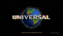
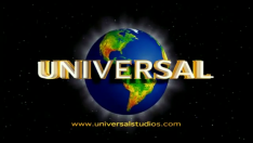
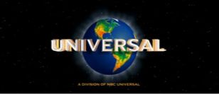
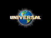
11th Logo
(May 23, 1997-July 3, 2012)


<iframe frameborder="0" height="167" src="http://wikifoundrytools.com/wiki/closinglogos/widget/unknown/55e725c9d607807e22bd502468d830ae1e7c7c80" width="297"></iframe>
Nicknames: "CGI Globe II", "The Glittering Globe", "The Shimmering Globe", "The Transparent Globe", "2000s Globe", "Rotating Letters III", "Earth Globe VII"
Logo: On a black background, an arc slowly appears and brightens. A series of lights begin appearing below the arc and we see that this is another globe, looking over Europe. We move down as the lights appear all over Europe, and then Africa (which the Earth's continents now have the green, yellow, and red color design this time). As we begin to zoom out, the letters in the word "UNIVERSAL", in a similar font as the last logo but handsomely redone (this time, the text is still gold, but has the inner white part of the text rising out of the gold part), rotate to the front of the globe as the lights around the continents dim out. By this time, the globe is shining from the back. A small copyright appears at the bottom-right.
Trivia: The logo was introduced to coincide with the rebranding of "MCA, Inc." into "Universal Studios, Inc." on December 9, 1996. It was designed by Identica Partnership in London.
Variants: A treasure trove. Here are a few variants:
- There is a shorter version of this logo, beginning as the "UNIVERSAL" text slides in over the logo, with a shortened version of the fanfare. This is usually found at the end of documentaries produced for DVD by Universal Studios Home Entertainment, with a web address for Universal's website.
- From 1998 to October 26, 2001, December 21, 2001 to February 22, 2002, and from April 19, 2002 to 2010, the web address, "<a class="external" href="http://www.universalstudios.com/" rel="nofollow" target="_blank">www.universalstudios.com</a>", in an orangish color, fades in at the end. In the 1998-1999 URL variant, the copyright information faded in alongside the URL. But by 1999, the copyright is gone.
- In 2005, the globe was graphically enhanced with a darker color and was rotating below the arc in the beginning of the logo.
- Another variant has a darker mood. Nicknamed "The Transparent Globe," the presentation is the same as usual... except the initial darkness of the globe is darker than usual (pay close attention to that). Then, after the word "UNIVERSAL" is rotated from behind, either a darker, thicker shadow suddenly pops out late or a slightly brighter-than-normal shadow fades in after it locks in position, and the entire globe zooms out farther than its intended mark, and instead of slowing to a stop, it stops hard in its far-back position. The website URL is featured in a Xerox Serif Wide-type font, like a rectangular Helvetica. The globe appears much further back in letterbox format. You can find this variant on 8 Mile, American Wedding, Seabiscuit, Master and Commander: The Far Side of the World, and The Bourne Supremacy. The variant with the slightly-brighter-than-normal shadow and NBC Universal byline can be seen on the stereoscopic 3D prints of Despicable Me. The 2D prints use the normal variant with the NBC Universal byline.
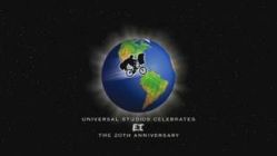
- The biggest variation came on November 21, 2001, when the studio celebrated the 20th anniversary of the most successful film of 1982, E.T the Extra-Terrestrial. The logo animates as normal until the very end, when the "UNIVERSAL" text fades out and the silhouette of E.T. and Elliott, on their bike, fly across the shining globe. Text appears on the bottom, "UNIVERSAL STUDIOS CELEBRATES E.T. THE 20TH ANNIVERSARY" with "E.T." in its own movie logo font. This was used on November 21, 2001 on Spy Game and March 22, 2002 on the 20th Anniversary Edition of E.T. The Extra Terrestrial. Shortly afterwards beginning with The Scorpion King, the normal logo was reinstated.
- Starting in 2009, the website URL has been removed in favor of the byline "A DIVISION OF NBC UNIVERSAL", also in an orangish color, which fades in toward the end.
- On some films, such as Munich and Nanny McPhee Returns (or Nanny McPhee and the Big Bang in places outside the US), the logo is bylineless.
- Since 2004, this logo was used on licensed games (due to the closure of Universal Interactive). It's either the still print logo on a black or white background, or just the last part with the shining, though a very few amount of titles use the full animation. Sometimes, it replaced the Universal Interactive logo on earlier games like The Grinch.
FX/SFX: The lighting of the globe and the rotation of the letters.
Music/Sounds: Begins with a powerful, majestic horn fanfare, followed by two orchestra hits. Then, another horn fanfare, followed by two more hits. Then, a very majestic fanfare as the logo is completed, with the horn theme coming back near the end. Composed by the late Jerry Goldsmith, who was also the composer for the Carolco logo theme.
Music/Sounds Variants:
- From November 21, 2001 to March 22, 2002, the music was changed in an arrangement by John Williams to go with the customized E.T. logo; there is only one horn fanfare/hits sequence, followed by the end fanfare. This then segues into the theme from E.T. as he and Elliott fly across the globe.
- When the E.T. logo was dropped on March 22, 2002, the music did not change back to the 1997 version until May 17, 2002. Instead, it's a re-orchestration of the 1997 fanfare, again in an arrangement by John Williams. Same melody, but like the E.T. logo, it is in a different key and sounds more "powerful", though this version was rather short lived.
- On some prints of Tremors II and Blu-ray international prints of TheAmerican President and Strange Days, the 1990 fanfare from the previous logo is heard, due to a plastering error; Syfy's airing has the correct 1997 fanfare. This error is also present on the Polish dub of We're Back! A Dinosaur's Story.
- On the R1 DVD of TimeCop 2 (if you select the French track), the entire logo (as well as the movie itself) plays low toned.
- On a Foxtel Movies print of The Hurricane, the second horn theme (which normally comes out of the right channel) is oddly omitted. This is likely due to a mastering mistake.
Availability: Very common. Appears on all Universal films from the era.
- This logo first appeared on The Lost World: Jurassic Park (although the trailers and TV spots for it had the previous logo) and made its final theatrical appearance on Wanderlust.
- Recently, it was seen on Universal's latest made-for-home media movie: An American Girl: McKenna Shoots for the Stars.
- This logo also precedes releases originally without this logo on video (and served as a de-facto home entertainment logo) and occasionally on cable channels.
- Also seen on new prints of The Blues Brothers (the theatrical cut only, the expanded version actually uses the 1963 logo), Tremors (replacing the 10th logo), The American President and Strange Days (Blu-ray international prints), and the 1999 DVD of The Last Starfighter, plastering the 10th and Lorimar logos.
- It was also found on some trailers for Dr. Seuss' The Lorax, Battleship, American Reunion, The Five-Year Engagement, and Snow White & The Huntsman (with the movies itself using the next logo).
Editor's Note: A favorite of many, this is a very popular and iconic logo with a famous fanfare. Universal would reuse the fanfare for the next logo.
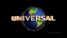
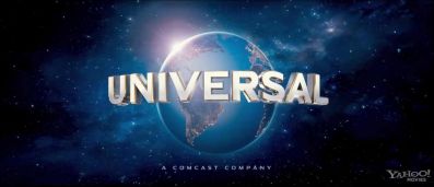
12th Logo
(March 2, 2012- )
12th Logo
(March 2, 2012- )


<iframe frameborder="0" height="167" src="http://wikifoundrytools.com/wiki/closinglogos/widget/unknown/30f98590840aaa232a4f63cc89748616431b7c68" width="297"></iframe><iframe frameborder="0" height="167" src="http://wikifoundrytools.com/wiki/closinglogos/widget/genericvideo/ae873160393ed920d5bd1f0ab5077b252c44d805" width="295"></iframe>
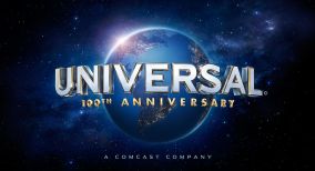
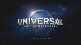
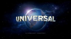
Nicknames: "CGI Globe III", "100th Anniversary Globe", "Rotating Letters IV", "Majestic Globe", "100 Years of Universal", "Comcast Globe", "Centennial Globe", "Earth Globe VII"
Logo: On a black starry background, as the sun shines on the planet, the camera pans backwards across Europe and Africa. Then "UNIVERSAL" in white with golden bordering rises upward as the sun pans down, and light glows on the continents. Then the screen eases back to its familiar position. The continents glow as the globe revolves showing the Americas. The sun shines, leaving a glow behind the Earth. Then the byline that reads "A COMCAST COMPANY" fades in underneath. The "UNIVERSAL" name shines before fading out.
Trivia: The logo was designed by Weta Digital of New Zealand.
Early Variant: Just like as they did with their 1990 logo when the company celebrated their 75th anniversary, Universal initially used a special variant of this logo on the year they celebrated their centennial milestone. The logo acts out as another "grand unveiling" or "passing of the torch," as it begins with clips of the previous logos of the company's history, beginning with the 5th logo and finishing with the previous logo; in which the current logo makes its majestic debut shortly afterwards. The 100th Anniversary variant of the logo also featured the words, "100TH ANNIVERSARY" in gold, which are seen rotating in under "UNIVERSAL" at the same time. The logo with the montage was only used as a promotional video for their 100th year.
Other Variants:
- In Blu-ray discs, there is a letterboxed version with the text "Loading a Fresh Preview from the Internet" added on the top black border. This pops up when a preview is loading from online while the viewer is using BD Live.
- There is a 4:3 version of the logo seen on certain fullscreen pre-1950 Paramount films and the 2018 DVD releases and Freeform broadcasts of Rudolph The Red Nosed Reindeer and Frosty the Snowman.
- A still version appears on licensed movie games, such as Battleship.
FX/SFX: The panning of the planet, the company name rising, the continents glowing. All brilliant CGI effects, and is reminiscent of the 1990 and 1997 logos.
Music/Sounds: A powerful re-orchestration of the last logo's fanfare, accompanied by "a choir, new string parts, and drum cadence utilizing world percussion instruments", according to the <a class="external" href="http://www.hollywoodreporter.com/news/universal-pictures-100th-anniversary-logo-the-lorax-296227" rel="nofollow" target="_blank">Hollywood Reporter</a>. Composed by Brian Tyler.
Music/Sounds Variants:
- On the 100th Anniversary logo variant, "One Last Wish" from Casper, composed by James Horner, is used during the montage.
- On Disney Channel's airing of Big Fat Liar, the 1997 music is heard with this logo, due to sloppy plastering.
- On the 2012 Blu-ray of Vertigo, it uses the music from the 10th logo.
Availability: Common. It can be seen on newer films from the company.
- The 100th anniversary logo was first unveiled on January 10, 2012, and is currently available on Universal's YouTube channel. It made its theatrical debut with Dr. Seuss' The Lorax (although trailers and TV spots for it had the previous logo) and made its last appearance on Mama, released on January 18, 2013.
- The version without the "100TH ANNIVERSARY" wording debuted theatrically on Identity Thief, released on February 8, 2013, although it previously appeared at the end of Universal's Cinematic Spectacular: 100 Years of Movie Memories at Universal Studios Florida, on trailers for movies released in 2013, and on the Blu-ray release of Vertigo.
- This has plastered the 1997 logo on an airing of The Perfect Man on TBS and Big Fat Liar on Disney Channel with the '97 fanfare.
- This logo also appears on reprints of DreamWorks Animation films, starting in 2018, and on newer films from said studio in 2019, beginning with How to Train Your Dragon: The Hidden World.
Editor's Note: A worthy update of the 1990 and 1997 logos, with beautiful CGI.
----------------------------------------------------------------------------------------------------
Copyright Stamps: Here is some information about the copyright stamps on the Universal Pictures films:
Copyright Stamps: Here is some information about the copyright stamps on the Universal Pictures films:
- 1925-1935: Copyright © by Universal Pictures Corporation.
- 1936-1937: Copyright © by Universal Productions, Inc.
- 1937-1966: Copyright © by Universal Pictures Company, Inc.
- 1966-1977: Copyright © by Universal Pictures.
- 1977-1998: Copyright © by Universal City Studios, Inc.
- 1999-present: Copyright © by Universal Studios.