Sony Pictures Television
Jump to navigation
Jump to search
Logo description by James Fabiano and Eric S.
Logo captures by Shadeed A. Kelly, Eric S., snelfu, Gilblitz112, originalsboy11, Derrick Anderson and ClosingLogosHD
Additional edits by Shadeed A. Kelly, FrozenHater, Logophile, BenIsRandom and Mario9000seven
Video captures courtesy of JohnnyL80, MacBookPro1990, Matthew Mayfield (Logophile), Michael Strum, Pepsi9072, ENunn, and whatacuck/LogoCuck
Background: On September 16, 2002, Sony Corporation decided to retire the Columbia TriStar Television name and logo from its television division, renaming it "Sony Pictures Television". For the first time since 1974, the Torch Lady or anything resembling Columbia's symbol is nowhere to be seen; instead, the corporate logo for Sony Pictures was introduced to television viewers for the first time.
1st Logo
(November 15, 2002- )
Nicknames: "The Shining Bars", "The Bars of Boredom", "The Bars of Annoyance", "SPE Bars", "Sony Bars", "The SPE Parallelogram", "The Carmen Logo", "Light Beam in a Striped Parallelogram"
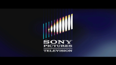
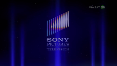
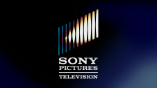
Logo: Against a lined background, the words "SONY PICTURES TELEVISION" (all in the Sony typeface and stacked word-by-word with "SONY" being largest) emerge and zoom away downwards from the screen. The three words aren't directly stacked at first, but as the animation progresses, they slide into place. A horizontal line is drawn between the "PICTURES" and "TELEVISION". While this happens, a flash of light appears on the left side of the screen, and the lines in the background themselves back away as well, eventually moving back to the upper part of the screen and into a diagonal pattern to form the logo. The flash dissipates and we see an oblong orange-white glare surrounding the logo and words, which shrinks into the bars to give it a shine. The finished logo appears against a shaded navy blue background. The logo is a striped parallelogram.
Trivia:
Variants:
FX/SFX: The words flying down, the bars zooming back and tilting, a white flash and a glare shrinking into the bars.
Music/Sounds: A majestic 5-note orchestral theme composed by David Kurtz, which sounds vaguely similar to the Habanera section of Bizet's opera Carmen.
Music/Sounds Variants:
Availability: Ultra common. In fact, it might be the most common logo to ever exist.
Editor's Note: This logo has earned the dubious honor of probably being the most hated closing logo of all time. It's wildly infamous for how often it plasters logos from previous Sony-owned companies on newer prints of old shows (about 99% of the time - the times where older logos are preserved are usually flukes). The version often used when plastering or appearing is usually NOT the full version, thus is seen as a cheap and uninspired logo since the most common version uses the technically simplest portion of the animation/overall logo is the one that is normally by logo enthusiasts. This has been said to be the most common logo when it comes to plastering on television.
Logo captures by Shadeed A. Kelly, Eric S., snelfu, Gilblitz112, originalsboy11, Derrick Anderson and ClosingLogosHD
Additional edits by Shadeed A. Kelly, FrozenHater, Logophile, BenIsRandom and Mario9000seven
Video captures courtesy of JohnnyL80, MacBookPro1990, Matthew Mayfield (Logophile), Michael Strum, Pepsi9072, ENunn, and whatacuck/LogoCuck
Background: On September 16, 2002, Sony Corporation decided to retire the Columbia TriStar Television name and logo from its television division, renaming it "Sony Pictures Television". For the first time since 1974, the Torch Lady or anything resembling Columbia's symbol is nowhere to be seen; instead, the corporate logo for Sony Pictures was introduced to television viewers for the first time.
1st Logo
(November 15, 2002- )
Sony Pictures Television (2002)Sony Pictures Television Black and White Variant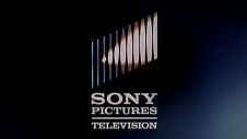 SPT 2005
SPTD: 2008Sony Pictures Television (Widescreen)Sony Pictures Television (Distributed By, 2005)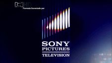
 SPT: 2009-wsSPT-NG: 2009
 SPT 2005
SPTD: 2008Sony Pictures Television (Widescreen)Sony Pictures Television (Distributed By, 2005)

 SPT: 2009-wsSPT-NG: 2009


<embed allowfullscreen="true" height="132" src="http://wikifoundrytools.com/wiki/closinglogos/widget/youtubevideo/0746d174b1deaa8bbebd000f6d250f91326bb1d8" type="application/x-shockwave-flash" width="165" wmode="transparent"/><embed height="132" src="http://wikifoundrytools.com/wiki/closinglogos/page/Sony+Pictures+Television/widget/youtubevideo/1386941567" type="application/x-shockwave-flash" width="165" wmode="transparent"/><embed allowfullscreen="true" height="132" src="http://wikifoundrytools.com/wiki/closinglogos/widget/youtubevideo/ed1cafb31b142e5ac5f22254f50881bba30c24ae" type="application/x-shockwave-flash" width="165" wmode="transparent"/><embed allowfullscreen="true" height="132" src="http://wikifoundrytools.com/wiki/closinglogos/widget/youtubevideo/8963216239d8c1b665b5b07e160d9f5e0a39333c" type="application/x-shockwave-flash" width="165" wmode="transparent"/><embed height="132" src="http://wikifoundrytools.com/wiki/closinglogos/page/Sony+Pictures+Television/widget/youtubevideo/1345783523" type="application/x-shockwave-flash" width="165" wmode="transparent"/>
<embed height="132" src="http://wikifoundrytools.com/wiki/closinglogos/page/Sony+Pictures+Television/widget/youtubevideo/-1536872376" type="application/x-shockwave-flash" width="165" wmode="transparent"/><embed allowfullscreen="true" height="132" src="http://wikifoundrytools.com/wiki/closinglogos/widget/youtubevideo/83329213849002c0c12103e0a312edfae20762d9" type="application/x-shockwave-flash" width="165" wmode="transparent"/><embed allowfullscreen="true" height="132" src="http://wikifoundrytools.com/wiki/closinglogos/widget/youtubevideo/190035cf17018b909ed0ddd820e6e264bff2d05f" type="application/x-shockwave-flash" width="165" wmode="transparent"/>
<embed height="132" src="http://wikifoundrytools.com/wiki/closinglogos/page/Sony+Pictures+Television/widget/youtubevideo/-1536872376" type="application/x-shockwave-flash" width="165" wmode="transparent"/><embed allowfullscreen="true" height="132" src="http://wikifoundrytools.com/wiki/closinglogos/widget/youtubevideo/83329213849002c0c12103e0a312edfae20762d9" type="application/x-shockwave-flash" width="165" wmode="transparent"/><embed allowfullscreen="true" height="132" src="http://wikifoundrytools.com/wiki/closinglogos/widget/youtubevideo/190035cf17018b909ed0ddd820e6e264bff2d05f" type="application/x-shockwave-flash" width="165" wmode="transparent"/>
<iframe frameborder="0" height="134" src="http://wikifoundrytools.com/wiki/closinglogos/widget/youtubevideo/635680a8d943608e0ad1fe55f8b52a1c06cadb50" width="239"></iframe>
Nicknames: "The Shining Bars", "The Bars of Boredom", "The Bars of Annoyance", "SPE Bars", "Sony Bars", "The SPE Parallelogram", "The Carmen Logo", "Light Beam in a Striped Parallelogram"
Logo: Against a lined background, the words "SONY PICTURES TELEVISION" (all in the Sony typeface and stacked word-by-word with "SONY" being largest) emerge and zoom away downwards from the screen. The three words aren't directly stacked at first, but as the animation progresses, they slide into place. A horizontal line is drawn between the "PICTURES" and "TELEVISION". While this happens, a flash of light appears on the left side of the screen, and the lines in the background themselves back away as well, eventually moving back to the upper part of the screen and into a diagonal pattern to form the logo. The flash dissipates and we see an oblong orange-white glare surrounding the logo and words, which shrinks into the bars to give it a shine. The finished logo appears against a shaded navy blue background. The logo is a striped parallelogram.
Trivia:
- This logo first appeared as a print logo in Fall 1991 on broadcasting ads in magazines such as Variety, around the time when SPE was founded.
- This logo was Animated by "Rick Scott" at Tigar Hare Studios, also known for their work on The Warner Films logo and the 2011 Technicolor logo.
Variants:
- A rare filmed variant of the logo exists.
- There is a longer version of this logo featuring an extreme close-up of the "stacked" names at the beginning of the animation. It starts off with a bright white light and later reveals the names as the light dies down. While the logo finishes, it shows a longer shot of the logo.
- There is an even shorter version of this logo that starts from where the 3rd-to-last note of the theme plays. This version began appearing in July 2003.
- In 2004, the phrase "DISTRIBUTED BY" appeared above the logo, it was still until it faded in above the logo on the 2006 version of Chain Reaction and season 4 of The Newlywed Game both on GSN, but the font is in Times New Roman on those said game shows. Early shorts on Crackle's C-Spot has the phrase above the name rather than the logo. for the rest, the phrase was placed on a black screen, which later fades to the SPT logo.
- In 2005, an updated widescreen version was introduced. It consists of just a solid blue lighting effect in the lower right-hand corner of the screen, where the reflection of the Bars would usually be. Sometimes this version was squashed to fit a 4:3 TV, and has been featured on several movies, first-run production, and classic series on television and DVD.
- There is also a black & white variant for classic shows by Screen Gems.
- In 2008, there is a black screen that reads "DISTRIBUTED BY" before the SPT logo. This only appears on web shows on websites like Crackle, MySpace, YouTube, and Hulu, among others such as C-Spot or Penn Says.
- Another variant has "DISTRIBUTED BY" in a small font above the SPT name rather than above the SPT logo. This appeared on early shows on Crackle.
- On pre-2011 episodes of Watch What Happens: Live, the logo is a still shot on a gray-like background.
- In 2010 on The Three Stooges short "The Sitter Downers", the 2005 logo is in black & white.
- Starting on the 4th season of The Newlywed Game, the text reads as "DISTRIBUTED THROUGH" above the logo.
- Sometimes, the logo can appear a little up-close.
- There is also a version with extra brightness on both 2002 and 2005 versions in color.
- On Robot Chicken since season 6, there is a still version of the logo.
- A superimposed in-credit variant exists. This can be found on international shows like Niñas Mal.
- Starting with the second season of Masters of Sex and newer episodes of Wheel of Fortune, The Dr. Oz Show, and Jeopardy!, the Sony Corporation logo is seen first. Then, the light flashes to reveal the short SPT logo. Some shows, such as The Young and the Restless, syndicated reruns of Seinfeld, and shows co-produced by SPT subsidiary Embassy Row still do not use this variant.
- On a PAL release of The Real Ghostbusters, the long version is used but the normal music is heard.
- On a April 16, 2017 HBO Signature Caribbeanairing of Pixels, the logo was silent, but the music played 5-6 seconds after the logo cut to black.
- A scoped version wherein the logo is in 21:9 aspect ratio and the black bars on top and the bottom are normal exists.
FX/SFX: The words flying down, the bars zooming back and tilting, a white flash and a glare shrinking into the bars.
Music/Sounds: A majestic 5-note orchestral theme composed by David Kurtz, which sounds vaguely similar to the Habanera section of Bizet's opera Carmen.
Music/Sounds Variants:
- The long version has a descending piano tune before the main fanfare (which is a bit re-orchestrated), and the last note is held much longer.
- Another music variation has only the last three notes of the theme re-arranged. This version began in July 2003.
- In later years, the music has become a bit more orchestrated.
- In 2005, there is another short version with the last half of the animation of the standard animation of the logo. Used on the ultra short-lived series Sit Down, Shut Up and several final season episodes of Jackie Chan Adventures.
- Sometimes, when used along a co-production or co-distributor ID, the first few notes of the music for this logo will play over the last few seconds of said ID before going into this visual logo. This has happened on such syndicated shows as Jeopardy! and Wheel of Fortune, back when King World Productions (now "CBS Television Distribution") was still in operation. But now until October 2007, the CTD music plays on the CTD logo, and the SPT theme plays on the SPT logo.
- Sometimes, the logo used the Columbia TriStar Television theme until 2014. The theme can still be heard on some syndicated airings of Good Times via TV One.
- Two more versions exist by having a high and low tone starting in 2003.
- Another version exists having a bell-type twinkle mixed into the standard theme.
- A very high tone version of the music was used on some S4 episodes of Married... With Children on its DVD release.
- On some shows like The King of Queens (2004-2007 episodes) and other shows, the end theme plays over this logo.
- Middle season local reruns of Good Times and Sanford and Son would have the first four notes of the standard theme playing first, followed by the finishing of the final notes from the SPT long version theme.
- Up until 2012, the Sony Pictures Television International sounder was sometimes used, particularly on the Mill Creek DVD release of the Nickelodeon original movie The Last Day of Summer (any SPT logo appears on the original SPHE DVD release), DVD releases of shows like Married... With Children and on Antenna TV's print of the Sanford and Son episode "Sanford and Gong."
- There is also a silent version (sometimes on movie networks like Starz and Encore).
- Another variation would have the 1993 CPT theme. This happened on several reruns of Just Shoot Me! on TV Land. R2 DVDs of T.J. Hooker and the 2nd season of Party of Five have also this variation if you select the French audio track.
- A variant exists that has the 1993 CPT theme overlapping the SPT theme. This was spotted on an Antenna TV airing of the show Good Times S4 episode "Michael's Great Romance".
- A few episodes of The Jeffersons from the 1980-1981 season last aired on TV One has the SPT and the short CTTD themes playing at the same time.
- On The Three Stooges short "Cash and Carry", there is a 2005 low tone version.
- On Antenna TV's print of the All in the Family episode "The Jeffersons Move Up," the short Columbia TriStar Television theme is heard.
- One S1 episode of That's My Mama! on DVD ("Clifton's Con") has the 1982 CPT music over this logo.
- On the CTHE DVD print of the S3 Married... with Children episode "The Gypsy Cried", it has the first note of the 1988 CPT theme before going into the SPTI theme.
- On several international prints of May-June 2013 episodes of Days of Our Lives and The Young and the Restless, the 1994 TriStar Television theme is heard.
- On the Mill Creek S4 DVD of Married... with Children, the episode "Hot Off the Grill" has the 1988 CPT theme playing over this logo.
- One 4:3 airing of the TV movie Breakaway has the Columbia TriStar Domestic Television music play over the logo.
- On the Me-TV print of The Facts of Life S5 episode "Brave New World Part 2", a sloppy plaster job results in the theme playing before the logo itself appears.
- On the NTSC DVD print of the mini-series Comanche Moon, the secondCBS Paramount Television logo's music plays (and vice-versa), due to an editing error.
- On current prints of the 1931 film Arizona, the movie's score finishes over the logo after the end title fades out, as the music originally ended over a black screen.
Availability: Ultra common. In fact, it might be the most common logo to ever exist.
- Seen on new series and a tremendous amount of new prints of classic shows, off-net syndication series, TV movies and theatrical films on television. It's quite infamous and annoying for removing and replacing old logos on many pre-2002 Sony TV programs.The only four pre-2002 shows do not have this logo are Walker, Texas Ranger on the former network Cloo and USA Network, All in the Family on Get TV and Sony Crackle, the original One Day at a Time on Antenna TV and The Jeffersons on Me-TV.
- This logo doesn't appear at all on some channels such as Fox Movies Asia, while its sister channel Fox Family Movies has this in most cases.
- It appears on shows produced by Adelaide Productions, Sony's television animation studio, as they do not have their own logo.
- The long version is not as common as the standard version, but it was seen on every episode of Jeopardy! from 2002-2007, The Nate Berkus Show, the DVD release of All in the Family: The Complete 3rd Season, and the DVD release and Crackle prints of Odyssey 5 (except for "Astronaut Dreams", which uses the normal version instead), but it may appear on some classic and off-network shows. It also appears at the end of every episode of The Three Stooges DVD Collection volume sets, beginning in the second volume, and can also be found on many other TV on DVD releases from 2002-04 (from 2005 onward it went to the standard version).
- The low tone theme is uncommon and was last seen on early episodes of Stuart Little: The Animated Serieson HBO Family and the 1976 TV movie Banjo Hackett on DVD, while the high tone (both 2002 and 2005 versions) appears on The Boondocks on Adult Swim and Netflix, many Three Stooges shorts on IFC, among other shows and certain films on television.
- The very high toned version (G version) also appears on international TV airings of some movies, probably due to the NTSC TV airings having it in high tone (F# version).
- The scoped version can be seen on CBS airings of S.W.A.T. and some theatrical films on TV such as HBO Asia airings of 13 Going On 30.
- As for the short version, it's fairly common and it appeared on The Shield on local syndication and Spike, the ultra short-lived series Sit Down, Shut Up on FOX, and reruns of Joan of Arcadia including Stephen King's Kingdom Hospital. The version with the SPTI theme was spotted on the 1971 film The Anderson Tapes on TCM. It can also be seen on Sony Movie Channel in widescreen. For series outside the US, it's seen on the series incarnation of the 2007 movie Niñas Mal (translated as Bad Girls) on MTV Latin America and nuvoTV. and Bienvenida Realidad (translated as Welcome Reality). This was oddly seen at the end of an episode of The Jeffersons on Antenna TV before the show's credits, with the CTT logo after the credits. This also strangely appears at the end of a Roku Channel print of Lake Placid.
Editor's Note: This logo has earned the dubious honor of probably being the most hated closing logo of all time. It's wildly infamous for how often it plasters logos from previous Sony-owned companies on newer prints of old shows (about 99% of the time - the times where older logos are preserved are usually flukes). The version often used when plastering or appearing is usually NOT the full version, thus is seen as a cheap and uninspired logo since the most common version uses the technically simplest portion of the animation/overall logo is the one that is normally by logo enthusiasts. This has been said to be the most common logo when it comes to plastering on television.
2nd Logo
(October 11, 2019- )
 <iframe frameborder="0" height="182" src="http://wikifoundrytools.com/wiki/closinglogos/widget/unknown/c4ad4c923a16467aced6fd4a1baa1ee4dd0a9bcd" width="322"></iframe>
Music/Sounds: None so far.
 <iframe frameborder="0" height="182" src="http://wikifoundrytools.com/wiki/closinglogos/widget/unknown/c4ad4c923a16467aced6fd4a1baa1ee4dd0a9bcd" width="322"></iframe>
Logo: On a blue gradient background, a purple flash appears onscreen, covering it. When the flash dies down, the print version of the Sony Pictures Television logo appears. The logo zooms back for a few seconds before stopping completely.
FX/SFX: The flash and the SPT logo zooming back.
Music/Sounds: None so far.
Availability: Brand new. It made its debut on El Camino: A Breaking Bad Movie, and it's unknown if this logo will replace the 1st logo on new SPT series and newer episodes of existing SPT shows in the near future. It's likely this is simply a custom logo produced for the film.
Editor's Note: Even though the logo can be seen as bland, it's a breath of fresh air from the previous logo.
3rd Logo
(January 10, 2020- )
Logo: Just white text reading "SONY PICTURES TELEVISION STUDIOS" against a black background. "STUDIOS" is sandwiched in between white lines.
FX/SFX: None.
Music/Sounds: None.
Availability: Brand new. Debuted on Lincoln Rhyme: The Hunt for the Bone Collector. Most likely a placeholder logo.
Editor's Note: Say what you will about the Bars of Boredom, but at least that one had some semblance of creativity. This one, on the other hand, is one of the worst of its kind, representing everything wrong with the 21st century trend of simplistic logos. It doesn't even transition correctly from the Sony Corporation logo. Only time will tell if this is just being used as a placeholder.
_______________________________________________________________
Copyright Stamps: Here is some information about the copyright stamps on the Sony Pictures Television series:
Copyright Stamps: Here is some information about the copyright stamps on the Sony Pictures Television series:
- 2002-: Copyright © [YEAR] Sony Pictures Television (Inc.) All Rights Reserved.
- 2002-: Copyright © [YEAR] Califon Productions, Inc. All Rights Reserved. (Used on Wheel of Fortune)
- 2002-: Copyright © [YEAR] Jeopardy Productions, Inc. All Rights Reserved. (Used on Jeopardy!)
- 2002-: Copyright © [YEAR] CPT Holdings, Inc. (Used on The Young & the Restless and international series)
- 2002-2007: Copyright © [YEAR] Columbia TriStar Television, Inc. and CBS Worldwide, Inc. All Rights Reserved. (Used on The King of Queens)
- 2002-2003: © [YEAR] Columbia TriStar Television Distribution. All Rights Reserved. (Used on Judge Hatchett)
- 2002-2004: Copyright © [YEAR] Columbia TriStar Domestic Television. All Rights Reserved. (Used on Pyramid)
- 2002-2009: Copyright © [YEAR] Adelaide Productions, Inc. All Rights Reserved.