Screen Gems Pictures
Jump to navigation
Jump to search
The printable version is no longer supported and may have rendering errors. Please update your browser bookmarks and please use the default browser print function instead.
Logo descriptions by Ryan Mead, Jason A. Matthews, James Fabiano, Matt Williams, PluMGMK and indycar
Logo captures by Eric S., V of Doom, kidinbed, EnormousRat and LogosForTheWin
Additional edits by V of Doom, Bob Fish, kidinbed and indycar
Video captures courtesy of CJOVideo and PluMGMK
Background: The "Screen Gems" name was resurrected by Sony Pictures Entertainmenton December 8, 1998, as a film division to distribute specific genre and mid-budget film releases, such as horror, thriller, science fiction and African-American films. The studio also distributed some independent films earlier on.
1st Logo
(June 4, 1999-)
![Screen Gems (2014) [Version 2]](/images/thumb/e/ef/Fca3ccf6de9850fb681d24647521d90b.jpeg/334px-Fca3ccf6de9850fb681d24647521d90b.jpeg)
![Screen Gems (Variant) [1999]](/images/thumb/9/90/Ec62d6318e72ff3e8ae73fcc246f10bd.jpeg/261px-Ec62d6318e72ff3e8ae73fcc246f10bd.jpeg)
![Screen Gems (Variant) [2014]](/images/thumb/c/cf/3d77a643684977617c3ec008c6ab43cf.jpeg/338px-3d77a643684977617c3ec008c6ab43cf.jpeg)
Logo: On a black background, a flash of light with a lens flare forms a light blue sphere. A series of tops (similar to the 1973 ITC Entertainment logo) spin around it and form the two lines of the "S" (the same as the 1965 Screen Gems Television logo, only the "S" is also in a sky blue color). Under the "S", the text "SCREEN GEMS" flips into place and flashes, and underneath that, the Sony byline fades in. The entire animation also has light trail and distortion effects.
Bylines:
Variants:
FX/SFX: The light and the spinning tops, all in stunning CGI that's made this logo a favorite of logo fans who have seen it.
Music/Sounds: It starts out with a rising orchestra, then to an extremely majestic and inspirational five-note tune with a choir singing along coinciding with the animation and the forming of the words "SCREEN GEMS". In other cases, it uses the opening theme or it's silent.
Availability: Common. Seen on many genre and mid-budget films produced and distributed by the studio from the era. It still pops up in trailers even with the next logo currently being used. It also makes a surprise appearance on the 2018 films.Searching and Brightburn.
Editor’s Note: Compared to the television version, the "S" has truly mellowed with age. A beautifully animated and orchestrated logo. The red version, however, can bring flashbacks to the original “S from Hell”, though the music still makes it far calmer.
2nd Logo
(July 22, 2011-)

<iframe frameborder="0" height="167" src="http://wikifoundrytools.com/wiki/closinglogos/widget/unknown/51e93f03301f1a651c6ff6f0b159323ac2774ae7" width="297"></iframe>
Nicknames: "S from Heaven II", "S in the Sky", "Crystal Screen Gems", "Crystal Gems", "S in Heaven"
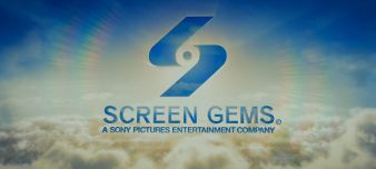
Logo: We start out high in the sky. The camera turns and ascends through layers of cloud. Eventually the clouds clear and we see a CGI blue letter "S". The camera continues to turn and zoom out, slowly revealing the name "SCREEN GEMS" which fades in with the smaller byline underneath it, in the same vein as the previous logo. The camera continues to ascend and zoom out, revealing the same trademark "Spiral S". It seems to be made out of glass, refracting the blue of the sky (rather than being blue itself). As the camera comes to a stop, the blazing sun is positioned exactly behind the bottom half of the "Spiral S", with the clouds forming a plane under the logo. The finished product looks similar to the 2006 version of the 1993 Columbia logo, this studio's corporate sister, complete with rainbow-like circles around the sun.
Trivia: This logo was based on artwork by Buffy Cutler, who was commissioned to create a new Screen Gems logo for Friends with Benefits. Some of the other candidates he produced are <a href="https://www.behance.net/gallery/Screen-Gems-Studio-Logo/10729055" target="_self">here</a>, and appear to have been inspired by the 1965 Screen Gems logo.
Bylines:
FX/SFX: The camera moving, the clouds blowing in the wind, the text and logo fading in and reflecting their surroundings. It's all very nice CGI by Picture Mill.
Music/Sounds: At first, wind can be heard blowing very faintly, then the opening theme of the film starts when the "S" first appears on the screen.
Availability: Current. It was initially used in tandem with the previous logo, appearing on comedy films such as Friends with Benefits, Think Like a Man, About Last Night, Think Like a Man Too, and The Wedding Ringer. Starting with The Perfect Guy, it now appears on all of their newer films, regardless of genre, with the exception of Searching and Brightburn.
Editor’s Note: This is a beautiful logo that's definitely a worthy successor to the previous one.
Logo captures by Eric S., V of Doom, kidinbed, EnormousRat and LogosForTheWin
Additional edits by V of Doom, Bob Fish, kidinbed and indycar
Video captures courtesy of CJOVideo and PluMGMK
Background: The "Screen Gems" name was resurrected by Sony Pictures Entertainmenton December 8, 1998, as a film division to distribute specific genre and mid-budget film releases, such as horror, thriller, science fiction and African-American films. The studio also distributed some independent films earlier on.
1st Logo
(June 4, 1999-)


![Screen Gems (2014) [Version 2]](/page/File:Fca3ccf6de9850fb681d24647521d90b.jpeg)
![Screen Gems (Variant) [1999]](/page/File:Ec62d6318e72ff3e8ae73fcc246f10bd.jpeg)
![Screen Gems (Variant) [2014]](/page/File:3d77a643684977617c3ec008c6ab43cf.jpeg)

<iframe frameborder="0" height="166" src="http://wikifoundrytools.com/wiki/closinglogos/widget/genericvideo/42cc63d65c7e69aca061d60926c86ab25ad432cf" width="297"></iframe><iframe frameborder="0" height="165" src="http://wikifoundrytools.com/wiki/closinglogos/widget/unknown/e3a2768e0b278ee851e1c63452f6b24bfb881a6d" width="303"></iframe><iframe frameborder="0" height="166" src="http://wikifoundrytools.com/wiki/closinglogos/widget/genericvideo/6c9fb969308fbcf012fbbf8775882eb110c6e4f3" width="297"></iframe>
Nicknames:- Original: "S from Heaven", "The CGI Spiral S from Heaven", "The S Returns"
- Red variant: "S from Hell Redux", "Revenge of the S from Hell", "Red S", "S from Not-So-Hell"
Logo: On a black background, a flash of light with a lens flare forms a light blue sphere. A series of tops (similar to the 1973 ITC Entertainment logo) spin around it and form the two lines of the "S" (the same as the 1965 Screen Gems Television logo, only the "S" is also in a sky blue color). Under the "S", the text "SCREEN GEMS" flips into place and flashes, and underneath that, the Sony byline fades in. The entire animation also has light trail and distortion effects.
Bylines:
- June 4-July 9, 1999: Bylineless (This was only used on trailers.)
- June 4, 1999-October 18, 2013: "A SONY PICTURES ENTERTAINMENT COMPANY" (This was used on the majority of their films.)
- July 2, 2014-: "a Sony Company"
- In 2004, there is a registered trademark symbol that appears next to the name.
- There's a red version of the logo used on some films, mostly horror/thrillers such as Untraceable, Lakeview Terrace, and Vacancy. It occasionally appeared on non-horror/thriller movies such as Dear John and First Sunday.
- On some early films released by the company, the "S" is bigger than usual. Also, the beginning of the logo is slightly different.
- On Deliver Us from Evil, No Good Deed, Searching, andBrightburn,the 2014 Sony logo transitions to this logo.
- Closing: Similar to the 1993 Columbia Pictures and TriStar Pictures logos, the print "Spiral S" is on the right with "SCREEN GEMS" stacked on top of one another on the left and the byline "A Sony Pictures Entertainment Company".
FX/SFX: The light and the spinning tops, all in stunning CGI that's made this logo a favorite of logo fans who have seen it.
Music/Sounds: It starts out with a rising orchestra, then to an extremely majestic and inspirational five-note tune with a choir singing along coinciding with the animation and the forming of the words "SCREEN GEMS". In other cases, it uses the opening theme or it's silent.
Availability: Common. Seen on many genre and mid-budget films produced and distributed by the studio from the era. It still pops up in trailers even with the next logo currently being used. It also makes a surprise appearance on the 2018 films.Searching and Brightburn.
Editor’s Note: Compared to the television version, the "S" has truly mellowed with age. A beautifully animated and orchestrated logo. The red version, however, can bring flashbacks to the original “S from Hell”, though the music still makes it far calmer.
2nd Logo
(July 22, 2011-)


<iframe frameborder="0" height="167" src="http://wikifoundrytools.com/wiki/closinglogos/widget/unknown/51e93f03301f1a651c6ff6f0b159323ac2774ae7" width="297"></iframe>
Nicknames: "S from Heaven II", "S in the Sky", "Crystal Screen Gems", "Crystal Gems", "S in Heaven"
Logo: We start out high in the sky. The camera turns and ascends through layers of cloud. Eventually the clouds clear and we see a CGI blue letter "S". The camera continues to turn and zoom out, slowly revealing the name "SCREEN GEMS" which fades in with the smaller byline underneath it, in the same vein as the previous logo. The camera continues to ascend and zoom out, revealing the same trademark "Spiral S". It seems to be made out of glass, refracting the blue of the sky (rather than being blue itself). As the camera comes to a stop, the blazing sun is positioned exactly behind the bottom half of the "Spiral S", with the clouds forming a plane under the logo. The finished product looks similar to the 2006 version of the 1993 Columbia logo, this studio's corporate sister, complete with rainbow-like circles around the sun.
Trivia: This logo was based on artwork by Buffy Cutler, who was commissioned to create a new Screen Gems logo for Friends with Benefits. Some of the other candidates he produced are <a href="https://www.behance.net/gallery/Screen-Gems-Studio-Logo/10729055" target="_self">here</a>, and appear to have been inspired by the 1965 Screen Gems logo.
Bylines:
- July 22, 2011-April 20, 2012: "A SONY PICTURES ENTERTAINMENT COMPANY"
- February 14, 2014- : "a Sony Company"
Variants:
- Starting with Think Like a Man Too, the 2014 Sony logo now transitions to this logo.
- Closing: Same as the previous logo.
FX/SFX: The camera moving, the clouds blowing in the wind, the text and logo fading in and reflecting their surroundings. It's all very nice CGI by Picture Mill.
Music/Sounds: At first, wind can be heard blowing very faintly, then the opening theme of the film starts when the "S" first appears on the screen.
Availability: Current. It was initially used in tandem with the previous logo, appearing on comedy films such as Friends with Benefits, Think Like a Man, About Last Night, Think Like a Man Too, and The Wedding Ringer. Starting with The Perfect Guy, it now appears on all of their newer films, regardless of genre, with the exception of Searching and Brightburn.
Editor’s Note: This is a beautiful logo that's definitely a worthy successor to the previous one.