Reeves Entertainment
Jump to navigation
Jump to search
Logo descriptions by James Fabiano, James Stanley Barr, and Matt Williams
Logo captures by Eric S., Shadeed A. Kelly, Tim Yei, and others
Editions by Shadeed A. Kelly and Hoa
Video captures courtesy of MachineryNoise and Eric S.
Background: Alan Landsburg Productions was a production company founded in April 1970 by Alan Landsburg, who was formerly working for Metromedia Producers Corporation. It was acquired by Tomorrow Entertainment, Inc. in August 1971 and Reeves Teletape Corp. (later part of "Reeves Communications Corp.") acquired ALP on September 18, 1978 from Tomorrow Entertainment. Alan Landsburg then left the company in 1985 to form "The Landsburg Company", and Alan Landsburg Productions became "Reeves Entertainment Group" on May 6, 1985. In 1990, Reeves was sold to UK's Thames Television for $89 million. Reeves Entertainment was closed down in 1994 and folded into Thames. Most of the television series it made are currently distributed by NBCUniversal Television Distribution in the US if distributed by MCA TV, while What Would You Do? and Wild and Crazy Kids! are owned by Nickelodeon and Doctor, Doctor is distributed by Sony Pictures Television. Some made for TV movies such as 1983's Adam and 1977's Tarantulas: The Deadly Cargo are distributed by FremantleMedia, successor to Thames Television.
Alan Landsburg Productions
1st Logo
(1971-1975)
 <iframe frameborder="0" height="176" src="http://wikifoundrytools.com/wiki/closinglogos/widget/unknown/0e3feb8da3e2edea9625b5c3ef9fab509f77fc60" width="273"></iframe>
Nickname: "Circles and Lines"
Logo: On a white background, a blue circle zooms towards us and stops in place. Then three colored vertical rectangles slide in from the top and bottom of the screen from right to left and stop in place over the circle; red from the bottom, yellow from the top, and blue from the bottom. The red and blue rectangles then slide across each other and swap places, with the red rectangle forming an "a", and the blue on forming a "p". The yellow rectangle stays in place, thus forming the letters "alp". A second later, the stacked words "ALAN LANDSBURG PRODUCTIONS" appear below the letters.
FX/SFX: The zooming of the circle, sliding of the rectangles, formation of the letters, and the ALAN LANDSBURG PRODUCTIONS text.
Music/Sounds: A catchy synth xylophone theme.
Availability: Rare. It's found on a DVD of In Search of: Ancient Astronauts.
Editor's Note: It's a pretty interesting logo with some quality animation and a catchy theme.
2nd Logo
(1975-1980)
 <iframe frameborder="0" height="177" src="http://wikifoundrytools.com/wiki/closinglogos/widget/unknown/3dc8fb55eb04a02193d5e1664274b3406651d783" width="280"></iframe>
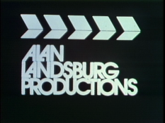
Nicknames: "Director's Block", "Slateboard"
Logo: Over a black background, we see a director's slate. 5 arrows facing to the right appear on screen on segment at a time. The top half of the slate then rises, and rapidly drops down and hits the bottom half. This changes the top half into the words:
The top half of the slate (ALAN LANDSBURG) rises again, then drops down once more. This causes the bottom half to change into the word "PRODUCTIONS". Another slate pops in on top of the words in traffic arrow fashion.
Variants:
FX/SFX: The dropping slate, and the changing words.
Music/Sounds:
Availability: Uncommon.
Editor's Note: Again, some decent animation if a little unrefined. The logo itself resembles title effects used on '70s B-movies.
3rd Logo
(September 20, 1979-May 11, 1985)
<iframe frameborder="0" height="172" src="http://wikifoundrytools.com/wiki/closinglogos/widget/genericvideo/73121f9c69681626923ab7f81024c5ef23281f83" width="305"></iframe>
Nickname: "ALP"
Logo: On a black background is a stylized blue "ALP" similar to the font seen in the Reeves Entertainment "REG" logo. Then it is blacked out, revealing behind it:
Trivia: This logo is designed in base of the Reeves Teletape Company logo from the time.
Variants:
FX/SFX: The logo revealing the text behind it.
Music/Sounds: A synthesizer stinger. There were three versions of this theme.
Music/Sounds Variants:
Availability: Common.
Reeves Entertainment
1st Logo
(Late 1984?-1985)
Nickname: "REG"
Logo: On the left, is a stylized REG, similar to the ALP in the 3rd logo. To the right, in the same font as "Alan Landsburg Productions" in the 3rd logo, is Reeves Entertainment Group and under that is A Reeves Communications Company".
Variants:
FX/SFX: None.
Music/Sounds: Same as ALP's 3rd logo.
Availability: It's seen on episodes of Gimme a Break! from the time. On some episodes with the previous logo on TV One, it's tacked on this logo.
Editor's Note: Same as ALP's 3rd logo.
2nd Logo
(September 14, 1985-December 1, 1992)
Nicknames: "REG II", "Day-Glo Reeves"
Logo: A stylized blue "R," which is decorated with vertical black stripes on its left side shines against a black background before backing away a bit. A similar "E" slides out from the right of the "R." It shines, the logo backs away, and then a "G" comes out of the right of the "E," shines, and completes the logo. When it stops, the words "Reeves Entertainment Group" appear underneath, and under that appears "A Reeves Communications Company".
Variants:
FX/SFX: Letters shining and coming out of letters.
Music/Sounds: A descending piano theme, then a warm 4-note synth horn theme. Otherwise, the end of the show's theme song.
Availability: Rare.
Editor's Note: The animation is also simple '80s stuff, but at least the music is soothing and also a bit more creative than the previous two logos.
3rd Logo
(September 19, 1990-March 8, 1995)
 <embed height="173" src="http://wikifoundrytools.com/wiki/closinglogos/widget/unknown/94e54c5b365e1e3a0140db806f792f28489d632b" type="application/x-shockwave-flash" width="213" wmode="transparent"/>
Nicknames: "Drama Faces", "The Thames Logo", "The Comedy/Drama Masks"
Logo: On a black background, we see a smiling drama face that moves up towards the top of the screen, followed by a sad drama face. Underneath the faces, several shards come together to form a blue triangle, and the black background has turned to a dark gray curtain. The text "REEVES ENTERTAINMENT" fades in at the triangle's tip, and the byline "A Thames Television Company" appears below that.
Variants:
FX/SFX: The moving drama faces, and the shards.
Music/Sounds: Either the same as the last logo, the end-title theme from any show, or silence.
Availability: Rare.
Editor's Note: A wonderful CGI logo to end the company on a marvelous note.
Logo captures by Eric S., Shadeed A. Kelly, Tim Yei, and others
Editions by Shadeed A. Kelly and Hoa
Video captures courtesy of MachineryNoise and Eric S.
Background: Alan Landsburg Productions was a production company founded in April 1970 by Alan Landsburg, who was formerly working for Metromedia Producers Corporation. It was acquired by Tomorrow Entertainment, Inc. in August 1971 and Reeves Teletape Corp. (later part of "Reeves Communications Corp.") acquired ALP on September 18, 1978 from Tomorrow Entertainment. Alan Landsburg then left the company in 1985 to form "The Landsburg Company", and Alan Landsburg Productions became "Reeves Entertainment Group" on May 6, 1985. In 1990, Reeves was sold to UK's Thames Television for $89 million. Reeves Entertainment was closed down in 1994 and folded into Thames. Most of the television series it made are currently distributed by NBCUniversal Television Distribution in the US if distributed by MCA TV, while What Would You Do? and Wild and Crazy Kids! are owned by Nickelodeon and Doctor, Doctor is distributed by Sony Pictures Television. Some made for TV movies such as 1983's Adam and 1977's Tarantulas: The Deadly Cargo are distributed by FremantleMedia, successor to Thames Television.
Alan Landsburg Productions
1st Logo
(1971-1975)
 <iframe frameborder="0" height="176" src="http://wikifoundrytools.com/wiki/closinglogos/widget/unknown/0e3feb8da3e2edea9625b5c3ef9fab509f77fc60" width="273"></iframe>
Nickname: "Circles and Lines"
Logo: On a white background, a blue circle zooms towards us and stops in place. Then three colored vertical rectangles slide in from the top and bottom of the screen from right to left and stop in place over the circle; red from the bottom, yellow from the top, and blue from the bottom. The red and blue rectangles then slide across each other and swap places, with the red rectangle forming an "a", and the blue on forming a "p". The yellow rectangle stays in place, thus forming the letters "alp". A second later, the stacked words "ALAN LANDSBURG PRODUCTIONS" appear below the letters.
FX/SFX: The zooming of the circle, sliding of the rectangles, formation of the letters, and the ALAN LANDSBURG PRODUCTIONS text.
Music/Sounds: A catchy synth xylophone theme.
Availability: Rare. It's found on a DVD of In Search of: Ancient Astronauts.
Editor's Note: It's a pretty interesting logo with some quality animation and a catchy theme.
2nd Logo
(1975-1980)
 <iframe frameborder="0" height="177" src="http://wikifoundrytools.com/wiki/closinglogos/widget/unknown/3dc8fb55eb04a02193d5e1664274b3406651d783" width="280"></iframe>
Nicknames: "Director's Block", "Slateboard"
Logo: Over a black background, we see a director's slate. 5 arrows facing to the right appear on screen on segment at a time. The top half of the slate then rises, and rapidly drops down and hits the bottom half. This changes the top half into the words:
ALAN----------------------------
LANDSBURG
LANDSBURG
The top half of the slate (ALAN LANDSBURG) rises again, then drops down once more. This causes the bottom half to change into the word "PRODUCTIONS". Another slate pops in on top of the words in traffic arrow fashion.
Variants:
- There was also a still shot of the logo.
- On some episodes of In Search of... and the TV movie It Happened at Lakewood Manor, the logo is shortened down to where the top half of the slate ("ALAN LANDSBURG") reveals "PRODUCTIONS".
FX/SFX: The dropping slate, and the changing words.
Music/Sounds:
- The sound effects of a camera shutter as the segmented lines appear, followed by a clapperboard sound during the respective action. The end-title theme from any show is sometimes heard on some programs or silence.
- On the DVD release of Tarantulas: The Deadly Cargo, the short version of the music from the 3rd logo plays over this logo, followed by the logo for FremantleMedia North America.
Availability: Uncommon.
- It is intact on the Visual Entertainment DVD of In Search of... and would be presumed intact if ever reran again.
- This can be spotted on the DVD release of Tarantulas: The Deadly Cargo.
Editor's Note: Again, some decent animation if a little unrefined. The logo itself resembles title effects used on '70s B-movies.
3rd Logo
(September 20, 1979-May 11, 1985)


<iframe frameborder="0" height="172" src="http://wikifoundrytools.com/wiki/closinglogos/widget/genericvideo/73121f9c69681626923ab7f81024c5ef23281f83" width="305"></iframe>
Nickname: "ALP"
Logo: On a black background is a stylized blue "ALP" similar to the font seen in the Reeves Entertainment "REG" logo. Then it is blacked out, revealing behind it:
Alan Landsburg
Productions--------------------
A--Reeves--Communications--Company
Productions--------------------
A--Reeves--Communications--Company
Trivia: This logo is designed in base of the Reeves Teletape Company logo from the time.
Variants:
- This logo was superimposed on the first two seasons of Gimme a Break! and the short-lived series No Soap, Radio, and the 1983 TV pilot Sutters Bay.
- An alternate version featured the usual logo animation, except that the Reeves byline popped in a second later. This appears on Jaws 3, later season 5 episodes of In Search of..., and the TV movie The Jayne Mansfield Story.
- On some shows like Kate & Allie, Gimme a Break!, and the short-lived series Spencer, the copyright stamp is shown below.
FX/SFX: The logo revealing the text behind it.
Music/Sounds: A synthesizer stinger. There were three versions of this theme.
Music/Sounds Variants:
- On Jaws 3, the logo is silent.
- Sometimes, it's the end-title theme. This appears on productions such as the U.S. adaptation of The Krypton Factor, season 1 of Kate & Allie, the first two seasons of Gimme a Break!, and the short-lived series No Soap, Radio.
Availability: Common.
- It was seen on episodes of That's Incredible and Kate & Allie and on seasons 1-4 of Gimme a Break!; most episodes with this logo often have the next one plastering this over on TV One prints.
- This was also seen on the last two seasons of In Search of..., which is preserved on DVD.
- It was also seen on the short-lived 1981 U.S. adaptation of The Krypton Factor with Dick Clark.
Editor's Note: The logo design is interesting, but the sliding away of the logo and the revealing of the text while smooth, does look kind of uninspired.
_______________________________________________________________
Reeves Entertainment
1st Logo
(Late 1984?-1985)
<iframe frameborder="0" height="150" src="http://wikifoundrytools.com/wiki/closinglogos/widget/unknown/cacb495db758ec7bccde182c7b4a1f34944e37e1" width="266"></iframe>
Nickname: "REG"
Logo: On the left, is a stylized REG, similar to the ALP in the 3rd logo. To the right, in the same font as "Alan Landsburg Productions" in the 3rd logo, is Reeves Entertainment Group and under that is A Reeves Communications Company".
Variants:
- On Gimme a Break!, after a few seconds, we cut to a copyright notice for this logo for Alan Landsburg Productions, followed by the 1982 MCA TV logo.
- On season 2 of Kate and Allie, instead of the music, the outro of the series' closing credits played over the logo.
FX/SFX: None.
Music/Sounds: Same as ALP's 3rd logo.
Availability: It's seen on episodes of Gimme a Break! from the time. On some episodes with the previous logo on TV One, it's tacked on this logo.
Editor's Note: Same as ALP's 3rd logo.
2nd Logo
(September 14, 1985-December 1, 1992)
237px|Reeves Entertainment Group (1985)
<embed height="151" src="http://wikifoundrytools.com/wiki/closinglogos/widget/unknown/07a7b187bdff7d22440dfa59c6e5bdc3963b7be1" type="application/x-shockwave-flash" width="189" wmode="transparent"/>


<embed height="151" src="http://wikifoundrytools.com/wiki/closinglogos/widget/unknown/07a7b187bdff7d22440dfa59c6e5bdc3963b7be1" type="application/x-shockwave-flash" width="189" wmode="transparent"/>
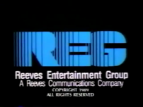
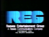
Nicknames: "REG II", "Day-Glo Reeves"
Logo: A stylized blue "R," which is decorated with vertical black stripes on its left side shines against a black background before backing away a bit. A similar "E" slides out from the right of the "R." It shines, the logo backs away, and then a "G" comes out of the right of the "E," shines, and completes the logo. When it stops, the words "Reeves Entertainment Group" appear underneath, and under that appears "A Reeves Communications Company".
Variants:
- On Wild & Crazy Kids, there is a copyright date under it that says "© [YEAR] Reeves Entertainment and MTV Networks". On the 1992 episodes, the copyright stamp reads "© [YEAR] MTV Networks. A Division of Viacom International, Inc. and Reeves Entertainment, A Thames Television Company". Also on this show, the music had some kind of laugh to it and it was part of the end theme. The logo is bylineless on the pilot. The copyright date was also seen on Gimme a Break! and early Kate & Allie episodes from 1985-1986 until it was moved to the end credits, as well as 1988-91 episodes of the talk show The Home Show (also known simply as Home).
- On the 1989 short-lived syndicated version of the game show Jackpot!, a still text "in Association with" is seen above the logo while the logo is animating.
- On Kate & Allie, the animation is in warp-speed.
FX/SFX: Letters shining and coming out of letters.
Music/Sounds: A descending piano theme, then a warm 4-note synth horn theme. Otherwise, the end of the show's theme song.
Availability: Rare.
- It was seen on What Would You Do? and Wild & Crazy Kids!, 1988-91 episodes of The Home Show, Kate and Allie, and the 1989 version of Jackpot!.
- It's also seen on the final two seasons of Gimme a Break!.
Editor's Note: The animation is also simple '80s stuff, but at least the music is soothing and also a bit more creative than the previous two logos.
3rd Logo
(September 19, 1990-March 8, 1995)
 <embed height="173" src="http://wikifoundrytools.com/wiki/closinglogos/widget/unknown/94e54c5b365e1e3a0140db806f792f28489d632b" type="application/x-shockwave-flash" width="213" wmode="transparent"/>
Nicknames: "Drama Faces", "The Thames Logo", "The Comedy/Drama Masks"
Logo: On a black background, we see a smiling drama face that moves up towards the top of the screen, followed by a sad drama face. Underneath the faces, several shards come together to form a blue triangle, and the black background has turned to a dark gray curtain. The text "REEVES ENTERTAINMENT" fades in at the triangle's tip, and the byline "A Thames Television Company" appears below that.
Variants:
- A shortened version exists.
- This appeared on a split-screen alongside the Nickelodeon and the 1991 Thames Television logos on 1992's The Tomorrow People.
- On Doctor, Doctor, this logo is sped-up.
FX/SFX: The moving drama faces, and the shards.
Music/Sounds: Either the same as the last logo, the end-title theme from any show, or silence.
Availability: Rare.
- The only shows known to have this logo are The Home Show, What Would You Do?, the first season of Homicide: Life on the Street, Doctor, Doctor, Covington Cross, and the 1992 remake of The Tomorrow People.
- Of these 5, only Homicide: Life on the Street is commercially available on DVD and VHS, and was airing reruns on Centric until 2012.
Editor's Note: A wonderful CGI logo to end the company on a marvelous note.
