Difference between revisions of "Print Logos - TriStar Pictures"
Jump to navigation
Jump to search
(Created page with "<div class="WPC-editableContent"><font size="3"><i><font color="#ffa500">Compiled by <font color="#333333">Logophile</font></font></i><br/><br/>1st Print Logo<br/><img align="...") |
|||
| Line 1: | Line 1: | ||
| − | <div class="WPC-editableContent"><font size="3"><i><font color="#ffa500">Compiled by <font color="#333333">Logophile</font></font></i><br/><br/>1st Print Logo<br/> | + | <div class="WPC-editableContent"><font size="3"><i><font color="#ffa500">Compiled by <font color="#333333">Logophile</font></font></i><br/><br/>1st Print Logo<br/>[[File:Db0599d265809fa157abf105450afca4.png|85px|TriStar Pictures Print Logo (1984-1991)]](1984-1991)<br/><br/><u>Logo</u>: Pegasus jumping over a triangle with "TRI STAR" inside and "PICTURES" below, with the words in the Didot font.<br/><br/><u>Note</u>: On advertising, this is frequently featured with the text "A TRI-STAR RELEASE" and below is the copyright "<font face="Arial">©<font face="Arial">(YEAR) T<font face="Arial">ri-Star Pictures, Inc. All<font face="Arial"> R<font face="Arial">ights Reserved.".</font></font></font></font></font></font><br/><br/><br/><br/>2nd Print Logo<br/>(1990-1993)<font size="3"><br/><br/><u>Logo</u>: The words "TRI" and "STAR" are big and stacked on top of each other. On the right, next to the "I" in "TRI", is a little version of the logo from before, sans the company name inside the triangle.<br/><br/><u>Notes</u>:</font>[[File:95d9788750493408eb41a92000adb7a0.jpeg|202px|TriStar Pictures Print Logo (1990-1993)]]<div><ul><li><font size="3">This logo actually debuted in 1990 on print ads seen on <i>Variety </i>magazine, but other advertising would use the previous print logo and would slowly ease it out throughout mid-to-late 1991.</font></li><li><font size="3">Sometimes a rectangular box would appear below the logo.</font><br/></li><li><font size="3">Like before, would have "A TRISTAR RELEASE" and copyright next to the logo. By this point the hyphen is taken out of the company name to reflect the slight name change after the formation of Sony Pictures </font><font size="3">Entertainment in 1991.</font></li></ul><font size="3"><br/><br/><br/>3rd Print Logo</font><div><font size="3">(1992- )</font></div><div><font size="3"><br/><u>Logo</u>: A box is seen with a cloud cutting out of it with the Pegasus inside. "TRI STAR" is seen to the left of the box.</font>[[File:8be714683419841a9ce227cff648c037.png|257px|TriStar Pictures Print Logo (1992-)]]<div><font size="3"><br/><u>Notes</u>:</font><ul><li><font size="3">Sometimes this appears with a full color picture of the Pegasus box.</font></li><li><font size="3">Sometimes can be seen with the company name in the Bank Gothic font (like its sister company Columbia Pictures). The name may appear horizontally with the Sony Pictures Entertainment byline or may be stacked on top of each other. The latter can be seen on the spine of the DVD release of <i>Tap</i>.</font></li><li><font size="3">On the side of the original VHS release of <i>Manhattan Murder Mystery</i>, "PICTURES" appears below the company name.</font></li><li><font size="3">MORE INFO TBA<br/></font></li></ul></div></div></div><br/></div> |
Latest revision as of 23:39, 5 November 2020
Compiled by Logophile
1st Print Logo
 (1984-1991)
Logo: Pegasus jumping over a triangle with "TRI STAR" inside and "PICTURES" below, with the words in the Didot font.
Note: On advertising, this is frequently featured with the text "A TRI-STAR RELEASE" and below is the copyright "©(YEAR) Tri-Star Pictures, Inc. All Rights Reserved.".
2nd Print Logo
(1990-1993)
Logo: The words "TRI" and "STAR" are big and stacked on top of each other. On the right, next to the "I" in "TRI", is a little version of the logo from before, sans the company name inside the triangle.
Notes: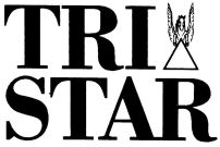
3rd Print Logo
Logo: A box is seen with a cloud cutting out of it with the Pegasus inside. "TRI STAR" is seen to the left of the box.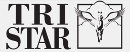
Notes:
1st Print Logo
 (1984-1991)
Logo: Pegasus jumping over a triangle with "TRI STAR" inside and "PICTURES" below, with the words in the Didot font.
Note: On advertising, this is frequently featured with the text "A TRI-STAR RELEASE" and below is the copyright "©(YEAR) Tri-Star Pictures, Inc. All Rights Reserved.".
2nd Print Logo
(1990-1993)
Logo: The words "TRI" and "STAR" are big and stacked on top of each other. On the right, next to the "I" in "TRI", is a little version of the logo from before, sans the company name inside the triangle.
Notes:

- This logo actually debuted in 1990 on print ads seen on Variety magazine, but other advertising would use the previous print logo and would slowly ease it out throughout mid-to-late 1991.
- Sometimes a rectangular box would appear below the logo.
- Like before, would have "A TRISTAR RELEASE" and copyright next to the logo. By this point the hyphen is taken out of the company name to reflect the slight name change after the formation of Sony Pictures Entertainment in 1991.
3rd Print Logo
(1992- )
Logo: A box is seen with a cloud cutting out of it with the Pegasus inside. "TRI STAR" is seen to the left of the box.

Notes:
- Sometimes this appears with a full color picture of the Pegasus box.
- Sometimes can be seen with the company name in the Bank Gothic font (like its sister company Columbia Pictures). The name may appear horizontally with the Sony Pictures Entertainment byline or may be stacked on top of each other. The latter can be seen on the spine of the DVD release of Tap.
- On the side of the original VHS release of Manhattan Murder Mystery, "PICTURES" appears below the company name.
- MORE INFO TBA