Pacific International Enterprises
Jump to navigation
Jump to search
Logo descriptions by Codyfinke2, Eric S. and PAV123
Photos by Eric S.
Video byDudeThatLogo and LogicSmash
Background: Pacific International Enterprises was founded in 1974 by Arthur J. Dubbs, noted for producing family-oriented movies. The company hasn't made anything since 1983, and is now a distributor of its archive. At one point, Carolco Pictures had the television rights to its library.
1st Logo
(1974-1983)
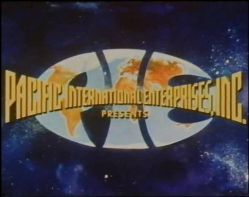
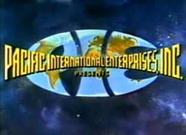
Nickname: "PIE in the Sky"
Logo: On a space background, we see an all-blue version of earth. Then the letters "P", "I", and "E" (in a rounded font) appear on the globe. Then the letters turn from yellow to the globe, this time with the continents colored, as is the rest of earth outside the letters disappear, and "PACIFIC INTERNATIONAL ENTERPRISES, INC." appears. Then "PRESENTS" appears under the company's name.
Variant: On some films, the globe appears smaller, the text is is blue, and "presents" is lacking.
FX/SFX: The animation in the logo.
Music/Sounds: A timpani drum roll, followed by a choral fanfare with three trumpet notes as the letters appear, then more trumpet notes. Sometimes, it is silent. For the later years, the logo had a triumphant orchestral fanfare synchronized with the logo animation.
Availability: Uncommon. Can be seen on films such as the Wilderness Family movies, Dream Chasers, and Across the Great Divide, among others.
Editor's Note: None.
Photos by Eric S.
Video byDudeThatLogo and LogicSmash
Background: Pacific International Enterprises was founded in 1974 by Arthur J. Dubbs, noted for producing family-oriented movies. The company hasn't made anything since 1983, and is now a distributor of its archive. At one point, Carolco Pictures had the television rights to its library.
1st Logo
(1974-1983)


<iframe frameborder="0" height="186" src="http://wikifoundrytools.com/wiki/closinglogos/widget/unknown/9d797d648adee1490497fe05b8fb81518d9e5dbe" width="329"></iframe><iframe frameborder="0" height="186" src="http://wikifoundrytools.com/wiki/closinglogos/widget/unknown/41459992fc988bb146308fce3af9ce3beae91422" width="329"></iframe>
Nickname: "PIE in the Sky"
Logo: On a space background, we see an all-blue version of earth. Then the letters "P", "I", and "E" (in a rounded font) appear on the globe. Then the letters turn from yellow to the globe, this time with the continents colored, as is the rest of earth outside the letters disappear, and "PACIFIC INTERNATIONAL ENTERPRISES, INC." appears. Then "PRESENTS" appears under the company's name.
Variant: On some films, the globe appears smaller, the text is is blue, and "presents" is lacking.
FX/SFX: The animation in the logo.
Music/Sounds: A timpani drum roll, followed by a choral fanfare with three trumpet notes as the letters appear, then more trumpet notes. Sometimes, it is silent. For the later years, the logo had a triumphant orchestral fanfare synchronized with the logo animation.
Availability: Uncommon. Can be seen on films such as the Wilderness Family movies, Dream Chasers, and Across the Great Divide, among others.
Editor's Note: None.
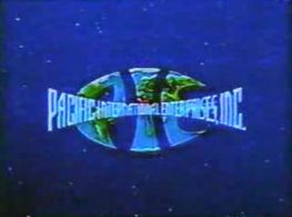
2nd Logo
(1993?- )
<iframe frameborder="0" height="186" src="http://wikifoundrytools.com/wiki/closinglogos/widget/unknown/cd2492bb70c7d45b1d637b2dbda51ad2d7a2a97a" width="329"></iframe>
Logo: On a moving space background we see a silver oval spinning into the middle of the screen as the metallic outlines of the letters from the previous logo rotate into the oval. When they do so a world map with a wireframe texture fades into the letters. The "PACIFIC INTERNATIONAL ENTERPRISES" text from before, this time in gold drops down to the middle of the letters which fade away in the process. The silver text "A universal force in family entertainment" fades in beneath the text.
FX/SFX: Everything in breathtaking CGI! This logo will hold up even by today's standards.
Music/Sounds: A triumphant fanfare.
Availability: First seen on The Challenge. This plastered the previous logo on DVD prints of Across the Great Divideand possibly on other previous films by the company.
Editor's Note: None.