Orange Sky Golden Harvest Entertainment Co. (Hong Kong)
Jump to navigation
Jump to search
Editions by mr3urious
Video captures courtesy of The Logo Hub, Movie Related Logos, Peakpasha, Logo Archive, DudeThatLogo, and Jason Malcolm
Background: Orange Sky Golden Harvest Entertainment is a film production, distribution, and exhibition company based in Hong Kong. It dominated Hong Kong box office sales from the 1970s to 1980s and played a major role in introducing Hong Kong films to the Western market, especially those by Bruce Lee (Concord Productions), Jackie Chan, and Sammo Hung.
Golden Harvest
1st Logo
(1970-1972)
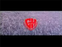
Nicknames: "GH Shield", "Warner Bros. Rip-Off", "Wheat Bros.", "Chinese Warner Bros. Shield"
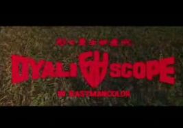
Logo: Set on a shot of a wheat field, we see "GH" in a shielded font similar to the WB shield sitting on what appears to be a wreath. It then fades out to some Chinese text with "GOLDEN HARVEST LTD. PRODUCTION" below. Then it fades out and is replaced by "DYALI SCOPE" with "GH" between "DYALI" and "SCOPE", some Chinese text above it, and "EASTMANCOLOR" underneath.
FX/SFX: Mostly live-action.
Music/Sounds: A slow bombastic fanfare with French horns (Orchestral Opening #2 by Cyril Watters, from the Thomas J. Valentino music library). There is a second fanfare where we start with a drum roll, then 5 changing notes which slows down with 4 notes, then 2 more during "DYALI SCOPE".
Availability: Rare. This logo was frequently plastered with either the 1978 Golden Harvest, or Media Asia Group logos, but now with the GH library under Fortune Star's hands, this logo has begun to resurface again on recent prints.
Editor's Note: TBA
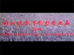
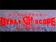
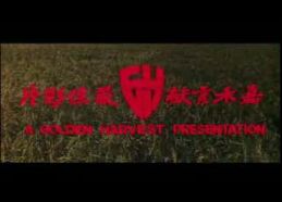
2nd Logo
(1971-1972)
<iframe frameborder="0" height="178" src="http://wikifoundrytools.com/wiki/closinglogos/widget/unknown/ea698a4ab876f7f6db0219deecc6f4198be46cb7" width="234"></iframe>
Nicknames: "GH Shield II", "Warner Bros. Rip-Off II", "Wheat Bros. II", "Chinese Warner Bros Shield II"
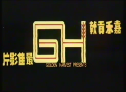
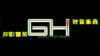
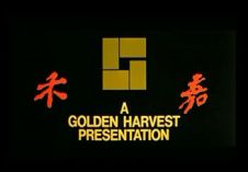
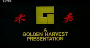
Logo: Set on a shot of a wheat field, we see the same "GH" from before, but without the wreath. The text "A GOLDEN HARVEST PRESENTATION" appears under it. Chinese characters appear left and right of the shield. Then the logo fades out, being replaced by the same Dyali Scope/Eastmancolor info from before but with "IN EASTMANCOLOR"
FX/SFX: Mostly live-action.
Music/Sounds: The second fanfare from the first logo.
Availability: Rare, see above.
Editor's Note: TBA
3rd Logo
(1972-1978)
Nicknames: "White Red-Lined GH", "Wheat Ears"
Logo: On a black background, a white "GH" is drawing. Then a thin red line is drawing in the "GH". Finally, a wheat-ear is drawn at the top right side of the "H". Four yellow Chinese characters appear on both sides of the logo, and "GOLDEN HARVEST PRESENTS", also in yellow, appears under it.
FX/SFX: The "GH" and wheat drawing, the Chinese letters drawing.
Music/Sounds: A suspenseful fanfare followed by xylophone tinkles as the wheat ear is drawn, then ending with a loud trumpet fanfare.
Availability: Rare. This logo was frequently plastered with either the 1978 Golden Harvest, or Media Asia Group logos. Now with the GH library under Fortune Stars hands, this logo has begun to resurface again on recent prints. This can be seen (in full) on the trailer for When Taekwondo Strikes (1973), which is on the Shout! Factory Angela Mao Ying DVD collection.
Editor's Note: None.
4th Logo
(1978-January 23, 2003)
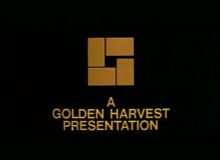
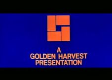
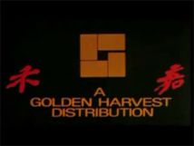
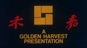
Nickname: "The Rectangle G"
Logo: On a black BG, we see 4 orange rectangles appearing each rectangle, forming a "G". Then it zooms out as the "G" changes colors. The "G" finally becomes yellow, and then stops zooming, and "A GOLDEN HARVEST PRESENTATION" flashes in under the "G", along with two red Chinese characters on both sides of the rectangle. The text sparkles.
Video captures courtesy of The Logo Hub, Movie Related Logos, Peakpasha, Logo Archive, DudeThatLogo, and Jason Malcolm
Background: Orange Sky Golden Harvest Entertainment is a film production, distribution, and exhibition company based in Hong Kong. It dominated Hong Kong box office sales from the 1970s to 1980s and played a major role in introducing Hong Kong films to the Western market, especially those by Bruce Lee (Concord Productions), Jackie Chan, and Sammo Hung.
Golden Harvest
1st Logo
(1970-1972)


<iframe frameborder="0" height="167" src="http://wikifoundrytools.com/wiki/closinglogos/widget/unknown/5da7d1049fc29c74f211061858036e0c277d616c" width="296"></iframe>
Logo: Set on a shot of a wheat field, we see "GH" in a shielded font similar to the WB shield sitting on what appears to be a wreath. It then fades out to some Chinese text with "GOLDEN HARVEST LTD. PRODUCTION" below. Then it fades out and is replaced by "DYALI SCOPE" with "GH" between "DYALI" and "SCOPE", some Chinese text above it, and "EASTMANCOLOR" underneath.
FX/SFX: Mostly live-action.
Music/Sounds: A slow bombastic fanfare with French horns (Orchestral Opening #2 by Cyril Watters, from the Thomas J. Valentino music library). There is a second fanfare where we start with a drum roll, then 5 changing notes which slows down with 4 notes, then 2 more during "DYALI SCOPE".
Availability: Rare. This logo was frequently plastered with either the 1978 Golden Harvest, or Media Asia Group logos, but now with the GH library under Fortune Star's hands, this logo has begun to resurface again on recent prints.
Editor's Note: TBA
2nd Logo
(1971-1972)


<iframe frameborder="0" height="178" src="http://wikifoundrytools.com/wiki/closinglogos/widget/unknown/ea698a4ab876f7f6db0219deecc6f4198be46cb7" width="234"></iframe>
Nicknames: "GH Shield II", "Warner Bros. Rip-Off II", "Wheat Bros. II", "Chinese Warner Bros Shield II"
Logo: Set on a shot of a wheat field, we see the same "GH" from before, but without the wreath. The text "A GOLDEN HARVEST PRESENTATION" appears under it. Chinese characters appear left and right of the shield. Then the logo fades out, being replaced by the same Dyali Scope/Eastmancolor info from before but with "IN EASTMANCOLOR"
FX/SFX: Mostly live-action.
Music/Sounds: The second fanfare from the first logo.
Availability: Rare, see above.
Editor's Note: TBA
3rd Logo
(1972-1978)


<iframe frameborder="0" height="167" src="http://wikifoundrytools.com/wiki/closinglogos/widget/unknown/064cd6f3573fe8a49a69cb36ca289c2c04c7f5fc" width="296"></iframe><iframe frameborder="0" height="167" src="http://wikifoundrytools.com/wiki/closinglogos/widget/unknown/069a5afa9a1c4deca9c7d3f8db672af1db0a5d4a" width="296"></iframe>
Nicknames: "White Red-Lined GH", "Wheat Ears"
Logo: On a black background, a white "GH" is drawing. Then a thin red line is drawing in the "GH". Finally, a wheat-ear is drawn at the top right side of the "H". Four yellow Chinese characters appear on both sides of the logo, and "GOLDEN HARVEST PRESENTS", also in yellow, appears under it.
FX/SFX: The "GH" and wheat drawing, the Chinese letters drawing.
Music/Sounds: A suspenseful fanfare followed by xylophone tinkles as the wheat ear is drawn, then ending with a loud trumpet fanfare.
Availability: Rare. This logo was frequently plastered with either the 1978 Golden Harvest, or Media Asia Group logos. Now with the GH library under Fortune Stars hands, this logo has begun to resurface again on recent prints. This can be seen (in full) on the trailer for When Taekwondo Strikes (1973), which is on the Shout! Factory Angela Mao Ying DVD collection.
Editor's Note: None.
4th Logo
(1978-January 23, 2003)


<iframe frameborder="0" height="150" src="http://wikifoundrytools.com/wiki/closinglogos/widget/unknown/8c0f4d9345017f08e43b8f4f384167021c1f4f5c" width="266"></iframe><iframe frameborder="0" height="150" src="http://wikifoundrytools.com/wiki/closinglogos/widget/unknown/f17351be486210bde6f2dc38abc2014e2c30e1f6" width="266"></iframe><iframe frameborder="0" height="150" src="http://wikifoundrytools.com/wiki/closinglogos/widget/unknown/a8ec3304adeb337dc3b4ad493f7eccab25add71a" width="266"></iframe><iframe frameborder="0" height="150" src="http://wikifoundrytools.com/wiki/closinglogos/widget/unknown/309f7f15323f04dd98eb72fc80ee37da7af2ecd9" width="266"></iframe>
Nickname: "The Rectangle G"
Logo: On a black BG, we see 4 orange rectangles appearing each rectangle, forming a "G". Then it zooms out as the "G" changes colors. The "G" finally becomes yellow, and then stops zooming, and "A GOLDEN HARVEST PRESENTATION" flashes in under the "G", along with two red Chinese characters on both sides of the rectangle. The text sparkles.
Trivia: This logo was spoofed in the Dragon Ball episode "He's Here! The Mighty Enemy Giran" ("Monster Beast Giran" on English releases). The spoof had parts of the Japanese character "武" appearing in the same way the rectangles appear.
Variants:
FX/SFX: The rectangles forming the "G".
Music/Sounds: It starts out with 4 drumbeats as the rectangles appear, then a synth tune plays, ending with a high synth note as the text appears. Later on, the music was rearranged with different instruments. Sometimes may be silent or may have the opening theme of the movie playing over it.
Music/Sounds Variants:
Editor's Note: This is a favorite among Asian film and martial arts fans.
5th Logo
(2002-2009?)
 Nicknames: "Writing GH on Golden Plate", "Golden Harvest GH"
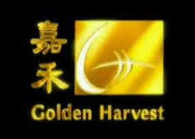
Logo: On a black background, we see a "G" and an "H" being drawn. As it is done drawing, a gold square/plate appears, shimmering, with 2 Chinese characters next to it, which zooms out. Then "Golden Harvest" appears under the square/plate.
FX/SFX: The animation in the logo.
Music/Sounds: A more triumphant, more orchestral remake of the 1978 theme, playing in sync with the animation.
Availability: Common. It was also seen on the www.goldenharvest.com website.
 <iframe frameborder="0" height="204" src="http://wikifoundrytools.com/wiki/closinglogos/widget/unknown/63f1bc689d568ca110908fb31ec0b2a2bd191859" width="361"></iframe>
Nicknames: "Bronze Harvest", "Wheat Field", "The Ultra-Majestic Rectangle G"
Editor's Note: TBAVariants:
- There is a version which lacks the Chinese characters, mainly for international releases of their films.
- A blue-background version (also lacking the Chinese characters) also exists.
- There is another version which reads "A GOLDEN HARVEST DISTRIBUTION" in a slightly different font as well as the logo off-center.
- Sometimes, the Chinese characters are shifted up higher.
- Around late 1998 to 2003, The logo was slighty redid, the color change of "G" is brightness with wipe effect and the word "A GOLDEN HARVEST PRESENTATION (or DISTRIBUTION)" text are slightly different along with Chinese text were fade in with no sparkles.
FX/SFX: The rectangles forming the "G".
Music/Sounds: It starts out with 4 drumbeats as the rectangles appear, then a synth tune plays, ending with a high synth note as the text appears. Later on, the music was rearranged with different instruments. Sometimes may be silent or may have the opening theme of the movie playing over it.
Music/Sounds Variants:
- On the 1978 re-release of Return of the Dragon, the Golden Harvest logo has the music from the Bryanston Pictures logo underneath.
- On some recent Fortune Star prints of GH films, the music from the 1994-2000 Media Asia logo would be heard, due to poor reverse plastering.
- On Blu-Ray prints of Miracles, it uses the Golden Way Films music, due to an editing mistake.
- On Interactive Murders, Funny Business, and 2002 (Nicholas Tse Film), the 1978 music is used on the 1998 logo.
- On 1992 Korean VHS of The Best of the Martial Arts Films, the music was slowed down and it's double low pitched was used.
- On Big Bullet (1996) the music was rearranged but if you listen closely at the end you can hear the 1978 music combined.
- On early films includingChina O'Brien, the music was re-orchestrated to make it more synthesized.
Editor's Note: This is a favorite among Asian film and martial arts fans.
5th Logo
(2002-2009?)
 Nicknames: "Writing GH on Golden Plate", "Golden Harvest GH"
Logo: On a black background, we see a "G" and an "H" being drawn. As it is done drawing, a gold square/plate appears, shimmering, with 2 Chinese characters next to it, which zooms out. Then "Golden Harvest" appears under the square/plate.
FX/SFX: The animation in the logo.
Music/Sounds: A more triumphant, more orchestral remake of the 1978 theme, playing in sync with the animation.
Availability: Common. It was also seen on the www.goldenharvest.com website.
Editor's Note: TBA
---------------------------------------------------------------------------------------------
Orange Sky Golden Harvest Entertainment Co.
(2010- )
Orange Sky Golden Harvest Entertainment Co.
(2010- )
 <iframe frameborder="0" height="204" src="http://wikifoundrytools.com/wiki/closinglogos/widget/unknown/63f1bc689d568ca110908fb31ec0b2a2bd191859" width="361"></iframe>
Nicknames: "Bronze Harvest", "Wheat Field", "The Ultra-Majestic Rectangle G"
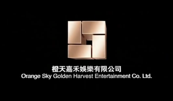
Logo: We zoom out from a steam of wheat in a golden wheat field. From this wheat, a light moves out of it and above the wheat field. The light then descends and flattens the wheat field. When, we zoom out, the unflattened wheat is the 1978 logo. The field then wipes out, forming a bronze CGI version of the "Rectangle G" as the logo straightens and white letters in both Cantonese and English reveal the company's name.
FX/SFX: The movement of the light flattening the wheat field, and the CGI of the logo.
Music/Sounds: Same as the last logo, but with added ambiance sounds from the field.
Availability: Should be on all current films produced and distributed by Orange Sky Golden Harvest.
FX/SFX: The movement of the light flattening the wheat field, and the CGI of the logo.
Music/Sounds: Same as the last logo, but with added ambiance sounds from the field.
Availability: Should be on all current films produced and distributed by Orange Sky Golden Harvest.