National Educational Television
Jump to navigation
Jump to search
Music/Sounds/Voice-over Variants: On Parents and Dr. Spock, over the ending theme, a male announcer says "From WQED, First in community television." After the WQED credit fades out, he then says "This is National Educational Television."
Editor's Note: None.
![[Untitled]](/images/thumb/e/e5/C0ae7656ca70b9e1608533bdf4b41088.png/276px-C0ae7656ca70b9e1608533bdf4b41088.png) <iframe align="bottom" frameborder="0" height="196" src="http://wikifoundrytools.com/wiki/closinglogos/widget/genericvideo/3a5909e22cbee55c0dcfeaa594dbe48ee39bc627" width="349"></iframe>
<iframe align="bottom" frameborder="0" height="196" src="http://wikifoundrytools.com/wiki/closinglogos/widget/genericvideo/3a5909e22cbee55c0dcfeaa594dbe48ee39bc627" width="349"></iframe>
 <iframe align="bottom" frameborder="0" height="200" src="http://wikifoundrytools.com/wiki/closinglogos/widget/genericvideo/3a280cbe673834c2c080e8990920ccc91f9684e5" width="354"></iframe>
 <iframe frameborder="0" height="205" src="http://wikifoundrytools.com/wiki/closinglogos/widget/genericvideo/a59ccde77b9750f988d33062dd62894b10a9bc8b" width="269"></iframe>
Editor's Note: While it is not as widely remembered as the 1968 logo and future PBS logos, this is one of the first to be recognized more widely compared to the previous logos.
12th Logo
(April 1967-November? 1970)
Nicknames: "The Roof", "The Most Iconic NET Logo", "The NET House III"
Logo: First, the left section of the screen fills with red from the bottom, the middle section fills with yellow from the top, and the right section fills with blue from the bottom. One by one, each colored section flips to form the letters "NET" on a black background. Then either one of two things would happen:
FX/SFX: The flipping effects.
Availability: Extremely rare. The B&W 1967 logo made an appearance on the VHS release of Our Neighbor, Fred Rogers, but has been cut from TV rebroadcasts of the documentary since 2003. It can be seen on several shows available for viewing at The Paley Center for Media, including the series premiere episodes of Mister Rogers' Neighborhood (1967 version, B&W), Black Journal (1967 version, color), and Sesame Street (1968 version, color). Though the videocassette release of the Mister Rogers' Neighborhood episode "Death of a Goldfish" plasters the standard version of the 1968 logo with the 1971 PBS logo, the show's in-credit variant remains. The 1968 opening and closing versions can also be seen on the Sesame Street: Old School Volume 2 DVD set on the test pilot episode, and the 1968 closing version can be found on a handful of 1969-70 Mister Rogers' Neighborhood episodes on Twitch (most plaster it with the 1971 PBS logo). The 1967 closing version can be found on all 1968 black and white episodes of Mister Rogers' Neighborhood, including episodes streaming on Twitch as well as episodes 1-5 on Amazon. The 1968 alternative closing logo is quite rare, it can be seen on Black Journal (1967 version, color). Its last confirmed new appearance was on Realities; the 1970 PBS logo plasters it on repeats, as seen on the series premiere (this logo can be found on a film print of the same show). The special program variant appears on Assessment of Cambodia. This logo first appeared on Conversations 1967. All variants, color and B&W, can be seen on over 100+ programs available for viewing on the American Archive of Public Broadcasting website.
Editor's Note: This is by far the most well known NET logo. With its mellotron fanfare, the announcer, the dark background, and the poor audio and grainy film quality, it gained a reputation of frightening children who grew up with Mister Rogers Neighborhood or Sesame Street. It is one of the more fascinating logos in the history of NET/PBS.
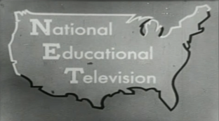
Background: NET (National Educational Television) was a former major educational and public TV network, founded in early 1952 and incorporated in November of that year. Among their original affiliates were WNET New York, KCET Los Angeles, WGBH Boston, WQED Pittsburgh, WETA Washington D.C., and various others. Originating from The Educational Television and Radio Center from 1952-1959, and later The National Educational Television and Radio Center from 1959 to 1962, when the radio portion was dropped. It was succeeded by PBS in 1970, due to the Corporation of Public Broadcasting and the Ford Foundation pulling its funding. It merged with WNDT to become the Educational Broadcasting Corporation, the parent company of WNET, in 1972.
1st Logo
(November 4, 1952-1955)
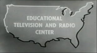
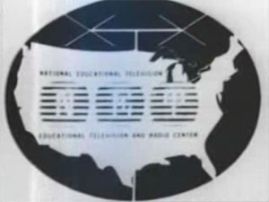 Nicknames: "NET Map of America", "The United States of NET", "Antenna on Map"
Logo: This logo consists of the typewriter letters "NET", each in a segmented rounded square, on a white map of the U.S. inside a black circle on a white background, with what looks like an antenna on the map. "NATIONAL EDUCATIONAL TELEVISION" and "EDUCATIONAL TELEVISION AND RADIO CENTER" are shown above and below, respectively, in very small print.
Variant: On Parents and Dr. Spock, a credit for WQED with the slogan "First in Community Television" below that, is superimposed over the NET logo, then fades out.
(November 4, 1952-1955)
 Nicknames: "NET Map of America", "The United States of NET", "Antenna on Map"
Logo: This logo consists of the typewriter letters "NET", each in a segmented rounded square, on a white map of the U.S. inside a black circle on a white background, with what looks like an antenna on the map. "NATIONAL EDUCATIONAL TELEVISION" and "EDUCATIONAL TELEVISION AND RADIO CENTER" are shown above and below, respectively, in very small print.
FX/SFX: None.
Music/Sounds: None.
Music/Sounds: None.
Music/Sounds/Voice-over Variants: On Parents and Dr. Spock, over the ending theme, a male announcer says "From WQED, First in community television." After the WQED credit fades out, he then says "This is National Educational Television."
Availability: This logo appears on Window Watchers and showed up three times on Because of You: 50 Years of Channel 9. Also seen on Parents and Dr. Spock.
Editor's Note: This logo, despite being basic, is an interesting look back at the very early years of what would become PBS, back when it was a limited service for distributing educational films produced by local stations nationally.
Editor's Note: This logo, despite being basic, is an interesting look back at the very early years of what would become PBS, back when it was a limited service for distributing educational films produced by local stations nationally.
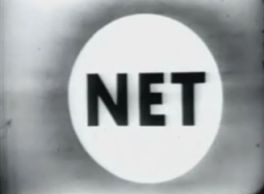
2nd Logo
(1955-1959)
(1955-1959)


Nicknames: "The NET Circle", "Spotlight", "Big, White Shine"
Logo: On a gray background, we see a white circle with "NET" written in black.
Variant: A variant where the background is black, and the circle is white except for the inside, exists. Another variant is essentially the normal logo, but the background is significantly darker this time around.
FX/SFX: None.
Music/Sounds: Just an announcer saying "This is National Educational Television."
Availability: This logo appears onDiscovery at the Brookfield Zoo, Search for America, and The Exceptional Child,as well asThe Role of Congress. This logo can be seen at the end of some programs on the American Archive of Public Broadcasting website.
Editor's Note: None.
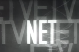
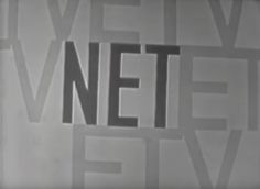
3rd Logo
(1958)


Nickname: "ETVNETETV"
Logo: On a black background, we see gray text that reads "ETV". In the middle, we see white letters that say"NET".
Variant: A inverted variant exists.
FX/SFX: None.
Music/Sounds: The end theme of the program.
Availability: Seen on Ten For Survival. The inverted variant appears on an episode of The Subject is Jazz, titled "Swing". Both productions are in collaboration with NBC.
Editor's Note: This logo appears to have been used for NBC co-productions, since all of its appearances (as discovered so far) have been on such.
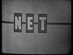
4th Logo

(1958-19??)
Nicknames: "Boxes", "Epitome of 50's Graphic Design", "Art Deco Carpet Design"
Logo: On a carpet like background, the words NET appear in multicolored boxes across on a white line.
FX/SFX: None.
Music/Sounds: The ending theme of the program.
Availability: This was recently rediscovered on a print of The Subject is Jazz. It is currently unknown if this logo appeared on any other program.
Editor's Note: This logo is an oddity, as the existence of this logo was essentially unknown until recently.
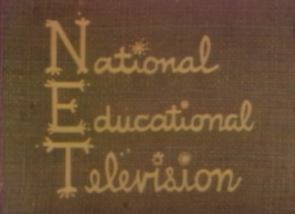
5th Logo
(1956-1961)

<iframe align="bottom" frameborder="0" height="161" src="http://wikifoundrytools.com/wiki/closinglogos/widget/genericvideo/d3786fc1aaea820be65a04e7db1576d721611634" width="290"></iframe><iframe frameborder="0" height="161" src="http://wikifoundrytools.com/wiki/closinglogos/widget/genericvideo/f3bce6bd1a5e202e8a646a489046ae3f1e56c3aa" width="277"></iframe>
Nicknames: "NET Map of America II", "Animated NET Map", "The United States of NET II"
Logo: We see a close-up of the letters "N", "E", and "T", each in a black box, positioned along the coast of California on a gray background. The camera zooms away from the letters, revealing a complete map of America, with a white line along the West Coast and Northernmost states. The boxes shoot to the right, revealing "National", "Educational", and "Television". Then, the text fades into the words "EDUCATIONAL TELEVISION AND RADIO CENTER".
Logo: We see a close-up of the letters "N", "E", and "T", each in a black box, positioned along the coast of California on a gray background. The camera zooms away from the letters, revealing a complete map of America, with a white line along the West Coast and Northernmost states. The boxes shoot to the right, revealing "National", "Educational", and "Television". Then, the text fades into the words "EDUCATIONAL TELEVISION AND RADIO CENTER".
Closing Variant: The logo plays in reverse.
Variants: There is a still variant, and a variant where the ETRC card does not show up. Another variant features an inverted color scheme.
FX/SFX: The animation of the map and the letters.
Music/Sounds/Voice-over: Just an announcer saying "This is National Educational Television." The still variant uses a different announcer. Another variant features the announcer saying "Educational Television and Radio Center" in addition when said card pops up, for both opening and closing variants.
Editor's Note: One of the first NET logos to feature animation, albeit limited.
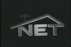
6th Logo
(1959-1961)
 Nicknames: "NET in a House", "The NET House"
Logo: On a grey background, we see an early version of the NET House logo, which is a black house with the words "NET" inside and an antenna in the roof.
FX/SFX: None.
Music/Sounds/Voice-over: An announcer says either "This is National Educational Television" or "This is N-E-T, National Educational Television."
Availability: Extremely rare. It appears on That Free Men May Live: Martin Luther King, Jr., which is available for viewing on PBS.org. The logo can also be seen on Prospects of Mankind with Eleanor Roosevelt,available for viewing on the American Archive of Public Broadcasting website.
Editor's Note: An introduction of the iconic house motif, marking the start of the most recognizable NET logo, and associating the network with said logo/motif. However, this is most likely a prototype/placeholder logo as the design does seem rough.
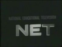
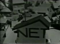
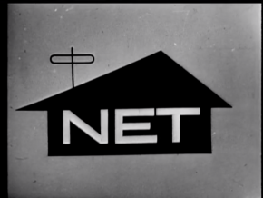
7th Logo
(1959-October 2, 1966)
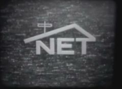
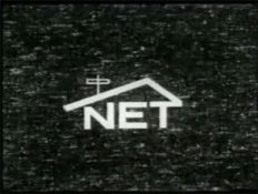
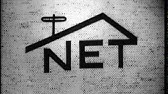
Nicknames: "The Carpet", "The NET House II", "The House on TV Static"
Logo: On a dark background with little white "stars" (kinda looks like carpet, but is actually supposed to represent TV static), we see a redesigned version of the "House" logo in white (The words "NET" with the "T" connecting to a roof that hangs over the "N" and "E", with an antenna sticking out of the roof, making the N look pretty squished). The style of this "NET House" logo would be used later on.
Music/Sounds/Voice-over:
Availability: Rare. One surviving source is a 1960 episode of the WTTW Chicago series Beginnings, which was formerly available for viewing on the Museum of Broadcast Communications Archives website. This can now be seen on over 50+ programs on the American Archive of Public Broadcasting website.
Editor's Note: The background looks like they just aimed the camera at the floor (hence the nickname).
Music/Sounds/Voice-over: Just an announcer saying "This is National Educational Television." The still variant uses a different announcer. Another variant features the announcer saying "Educational Television and Radio Center" in addition when said card pops up, for both opening and closing variants.
Availability: Much like the second logo, it is unknown if film prints at the Museum of Broadcast Communications have this logo, however it did show up once on the 50th anniversary special for KVIE in Sacramento. The still variant can be found on The Born Criminal, The Exceptional Child and On The Shoulder Of Giants (which appears to be the last time it appeared).The animated variant appears on Channelizing Aggression; The Impact of Personalities. The animated closing variant appears on Books and Ideas. The variant with the announcer saying "Educational Television and Radio Center" can be spotted on Religions of Man.The inverted variant appears on KUHT-TV'sMexicana.This can be seen at the end of many programs available for viewing on the American Archive of Public Broadcasting website.
Editor's Note: One of the first NET logos to feature animation, albeit limited.
6th Logo
(1959-1961)

Logo: On a grey background, we see an early version of the NET House logo, which is a black house with the words "NET" inside and an antenna in the roof.
FX/SFX: None.
Music/Sounds/Voice-over: An announcer says either "This is National Educational Television" or "This is N-E-T, National Educational Television."
Availability: Extremely rare. It appears on That Free Men May Live: Martin Luther King, Jr., which is available for viewing on PBS.org. The logo can also be seen on Prospects of Mankind with Eleanor Roosevelt,available for viewing on the American Archive of Public Broadcasting website.
Editor's Note: An introduction of the iconic house motif, marking the start of the most recognizable NET logo, and associating the network with said logo/motif. However, this is most likely a prototype/placeholder logo as the design does seem rough.
7th Logo
(1959-October 2, 1966)


<embed height="158" src="http://wikifoundrytools.com/wiki/closinglogos/widget/genericvideo/c031a2567ef0c718550b9cd8d2c0b1ed40fd24e8" type="application/x-shockwave-flash" width="158" wmode="transparent"/><iframe frameborder="0" height="160" src="http://wikifoundrytools.com/wiki/closinglogos/widget/genericvideo/bc7cf7ea4f7a79e62ab3f6206c77db9d49ab9a48" width="279"></iframe><iframe frameborder="0" height="160" src="http://wikifoundrytools.com/wiki/closinglogos/widget/genericvideo/f468f5b1ae751ae208552a8f05390b94141b2550" width="211"></iframe><iframe frameborder="0" height="161" src="http://wikifoundrytools.com/wiki/closinglogos/widget/genericvideo/f7ff227d547895c3bba5ae8fedeb0e01ebfb88b2" width="279"></iframe><iframe frameborder="0" height="160" src="http://wikifoundrytools.com/wiki/closinglogos/widget/genericvideo/601d6f76f954f90016bfcce92f42b29674cd0d29" width="278"></iframe>
Nicknames: "The Carpet", "The NET House II", "The House on TV Static"
Logo: On a dark background with little white "stars" (kinda looks like carpet, but is actually supposed to represent TV static), we see a redesigned version of the "House" logo in white (The words "NET" with the "T" connecting to a roof that hangs over the "N" and "E", with an antenna sticking out of the roof, making the N look pretty squished). The style of this "NET House" logo would be used later on.
FX/SFX: None.
Music/Sounds/Voice-over:
- Until October 1962, an announcer (Edward R. Murrow) said "This is National Educational Television."
- An alternate version of the logo featured the announcer saying, "This is N-E-T, National Educational Television." It is unknown what year this began being used, but it outlived its predecessor, being used until 1966.
- Another variant has a V/O which says "This is N-E-T, the National Educational Television network."
- An inverted variant appears on an 1960s episode of Perspectives. On the same episode, an opening variant (also inverted) appears with the text reading "NATIONAL EDUCATIONAL TELEVISION presents PERSPECTIVES", replacing the NET House logo while the static background is retained.
Availability: Rare. One surviving source is a 1960 episode of the WTTW Chicago series Beginnings, which was formerly available for viewing on the Museum of Broadcast Communications Archives website. This can now be seen on over 50+ programs on the American Archive of Public Broadcasting website.
Editor's Note: The background looks like they just aimed the camera at the floor (hence the nickname).
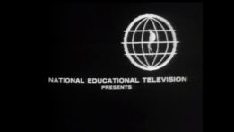
8th Logo
(1961-19??; 1970)
![[Untitled]](/page/File:C0ae7656ca70b9e1608533bdf4b41088.png) <iframe align="bottom" frameborder="0" height="196" src="http://wikifoundrytools.com/wiki/closinglogos/widget/genericvideo/3a5909e22cbee55c0dcfeaa594dbe48ee39bc627" width="349"></iframe>
<iframe align="bottom" frameborder="0" height="196" src="http://wikifoundrytools.com/wiki/closinglogos/widget/genericvideo/3a5909e22cbee55c0dcfeaa594dbe48ee39bc627" width="349"></iframe>Nicknames: "Smooth NET House", "Generic NET House", "Plain NET House"
Logo: Same as the previous logo, but the background is completely dark gray, and has a smooth texture.
FX/SFX: None.
Music/Sounds/Voice-over: Same as last logo.
Availability: First appeared on Conversation with Dean Rusk and last appeared on Of Broccoli and Pelicans and Celery and Seals. This logo also appears on Pathfinders.
Editor's Note: Another oddity, this time in terms of how and when it was used.
9th Logo (What's New? Variant)
(1961-1970)

Nicknames: "Marching Band Children", "Backwards Musical Trio", "Sparkles on Jeans"
Opening Logo: On a blue cloth like background, "NET" appears in big bold letters, with "presents" underneath and sparkles appear.
Closing Logo: On a rough sepia background, 3 children appear marching backwards, forming the words"National Educational Television",all stacked on top of each other.
Variant: This logo debuted in black and white.
FX/SFX: 2D Animation.
Music/Sounds: An announcer saying "This is National Educational Television" with the closing theme playing in the background.
Availability: Appears on What's New?.
Editor's Note: None.
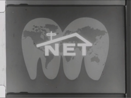
10th Logo (Perspectives variant)
(1962)
 <iframe align="bottom" frameborder="0" height="200" src="http://wikifoundrytools.com/wiki/closinglogos/widget/genericvideo/3a280cbe673834c2c080e8990920ccc91f9684e5" width="354"></iframe>
Nicknames: "The Animated NET House Globe", "NET Map (Sort of) Returns!", "A New Perspective of the NET House", "NET House On a Globe", "Foldable Earth Diagram"
Logo: After the closing titles of the show, the globe that is spinning around suddenly folds out to a 2D model of the globe, and then 3 letters: "N", "E", "T", appear vertically at the left side of the globe, then rearrange to appear horizontally, slides to the middle, and then the roof is drawn over the NET text, with the N slightly shrinking to make room for the roof.
FX/SFX: Typical 60's 2-D Animation.
Music/Sounds: The closing theme of the show.
Availability: Appears on Perspectives.
Editor's Note: A unique and wonderful logo, one of the few animated custom logos NET has had.
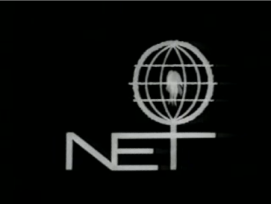
11th Logo
(1963-June 1967)
(1963-June 1967)

 <iframe frameborder="0" height="205" src="http://wikifoundrytools.com/wiki/closinglogos/widget/genericvideo/a59ccde77b9750f988d33062dd62894b10a9bc8b" width="269"></iframe>
Nickname: "NET Fire Cage", "The Dancing Birdcage", "Buffering YouTube Dots"
Logo: On a black screen, several dots flash near the center of the screen (a la the Screen Gems “Dancing Sticks” logo, or like YouTube dots while a video is buffering), and then we see a circle being drawn in the counter-clockwise direction. A line is drawn through the circle going downwards, which quickly vanishes. A small fire can be seen starting within the circle. Another line is drawn through the center of the circle from left to right. Two lines similar to a Worldvision-like globe are drawn. Another pair, closer to the circle are drawn, like that of the first lines, and then two horizontal lines above the first horizontal line. The camera zooms backwards and we see a thick line (the top of the "T") being drawn under the ball of fire, which later connects to the ball of fire. A vertical line (the beginning of the "N") is then formed. The "T" then finishes, and then the diagonal part of the "N" appears. Lastly, the "E" is formed. The fire continues blazing until we fade out.
Logo: On a black screen, several dots flash near the center of the screen (a la the Screen Gems “Dancing Sticks” logo, or like YouTube dots while a video is buffering), and then we see a circle being drawn in the counter-clockwise direction. A line is drawn through the circle going downwards, which quickly vanishes. A small fire can be seen starting within the circle. Another line is drawn through the center of the circle from left to right. Two lines similar to a Worldvision-like globe are drawn. Another pair, closer to the circle are drawn, like that of the first lines, and then two horizontal lines above the first horizontal line. The camera zooms backwards and we see a thick line (the top of the "T") being drawn under the ball of fire, which later connects to the ball of fire. A vertical line (the beginning of the "N") is then formed. The "T" then finishes, and then the diagonal part of the "N" appears. Lastly, the "E" is formed. The fire continues blazing until we fade out.
Variant: A still, opening variant of the last shot of the logo with the NET text replaced by "NATIONAL EDUCATIONAL TELEVISION presents" appears onGreat Decisions 1966.
FX/SFX: The dots, the live-action fire, and the lines being drawn.
Music/Sounds/Voice-over: Pinball-like dings to start, which turns into a bombastic but brief brass piece. Almost immediately afterward, an announcer can be heard saying "The following program is from N-E-T, the National Educational Television network." (opening) or "This is N-E-T, the National Educational Television network.". (closing)
Availability: Extremely rare. Can be seen on the 1965 program Changing the World: Southeast Asia, the Other War, the 1967 program Aphasia, the road back, both formerly available for viewing on the Museum of Broadcast Communications Archives website, and on the 1965 James Baldwin vs. William F. Buckley debates, available for watching on YouTube and the American Archive of Public Broadcasting. It has also been preserved on the VHS and DVD of Ten Blocks on the Camino Real. This can also be seen on over 45+ programs available for viewing on the American Archive of Public Broadcasting website.
Editor's Note: While it is not as widely remembered as the 1968 logo and future PBS logos, this is one of the first to be recognized more widely compared to the previous logos.
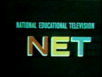
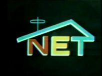
12th Logo
(April 1967-November? 1970)


<iframe frameborder="0" height="148" src="http://wikifoundrytools.com/wiki/closinglogos/widget/genericvideo/4063e41ab4c3282f1d7bde6c656c876e15dea63e" width="186"></iframe><iframe frameborder="0" height="148" src="http://wikifoundrytools.com/wiki/closinglogos/widget/genericvideo/153947c978fc7acedbf5bf2028b9155db17cc566" width="189"></iframe><iframe frameborder="0" height="148" src="http://wikifoundrytools.com/wiki/closinglogos/widget/genericvideo/fedf37a672e1e470ccf28c71c26653015f612790" width="263"></iframe><iframe frameborder="0" height="149" src="http://wikifoundrytools.com/wiki/closinglogos/widget/unknown/9fd56ee80039e8497df6d6cb71dfb437eb6c474e" width="257"></iframe>
Note: The first four images are the regular variants, the fifth image is a Black Journal variant, the sixth and seventh images are the Mister Rogers variants, and the last image is the copyright version.
Logo: First, the left section of the screen fills with red from the bottom, the middle section fills with yellow from the top, and the right section fills with blue from the bottom. One by one, each colored section flips to form the letters "NET" on a black background. Then either one of two things would happen:
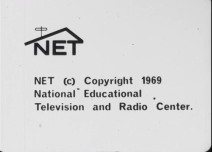
- 1967-1968: The text "NATIONAL EDUCATIONAL TELEVISION" appears above the NET logo and morph into a line, which bends to form a gable roof with an aerial antenna on top, which is connected to the T. You can see 4th logo for see about the style of this logo.
- 1968-1970: A blue line is drawn above the letters, which bends to form the aforementioned gable roof with the aerial antenna on top (still connected to the T) from the 1968 variant.
- The 1968 version came in both black and white and color versions.
- In early shows, the logo had more lighter colors (NET), likely due to film/tape deterioration.
- On the first 3 seasons (1968-1970) of Mister Rogers Neighborhood, the NET logo was built into a building that was part of the toy neighborhood in the show’s opening and closing (it was in black on B&W broadcasts to stand out better). This feature remained in reruns until 1989. A copyright notice to “National Educational Television and Radio Center” continued to be used on the show through 1971.
- The closing variant in Black Journal has the animation for the logo (during the part when the right section of the screen fills up with blue) fade in a few seconds after the music begins.
- At the end of Black Journal, an alternative closing variant can be seen after the regular closing logo. It's just the text "NATIONAL EDUCATIONAL TELEVISION" in gray stacked on top of each other on a black background. The end result is quite similar to the first PBS logo.
- In The Warren Years, a black version of the logo appear in a white background with a copyright notice below.
- A still variant was used for special programming that preempted regularly scheduled shows.
- Oddly enough, the closing Fall 1968 variant was used as the opening logo variant for an 1968 episode of Black Journal.
FX/SFX: The flipping effects.
Music/Sounds/Voice-over: A low-tone mellotron fanfare edited from "Plenipoteniary" by Eric Siday, similar in style to his Screen Gems “S from Hell” and CBS “In Color” jingles, and an announcer saying his part below depending on the variant:
- July 2, 1967-Fall 1968: The announcer says “The following program is from N-E-T, the National Educational Television network.” (opening) or “This is N-E-T, the National Educational Television network.” (closing).
- Fall 1968-Summer 1970: The announcer says “The following program is from N-E-T, the public television network.” (opening) or “This is N-E-T, the public television network.” (closing).
- Summer-Fall 1970: The announcer says "This is N-E-T, National Educational Television." This variant is rarer than the others.
Music/Sounds/Voice-over Variants:
- On The Assessment of Cambodia, the announcer says "The program scheduled for this time will not be seen so that we may bring you the following N-E-T special program." This is a still variant and no music plays during this variant.
Availability: Extremely rare. The B&W 1967 logo made an appearance on the VHS release of Our Neighbor, Fred Rogers, but has been cut from TV rebroadcasts of the documentary since 2003. It can be seen on several shows available for viewing at The Paley Center for Media, including the series premiere episodes of Mister Rogers' Neighborhood (1967 version, B&W), Black Journal (1967 version, color), and Sesame Street (1968 version, color). Though the videocassette release of the Mister Rogers' Neighborhood episode "Death of a Goldfish" plasters the standard version of the 1968 logo with the 1971 PBS logo, the show's in-credit variant remains. The 1968 opening and closing versions can also be seen on the Sesame Street: Old School Volume 2 DVD set on the test pilot episode, and the 1968 closing version can be found on a handful of 1969-70 Mister Rogers' Neighborhood episodes on Twitch (most plaster it with the 1971 PBS logo). The 1967 closing version can be found on all 1968 black and white episodes of Mister Rogers' Neighborhood, including episodes streaming on Twitch as well as episodes 1-5 on Amazon. The 1968 alternative closing logo is quite rare, it can be seen on Black Journal (1967 version, color). Its last confirmed new appearance was on Realities; the 1970 PBS logo plasters it on repeats, as seen on the series premiere (this logo can be found on a film print of the same show). The special program variant appears on Assessment of Cambodia. This logo first appeared on Conversations 1967. All variants, color and B&W, can be seen on over 100+ programs available for viewing on the American Archive of Public Broadcasting website.
Editor's Note: This is by far the most well known NET logo. With its mellotron fanfare, the announcer, the dark background, and the poor audio and grainy film quality, it gained a reputation of frightening children who grew up with Mister Rogers Neighborhood or Sesame Street. It is one of the more fascinating logos in the history of NET/PBS.
13th Logo
(October 5, 1970-March 1972)


<iframe frameborder="0" height="150" src="http://wikifoundrytools.com/wiki/closinglogos/widget/genericvideo/049620666df828862c41836dc24d744a6c775436" width="266"></iframe><iframe frameborder="0" height="150" src="http://wikifoundrytools.com/wiki/closinglogos/widget/genericvideo/af51b994edb14ca84043856ebecbb185af54a7b3" width="265"></iframe><iframe frameborder="0" height="150" src="http://wikifoundrytools.com/wiki/closinglogos/widget/genericvideo/488d3d8a1f944b6aa5143a95c01b71c80b7cee92" width="266"></iframe><iframe frameborder="0" height="147" src="http://wikifoundrytools.com/wiki/closinglogos/widget/genericvideo/20219242c706763ee04cd3aeec7fb3945422252e" width="262"></iframe>
<iframe frameborder="0" height="150" src="http://wikifoundrytools.com/wiki/closinglogos/widget/genericvideo/fa40c547404053cb868220d5bf8a01c7232d0d33" width="266"></iframe><iframe frameborder="0" height="150" src="http://wikifoundrytools.com/wiki/closinglogos/widget/genericvideo/45393a37f5154571bfd6d24f2bde9d52ee167fda" width="266"></iframe><iframe frameborder="0" height="150" src="http://wikifoundrytools.com/wiki/closinglogos/widget/genericvideo/60c0791ee929bf532ac2879900a26e387611a597" width="266"></iframe><iframe frameborder="0" height="147" src="http://wikifoundrytools.com/wiki/closinglogos/widget/genericvideo/54a65eaba675be462687051c7dfdb66fa0257d41" width="196"></iframe>
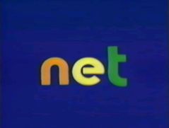
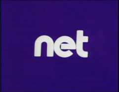
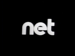
Nicknames: "Scanimate Letters", "Ain't This WNET's?", "Contender for Best Scanimated Logo"
Logo: On a dark purple background, several distorted white shapes spin around the center of the screen, which appear to be letters spinning and rolling around each other and larger copies made of lines forming around them. The letters then unwrap from each other, and the copies also absorb themselves into the letters, revealing the word "net" in a Bauhaus 93-like font.
Variants:
- Some programs carry a custom variant for their respective shows, in which the logo leads out to their intros. This was seen on Fanfare and Realities (with the latter also carrying a "News Special" variant).
- A "Special Events" variant was seen on an NET special.
- A B&W variant also exists.
- Beginning on October 3, 1971, the logo was updated. It is now on an ultramarine background, the lines are now yellow, and the "n" is orange, the "e" is yellow, and the "t" is green. Additionally, it is also videotaped, the mass appears to zoom in, and the letters also appear to be thinner and spread a bit further out from each other.
- A variant exists of the Realities logo, in 16mm. It is currently unknown if there is any other variant that is in the format.
Trivia: This logo was reused and retooled for WNET.
FX/SFX: Advanced Scanimation for its time.
Music/Sounds/Voice-overs:
- Regular: A four-note keyboard tune which is repeated four times, the last over a synthesized drone. The announcer says "The following program is from NET." or "The following program is a presentation of NET."
- Custom: A low analog synth with a background scaling, which saturates over time. Sometimes, this is replaced by a fast synthesized piano with an uprising note that changes note momentarily and lowers back.
Availability: The custom variants appeared on Civilization (and may be preserved on the MacArthur Library VHS release), Realities, and Fanfare, being retained on a 1987 rebroadcast of the series premiere of the latter, "Welcome to the Fillmore East", and the official DVD release of "Go Ride the Music". The black and white variant appears on the Realities episode "Soldiers Who Search and Dissent". The regular logos also appears on Black Journal, The Great American Dream Machine (retained on most episodes on Volumes 3 and 4, with the first variant appearing on Volume 3 and the later variant appearing on Volume 4), President's Report on Indochina, Soul! and An American Family.
Editor's Note: This is highly one of the most advanced logos of its time, and is even more advanced than some of the later Scanimate logos. This logo was extremely unique, and the later was reused for its use on WNET's logo. There was a debate if this logo was the original NET's logo or WNET's logo due to its usage on both of the station's shows and their relationship and interactions with each other. However, this logo first appeared only a few days before PBS officially began broadcasting, and a show the logo can be seen on wasn't produced by WNET, instead Washington, DC affiliate WETA. Plus, WNET carried an entirely different logo under the WDNT name around the same time this logo was being used. However, the logo under WDNT's name was changed to use the WNET name for a 1971 in-credit notice. When NET merged with WNET, it was known as EBC, a division of NET. NET was also still around when PBS started, as PBS didn't fully take over until NET dissolved completely in 1972. Regardless, this is an interesting logo.
1
1
1
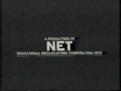
14th Logo
(October 5, 1970-1972)

<iframe frameborder="0" height="185" src="http://wikifoundrytools.com/wiki/closinglogos/widget/genericvideo/ac699aeaf9ec8f361ca355f8b877ef0807bc13f4" width="246"></iframe>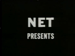
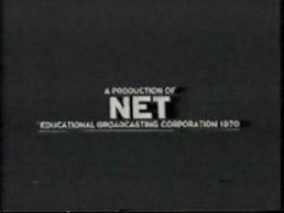


Logo: Just an in-credit logo with either "NET PRESENTS" (opening) or "A PRODUCTION OF NET EDUCATIONAL BROADCASTING CORPORATION (Copyright year)" (closing).
FX/SFX: Just the fading.
Music/Sounds: Silent.
Availability: Extremely rare. This was used briefly by NET as an in-credit logo.
Editor's Note: Not a very interesting logo, especially when compared to the logo it was used in tandem with. The font does slightly resemble the text from the "House" logo, though.
Music/Sounds: Silent.
Availability: Extremely rare. This was used briefly by NET as an in-credit logo.
Editor's Note: Not a very interesting logo, especially when compared to the logo it was used in tandem with. The font does slightly resemble the text from the "House" logo, though.
Final Note: NET was fully absorbed into WNET in 1972. PBS took over what NET left behind, while WNET took control of all still-airing programs aired by NET.