Motion Pictures S.A. (Spain)
Jump to navigation
Jump to search
Logo descriptions by bigladiesman, MegaAveron25 and PAV123
Logo captures by Eric S. and MegaAveron25
1st (known) Logo
(Late 1980s-Late 1990s)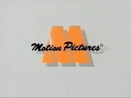 <embed align="bottom" allowfullscreen="true" height="195" src="http://wikifoundrytools.com/wiki/closinglogos/widget/youtubevideo/8b84e9607eda3d4628bd21d44862c635fe6b016b" type="application/x-shockwave-flash" width="245" wmode="transparent"/>
3rd Logo
(Late 1990s-200?)
 <embed align="bottom" allowfullscreen="true" height="195" src="http://wikifoundrytools.com/wiki/closinglogos/widget/youtubevideo/7b1ca5f6401ecaefddcd23b33d5431b39a57ad5d" type="application/x-shockwave-flash" width="245" wmode="transparent"/>
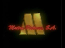
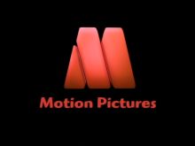
Nicknames: "Abstract M III", "Abstract M of Purgatory"
Logo: On a black background, a golden triangle zooms in leaving a blurry trail, followed by two deformed parallelograms, forming the M from the previous logo. Then a red blur appears and, after spinning a little, places itself in the middle of the screen, revealing the text "Motion Pictures, S.A." (in the same font as the previous logo). This logo was used for feature films distributed by the company.
Variant: There's an abridged, silent version for TV shows.
FX/SFX: Unimpressive CGI again. It's a step down from the previous logo as well.
Music/Sounds: A synthesizer tune.
Availability: Common. Can be seen on movies distributed by this company like La Dolce Vita.
Editor's Note: The dark environment and the synthesizer music make for a rather unsettling logo.
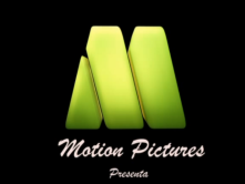
Nicknames: "Abstract M IV", "Cute Abstract M", "Rounded Abstract M"
Logo: On the black background, the abstract M, but now slightly redesigned, pops out piece-by-piece. Then, the words "Motion Pictures Presenta" in a white Brush Stroke MT font, with "Presenta" in smaller letters, fades in below.
Variants:
FX/SFX/Cheesy Factor: The logo looks even cheaper than the previous ones, with the logo being too large and off-center.
Music/Sounds: A 5-note whistle tune, repeated again with a tuba, followed by a single note and a happy xylophone tune.
Availability: Current. The 2010 version was seen on current prints of Raindrop: Water is Adventure. The preschool variant appears on some learning cartoons, including Zumbers. The green and blue variants are no longer current. It can seen on their YouTube channel (on every full cartoon).
Editor's Note: None.
Logo captures by Eric S. and MegaAveron25
Video captures courtesy of Eric S.
Background: Founded in 1977, Motion Pictures S.A. is an independent production and distribution company based in Barcelona. They're mostly known as being the Spanish distributors of many well known TV cartoons, mostly from DiC (Heathcliff, Dennis the Menace, etc.), but also from other companies like New World. For further info, visit its official page <a class="external" href="http://www.motionpic.com/" rel="nofollow" target="_blank">here</a> and check its catalogue <a class="external" href="http://www.catalanfilmsdb.cat/en/empreses/productora/motion-pictures/1015/" rel="nofollow" target="_blank">here</a>.
Background: Founded in 1977, Motion Pictures S.A. is an independent production and distribution company based in Barcelona. They're mostly known as being the Spanish distributors of many well known TV cartoons, mostly from DiC (Heathcliff, Dennis the Menace, etc.), but also from other companies like New World. For further info, visit its official page <a class="external" href="http://www.motionpic.com/" rel="nofollow" target="_blank">here</a> and check its catalogue <a class="external" href="http://www.catalanfilmsdb.cat/en/empreses/productora/motion-pictures/1015/" rel="nofollow" target="_blank">here</a>.
1st (known) Logo
(Late 1980s-Late 1990s)
 <embed align="bottom" allowfullscreen="true" height="195" src="http://wikifoundrytools.com/wiki/closinglogos/widget/youtubevideo/8b84e9607eda3d4628bd21d44862c635fe6b016b" type="application/x-shockwave-flash" width="245" wmode="transparent"/>
Nickname: "Abstract M"
Logo: On a white background, the words "Motion" and "Pictures" write themselves in a Brush Stroke MT font. Their shadows are visible on the background. Then two orange deformed parallelograms slide from the center top and bottom sections of the screen, as a triangle, inorange as well, comes from the left, forming a Motown-like Futura Black D "M". This logo was used for TV shows.
Variant: On some films like The Neverending Story, the logo was still. This rendition was pretty common.
FX/SFX: Cheap computer animation, even for its time's standards.
Music/Sounds: The outro of the show's theme.
Availability: Very common. It tends to appear on all re-runs of shows from their catalog, but exclusively in Spanish stations, of course.
Editor's Note: None. It's unoriginal, uninspired, and cheap.
2nd Logo
(1997)
<iframe align="right" frameborder="0" height="183" src="http://wikifoundrytools.com/wiki/closinglogos/widget/youtubevideo/a023fc4e128ef5df1f4ebdc99519ff4e36080772" width="325"></iframe>
Nickname: "Abstract M II"
Logo: On a black background, we see a rectangular creature walk to the center of the screen. It opens a door with a button behind it. It presses the button and a spotlight activates while a line carrying a sleeping triangle comes down. The rectangular yells at it to wake up and it instructs the triangle to stand next to it (which it does). Another rectangular creature slides in next to the others and the spotlight dies out and restarts again, showing the abstract M (sans eyes). The text "Motion Pictures S.A." appear in a blue Brush Stroke MT font, which flickers. A blue line is beneath the M, which proceeds to fade out.
FX/SFX: The movement of the creatures, the spotlight, the text. It's all very basic CGI, but it's an improvement over the previous logo for sure.
Music/Sounds: A nice jazz tune.
Availability: Rare. Was seen on Patrol 3 and Narigota.
Editor's Note: The logo can be a favorite due to its comedic and enjoyable nature.
3rd Logo
(Late 1990s-200?)
 <embed align="bottom" allowfullscreen="true" height="195" src="http://wikifoundrytools.com/wiki/closinglogos/widget/youtubevideo/7b1ca5f6401ecaefddcd23b33d5431b39a57ad5d" type="application/x-shockwave-flash" width="245" wmode="transparent"/>
Nicknames: "Abstract M III", "Abstract M of Purgatory"
Logo: On a black background, a golden triangle zooms in leaving a blurry trail, followed by two deformed parallelograms, forming the M from the previous logo. Then a red blur appears and, after spinning a little, places itself in the middle of the screen, revealing the text "Motion Pictures, S.A." (in the same font as the previous logo). This logo was used for feature films distributed by the company.
Variant: There's an abridged, silent version for TV shows.
FX/SFX: Unimpressive CGI again. It's a step down from the previous logo as well.
Music/Sounds: A synthesizer tune.
Availability: Common. Can be seen on movies distributed by this company like La Dolce Vita.
Editor's Note: The dark environment and the synthesizer music make for a rather unsettling logo.
4th Logo
(2008- )
(2008- )


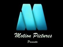
Nicknames: "Abstract M IV", "Cute Abstract M", "Rounded Abstract M"
Logo: On the black background, the abstract M, but now slightly redesigned, pops out piece-by-piece. Then, the words "Motion Pictures Presenta" in a white Brush Stroke MT font, with "Presenta" in smaller letters, fades in below.
Variants:
- On preschool shows, the M is green.
- On shows rated 5+, The M is sky blue.
- Starting in 2010, the company name and "M" are now vermillion and in a new font. Its also smaller and "Presenta" isn't there.
FX/SFX/Cheesy Factor: The logo looks even cheaper than the previous ones, with the logo being too large and off-center.
Music/Sounds: A 5-note whistle tune, repeated again with a tuba, followed by a single note and a happy xylophone tune.
Availability: Current. The 2010 version was seen on current prints of Raindrop: Water is Adventure. The preschool variant appears on some learning cartoons, including Zumbers. The green and blue variants are no longer current. It can seen on their YouTube channel (on every full cartoon).
Editor's Note: None.