Logo Variations - Relativity Media
Jump to navigation
Jump to search
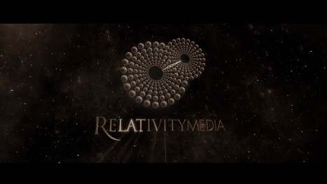
The Kingdom (2007): The logo is sepia-toned and fades to white.
_______________________________________________________________________________________________
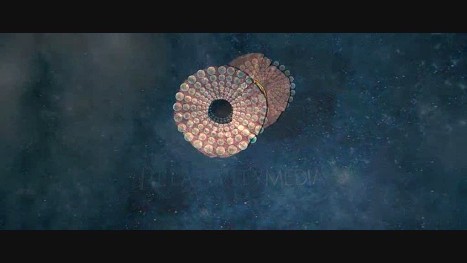
The Tale of Despereaux (2008): The logo turns into rope.
_______________________________________________________________________________________________
Duplicity and Love Happens (2009): The 2005 logo is used.
_______________________________________________________________________________________________
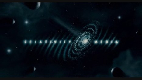
Nine (2009): The logo is black and white and it's fast forwarded.
_______________________________________________________________________________________________
The Wolfman (2010): The logo is in a shade of grey.
_______________________________________________________________________________________________
Catfish (2010): The logo is an online video and the background is dark.

_______________________________________________________________________________________________
The Tale of Despereaux (2008): The logo turns into rope.

_______________________________________________________________________________________________
Duplicity and Love Happens (2009): The 2005 logo is used.
_______________________________________________________________________________________________
Nine (2009): The logo is black and white and it's fast forwarded.
_______________________________________________________________________________________________
The Wolfman (2010): The logo is in a shade of grey.

_______________________________________________________________________________________________
Catfish (2010): The logo is an online video and the background is dark.

_______________________________________________________________________________________________
Free Birds (2013): The first film to use the 2013 logo. After the logo's animation has finished, we see a light behind the word. The light passes from behind the logo and transitions into the Reel FX Animation Studios logo.