Difference between revisions of "Logo Variations - Miramax Films"
Jump to navigation
Jump to search
Kill Bill Vol. 1 (2003): The logo goes as usual but at the end the Shaw Brothers logo theme starts and then cuts to the Shaw Bros. logo.
_______________________________________________________________________________________
Kill Bill Vol. 2 (2004): The logo is in black & white.
_______________________________________________________________________________________
Ella Enchanted (2004): The logo is on a blue sky background and the buildings are curved. Also, shortly after the logo is formed with the buildings just nearly disappeared, the buildings become castle towers in the opening shot.
Heart of the Game (2005): The logo lies on a wooden floor.
_______________________________________________________________________________________
Hollywoodland (2006): The logo is sepia.
(Created page with "<div class="WPC-editableContent" id="WPC-area?cellId=Logo+Variations+-+Miramax+Films&version=54&savePath=%2Fpage%2FLogo%2BVariations%2B-%2BMiramax%2BFilms&saveType...") |
|||
| Line 1: | Line 1: | ||
| − | <div class="WPC-editableContent" id="WPC-area?cellId=Logo+Variations+-+Miramax+Films&version=54&savePath=%2Fpage%2FLogo%2BVariations%2B-%2BMiramax%2BFilms&saveType=page"><div align="center"> <font size="3"><b>Scandal (1989): </b>T</font><font size="3"><font size="3">he logo is still, except for "</font></font><font size="3"><font size="3"><font face="Arial" size="3"><b><font face="Times"><i>presents</i></font></b></font>" fading in.<br/></font></font><font size="3"><font size="3"><font size="3"><b>_______________________________________________________________________________________<br/><br/></b></font></font><b>Clerks (1994):</b> The 1987 still picture logo fades into the 1994 View Askew Productions logo.</font></div><font size="3"> </font><div align="center"><font size="3"> <b>_______________________________________________________________________________________</b><br/><br/><b>Two Bits (1995): </b>The 1987 logo is sepia-toned.</font><br/> | + | <div class="WPC-editableContent" id="WPC-area?cellId=Logo+Variations+-+Miramax+Films&version=54&savePath=%2Fpage%2FLogo%2BVariations%2B-%2BMiramax%2BFilms&saveType=page"><div align="center"> <font size="3"><b>Scandal (1989): </b>T</font><font size="3"><font size="3">he logo is still, except for "</font></font><font size="3"><font size="3"><font face="Arial" size="3"><b><font face="Times"><i>presents</i></font></b></font>" fading in.<br/></font></font><font size="3"><font size="3"><font size="3"><b>_______________________________________________________________________________________<br/><br/></b></font></font><b>Clerks (1994):</b> The 1987 still picture logo fades into the 1994 View Askew Productions logo.</font></div><font size="3"> </font><div align="center"><font size="3"> <b>_______________________________________________________________________________________</b><br/><br/><b>Two Bits (1995): </b>The 1987 logo is sepia-toned.</font><br/>[[File:Eb64I5G 1uNqz33xf8PmhQ31141.jpeg|465px|Miramax Films - Two Bits (1995)]]<br/><font size="3"><b>_______________________________________________________________________________________</b></font><br/><br/><b><font size="3">Don't Be a Menace to South Central While Drinking Your Juice in the Hood</font> (1996):</b><b> </b><font size="3">T</font><font size="3">he words are in silver.</font><br/><font size="1">[[File:FZNmJCPuO93xP8zEF7R64A128368.jpeg|482px|Miramax Films (1996)]]</font><br/><font size="3"><b>_______________________________________________________________________________________<br/></b></font><font size="3"><b><br/>The Musketeer (2001): </b>The 1998-2008 logo isn't animated.<br/></font><font size="3"><b>_______________________________________________________________________________________<br/></b></font><br/><font size="3"><b>Cidade de Deus (2002): </b>The sunset appears through the logo.</font><font size="3"> Seen on the trailer.<br/></font><font size="3"><b>_______________________________________________________________________________________</b></font><br/><font size="3"><br/><b>Waking Up in Reno (2002): </b>When all of the lights of the buildings in the 1998-2008 logo are turned off, the lights of the Reno skyline turn on, revealing the Reno skyline behind the logo. The logo is also in shadow mode.</font><br/><font size="3">[[File:NyTCvBRyi3shkvuo8qsIug50801.jpeg|377px|Miramax Films - Waking Up in Reno (2002)]]<br/><b>_______________________________________________________________________________________</b><br/><br/><b>Gangs of New York (2002): </b>On a dark gray background, the words "MIRAMAX FILMS" in the font for the word "MIRAMAX" based from the 1987-1999 logo is shown. On recent prints, it is altered to solely read "MIRAMAX".</font><br/>[[File:Gz9NCREWGM2AT4nCpWC50g98932.png|496px|Miramax Films - Gangs of New York (2002)]]<font size="3"><b><br/></b></font></div><div align="center"><font size="3"><b>_______________________________________________________________________________________</b></font></div><div align="center"> <font size="3"><b><br/>Kill Bill Vol. 1 (2003): </b>The logo goes as usual but at the end the Shaw Brothers logo theme starts and then cuts to the Shaw Bros. logo.<br/></font><font size="3"><b>_______________________________________________________________________________________</b><br/></font><font size="3"><b><br/>Kill Bill Vol. 2 (2004)<font size="3">:</font></b><font size="3"> The<font size="3"> logo is in black & white.</font></font><br/><font size="3"><b>_______________________________________________________________________________________</b></font><br/><br/><b>Ella Enchanted (2004): </b>The logo is on a blue sky background and the buildings are curved. Also, shortly after the logo is formed with the buildings just nearly disappeared, the buildings become castle towers in the opening shot.</font></div><div align="center"><font size="3"><br/></font></div><div align="center"><font size="3">On current prints of the film, the 2008 logo is used, though it fades into this variation when completed.</font></div> <div align="center"> <font size="3"><b>_______________________________________________________________________________________<br/></b></font><br/><font size="3"><b>An Unfinished Life (2005):</b>The logo ends just before all the lights in the buildings are turned off, hence the name of the movie.</font></div><div align="center">[[File:5aed49e436290e9da2a78298143f4e92.jpeg|465px|Miramax 2005, in progress]]</div><div align="center"><b>_</b><b>_______________________________________________________________________________________________</b></div><div align="center"><br/><font size="3"><b>Heart of the Game (2005): </b>The logo lies on a wooden floor.</font><font size="3"><br/></font><font size="3"><b>_______________________________________________________________________________________</b></font><font size="3"><b><br/></b></font><br/><font size="3"><b>Hollywoodland (2006): </b>The logo is sepia.</font></div><br/></div> |
Latest revision as of 18:06, 3 November 2020
Scandal (1989): The logo is still, except for "presents" fading in.
_______________________________________________________________________________________
Clerks (1994): The 1987 still picture logo fades into the 1994 View Askew Productions logo.
_______________________________________________________________________________________
Clerks (1994): The 1987 still picture logo fades into the 1994 View Askew Productions logo.
_______________________________________________________________________________________
Two Bits (1995): The 1987 logo is sepia-toned.
_______________________________________________________________________________________
Don't Be a Menace to South Central While Drinking Your Juice in the Hood (1996): The words are in silver.
_______________________________________________________________________________________
The Musketeer (2001): The 1998-2008 logo isn't animated.
_______________________________________________________________________________________
Cidade de Deus (2002): The sunset appears through the logo. Seen on the trailer.
_______________________________________________________________________________________
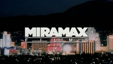
Waking Up in Reno (2002): When all of the lights of the buildings in the 1998-2008 logo are turned off, the lights of the Reno skyline turn on, revealing the Reno skyline behind the logo. The logo is also in shadow mode.
_______________________________________________________________________________________
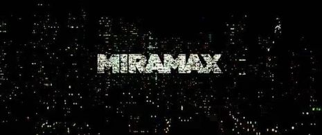
Gangs of New York (2002): On a dark gray background, the words "MIRAMAX FILMS" in the font for the word "MIRAMAX" based from the 1987-1999 logo is shown. On recent prints, it is altered to solely read "MIRAMAX".
Two Bits (1995): The 1987 logo is sepia-toned.

_______________________________________________________________________________________
Don't Be a Menace to South Central While Drinking Your Juice in the Hood (1996): The words are in silver.

_______________________________________________________________________________________
The Musketeer (2001): The 1998-2008 logo isn't animated.
_______________________________________________________________________________________
Cidade de Deus (2002): The sunset appears through the logo. Seen on the trailer.
_______________________________________________________________________________________
Waking Up in Reno (2002): When all of the lights of the buildings in the 1998-2008 logo are turned off, the lights of the Reno skyline turn on, revealing the Reno skyline behind the logo. The logo is also in shadow mode.

_______________________________________________________________________________________
Gangs of New York (2002): On a dark gray background, the words "MIRAMAX FILMS" in the font for the word "MIRAMAX" based from the 1987-1999 logo is shown. On recent prints, it is altered to solely read "MIRAMAX".

_______________________________________________________________________________________
Kill Bill Vol. 1 (2003): The logo goes as usual but at the end the Shaw Brothers logo theme starts and then cuts to the Shaw Bros. logo.
_______________________________________________________________________________________
Kill Bill Vol. 2 (2004): The logo is in black & white.
_______________________________________________________________________________________
Ella Enchanted (2004): The logo is on a blue sky background and the buildings are curved. Also, shortly after the logo is formed with the buildings just nearly disappeared, the buildings become castle towers in the opening shot.
On current prints of the film, the 2008 logo is used, though it fades into this variation when completed.
_______________________________________________________________________________________
An Unfinished Life (2005):The logo ends just before all the lights in the buildings are turned off, hence the name of the movie.
An Unfinished Life (2005):The logo ends just before all the lights in the buildings are turned off, hence the name of the movie.

________________________________________________________________________________________________
Heart of the Game (2005): The logo lies on a wooden floor.
_______________________________________________________________________________________
Hollywoodland (2006): The logo is sepia.