Difference between revisions of "KPTS"
Jump to navigation
Jump to search
| Line 1: | Line 1: | ||
| − | <div class="WPC-editableContent" id="WPC-area?cellId=KPTS&version=15&savePath=%2Fpage%2FKPTS&saveType=page"><font size="3"><u>Background</u>: KPTS is a PBS affiliate located in Wichita, Kansas.<br/><br/><br/>1st (known) Logo<br/>(1970s)<br/></font><font size="3"><u><br/></u></font>[[ | + | <div class="WPC-editableContent" id="WPC-area?cellId=KPTS&version=15&savePath=%2Fpage%2FKPTS&saveType=page"><font size="3"><u>Background</u>: KPTS is a PBS affiliate located in Wichita, Kansas.<br/><br/><br/>1st (known) Logo<br/>(1970s)<br/></font><font size="3"><u><br/></u></font>[[File:MgqYR Q2TBrHRNvaZMx63A10726.jpeg|360px|KPTS 1970s "Starry 8" logo]]<div><font size="3"><u>Nickname</u><font color="#333333">: "Starry 8"</font><br/><br/><u>Logo</u><font color="#333333">: On a black background, a </font><font color="#ffff00">yellow </font><font color="#333333">"</font><b>8</b><font color="#333333">" zooms in, and six stars pop up. "</font><b>Wichita</b><font color="#333333">" fades in below.</font><br/><u><br/>FX/SFX</u><font color="#333333">: Early scanimation graphics.</font><br/><br/><u>Music/Sounds</u><font color="#333333">: Unknown.</font><br/><br/><u>Availability</u><font color="#333333">: It showed up on KPTS' 40th anniversary special. Not sure if this was an actual logo, though.</font><br/><br/><u>Editor's Note</u><font color="#333333">: None.</font><br/><br/><br/><font color="#333333">2nd Logo</font><br/><font color="#333333">(1981-1990)</font><br/></font><font size="3"><br/></font>[[File:9Yu0TATNj3RCJrWG5sP4lA18692.jpeg|314px|KPTS logo from 1981]]<font size="3"><u>Nickname</u>: "Wheat"<br/><br/><u>Logo</u>: We see three live-action strands of wheat blowing back and forth against a </font><font color="#0000ff" size="3">blue</font><font size="3"> stripy background. "</font><font size="3"><b><i>KPTS</i></b></font><font size="3">", in a sort-of futuristic cursive </font><font color="#ffff00" size="3">yellow </font><font size="3">display font you might find on old 1950s cars and tires, fades in on the bottom-right. "WICHITA", in </font><font color="#ffff00" size="3">yellow </font><font size="3">Handel Gothic font (like "HOME VIDEO" in the 1983 Walt Disney Home Video logo) fades in below "</font><font size="3"><b><i>KPTS</i></b></font><font size="3">".<br/><br/><u>FX/SFX</u>: Not much on animation.<br/><br/><u>Music/Sounds</u>: Again, unknown.<br/><br/><u>Availability</u>: This was seen on locally-produced shows from KPTS from that era. It also showed up on the anniversary special.<br/><br/><u>Editor's Note</u>: None, it's just boring.</font></div><br/></div> |
Revision as of 15:08, 3 November 2020
Background: KPTS is a PBS affiliate located in Wichita, Kansas.
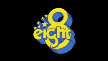
1st (known) Logo
(1970s)
1st (known) Logo
(1970s)

Nickname: "Starry 8"
Logo: On a black background, a yellow "8" zooms in, and six stars pop up. "Wichita" fades in below.
FX/SFX: Early scanimation graphics.
Music/Sounds: Unknown.
Availability: It showed up on KPTS' 40th anniversary special. Not sure if this was an actual logo, though.
Editor's Note: None.
2nd Logo
(1981-1990)
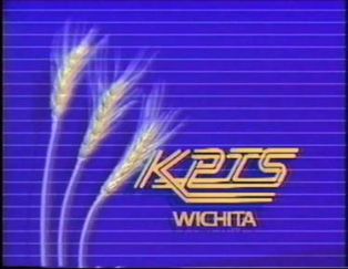 Nickname: "Wheat"
Logo: We see three live-action strands of wheat blowing back and forth against a blue stripy background. "KPTS", in a sort-of futuristic cursive yellow display font you might find on old 1950s cars and tires, fades in on the bottom-right. "WICHITA", in yellow Handel Gothic font (like "HOME VIDEO" in the 1983 Walt Disney Home Video logo) fades in below "KPTS".
FX/SFX: Not much on animation.
Music/Sounds: Again, unknown.
Availability: This was seen on locally-produced shows from KPTS from that era. It also showed up on the anniversary special.
Editor's Note: None, it's just boring.