KLASS! (Russia)
Jump to navigation
Jump to search
Logo descriptions by Grig2007
Video captures by El Chanel and Grig2007
Background: KLASS! was a television company that known for program Good night, kids! (Спокойной ночи, малыши!). It was founded in 1994.
 <iframe frameborder="0" height="255" src="http://wikifoundrytools.com/wiki/closinglogos/widget/genericvideo/1242767e6a9abfb3bdbe4a8e0d9127f701f08cfe" width="338"></iframe>
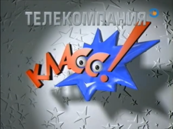
Logo: On a sky background, a comet flies. Then it flies until a gray planet appears. The company name appears letter by letter. The comet then explodes into a blue splat-like creature with eyes. It stays on screen until the exclamation mark appears. Then splat-like creature's bounce and winks. The word "ТЕЛЕКОМПАНИЯ" written in Micra font appears above.
FX/SFX:Primitive 3D animation.
Availablity: Very rare, as seen on programs from that time, like the 2nd season ofDendy: The New Reality, that's very hard to find.
Editor's Note:While to a much lesser extent than, say, VID mask, the star-splat creature was found unsettling by some. Still, it's a fitting enough logo for a company that mostly produced children shows.
 <iframe frameborder="0" height="186" src="http://wikifoundrytools.com/wiki/closinglogos/widget/genericvideo/795865539bff9007604740f9321beefd4eafcd6a" width="246"></iframe>
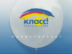
Logo: On white background, we see the balloons in colors of logo used till' 2014 and still used in print version after 2014. Then the lines drawing couple of times. Balloons then form the shapes, consisting of three differently-colored paint strokes, and the logo solidifies. Then the company name, complete with the yellow circle surrounding "ас", appears below. and they are forcing on white balloon on sky background. Words "представляет" appears below.
Scare Factor: Low. It's tamer than previous ones.
Scare Factor: None
 <iframe align="bottom" frameborder="0" height="204" src="http://wikifoundrytools.com/wiki/closinglogos/widget/genericvideo/dcda3b006b4d1d0cb9532ef5b9cc9a70c88164c5" width="357"></iframe>
Cheesy Factor: The finished logo design is lazy! Seriously, why don't you adapt previous logo for 16:9 instead of using this?
Music/Sounds: See the last logo.
Video captures by El Chanel and Grig2007
Background: KLASS! was a television company that known for program Good night, kids! (Спокойной ночи, малыши!). It was founded in 1994.
1st logo
(1995-1999?)
 <iframe frameborder="0" height="255" src="http://wikifoundrytools.com/wiki/closinglogos/widget/genericvideo/1242767e6a9abfb3bdbe4a8e0d9127f701f08cfe" width="338"></iframe>
Variant: On some programs, the last shot of the logo is used as a still ident.
FX/SFX:Primitive 3D animation.
Music/Sounds: A comet sound with a happy fanfare, followed by two boings, a zooming-like sound, and a shining sound.
Availablity: Very rare, as seen on programs from that time, like the 2nd season ofDendy: The New Reality, that's very hard to find.
Editor's Note:While to a much lesser extent than, say, VID mask, the star-splat creature was found unsettling by some. Still, it's a fitting enough logo for a company that mostly produced children shows.
2nd logo
(1997?-2002)
(1997?-2002)
<iframe align="right" frameborder="0" height="167" src="http://wikifoundrytools.com/wiki/closinglogos/widget/genericvideo/4d13af45826075de5f1f43cec0b6a7754b28f714" width="220"></iframe>
Logo: On a night background, we see the Earth rotating. Then a comet flies around the planet, and flashes causing the night background to change to the morning sky. The splat-like creature from previous logo appears. Then the words appear with same effect as before, but the creature is not zooming in and out. Instead, the words do that thing. Then the splat-like creature winks. The words "ТЕЛЕКОМПАНИЯ" appear at the top with a lighting effect.
Logo: On a night background, we see the Earth rotating. Then a comet flies around the planet, and flashes causing the night background to change to the morning sky. The splat-like creature from previous logo appears. Then the words appear with same effect as before, but the creature is not zooming in and out. Instead, the words do that thing. Then the splat-like creature winks. The words "ТЕЛЕКОМПАНИЯ" appear at the top with a lighting effect.
FX/SFX: Better 3D animation, all improvement over previous logo.
Music/Sounds: Same as before.
Availablity: Again, very rare. It was used in tandem with previous logo for 2 years. Seen on the programs from that era, also appears in some episodes of their famous show, that's very hard to find again. It will be intact on Detskiy reruns of Зов джунглей.
Scare Factor: Low to medium, another appearing of splat-like creature can scare some, but it's tamer than the previous logo.
Scare Factor: Low to medium, another appearing of splat-like creature can scare some, but it's tamer than the previous logo.
3rd logo
(2002-2004, 2006)
 <iframe frameborder="0" height="186" src="http://wikifoundrytools.com/wiki/closinglogos/widget/genericvideo/795865539bff9007604740f9321beefd4eafcd6a" width="246"></iframe>
Trivia: This logo was designed by Merkator Group, a company that produced graphics for a handful of KLASS! shows.
FX/SFX: Everything, done with combining 2D and 3D.
Music/Sounds: 5 notes of trumpet, followed by crash cymbal and trumpet fanfare.
Availablity: Uncommon, bordering to rare, seen on programs of that era and also some episodes of their famous program.
Scare Factor: Low. It's tamer than previous ones.
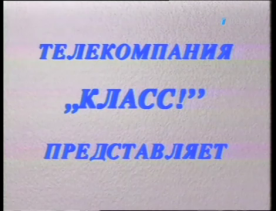
4th logo
(2003-2004)

Logo: On white background, we see the text written in Times New Roman Bold Italic:
ТЕЛЕКОМПАНИЯ
„КЛАСС!”
ПРЕДСТАВЛЯЕТ
Then the logo cross-fades to thePoka Vse Doma intro.
FX/SFX: None.
Music/Sounds: None.
Availablity: Uncommon, was seen before Poka Vse Domafrom 2002 to 2004.
Scare Factor: None
5th logo
(2004-2014)

<iframe frameborder="0" height="230" src="http://wikifoundrytools.com/wiki/closinglogos/widget/genericvideo/4470d06d82cb070f2bc682c98dfdcf0e46eb642f" width="304"></iframe><iframe frameborder="0" height="230" src="http://wikifoundrytools.com/wiki/closinglogos/widget/genericvideo/001424716bb25bc5901de0499ce73e0a2d80d26a" width="304"></iframe>
Logo:On a dark blue background, we see the electric yellow, red and blue stripes. They move to form the logo of TV company, along with the flashing letters. Then we come to the logo (the band is already formed). Logo formed by lines drawn, and the text appears:
класс!
телекомпания
представляет
Variants: It depends on the variant:
- Good Night, Kids! variant: Same as standard logo, but it cross-fades with the text:
Программа создана
при финансовой поддержке
Федерального агентства
по печати и массовым
коммуникациям
- Poka Vse Doma variant: Same as the standard logo, but the heavy "KLONG!" (the sound when the heavy object, like an anvil, is dropped) is added when the logo is formed, before crossfading to thePoka Vse Doma intro. Strangely, there is no word "представляет" under the word "телекомпания".
Trivia: The print version of KLASS! logo is still used on Good night, kids! website <a href="https://www.spokoinoinochi.ru/" target="_self">https://www.spokoinoinochi.ru/</a>.
Music/Sounds: There are two music variants for this logo.
- A short fast paced rock tune.
- A fast-paced dreamy electronic music complete with drums, accompanied by the whoosh.
Availablity: Common, as being used for 10 years. Seen on programs of that era and episodes of Good night, kids! Lastly seen on TV with that program broadcasting until start of 2014.
Scare Factor: High due to thunderclaps and dark atmosphere.
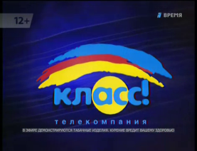
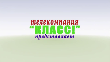
6th logo
(2013, 2014-present)
 <iframe align="bottom" frameborder="0" height="204" src="http://wikifoundrytools.com/wiki/closinglogos/widget/genericvideo/dcda3b006b4d1d0cb9532ef5b9cc9a70c88164c5" width="357"></iframe>
Logo: On the white background, we see the rainbows coming and disappearing. Then the camera pans and rainbows reveal the "hidden" text:
телекомпания
"КЛАСС!"
"КЛАСС!"
представляет
Then the logo is little stays on screen. After it cross-fades with the text like this:
Программа создана
при финансовой поддержке
Федерального агентства
по печати и массовым
коммуникациям
Trivia: The template that the logo was used is "<a href="https://videohive.net/item/rainbow-reveal/110768" target="_self">Rainbow Reveal</a>", by uniquefx on Videohive.
FX/SFX: The rainbows, the text.
Cheesy Factor: The finished logo design is lazy! Seriously, why don't you adapt previous logo for 16:9 instead of using this?
Availablity: Current, used on new episodes of Good night, kids! and it's spin-off, Good morning, kids! Also seen on some programs.
Scare Factor: Minimal, as you laugh how the template is stock.