Georgia Public Broadcasting
Jump to navigation
Jump to search
Editions by Kris Starring, Jacob Goff, MariluHennerArtist45, and Michael Bass
Background: Georgia Public Broadcasting is the statewide PBS affiliate located in Georgia. The headquarters are located in Atlanta, where the flagship station WGTV is located. It started in 1960 as "Georgia Educational Television" to make educational and instructional shows. A decade later, it changed its name to "Georgia Public Television" (GPTV), and, in 1984, entered radio business for the first time. Starting January 2004, GPTV was rebranded to the name of its parent organization, Georgia Public Broadcasting (GPB).
Georgia Public Television
FX/SFX: Good but pixelated CGI animation.
1st Logo
(2004-2010)
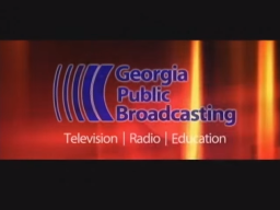
Logo: In 2:35:1, on the same background for CPB's current logo (only tinted in scarlet), "Georgia Public Broadcasting" in blue zooms out one at a time and then "Television | Radio | Education" appears via a shining effect. All this is behind a transparent glass square.
FX/SFX: The zooming out and the shine. The local ID is essentially an update of the previous ID.
Music/Sounds: A quiet piano tune.
Availability: Extinct for the local ID, but rare for the production variant. Probably seen on programming during the time.
Editor's Note: None.
2nd Logo
(2010-2015)
 <iframe frameborder="0" height="192" src="http://wikifoundrytools.com/wiki/closinglogos/widget/unknown/d8f798236083a03e8872971ff7484187652ed9f5" width="333"></iframe>
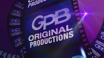
Logo: On a violet background with a swirl, a filmstrip spins many times until it is close enough. A small spotlight shines near the top right corner. The letters "GPB" in white, each blur out in order. Finally, the GPB logo rotates and "ORIGINAL PRODUCTIONS" zooms out.
FX/SFX: Again, CGI animation.
Music/Sounds: A tribal tune. An announcer says "This has been a GPB original production."
Availability: Common. Seen on programming from the time.
Editor's Note: None.
 <iframe frameborder="0" height="181" src="http://wikifoundrytools.com/wiki/closinglogos/widget/unknown/a78e0f3d883af9952f93d7b0c593040e7543913c" width="321"></iframe><iframe frameborder="0" height="181" src="http://wikifoundrytools.com/wiki/closinglogos/widget/unknown/7a4e45446eb5a85422da54386a0813dc12e5e3ac" width="321"></iframe>
Background: Georgia Public Broadcasting is the statewide PBS affiliate located in Georgia. The headquarters are located in Atlanta, where the flagship station WGTV is located. It started in 1960 as "Georgia Educational Television" to make educational and instructional shows. A decade later, it changed its name to "Georgia Public Television" (GPTV), and, in 1984, entered radio business for the first time. Starting January 2004, GPTV was rebranded to the name of its parent organization, Georgia Public Broadcasting (GPB).
Georgia Public Television
1st Logo
(1970-1984)
 <iframe frameborder="0" height="224" src="http://wikifoundrytools.com/wiki/closinglogos/widget/unknown/ea5adccff7e98854bce4d2476bd4ca4ea71bb8a7" width="299"></iframe>
(1970-1984)
 <iframe frameborder="0" height="224" src="http://wikifoundrytools.com/wiki/closinglogos/widget/unknown/ea5adccff7e98854bce4d2476bd4ca4ea71bb8a7" width="299"></iframe>
Nicknames: "The Cylinder", "Tricolor Circles"
Music/Sounds: An ascending trumpet fanfare with a strange synth note at the end, though sometimes the opening theme of the show is used.
Availability: Extinct. As well as being used as a local ID, it was seen on shows like Lawmakers, and some TV specials, like Langston!. These shows are long gone from TV, though there may be a slight chance of it appearing on old prints.
Editor's Note: This and the next logo bear a striking resemblance to the Radio-Quebec logo.
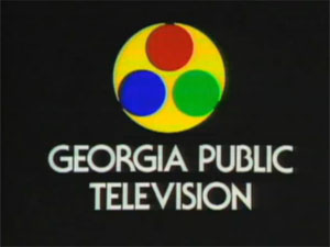
2nd Logo
Nicknames: "The Cylinder II", "Tricolor Circles II", "Sleepless in Georgia"
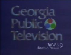
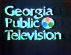
Logo: On a dark blue background, we see a giant 3D cylinder with three holes cut out of it (likely to represent a filmreel or a tube where colors shoot out of the holes to create a color picture on a TV screen). It looks like the cylinder from the last logo, except it's white. The cylinder spins while "Georgia Public Television" in a gray chrome Friz Quadrata font zooms in from the top-left of the screen. 3 lasers of red, green, and blue zap through the holes, filling them with their respective colors. The cylinder becomes a 2D circle, resting to the right of "Public". The logo shines a little before fading to black.
Variants:
FX/SFX: The cylinder spinning, the lasers, and the shining.
Music/Sounds: A loud synth drone, followed by a two-note chime tune. A synthpop-like jingle plays in the long version after that.
Availability: Rare. If GPT programming from the time is ever re-ran, it can be seen. Also seen on some home video releases, like the Video Treasures release of Messiah.
Editor's Note: This logo is known to have unnerved some due to the fast, in-your-face animation and strange music.
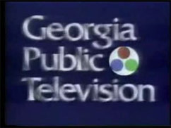
3rd Logo
(1989-2000)
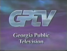
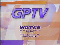
Logo: On a dark, cloudy background, we see "GPTV" in a futuristic font. Below is "Georgia Public Television", in silver. "Television" is on the bottom of the other two words.
FX/SFX:
Music/Sounds: A somewhat loud 4-note orchestral fanfare.
Availability: Uncommon. This was used for quite a while. Seen on programming from the time.
Editor's Note: This logo is a favorite among many, and the local variant boasts CGI that's way ahead of its time for the late '80s.
4th Logo
(2000-200?)
Logo: A blue circle zooms out on a red background. As it heads for the bottom left of the screen and eventually stops, the red background zooms outand we see that it is actually a red circle on a green background. The red circle continues to zoom out until it plasters itself to the top right of the blue circle. When the green background zooms out, it reveals itself as a green circle on a yellow background. The green circle places itself to the right of the blue one. The yellow background zooms out. It is actually a yellow circle on a black background. As it zooms out, goes behind all the other circles, and stops, it reveals the words "GEORGIA PUBLIC TELEVISION" at the bottom of the screen. The logo looks like an abstract film cylinder at the end.
Variant: An in-credit version was seen on some shows.
Music/Sounds: An ascending trumpet fanfare with a strange synth note at the end, though sometimes the opening theme of the show is used.
Music/Sounds Variant: Sometimes, a female announcer states over the regular music, "Georgia Public Television wishes to thank the following for investing in primetime programming."
Availability: Extinct. As well as being used as a local ID, it was seen on shows like Lawmakers, and some TV specials, like Langston!. These shows are long gone from TV, though there may be a slight chance of it appearing on old prints.
Editor's Note: This and the next logo bear a striking resemblance to the Radio-Quebec logo.
2nd Logo
(1983-1996)


<iframe frameborder="0" height="167" src="http://wikifoundrytools.com/wiki/closinglogos/widget/unknown/62bef65103a451b3be35234e04dfb78868ec77c7" width="297"></iframe>
Nicknames: "The Cylinder II", "Tricolor Circles II", "Sleepless in Georgia"
Variants:
- A long version with much slower animation and a female announcer speaking the station's city and channel number with the station's call sign appearing at the lower right corner was used as a local ID. The logo sparkles a bit after that.
- There is a still version on a black background.
FX/SFX: The cylinder spinning, the lasers, and the shining.
Music/Sounds: A loud synth drone, followed by a two-note chime tune. A synthpop-like jingle plays in the long version after that.
Availability: Rare. If GPT programming from the time is ever re-ran, it can be seen. Also seen on some home video releases, like the Video Treasures release of Messiah.
Editor's Note: This logo is known to have unnerved some due to the fast, in-your-face animation and strange music.
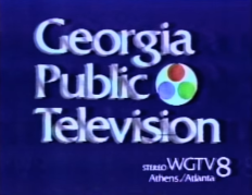
3rd Logo
(1989-2000)


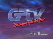
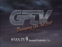
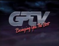
<iframe frameborder="0" height="166" src="http://wikifoundrytools.com/wiki/closinglogos/widget/unknown/33ab874df2485ce148dcad74d6772a5016007908" width="213"></iframe><iframe frameborder="0" height="167" src="http://wikifoundrytools.com/wiki/closinglogos/widget/unknown/ab1f891249f2a03b1932e692e07e229c6ffe3ca5" width="222"></iframe><iframe frameborder="0" height="167" src="http://wikifoundrytools.com/wiki/closinglogos/widget/unknown/320f32e909975016a3185a1b2da93740bda05532" width="296"></iframe>
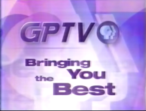
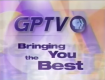
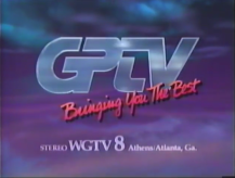
Nickname: "Bringing You the Best"
Nickname: "Bringing You the Best"
Logo: On a dark, cloudy background, we see "GPTV" in a futuristic font. Below is "Georgia Public Television", in silver. "Television" is on the bottom of the other two words.
Variants: When used locally, it had extra animation:
- 1989-1994: On the same background, many orbs carve a glass "GPTV" while leaving streaks. The letters "GPTV" zoom in. A dot suddenly draws out "Bringing You The Best", colored red. The station call sign and number appear below.
- 1992-2000: On the same background as before, we see some glowing orbs drawing out the letters "GPTV". The call signs and their stations appear below. They all form one dot to draw out the words "Bringing You The Best". Sometimes on a purple background with revolving squares, triangles, and circles, the words "GEORGIA PUBLIC TELEVISION" zooms out to the middle. It then fades to the GPTV logo and the words "Bringing You The Best" zoom out one by one into the space below.
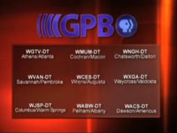
- There was also an extended version seen at sign on and sign off that had "GPTV" by itself and included an extended run-through of GPTV's stations with each call sign sliding (like some closing credits), which likewise closes with the "Bringing You The Best" tagline.
FX/SFX:
- National: The clouds zooming in and shining of the "GPTV".
- Local: Outstanding quality CGI from Atlanta's own television graphics master and TBS veteran Jay Cordova. When GPTV received this graphics package, they were so pleased they it is said that they wanted to use it for at least ten years, which they gladly did. Definitely nothing cheesy here.
Music/Sounds: A somewhat loud 4-note orchestral fanfare.
Music/Sounds Variants: Local versions used different music:
- 1989-1994: An orchestrated fanfare with horns and strings. A female announcer says "Bringing you the best, GPTV on Channel (number of Channel), (station call sign letters), (location of station).
- 1992?-2000: A beautifully synthesized orchestral piece plays throughout the logo, which was GPTV's theme at the time. An announcer would say over the logo, "This is Georgia Public Television, a nine station network serving all of Georgia. GPTV, Bringing you the best.". On the variant, a very Starmaker-esque synthesized news theme plays throughout.
Availability: Uncommon. This was used for quite a while. Seen on programming from the time.
Editor's Note: This logo is a favorite among many, and the local variant boasts CGI that's way ahead of its time for the late '80s.
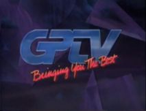
4th Logo
(2000-200?)

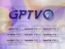
Logo: We see the letters "GPTV" in an italicized silver or dodger blue futuristic font zoom out together and spread out over a background of cascading purple, blue, orange, and white shapes. The calls and city of license of all of GPTV's stations andtransmitter sites briefly appears underneath the GPTV logo. The call information fades out and the words "Bringing You The Best" zoom out one by one into the space below.
FX/SFX: Good but pixelated CGI animation.
Music/Sounds: The 1996 GPTV music.
Availability: Extinct.
Editor's Note: None.
Availability: Extinct.
Editor's Note: None.
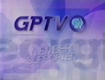
5th Logo
(200?-2004)


Logo: Over a background of indigo shadows, we see "GPTV" with the PBS logo next to it rotate to the left and zoom out to the top. Below is "MEMBER SUPPORTED" In white and tilted. It fades and stretches out and the stacked words "Georgia Public Television" zoom out one by one. "Bringing You the Best" zooms in, arranged in the same manner.
FX/SFX: Very nice computer animation.
Music/Sounds: Either the music from before, or the piano tune from the next logo.
Availability: Extinct.
Editor's Note: None.
---------------------------------------------------------------------------------------------------------
Georgia Public Broadcasting
Georgia Public Broadcasting
1st Logo
(2004-2010)


<iframe frameborder="0" height="183" src="http://wikifoundrytools.com/wiki/closinglogos/widget/unknown/dafc2087bc4b0b0e5ae4aacbe22db1a87606ec40" width="244"></iframe><iframe frameborder="0" height="183" src="http://wikifoundrytools.com/wiki/closinglogos/widget/unknown/2d55bab4764a1b07bbaa751d416d7e8ecfea6eaa" width="244"></iframe>
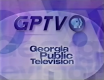
Logo: In 2:35:1, on the same background for CPB's current logo (only tinted in scarlet), "Georgia Public Broadcasting" in blue zooms out one at a time and then "Television | Radio | Education" appears via a shining effect. All this is behind a transparent glass square.
Variant: As a local ID, the current GPB logo zooms out, consisting of the violet words "GPB" with four blue curved lines to the left of it and the PBS logo on the right. The station numbers appear at the bottom of the screen and there is a shine on the logo. It is fullscreen here.
FX/SFX: The zooming out and the shine. The local ID is essentially an update of the previous ID.
Music/Sounds: A quiet piano tune.
Availability: Extinct for the local ID, but rare for the production variant. Probably seen on programming during the time.
Editor's Note: None.
2nd Logo
(2010-2015)
 <iframe frameborder="0" height="192" src="http://wikifoundrytools.com/wiki/closinglogos/widget/unknown/d8f798236083a03e8872971ff7484187652ed9f5" width="333"></iframe>
Logo: On a violet background with a swirl, a filmstrip spins many times until it is close enough. A small spotlight shines near the top right corner. The letters "GPB" in white, each blur out in order. Finally, the GPB logo rotates and "ORIGINAL PRODUCTIONS" zooms out.
FX/SFX: Again, CGI animation.
Music/Sounds: A tribal tune. An announcer says "This has been a GPB original production."
Availability: Common. Seen on programming from the time.
Editor's Note: None.
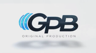
3rd Logo
(2015-)
 <iframe frameborder="0" height="181" src="http://wikifoundrytools.com/wiki/closinglogos/widget/unknown/a78e0f3d883af9952f93d7b0c593040e7543913c" width="321"></iframe><iframe frameborder="0" height="181" src="http://wikifoundrytools.com/wiki/closinglogos/widget/unknown/7a4e45446eb5a85422da54386a0813dc12e5e3ac" width="321"></iframe>
Logo:
- Opening: We zoom out from a screen showing various filmstrip scratches which then shows the GPB logo and shows film scratches again, where we zoom out enough to see 3 screens showing "ORIGINAL PRODUCTION", then "PRODUCTION START", which is stacked, and then a countdown as we pan to the right, where the GPB logo is revealed. Below is "ORIGINAL PRODUCTION"
- Closing: Same as the opening, but "THIS HAS BEEN A" is added above "ORIGINAL PRODUCTION" in the first half and "PRODUCTION START" is replaced with "PRODUCTION END".
FX/SFX: The film like objects and the panning. It's all simple but nice CGI.
Music/Sounds: Film reel sounds, which is then followed by a piano tune.
Availability: Current. Seen on When Georgia Howled: Sherman on the March.
Editor's Note: None.