Freeform Originals
Jump to navigation
Jump to search
The printable version is no longer supported and may have rendering errors. Please update your browser bookmarks and please use the default browser print function instead.
Background: On January 12, 2016, ABC Family was rebranded as Freeform. This debunked earlier rumors that the network was in a contract that forced the term "Family" into its name no matter what they did and what they broadcast.
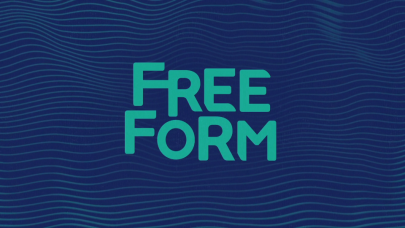
1st Logo
(January 12, 2016-2018)
 <iframe frameborder="0" height="227" src="http://wikifoundrytools.com/wiki/closinglogos/widget/youtubevideo/b7298191b4d8459125655289c5e285155af8565f" width="402"></iframe>
Nicknames: "The Waves", "The Freeform Waves", "Wavy Freeform"
 <iframe frameborder="0" height="227" src="http://wikifoundrytools.com/wiki/closinglogos/widget/youtubevideo/98715f7f2b12aaf789d001a749a575a2938c3c34" width="401"></iframe>
1st Logo
(January 12, 2016-2018)
 <iframe frameborder="0" height="227" src="http://wikifoundrytools.com/wiki/closinglogos/widget/youtubevideo/b7298191b4d8459125655289c5e285155af8565f" width="402"></iframe>
Nicknames: "The Waves", "The Freeform Waves", "Wavy Freeform"
Logo: We see some light blue waves on a blue background as the Freeform logo is seen through it. The waves change color and all of a sudden change to a different view as the letters of the Freeform logo quickly stretch in. The background turns light blue as the waves briefly go into the Freeform logo as a burst happens in the background. Dark waves then briefly go into the logo. The logo ends with waves appearing in the Freeform logo for one final time.
FX/SFX: The fast-paced animation.
Music/Sounds: An electronic tune.
Availability: It can be seen on the VOD release of Shadowhunters.
Editor's Note: This logo is really poorly made, from the unnecessary flashing, to how its design screams style over substance.
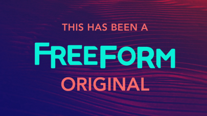
2nd Logo
(January 12, 2016-2018)
 <iframe frameborder="0" height="227" src="http://wikifoundrytools.com/wiki/closinglogos/widget/youtubevideo/98715f7f2b12aaf789d001a749a575a2938c3c34" width="401"></iframe>
Nicknames: "The Waves II", "The Freeform Waves II", "Still Waves"
Logo: We see waves similar from the last logo, but we see:
THIS HAS BEEN A
FREEFORM
ORIGINAL
FX/SFX: None.
Music/Sounds: None.
Availability: Seen on earlier episodes ofShadowhunters.
Editor's Note: None.
3rd Logo
(March 2018-)
Nicknames: "The Circles", "a little forward"
(March 2018-)
Nicknames: "The Circles", "a little forward"
Logo: On a black background, several circles quickly scroll down (in red, yellow, green, and blue, respectively). When it stops on the blue square, a connected "ff" appears one by one, and "FREEFORM" also appears below in a very bold font.
FX/SFX: The very, very fast-paced animation.
Music/Sounds: A tune consisting of claps and a few beeps.
Availability: Current.
Editor's Note: A overall improvement from the first logo.