Freeform Originals
Revision as of 21:28, 4 November 2020 by Travis (talk | contribs) (Created page with "<div class="WPC-editableContent"><font size="3"><u>Background</u>: On January 12, 2016, <font color="#333333">ABC Family</font> was rebranded as Freef...")
Background: On January 12, 2016, ABC Family was rebranded as Freeform. This debunked earlier rumors that the network was in a contract that forced the term "Family" into its name no matter what they did and what they broadcast.
1st Logo
(January 12, 2016-2018)
 <iframe frameborder="0" height="227" src="http://wikifoundrytools.com/wiki/closinglogos/widget/youtubevideo/b7298191b4d8459125655289c5e285155af8565f" width="402"></iframe>
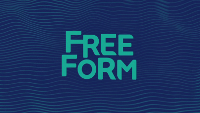
Nicknames: "The Waves", "The Freeform Waves", "Wavy Freeform"
 <iframe frameborder="0" height="227" src="http://wikifoundrytools.com/wiki/closinglogos/widget/youtubevideo/98715f7f2b12aaf789d001a749a575a2938c3c34" width="401"></iframe>
1st Logo
(January 12, 2016-2018)
 <iframe frameborder="0" height="227" src="http://wikifoundrytools.com/wiki/closinglogos/widget/youtubevideo/b7298191b4d8459125655289c5e285155af8565f" width="402"></iframe>
Nicknames: "The Waves", "The Freeform Waves", "Wavy Freeform"
Logo: We see some light blue waves on a blue background as the Freeform logo is seen through it. The waves change color and all of a sudden change to a different view as the letters of the Freeform logo quickly stretch in. The background turns light blue as the waves briefly go into the Freeform logo as a burst happens in the background. Dark waves then briefly go into the logo. The logo ends with waves appearing in the Freeform logo for one final time.
FX/SFX: The fast-paced animation.
Music/Sounds: An electronic tune.
Availability: It can be seen on the VOD release of Shadowhunters.
Editor's Note: This logo is really poorly made, from the unnecessary flashing, to how its design screams style over substance.
2nd Logo
(January 12, 2016-2018)
 <iframe frameborder="0" height="227" src="http://wikifoundrytools.com/wiki/closinglogos/widget/youtubevideo/98715f7f2b12aaf789d001a749a575a2938c3c34" width="401"></iframe>
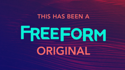
Nicknames: "The Waves II", "The Freeform Waves II", "Still Waves"
Logo: We see waves similar from the last logo, but we see:
THIS HAS BEEN A
FREEFORM
ORIGINAL
FX/SFX: None.
Music/Sounds: None.
Availability: Seen on earlier episodes ofShadowhunters.
Editor's Note: None.
3rd Logo
(March 2018-)
Nicknames: "The Circles", "a little forward"
(March 2018-)
Nicknames: "The Circles", "a little forward"
Logo: On a black background, several circles quickly scroll down (in red, yellow, green, and blue, respectively). When it stops on the blue square, a connected "ff" appears one by one, and "FREEFORM" also appears below in a very bold font.
FX/SFX: The very, very fast-paced animation.
Music/Sounds: A tune consisting of claps and a few beeps.
Availability: Current.
Editor's Note: A overall improvement from the first logo.