East Tennessee PBS
Jump to navigation
Jump to search
Logo descriptions by Ryan Froula and Jon Cox
Editions by Jon Cox, Lizz Tetlow, Ryan Froula, gshowguy and Shadeed A. Kelly.
Background: East Tennessee PBS is a PBS affiliate that serves the east side of Tennessee, via its two stations WKOP-TV and WETP-TV. It started life as WSJK-TV, which was founded in 1967 to serve the Tri-Cities (Sneedville, TN; Johnson City, TN; and Knoxville, TN). WKOP-TV began broadcasting on August 15, 1990, serving Knoxville. Its digital counterparts are WSJK-DT and WKOP-DT, which started broadcasting in 2000. In 2002, WSJK was renamed WETP, and the two studios collectively became known as East Tennessee Public Television. In 2010, ETPTV changed its named to East Tennessee PBS.
1st Logo
(1986-1987)
Nickname: "2 of the Future"
Logo: After a shot of prima ballerina Cynthia Gregory fouetting (from the Great Performances: Dance in Americaepisode "The American Ballet Theatre at the Met"), a shot of an owl (probably from an episode of Nature), and a shot of a young woman (program unknown), a white slide with a gray outline appears with a blue square, outlined in gray, in the center. In the lower right-hand corner of the square is a large, stylized number 2 consisting of a futuristic-looking shape and a dot in its upper left-hand corner. Circling the dot is a white ring consisting of a white line and, in a stenciled font, "WSJK-TV". The white slide zooms out against a black background, revealing "WSJK-TV" in a yellow Windsor font with a similar yellow 2 (but with the ring being a complete circle instead of just a line connected by the callsign) and "Sneedville, Tennessee" in a cyan Windsor font.
Variant: There exists a slightly longer version, with the line "You'll turn us on and you'll love it" being sung before "TV Worth Watching, Channel 2!" It is unknown what clips were used for this extended version.
FX/SFX: The clips, and the zoomout.
Music/Sounds/Voiceovers: A shortened version of the original "TV Worth Watching" jingle, followed by local celebrity Hop Edwards (1929-2014) saying, "This is viewer-supported WSJK-TV Channel 2."
Availability: Extinct.
Editor's Note: None.
2nd Logo
(1987-1990)
Nicknames: "Ugly TWO", "TV Worth Watching"
Logo: On a dark blue-black gradient background, we see the word "TWO", in an ugly font and colored pinkish-red, as well as230px|WSJK - CLG Wiki a gray line flying in from both directions. They turn into place, and after the "TWO" shines, "WSJK-TV", in Tahoma font, flips up underneath. The whole thing then zooms out to reveal the 1987 "TV Worth Watching" ID animation behind it.
FX/SFX: Early computer graphics.
Music/Sounds: The "TV Worth Watching" jingle, at least, when the singers sing "On channel 2...!". A short instrumental version (except for "On channel 2...!") was also used.
Availability: Extinct. Seen on a PBS' "TV Worth Watching" promo custom-made for WSJK, and also as a local ID. This might or might not have been a program intro tag, too (which would probably have music of its own).
Editor's Note: None.
3rd Logo
(1988-August 14, 1990)
Nickname: "Ugly TWO II"
Logo: Same as the 2nd logo, but the background is now blue, with rows of P-Heads scrolling up. "SNEEDVILLE, TN" also fades in below. Plus, there isn’t any zooming out to any PBS graphics.
FX/SFX: Same as before, but with the scrolling background.
Music/Sounds: Same as before, this time with Hop Edwards saying "This is your station for quality PBS programs, WSJK."
Availability: Extinct.
Editor's Note: Low.
4th Logo
(August 15, 1990-1995)
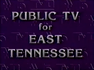
 Nickname: "Ugly TWO and '70s-style 15"
Logo: On a purple background with the logo from before, a striped 15, and the PBS P-Head embossed into it, the screen scrolls downwards. "PUBLIC TV FOR EAST TENNESSEE", in a chrome Kiera font, is seen. Each word then flips out, followed by the WSJK and WKOP logos flipping in. The WSJK logo is the same as before, but in white, with smaller text below it and turned to face the right, and the WKOP logo (which is silver) has the 15, with the segmented text "WKOP" right beside it, along with "KNOXVILLE" below, facing the left.
Variants:
FX/SFX: The etch-in effect and the flipping in of the logo, which is extremely bad.
Music/Sounds: Just Hop Edwards saying either:
Availability: Extinct.
Editor's Note: None.
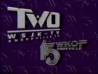
5th Logo
(August 15, 1990-1995)
Logo: Against a lake background, a blue/rose gradient rectangle flips in from the left. On it is a light cyan-colored "2 WSJK/15 WKOP" logo w/ the "2" & "15" in the Sahara Bodoni font and a P-Head (with "PBS" in Didot font under the P-Head) stacked on top of each other.
Variant: Sometimes, there's a longer version where after about 30 seconds, the background fades into a waterfall scene.
FX/SFX: The flipping in of the rectangle.
Music/Sounds: A catchy tune played on drums, bass, and clavinet which segues into a funky, upbeat rock/country tune with a clavinet, drums and bass with a few electric guitar riffs thrown in. Hop Edwards says "This is viewer-supported WSJK-TV and WKOP-TV." On a side note, this logo's music played on some community events calendars on WSJK/WKOP up until at least the summer of 1997.
Availability: Extinct.
Editor's Note: None.
6th Logo
(August 15, 1990-1995)
Logo: Just a powder blue-tinted image of Knoxville with the "Ugly Two" and '70s-style 15 in silver superimposed off center.
FX/SFX: None.
Music/Sounds: Logo 4's jingle. Sometimes it's silent.
Availability: Extinct.
Editor's Note: None.
7th Logo
(1990-1995)
Logo: We see a still pic of a generic live footage taken in Tennessee (much like the 1st Prairie Public Television ident). Superimposed over the pic occupying all of the left portion of the screen is a translucent image of the rectangle logo from the 6th ident, except colored violet/medium red-violet gradient and w/ powder blue logos on it.
Variants: One features a country side scenery cross-fading to the lake from logo 6, and another features an otter swimming.
FX/SFX: None for the otter variant, but the cross-fading for the other version.
Music/Sounds: No announcer, but there is music. A calm new age tune with a bass, electric piano & clapping on the cross-fading variant and a very brief Moog synth "WULLUP!"-like sound on the otter variant.
Availability: Extinct, this was the least-common of the 1990-1996 idents.
Editor's Note: None.
8th Logo
(October 1990-October 2002?)
Nickname: "The Halloween Logo"
Logo: On a black background with eggplant-colored smoke, we see an orange pumpkin with a P-head carved into it. In the upper-left corner is a gray ghost. In the lower-right corner is a box with two rectangles and a shadow drop. The top rectangle is white and has black text reading "PUBLIC TV FOR EAST TENNESSEE". The bottom rectangle is red and contains the WSJK/WKOP logo as seen in the 6th logo in white.
FX/SFX: None.
Music/Sounds: Just Hop Edwards saying "This is Public TV For East Tennessee, on viewer-supported WSJK-TV and WKOP-TV."
Availability: Extinct.
Editor's Note: None.
2nd Logo
(1987-1990)
Nicknames: "Ugly TWO", "TV Worth Watching"
Logo: On a dark blue-black gradient background, we see the word "TWO", in an ugly font and colored pinkish-red, as well as230px|WSJK - CLG Wiki a gray line flying in from both directions. They turn into place, and after the "TWO" shines, "WSJK-TV", in Tahoma font, flips up underneath. The whole thing then zooms out to reveal the 1987 "TV Worth Watching" ID animation behind it.
FX/SFX: Early computer graphics.
Music/Sounds: The "TV Worth Watching" jingle, at least, when the singers sing "On channel 2...!". A short instrumental version (except for "On channel 2...!") was also used.
Availability: Extinct. Seen on a PBS' "TV Worth Watching" promo custom-made for WSJK, and also as a local ID. This might or might not have been a program intro tag, too (which would probably have music of its own).
Editor's Note: None.
3rd Logo
(1988-August 14, 1990)
Nickname: "Ugly TWO II"
Logo: Same as the 2nd logo, but the background is now blue, with rows of P-Heads scrolling up. "SNEEDVILLE, TN" also fades in below. Plus, there isn’t any zooming out to any PBS graphics.
FX/SFX: Same as before, but with the scrolling background.
Music/Sounds: Same as before, this time with Hop Edwards saying "This is your station for quality PBS programs, WSJK."
Availability: Extinct.
Editor's Note: Low.
4th Logo
(August 15, 1990-1995)


Logo: On a purple background with the logo from before, a striped 15, and the PBS P-Head embossed into it, the screen scrolls downwards. "PUBLIC TV FOR EAST TENNESSEE", in a chrome Kiera font, is seen. Each word then flips out, followed by the WSJK and WKOP logos flipping in. The WSJK logo is the same as before, but in white, with smaller text below it and turned to face the right, and the WKOP logo (which is silver) has the 15, with the segmented text "WKOP" right beside it, along with "KNOXVILLE" below, facing the left.
Variants:
- During sign-on and sign-off, this logo was used as the template for the sign-on and sign-off screens, first showing "PUBLIC TV FOR EAST TENNESSEE", then the station logos. Then, we see the Ugly Two and info on WSJK, followed by the '70s-style 15 and info on WKOP, then info on the East Tennessee Public Communications Corporation, then the microwave stations, and finally the "Ugly Two" and '70s-style 15.
- Sometimes Hop Edwards would start saying "This is viewer-supported Public TV For East Tennessee" over the end of the PBS "Just Watch Us Now!/Come See the Light" promo, which after a couple of seconds cuts to this logo, with the Ugly Two and '70s-style 15 already formed.
- Sometimes, there's a rare still variant. Edwards doesn't announce on it.
- Sometimes, the background is fire engine red.
FX/SFX: The etch-in effect and the flipping in of the logo, which is extremely bad.
Music/Sounds: Just Hop Edwards saying either:
- "This is Public TV For East Tennessee, on viewer supported WSJK-TV and WKOP-TV.",
- "This is Public TV For East Tennessee, on viewer supported WSJK and WKOP.",
- "This is viewer supported Public TV For East Tennessee.",
- or "This is viewer supported WSJK-TV and WKOP-TV."
Availability: Extinct.
Editor's Note: None.
5th Logo
(August 15, 1990-1995)
Logo: Against a lake background, a blue/rose gradient rectangle flips in from the left. On it is a light cyan-colored "2 WSJK/15 WKOP" logo w/ the "2" & "15" in the Sahara Bodoni font and a P-Head (with "PBS" in Didot font under the P-Head) stacked on top of each other.
Variant: Sometimes, there's a longer version where after about 30 seconds, the background fades into a waterfall scene.
FX/SFX: The flipping in of the rectangle.
Music/Sounds: A catchy tune played on drums, bass, and clavinet which segues into a funky, upbeat rock/country tune with a clavinet, drums and bass with a few electric guitar riffs thrown in. Hop Edwards says "This is viewer-supported WSJK-TV and WKOP-TV." On a side note, this logo's music played on some community events calendars on WSJK/WKOP up until at least the summer of 1997.
Availability: Extinct.
Editor's Note: None.
6th Logo
(August 15, 1990-1995)
Logo: Just a powder blue-tinted image of Knoxville with the "Ugly Two" and '70s-style 15 in silver superimposed off center.
FX/SFX: None.
Music/Sounds: Logo 4's jingle. Sometimes it's silent.
Availability: Extinct.
Editor's Note: None.
7th Logo
(1990-1995)
Logo: We see a still pic of a generic live footage taken in Tennessee (much like the 1st Prairie Public Television ident). Superimposed over the pic occupying all of the left portion of the screen is a translucent image of the rectangle logo from the 6th ident, except colored violet/medium red-violet gradient and w/ powder blue logos on it.
Variants: One features a country side scenery cross-fading to the lake from logo 6, and another features an otter swimming.
FX/SFX: None for the otter variant, but the cross-fading for the other version.
Music/Sounds: No announcer, but there is music. A calm new age tune with a bass, electric piano & clapping on the cross-fading variant and a very brief Moog synth "WULLUP!"-like sound on the otter variant.
Availability: Extinct, this was the least-common of the 1990-1996 idents.
Editor's Note: None.
8th Logo
(October 1990-October 2002?)
Nickname: "The Halloween Logo"
Logo: On a black background with eggplant-colored smoke, we see an orange pumpkin with a P-head carved into it. In the upper-left corner is a gray ghost. In the lower-right corner is a box with two rectangles and a shadow drop. The top rectangle is white and has black text reading "PUBLIC TV FOR EAST TENNESSEE". The bottom rectangle is red and contains the WSJK/WKOP logo as seen in the 6th logo in white.
FX/SFX: None.
Music/Sounds: Just Hop Edwards saying "This is Public TV For East Tennessee, on viewer-supported WSJK-TV and WKOP-TV."
Availability: Extinct.
Editor's Note: None.
9th Logo
(December 1990-December 2002?)
Nickname: "The Christmas Logo"
Logo: On a gray background with embedded snowflakes, we see a picture of a blue ornament on a Christmas tree with a light blue border and a drop shadow behind it all. In the bottom-left corner is "Happy Holidays" in a cursive font. Sliding in to the right is the same rectangles from the previous logo, again with a drop shadow.
FX/SFX: Just the rectangles sliding in.
Music/Sounds: A jazzy, easy-listening rendition of "Have Yourself a Merry Little Christmas", with Hop Edwards saying "This is Public TV For East Tennessee, on viewer-supported WSJK-TV and WKOP-TV."
Availability: Extinct.
Editor's Note: Perhaps the single most relaxing ID the station ever produced.
10th Logo
(1995-December 24, 2002)
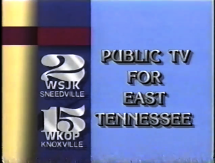 Logo: We see the logo from the 6th ident in a dark blue box on the left side of the screen. On the light blue right side of the screen, we see in white "PUBLIC TV FOR EAST TENNESSEE" and shadows of CGI window-style effects. Under the "2" is "WSJK SNEEDVILLE", and under the 15 is "WKOP KNOXVILLE". To the left of the dark box is yellow, and the bar on the top over both the yellow and dark blue areas is colored red.
Variants: There were three color schemes: blue (mentioned above and pictured to the right), red, and yellow. The red & yellow variants also have totally different color schemes than the blue one. Yellow has a yellow BG, army green rectangle, light gray on the far left, and cyan over the areas. Red has a red BG, dark red rectangle, light gray on the far left, and yellow over the areas. Coincidentally, the red variant's color scheme is also used as a screen tint for the 10th WNET ident.
Preambles:
FX/SFX: The shadows.
Music/Sounds: There were three jingles: a peaceful brass tune with a few English horn and violin riffs thrown in (used only on the blue color scheme), an African-style new age tune with flutes, cellos, a choir and a piano (used on the blue and red color schemes), and a piano/guitar tune with bongo drums beating in the background (used on all three color schemes). On all three, Hop Edwards says either "This is Public TV For East Tennessee, on viewer-supported WSJK-TV and WKOP-TV." or "This is viewer-supported Public TV For East Tennessee". Sometimes (at least on the blue variant), there's no music and just has Hop Edwards saying, "This is viewer-supported Public TV For East Tennessee."
Availability: Extinct.
Editor's Note: This is based on a 1995 rebrand of PBS, which would be incorporated into PBS’s own logo the next year.
11th Logo
(December 25, 2002-2006)
Logo: We see a blue/purple/red ethereal background with the new ETP-TV logo in the center. After a few seconds, it zooms out to make room for "WETP-TV 2 Sneedville, TN" and "WKOP-TV 15 Knoxville, TN".
Variant: In 2004, two digital stations were added: "WETP-DT 41" and "WKOP-DT 17".
FX/SFX: The blue/purple/red ethereal background, the occasional P-Head movement, and the zooming out.
Music/Sounds: An extended variant of the 2002 CPB logo's music. For the first two years, Hop Edwards says "This is viewer-supported East Tennessee Public TV, on WETP-TV channel 2 and WKOP-TV channel 15" or "This is viewer-supported East Tennessee Public TV". For the final two years, Hop Edwards says "This is viewer-supported East Tennessee Public TV, broadcasting on WETP-TV channel 2, WKOP-TV channel 15, WETP-DT channel 41, and WKOP-DT channel 17.", "This is viewer-supported East Tennessee Public TV, broadcasting on WETP and WKOP.", or "This is viewer-supported East Tennessee Public TV, on WETP and WKOP.".
Availability: Extinct.
Editor's Note: None.
12th Logo
(2006-February 16, 2009)
TBA
13th Logo
(February 17, 2009-February 15, 2010)
TBA
14th Logo
(February 16, 2010-July 30, 2010)
TBA
Logo: Against the generic blue PBS standard background is the East Tennessee PBS logo, with the station's slogan "Discover More" directly below. Below all that are the callsigns, WETP-DT Sneedville, TN, and WKOP-DT Knoxville, TN, and the URL.
FX/SFX: The background animation.
Music/Sounds: A country rock instrumental in three different lengths, with a different voiceover for each:
Availability: Current.
Editor's Note: None.
10th Logo
(1995-December 24, 2002)
 Logo: We see the logo from the 6th ident in a dark blue box on the left side of the screen. On the light blue right side of the screen, we see in white "PUBLIC TV FOR EAST TENNESSEE" and shadows of CGI window-style effects. Under the "2" is "WSJK SNEEDVILLE", and under the 15 is "WKOP KNOXVILLE". To the left of the dark box is yellow, and the bar on the top over both the yellow and dark blue areas is colored red.
Variants: There were three color schemes: blue (mentioned above and pictured to the right), red, and yellow. The red & yellow variants also have totally different color schemes than the blue one. Yellow has a yellow BG, army green rectangle, light gray on the far left, and cyan over the areas. Red has a red BG, dark red rectangle, light gray on the far left, and yellow over the areas. Coincidentally, the red variant's color scheme is also used as a screen tint for the 10th WNET ident.
Preambles:
- Arts and Entertainment: "Bringing you the great variety of the performing arts..." Both long and short versions use the blue color scheme with the first music variant.
- Nature: "Setting the standard for nature documentaries..." Both long and short versions use the blue color scheme; the long version uses the first music variant, while the short version uses the second music variant.
- Explore: "Exploring the world..." The long version uses the blue color scheme, while the short version uses the red color scheme; both use the second music variant.
- Science: "For the best in science and technology documentaries..." Unknown for the long version; the short version uses the blue color scheme with the third music variant.
- Depth, Dialogue, Discussion: "Your source for award-winning news and public affairs programming..." Unknown for the long version; the short version uses the red color scheme with the third music variant.
- Do It Yourself: Unknown voiceover and long version setup; the short version uses the red color scheme with the second music variant.
- History: Unknown.
FX/SFX: The shadows.
Music/Sounds: There were three jingles: a peaceful brass tune with a few English horn and violin riffs thrown in (used only on the blue color scheme), an African-style new age tune with flutes, cellos, a choir and a piano (used on the blue and red color schemes), and a piano/guitar tune with bongo drums beating in the background (used on all three color schemes). On all three, Hop Edwards says either "This is Public TV For East Tennessee, on viewer-supported WSJK-TV and WKOP-TV." or "This is viewer-supported Public TV For East Tennessee". Sometimes (at least on the blue variant), there's no music and just has Hop Edwards saying, "This is viewer-supported Public TV For East Tennessee."
Availability: Extinct.
Editor's Note: This is based on a 1995 rebrand of PBS, which would be incorporated into PBS’s own logo the next year.
11th Logo
(December 25, 2002-2006)
Logo: We see a blue/purple/red ethereal background with the new ETP-TV logo in the center. After a few seconds, it zooms out to make room for "WETP-TV 2 Sneedville, TN" and "WKOP-TV 15 Knoxville, TN".
Variant: In 2004, two digital stations were added: "WETP-DT 41" and "WKOP-DT 17".
FX/SFX: The blue/purple/red ethereal background, the occasional P-Head movement, and the zooming out.
Music/Sounds: An extended variant of the 2002 CPB logo's music. For the first two years, Hop Edwards says "This is viewer-supported East Tennessee Public TV, on WETP-TV channel 2 and WKOP-TV channel 15" or "This is viewer-supported East Tennessee Public TV". For the final two years, Hop Edwards says "This is viewer-supported East Tennessee Public TV, broadcasting on WETP-TV channel 2, WKOP-TV channel 15, WETP-DT channel 41, and WKOP-DT channel 17.", "This is viewer-supported East Tennessee Public TV, broadcasting on WETP and WKOP.", or "This is viewer-supported East Tennessee Public TV, on WETP and WKOP.".
Availability: Extinct.
Editor's Note: None.
12th Logo
(2006-February 16, 2009)
TBA
13th Logo
(February 17, 2009-February 15, 2010)
TBA
14th Logo
(February 16, 2010-July 30, 2010)
TBA
15th Logo
(July 31, 2010- )
Logo: Against the generic blue PBS standard background is the East Tennessee PBS logo, with the station's slogan "Discover More" directly below. Below all that are the callsigns, WETP-DT Sneedville, TN, and WKOP-DT Knoxville, TN, and the URL.
FX/SFX: The background animation.
Music/Sounds: A country rock instrumental in three different lengths, with a different voiceover for each:
- Full version: "We are driven by our public service mission to provide opportunities for exploration for everyone. We are East Tennessee PBS."
- Short version: "You're watching viewer-supported East Tennessee PBS. Become a member today."
- Extra short version: "This is East Tennessee PBS."
Availability: Current.
Editor's Note: None.
16th Logo
(February 2019- )
Nickname: "Over 100 Years of Country Music"
Logo: Several variants exist of this logo:
- Bristol: Just a photo of old Bristol, Tennessee.
- Dolly Parton: A photo of Dolly Parton with her guitar.
- Chet Atkins: A photo of Chet Atkins with his guitar.
- Jim Clayton: The only one with any significant material. Jim Clayton, on camera, says, "You're watching East Tennessee PBS, exploring 100 years of country music all year long." It then fades to the aforementioned Bristol photo.
- Louvin Brothers: A photo of the Louvin Brothers in the recording studio.
- And others, it will take some time to identify all of them.
FX/SFX: Not very much.
Music/Sounds: Depends on the variant.
- The Bristol variant has a recording of "Wildwood Flower".
- The Dolly Parton variant has "Jolene".
- The Chet Atkins variant has his cover of "Orange Blossom Special".
- The Jim Clayton variant has "I'm So Lonesome I Could Cry".
- As with the variants, it will take some time to identify all the music tracks used.
Availability: Seen on East Tennessee PBS in celebration of over 100 years of country music and anticipation of Ken Burns's documentary Country Music.
Editor's Note: A fitting set of logos for a celebration of country music.